[Ed note: Hi everyone! This week's first post comes from Maddy from The Inspired Bride – Maddy is a talented graphic designer and art director based in Minnesota, and a recent newlywed! At The Inspired Bride, Maddy focuses on the "how to" part of wedding planning, from color palettes to etsy finds to details and personal touches. I'm so excited to have her here on Oh So Beautiful Paper this week!]
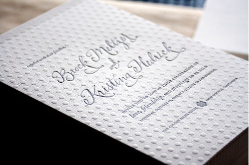
invitation from Kristina's wedding at Lovely Morning via Love Jenna
Just like Nole, I'm a paper connoisseur. As a wedding blogger, I'm delighted to see invitations daily from designers and couples alike. The more I see, the more I notice recurring details among invitations that really stand out to me. Here is my short list of design elements that will wow and make your invitation unique.
Blind Debossing: a great feature if you're going letterpress. Instead of printing with an ink, the plate makes an impression into the surface of the paper and the dimension left behind becomes the design element. This works beautifully with patterns in particular – the dimensional effect won't have as great an impact in larger graphic images. [Ed note: this process is also referred to as blind stamping]
Modern Calligraphy: I'm a fan of well done calligraphy in all forms, but I've seen a lot more invitations move to something a little bolder like Jenna Hein's work. It combines the right balance of elegant and contemporary to give an invitation a really fresh look.
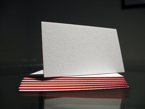
photo via Dolce Press
Edge Painting: add a pop of color and fun in a more non-traditional way. Edge painting only pays off on thicker stocks like a 300 gsm or 600 gsm duplex, but it looks fantastic!
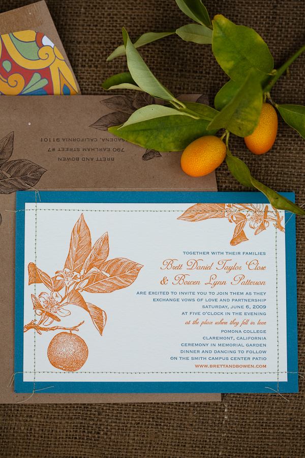
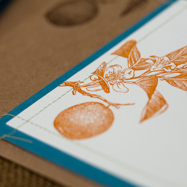
Stitching: a detail that's becoming more and more popular, and with good reason! This simple, handmade touch makes invitations feel more personal and precious. The tactile nature of stitching is great to give a little more dimension to offset printing.
Books: instead of a suite, consider compiling it all into one place – your directions, your RSVP post card, your accommodations, and every other card you'd otherwise stuff in your envelope. It's a great opportunity to tell a story as a couple while also informing your guests of all the details! It's certainly a more unique than your standard invitation, but consider your budget before going down this route.

