2012 Calendar Round-up, Part 1

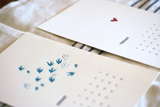
Y’all, I can barely believe it, but it’s that time of year… calendar season!  Today is the first of what I’m sure will be many calendar round up posts (last year there were nine!), and for the first installment I’m focusing on 2012 editions from some of my favorites from 2011.  First up, the always lovely nature-inspired minimalist designs from one of my perennial favorites, Satsuma Press:

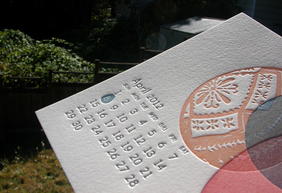
Letterpress Calendar

Satsuma Press

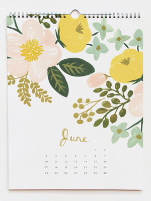
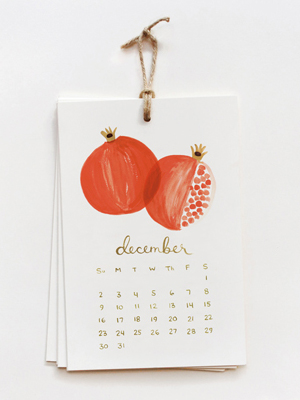
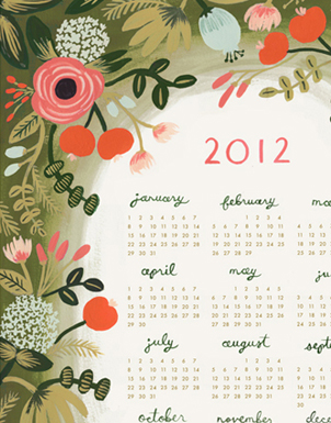
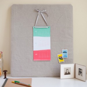
This year Rifle  Paper Co. is offering three different calendar formats – two monthly wall calendars in botanical or fruit themes, and a twelve month floral wall calendar:


Rifle  Paper Co.

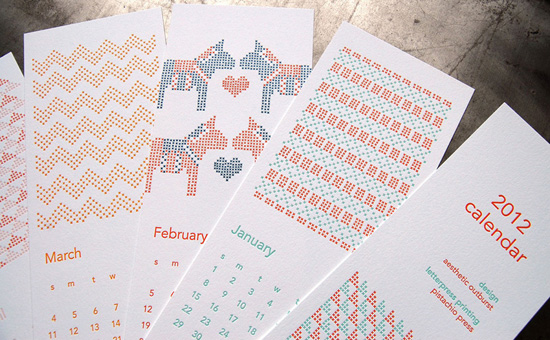
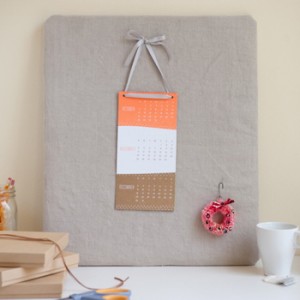
I first glimpsed the Pistachio Press cross stitch calendar back at the National Stationery Show in May, and it’s still one of my favorites for 2012:

Cross Stitch Calendar

Pistachio Press

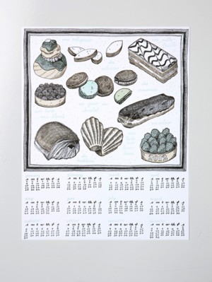
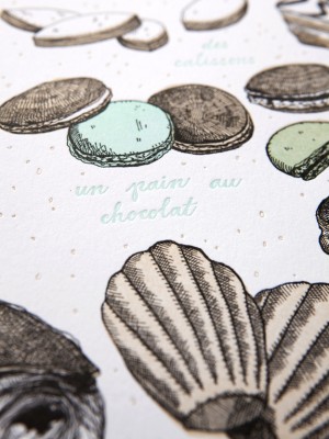
The Sycamore Street Press 2012 calendar was inspired by French pastries, featuring a twelve month wall calendar with a dozen illustrations, from macarons to éclairs – yum!

French Pastry Calendar 

Photos by Nicole Hill Gerulat for Sycamore Street Press

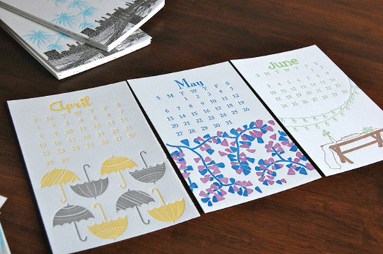
The Paisley Tree Press 2012 calendar comes with thirteen envelopes – you can use the cover and each month to send a sweet note to friends and family!

Letterpress Wall Calendar

Paisley Tree Press

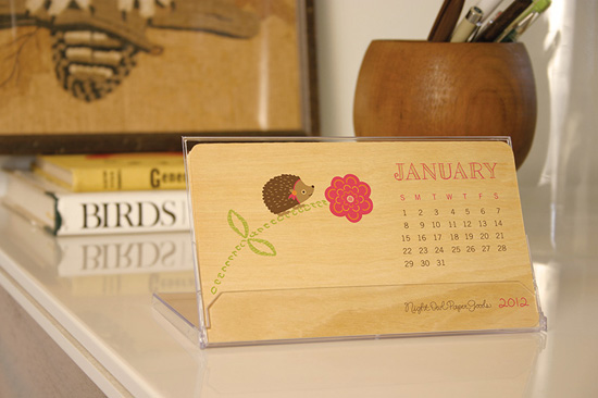
I always love the wood veneer calendars from Night Owl Paper Goods – this year they’re offering half a dozen adorable formats, from the critters desk calendar below to hanging wall calendars.

Critter Calendar

Night Owl Paper Goods

I love the modern illustrations and patterns on the 2012 calendars from SusyJack*.  Susy is also offering two formats this year – a hanging wall calendar and write-on wall calendar:

Deluxe Wall Calendar 

Susy Jack

Linda & Harriett is offering two super limited edition 2012 calendars – a wall calendar inspired by watercolors and an adorable letterpress calendar (the bottom of each month detaches for use as a postcard!).

Letterpress Calendar Watercolor Calendar

Linda & Harriett

The Ilee calendar has been one of my favorites for the past three years – I can’t wait to receive my 2012 edition!

Letterpress Calendar

Ilee

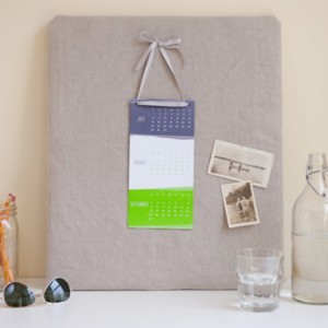
And last up for today, the Simplesong 2012 limited edition calendar features three months to a page, with a super fun color palette for each season.  So cute!


Simplesong Design

I’ll be back tomorrow with more beautiful calendars!

{images via their respective sources}

*Pistachio Press and Paisley Tree Press are two of my fab­u­lous spon­sors; for more on my edi­to­r­ial poli­cies please click here.
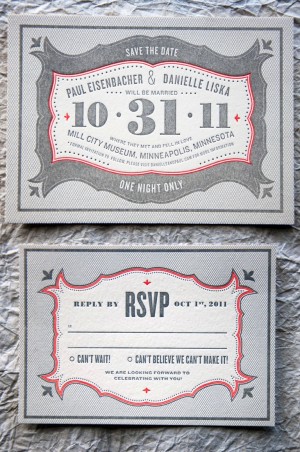
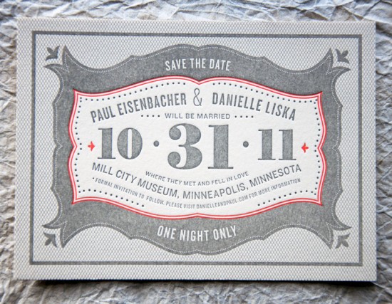
Danielle + Paul’s Vintage-Inspired Marquee Halloween Wedding Invitations

It’s always a good day when an invitation from Kate at Wit + Delight shows up in my inbox.  Kate sent over these fabulous custom invitations that she designed for a wedding taking place on Halloween.  Danielle and Paul’s wedding reception will include a masquerade, so Kate designed an invitation inspired by the concept of a 1920s marquee and incorporating Danielle and Paul’s color palette of cream, gray, and pumpkin!

From Kate: The wedding is taking place on October 31st in the ruins of a historic factory called the Mill City Ruins, which is equal parts elegant and mysterious.  Paul and Danielle have done a great job balancing the intrigue and liveliness of Halloween without feeling kooky, or costume-y.  Their palette is mostly creams and grays, with a pop of pumpkin.


The entire evening is filled with non-traditional details – like a masquerade! – and Danielle really loved the idea of invitations inspired by a vintage marquee.  We incorporated eclectic typography and ornate shapes to reference the 1920s era.  The invitations were printed by Evolutionary Press on thick cotton stock that gives the design a really great texture.

Thanks Kate!

Design and Concept: Kate Gabriel

Letterpress Printing: Evolutionary Press

Photo Credits: Kate Gabriel | Wit + Delight

Elizabeth + John’s Classic Calligraphy Wedding Invitations

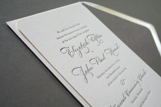
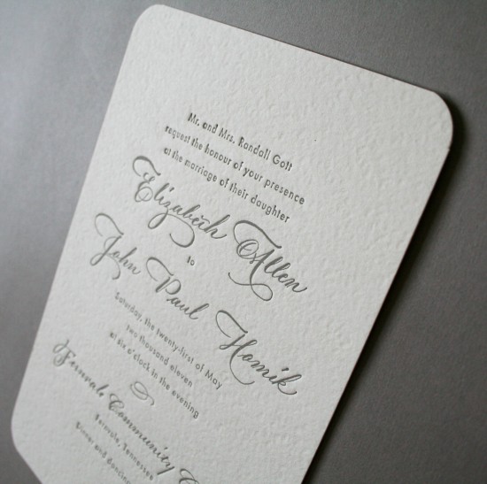
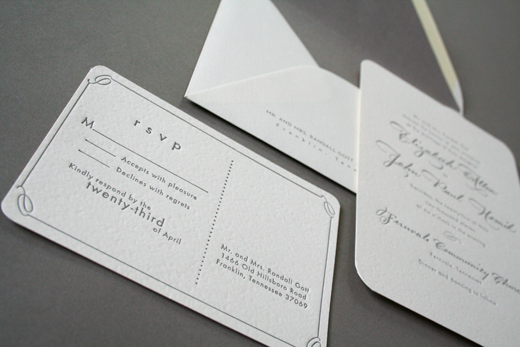
I’m having one of those days where I just keep repeating the phrase “Serenity Now” over and over and over, so I’m in dire need of something classic and undeniably pretty to help me get through the day.  Erin from Arboreal sent over these beautiful and classic wedding invitations that she created for the Tennessee wedding of recent clients Elizabeth (aka Biz) and JP.  Erin incorporated calligraphy by Barbara Thomas and simple design elements to create these elegant invitations.

From Erin: To set the tone of the wedding, Biz and JP asked me to create a simple and classic invitation with hand written calligraphy.  The wedding suite was letterpress printed in charcoal ink on textured ivory paper with rounded edges and finished with a matching lined envelope.

Erin also sent over a couple of images from Biz and JP’s wedding, courtesy of Justin Wright Photography – so gorgeous!  You can see a few more images over on Erin’s blog right here.

Congratulations Biz and JP!

Design: Arboreal

Calligraphy: Calligraphy by Barbara

Check out the Designer Rolodex for more tal­ented wed­ding invi­ta­tion design­ers and the real invi­ta­tions gallery for more beau­ti­ful cus­tom invitations!

Photo Credits: Invitation images by Arboreal, wedding images by Justin Wright Photography

{happy weekend!}

Happy Friday everyone – and happy first day of Fall!  But seriously, how is it almost the end of September already?  Time is seriously starting to fly!  Do you all have interesting plans for this weekend?  My agenda this weekend is happily low key; hanging out with friends, a few fun errands, and a movie with the husband.  My favorite kind of weekend.  But in the meantime…

…a few links for your weekend:

This week on Oh So Beautiful Paper:

A big welcome to the newest Designer Rolodex members!

That’s it for me this week!  I hope you all have a wonderful weekend, and I’ll see you back here on Monday! xoxo

Photo Credit: The Swerve and the Static by Cinnamon, via Design is Mine