Behind the Stationery: Ramona & Ruth

Taking us to Nebraska, our next feature on Behind the Stationery is Ramona & Ruth!  Kim, the brand’s founder and designer, shares about her self-taught journey with letterpress and why this classic print method is a key element of Ramona & Ruth. As an illustrator, Kim gives us an inside look to how she sets up her ideal sketching environment, what inspires her designs, and what she’s been sketching lately. –Megan Soh
Ramona & Ruth

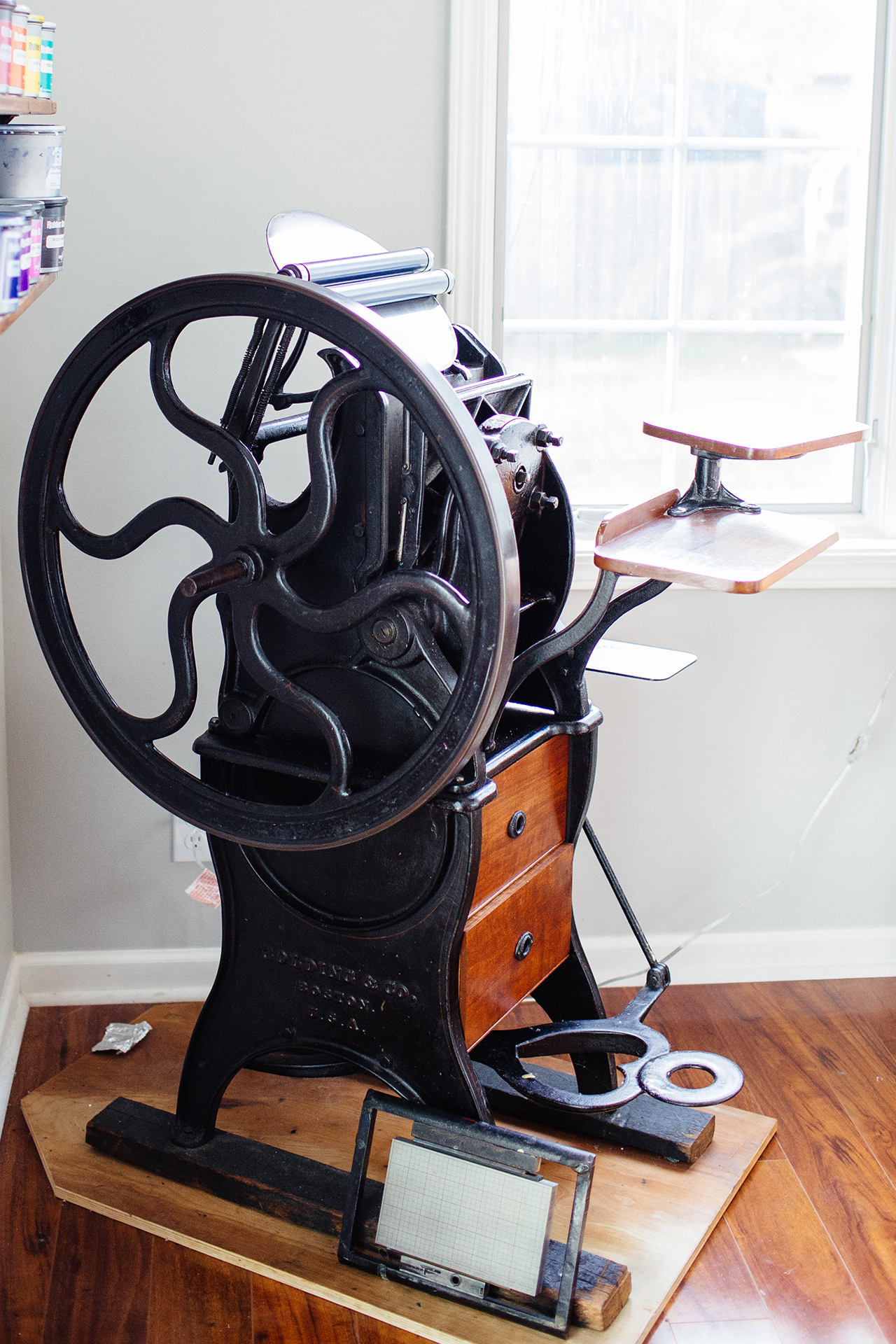
From Kim: It was around 9 years ago that my first little antique tabletop press was delivered to my doorstep in Omaha, Nebraska. It was better than Christmas morning. I had begun my nationwide search for a letterpress after a few years of working as a graphic designer in a corporate job and not feeling very fulfilled. I initially set out to use this letterpress to print wedding invitations for clients, but the more I learned, the more I wanted to explore, so I began printing my own hand-drawn illustrations. I spent countless hours researching the craft and fumbling around on the press trying to figure out how it worked. I still remember the very first illustration I printed of a little coffee cup and the joy it brought me to see my design come to life in print. It was then that I knew this was meant to be.
Ramona & Ruth

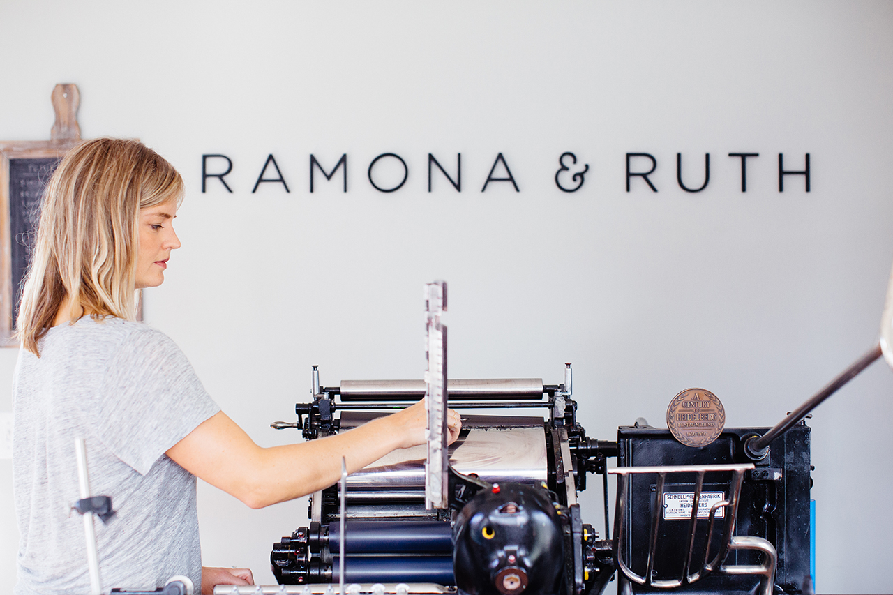
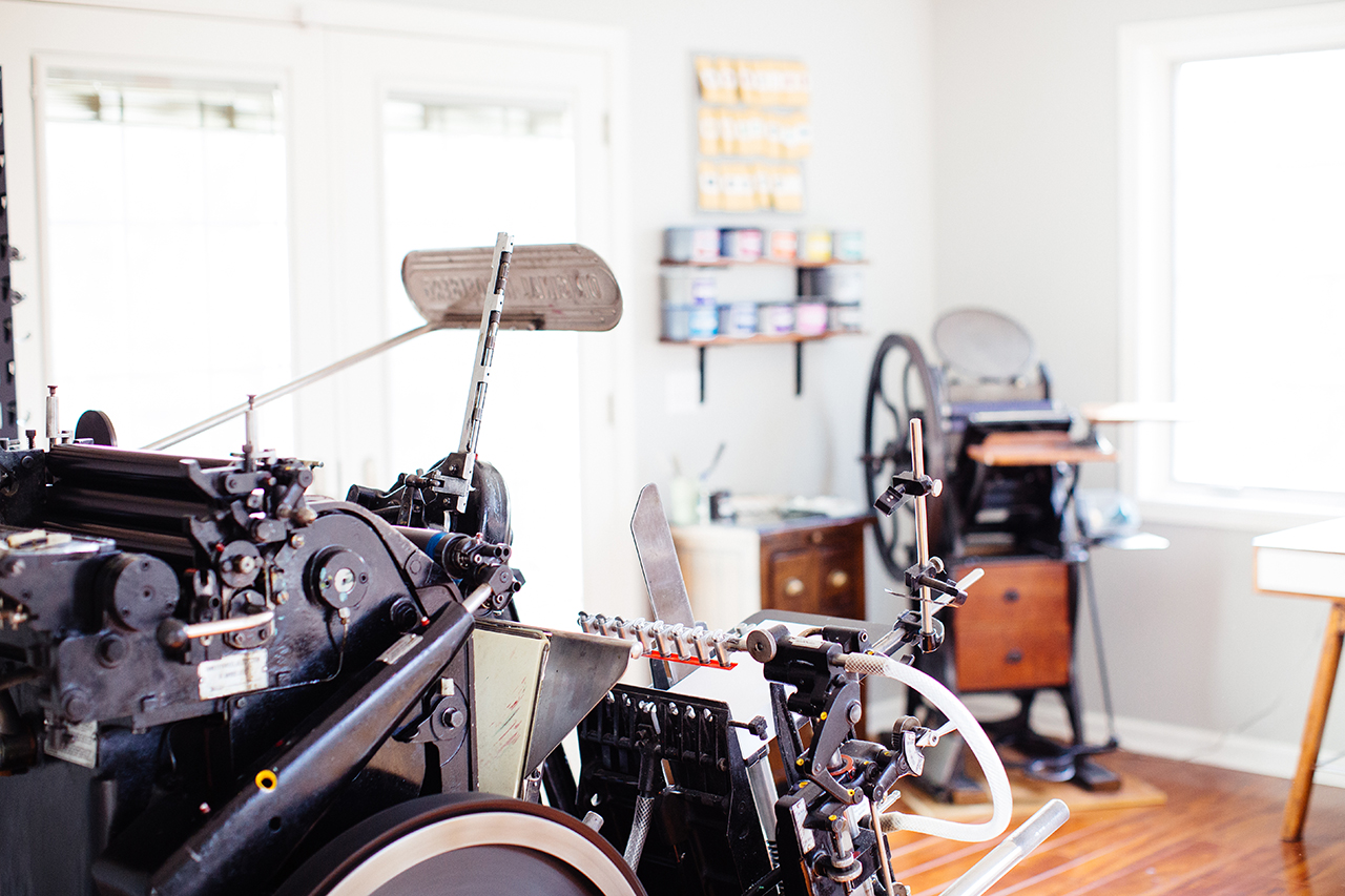
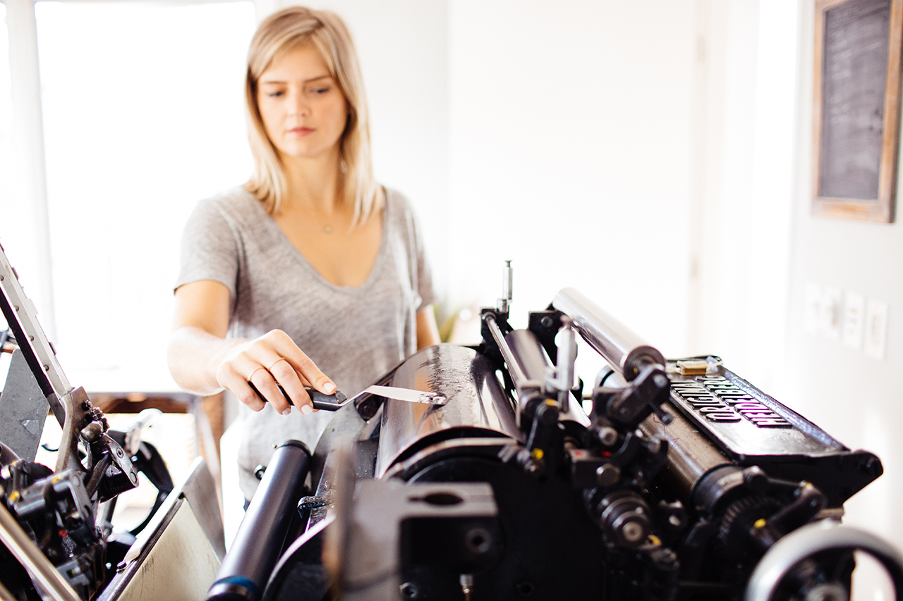
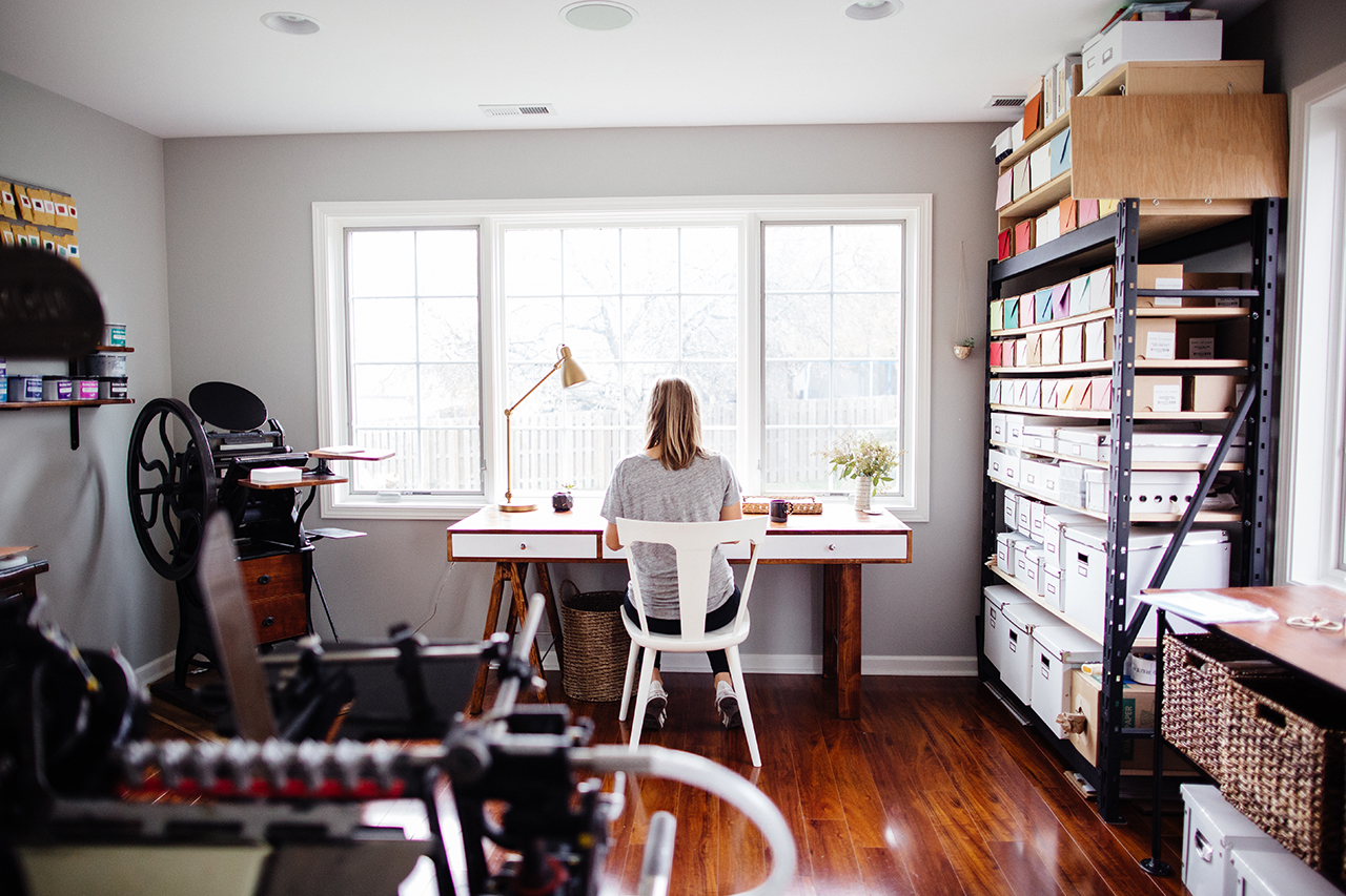
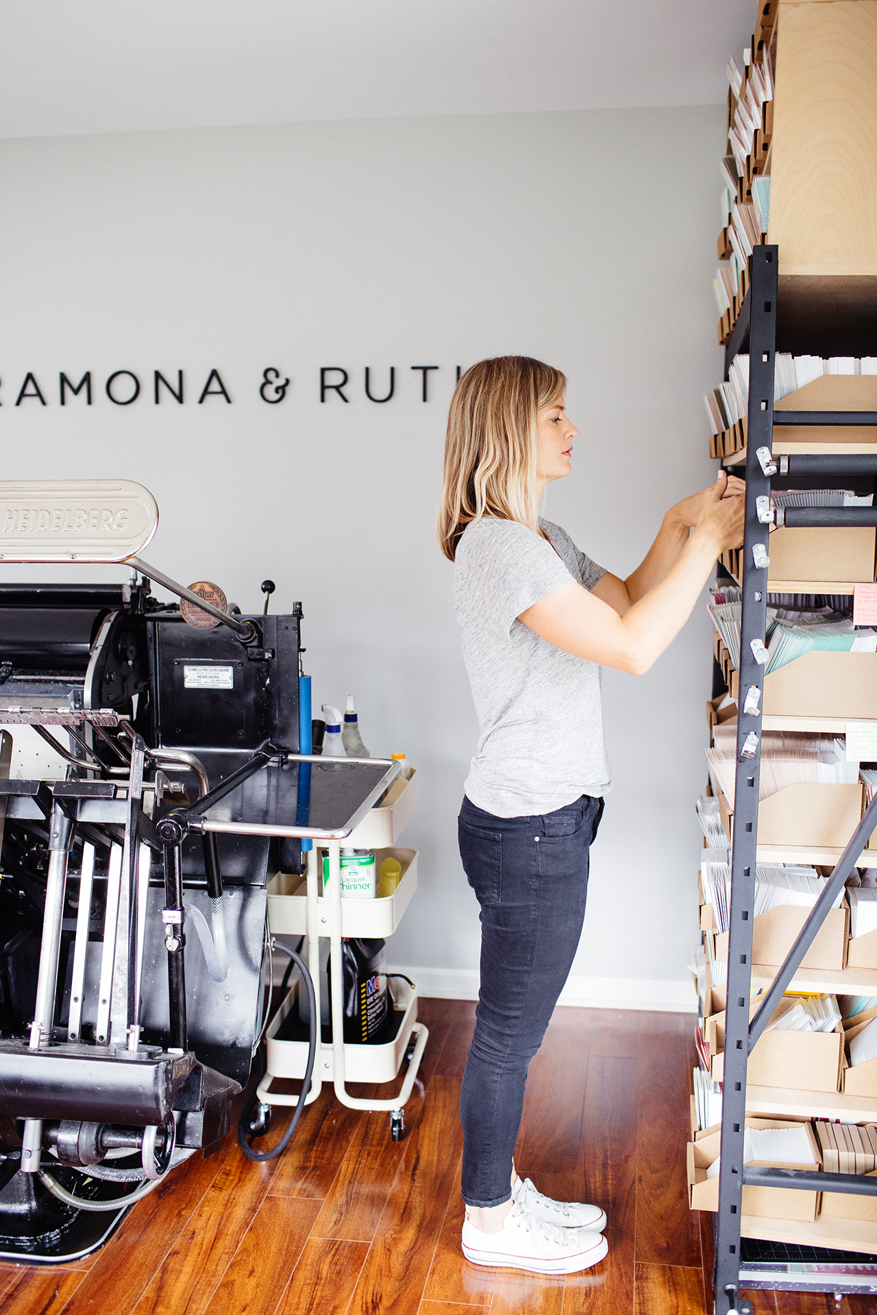
Over the years, my Omaha-based studio has grown to include two antique printing presses as well as a paper cutter from the late 1800’s. It was a few years ago that I knew time was right to purchase a Heidelberg Windmill letterpress to help me with printing larger wholesale orders. With this press upgrade also came a studio upgrade. Weighing in at 3,000 pounds, the Windmill was a much larger machine than my current press and therefore needed the space to accommodate it. Instead of finding a separate off-site studio space, my husband and I decided to have a letterpress studio built onto the back of our home. With no overhead and no commute I could better balance staying at home with my two little boys with my work in the studio.
Ramona & Ruth

After a few months, the studio was finished and the presses were moved in safe and sound. It was so important to me to have a generous amount of windows so the studio would be filled with an abundance of natural light. My studio is my outlet. I just love the light and airy feeling of my space and how it provides me with an inspirational and uplifting place to design and print. It is in this studio that I strive each day to build a brand of letterpress goods that create delicate, thoughtful designs that leave lasting impressions.
Ramona & Ruth

Ramona & Ruth is named for my grandmothers who inspired me to find beauty in simplicity. Ramona, an entrepreneur who handcrafted beautiful floral designs in her very own floral shop; and Ruth, who spent her days tending to dairy cows and wrangling chickens out on the farm. These hardworking, dedicated women helped instill my passion for developing my own business.
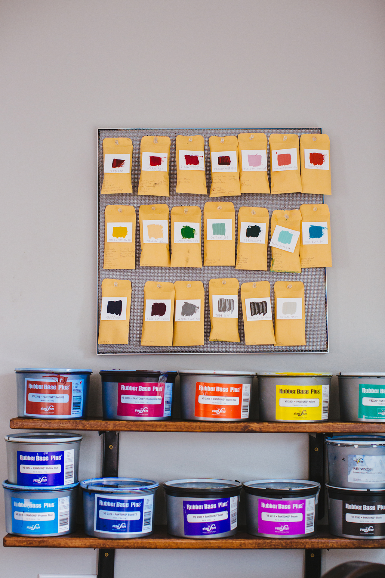
Ramona & Ruth - Ink

Ramona & Ruth

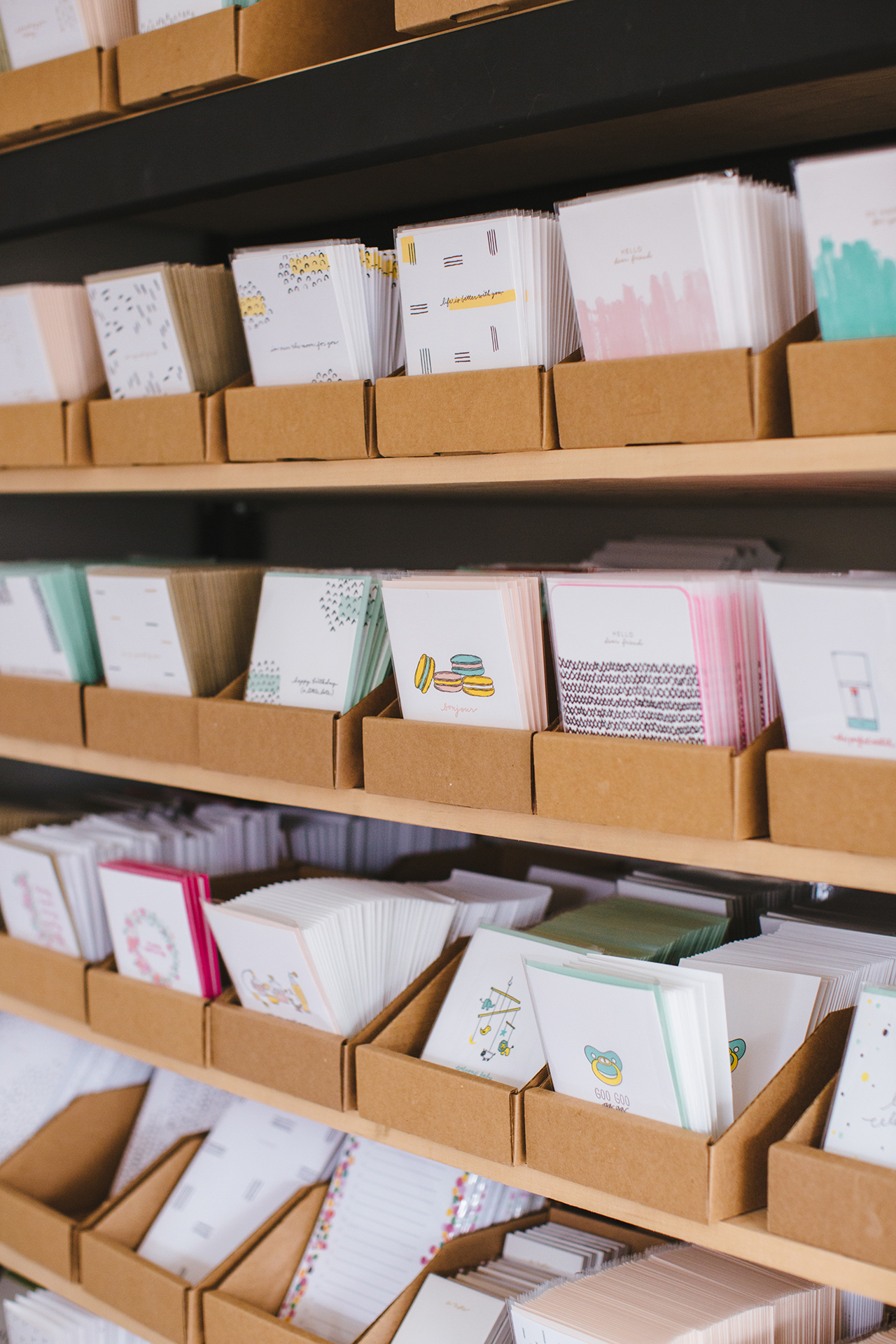
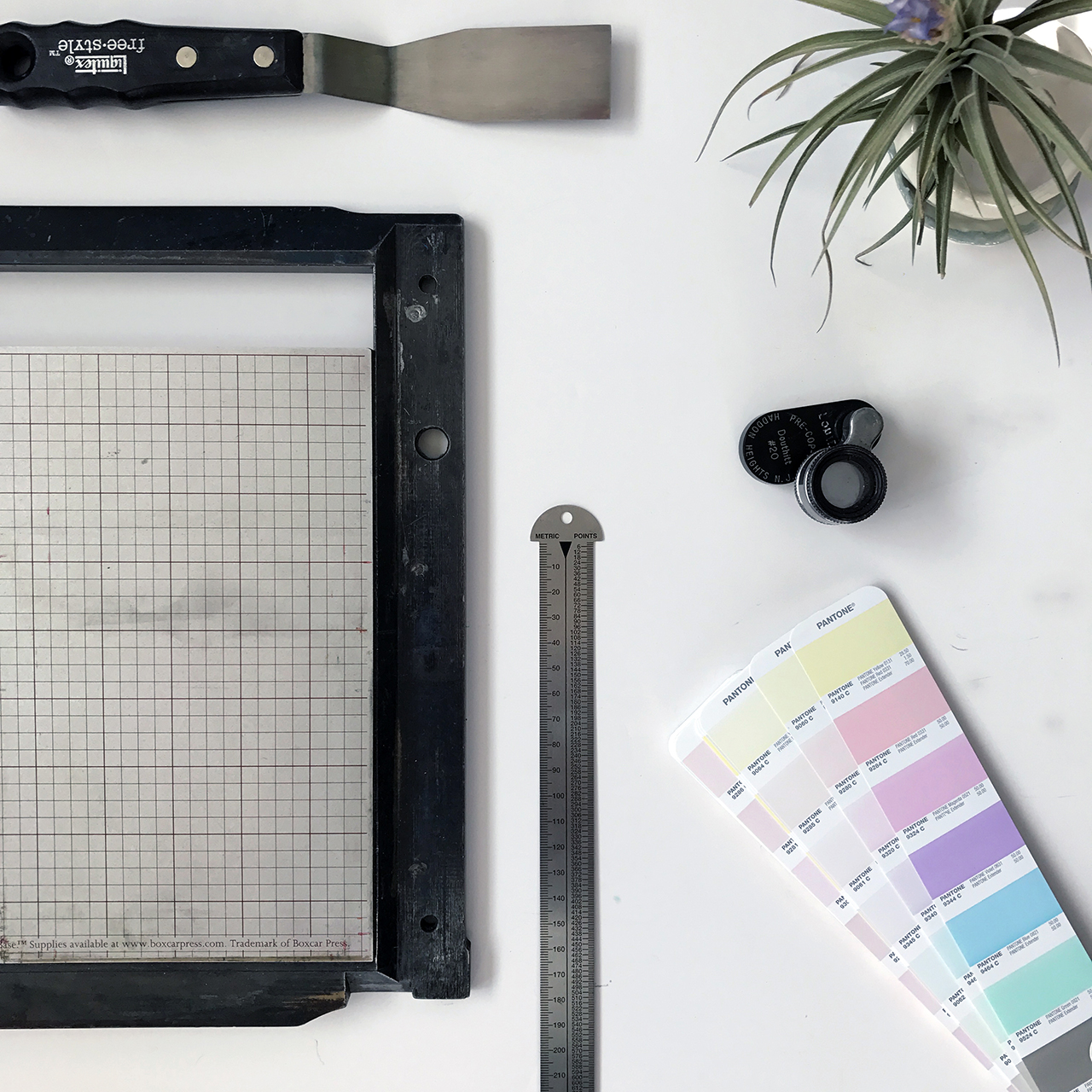
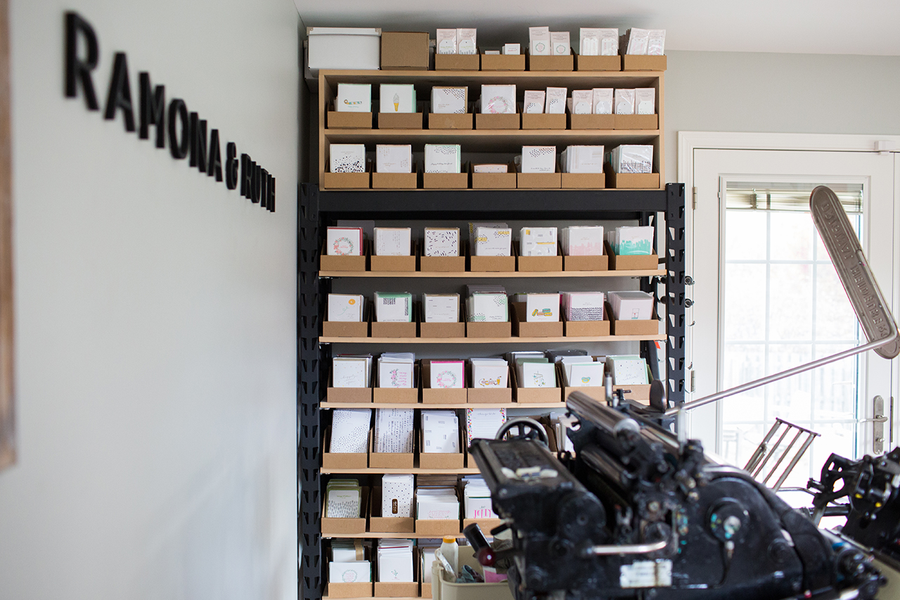
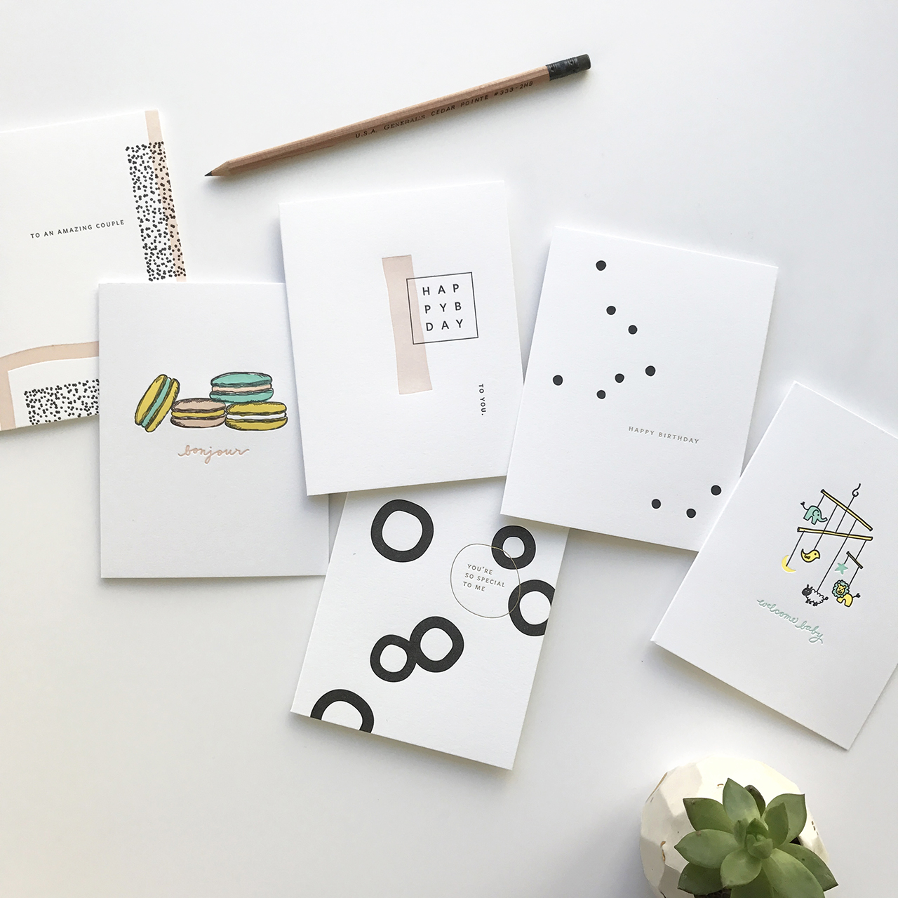
At Ramona & Ruth we print contemporary designs with timeless sentiment the old-fashioned way. While offering a variety of paper goods, the core of our product line is letterpress greeting cards. Each design starts from a sketch in my notepad and from there, is transferred to a digital image in Illustrator and prepared for platemaking. Letterpress is an art form and the details are what make it remarkable. The initial sketch, hand-mixing the colors, the intricacies of typography and spacing, hand-feeding the vintage presses — from conception to fruition, each and every product is a beautiful journey.
Ramona & Ruth

Each day at the studio is a little different, which is part of what I love about running this business. I typically start the work day at around 9 am once my boys are at their grandparent’s. After I pour a fresh cup of coffee and check through my emails, I go through my list of the day’s tasks which often include a mix of designing new products, printing, packaging wholesale orders, and marketing tasks including social media posts and newsletter design. I recently hired my first employee who will be working as our wholesale coordinator. I am hopeful that this will free up some time for me to focus on more of the things I enjoy, such as the design work and marketing outreach.

Ramona & Ruth

Ramona & Ruth

Designing fresh new products is the absolute favorite part of my job. I can sometimes be quick to tire of my more seasoned products, so I gain a lot of enjoyment out of dreaming up new ideas and nurturing them to life. When it’s time to start thinking about designs for new product releases, I like to start the design process by setting up a calm, quiet atmosphere where there are minimal distractions. This could be at my studio desk alongside my favorite citrus candle with a little music playing in the background. Other times I need a change of scenery so will head over to my favorite little coffee shop that is both quiet and spacious and design there for a few hours. Setting aside specific blocks of time to design along with creating a calm, relaxing atmosphere helps to clear my mind and allow the ideas to flow.
Ramona & Ruth

I have one designated notebook where I jot down my ideas and draw little sketches so that all of my ideas can be found in one place. Recently, I have been really drawn to patterns, so have been experimenting with different shapes and lines and how those can interact with each other in different ways. I also find it helpful to curate boards of things that inspire me such as fashion, textiles, interiors and ceramics. From there, it is interesting to see what overarching theme is apparent across the board and draw inspiration from there. Some of the most fulfilling products to develop are the letterpress greeting cards since many times I am involved in the production from start to finish. It is such an amazing feeling to see a design that started as a little idea in my head pressed into the sheet of cotton paper for the very first time.
Ramona & Ruth

Ramona & Ruth

All photos courtesy of Ramona & Ruth.

Interested in being featured on the Behind the Stationery column? Reach out to Megan for more information at megan[at]ohsobeautifulpaper.com.

NSS 2017: Beautiful Booth Designs

Yay! Today I’m finally kicking off my recaps from the 2017 National Stationery Show (aka NSS 2017) – but starting this year I’m doing things a wee bit different! Instead of doing long recaps with every photo in a series of posts stretched out over a couple of months, you can find ALL the photos from this year’s National Stationery Show in our brand new trade show gallery! Here on the main page, I’ll be doing a few highlight recaps based around a particular theme. We’ll be highlighting some of the new exhibitors, a few design trends, and a few product round ups. It’ll be so fun!

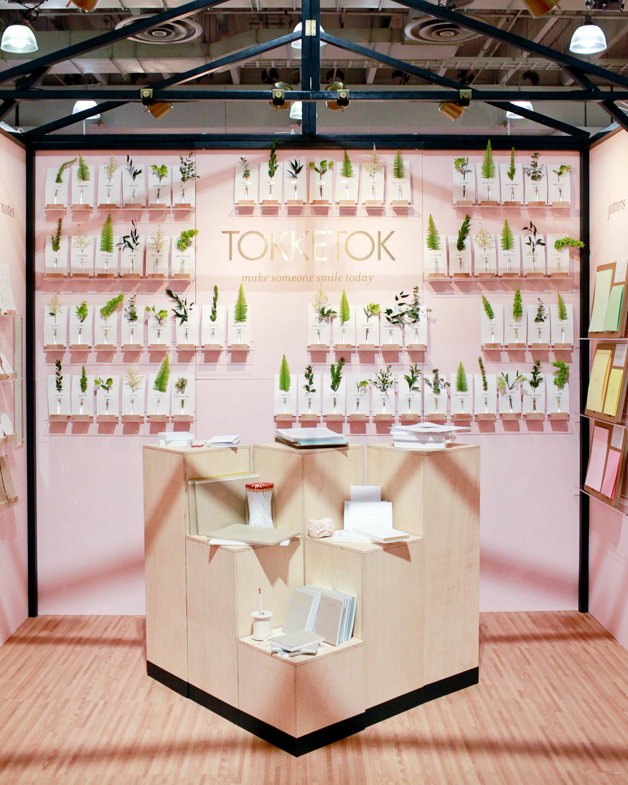
NSS 2017: Tokketok

Tokketok – see more from the Tokketok booth here!

For those of you who have been reading for a while, you know that I normally do these super long recap posts right after the show with all the noteworthy exhibitors from that year’s show. The National Stationery Show isn’t open to the public, and I want to give you the experience of being there by sharing a ton of photos! But the last couple of years I’ve been wanting to change things up a bit. The big recaps can be kind of a slog to get through, and those of you who follow me on Instagram already get a real-time sneak peek of the show while it’s happening. So! I’ve been working with my developer to create a gallery with every single exhibitor that I visited at the show each year. You can visit the gallery, pick an exhibitor, and browse the images in slideshow format – or scroll below the slideshow to view all of the images from that booth in thumbnail form. I’ve been busy uploading all of my photos from this year’s show (all 99 booths!), so there’s plenty of eye candy to browse. You can also browse the 2016 exhibitors, and eventually we’ll get previous years up there, too!

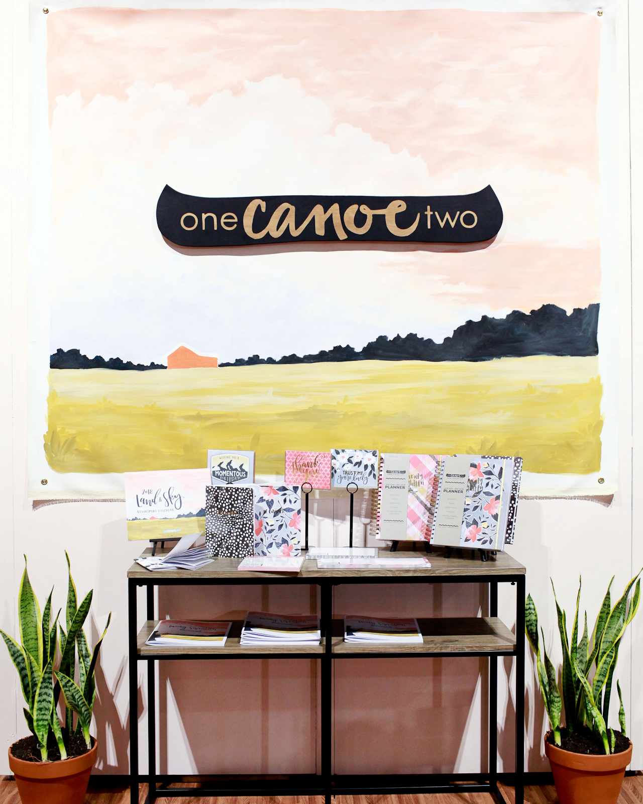
NSS 2017: One Canoe Two

One Canoe Two – see more from the One Canoe Two booth here!

Today we’re kicking things off with one of my favorite things about any trade show: booth designs! Now, obviously the most important element of any trade show booth is the product inside the booth (and we’ll get to that soon), but good booth design is absolutely essential for catching the attention of busy retailers walking the show and getting them into your booth! Being the amazing artists that they are, National Stationery Show exhibitors do an amazing job creating the most beautiful booths, but there are always standouts each year. Let’s take a look at a few of them!

NSS 2017: Tokketok

NSS 2017: Tokketok

Tokketok – see more from the Tokketok booth here!

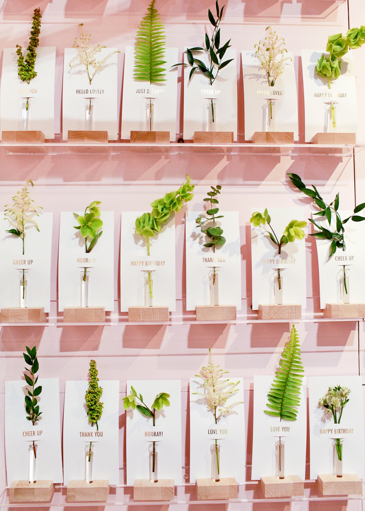
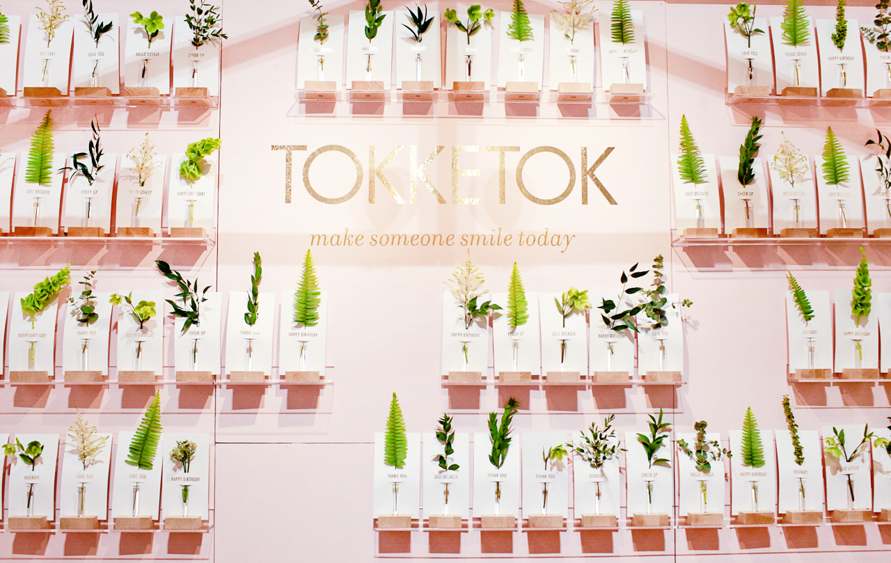
Tokketok made their trade show debut at this year’s National Stationery Show, and their booth was easily one of my favorites from the entire show! The booth was constructed to resemble a green house, which prominently featured this amazing wall of flower notes. Just gorgeous!

NSS 2017: One Canoe Two

One Canoe Two – see more from the One Canoe Two booth here!

When painting is a big part of your line, make it a major feature of your booth design! One Canoe Two set up a feature wall with an original painting of their twilight landscape art print. Such a beautiful focal point!

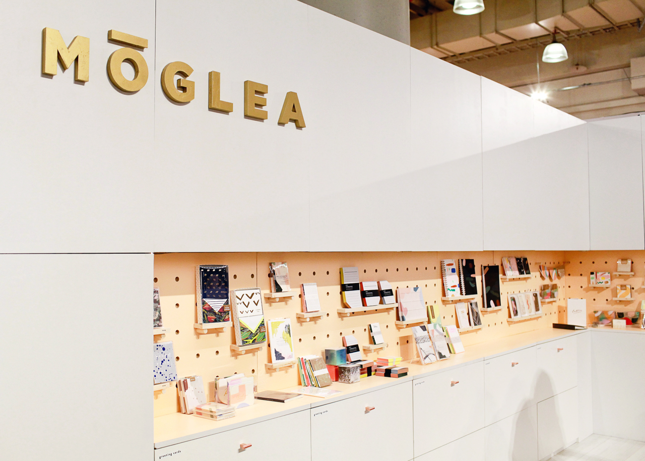
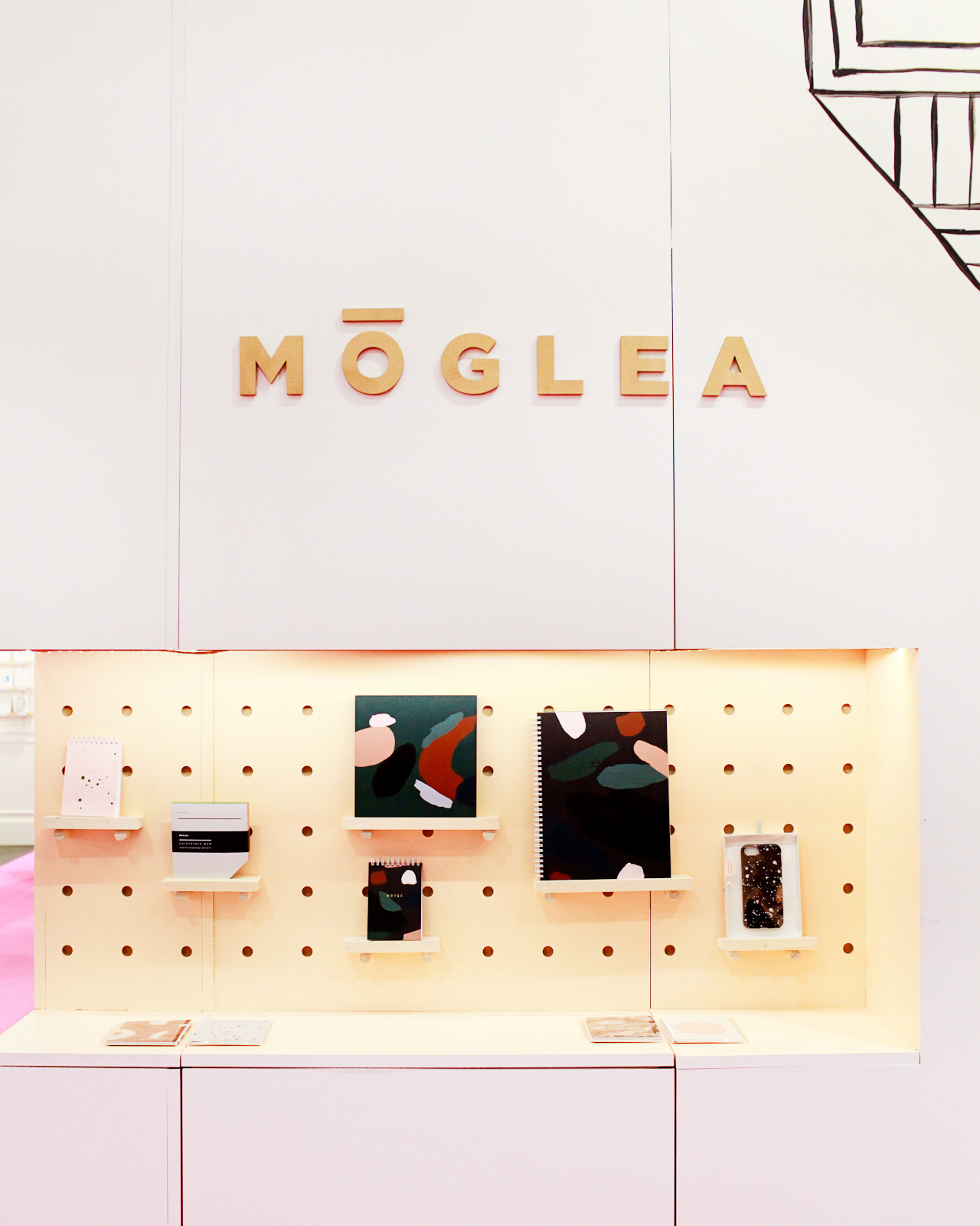
NSS 2017: Moglea

NSS 2017: Moglea

Moglea – see more from the Moglea booth here!

I’m still in awe of the Moglea booth, which displays a curated selection of new products on the pegboard-inspired wood dowel shelves and houses the full Moglea catalogue in the lower cabinets. Total genius.

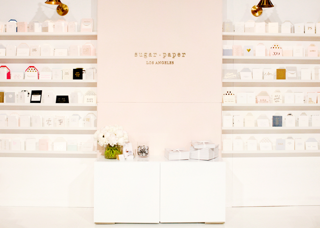
NSS 2017: Sugar Paper

NSS 2017: Sugar Paper

Sugar Paper – see more from the Sugar Paper booth here!

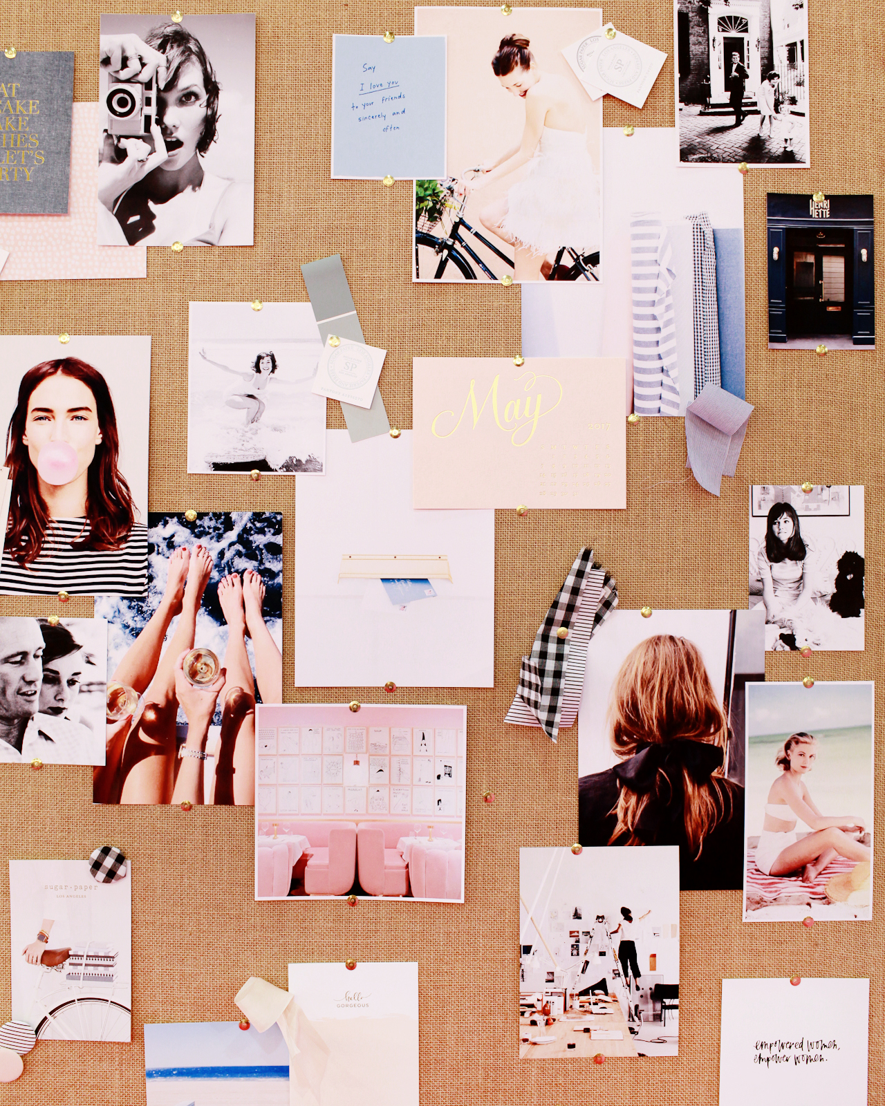
The Sugar Paper booth felt like walking into a beautifully curated stationery store. Also, all trade show booths should come with inspiration boards – don’t you think?

NSS 2017: Our Heiday

Our Heiday – see more from the Our Heiday booth here!

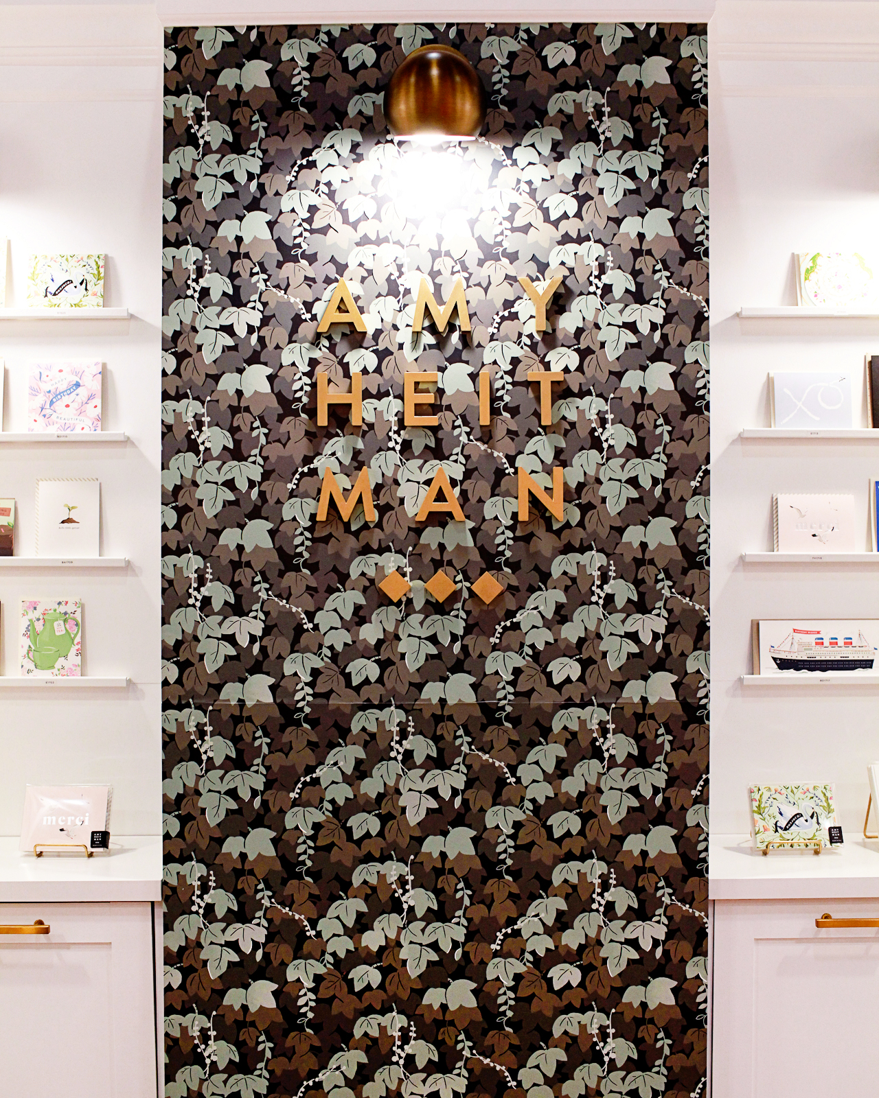
NSS 2017: Amy Heitman

Amy Heitman – see more from Amy Heitman’s booth here!

Wallpaper for the win! Both Our Heiday and Amy Heitman turned their designs into wallpaper for a feature wall in their booths. I’ll just move right in, okay?

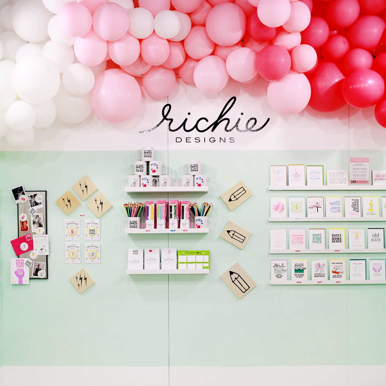
NSS 2017: Richie Designs

Richie Designs – see more from the Richie Designs booth here!

NSS 2017: My Little Day

My Little Day – see more from the My Little Day booth here!

Balloons are such a fun way to decorate a trade show booth! Richie Designs commissioned Wild Child Party to create a balloon installation along the top of her booth for an extra dose of color, while My Little Day created an entire wall made with their printed balloons for big visual impact.

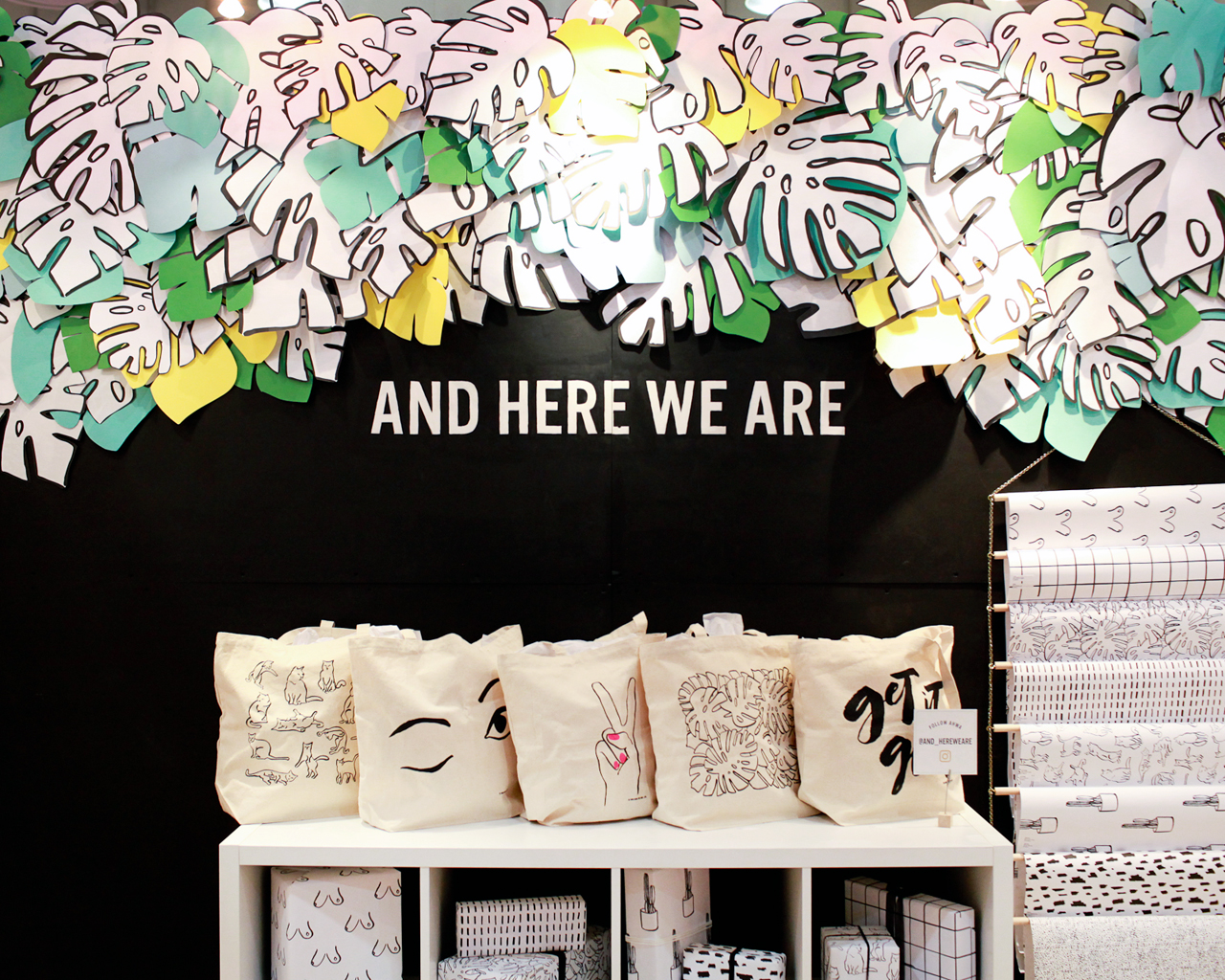
NSS 2017: And Here We Are

And Here We Are – see more from the And Here We Are booth here!

Vibrant paper monstera leaves lining the top of the And Here We Are booth! Such a great way to make a visual impact without sacrificing precious product display space.

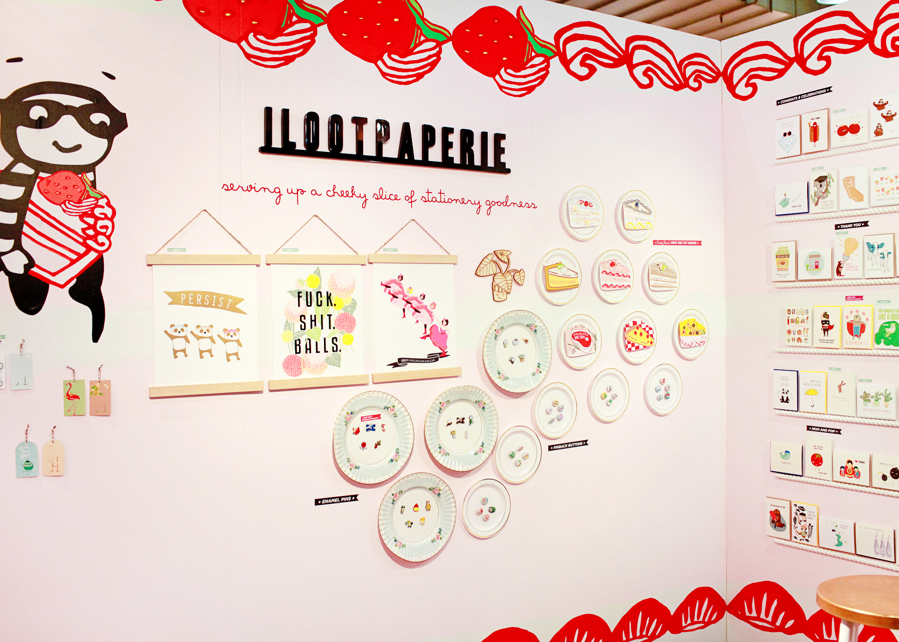
NSS 2017: ilootpaperie

ilootpaperie – see more from the ilootpaperie booth here!

It’s hard to tell from this photo, but ilootpaperie decorated their entire booth to look like a piece of cake! See the frosting along the top and bottom edges, and the strawberries? So fun!

So what are you thinking about the new trade show gallery? Do you like having all the images in one place? Or did you prefer the long recaps on the main page? Should I even still be doing NSS recaps on the blog, or just stick to highlights on Instagram? I’ve been thinking about the way I cover these trade shows a LOT these past few weeks, so I really do want to hear your opinion! 

I’ll be back tomorrow with another recap from the 2017 National Stationery Show!

Learning New Things with Skillshare

I’m a big proponent of lifelong learning and always trying out new skills and hobbies. Learning new things and skills is such a great way to keep your mind fresh, and I find that you can often apply lessons learned from new disciplines to other things in your life. Plus, picking up a new hobby can be a fantastic way to spark creativity and inspiration. And even if you’re not looking for a new hobby, it’s a good idea to continue honing your skills – you’re always bound to pick up a new technique or learn something new. I’ve been feeling a bit uninspired lately, so I decided to take a few classes on Skillshare focused on a couple of my favorite hobbies, calligraphy and photography, along with something that was totally new for me – watercolor painting! Skillshare is offering Oh So Beautiful Paper readers two FREE months of premium membership, so it’s the perfect time to try something new! It’s usually $15 a month, but if you click here you’ll get two free months with unlimited access to stream their online classes.

Learning New Things with Skillshare!

Skillshare offers more than 16,000 classes on topics such as calligraphy and hand lettering, illustration, watercolor painting, and photography – even marketing and creative writing! – all taught by masters of their crafts. One of my favorite things about Skillshare (other than all the amazing class topics, of course) is that you can watch the classes anywhere, anytime: watch them on your laptop, on your phone through the Skillshare app, or download them to your phone or tablet to watch later without an internet connection.

Learning New Things with Skillshare

Here are the classes that I took:

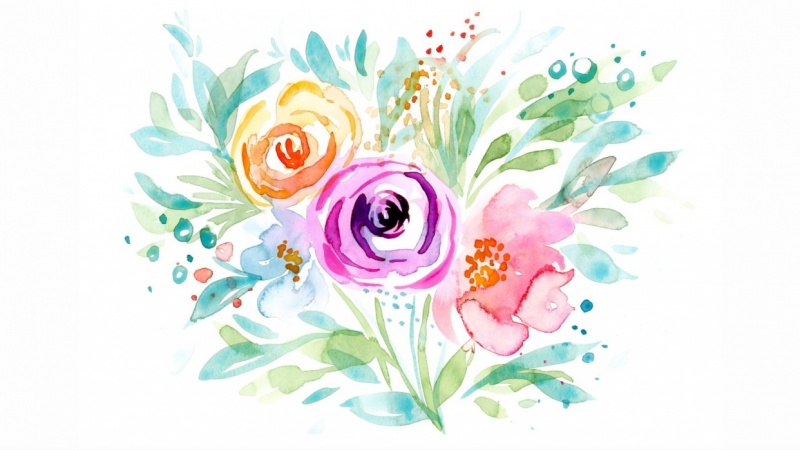
Fun & Loose Watercolor Florals, Leaves, & Butterflies / Skillshare

Fun & Loose Watercolor Florals, Leaves, & Butterflies / Skillshare

Fun & Loose Watercolor Florals, Leaves, & Butterflies

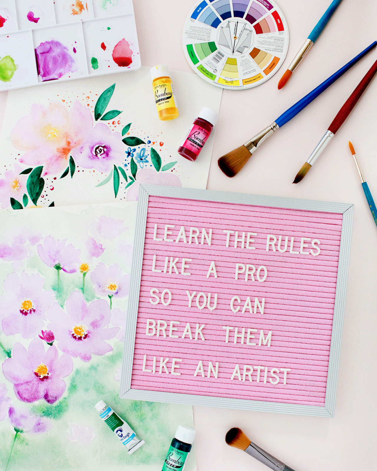
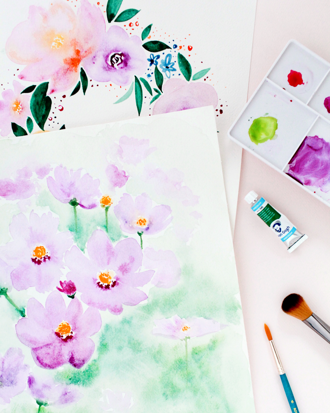
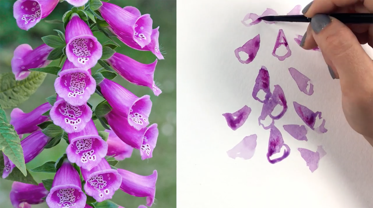
I grew up in an artistic home. We had an art room instead of a traditional playroom, and my mom signed me up for lots of art classes and summer camps as a kid. But I’ve never taken a watercolor class! My painting style as an adult has always trended towards modern abstract painting, and I’ve felt intimidated by the idea of trying to paint something with a lot of detail. I also have a deep love of flowers, so when I saw Fun & Loose Watercolor Florals, Leaves, & Butterflies with Yasmina Creates, I thought it would be the perfect way to combine my love of flowers with my more abstract painting style. This class was so much fun! I loved the way Yasmina taught me to break each flower down into its basic shape and loosely interpret that shape in the painting, instead of worrying about representing a flower exactly as it appears in a photograph. Yasmina also shares some fantastic tips and techniques in the class, like how to put different amounts of pressure on the brush to create different leaf shapes and sizes and when to new colors to wet paint as a way of adding dimension to the painting. The paintings in the two photos at the top of the post are what I created after taking this class!

Pen and Ink Calligraphy: The Art of the Envelope / Skillshare

Pen and Ink Calligraphy: The Art of the Envelope / Skillshare

Pen and Ink Calligraphy: The Art of the Envelope

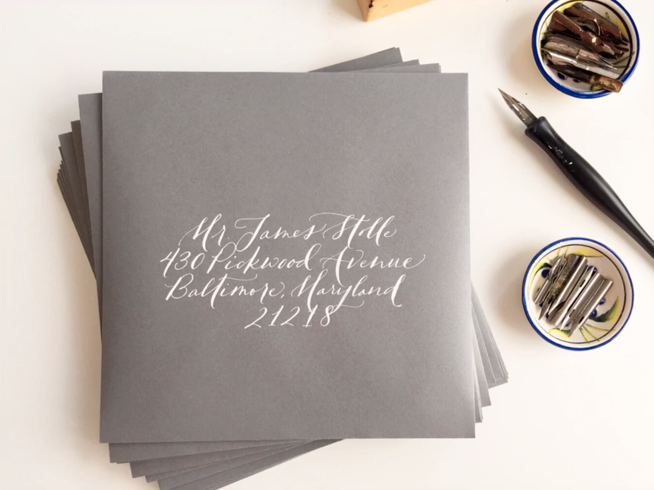
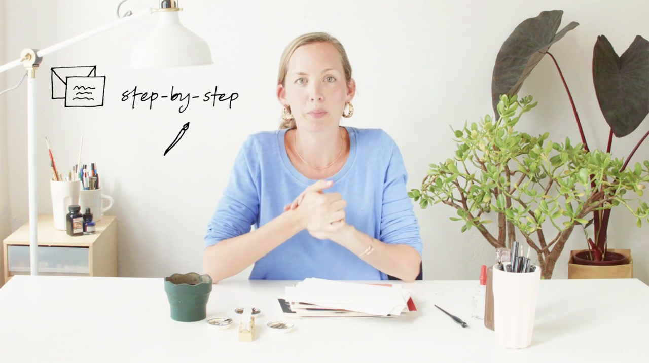
With two young daughters and a slew of nieces and nephews, I’m always sending cards in the mail: birthday cards, holiday cards, feel better soon cards, etc. My envelope addressing game definitely needs some work, so I signed up for The Art of the Envelope with Bryn Chernoff of Paperfinger. This class is great for just about anyone, from an aspiring professional calligrapher to a bride or groom hoping to address the envelopes for their own wedding invitations. Young kids almost never receive mail, so you can just imagine their surprise when a fancy envelope with their name on it shows up in the mailbox! Bryn also teaches a fantastic Introduction to Modern Script Calligraphy class with foundational instruction on calligraphy tools and creating beautiful letterforms. If you prefer brush lettering over pointed pen calligraphy, I also highly recommend this Waterbrush Lettering Essentials class.

Photography and Visual Storytelling

Food Photography: Shooting in 5 Styles / Skillshare

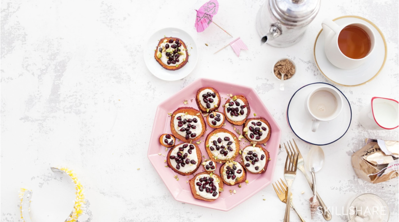
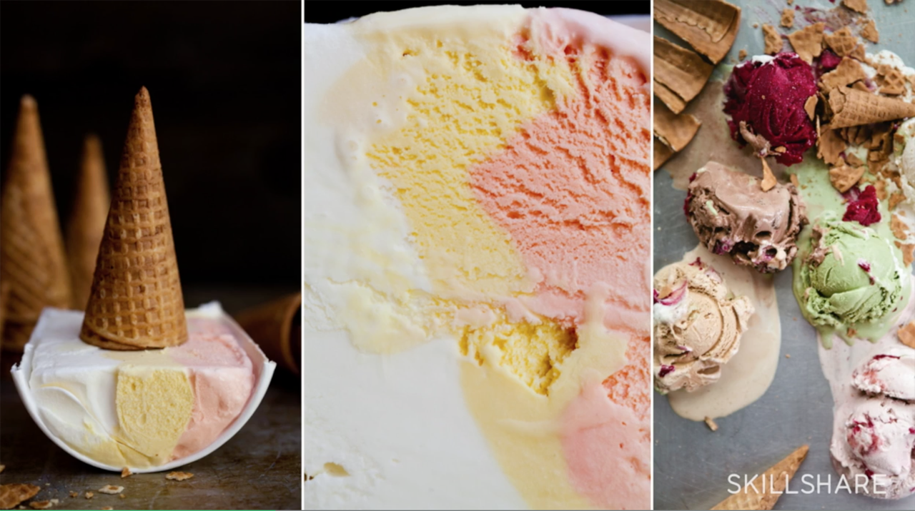
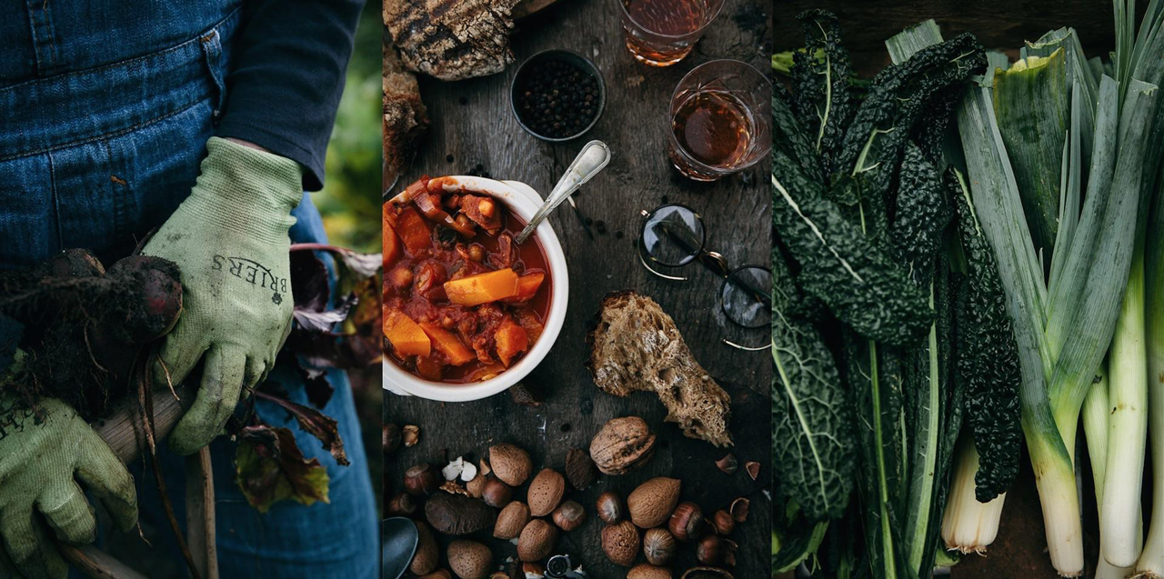
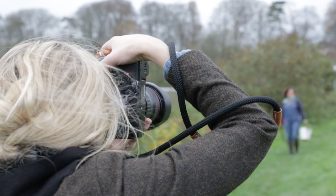
Photography is one of those skills where I always feel like I have more to learn, no matter how many times I pick up a camera. Visual storytelling is such a large part of what I do online, from photographing our cocktail recipes to sharing images on Instagram, and there’s always room for improvement. I took a couple of photography classes with a focus on food photography, but I think there’s plenty of lessons to take away from these classes whether you’re a stationer looking to take better styled product photos or an artist looking to share a behind the scenes peek of your space.

Food Photography: Shooting in 5 Styles / Skillshare

Food Photography: Shooting in 5 Styles / Skillshare

Food Photography: Shooting in 5 Styles

Lifestyle Photography: Visual Storytelling / Skillshare

Lifestyle Photography: Visual Storytelling / Skillshare

Lifestyle Photography: Visual Storytelling

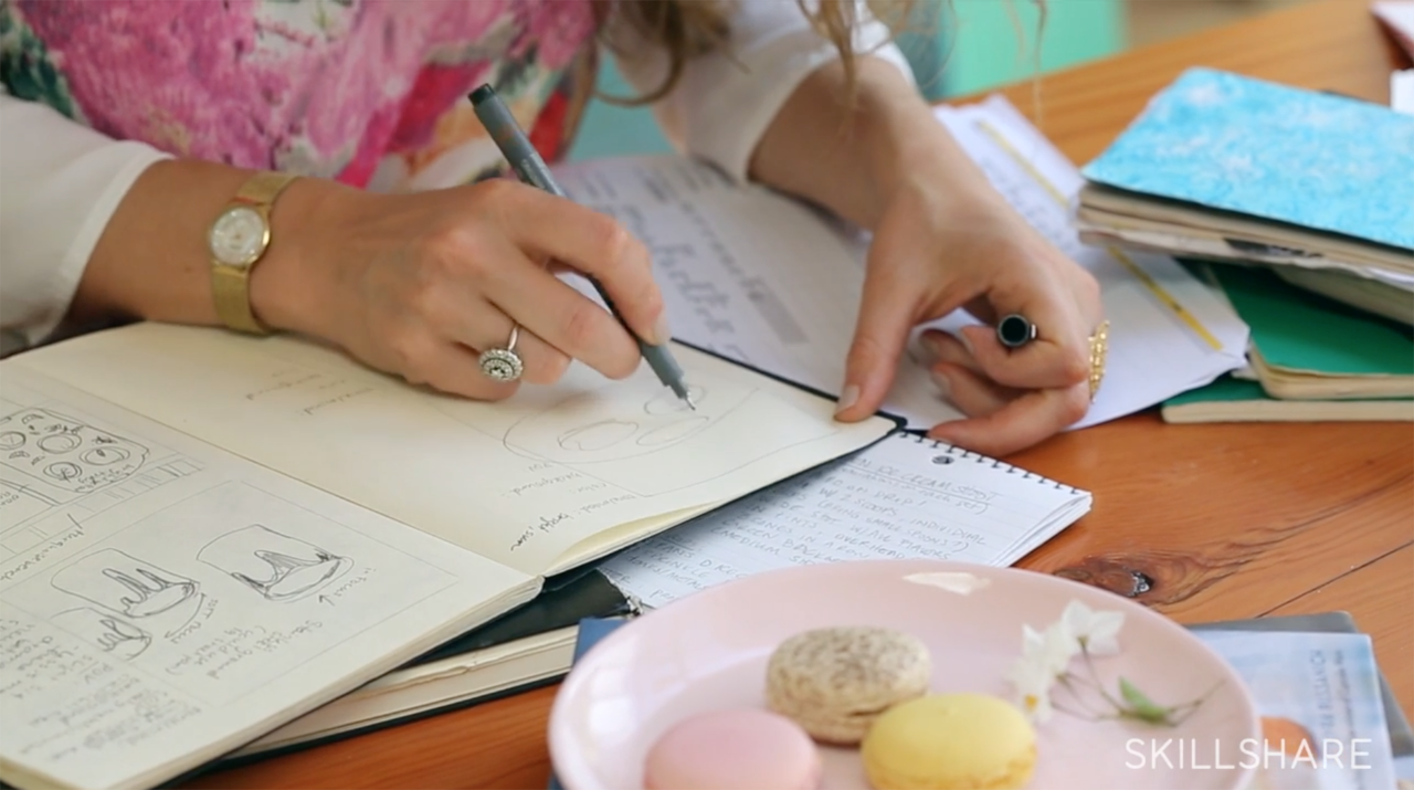
Both of these classes focus on food photography, but the lessons are applicable to any type of lifestyle photography. In Food Photography: Shooting in 5 Styles, food photographer Leela Cyd talked about shooting the same subject (milk and cookies!) in five different styles: light and airy, dark and moody, bright and crisp, in progress, and lifestyle (aka with a person in the photo). She provided a bunch of really helpful tips on camera settings without getting too technical, and I loved her advice of drawing an image storyboard of each shot that I want to get BEFORE the photo shoot. In Lifestyle Photography: Visual Storytelling we get to see Marte Maria Forsberg’s process from start to finish: shopping at a local market to purchase ingredients and props for a photo shoot, working with a model, and styling the meal that serves as the focal point of the session. Marte Maria’s lessons taught me to think about each type of image that I want to get out of a photo shoot – similar to Leela’s storyboarding process â€“ and a totally different way to use light to enhance my images.

Don’t forget! Skillshare is offering Oh So Beautiful Paper readers two FREE months of unlimited access to stream their more than 16,000 online classes. Click here to get started!

Top two photos by Nole Garey for Oh So Beautiful Paper. This post is sponsored by Skillshare. All content and opinions are my own. Thank you for supporting the sponsors that make Oh So Beautiful Paper possible!

Happy Weekend!

Happy Friday everyone! We’re in the middle of a huge heat wave in DC, so we’re doing our best to stay close to air conditioning or hang out in the water to stay cool. I expect we’ll be hanging out at our neighborhood splash pad this weekend! Other than that, my weekend plans consist of getting over to District Doughnut to try their new Everything Bagel Doughnut. Yes, a savory doughnut! I hope you’re all staying cool and have fun weekend plans! But in the meantime…

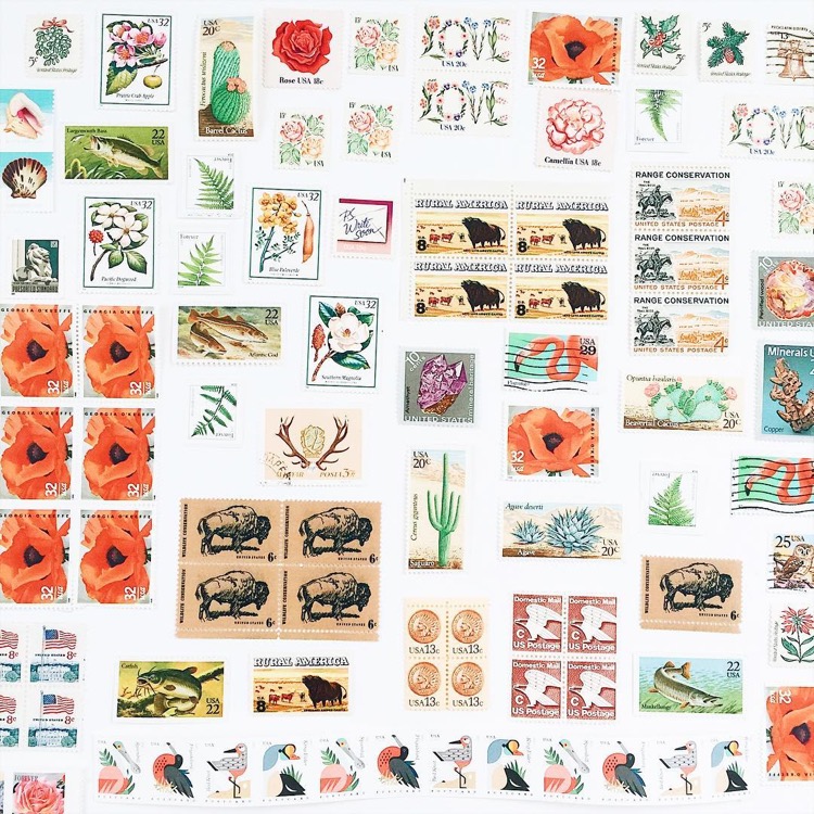
Stamp Collection! / Shannon Kirsten Illustration via Instagram

Stamp collection photo by Shannon Kirsten Illustration via #dailydoseofpaper on Instagram

…a few links for your weekend!

The absolute CUTEST summer dress. Like, get in my closet now, please!

San Francisco friends, have you heard about Color Factory? It sounds amazing – I wish I could go!

Oooh! These watercolor flats are so pretty!

Super interesting: A Google study of 5 traits of successful teams

Such a perfect summer shirt.

Iridescent wine glasses!

MAKE: Chocolate Earl Grey Ice Cream Sandwiches

Card of the week!


This week on Oh So Beautiful Paper:

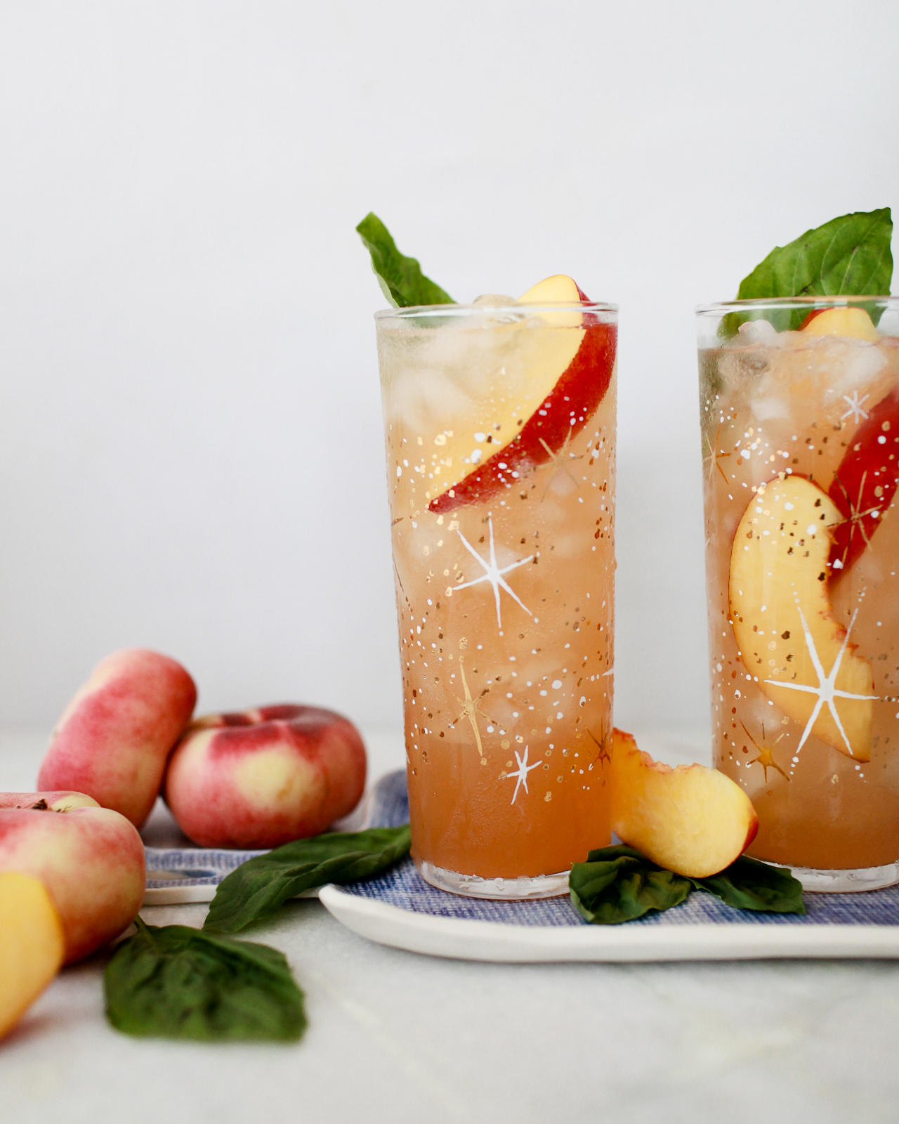
It’s hot outside! Make this refreshing Peach Basil Whiskey Cobbler this weekend

Our backyard makeover!

Love and romance cards (that aren’t Valentine’s Day cards!)

Modern eclectic navy and white wedding invitations


That’s all for this week! See you back here on Monday! xoxo

Peach Basil Whiskey Cobbler

There’s something of a misnomer that fruit found its way into cocktails during Prohibition, when bartenders used produce to mask the taste of low-quality hooch, maybe by way of someone’s bathtub. This isn’t true! Fruit had a place in cocktails from the very beginning, and many of the oldest drinks – cobblers, smashes, juleps, and the like – were practically drenched with fresh fruit.  Which makes a lot of sense when you think about alcohol as an agricultural product, made from produce grown on the same sorts of farms that also grow all the other things we can throw into a drink. Like goes with like. We decided to celebrate summer and all it’s bounty with two of our favorite in-season ingredients: a Peach Basil Whiskey Cobbler. – Andrew

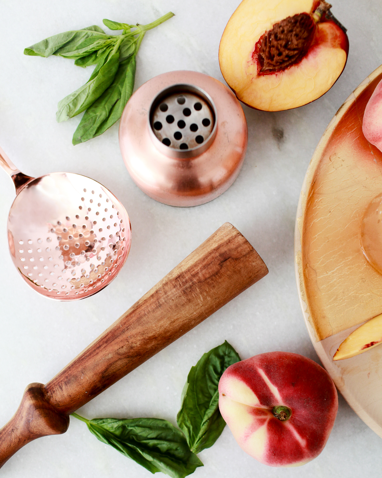
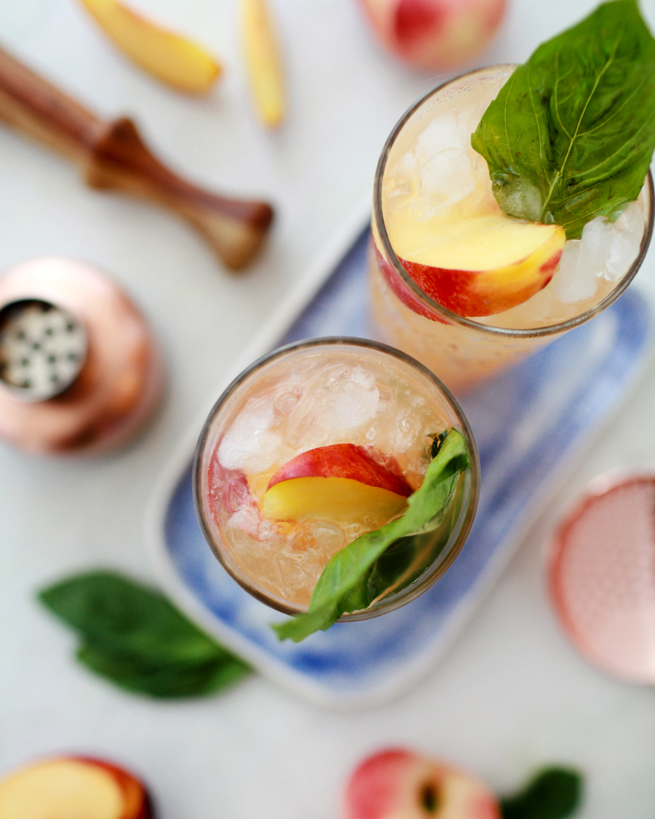
Peach Basil Whiskey Cobbler Cocktail Recipe

Peach Basil Whiskey Cobbler Cocktail Recipe

Peach Basil Whiskey Cobbler Cocktail Recipe

Peach Basil Whiskey Cobbler

2 oz Bourbon Whiskey
1/2 oz Simple Syrup
1/2 oz Lemon Juice
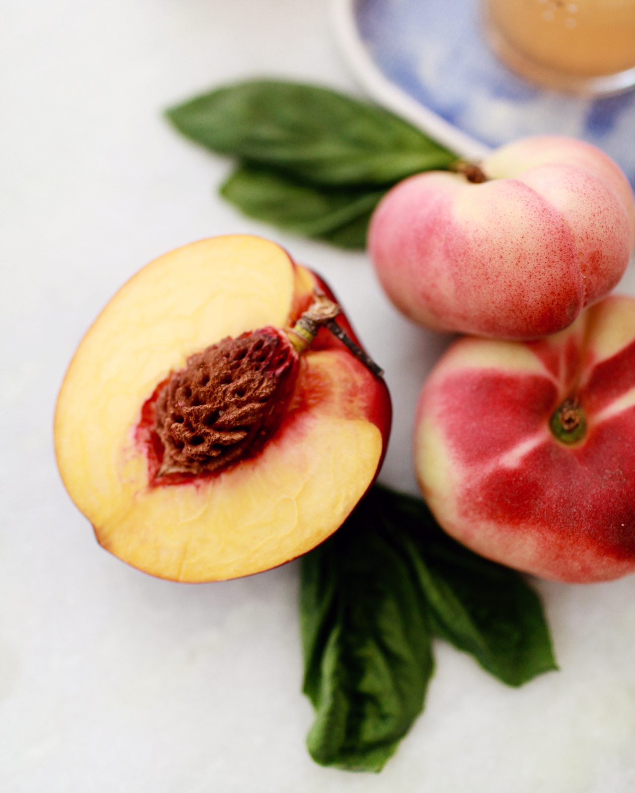
1/4 Peach or Nectarine, sliced
1 sprig Basil

Combine the peach slices, basil, syrup, and lemon juice in a shaker and muddle them together. Fill the shaker two-thirds with ice, add the whiskey, and shake well. Double-strain (using a tea strainer or sieve in addition to a regular strainer to remove any pulp) into a highball glass filled with crushed ice. Garnish with more fresh peach slices and basil sprigs. Enjoy!

Peach Basil Whiskey Cobbler Cocktail Recipe

Peach Basil Whiskey Cobbler Cocktail Recipe

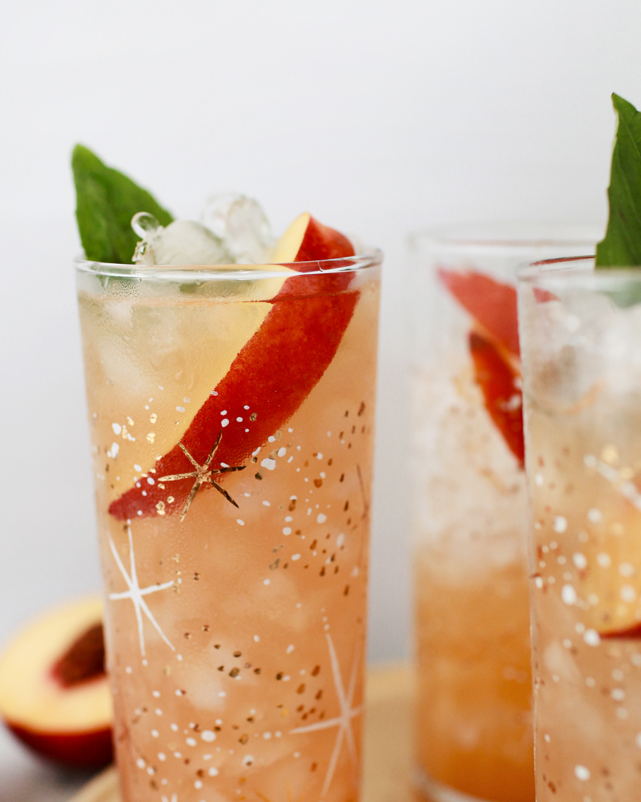
And this is why we put fresh fruit in our drinks: cold and fresh and fruity and a little zesty, perfect for the summer. This drink has big round peach flavors and a bit of herbaceous zing from the basil, plus a nice chewiness from the whiskey. We wanted to keep this one simple, the sort of thing you could throw together if you had some peaches and basil left over from making dinner. Did I mention perfect for the summer?

Peach Basil Whiskey Cobbler Cocktail Recipe

Peach Basil Whiskey Cobbler Cocktail Recipe

Glassware by Liquorary

(Don’t forget to follow us on Instagram!)

Photo Credits: Nole Garey for Oh So Beautiful Paper

This post contains affiliate links. By clicking on these links, you’ll help support Oh So Beautiful Paper while also purchasing some fantastic products. We only recommend products that we truly love and trust that you’ll love, too. Our full disclosure policy can be found here.