Kendra + Robb’s Rustic Woodgrain Wedding Invitations

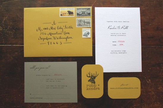
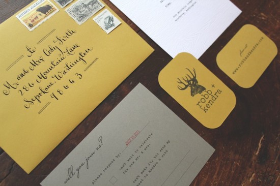
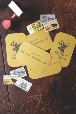
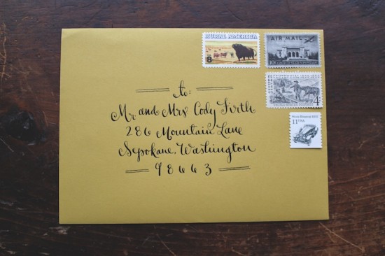
These gorgeous and woodsy wedding invitations come to us from Sally at La Happy, designed for an outdoor wedding in Washington state this past summer.  Sally kept the actual invitation simple and relaxed, bringing in hand stamped website cards and beautiful vintage stamps (not to mention stunning calligraphy) to pull the entire invitation suite together.

From Sally: I created this invitation for an outdoor rustic wedding in Winthrop, Washington, which is in the backwoods of Washington State.  The inspiration was the groom’s love of all things outdoors: camping, hiking, etc.  The bride and groom wanted a rustic wedding with a non-fussy, vintage feel, so we tried to incorporate that into the paper design.

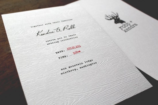
The colors of the wedding were really earthy.  Mustard yellow was a key color, then we brought in the stone gray as a neutral color to complement the yellow.  I created the “deer logo” for the wedding and then made a custom stamp out of it and stamped all of the paper pieces.  The invitation was printed on faux bios (a faux wood grain) paper, to relay the feel of the woods and the outdoors.


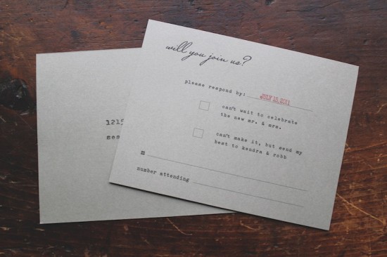
I created custom stamps to look like an industrial time stamp to use for the date and time of the wedding.  The bride and groom wanted to make sure the invitations did not feel fussy, so we made sure everything had a more industrial, vintage feel.  The RSVP card is a postcard with vintage stamps.  We worked with the lovely (and SO helpful) Virginia Sauder of Verde Studios to find the perfect vintage postage to fit the set.

Thanks Sally!

Invitation design + calligraphy: La Happy

Vintage Stamps: Verde Studio

Check out the Designer Rolodex for more tal­ented wed­ding invi­ta­tion design­ers and the real invi­ta­tions gallery for more wedding invitation ideas!

Photo Credits: La Happy

Alix + Brandon’s Photostrip and Letterpress Save the Dates

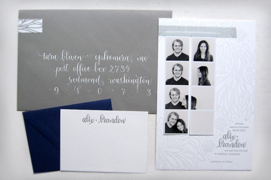
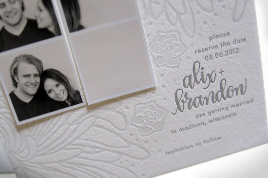
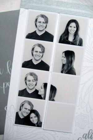
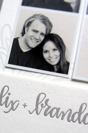
Happy Monday everyone!  We’re starting the last week before the Christmas holiday with a fun and totally cute save the date from Tara at Ephemera Press!  Alix and Brandon chose to incorporate faux-photo booth strips into their save the date, paired with a gray letterpress card with Tara’s illustrations and calligraphy.  So pretty!

From Tara: Alix and Brandon had engagement photos taken by Wisconsin-based photographer Anna Page.  They had this fun idea to fake some old-fashioned photo booth strips, and crop things to that Alix was walking into the frame with Brandon.  I thought it was so clever!  We adhered the photos with washi tape, which was a perfect choice since Alix is half Japanese, and adores the Japanese aesthetic.

Alix asked me to design a letterpress card for these photos that was clean and organic, yet incorporated the chrysanthemums and succulents that will be at her reception next August.  A tall order!  We made it work by sticking with a monochromatic look, and lightening the ink so it was nice and subtle.  The type floats in the lower right corner and balances out the design overall.  The couple’s names are highlighted in my calligraphy.  I think it looks particularly good in all lower-case like this.


Finishing touches were coordinating gray envelopes, a matching letterpress wrap-around return address label, and hand-lettered guest addresses in white ink.  Alix and Brandon also got super-simple thank you cards.  I can’t wait to start on the invitations!

Thanks Tara!

Check out the Designer Rolodex for more tal­ented wed­ding invi­ta­tion design­ers and the real invi­ta­tions gallery for beau­ti­ful cus­tom wed­ding invitations!

Photo Credits: Ephemera

p.s. Tara tells me that she’s currently offering a $100 discount on wedding invitation orders from now until December 30!  Check out the details right here!

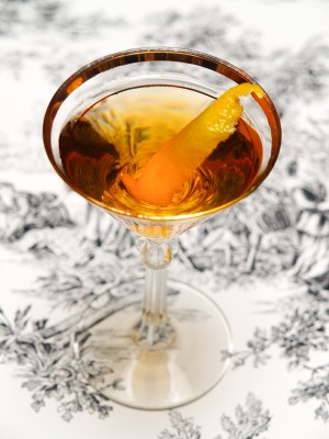
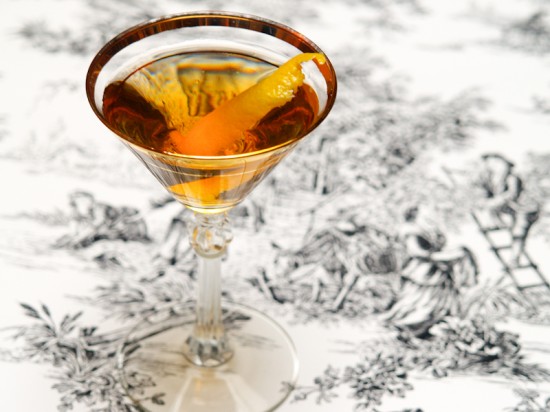
The Martinez

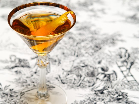
The Martini and the Manhattan, at first glance, don’t seem to have a lot in common except for their use of vermouth.  The Martini is dry and tangy; the Manhattan is sweet and spicy.  But they may share a common ancestor, the Martinez, a fantastic drink that shares some traits of the other two but which stands apart from both.  For a long time, the Martinez was out of reach, but thanks to the reproduction and importation of missing ingredients, we can once again enjoy this previously-lost drink.

Read below for the full recipe!

The Martinez

2 oz Old Tom Gin or Genever
1 oz Sweet Vermouth
1/2 oz Maraschino Liqueur
4 Dashes Orange Bitters

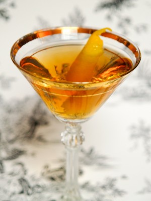
Combine the ingredients with ice, stir well, and strain into a chilled cocktail glass.  Garnish with a lemon twist and enjoy.

Take a sip of a Martinez and you’ll see why this is a good bet for the original version of two very dissimilar drinks.  It combines the rich juniper and other botanicals of gin with the sweetness of the Italian Vermouth and almond sweetness of the liqueur.  The Martinez dates back (maybe? probably? it’s not really clear) to the 1860s, a time when Americans liked their drinks a lot sweeter than they did just a short time later, but it’s more rich than sweet, with a malty roundness that balances the sugar nicely.


The Martinez was first made with Old Tom Gin, the precursor to modern English dry gin.  Until the 1890s, this is what people were drinking when they were drinking gin: sweeter and with more complex botanical flavors than modern dry gin, with just a hint of malt.  Old Tom was unavailable for a long time, but it’s being manufactured again.  I’ve been enjoying a bottle of Hayman’s Old Tom Gin, imported by my favorite, Haus Alpenz.

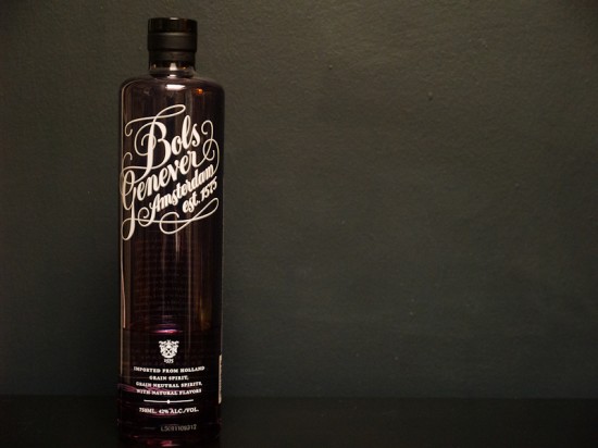
But I really love my Martinez with Genever, also (confusingly) called Jenever, Genièvre, Dutch or Holland Gin, and a few other names.  Genever is the oldest form of gin, and it’s still made this way in the Netherlands, Belgium, and a handful of other places (and being imported again!).  Unlike dry gin, which starts life as neutral spirits that are redistilled with botanicals, Genever adds the botanical flavors to malted grain alcohol (“malt wine”), which creates a spirit that is sharp but sweet, with gin’s familiar juniper flavors but a maltiness that makes it almost as much a whiskey as a gin.  In other words, it’s delicious.  I’m a fan of Bols Genever, which is sweeter and sharper than some others that are malty and smooth and great in their own right.  Play around!

Is the Martinez really the origin of two such different drinks?  The history of cocktails is a little fuzzy; most mixologists were probably too busy making and drinking their drinks to write down their stories, and most people involved were probably a little too tipsy to remember things clearly anyway.  So it’s not entirely clear where these drinks came from, but it’s as good an explanation as any.

Photo Credits: Nole Garey for Oh So Beautiful Paper

{happy weekend!}

Happy Friday everyone!  Are you ready to start your weekend?  I am!  This was a fun week (I even went to a cookie swap!), but I’m looking forward to some much-needed rest before the holidays.  But in the meantime…

Photo Credit: Anna Adén Photography, found via Mon Carnet

…a few links for your weekend!

This week on Oh So Beautiful Paper:

I’ve got a cocktail post coming up a bit later, but otherwise that’s it for me this week!  Have a wonderful weekend, and I’ll see you back here on Monday. xoxo

Quilled Ketubah by Ann Martin

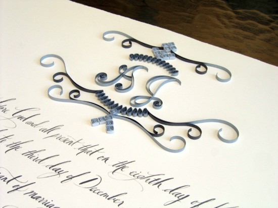
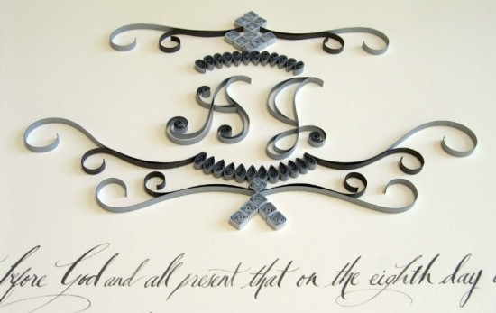
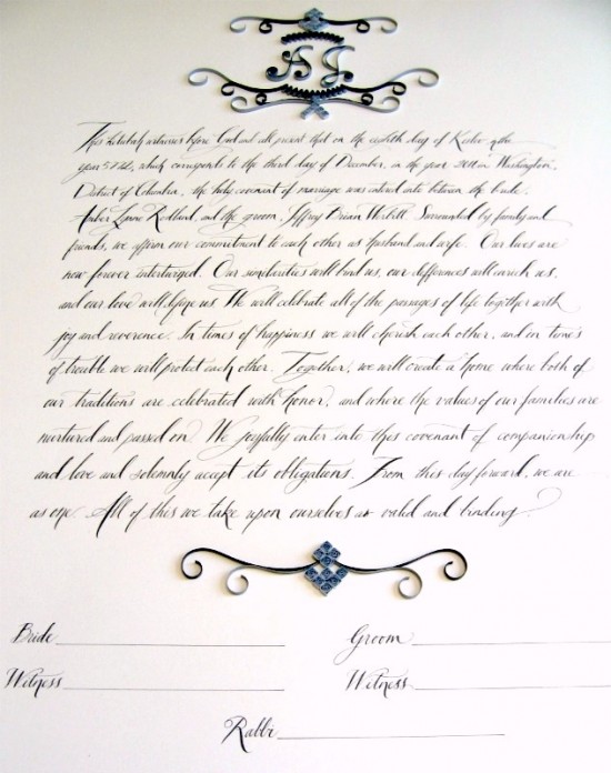
Ann Martin creates the most beautiful paper filigree (aka quilling) pieces.  I’ve had the pleasure of featuring two of her gorgeous quilled marriage certificates (here and here), and today Ann is back with a quilled ketubah!  Calligrapher Tara Jones provided the hand lettering alongside Ann’s quilled design in shades of gray and pale blue.  So pretty for a December wedding!

From Ann: The couple’s wedding palette is smoke gray and pale blue, so I used two shades of gray quilling paper (1/8″ wide) – actually silver and charcoal, along with pale blue for the monogram that they had requested.  The design was my interpretation of a monogram Tara created for all of their wedding stationery.

The ketubah will be signed at the wedding and placed on display in the couple’s home to remind them daily of their vows and responsibilities to one another.  The overall size is 22″ x 30″ – perfect for displaying!

Thanks Ann!  For more beautiful quilling work by Ann, check out her blog right here!

Photo Credits: Ann Martin