Pretty Paper in the Office: Time to Get Organized!

With each new year comes a blank slate and the oh so familiar resolution to keep organized.  It’s all well and good at first, but it can be easy to lose your way with so may projects, papers, and bills to keep track of.  So it’s only fitting that the first Pretty Paper in the Office post of the year be a roundup of office organization arsenal.  From correspondence to finances, everyday tasks to New Year’s resolutions, I’ve got you covered!

Office Stationery - Organization

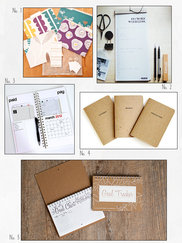
No. 1 File folder set by Lotta Jansdotter; No. 2 Desktop details calendar by Our Paper Shop; No. 3 2012 Bills calendar by REDSTARink; No. 4 Tally notebooks by Set Editions; No. 5 36 month goal tracker by Michelle Smith

Office Stationery - Organization letter ledger

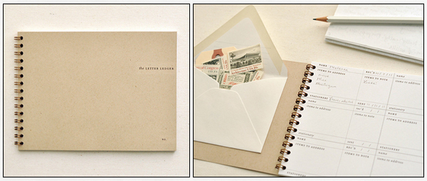
I came across lots of different organizers in my search for this post.  But one of my favourites has to be The Letter Ledger by Paper & Type.  Nothing thrills me more than writing letters.  But when it comes to keeping track of whether or not I replied to my penpal or mailed that Thank You card to my aunt, I’m a scatterbrain.  This nifty ledger will put an end to that and my scavenger hunt for stamps in my drawers.

{images via their respective sources}

p.s. Ed Note: If you’re still on the hunt for a planner to help keep you organized in 2012, check out a few planner ideas right here and my personal favorite, the Laurel Denise planner here

Diane’s Circus-Inspired Bar Crawl Party Invitations

Lindsay from McMillian + Furlow sent over these super fun bar crawl invitations that she designed to help celebrate a friend’s return to the United States from a teaching stint overseas.  Lindsay wanted the invitations to feel jubilant and playful, so she drew inspiration from vintage circus posters, incorporating a very American red and blue color palette along with fun wood type-inspired fonts.  So cool!

From Lindsay: I decided to go with a circus themed bar crawl, and found a ton of inspiration in vintage Barnum and Bailey posters, raffle tickets and the beloved classic popcorn bag.  Along with the red and blue, I love how the design feels very American, which is appropriate for this particular celebration.

I’m always trying to find any excuse to use some of my favorite wood type fonts, and this project was no exception.  The combination of bold color, playful typography and circus-inspired illustration all contribute to the success of this festive design.  The invitations were printed digitally on a thick glossy paper and mailed in bright yellow envelopes.  With all this hype it’s bound to be a exceptionally good time!

Thanks Lindsay!

Photo Credits: McMillian and Furlow

Beth + Michael’s Chevron Stripe Calligraphy Save the Dates

My oh my, I’m seriously in love with these save the dates. Created by Sarah of August Blume, Beth and Michael’s modern and whimsical save the dates combine beautiful lettering from Feast Calligraphy, chevron stripes, a fun interactive layout, and cut-out details. So cute!

From Sarah: I had the pleasure of designing a save the date card (and getting extra creative) for photographer Beth Morgan and her beau, Michael, for their spring 2012 wedding.  With a palette of teal, plum, fuchsia & slate (and the occasional red heart), we mixed their “Mississippi is for Lovers” theme with custom silhouettes and a muted chevron pattern.

We wanted a unique, interactive save the date to set the tone for their April wedding and to get guests excited about traveling to the South.  The couple met and fell in love in Mississippi so we included little-known-facts about the couple and their state on the back of the trifold card with a teal watercolor background.


The last panel features a mini glassine envelope holding a hang tag so guests can mark their calendar!  The calligraphy was penned by the very talented Alissa of Feast Calligraphy.  The cards were digitally printed on solar white cover stock and each Mississippi was individually cut using my Silhouette Cameo.

I love it!  Thanks Sarah!

Check out the Designer Rolodex for more tal­ented wed­ding invi­ta­tion design­ers and the save the date gallery for more beau­ti­ful cus­tom save the dates!

Photo Credits: August Blume

Lauren + John’s Rustic Home Letterpress Wedding Invitations

This set of beautiful and incredibly meaningful rustic wedding invitations comes to us from Ravyn of Three Fifteen Design.  Ravyn included illustrations of houses with picket fences to represent Lauren and John’s new home together, along with a lyric from one of their favorite songs.  Just perfect.

From Ravyn: John & Lauren are an awesome couple: They met in high school and have had a long distance relationship ever since.  John was deployed overseas as a lieutenant in the Army while Lauren was planning their Fall wedding back in Indiana.  Right before the wedding, John made it back to the U.S., and they bought their first home together.  They loved the idea of incorporating a rustic home theme into their suite, as they had never shared an actual house when we started the process… and they felt at home with each other.

We took the line, “Home Is Wherever I’m With You” from one of their favorite songs, and used it as the base for the entire suite.  We wanted everything to feel natural and comfortable.  We created a series of little houses with the picket fence as the common graphic element that was used throughout the set.  We modified a script font a bit and traced it by hand to give it a more handmade feel.

The suite was printed by our amazing letterpress printer, Czar Press.  The invitation was printed by letterpress on beautiful and thick cotton paper.  The response and accommodations cards were flat printed on the same paper, which allowed us to bring in the pop of apple green they wanted.

The entire suite was wrapped up with kraft paper envelopes and finished off with a custom return address stamp we created to match the stationery.  Lauren & John also had us create a little house stamp they could use for favor tags & bar napkins at the wedding.

Thank you so much Ravyn!

Design: Three Fifteen Design

Letterpress Printing: Czar Press

Check out the Designer Rolodex for more tal­ented wed­ding invi­ta­tion design­ers and the real invi­ta­tions gallery for more wedding invitation ideas!

Photo Credits: Three Fifteen Design

*Czar Press is a spon­sor of Oh So Beau­ti­ful Paper; for more on my edi­to­r­ial poli­cies please click here.