{happy weekend!}

Whew… today has really gotten away from me!  But happily it's Friday, so the fact that I seem to be operating on a 2-hour delay today doesn't really bother me.  Hooray weekend!  But in the meantime…

Wedding-inspiration

…a few links for your weekend reading enjoyment:

That's it for me this week!  I hope you all have a wonderful weekend.  See you again on Monday!

{image credits: t&h photography via grey likes weddings}

Today I Love: Wedding Inspiration from Urban Wed

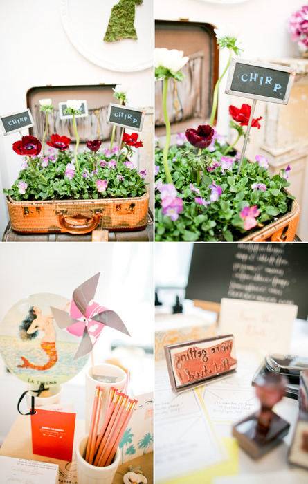
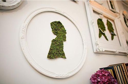
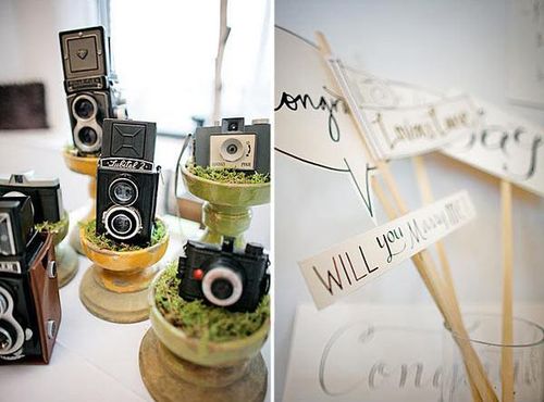
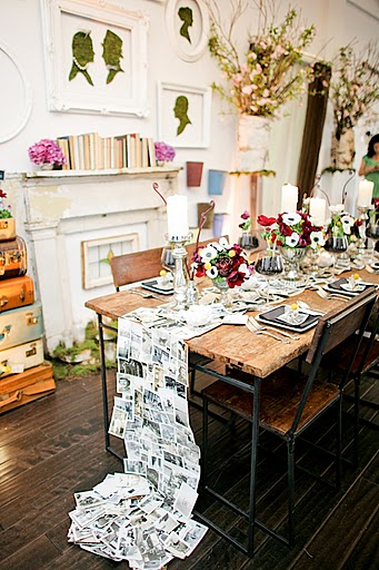
…all the gorgeous details from the Urban Wed event earlier this week:

Urban-wed-chalkboard-seating-global-stamps
Urban-wed-moss-silhouettes
Urban-wed-cameras-calligraphy
Urban-wed-photograph-table-runner
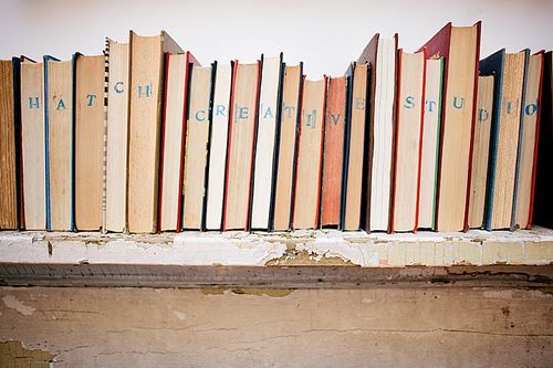
Urban-wed-rubber-stamp-books
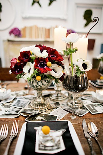
Urban-wed-table-centerpiece
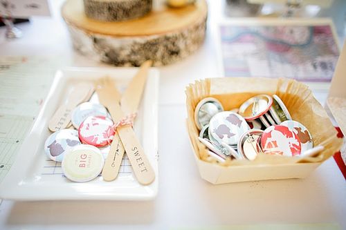
Urban-wed-paper-cup-pins{photos above by jen huang photography}

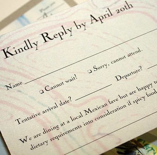
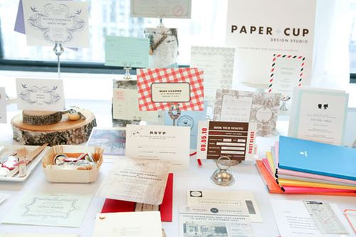
 Urban-wed-paper-cup-invitations
Urban-wed-paper-cup-invitations2{photos by jenny ebert photography}

From the invitations (Paper + Cup) to the calligraphy (Paperfinger) to the amazing vintage photograph table runner and centerpieces (by Hatch Creative Studio), Vané pulled together an amazing group of vendors for a beautiful show.  I wish I could have been there in person!  I’m sure Vané will be doing a more extensive review of the show on Brooklyn Bride and the Urban Wed blog, but in the meantime you can read about the experience on Ruffled, Papertastebuds, and Paper + Cup.

{image credits: top photos by jen huang photography, bottom two photos by jenny ebert photography via paper + cup}

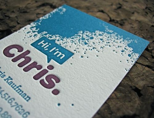
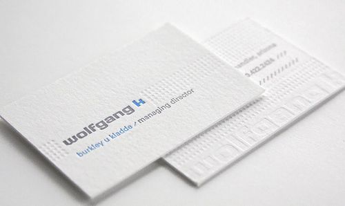
Business Card Ideas and Inspiration #2

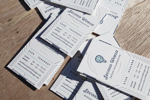
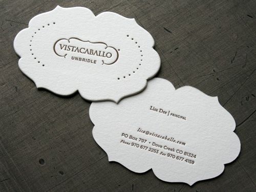
I'm overdue for new business cards, so I've been looking around for layout ideas.  Last year, I went with a one-sided horizontal layout, but this year I'm thinking I'd like to mix things up a bit.  I really love the vertical layout of these business cards from Second World Design Collaborative and Papered Together:

Vertical-letterpress-business-cards{via FPO}

Vertical-letterpress-business-card{via vandelay design}

I also really like the idea of double-sided business cards, like these from Ink + Wit (printed by Boxcar Press) and Thinktopia (printed by Studio on Fire):

Ink-wit-double-sided-letterpress-business-cards{via ink + wit}

Double-sided-letterpress-business-cards{via beast pieces}

I've got a few more business card photos over on my tumblr page.  I'm thinking about a combination of vertical and horizontal layouts on double-sided cards.  I'll be sure to share photos a bit later on!

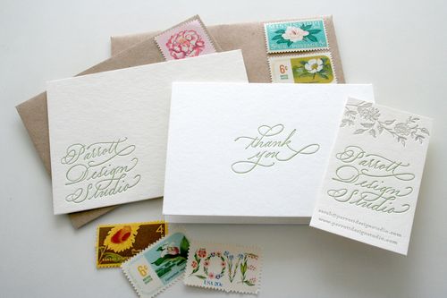
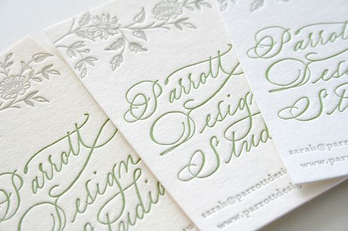
UPDATE: So I just saw that Sarah from Parrott Design Studio also recently printed new letterpress business cards for herself, using her new calligraphy logo by Grace Edmands – and I'm in love.  Such a gorgeous card, from the vertical layout, to the calligraphy, to the floral border at the top:

Calligraphy-business-collateral

Calligraphy-vertical-business-cards


{images from their respective sources}

Kristy + Adam’s Unique Watercolor Vow Renewal Invitations

Last year, I featured the stunningly gorgeous hand-painted letterpress Save the Dates for the 10-year vow renewal of Kristy Rice from Momental Designs.  Today, I’m thrilled that Kristy is back with her equally beautiful watercolor wedding invitations — with a design inspired by the majesty of Zion National Park, where Kristy’s vow renewal will take place:
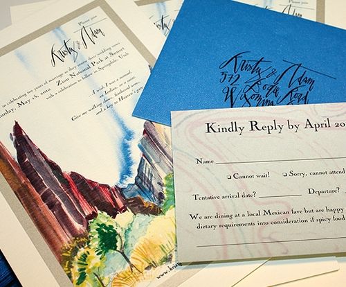
Momental-zion-invitation-suite

From Kristy: The save the date design was meant to introduce our guests to the beauty of Zion National Park in Utah but the invitations were meant to immerse them!
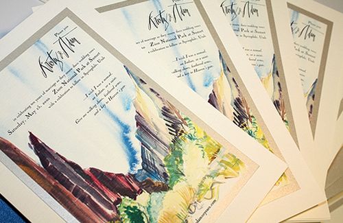
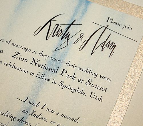
Momental-zion-watercolor-invitations
Momental-watercolor-invitation-text

Momental-zion-invitation-rsvp

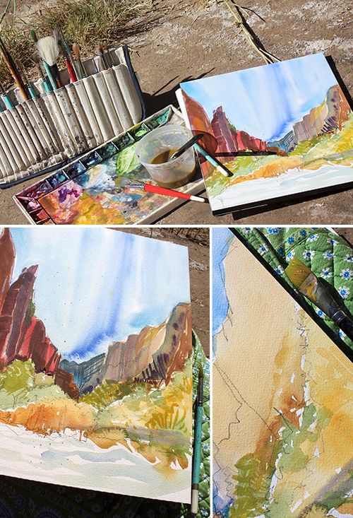
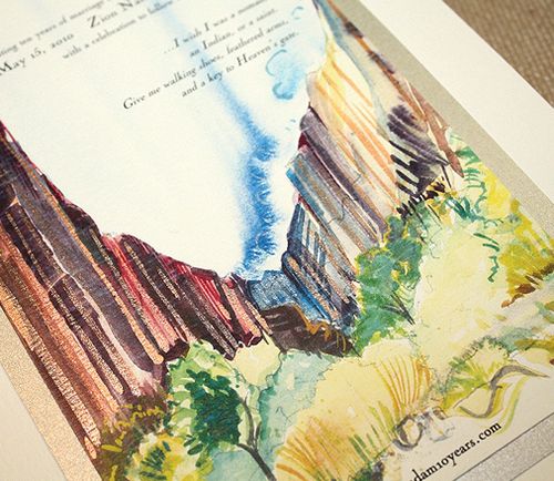
After many, many trips to Zion I have developed a serious collection of watercolor sketches and paintings.  A full color watercolor painting worked into the actual invitation layout seemed the perfect option.
Momental-zion-invitations-process1

The particular painting chosen for the invitation was created on one very sunny October day at a quiet spot near the crystal waters of the Virgin River.
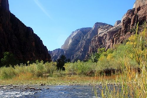
Zion-national-park

I sat on the cool rocks near the water and proceeded to paint for nearly 3 hours, leaving with a detailed and expressive painting and also a bit of a sunburn!
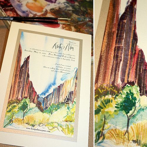
Momental-zion-watercolor-detail2

After each invitation was reproduced, shimmering copper and cobalt blue hand painted strokes of color were added to each individual card.  I wanted to give our guests a sense of how the water reflects light on the towering rocks and dances shadows in every direction.
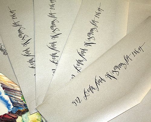
Momental-zion-envelopes-calligraphy
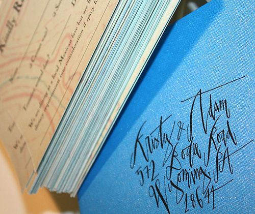
Momental-zion-invitations-calligraphy

The calligraphy for the names and addresses on the outer envelopes, as well as our names on the main invitation, was done by the talented Betsy Dunlap.  I used the print ready image that Betsy created for our save the dates everywhere I could, from the invitation to the rsvp response and outer envelope backflap.
Momental-zion-watercolor-invitation-detail

Size and scale were important in this design since the redrock landscape of Zion is so towering and massive.  The finished invite measured nearly 6.5 x 9.5 inches!

You can check out Kristy’s letterpress save the dates right here, and you can see lots more of her beautiful work over on Momental Designs.  Thank you so much Kristy!

{image credits: kristy rice}
Heather + John’s Fabric Save the Dates

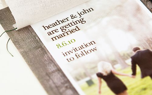
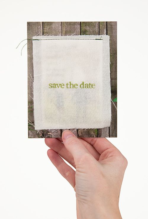
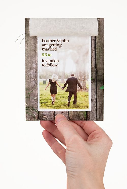
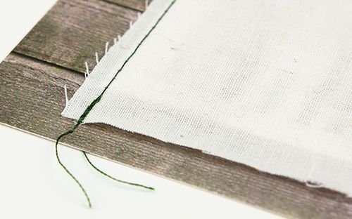
As much as I love paper, I absolutely adore it when couples incorporate fabric and other materials into their wedding stationery.  For Heather and John’s Save the Dates, designer Alan Valek incorporated natural canvas stitched onto paper digitally printed to resemble wooden planks – with a stunning result:

Heather-john-wood-fabric-save-the-date
Heather-john-wood-fabric-save-the-date2
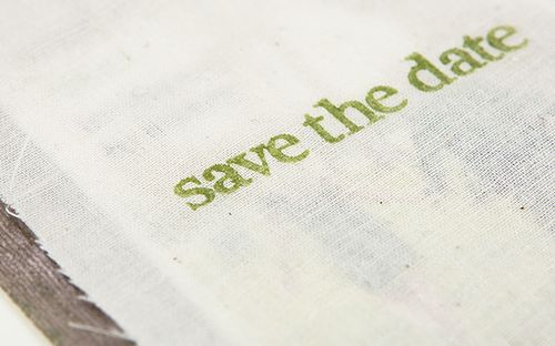
Alan used a simple rubber stamp with chalk ink from Paper Source to create the Save the Date text in a crisp summer green – perfect for an August wedding:

Heather-john-wood-fabric-save-the-date3

Heather-john-wood-fabric-save-the-date4
Heather-john-wood-fabric-save-the-date5

Alan is thinking about doing screen printed wooden planks for the main invitation – I can’t wait to see what he comes up with!

{image credits: alan valek}