Classic Monogram Birth Announcements for Baby Rhett

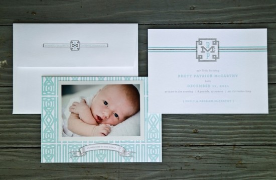
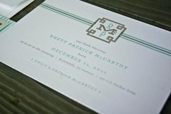
Savannah-based stationer Emily McCarthy of emma j design recently welcomed her first child, an adorable baby boy named Rhett.  For the birth announcements, Emily stayed true to her Southern roots with a sophisticated design featuring a custom pattern and elegant monogram.  I’m absolutely in love with the tiny “Mc” detail in Rhett’s monogram – so cute!

From Emily: Rhett’s birth announcement was inspired by a custom pattern that I designed while planning his nursery.  The pattern was created out of “R”s for Rhett and I wanted to give the hint of a celtic knot keeping true to our Irish heritage.


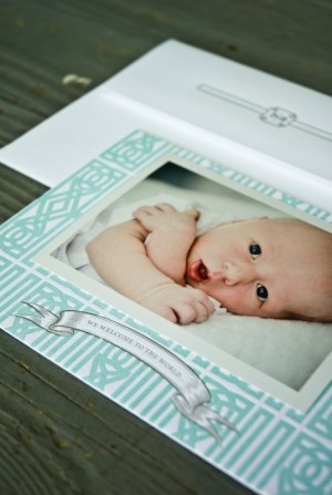
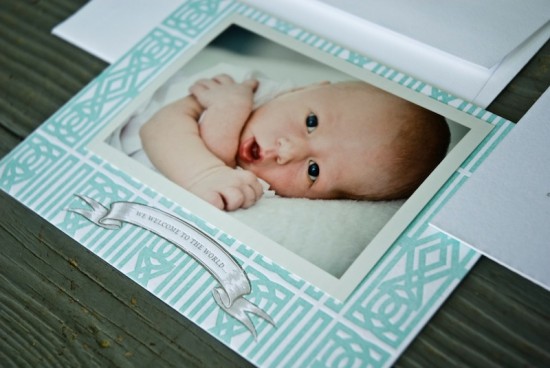
The double-sided announcement features Rhett’s pattern and a photo on the front, while the back displays a custom monogram design that has been used on his stationery as well as embroidered items like linens and clothing.  The announcement and corresponding envelopes were letterpress printed by Steve at Fireside Printing on 100% cotton Crane 220lb Lettra.

Thanks Emily!

Design: emma j design

Letterpress Printing: Fireside Printing

Photo Credits: emma j design

A Paper Marriage Proposal Pop-Up Book

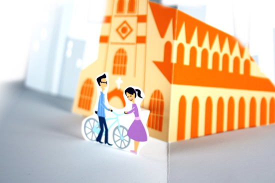
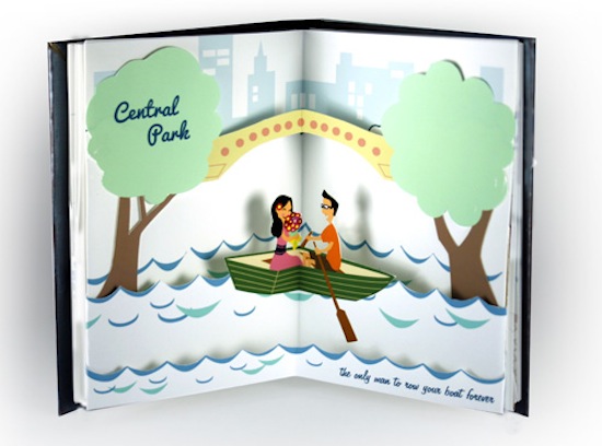
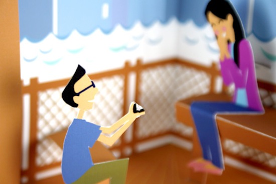
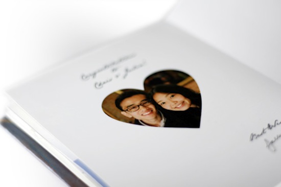
You guys, this might just be the cutest thing ever.  Chris, a student in New York City, really wanted to propose to his girlfriend… so he worked with paper artist Jackie Huang to create a pop-up book with important elements from their relationship as part of his proposal.  Such a sweet idea – not to mention a wonderful keepsake!

From Jackie: I’m a recent graduate from Art Center College of Design and specialize in creating art with paper.  I create many forms of art with paper but am most known for my pop-up work.  Chris contacted me about doing a pop-up proposal book for his girlfriend, Julia.  Over the next few months, Chris and I worked together to figure out the key moments of their relationship to tell their story.  Chris figured out the moments and text to go along with them, and then I created the engineering and illustration to fit the idea.  I’m proud to say that Chris proposed on March 29 and Julia said yes!

Thanks Jackie!

Photo Credits: Jackie Huang

Travel-Inspired Letterpress Business Cards from A Fine Press

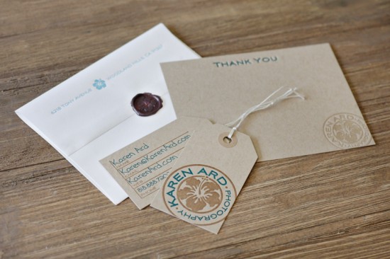
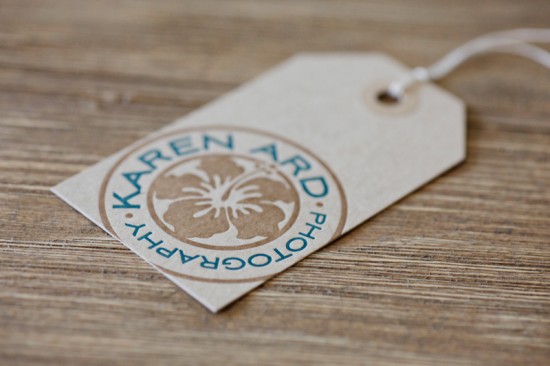
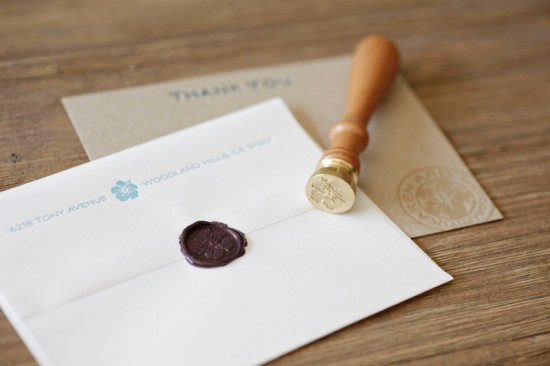
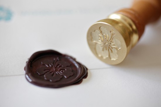
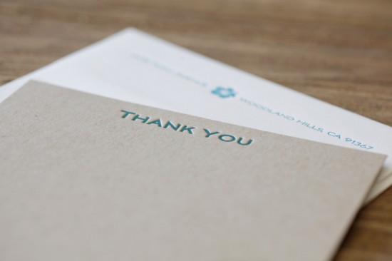
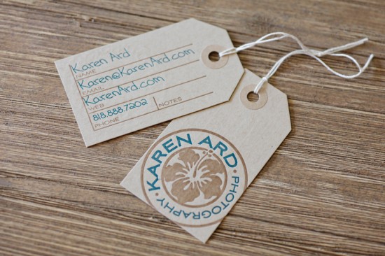
Matthew from A Fine Press sent over the fabulous business identity and stationery that he recently designed for wedding photographer Karen Ard.  Karen loved the idea of incorporating a wax seal (such a great detail!) and doing something travel-inspired, so Matthew came up with an identity inspired by Southern California surf culture and business cards inspired by luggage tags.  The entire suite was letterpress printed on kraft paper in soft and beachy colors.  So lovely!

From Matthew: Karen was particularly drawn to the idea of a wax seal to bring her business stationery together.  She approached me with the idea of doing a travel-inspired visual identity and stationery suite that maintained a nod to her SoCal location.

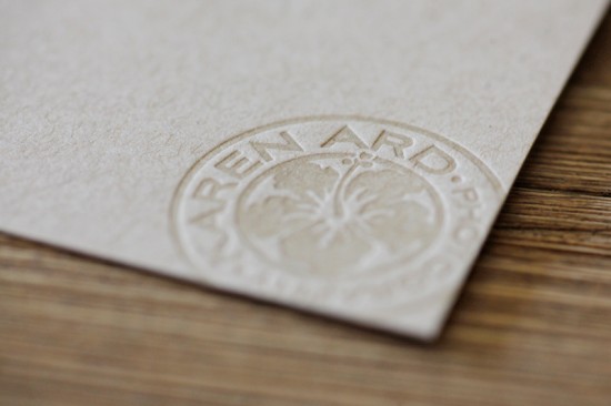
For inspiration, we drew heavily from postage and postmarks from around the world.  We loved the idea of using the circle of a postmark as our starting point.  A friend’s surf video got me thinking about all the great surf-culture branding out there and the image of a hibiscus blossom on a longboard provided us with a clear direction.

Karen wanted colors to reflect the beach and had suggested we start with seaglass colors.  From there, we settled on teal, with brown as a second color along with cream and kraft-substrates.  For a typeface, we went with the Deco-styled Aviano Sans, which I found extremely evocative of vintage travel.

The print pieces were done on French Paper’s Muscletone Kraft with PopTone Whip Cream envelopes.  In addition to Karen’s official colors, I printed her 1-color logo in transparent white on her thank you cards to make it pop while keeping it neutral in color.  Her luggage tag-inspired business cards were printed with her handwriting filling in the important details.

Thank you so much Matthew!

Photo Credits: Karen Ard

Janie + David’s Oversize Map Destination Wedding Invitations

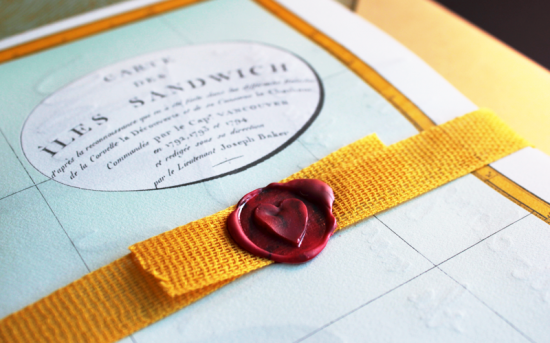
The ladies at Ladyfingers Letterpress make the coolest wedding invitations.  You (hopefully) remember Arley-Rose and Morgan’s awesome neon and hand lettered wedding invitations for their own wedding last September, and today they’re back with an equally fabulous invitation suite designed for a destination wedding in Hawaii.  I love the oversize invitation (printed on the reverse side of a vintage map!) and all the fun hand lettering elements!
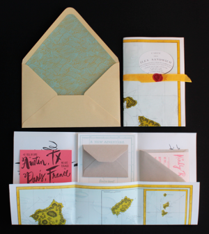
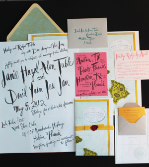
From Morgan and Arley-Rose:  Janie and David have an amazing destination wedding planned for a small group of family and friends in Hawaii.  As a lover of paper and stationery, Janie wanted to incorporate the idea of a love letter into the design for the invitation.
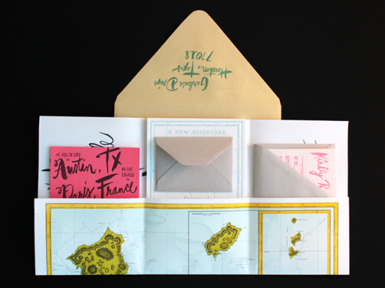
We started with a beautiful map from the year 1794.  We wanted to use something that was was historic and it turns out our printshop is down the street from a small map shop. We called and they had a map of Hawaii!  It was so breathtaking and since its design was within the public domain, all we had to do was some color separation and it was ready to be offset printed in four colors!
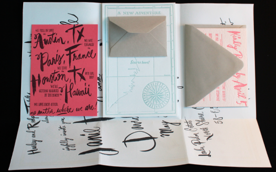
Almost all of the typography is hand drawn, written, or painted by Arley-Rose.  The actual invitation is printed on the back of the map, which is folded and serves as the vehicle for all of the other invitations pieces to travel within.  Morgan sourced the very last pallet of Crane’s 100% Cotton Coral Paper (sorry everyone) for the card detailing the story of Janie and David’s love.
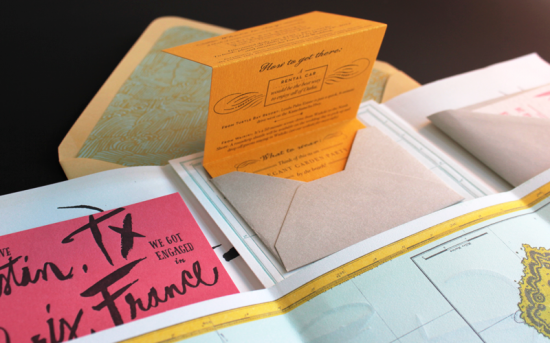
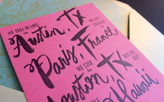
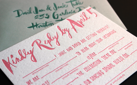
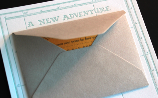
The response card is a Mad Lib for guests and includes questions such as “dancing sandal size.”  The travel details are printed on a tiny sunshine yellow card are tucked in a gray envelope mounted on a much larger card declaring “A New Adventure Starts Here.”
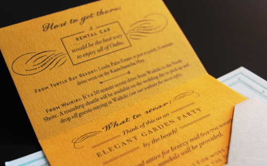
Each invitation was folded with its accompanying pieces and wrapped in ribbon from Carta Inc., wax sealed with a heart, and stuffed in a gold envelope lined with wave patterned liners.
So awesome!  Thanks Arley-Rose and Morgan!

Ladyfingers Letterpress is a member of the Designer Rolodex – check out more of their beautiful work right here or visit the real invi­ta­tions gallery for more wedding invitation ideas!

Photo Credits: Ladyfingers Letterpress

Sean + Tori’s Modern Primary Color Wedding Invitations

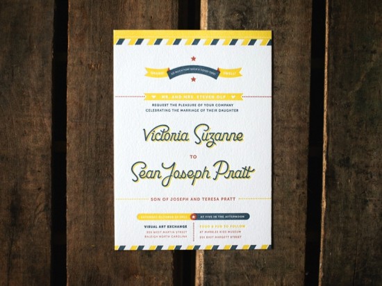
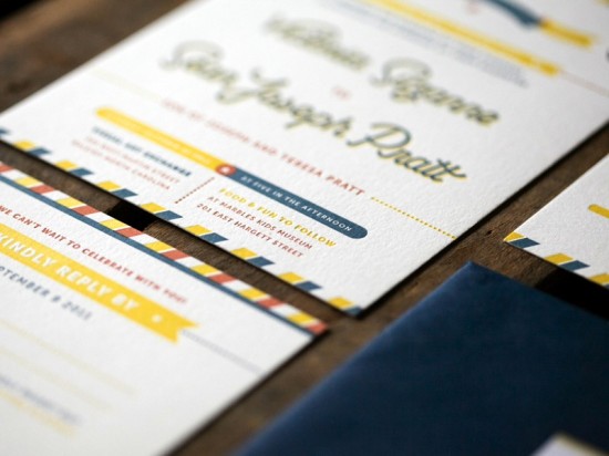
I’m loving these modern wedding invitations from Jaime of Ketchup and Mustard!  Jaime designed the invitations for good friends Sean and Tori, incorporating custom lettering and a cheerful palette of primary colors.  Such a joyful and vibrant wedding invitation suite for a fun and energetic couple!

From Jaime: Sean and Tori are an energetic, fun-loving couple that I’ve had the pleasure of knowing for over four years.  They were married in Raleigh, North Carolina in October.  It was only natural that the wedding stationery reflect their natural energy and fun personalities.

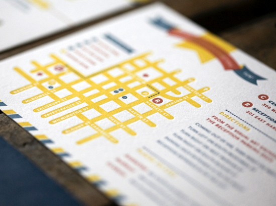
The custom lettering used for the couple’s names was adapted from the logo I designed for Tasty Beverage Company, a specialty retail beer store Sean opened last summer in downtown Raleigh.  On the accompanying map, Sean and Tori are illustrated as their favorite food and drink, a beer and a biscuit giving each other a high five.

Thanks Jaime!

Design: Jaime Van Wart, Ketchup and Mustard

Letterpress Printing: SomethingPressed

Check out the Designer Rolodex for more tal­ented wed­ding invi­ta­tion design­ers and the real invi­ta­tions gallery for more wedding invitation ideas!

Photo Credits: Brett and Jessica Donar of Brett Arthur Weddings