Behind the Stationery: The Good Twin

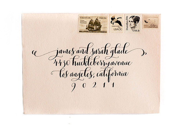
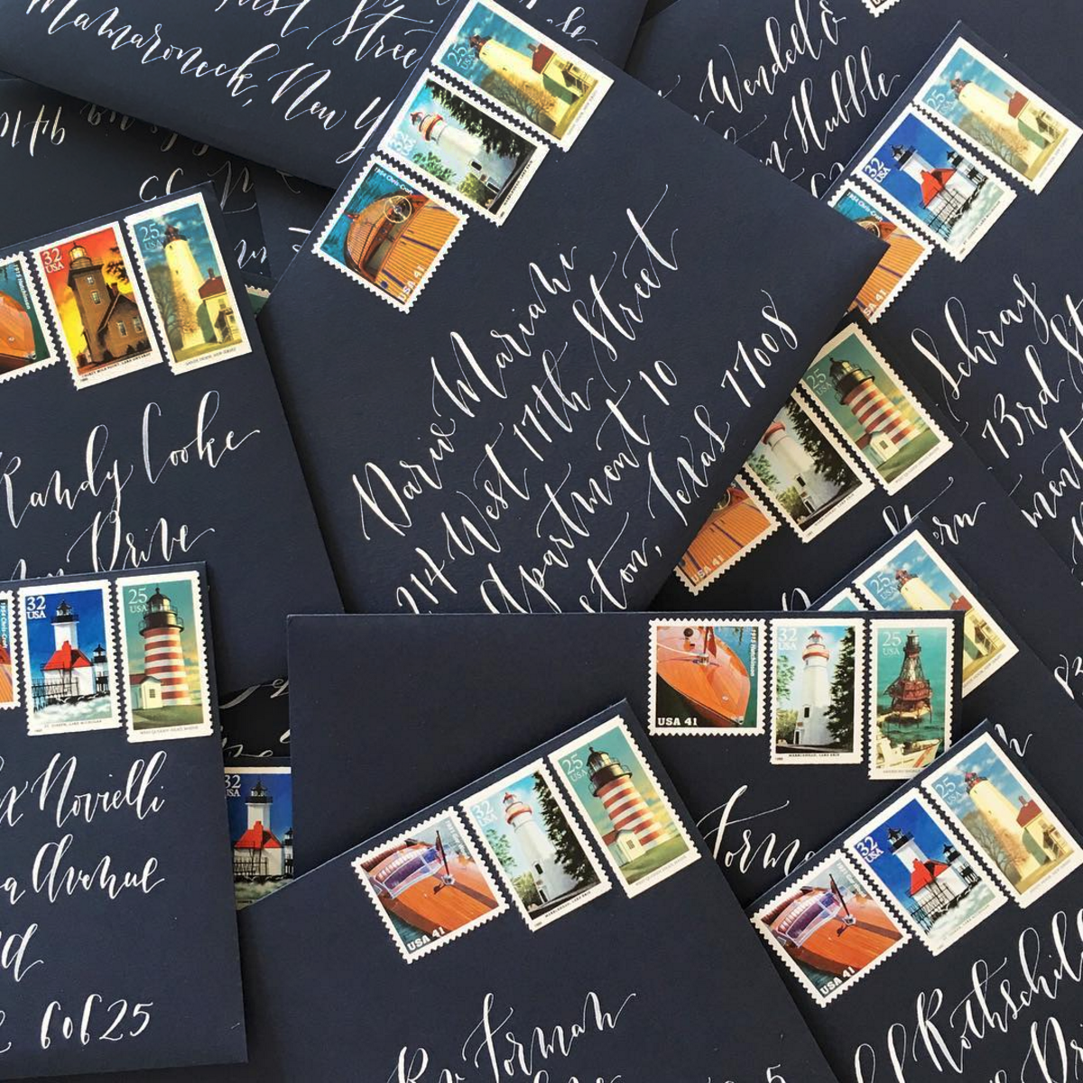
Based in the colorful land of Los Angeles, California, Katie from The Good Twin is here to share with us the founding moments of her stationery company and take us through a day in her life. I love seeing her pins and stationery in local Brooklyn shops here in New York! So glad to have you here today, Katie. Take it away –Megan

Behind the Stationery: The Good Twin / Oh So Beautiful Paper

Hi there! I’m Katie, owner and operator of The Good Twin, based here in toasty Los Angeles. And yes, I am a twin, although my brother might argue with you about the â€œgood” part, ha. I’m so excited to be chatting with you guys today – Oh So Beautiful Paper has been a source of inspiration for me for many years, and stationery is one of my favorite things to talk about, go figure.

Behind the Stationery: The Good Twin / Oh So Beautiful Paper

I’ve been working in stationery since my college days in Minneapolis, after a childhood in Portland spent creating greeting cards for family and friends for pretty much any occasion. While I was in art school, I interned for a corporate greeting card company, and then a small letterpress shop, both of which really helped me learn the ins and outs of the industry. I realized I was really excited about the big picture of a business — growing a full line and having creative control, rather than being a hired gun for an art director, and I set my sights on producing my own designs.

When I graduated, I worked a few jobs (barista, library assistant, and freelance illustrator) while my friend John and I started Dude and Chick, a tiny line of letterpress cards. After a few years of long hours and late nights, I moved to L.A., where I eventually decided to leave Dude and Chick and start my own line. The Good Twin was finally off and running in May of 2014.

Behind the Stationery: The Good Twin / Oh So Beautiful Paper

My studio is in Lincoln Heights, way on the east side of Los Angeles just northeast of downtown. It’s small, but it’s mine! I only recently moved into a space outside of my house, which has been a big change, but also very welcomed – my apartment feels like a real place again, rather than a storage locker filled to the brim with paper! All of my inventory lives in the studio, and I also carved out a designated area that feels a bit more officelike, with a big desk for drawing.

Behind the Stationery: The Good Twin / Oh So Beautiful Paper

I usually bring my pug Peggy to work with me, and we’re joined a few times a week by my friend Bryan, who helps out with inventory management and order fulfillment. Having an employee has been my saving grace —before that, my nights and weekends (and sometimes afternoons) would be spent sleeving cards and pulling orders. I still do a lot of that, but now I have a lot more time to focus on illustrating and the business as a whole.

Behind the Stationery: The Good Twin / Oh So Beautiful Paper

As The Good Twin has grown and expanded, I’ve learned to delegate a bit, but I still find myself packing my days with a million different things. I work best when I’m multitasking. My best trick for any problem is to step away for a few minutes and work on something else, then return with a fresh eye. I’ve always relied pretty heavily on a routine and regular work hours, since my brain responds really well to structure. There’s always something to do when you run the show, so I try to put in a full day even if I’m feeling uncreative or having one of those blocks where I feel like I’ll never be able to draw again.

Behind the Stationery: The Good Twin / Oh So Beautiful Paper

Days usually begin around 9am, after a morning run and breakfast at home with my boyfriend. Mornings are reserved for processing orders and managing my books (nothing like a little Quickbooks with a cup of coffee to wake me up!). I spend a lot of time writing and answering emails from buyers, sales reps, and printers, as well as entering expenses and planning budgets for reprints and new products in the works.

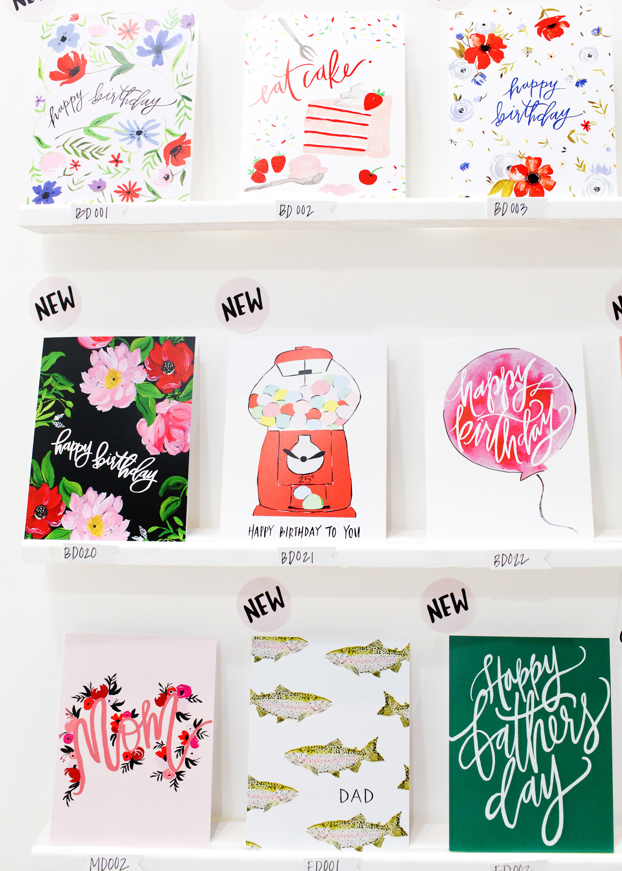
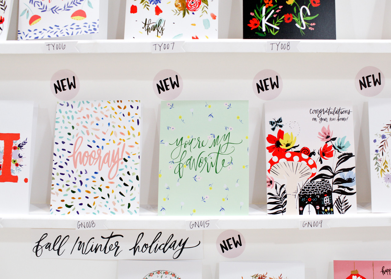
By the afternoon I’m ready for a little creativity. I do my best to draw a bit every day, even if it’s just a few minutes of calligraphy practice. I keep a folder on my phone with all my dumb (and occasionally awesome) ideas for new cards and products. About half the time, I start from a really concrete idea, but often I’ll just be browsing through my endless Pinterest boards for inspiration and just make a drawing or pattern I really like.

Behind the Stationery: The Good Twin / Oh So Beautiful Paper

Every week I comb through my sketchbooks and pull anything I feel is worthwhile, and from there I ink those drawings (sometimes with a Micron pen, sometimes with a brush), scan them in, and start playing around with layout and color in Illustrator. Although I do hand draw everything, including type, I usually piece things together either in the computer or with a light box. For me, it’s easier to focus on each piece of a composition separately, and then assemble everything in post.Behind the Stationery: The Good Twin / Oh So Beautiful Paper

My biggest challenge has always been color, and sometimes I’ll go through ten different palettes before I find something I like. Each season’s release gets one huge file where I keep everything so I can be sure it all looks nice together. Once I have the general look down, each design gets a separate file for cleanup, color separations, and other finishing touches before they go off to print. While I’m working, I like to listen to music and podcasts and occasionally audio books.

Behind the Stationery: The Good Twin / Oh So Beautiful Paper

I head home for the day between 5-8pm depending on how busy things are and how much I’m getting done. I really love my job, and hands down my favorite aspect of running a small business is the variety. As much as I love designing, it’s important to me to understand things like profit margins, trend research, and sales patterns. I think it helps me better direct my own work and style. I’m constantly giving myself pep talks and figuring out things that I never dreamed I’d be wrestling with, but that’s how I like it.

Behind the Stationery: The Good Twin / Oh So Beautiful Paper

Stationery is really exciting industry, and I love seeing change in my own style as well as the different lines I admire. Hope you enjoyed the peek into my corner of the paper world! Thanks for having me, Megan and Nole!

Photos by Kate Miss

Want to be featured in Behind the Stationery? Email [email protected] for details.

Soft Modern Watercolor Wedding Invitations

Back in April I featured these gorgeous and subtle gold foil splatter wedding invitations from Mariko at Miks Letterpress – I love the way Mariko incorporated gold foil into a modern minimalist wedding invitation design! Today I’m thrilled to share another beautiful invitation suite from Mariko, this time incorporating a beautiful watercolor design in my favorite color: pink! These soft modern watercolor wedding invitations are the perfect combination of abstract painterly elements with modern type selections and design. Add in vintage postage stamps in neutral gray tones and calligraphy from Meant to Be Calligraphy, and this invitation suite is just about as pretty as it gets!

Soft Modern Watercolor Wedding Invitations by Miks Letterpress / Photo by Rachel Lynn Photography via Oh So Beautiful Paper

From Mariko: The inspiration for this wedding suite was drawn from the couple themselves. The bride wanted a soft watercolor look, while the groom wanted something more modern. I married the two concepts (pun intended) and came up with this wedding suite. It includes the soft element the bride wanted with the flowing watercolor and the crisp design element the groom liked with the white space around the text and modern type selections.

Soft Modern Watercolor Wedding Invitations by Miks Letterpress / Photo by Rachel Lynn Photography via Oh So Beautiful Paper

Soft Modern Watercolor Wedding Invitations by Miks Letterpress / Photo by Rachel Lynn Photography via Oh So Beautiful Paper

Soft Modern Watercolor Wedding Invitations by Miks Letterpress / Photo by Rachel Lynn Photography via Oh So Beautiful Paper

The watercolor was printed digitally on cotton paper, while the text was letterpress printed to give a 3D texture to the suite. Vintage postage stamps in a neutral gray tone were incorporated to complement the pink color scheme and not take attention away from the main feature: the pink watercolor. The envelope calligraphy from Michele of Meant to Be Calligraphy could have gone both ways, either a soft flourished style or a modern style and we went with a softer look.

Soft Modern Watercolor Wedding Invitations by Miks Letterpress / Photo by Rachel Lynn Photography via Oh So Beautiful Paper

Vintage Postage Stamps and Modern Calligraphy by Meant to Be Calligraphy / Photo by Rachel Lynn Photography via Oh So Beautiful Paper

Soft Modern Watercolor Wedding Invitations by Miks Letterpress / Photo by Rachel Lynn Photography via Oh So Beautiful Paper

Thanks Mariko!

Design and Letterpress Printing: Miks Letterpress+

Envelope Calligraphy: Meant to Be Calligraphy

Floral Styling: Taffy Floral

Check out the Designer Rolodex for more tal­ented wed­ding invi­ta­tion design­ers and the real invi­ta­tions gallery for more wedding invitation ideas!

Photo Credits: Rachel Lynn Photography

The 2016 National Stationery Show, Part 7

It’s probably more than obvious around here, but I’m completely in love with calligraphy and hand lettering. Watching a calligrapher or hand lettering artist at work is one of my absolute favorite things – it’s like magic! So for today’s recap from the 2016 National Stationery Show, I thought we’d focus in on a few of the calligraphy and hand lettering booths at the show. Let’s start with an exhibitor making their debut at this year’s show, Shannon Kirsten! Shannon combines her unique calligraphy with gorgeous illustrations – I love all those amazing florals!

NSS 2016 – Calligraphy and Hand Lettering: Shannon Kirsten / Oh So Beautiful Paper

NSS 2016 – Calligraphy and Hand Lettering: Shannon Kirsten / Oh So Beautiful Paper

NSS 2016 – Calligraphy and Hand Lettering: Shannon Kirsten / Oh So Beautiful Paper

Continue reading after the jump for more from Shannon Kirsten, laLa Grace, Leen Jean, Bundle Design, Imogen Owen, Printable Wisdom, Sea & Lake, and Ladyfingers Letterpress!

Continue reading

Happy Weekend – and Happy Fourth of July!

Happy Friday everyone! And Happy (almost) Fourth of July! Do you have fun plans for the long weekend? I’m hoping to take our girls to a swimming pool for the first time in FOREVER. We took Sophie swimming when she was just a wee baby, but this will be Alice’s first swimming experience! Sophie hated swimming pools (and any large body of water, really) back then, but I’m hoping things have changed now that she’s an (almost) four year old. We’ll see! But in the meantime…

Envelopes by Lauren Essl (Blue Eye Brown Eye Calligraphy) via Oh So Beautiful Paper

Envelopes by Lauren Essl (aka Blue Eye Brown Eye Calligraphy) from the #dailydoseofpaper feed on Instagram!

…a few links for your weekend:

This week on Oh So Beautiful Paper:

That’s it for me this week! Check back in a bit for this week’s cocktail recipe – it’s a REALLY good one! Have a fantastic holiday weekend and I’ll see you back here on Tuesday! xoxo

Printable 4th of July Calligraphy Art Print

With the 4th of July just a few days away, you could be like me and scrambling for all of the red, white, and blue things you can find, eat, or wear… or, you could actually be prepared and ready to go for your festive celebration. Either way, we have one little extra that you absolutely must download and print this year: a printable 4th of July calligraphy art print to celebrate the land of the free and the home of the brave. It’s the perfect finishing touch for your BBQs, picnics, and other celebrations this holiday weekend! –Lauren

Land of the Free and Home of the Brave Printable 4th of July Calligraphy Art Print / A Fabulous Fete for Oh So Beautiful Paper

I created this printable with multiple uses in mind – but the top of my list would be for decorating your table or bart cart with a framed version! Add in a colorful red, white, and blue garland, a delicious cocktail or two, and maybe even some fresh white flowers and you have yourself a good looking 4th of July display. But don’t feel like you’re limited to just the 4th of July holiday weekend – this print can be displayed all summer or even all year long. There are even two colors to choose from: a traditional blue or a softer coral. Land of the Free and Home of the Brave Printable 4th of July Calligraphy Art Print / A Fabulous Fete for Oh So Beautiful Paper

Choose and download your favorite from the two files below, then print on a letter size sheet of white paper or card stock. To display, either pop the print into an 8″ x 10″ frame or simply hang on the wall with a few strips of washi tape. Easy!

Land of the Free and Home of the Brave Printable 4th of July Calligraphy Art Print / A Fabulous Fete for Oh So Beautiful Paper

Land of the Free and Home of the Brave Printable 4th of July Calligraphy Art Print / A Fabulous Fete for Oh So Beautiful Paper

DOWNLOAD THE BLUE PRINTABLE | DOWNLOAD THE CORAL PRINTABLE

Printable artwork © Lauren Saylor of A Fabulous Fete and created exclusively for Oh So Beautiful Paper. All artwork is created for personal use only and may not be altered, reproduced, or sold in any way without prior written consent.

Photo Credits: Lauren Saylor of A Fabulous Fete for Oh So Beautiful Paper