Emma’s Modern Orange Bat Mitzvah Invitations

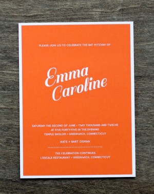
Bar and Bat Mitzvah invitations can be really tough: they have to walk a fine line, trying to stay away from being too adult or too childish while also remaining respectful of the tradition itself.  Aubrey from J. Papers created these fantastic  invitations for a recent Bat Mitzvah in Connecticut.  The invitations combine bright orange with white foil for a crisp and modern design that is simultaneously youthful and sophisticated.

Modern Bat Mitzvah Invitations by J. Papers via Oh So Beautiful Paper (3)

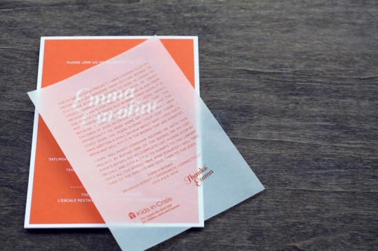
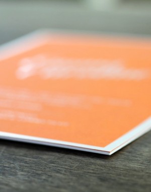
From Aubrey:  This invitation suite has so much style and sophistication while remaining age appropriate – we love that!  The main invitation panel is made with extra thick orange stock.  The invitation was foil stamped to get the crisp, opaque white text and border.

Modern Bat Mitzvah Invitations by J. Papers via Oh So Beautiful Paper (4) 

Modern Bat Mitzvah Invitations by J. Papers via Oh So Beautiful Paper (1)

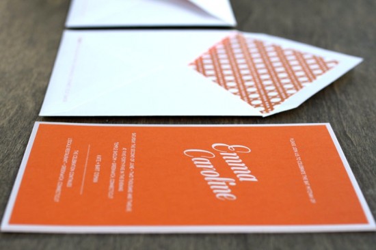
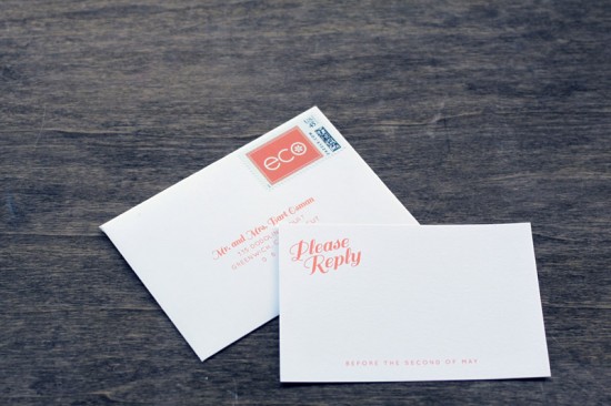
We also designed a basket weave pattern in Emma’s signature orange color to use for the envelope liner.  There were two inserts: a letter flat printed on vellum paper; and an rsvp card on bright white cotton stock.  Both the reply envelope and the invitation outer envelope were adorned with a custom stamp featuring the custom Bat Mitzvah event logo we designed specifically for Emma.

Modern Bat Mitzvah Invitations by J. Papers via Oh So Beautiful Paper (2)

Thanks Aubrey!

Photo Credits: J. Papers

Modern Custom Personal Stationery by Fine Day Press

Technically paper is the gift given on the first anniversary… but as far as I’m concerned stationery makes a wonderful gift for any occasion – from anniversaries to birthdays to holidays.  Ashley from Fine Day Press recently created this custom personal stationery set for a client wanting to surprise her husband on their anniversary.  So great!

Custom Stationery by Fine Day Press via Oh So Beautiful Paper (1)

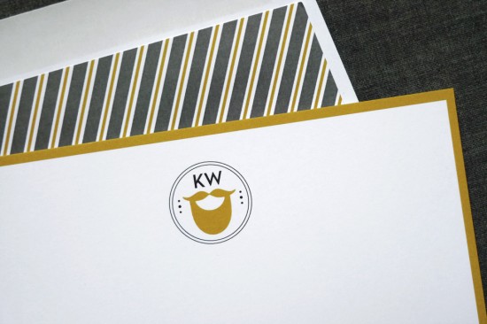
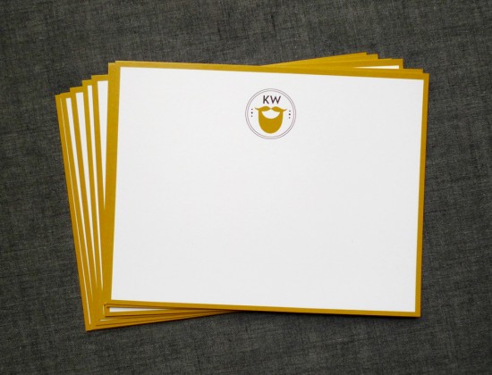
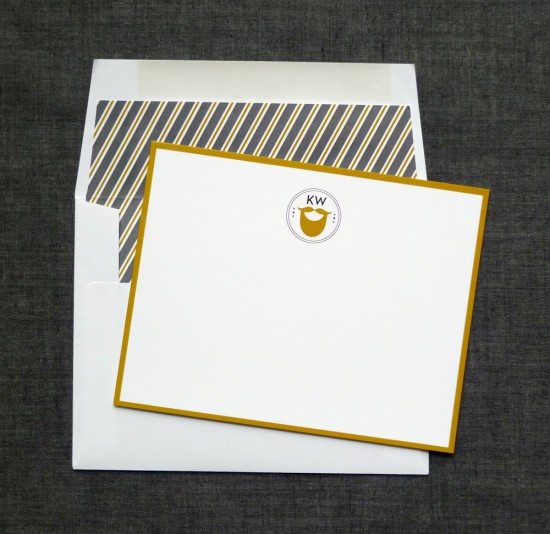
From Ashley: My client, Tina, wanted to create a custom personalized stationery set as a surprise anniversary gift for her husband, featuring his prominent beard as a motif along with his initials.

Custom Stationery by Fine Day Press via Oh So Beautiful Paper (2)

I created a personal logo using these elements with the beard icon in a curry/gold color; we added this same accent color as a border on the notecard.  The charcoal and gold striped custom envelope liner adds a sophisticated touch to balance out the whimsy.

Custom Stationery by Fine Day Press via Oh So Beautiful Paper (3)

Fantastic!  Thanks Ashley!

Photo Credits: Fine Day Press

*Fine Day Press is a sponsor of Oh So Beautiful Paper

Emily + Robert’s Summery Gray and Yellow Wedding Invitations

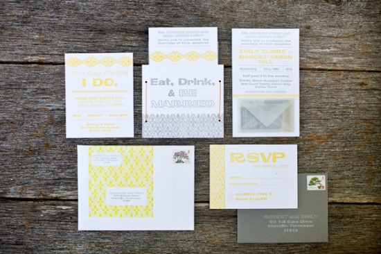
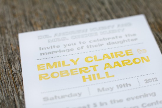
Emily and Robert wanted a playful and modern design for their wedding invitations; they worked with Emily and Dianna from Fourth Year Studio to create a typography-based design that was letterpress printed in a sunny yellow and gray color palette.  Just perfect for a laid back summer wedding in Texas!

Wedding Invitations by Fourth Year Studio via Oh So Beautiful Paper (9)

From Emily and Dianna: Emily and Robert were married in Dallas, Texas.  We jumped at the chance to print in yellow and gray, one of our favorite color combos.  There was a ton of information to relay to their guests – and when there are multiple pieces to an invitation suite we try to come up with a way to make it to all fit together in a package that guests will enjoy opening.

Wedding Invitations by Fourth Year Studio via Oh So Beautiful Paper (2)

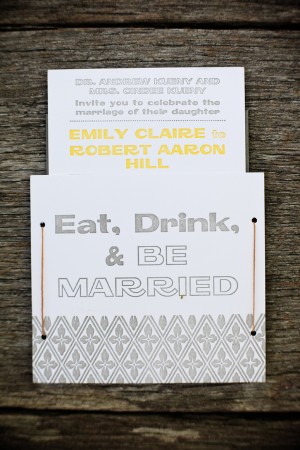
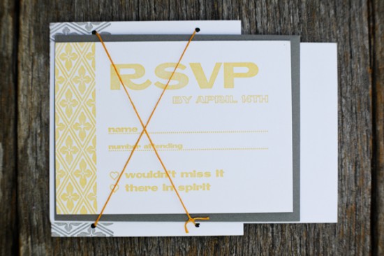
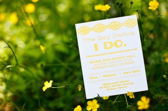
The invitation and rehearsal dinner card were letterpress printed on cotton stock and tucked into a pocket that held it all together.  Each pocket was tied with wax thread, the same kind used for book binding.

Wedding Invitations by Fourth Year Studio via Oh So Beautiful Paper (8) Wedding Invitations by Fourth Year Studio via Oh So Beautiful Paper (7)

Wedding Invitations by Fourth Year Studio via Oh So Beautiful Paper (6)

The RSVP card and envelope were tucked behind the crisscross of the thread.  The RSVP cards were printed front and back – one side for the wedding (yellow) and the other for the rehearsal dinner (gray).  The RSVP addresses were letterpress printed with white ink onto gray envelopes.

Wedding Invitations by Fourth Year Studio via Oh So Beautiful Paper (5)

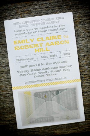
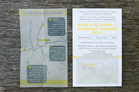
Our favorite part of the entire set is the map.  At the bottom of the invitation is a small vellum envelope.  Inside is a flat printed vellum map with directions to the wedding venue.  Removal of the map reveals a letterpress printed outline of Texas with corresponding text “map to our heart.”  The invitation suite was packaged with a matching envelope label with the repeating floral pattern that was derived from native Texas succulents and used graphically throughout the set.

Wedding Invitations by Fourth Year Studio via Oh So Beautiful Paper (4)

Thanks Emily and Dianna!

Check out the Designer Rolodex for more tal­ented wed­ding invi­ta­tion design­ers and the real invi­ta­tions gallery for more wedding invitation ideas!

Photo Credits: 5 Rings Photography

Ramona + Rudolf’s Air Mail-Inspired Wedding Announcements

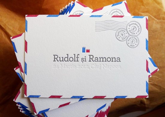
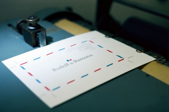
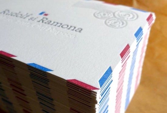
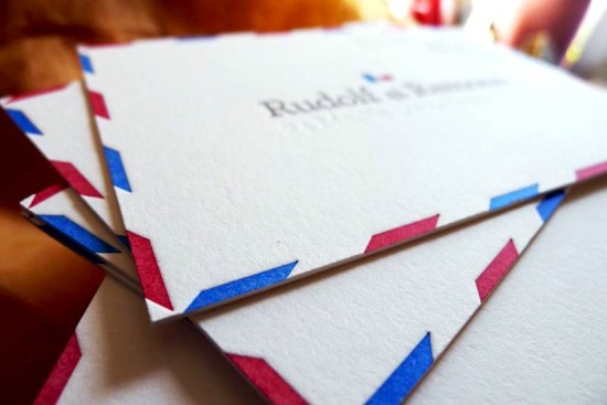
I’m a huge fan of air mail-inspired details for weddings, from invitations to day-of details – and of course marriage announcements!  Designer Ramona Todoca designed these postcard-style announcements to share the happy news of her wedding with family and friends, then collaborated with Maggie from Campbell Raw Press to bring the four-color letterpress design to life.

Airmail Wedding Announcements by Campbell Raw Press via Oh So Beautiful Paper (5)

From Maggie: We recently collaborated with designer Ramona Todoca on these air mail inspired announcements for her wedding this past March in Cluj Napoca, Romania.  Ramona and her husband, Rudolf, have nurtured their relationship through an extensive snail mail correspondence between Hong Kong, New York City, and Romania, so the air mail theme suited Ramona and Rudolf perfectly.

Airmail Wedding Announcements by Campbell Raw Press via Oh So Beautiful Paper (1)

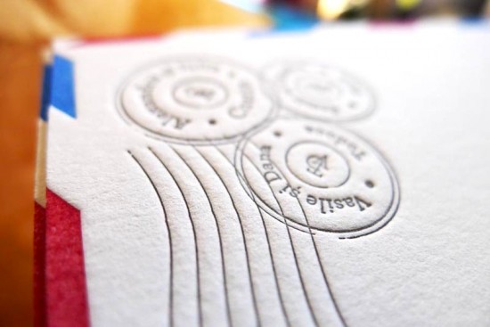
The announcements are a postcard-style, one-sided design, printed in red, blue, gray, and one blind impression (no ink) on the double-thick version of Crane’s bright white 100% cotton Lettra stock.  (Yes, that’s four passes through the press!)

Airmail Wedding Announcements by Campbell Raw Press via Oh So Beautiful Paper (2)

The results were marvelously simple, stylish, and personal.  We’re also excited to be collaborating with Ramona on a new wedding invitation collection, including Ramona and Rudolf’s air mail design, that we will begin to offer this coming fall!

Airmail Wedding Announcements by Campbell Raw Press via Oh So Beautiful Paper (4)

Airmail Wedding Announcements by Campbell Raw Press via Oh So Beautiful Paper (3)

Thanks Maggie!

Design: Ramona Todoca

Letterpress Printing: Campbell Raw Press

Campbell Raw Press is a member of the Designer Rolodex – you can see more of their beautiful work right here or visit the real invi­ta­tions gallery for more wedding invitation ideas!

Photo Credits: Campbell Raw Press

Liz + Julian’s Colorful Destination Wedding Save the Dates

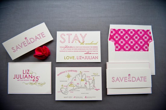
Happy Monday everyone! We’re starting the week off with bright and colorful save the dates from the talented ladies of Gus & Ruby Letterpress. Samantha and Whitney created these 3-piece letterpress save the dates for a destination wedding on Martha’s Vineyard. I’m absolutely loving all those wonderful pops of hot pink!

Colorful Destination Wedding Save the Dates by Gus & Ruby Letterpress (9)

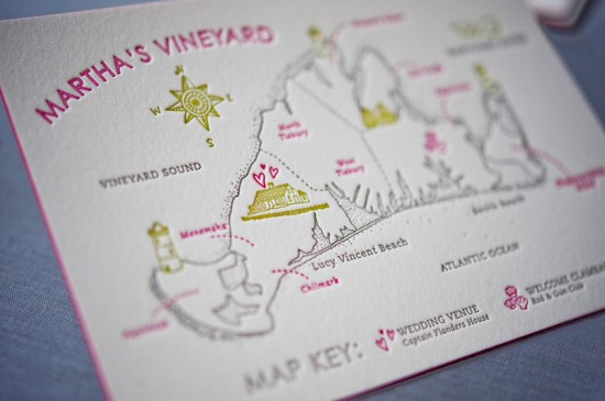
From Samantha and Whitney: Liz and Julian live in New York City and were planning a June wedding in Martha’s Vineyard, where the Liz spent her summers growing up.  They wanted a fun piece that gave guests a taste of the island and got them excited for the weekend-long event to come.  The save the date consisted of three separate letterpress printed panels that were bundled together by a letterpress printed belly band.  The bundle was then mailed in a calligraphed envelope with a graphic envelope liner printed in the same bright pink.

Colorful Destination Wedding Save the Dates by Gus & Ruby Letterpress (4)

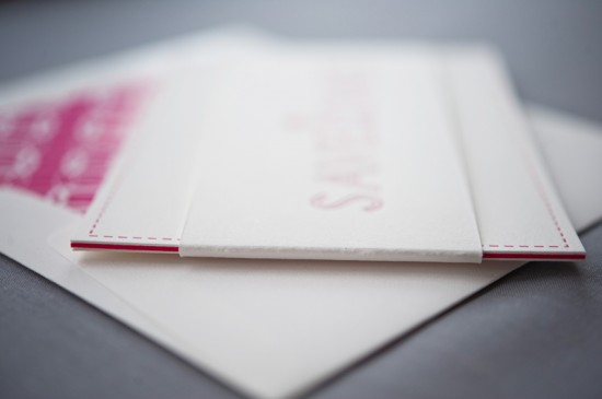
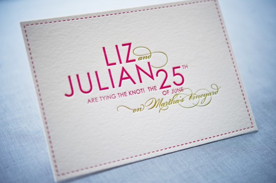
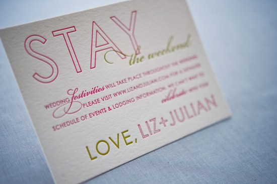
The belly band covered over the text of the first panel so that the wording was only revealed once you slid the band off.  The first panel announced to guests the event and date, the middle panel featured a sweet custom illustration of Martha’s Vineyard (illustrations were done by our friend and illustrator extraordinaire, Jen Skelley), and the third panel gave guests a bit more information about the weekend.

Colorful Destination Wedding Save the Dates by Gus & Ruby Letterpress (5)

The middle panel was printed in 3 colors on luxurious 220# cotton and edge painted in the hot pink so, when it was sandwiched between the 2 panels that were printed on 110# paper, it created a fun pop of color.  As always, all pieces were printed by hand on our antique press on luxurious 100% cotton paper.

Colorful Destination Wedding Save the Dates by Gus & Ruby Letterpress (2)

Colorful Destination Wedding Save the Dates by Gus & Ruby Letterpress (3)

Colorful Destination Wedding Save the Dates by Gus & Ruby Letterpress (7)

Just gorgeous!  Thanks Sam and Whit!

Design and Letterpress Printing: Gus & Ruby Letterpress

Illustrations: Jen Skelley

Gus & Ruby Letterpress is a member of the Designer Rolodex – check out more of their beautiful work right here or visit the real invi­ta­tions gallery for more wedding invitation ideas!

Photo Credits: Brea McDonald Photography for Gus & Ruby Letterpress