Romantic Botanical Winter Wedding Invitations

Ooooh, I am LOVING the dove gray and oxblood color combination in these romantic botanical winter wedding invitations from Britt of Swell Press Paper Co.! Gray and white is absolutely classic for late fall and winter wedding invitations, but the addition of moody oxblood is just so perfect. Britt incorporated floral illustrations inspired by vintage botany books throughout the invitation suite (complete with the Latin plant names!), along with oxblood edge painting and kraft paper envelopes with a wax seal – not to mention beautiful envelope calligraphy by Olive Branch & Co. So pretty!

Romantic Botanical Winter Wedding Invitations by Swell Press Paper Co. / Oh So Beautiful Paper

From Britt: When Laura and John came to me to design and print their wedding invitation suite, they knew they wanted something traditional and romantic, with a subtle hint of winter for their late November wedding in Baltimore. Laura’s Pinterest board was filled with pages from vintage botany books, so I took it from there, incorporating vintage floral and botanical elements throughout the suite.

Romantic Botanical Winter Wedding Invitations by Swell Press Paper Co. / Oh So Beautiful Paper

Romantic Botanical Winter Wedding Invitations by Swell Press Paper Co. / Oh So Beautiful Paper

The back of the RSVP card is a throwback to the old botany indexes, with the Latin names for the plants listed under the figure key. Another floral element was printed on the back of the invitation to tie it all together.

Romantic Botanical Winter Wedding Invitations by Swell Press Paper Co. / Oh So Beautiful Paper

Romantic Botanical Winter Wedding Invitations by Swell Press Paper Co. / Oh So Beautiful Paper

The invitation suite was printed on 220lb Crane’s Pearl White Lettra with medium grey ink, with oxblood edge painting and custom-sourced oxblood linen paper for the details card to give a pop of autumnal color.

Romantic Botanical Winter Wedding Invitations by Swell Press Paper Co. / Oh So Beautiful Paper

We then tied everything together in a natural kraft inner envelope, topped off with a custom wax seal made from one of the floral elements.

Romantic Botanical Winter Wedding Invitations by Swell Press Paper Co. / Oh So Beautiful Paper

Thanks Britt!

Invitation Design and Printing: Swell Press Paper Co.

Envelope Calligraphy: Olive Branch & Co.

Photo Styling: Erin McDonald

Check out the Designer Rolodex for more tal­ented wed­ding invi­ta­tion design­ers and the real invi­ta­tions gallery for more wedding invitation ideas!

Photo Credit: Gregory Ross

Business Card Inspiration #18

It has been a little while since I rounded up some pretty business cards! Here are a few recent favorites!

Business Card Inspiration / Oh So Beautiful Paper

1. Illustrator Meera Lee Patel‘s colorful painterly business cards (via Instagram)

2. Beautiful watercolor and letterpress business cards with gold edge painting by Holly Hollon for Joanne Lue Events (via Instagram)

3. GORGEOUS green and gold foil business cards by Christine Wisnieski for floral studio Molly Taylor & Co. (via Instagram)

4. Gold foil and offset printed business cards for Candlefish / Design by Fuzzco and gold foil by Mama’s Sauce (via Instagram)

5. Hand lettered letterpress printed business cards / Printed by Czar Press for Odd Daughter Paper Co. (via Instagram)

p.s. If you’d like to submit your own business cards for a future post just tag your photos with #osbpbusinesscardlove on Instagram!

Behind the Stationery: Underwood Letterpress

I had the pleasure of meeting Cara of Underwood Letterpress in person at The National Stationery Show this year. Though it was her first show, she is no printmaking or business rookie – she is (very quickly) taking over the California coast! Here’s the scoop on her business prowess, days at work, and design process. –Megan

Behind the Stationery: Underwood Letterpress / Oh So Beautiful Paper

I learned to letterpress print about 10 years ago in a printmaking class during college, but then I took a detour from the world of design for a bit, got my masters in public policy and built a career in philanthropy working with some of the most talented and generous people that I know. I gained skills in management, planning and collaboration that have influenced the way I run my business today. I thrived in my career, but couldn’t be happier about the switch. I love working with my hands again, designing beautiful things and being my own boss. I don’t know what the future holds, but I’m excited to have embraced this non-linear career path and am excited about where it may take me!

Behind the Stationery: Underwood Letterpress / Oh So Beautiful Paper

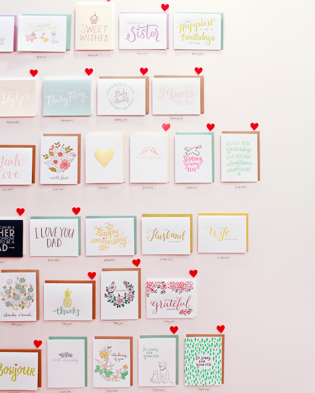
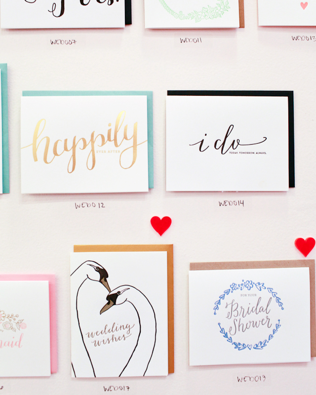
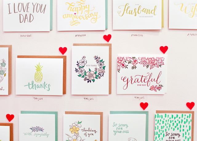
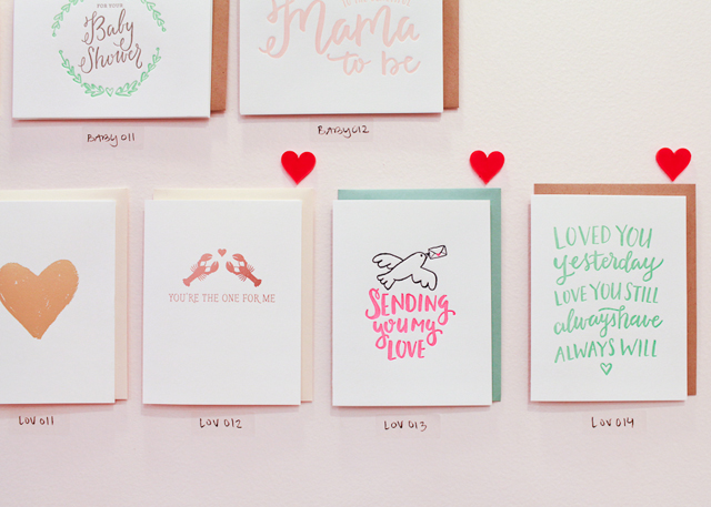
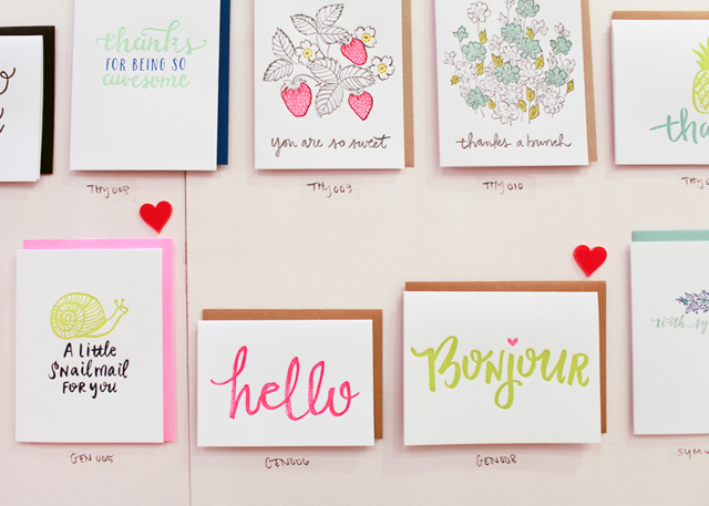
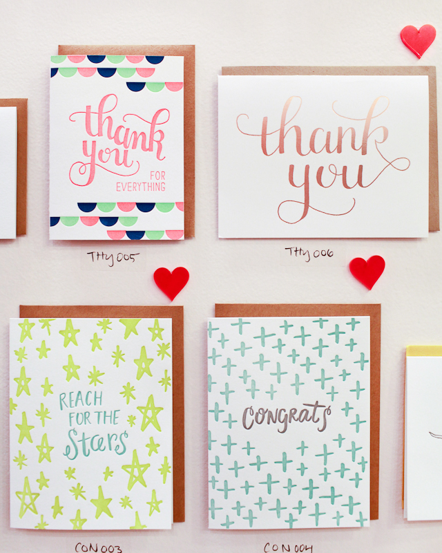
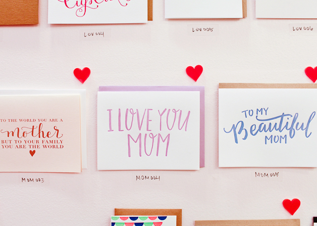
I officially launched Underwood Letterpress in 2012. When we launched, our custom work took off really quickly and we were fortunate to get some great exposure through various prominent design blogs including Apartment Therapy, One King’s Lane and Design Love Fest. We spent two years building our custom work and with a leap of faith we decided to launch our own greeting card line this year at the National Stationery Show. We were a finalist for Best New Product and had a really great response to our card’s simple, modern designs and playful color palette.

Behind the Stationery: Underwood Letterpress / Oh So Beautiful Paper underwood-38

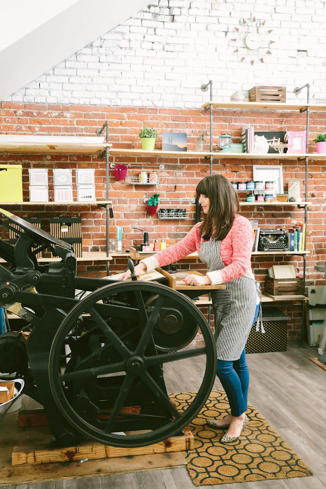
Underwood Letterpress is located in the arts district in downtown Los Angeles in a shared workspace called The Unique Space. The building is a collective of designers, entrepreneurs, writers and bloggers, and also has a co-working space that brings different creative people to the building every day. While we are all hard at work running our own small business, we often find time to collaborate on projects or just bounce ideas off of one another. It’s a creative utopia!

Behind the Stationery: Underwood Letterpress / Oh So Beautiful Paper

Behind the Stationery: Underwood Letterpress / Oh So Beautiful Paper

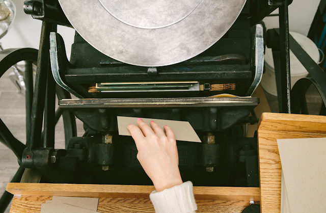
Our studio consists of our 12×18 Chandler and Price printing press from 1915 (yes, there’s a 100 year birthday in the house!!), our guillotine paper cutter, workspace, and as much shelving as we could fit to house our paper, inks, and other wares. We are lucky to have access to storage in the building’s basement which has allowed us to house a ton of inventory and grow our product line without crowding us out of the studio.
Behind the Stationery: Underwood Letterpress / Oh So Beautiful Paper

Our incredibly talented studio associate Mallory is running the show in L.A., while I work on expanding our business in the Bay Area. With a “minor” turn of events, my husband was recruited to northern California for a new job early this year, so I figured I would take on the challenge of bringing the business to another part of California that I love. I have set up a home studio and am fortunate to be printing at the San Francisco Center for the Book until I set up a permanent studio there. I travel to L.A. every other month for various projects and to meet with clients.Behind the Stationery: Underwood Letterpress / Oh So Beautiful Paper

Running a business in two locations means there is no “typical” day in the office. Each day is a unique combination of client consultations, emails, and designing. I am on the press about twice per week and spend the rest of the time building the business. I’ve found that I actually love working on the business side of things — finances, marketing, planning — all of it. This is an area I want to grow in and can’t wait to attend Business Boot Camp organized by the paper industry’s amazing professional network TSBC.

Behind the Stationery: Underwood Letterpress / Oh So Beautiful Paper

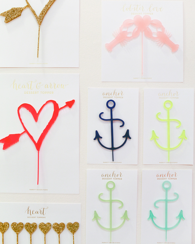
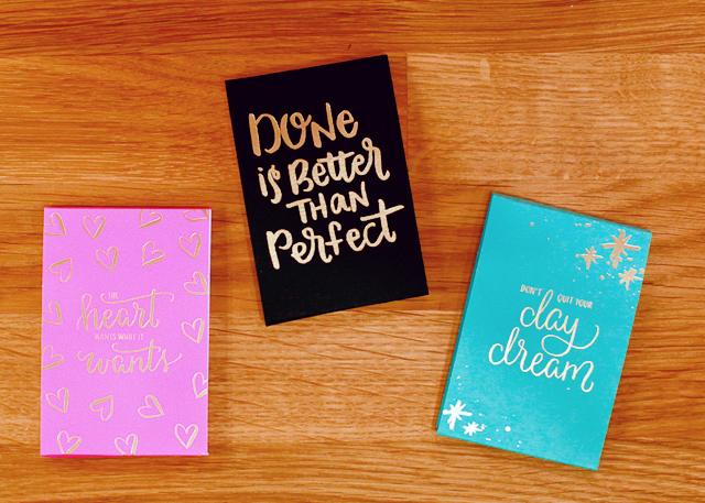
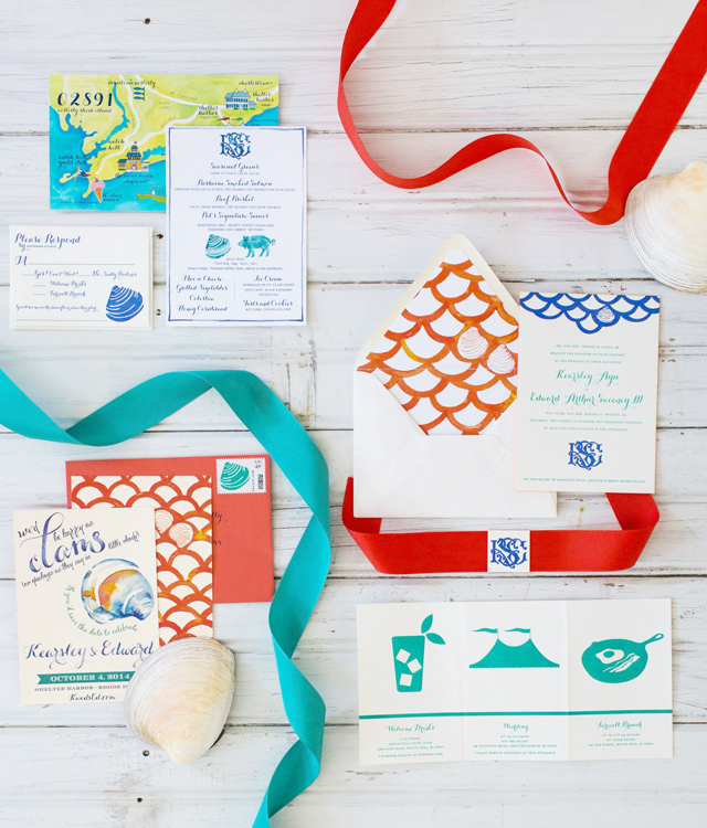
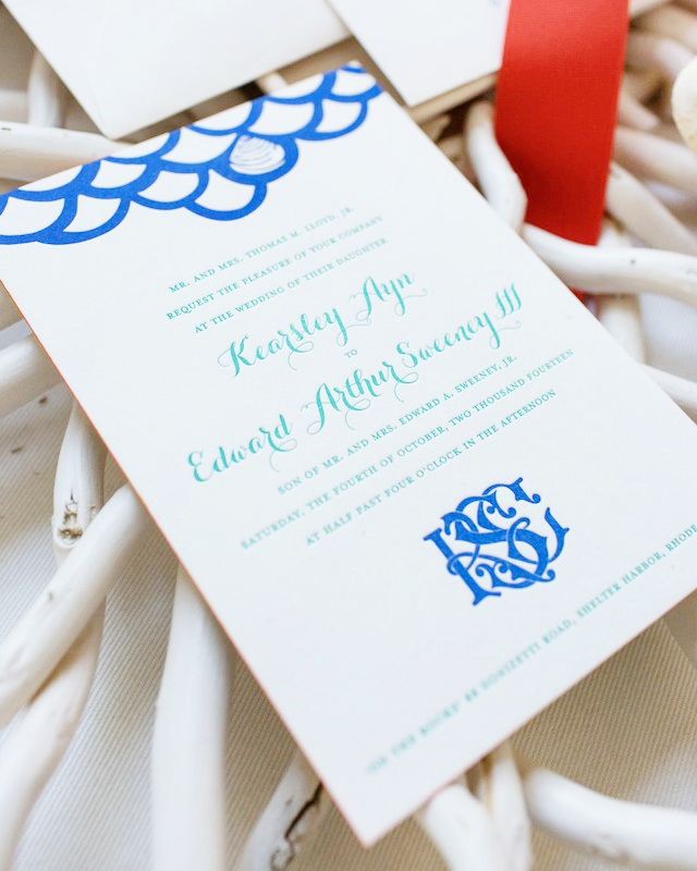
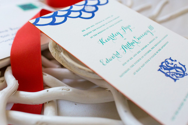
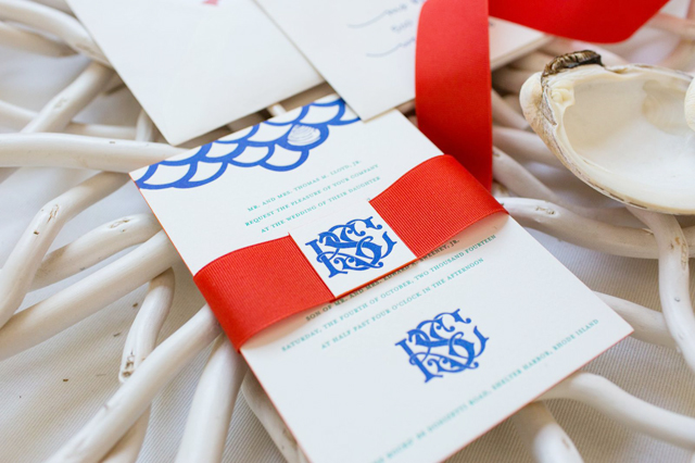
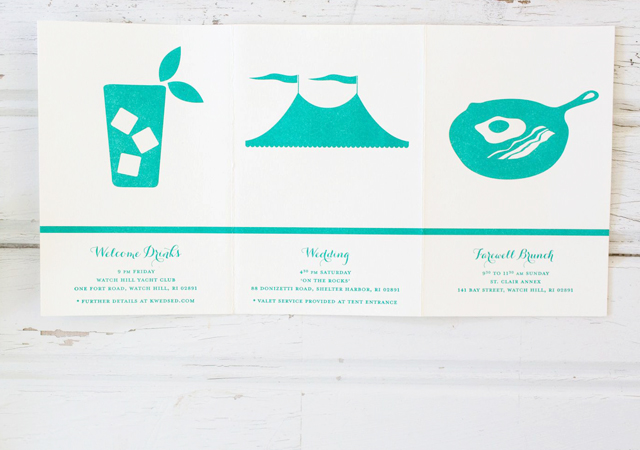
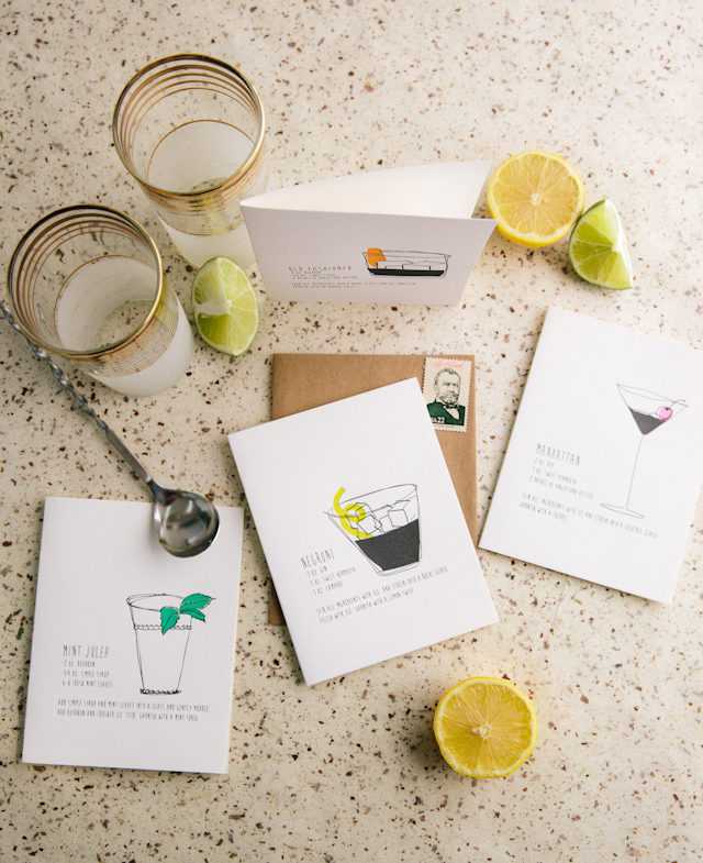
Our greeting card line incorporates bold color, pattern, geometry and juxtaposition. I take a lot of cues from fashion, home and lifestyle trends and love Scandinavian design. When designing a new card, I focus on color and design first. The sentiment or occasion comes next and usually organically pops right out at me.
Behind the Stationery: Underwood Letterpress / Oh So Beautiful Paper

All of the cards are hand drawn which means that I start the process with a trusty Sharpie pen. I like to lay out a large piece of paper on my workspace and cover it with doodles, to do lists and reminders. That way, I have access to a canvas all day long and can sketch my ideas as they come to me. From there, I convert the images to digital artwork, refine the designs in Illustrator and then determine the color palette.

Behind the Stationery: Underwood Letterpress / Oh So Beautiful PaperUnderwoodLetterpressStudioTour058-9UnderwoodLetterpressStudioTour069-11UnderwoodLetterpressStudioTour066-10

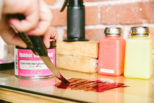
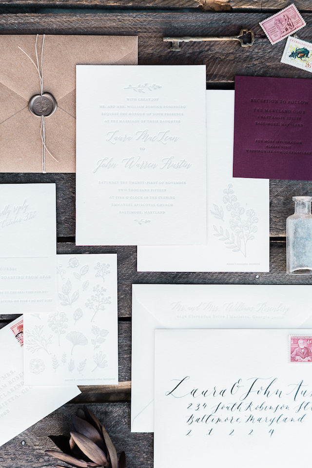
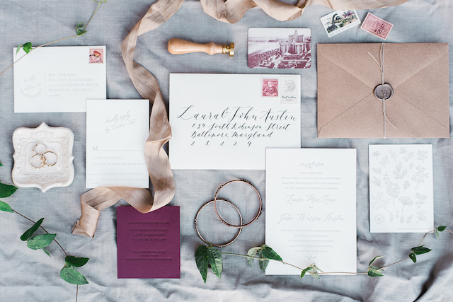
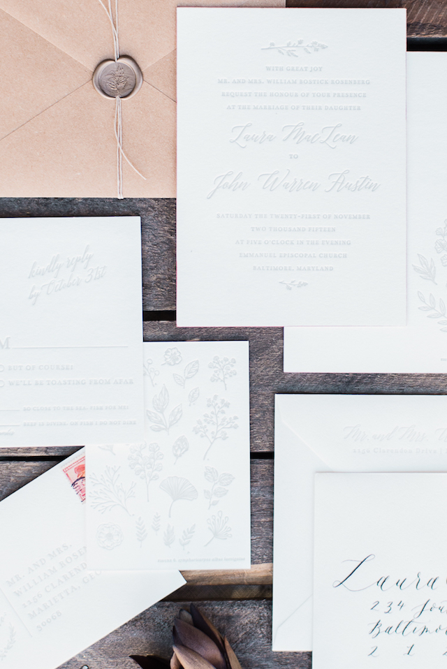
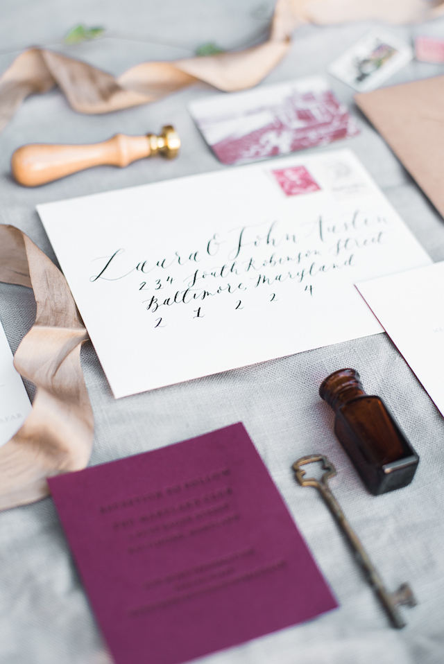
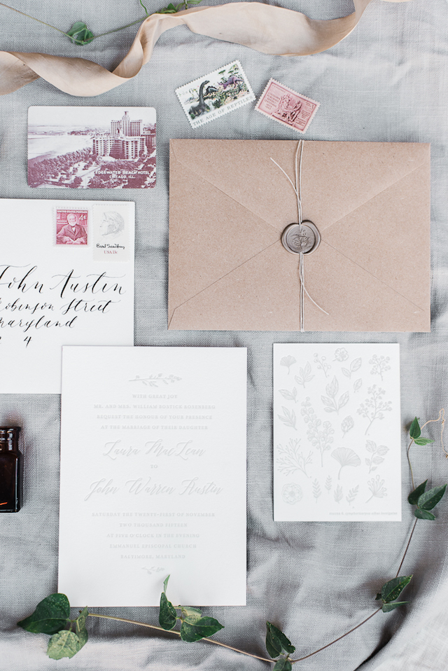
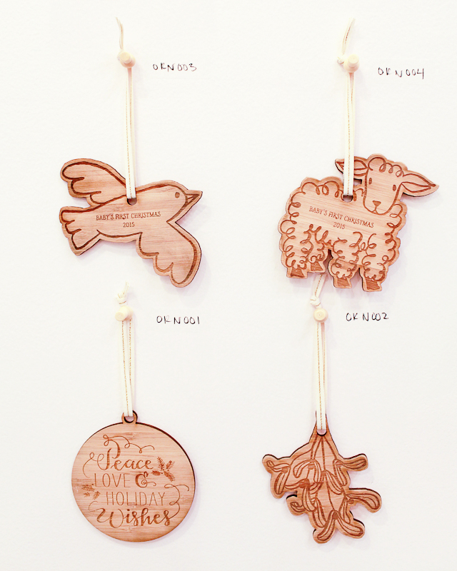
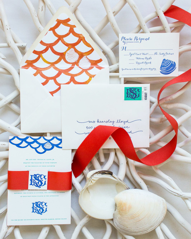
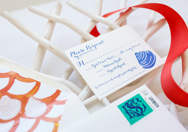
We specialize in letterpress printing, but offer foil printing, edge painting and embossing. We dip dye in house using a special technique that allows us to get really rich and textured color. We also work with handmade papers to create custom envelope liners and other special finishes. I’ve had a lot of people tell me that they like to frame our cards and I love that! We work hard to make sure everything we touch turns in to a piece of art which I think makes our card line unique.

Behind the Stationery: Underwood Letterpress / Oh So Beautiful Paper

We also have a love affair with vintage postage and offer curated postage sets through our Etsy shop. We believe that the outside of our mail should be just as pretty as the inside. The U.S. Postal Service has been issuing beautiful stamps for the last 150+ years, so why not send them out in to the world so they can be enjoyed! We just started selling our curated postage through card shops all over the country this year, so definitely be on the lookout!Behind the Stationery: Underwood Letterpress / Oh So Beautiful Paper

All photos by Jen Emerling.

Interested in being featured on the Behind the Stationery column? Please contact Megan at [email protected].

National Stationery Show 2015, Part 3

If you love color, you’re going to LOVE today’s recap from the 2015 National Stationery Show! From bright explosions of neon to understated pastels, each of the following stationers incorporated color (and more than a few pops of gold foil) into their booths in a major way. Let’s start with Parrott Design Studio – Sarah’s booth design with colorful oversized acrylic hearts was one of my favorites from the entire show! Sarah incorporated those same colors throughout her new designs, from letterpress and gold foil greeting cards to laser cut cake toppers!

NSS-2015-Parrott-Design-Studio-OSBP-1

NSS-2015-Parrott-Design-Studio-OSBP-4

NSS-2015-Parrott-Design-Studio-OSBP-9

NSS-2015-Parrott-Design-Studio-OSBP-13

NSS-2015-Parrott-Design-Studio-OSBP-17

NSS-2015-Parrott-Design-Studio-OSBP-18

NSS-2015-Parrott-Design-Studio-OSBP-21

NSS-2015-Parrott-Design-Studio-OSBP-23

NSS-2015-Parrott-Design-Studio-OSBP-26

NSS-2015-Parrott-Design-Studio-OSBP-28

NSS-2015-Parrott-Design-Studio-OSBP-29

NSS-2015-Parrott-Design-Studio-OSBP-35

Parrott Design Studio

Continue reading

Kearsley + Edward’s New England Quahog Wedding Invitations

Well this is fun! A collaboration between artist Kearsley Lloyd and Albertine Press, these invitations feature a bright and colorful color palette with a regional New England Quahog inspired design – and some beautiful watercolor illustrations to boot. Pretty!

New-England-Quahog-Wedding-Invitations-Kearlsey-Lloyd-Albertine-Press-OSBP5

From Kearsley: Having designed custom wedding monograms and crests for years, I was especially eager to craft an invitation suite for my own wedding. All of my designs begin by hand with an original watercolor and gouache illustration, which I then manipulate digitally. The watercolor painting is preserved for use on stationery and paper goods while the digital version can be converted to any color scheme to feature on embroidery, screen printing, stamping, and other decorative uses for weddings…and well beyond.

New-England-Quahog-Wedding-Invitations-Kearlsey-Lloyd-Albertine-Press-OSBP2

Our save the date was flat printed to preserve the unique appearance of the watercolor, and then invitations were letterpress printed by Albertine Press. It introduced and established the colorful theme and playful impression that carried through the invitation and entire sequence of wedding events.

New-England-Quahog-Wedding-Invitations-Kearlsey-Lloyd-Albertine-Press-OSBP3

New-England-Quahog-Wedding-Invitations-Kearlsey-Lloyd-Albertine-Press-OSBP7

Our wedding was to take place at my family’s home on the Rhode Island coast, so we chose to feature the well-recognized Rhode Island Quahog (also known as a cherrystone clam) in our theme. Since my husband and I live in Bermuda, a British colony, the Hog Penny had become a symbol of our new life together and a fun secondary theme. Finally, a little research turned up a handy coincidence: my fiancé’s Celtic family crest indeed featured wild boars! You can imagine what fun we had, once the ‘Qua-Hog’ theme was established!

New-England-Quahog-Wedding-Invitations-Kearlsey-Lloyd-Albertine-Press-OSBP6

I love taking a twist on traditional letterpress printing by infusing it with unusual colors and pattern. Echoing the fish scale pattern of our save the date card, I introduced an intertwined monogram design that served as the central theme of our wedding day décor. The painted edge on the invitation tied the color palette together beautifully. To that, I added a colorful tri-fold schedule of weekend events, as well as custom postage for the outer and RSVP envelopes. The design from the back of the dave the date greeting became the perfect pattern for the envelope liner, and my vibrant watercolor map design was a handy travel guide, included in a welcome bag for out-of-town guests.

New-England-Quahog-Wedding-Invitations-Kearlsey-Lloyd-Albertine-Press-OSBP

New-England-Quahog-Wedding-Invitations-Kearlsey-Lloyd-Albertine-Press-OSBP4

New-England-Quahog-Wedding-Invitations-Kearlsey-Lloyd-Albertine-Press-OSBP8

New-England-Quahog-Wedding-Invitations-Kearlsey-Lloyd-Albertine-Press-OSBP9

Thanks Kearsley and Abby!

Design: Kearsley Lloyd

Letterpress Printing: Albertine Press

Styling: Abby Capalbo

Calligraphy: Deanna Wiles

Custom Postage: Zazzle.com

Albertine Press is a member of the Designer Rolodex – you can see more of their fabulous work right here!

Photo Credits: Erin McGinn