August Desktop Downloads!

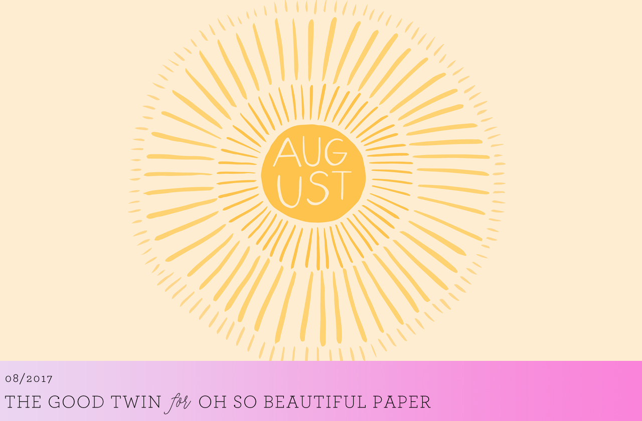
Oh, hello there August! The sun is shining and the weather is hot hot hot, but pretty soon we’ll be talking about going back to school and changing seasons. So let’s enjoy summer while we can with three gorgeous new illustrated August wallpapers from The Good Twin and Li Ward! As always, we have both desktop and iPhone sizes, so you can pick your favorite for both devices or change it up with two different wallpapers. We’ve got watercolor farmer’s market vibes, cacti, and a bright sun – which will you choose????

August Cactus Wallpaper by The Good Twin for Oh So Beautiful Paper

Desktop | iPhone

August Sun Wallpaper by The Good Twin for Oh So Beautiful Paper

Desktop | iPhone

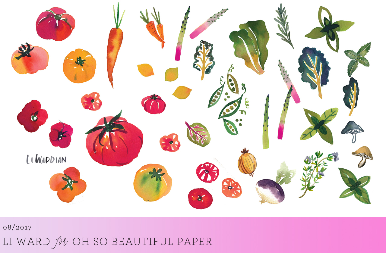
Watercolor Farmer's Market Wallpaper by Li Ward for Oh So Beautiful Paper

Desktop | iPhone

Illustrations © The Good Twin and  Li Ward. All artwork is made available for personal use only. By downloading the wallpapers you agree to the terms of use.

p.s. If you’re a designer or illustrator interested in contributing your own designs to this column, please email your design to hello(at)ohsobeautifulpaper.com with the subject line “desktop downloads” and image files in both desktop and iPhone retina screen sizes. If it’s a good fit I’ll add it to the post for the following month!

NSS 2017: New Exhibitors, Part 1

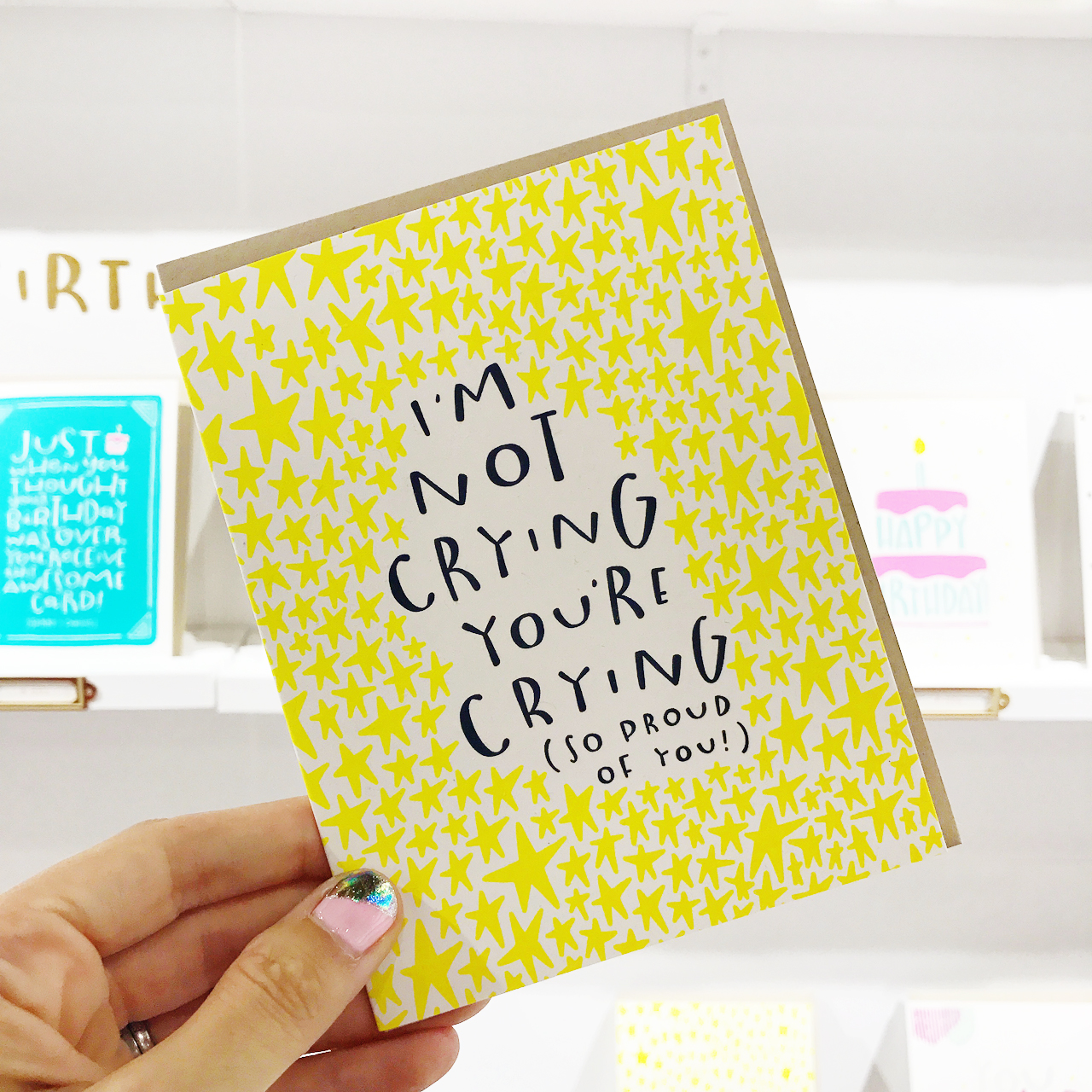
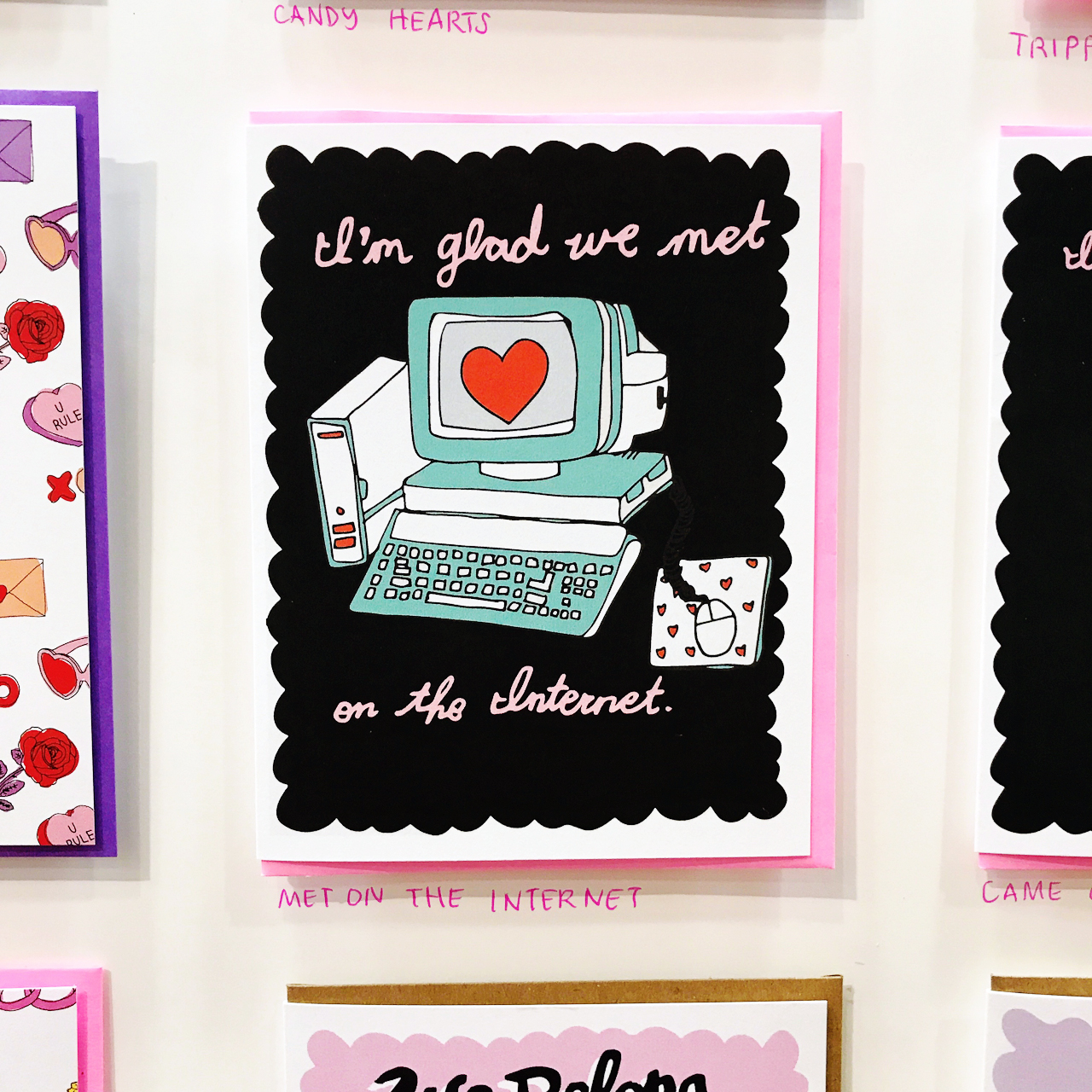
There are always a slew of new exhibitors at every National Stationery Show, and this year was no exception! Some of the new exhibitors have been on my radar for years but just made their trade show debut this year, while others are new-to-me businesses (always a pleasant surprise at the show!), and even others are just launching their businesses. Today I thought I would introduce you to a few of those new exhibitors – with a few more to come tomorrow. Let’s start with the playful hand lettered greeting cards from Pinwheel Print Shop, definitely one of my faves from this year’s show!
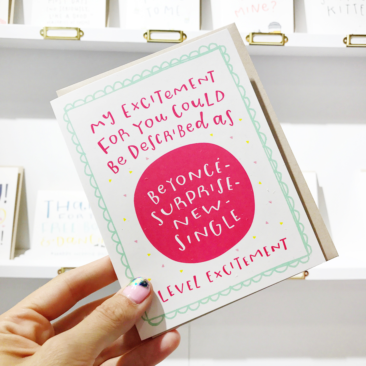
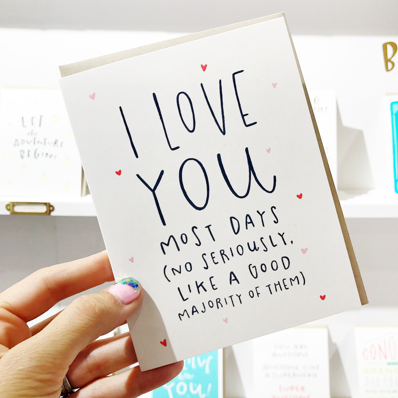
NSS 2017: Pinwheel Print Shop

NSS 2017: Pinwheel Print Shop

NSS 2017: Pinwheel Print Shop

Pinwheel Print Shop (see the full booth here!)

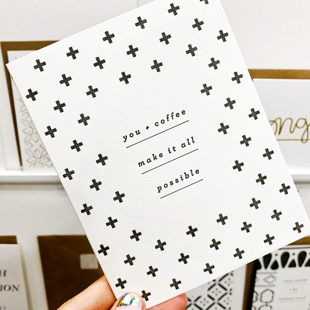
I love the clean, elegant aesthetic of these cards from Bred & Butter Paper Co. – those pops of color are so good paired with classic black text!
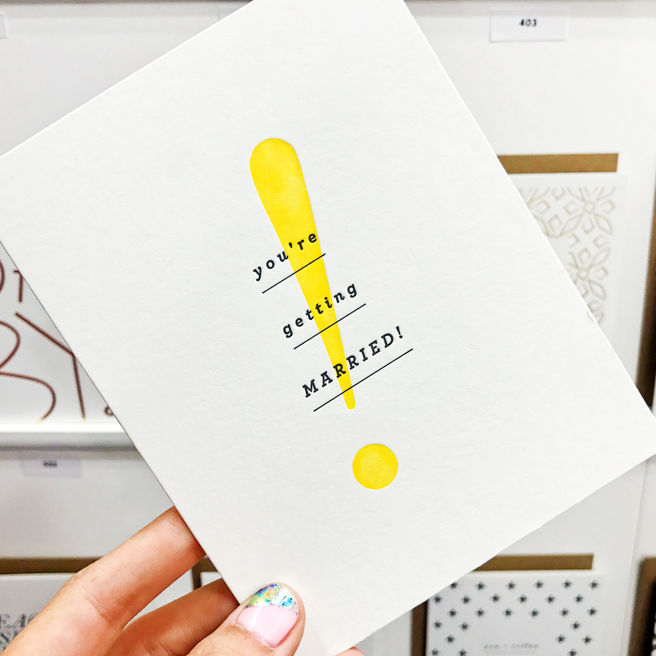
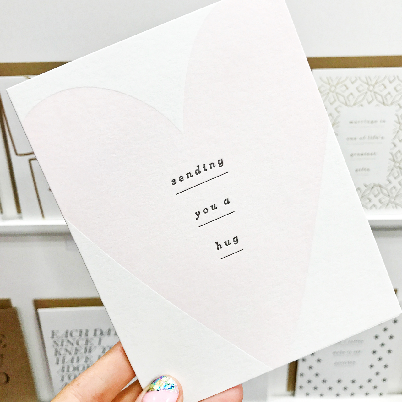
NSS 2017: Bred & Butter Paper Co.

NSS 2017: Bred & Butter Paper Co.

NSS 2017: Bred & Butter Paper Co.

Bred & Butter Paper Co. (see the full booth here!)

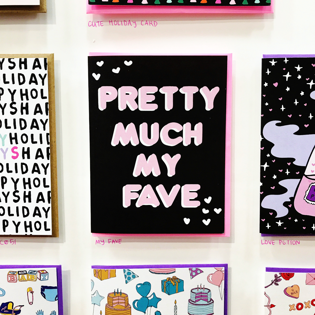
It was hard to miss the bold, colorful style of Brooklyn-based Ash + Chess, for good reason! Their illustration and hand lettering style is so fresh and unique.
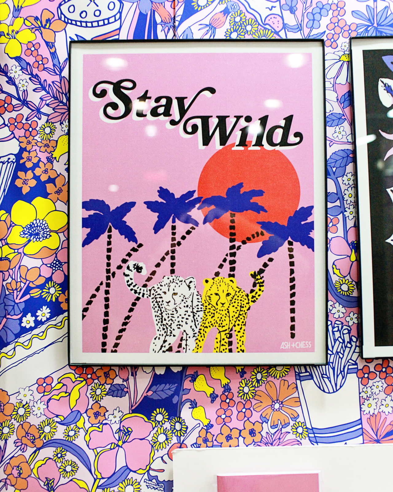
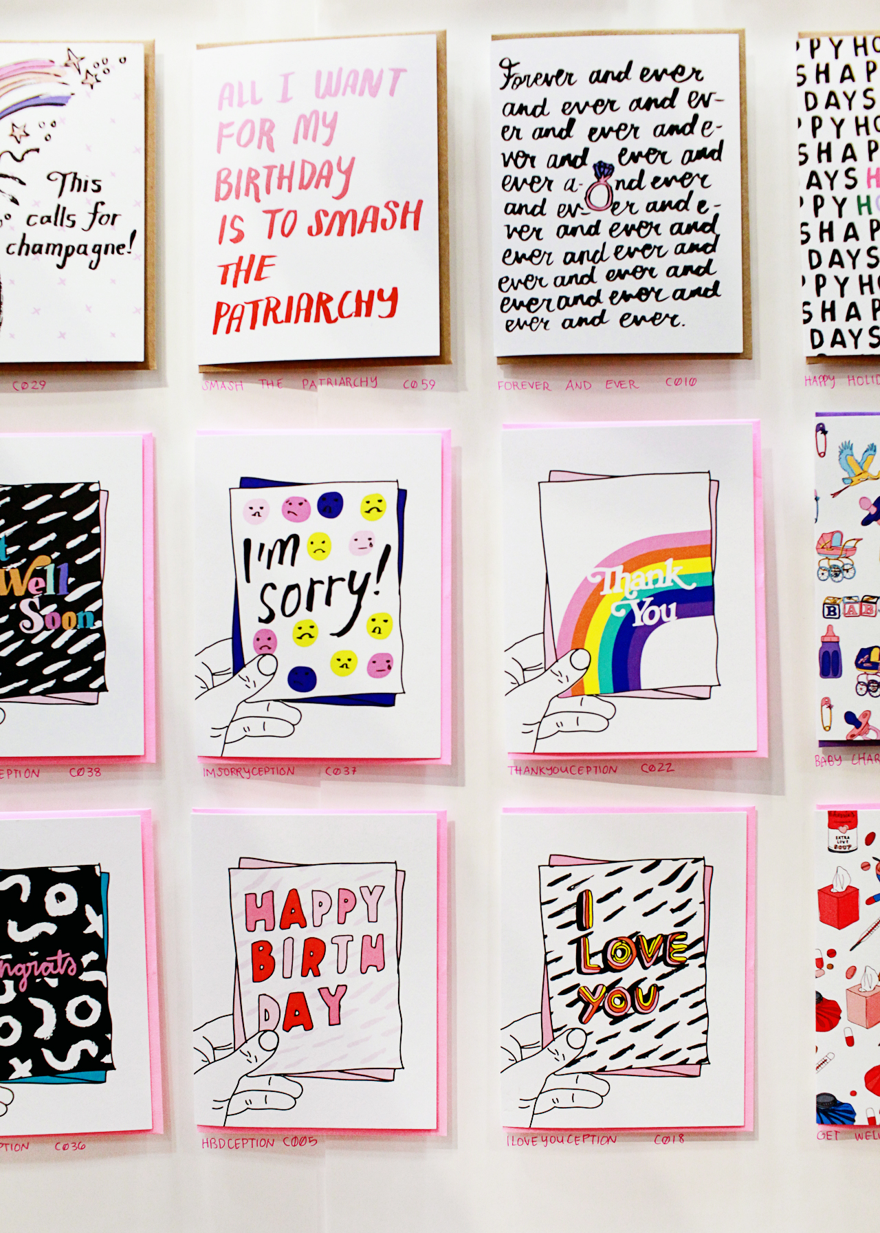
NSS 2017: Ash and Chess

NSS 2017: Ash and Chess

NSS 2017: Ash and Chess

NSS 2017: Ash and Chess

Ash + Chess (see the full booth here!)

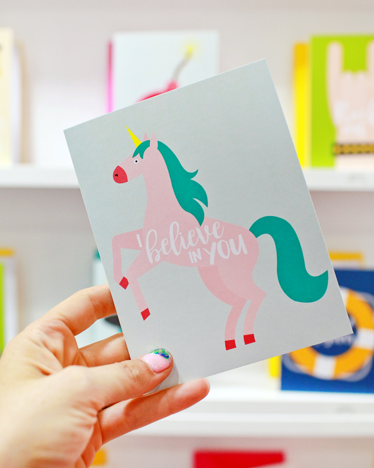
I love cards that make me laugh! The Lovebird Paper booth was full of bold, sassy humor – from greeting cards to notepads and mugs. So fun!
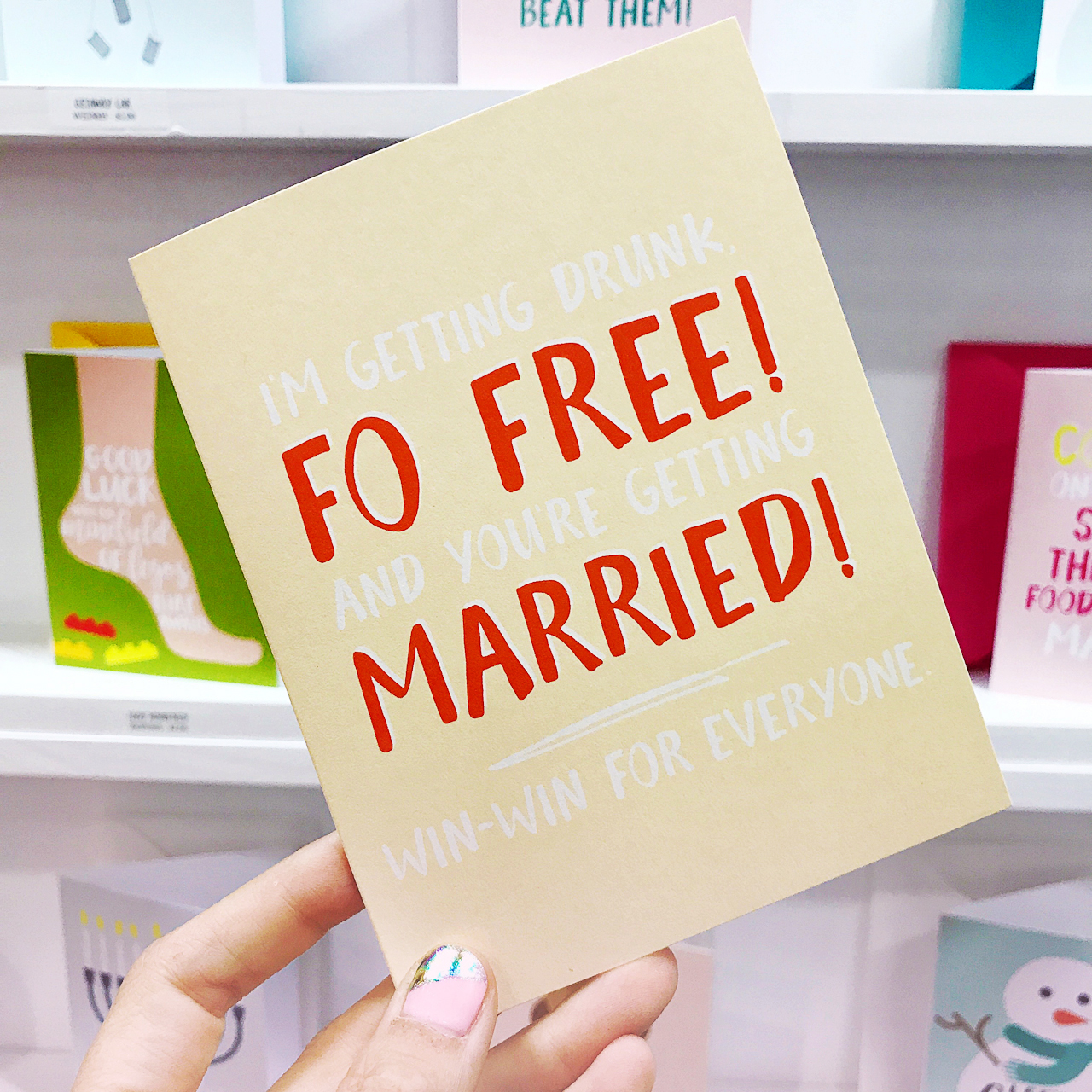
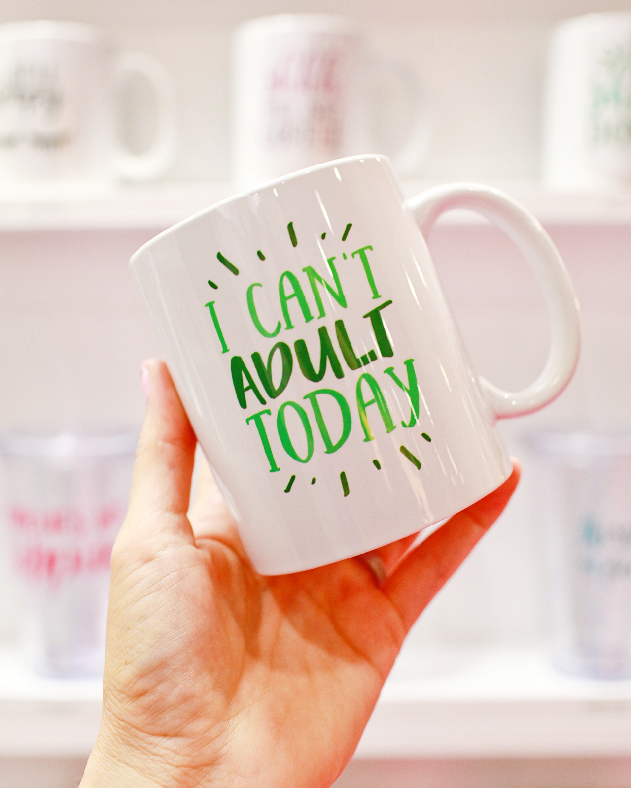
NSS 2017: Lovebird Paper Co.

NSS 2017: Lovebird Paper Co.

NSS 2017: Lovebird Paper Co.

Lovebird Paper Co. (see the full booth here!)

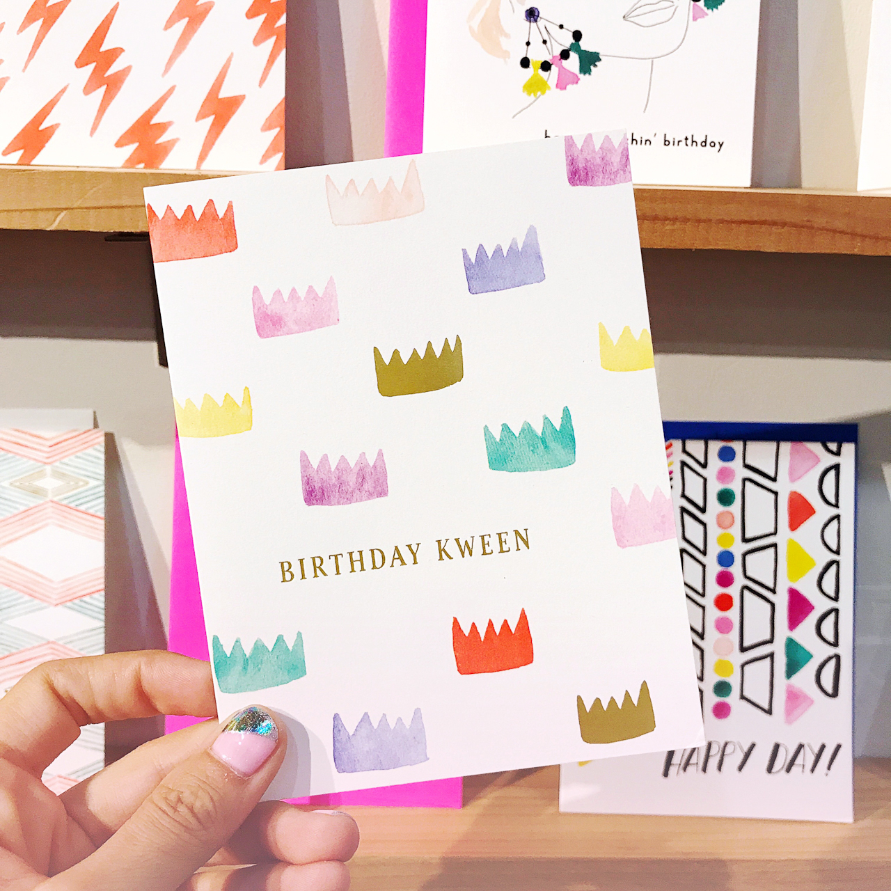
So many beautiful gems in Party Sally’s debut at the National Stationery Show! Each design is created from an original watercolor painting or illustration, with plenty of shiny gold foil sprinkled throughout the collection.
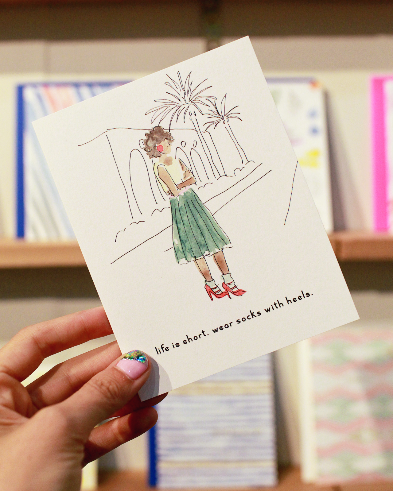
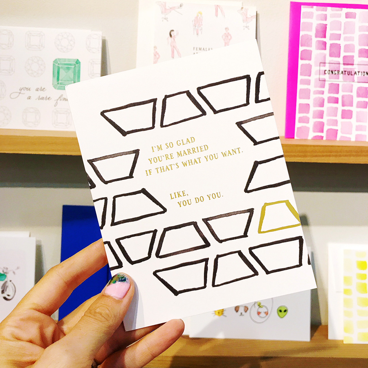
NSS 2017: Party Sally

NSS 2017: Party Sally

NSS 2017: Party Sally

Party Sally (see the full booth here!)

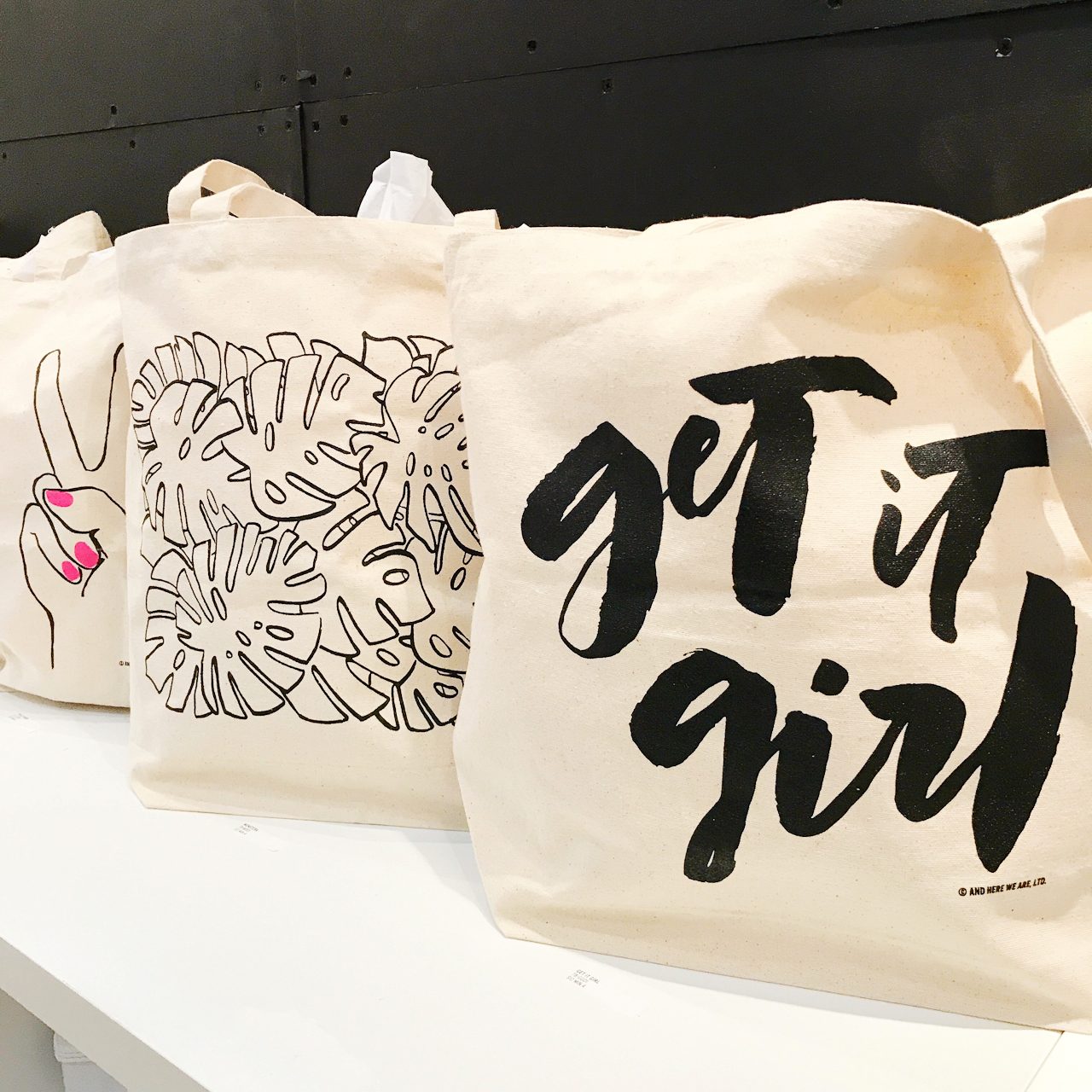
I’m a huge fan of the bold, graphic style of And Here We Are. Gotta love those monstera leaf illustrations and pops of neon!
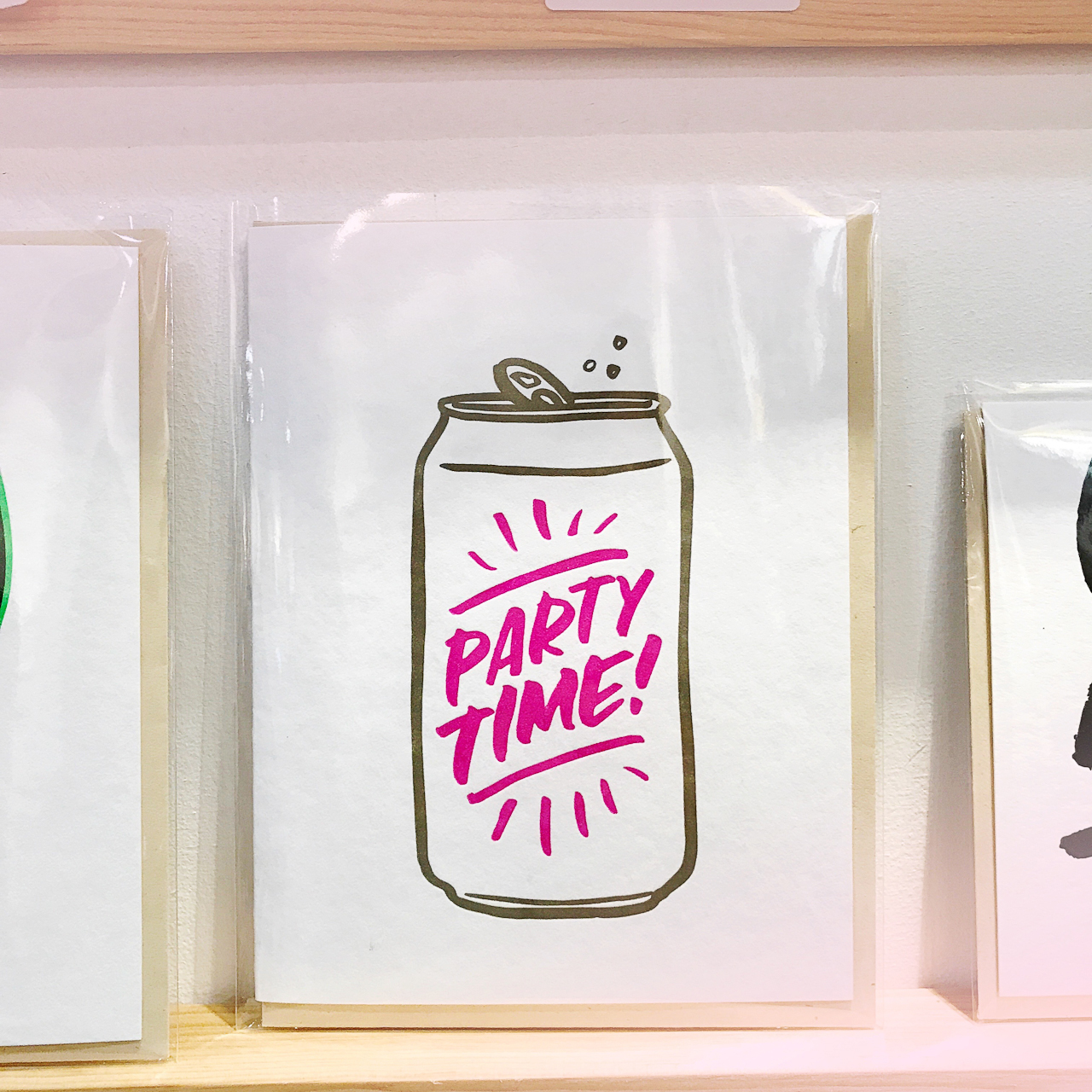
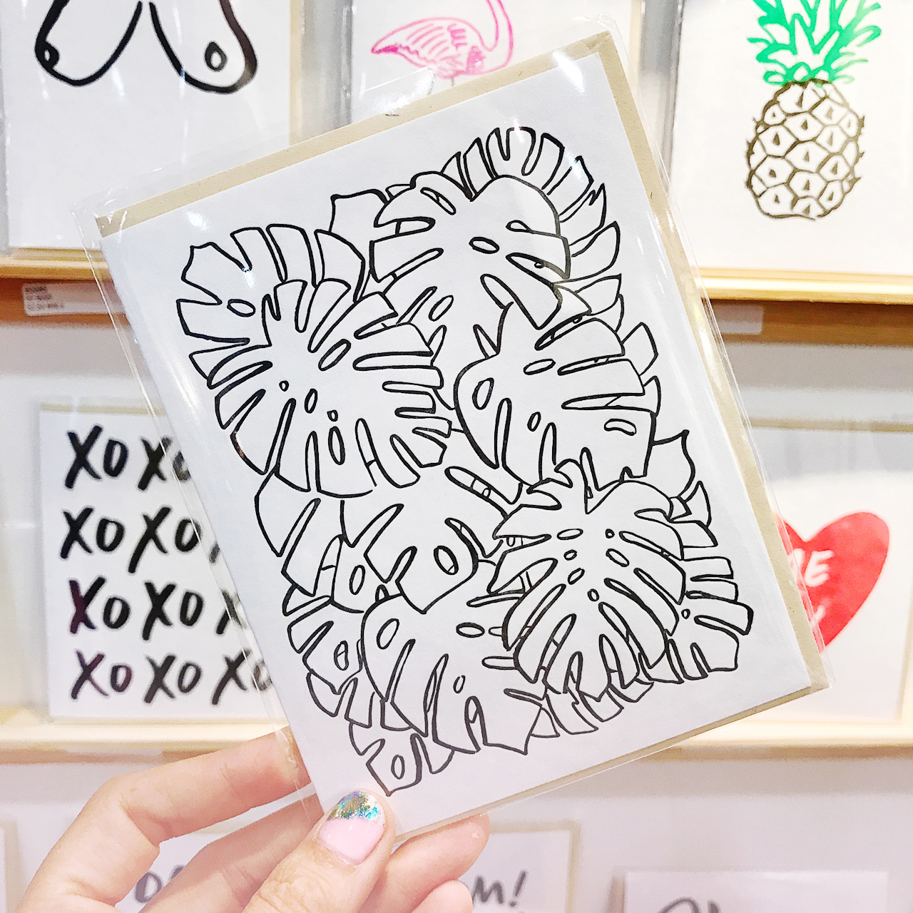
NSS 2017: And Here We Are

NSS 2017: And Here We Are

NSS 2017: And Here We Are

And Here We Are (see the full booth here!)

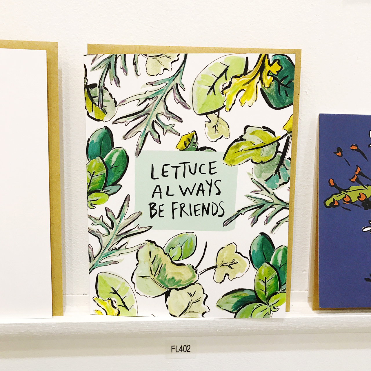
Ivy House was a surprise find at this year’s show – I just love her illustration style and sweet sentiments! Designer and illustrator Rachel Cohen previously worked in textile design and art education, which definitely shines through her loose, nature-inspired patterns and illustrations.
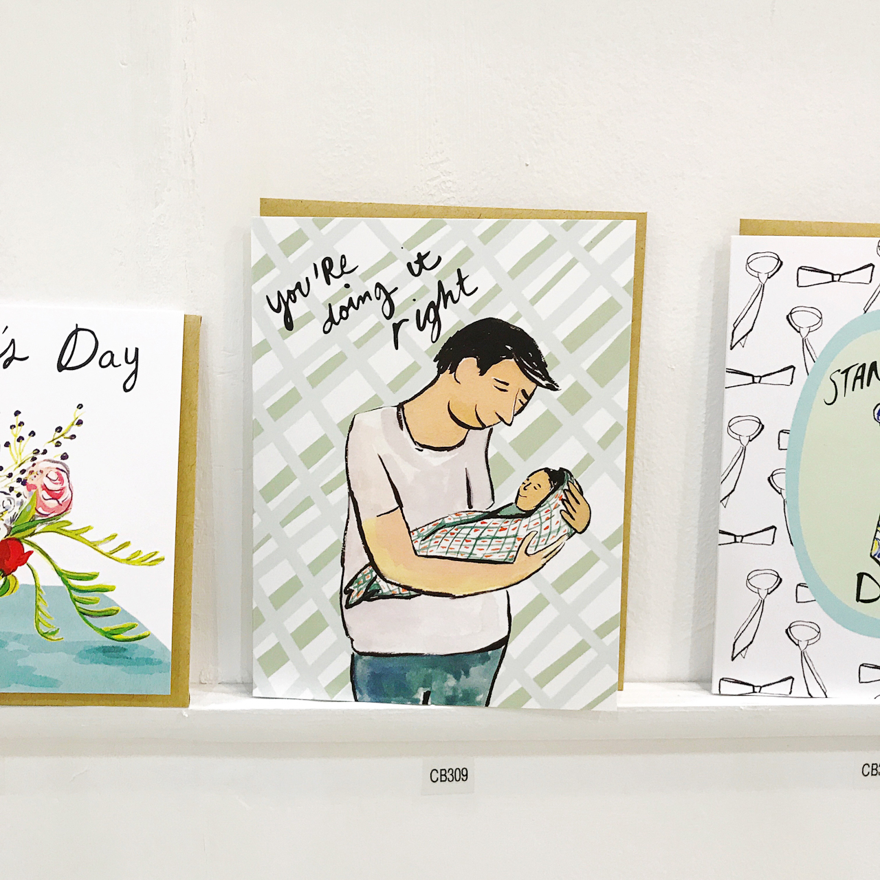
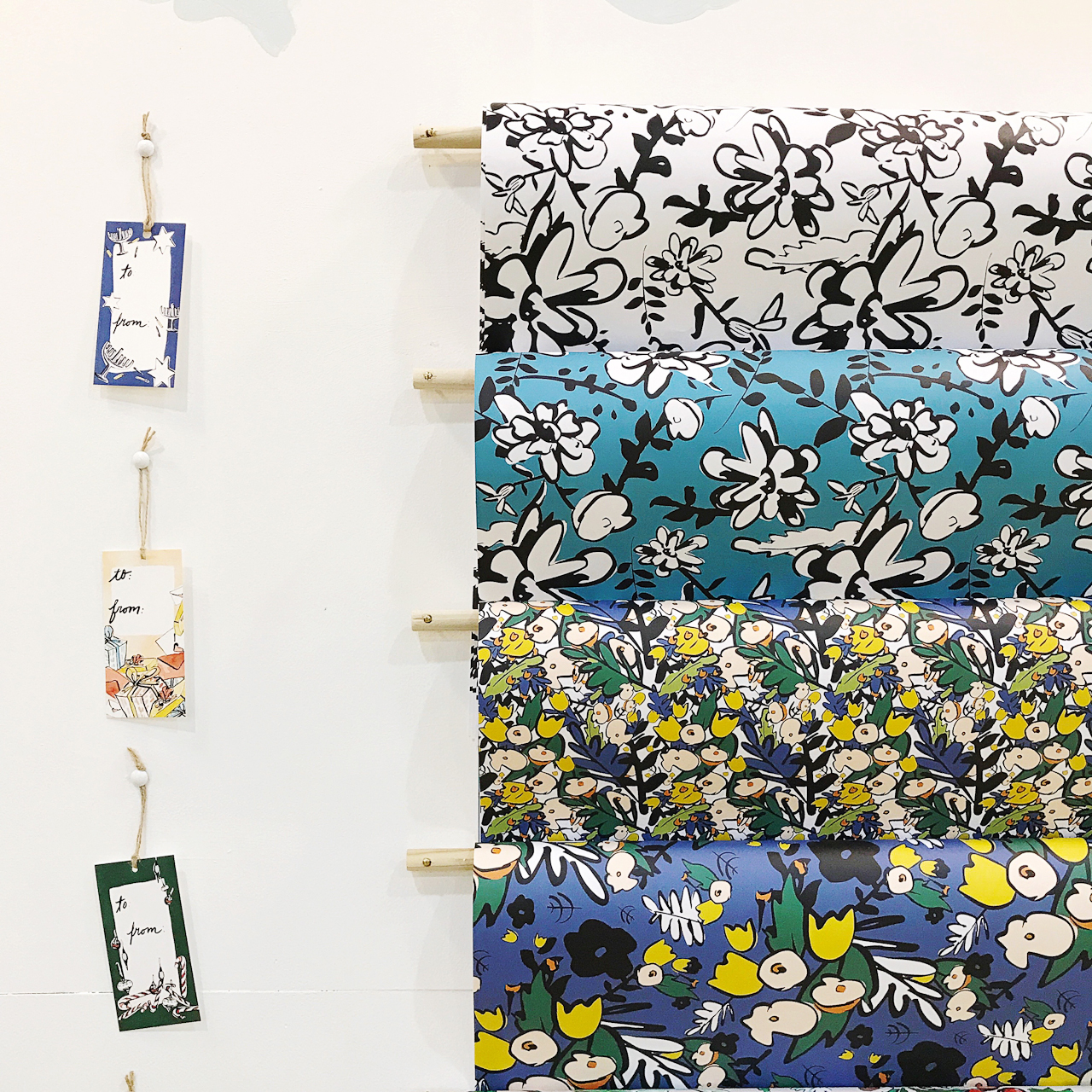
NSS 2017: Ivy House

NSS 2017: Ivy House

NSS 2017: Ivy House

Ivy House (see the full booth here!)

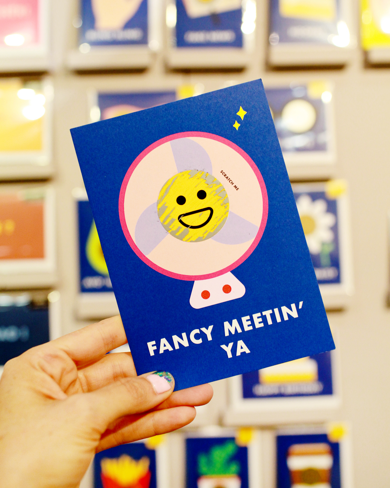
I literally stopped and did a u-turn after spotting these colorful pencils from UK-based I Am A out of the corner of my eye. Isn’t this unicorn set (with rainbow foil!!) the CUTEST??? I also love the cheerful emoji cards and scratch off cards – with a secret emoji hidden underneath!
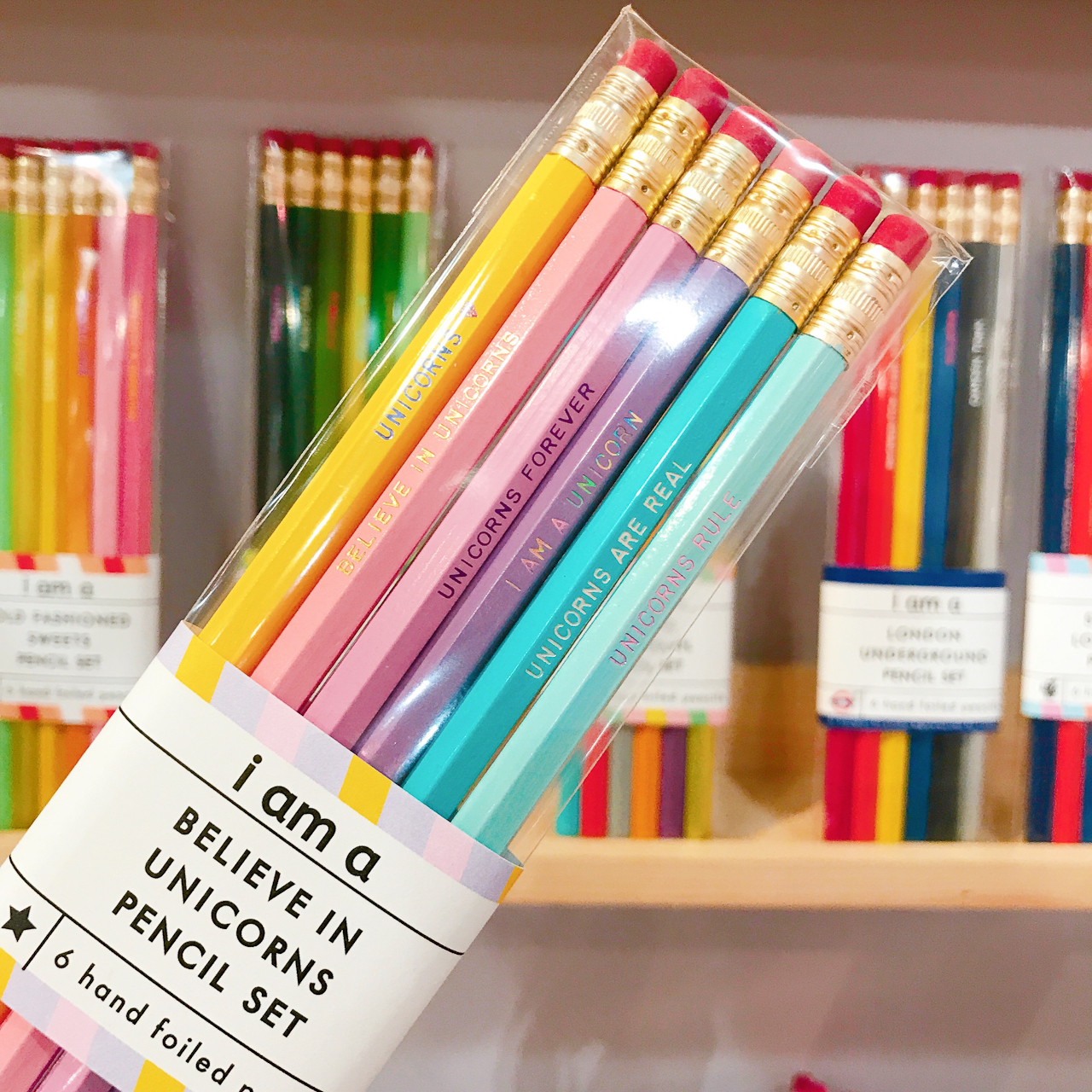
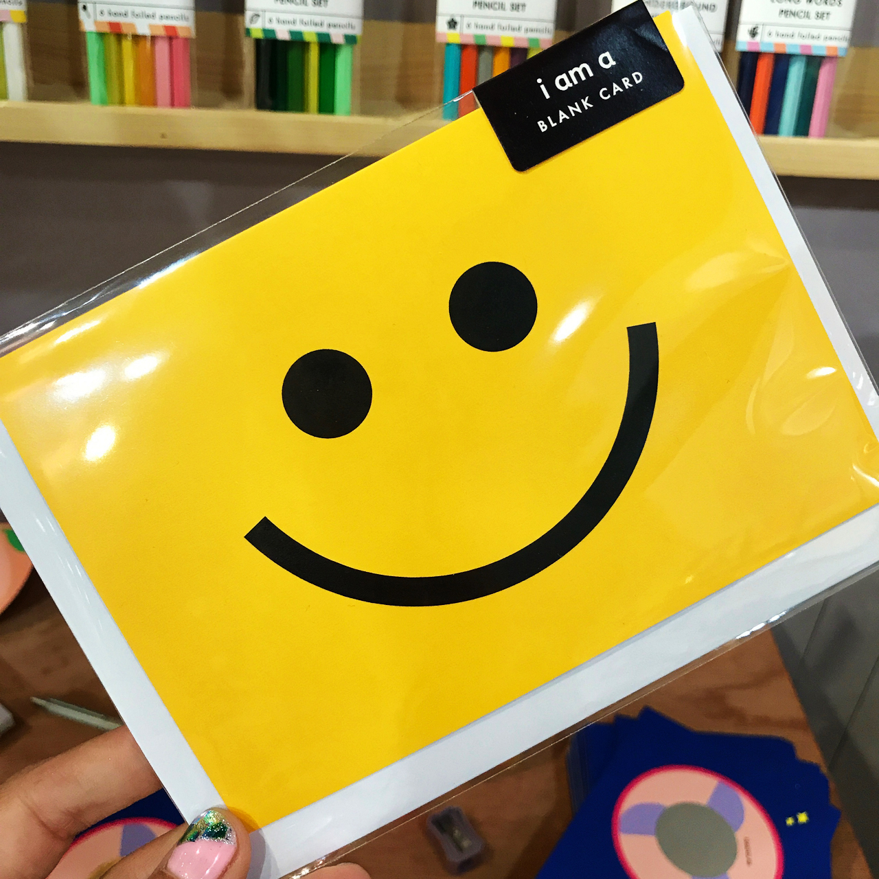
NSS 2017: I Am A (London)

NSS 2017: I Am A (London)

I Am A (London)

I Am A (see the full booth here!)

I mentioned Tokketok in the round up of beautiful booth designs, and the products inside were equally gorgeous! I particularly love these gold foil notepads, which come with a variety of messages in rainbow colors. Keep a couple of notepads at the office to write out quick thank you notes or birthday notes to colleagues, or even at home to leave little love notes for your spouse or kids!
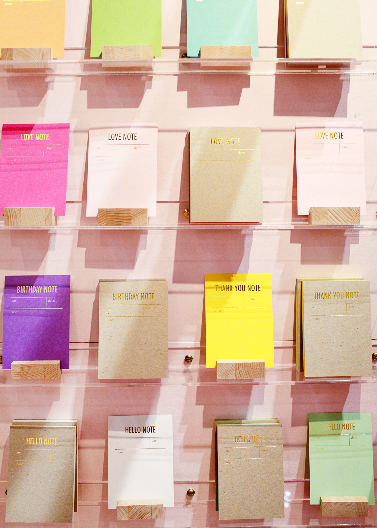
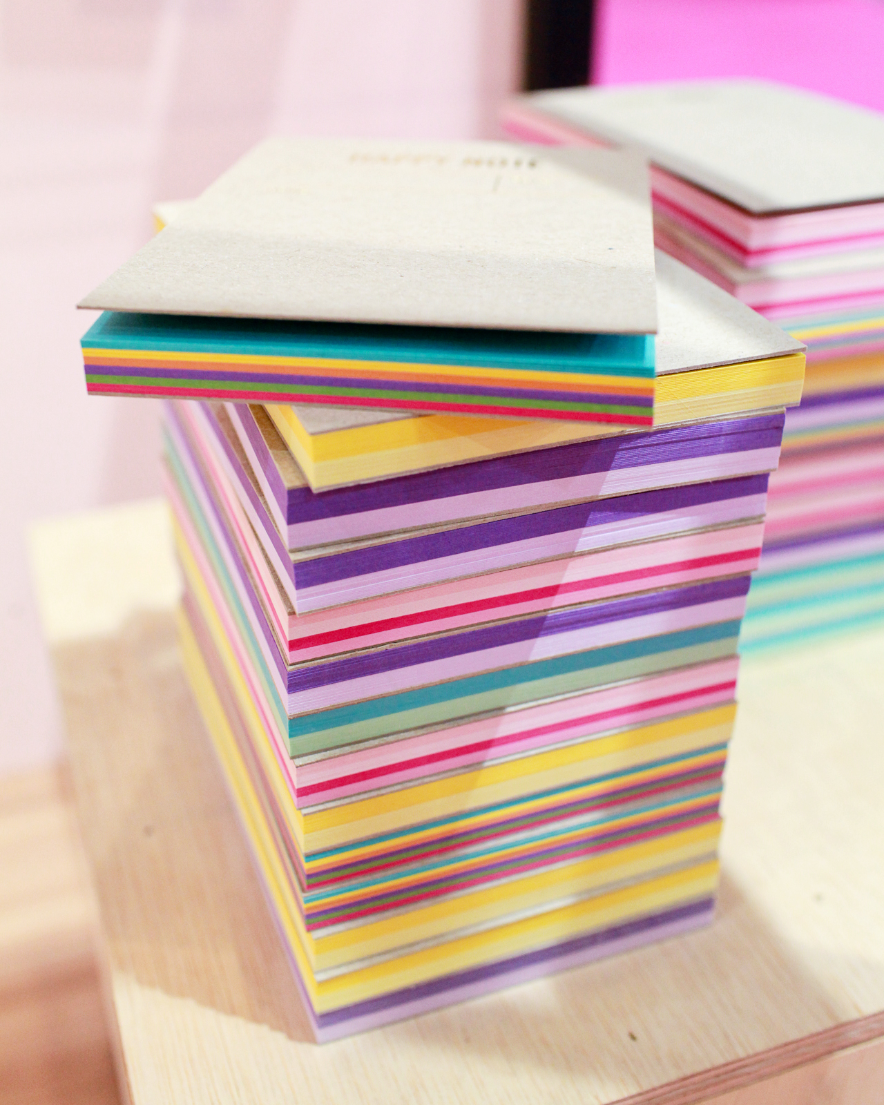
NSS 2017: Tokketok

NSS 2017: Tokketok

Tokketok (see the full booth here!)

That’s it for today! You can browse all the booths from this year’s show right here, and I’ll be back with more new exhibitors tomorrow!

Photo Credits: Nole Garey for Oh So Beautiful Paper
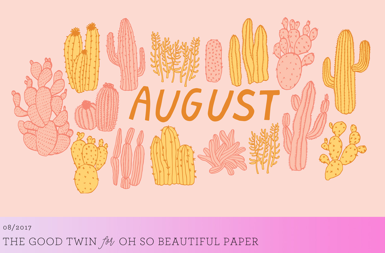
Happy Weekend!

Happy Friday everyone! It’s raining cats and dogs outside right now (and will for most of the weekend), so I guess we’re in for a cozy weekend at home! For any aspiring calligraphers out there, this is the perfect time to sign up for the Calligraphy Portfolio Challenge with the Modern Calligraphy Summit! It’s a four week email challenge that helps you build your portfolio and attract your first clients! Topics include sourcing supplies, time to write, photographing your work, and sharing your work. And if you haven’t yet signed up for the Summit, you can also do that here! It would be like Calligraphy Summer Camp!

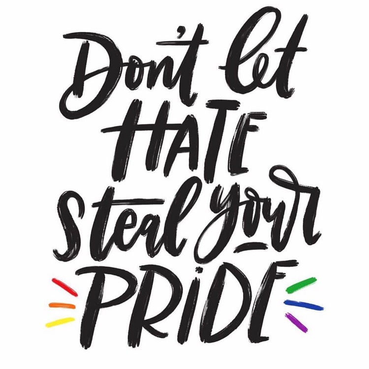
Don't Let Hate Steal Your Pride by Manayunk Calligraphy

Image by Manayunk Calligraphy, because anyone who wants to serve their country, who is willing to risk their life in defense of their fellow citizens, should be allowed to serve regardless of their sexual orientation, gender at birth, race, etc. Full stop.

A few links for your weekend!

The unfolding nightmare in Somalia. I spent eight years working on Somalia when I was at the State Department, so this is an area of the world is near and dear to my heart. The humanitarian situation is absolutely heartbreaking.

Turns out I’m part of a micro generation between Gen X and Millennials. I’ve never really identified as either generation, so this makes SO much sense!

Loving this sputnik-inspired chandelier (it also comes in a gold finish!)

This is interesting: Pantone Diplomacy

How to watch the upcoming solar eclipse safely

I’m on the hunt for a couple cute new pairs of shoes. So far I’m loving these hologram ballet flats, these ruffled sandals and these cute wraparound gingham flats (which are on sale, and an extra 25% off with code FRIDAY!)

Oooh, these chunky sandals are also really cute (and 30% off right now!)


This week on Oh So Beautiful Paper:

I’ve been having so much fun taking classes on Skillshare – and you can get two free months of premium membership!

The most beautiful booth designs and all the lady power vibes at this year’s National Stationery Show

Behind the Stationery with Ramona & Ruth

So many ideas for incorporating acrylic details into your wedding!

You’re going to want to make this Rosé and Blood Orange Sgroppino


Rosé and Blood Orange Sgroppino

We’re big fans of a boozy slushie, and today we’re taking a new recipe for a spin: Rosé and Blood Orange Sgroppino! In case you haven’t heard of Sgroppino, it’s a traditional Italian after-dinner treat that involves lemon sorbet mixed with vodka and topped with Prosecco. Of course, I decided to mix things up a little bit with a sparkling Rosé! It’s a fun alternative to Frosé and doesn’t require freezing Rosé ice cubes overnight, so you can easily whip this up on the fly. Just add a scoop of your favorite sorbet and top with a sweet, sparkling Rosé!

RoséŽ and Blood Orange Sgroppino

To make the Rosé and Blood Orange Sgroppino, just add a scoop of your favorite sorbet to a large glass, then top with 3-4 ounces of sparkling Rosé. To make an even boozier version of this drink, use 3 ounces of sparkling Rosé and 1 ounce of limoncello. You can also whisk the ingredients together in a large bowl or cocktail shaker, then pour into a cocktail glass, which might be easier if you’re making a large batch for guests.

RoséŽ and Blood Orange Sgroppino

For a mocktail version of Sgroppino, swap out the sparkling Rosé and limoncello in favor of this Belvoir Elderflower and Rose sparkling lemonade over a scoop of sorbet. Easy peasy!

RoséŽ and Blood Orange Sgroppino

Have you been to Italy? I’ve been twice: first just after I graduated from high school, then again six years ago with my husband, Andrew (you can see photos from that trip here!). I loved it so much each time I visited and I dream of going back someday with my girls! The last time we went, we were there for 10 days and mostly stuck to southern Italy: we visited Rome, Sorrento, and Positano. It was halfway through Andy’s 6-month deployment to Iraq, and we didn’t have children yet, so we pretty much just ate, drank, and explored our way through those 10 days. It was GLORIOUS. We found the most beautiful little gelateria in Positano and would stop by every day for an afternoon treat of melon sorbet and coconut gelato. I’d love to visit northern Italy someday, specifically Florence and Venice (where Sgroppino originates from).

RoséŽ and Blood Orange Sgroppino

Doesn’t Sgroppino sound like the most perfect summer treat? Try it for yourself – you won’t regret it!

Glassware by Liquorary

Photo Credits: Nole Garey for Oh So Beautiful Paper
This post contains affiliate links. By clicking on these links, you’ll help support Oh So Beautiful Paper while also purchasing some fantastic products. We only recommend products that we truly love and trust that you’ll love, too. Our full disclosure policy can be found here.

Wedding Stationery Inspiration: Acrylic Details

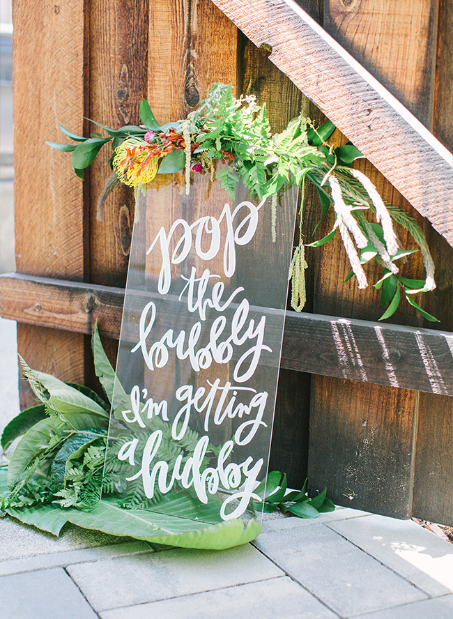
A few years ago, we did a really fun DIY neon acrylic menu tutorial – and these days, acrylic is everywhere! And it totally makes sense. Acrylic (aka plexiglass) is super versatile (especially for weddings), inexpensive, and can be customized to suit any color palette. Make signs, menus, place cards, cake toppers… you name it! – Annie

Wedding Stationery Inspiration: Acrylic Details / Oh So Beautiful Paper

Welcome guests with a graphic acrylic sign. I love the addition of florals and greenery. | Photography: Yasmin Sarai, Design: Abby of Beijos Events, Signs: Meghann Miniello via Inspired By This

Wedding Stationery Inspiration: Acrylic Details / Oh So Beautiful Paper

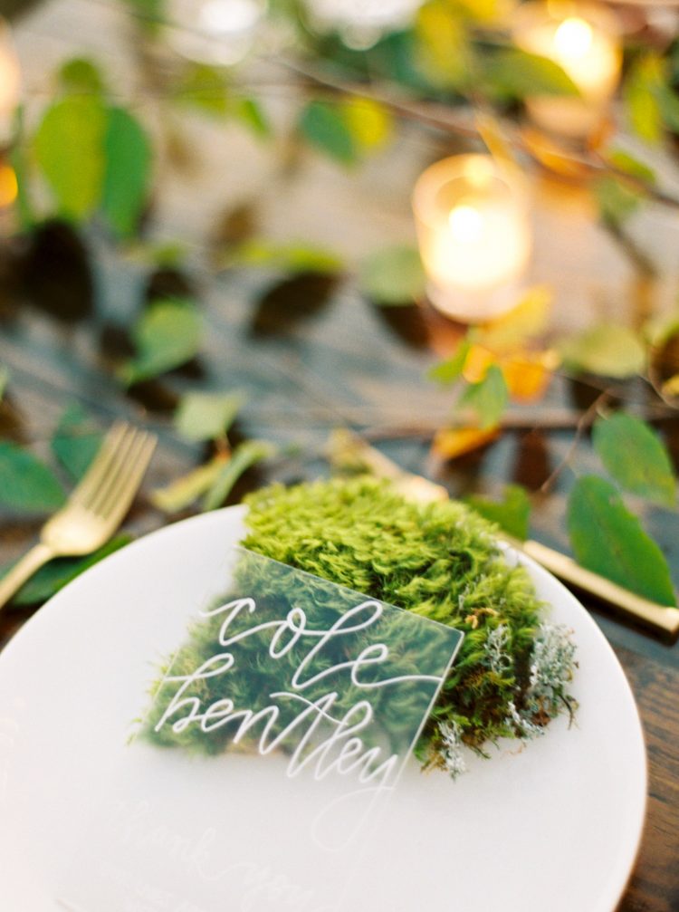
The white calligraphy on this acrylic place card really pops against the moss! | Photography: Erich McVey, Event Design & Planning: We Tie the Knots via Once Wed

Wedding Stationery Inspiration: Acrylic Details / Oh So Beautiful Paper

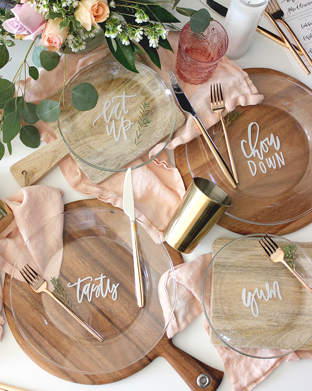
Look familiar? Of course I had to include these plates featured a few years ago! They could also double as place cards. | Printable Artwork: Lauren Saylor of A Fabulous Fete for Oh So Beautiful Paper
Wedding Stationery Inspiration: Acrylic Details / Oh So Beautiful Paper

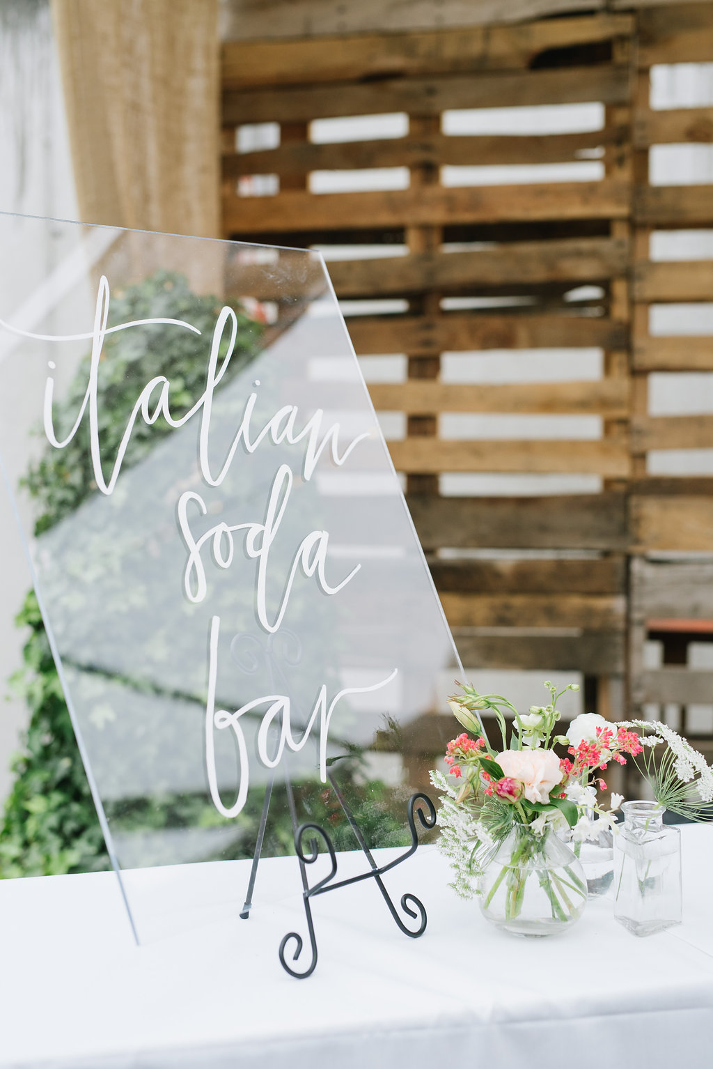
An acrylic bar sign looks sleek and doesn’t clutter up your bar. | Photography: Jessica Kettle, Calligraphy: Lavender + Pine via Rachael Ellen Events

Wedding Stationery Inspiration: Acrylic Details / Oh So Beautiful Paper

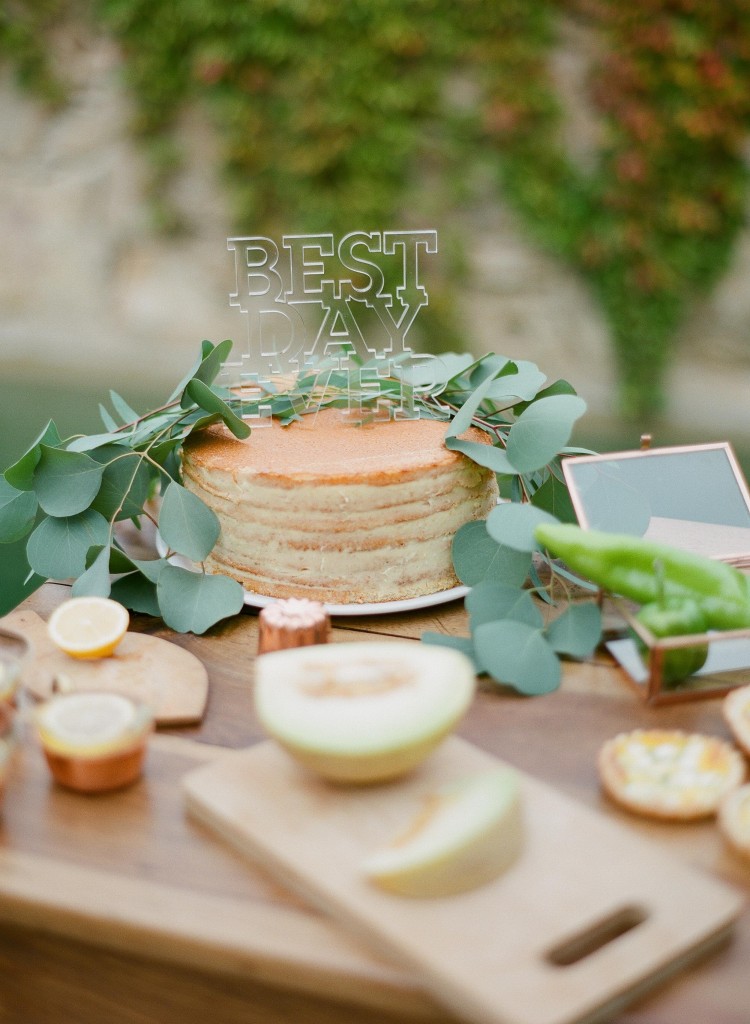
I love the contrast of the acrylic cake topper and naked cake. | Photography: Greg Finck Photography, Planning & Design: Majenia via Green Wedding Shoes

Wedding Stationery Inspiration: Acrylic Details / Oh So Beautiful Paper
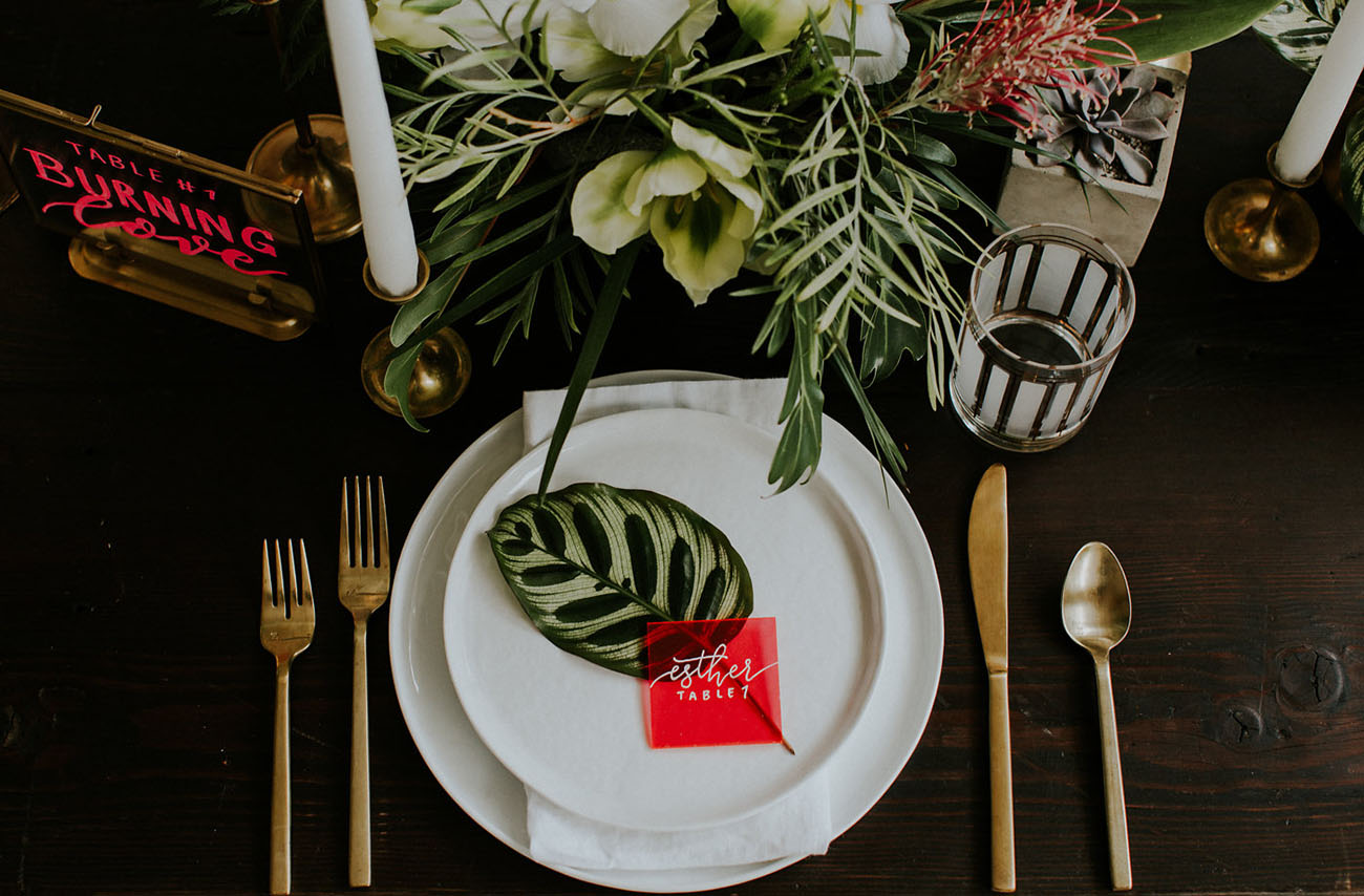
These colorful acrylic signs are a modern way to add color to your place setting. | Photography: Hazelwood Photo, Event Design & Planning: Something Borrowed PDX, Signage: Letters & Dust via Green Wedding Shoes

Wedding Stationery Inspiration: Acrylic Details / Oh So Beautiful Paper

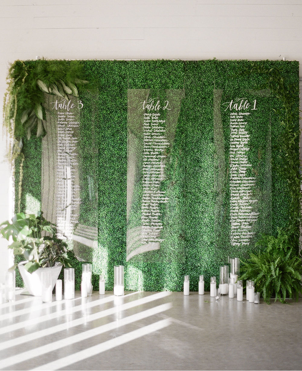
Hang seating charts in front of greenery, making them easier to read. | Photography: Matthew Moore Photography, Event Design & Planning: BW Theory, Paper Goods: Dear Darling Calligraphy via Green Wedding Shoes

Wedding Stationery Inspiration: Acrylic Details / Oh So Beautiful Paper

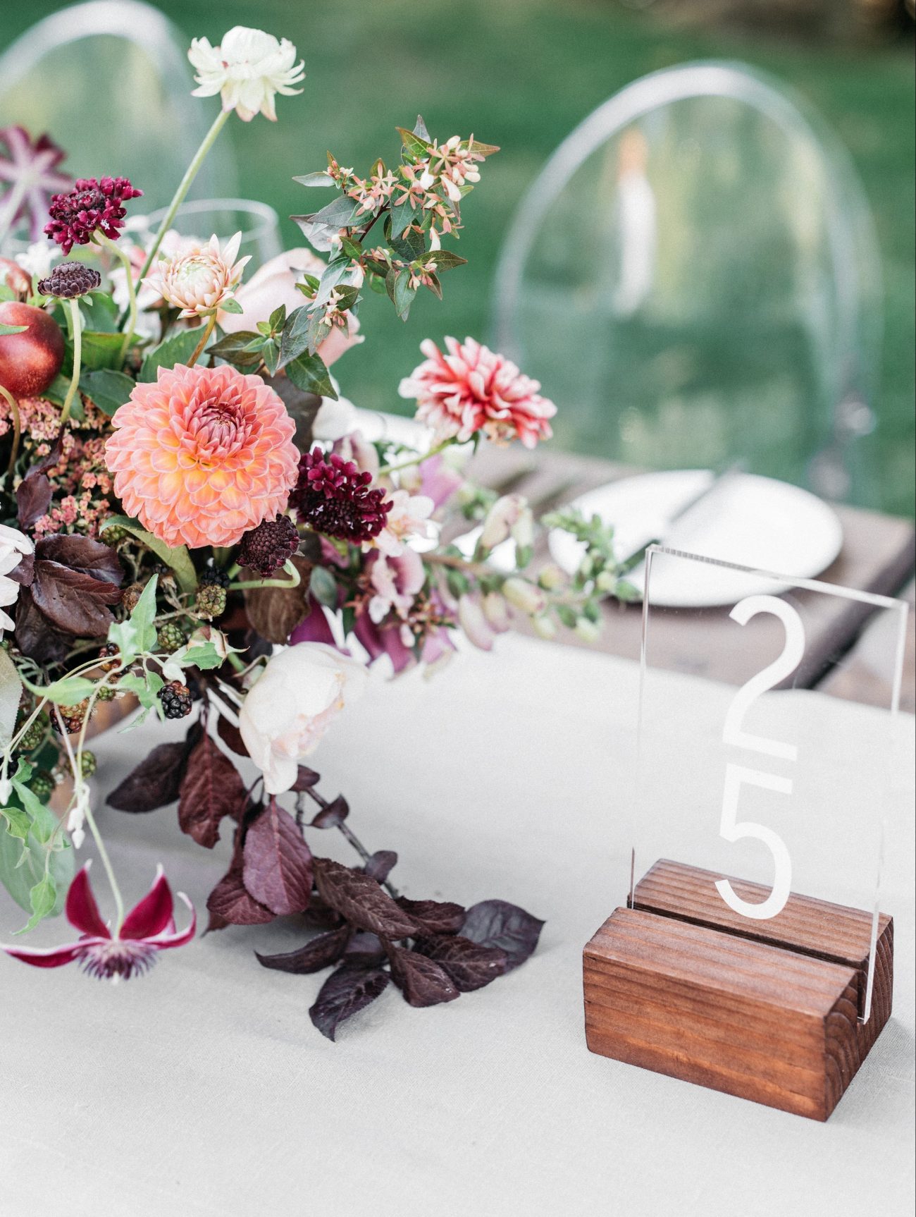
Acrylic table numbers don’t distract from the rest of your table decor. | Photography: Kate Holstein, Design: Joy Thigpen via Once Wed

Wedding Stationery Inspiration: Acrylic Details / Oh So Beautiful Paper
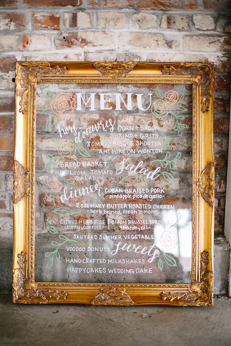
A gold frame gives this acrylic menu a more traditional look. | Photography: James Christianson, Planner: Calluna Events, Calligraphy and Signage: Whimsy Design via Calluna Events

Wedding Stationery Inspiration: Acrylic Details / Oh So Beautiful Paper

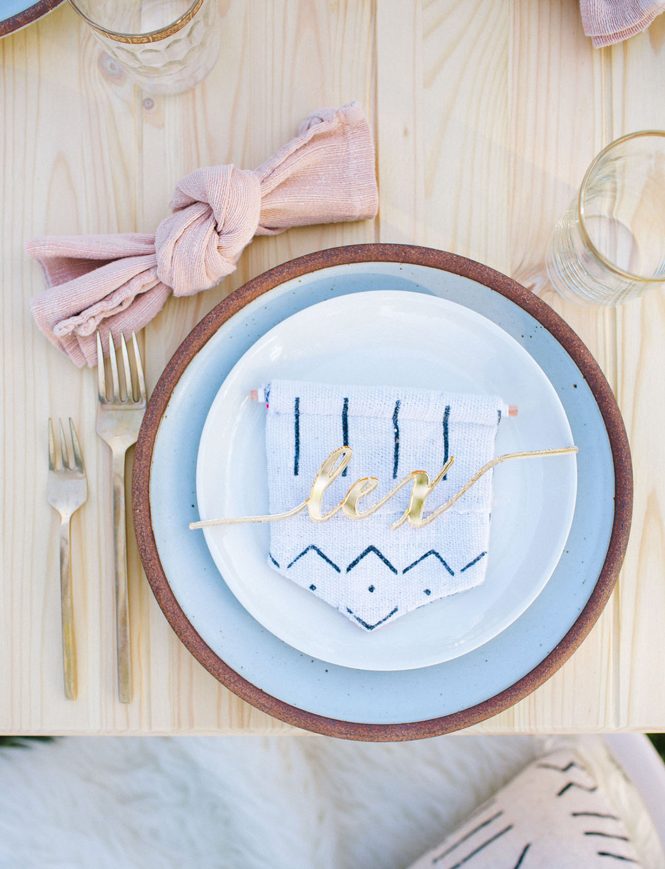
How amazing are these laser cut names?! | Photography: Ally Burnette, Acrylic Place Cards: De Lovely Details via Green Wedding Shoes
Did any of you incorporate acrylic elements into your wedding? Or are any of you planning to use acrylic elements in your wedding? Let us know in the comments!