Summer Giveaway with Moontree Letterpress

Happy Mon­day every­one – and I hope all my East Coast readers are okay after the hurricane this weekend!  I can’t believe we’re already at the end of summer, but here it is, the last week of August!  We’re start­ing the week off with the final installment in our sum­mer con­test series with Moon­tree Let­ter­press!  In case you missed it before, here’s a bit of back­ground on the con­test and how to enter.  The win­ner with the best six word story will receive 50 per­son­al­ized let­ter­press note­cards!  We thought it would be only fitting that the theme for this week be “Last Days of Summer” – feel free to leave mul­ti­ple comments/entries, and don’t be afraid to get creative!

The giveaway will be running all week, so you’ll have until 11:59 p.m. EST on Friday to leave your entry in the com­ments below, then Rebecca will announce the win­ner on her blog!  And just in case you need some inspi­ra­tion, you can check out these six word auto­bi­ogra­phies.  Bonne chance!

Photo Credit: Moon­tree Letterpress

{happy weekend!}

It’s been quite a week here in DC!  First an earthquake on Tuesday and now we’re bracing for some heavy rain and wind from Hurricane Irene this weekend.  As a girl who was born in California and grew up in Florida, I’ve experienced my share of earthquakes and hurricanes – just never in the same week!  My in-laws are coming to visit this weekend, so we’re trying to come up with some fun indoor activities for the next couple of days.  But in the meantime…

…a few links for your weekend!

Bella Figura

Smock

This week on Oh So Beautiful Paper:

I hope you all have a wonderful weekend – and for those of you on the East Coast, stay safe!  I’ll see you back here on Monday!  xoxo

Photo Credit: Ampersand by Zim and Zou via Plenty of Colour

*Smock and Bella Figura are two of my fab­u­lous spon­sors; for more on my edi­to­r­ial poli­cies please click here.

Colleen + Paul’s Illustrated Cartography-Inspired Wedding Invitations

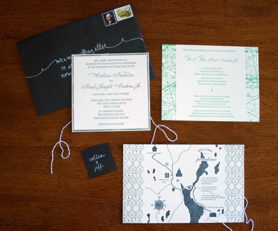
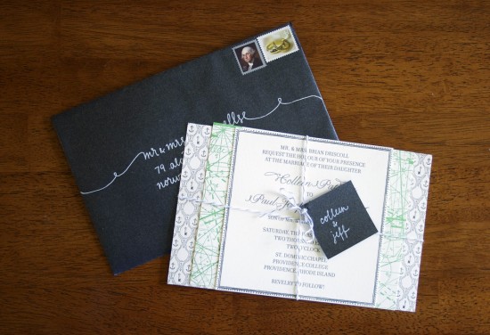
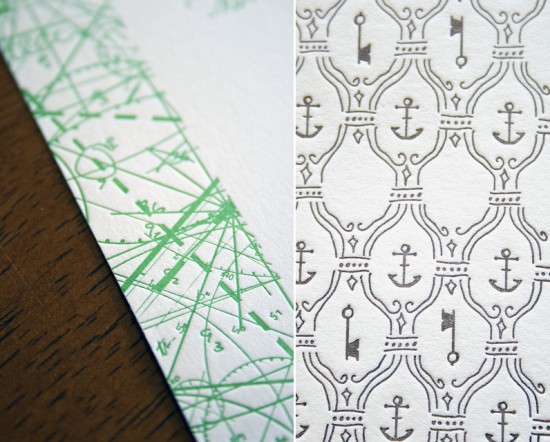
I couldn’t end the week without featuring these beautiful cartography-inspired wedding invitations, designed by the bride and groom and printed by the lovely Colleen Ellse.  You might remember Paul and Colleen’s silhouette save the dates from a few months back, and the wedding invitations continued the illustrated feel along with the gray and green color palette.  I’m loving the cartography border on the information card and the anchor illustration on the hand drawn map.  The bride also did the calligraphy – isn’t it so pretty??

Modern-Cartography-Letterpress-Wedding-Invitations

Modern-Cartography-Letterpress-Wedding-Invitations-White-Calligraphy

Modern-Cartography-Letterpress-Wedding-Invitations-Detail

Get the full details over on Colleen‘s blog, Craft Lovely.

Photo Credits: Colleen Ellse | Craft Lovely

*Colleen Ellse is one of my fab­u­lous spon­sors, but she had no idea I was going to write this post today; for more on my edi­to­r­ial poli­cies please click here.

Jason’s Modern Nursery Alphabet Blocks

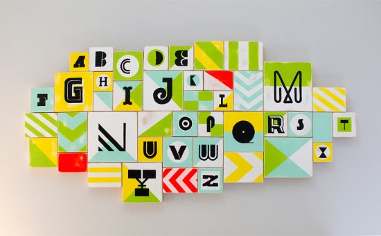
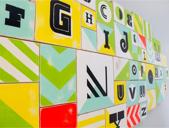
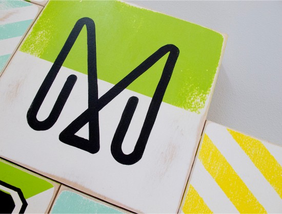
We’re starting today off with something a little different – this very cool alphabet installation that designer Jason Gomez created for his daughter’s nursery.  Jason and his wife didn’t know the gender of their baby, Jason wanted to keep the color palette neutral while incorporating lots of pattern and interesting letter shapes.  The result is very cool – and something that his baby girl will enjoy for years to come!

From JasonThis is somewhat a big project for a small person that is now the love of our lives in our new family.  I decided to create a custom alphabet painting for our first baby girl Alena to hang in her room.  Since we didn’t want to know the gender of our baby until she was born I wanted to keep the colors neutral to work for either a boy or a girl but to keep it bright and fun.

Since I love typography I wanted to showcase various type styles for each letter form along with some simple colorful shapes and patterns.  It was a labor of love for me, incorporating various sizes of wood canvases and various types of mediums from house paint to acrylic and paint pens.  In the end the overall piece measured up to 67″ wide to 32″ high, a big bold colorful piece for our beautiful little girl.

Thanks Jason!

Photo Credits: Jason Gomez

Red and White Modern Letterpress Wedding Invitations

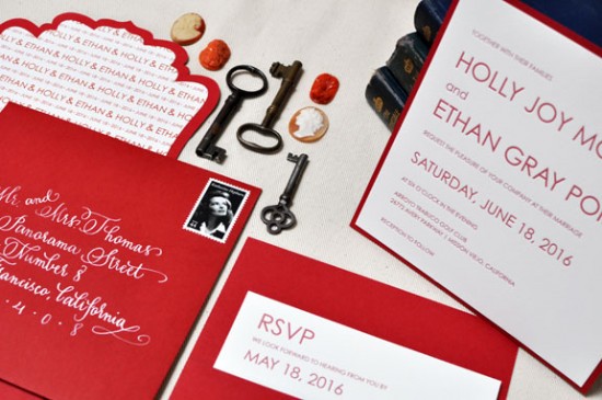
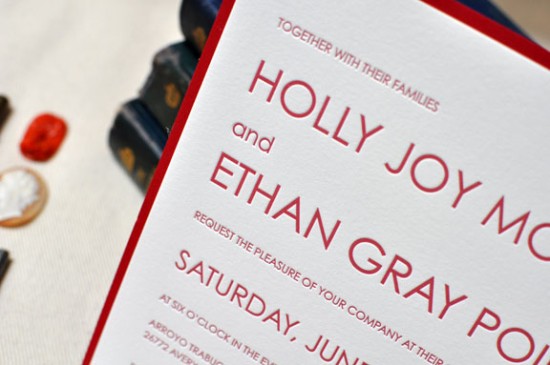
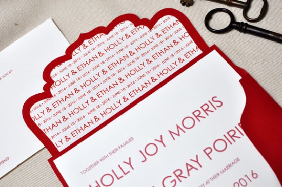
Theresa from b.t. elements sent over these beautiful red and white invitations from her brand new letterpress collection.  Theresa chose a minimalist and crisp design for the main invitation while bringing in a unique die cut outer envelope and bold white calligraphy.  Theresa even did the beautiful calligraphy herself – so pretty!

From Theresa: I love the beauty of the letterpress printing process and wanted to design an invitation that was clean and simple, working with just the relationship of small and large type.  The crisp design of this invitation was really inspired by the printing method itself.  I’m always inspired by strong bold colors that stand well on their own – red is one of those colors.  It’s bold, striking, and just a timeless color.

At b.t. elements we’re known for our custom pockets and folders, so I added in a very simple back pocket – you always need a place to tuck in those extra enclosures.  And we never overlook the envelope.  Our fancy cut envelopes are new this year and a big hit.  It’s so wonderful to see that envelope come in the mail.

The handwriting on the envelope is my own; I’ve been trying to teach myself calligraphy so I’ll take any practice I can get.  I love the contrast of the white on red.

Lovely!  Thanks Theresa!

Photo Credits: b.t. elements