Classic Gray and French Blue Letterpress Wedding Invitations

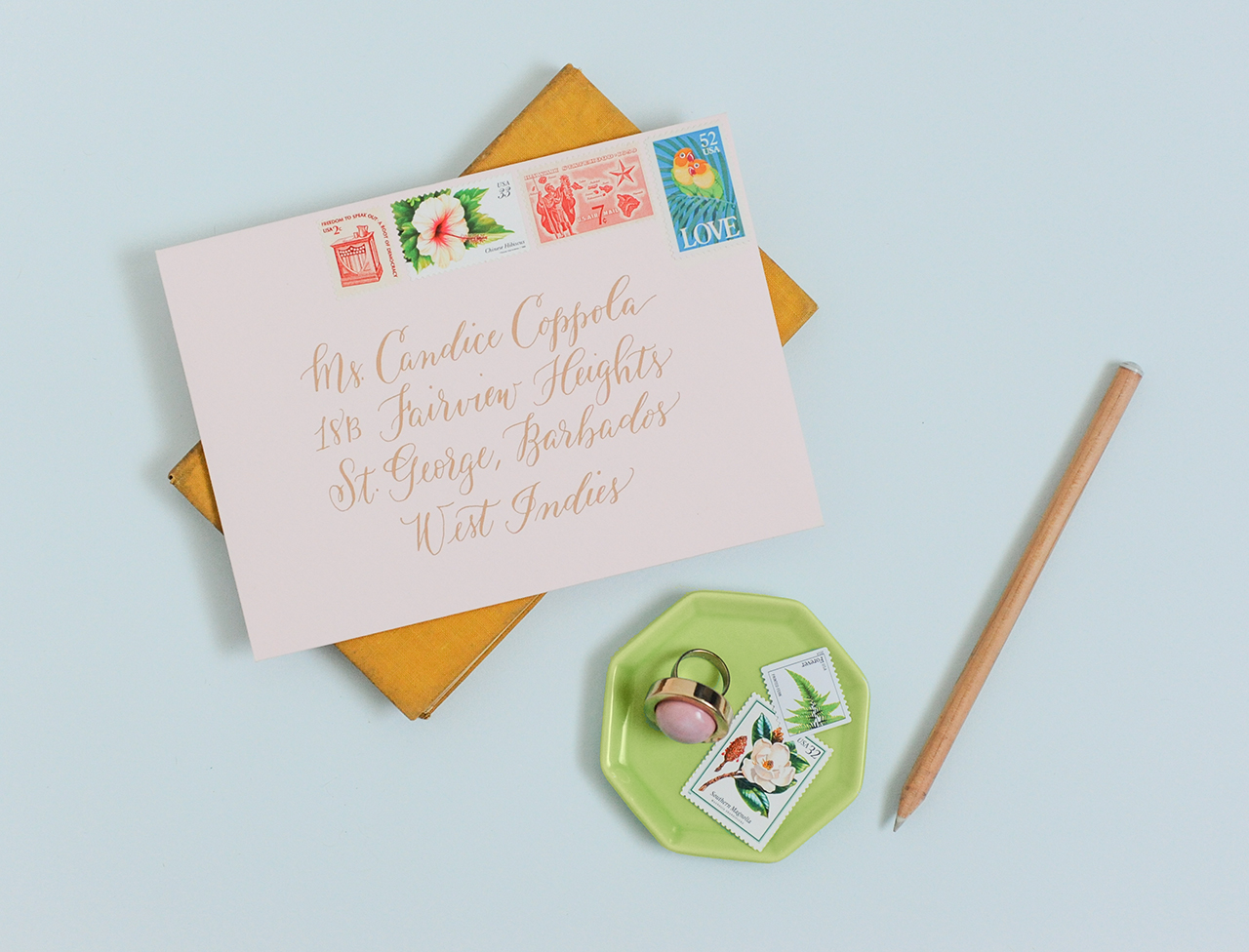
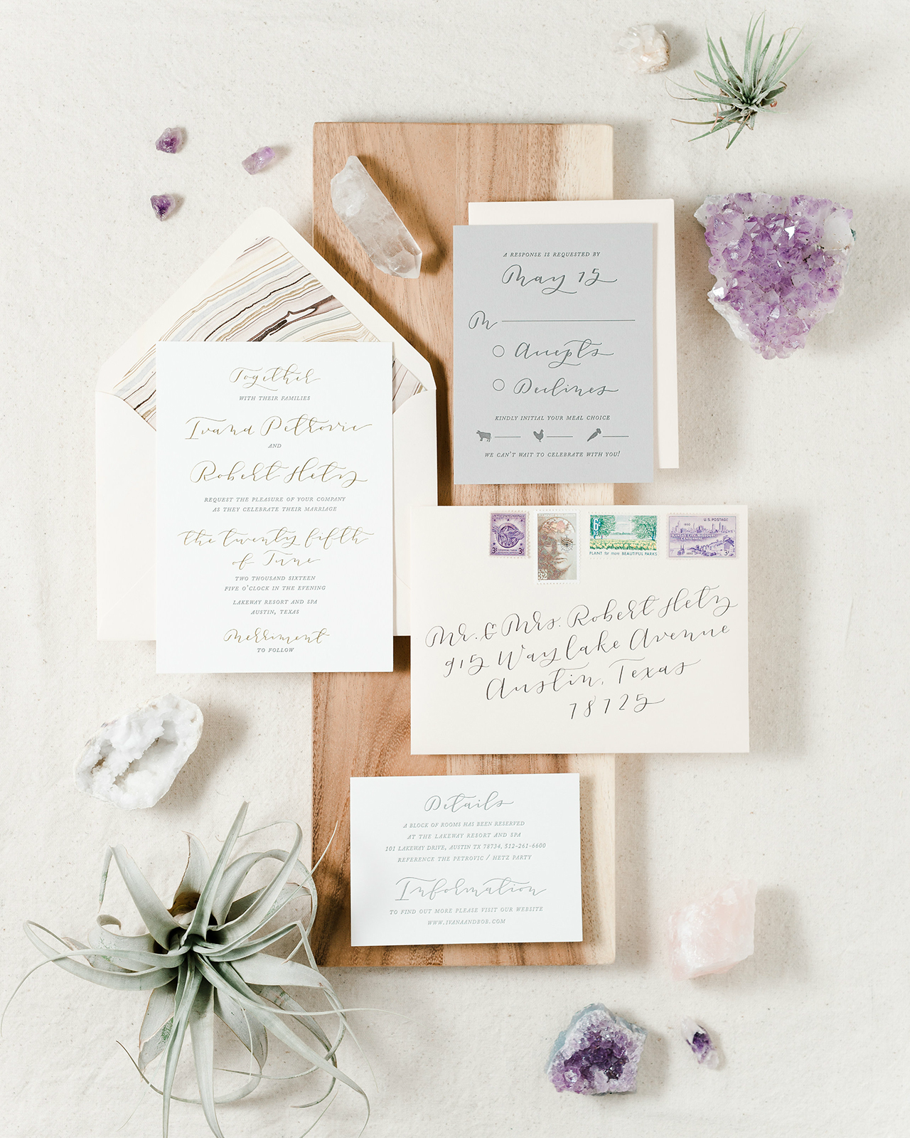
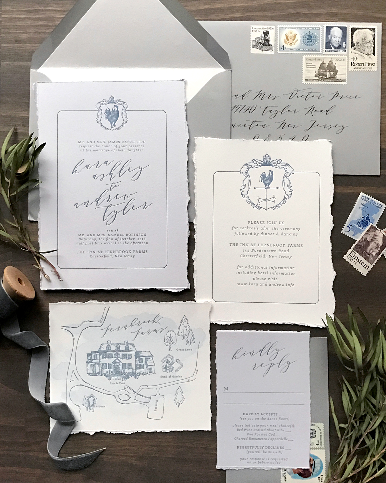
Romantic elegance will never go out of style! These classic gray and french blue letterpress wedding invitations from Lauren of Darling + Pearl feature a custom crest illustration, an illustrated map of the wedding venue, and elegant type selections – all letterpress printed on cool gray and white paper with hand torn edges. We’re loving the combination of classic serif type with an elegant script that conveys the look of modern, organic calligraphy. What a lovely, and classic, invitation suite!

Classic Gray and French Blue Letterpress Wedding Invitations by Darling and Pearl

From Lauren: I find that clients with a clear, cohesive vision are just as much fun to work for as the clients that really want to put the creative power directly in my hands. Both creative “scenes” are the birthplace for beautiful design that really, in the end, reflect each couple and stationery that fits their history as well as their event.

Classic Gray and French Blue Letterpress Wedding Invitations by Darling and Pearl

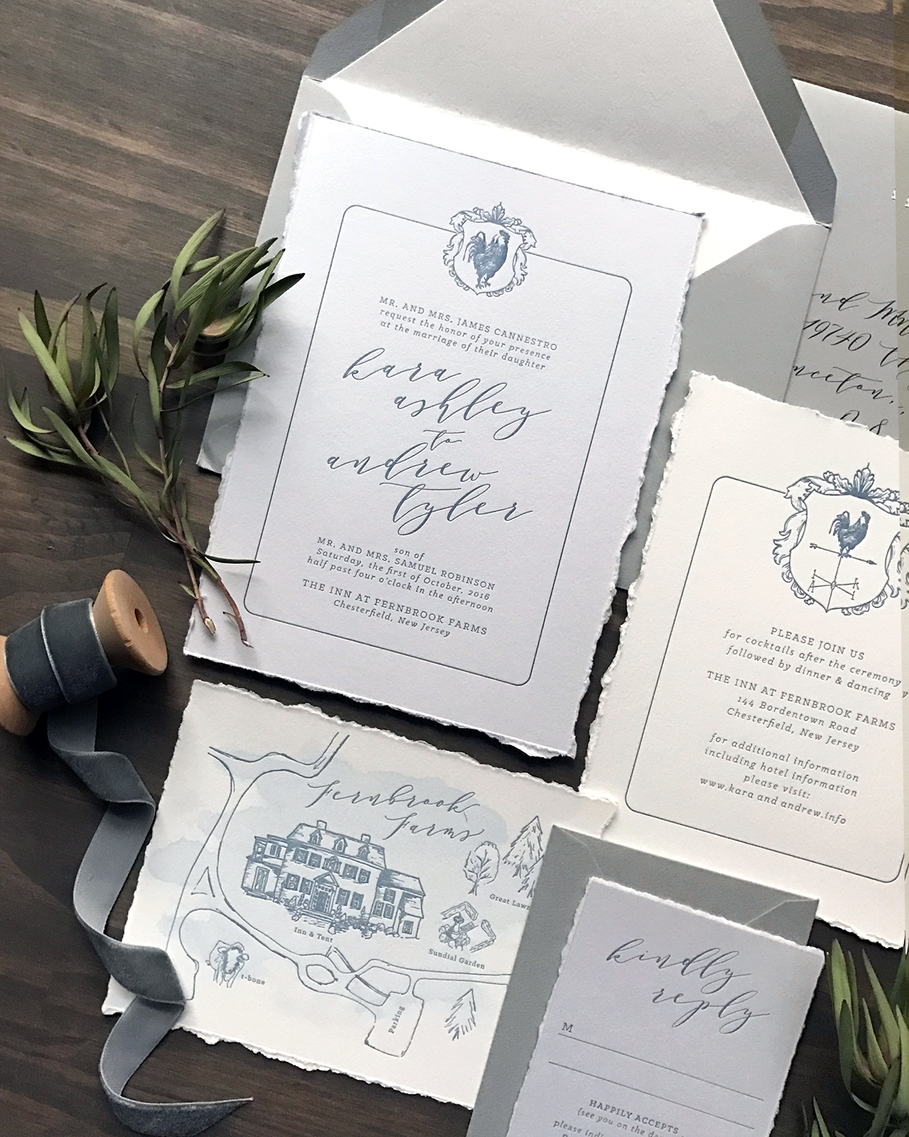
Kara first contacted me with a very clear vision for her wedding invitations. Kara and her fiancé, Andrew, were planning their October 2016 wedding at Fernbrook Inn and Farms in central New Jersey. Fernbrook is a stunning farmhouse style wedding and event venue and we really wanted to encompass an organic and classy experience within their wedding stationery. The venue is a gorgeous 1750s Georgian Manor House in the middle of a 250 acre active farm with tented reception area.

Classic Gray and French Blue Letterpress Wedding Invitations by Darling and Pearl

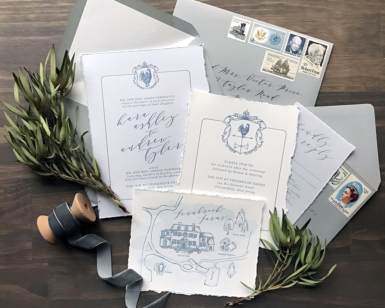
The list of Kara’s must haves in regards to their invitations included: mature modern style script, torn edges, and the cherry on top was an illustrated map of the grounds complete with parking areas, outlines of several ceremony options, the reception area, and T-Bone, the farm mascot.

Classic Gray and French Blue Letterpress Wedding Invitations by Darling and Pearl

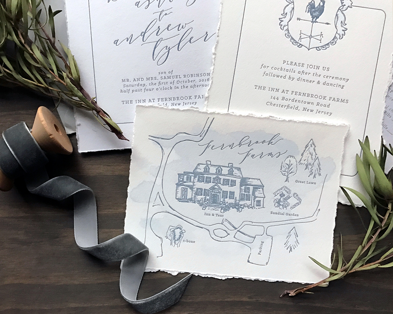
The weather vane crest was taken in part from the groom’s own artwork. We added a more detailed and textured rooster and they both couldn’t have been more blown away with the final result. Not to mention, I really enjoy that little guy looking towards the future, how fitting for a union of two amazing people!

Classic Gray and French Blue Letterpress Wedding Invitations by Darling and Pearl

Classic Gray and French Blue Letterpress Wedding Invitations by Darling and Pearl

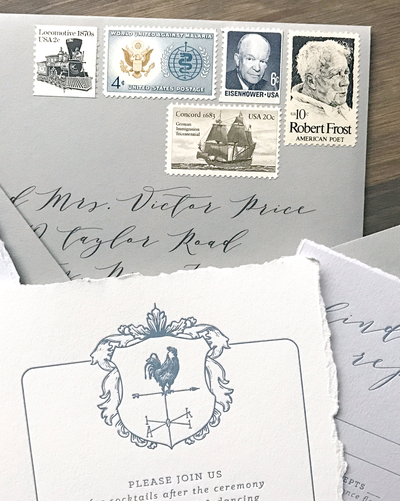
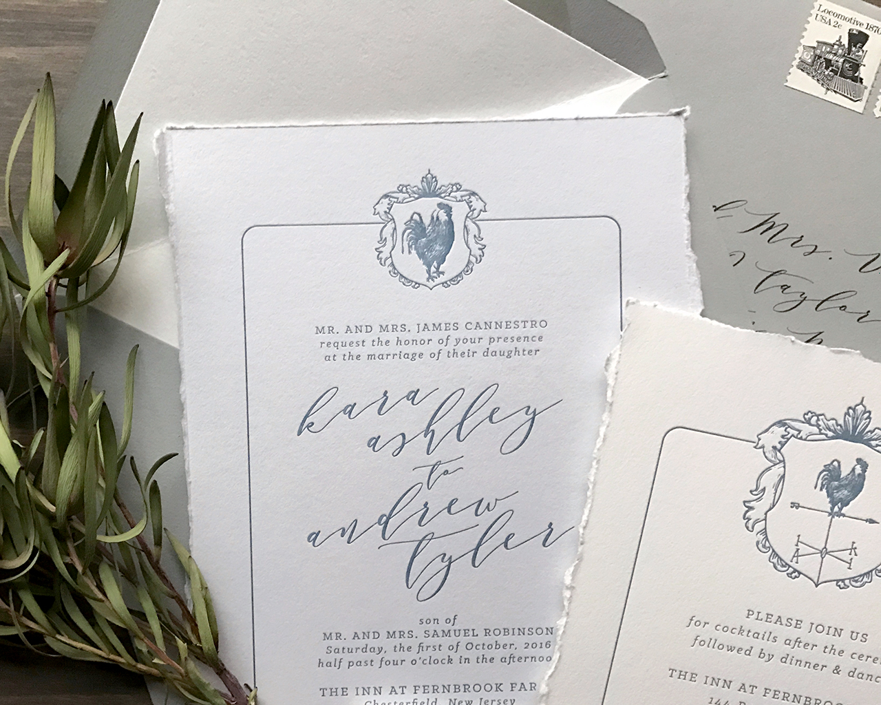
The entire wedding invitation suite was letterpress printed with french blue ink on a combination of cool grey and natural white 100% cotton stock. And naturally, ALL the edges were hand torn. These were an absolute pleasure to design, have on press and see through for the final result. Congrats Mr. and Mrs. Robinson!

Thanks Lauren!

Design: Darling + Pearl

Map Illustration: Erin Niehenke

Darling + Pearl is a member of the Designer Rolodex – you can see more of their beautiful work right here or visit the real invi­ta­tions gallery for more wedding invitation ideas!

Photo Credits: Lauren Reed of Darling and Pearl

Happy Weekend!

Well, I meant to write my usual weekly round up last Friday, but we decided to take advantage of the Veterans Day weekend and escape DC for a few days at my dad’s house in New Jersey (boy, did we need it!). But honestly, despite my intentions I’m not sure I actually could have written my usual post last week. I try to keep a positive tone here, and I think I needed more time to wrap my head around everything that has happened in our country in the last couple of weeks. I rarely discuss political issues here, but I couldn’t move forward without acknowledging that this has been a very difficult time for many of us, myself included. I posted this on Instagram the day after the election, when I felt the need to be quiet, to listen and process. Two weeks later, I’m still feeling pretty unsettled, and I want to send a giant virtual hug to everyone out there who might be feeling the same way. But life moves forward and this too shall pass, and in the meantime I’ll do my best to bring a smile to your face by sharing beautiful stationery that helps celebrate life’s special occasions and encourages us to connect with each other in a meaningful way.

Anne Robin Calligraphy / Throw Kindness Around Like Confetti

Image (and print) by Anne Robin Calligraphy via Instagram

A few links for your weekend:

Recently on Oh So Beautiful Paper:

That’s it for us this week! I’ll see you back here next week! xoxo

Wedding Stationery Inspiration: Fall Color Palette

Fall weddings are my favorite. From earthy textures and moody fall hues, there are so many natural elements to draw inspiration from. And when it comes to color combinations, the options are endless: jewel tones, rusty neutrals and metallics, deep berry tones and shades of red, dark greens, deep indigo blue, and so much more. I hope you get some ideas from these fall color palettes! –Annie

Wedding Stationery Inspiration: Fall Color Palette / Oh So Beautiful Paper

White calligraphy pops against a red leaf. | Photography: KariMe Photographer, Planning & Design: Chelsea Porter, Stationery: Sandpiper & Co. via Green Wedding Shoes

Wedding Stationery Inspiration: Fall Color Palette / Oh So Beautiful Paper

A neutral ribbon ties this bouquet together perfectly. | Styling & Design: Clayton Austin via Green Wedding Shoes

Wedding Stationery Inspiration: Fall Color Palette / Oh So Beautiful Paper

Gold calligraphy on textured black cards look oh so elegant. | Photography: Whiskers and Willow Photography, Planning & Design: Layered Vintage, Calligraphy: Type and Title via Green Wedding Shoes

Wedding Stationery Inspiration: Fall Color Palette / Oh So Beautiful Paper

Guests won’t miss this berry dip-dyed menu. | Photography: Studio Castillero, Event Design & Planning: Bride + Lace & Likes via Green Wedding Shoes

Wedding Stationery Inspiration: Fall Color Palette / Oh So Beautiful Paper

Gold and deep purple place cards add a rich element. | Photography: Jose Villa Photography, Calligraphy: Tara Jones Calligraphy via Style Me Pretty

Wedding Stationery Inspiration: Fall Color Palette / Oh So Beautiful Paper

Indigo type on white paper stands out against the neutral table. | Photography: Lolo & Noa Photography, Event Design: Simply Sisters via Junebug Weddings

Wedding Stationery Inspiration: Fall Color Palette / Oh So Beautiful Paper

Black leather menus with white calligraphy add subtle texture to the table. | Photography: Yasmin Sarai, Leather Signage & Leather Names: Tia Joy Kim via Green Wedding Shoes

Wedding Stationery Inspiration: Fall Color Palette / Oh So Beautiful Paper

Leaf place cards in shades of red and burgundy. | Photography: KariMe Photographer, Planning & Design: Chelsea Porter, Stationery: Sandpiper & Co. via Green Wedding Shoes

Wedding Stationery Inspiration: Fall Color Palette / Oh So Beautiful Paper

Peach ribbon tied around burlap bags bring natural color. | Photography: Michelle Boyd Photography, Event Design: Westcott Weddings via Style Me Pretty

Wedding Stationery Inspiration: Fall Color Palette / Oh So Beautiful Paper

I love the addition of emerald green. | Photography: Marina Mauletkali Photography, Event Styling & Florals: Petals by the Shore, Calligraphy: LoweLove Calligraphy via Junebug Weddings

Anyone out there planning a fall wedding? What colors are you bringing into your celebration??

Modern Tropical Destination Wedding Invitations

After the turbulence of the last couple of weeks, I think we could all use a quick mental vacation to the Caribbean – don’t you agree? Well, Nichole of Coral Pheasant is coming to our rescue with these modern tropical destination wedding invitations for a wedding in Barbados! The invitation suite features a color palette inspired by the island, with lush greens, pops of coral, and vibrant citrus tones, along with some gorgeous spot calligraphy and the most perfectly curated postage stamps. I’m also loving the fun and playful language in the RSVP and rehearsal dinner invitation!

Modern Tropical Destination Wedding Invitations by Coral Pheasant

From Nichole: Jessica and Matt came to me by way of the fabulous Jubilee Events, who created the vision for their destination wedding in Barbados. Out of the gate I knew Jessica was my kind of gal when she expressed that it was important for their invitations to celebrate the sacrament of marriage while also being fun and surprising. Yes gurl, yes! Let’s do this! The tropical celebration they were planning embraced the natural surroundings of Barbados and more specifically their reception venue, Cobblers Cove, whose tag line reads “English elegance with Caribbean character.”

Modern Tropical Destination Wedding Invitations by Coral Pheasant

For their invitation suite we incorporated bright, vibrant colors inspired by the island: the lush green gardens, the coral colored plantation and cheerful pops of citrus. Gorgeous calligraphy by Everly Calligraphy was paired with modern fonts and fun language. The main invitation was letterpress printed on double thick eggshell stock and the enclosure cards were flat printed on matching, lighter weight cover stock.

Modern Tropical Destination Wedding Invitations by Coral Pheasant

Modern Tropical Destination Wedding Invitations by Coral Pheasant

With their wedding being a multi-day destination event, it was important to share all the details with their guests in a cute and concise way. To do that, we created a tri-fold itinerary with custom illustrations by Social Alchemy highlighting the what, when and where. Contrasting patterns inspired by the tropical English aesthetic of Cobblers Cover were layered into the design as seen in the watercolor leaves on the itinerary and the lattice-like design on the envelope liner.

Modern Tropical Destination Wedding Invitations by Coral Pheasant

Tropical themed vintage stamps and a lemon yellow silk ribbon added texture and color to the suite. Bringing the paper story full circle, we used the custom illustrations from the itinerary on cheerful colored cocktail napkins for the various weekend events.

Modern Tropical Destination Wedding Invitations by Coral Pheasant

Modern Tropical Destination Wedding Invitations by Coral Pheasant

Thanks Nichole!

Invitations and Styling: Coral Pheasant
Calligraphy: Everly Calligraphy
Building Illustrations: Social Alchemy

Coral Pheasant is a member of the Designer Rolodex – you can see more of Nichole’s beautiful work right here or visit the real wedding invitations gallery for more invitation inspiration!

Photo Credits: Charlotte Jenks Lewis

Romantic Blush and Gray Letterpress Calligraphy Wedding Invitations

These romantic blush and gray letterpress calligraphy wedding invitations from Laura of Paper & Honey were inspired by the natural elegance of Austin, Texas and the quintessential charm and simplicity of the wedding’s resort venue. The subtle blush and gray color palette is complemented by the gorgeous gold foil and gray letterpress printed text, vintage postage stamps, and timeless calligraphy details! We always love a fun envelope liner and these marbled envelope liners made from handmade paper have us swooning!

Romantic Blush and Gray Letterpress Calligraphy Wedding Invitations by Paper & Honey

From Laura: Working on Ivana and Bob’s invitation suite was a total dream! These two lived on opposite coasts for three years of their relationship to pursue their professional dreams — his of being a surgeon, hers of working for Google — and over the course of their long distance they learned to “love each other to the moon and back.” What an honor it was to help them craft an invitation suite worthy of helping them celebrate finally starting their lives together!

Romantic Blush and Gray Letterpress Calligraphy Wedding Invitations by Paper & Honey

Ivana and Bob married at the Lakeway Resort and Spa. With a wedding held in the rolling hills of Austin, Texas, just overlooking Lake Travis, we knew the paper had to convey the beauty and simplicity of the area. Elongated, sweeping calligraphy paired with a simple serif kept the design timeless and classic with a hint of whimsy. Everything was letterpress printed on delicious cotton paper, and metallic gold foil stamping elevates the invitation and provides a hint of sparkle. Gold foil always says romance to me! The RSVP card is one of my favorite parts — I love the contrast of the light gray paper, and the tiny food icons are too cute.

Romantic Blush and Gray Letterpress Calligraphy Wedding Invitations by Paper & Honey

Romantic Blush and Gray Letterpress Calligraphy Wedding Invitations by Paper & Honey

To wrap everything up, we added a pop of blush (one of Ivana’s wedding colors) through the euro flap envelopes, and an envelope liner made from handmade marbled paper. Handmade paper is the best; each piece is so unique and prettier than the last. Outer envelopes were addressed to guests with romantic calligraphy cohesive with the rest of the suite, and how else could we get them to friends and loved ones but with perfect vintage stamps.

Romantic Blush and Gray Letterpress Calligraphy Wedding Invitations by Paper & Honey

Romantic Blush and Gray Letterpress Calligraphy Wedding Invitations by Paper & Honey

Romantic Blush and Gray Letterpress Calligraphy Wedding Invitations by Paper & Honey

This wedding suite, perfectly simple, romantic, and organic with a hint of playful movement, was such a joy to create! With Ivana’s ideas and the location in mind, it came together easily. I hope it did Lake Travis a bit of justice!

Romantic Blush and Gray Letterpress Calligraphy Wedding Invitations by Paper & Honey

Thanks Laura!

Design: Paper & Honey

Printing: Czar Press

Vintage Postage Stamps: Verde Studio

Check out the Designer Rolodex for more tal­ented wed­ding invi­ta­tion design­ers and the real invi­ta­tions gallery for more wedding invitation ideas!

Photo Credits: Andrea Pesce Photography