Happy Weekend!

Happy Friday everyone! We’ve had the most gorgeous week here in DC, and I got to chaperone my first field trip for Sophie’s kindergarten class on Monday! We went out to a farm in Virginia with a huge pumpkin patch and a bunch of fun things for kids to do. Sophie has 25 kids in her class, so it was a little bit chaotic, but a lot of fun. This weekend we’re planning to take Alice to the pumpkin patch (since she didn’t get to go on the field trip) and enjoy this gorgeous fall weather! But in the meantime…

Dallas Clayton #kindcomments Mural at Union Market in Washington, DC

Photo by me of the new Dallas Clayton #kindcomments Mural at Union Market here in DC

…a few links for your weekend!

I just bought this jacket and I’m already completely obsessed with it! And it’s currently 25% off!

Definitely going to try this DIY two-toned concrete vase project

Country Curtains is going out of business after 60 years, and I’m so sad. They make my absolute favorite thermal blackout roman shades – get some while you still can!

This velvet dress is perfect for the holidays!

Love the hologram foil edge on these business cards

The perfect fall bootie

MAKE: Pumpkin donuts with maple glaze and toasted coconut


This week on Oh So Beautiful Paper:

Weekend project alert! Make these DIY Matisse-inspired pumpkins

Have you tried the new recycled cotton business cards from MOO? They’re perfect for bright colors and illustrations!

Fun and modern color blocked geometric wedding invitations

Black and white wedding stationery inspiration


That’s it for me this week. I’ll see you all back here on Monday! xoxo

DIY Matisse-Inspired Pumpkins

With two little kids in the house, our Halloween tends to be more fun and colorful – less creepy and scary. So today I’m sharing a Halloween pumpkin tutorial inspired by fine art! The idea for these pumpkins came as I was making this Matisse-inspired paper garland a couple of weeks ago. The shapes are just so fun and colorful, I thought they would be great on Halloween pumpkins. These DIY Matisse-inspired pumpkins are super easy to make, and I’m sharing my template below so you can make your own!

DIY Matisse-Inspired Pumpkins

I love, love, love the way the colors pop against the white pumpkins, but they’re also great against black faux pumpkins or colorful painted pumpkins! The pink painted pumpkin is so sweet, don’t you think?

DIY Matisse-Inspired Pumpkins

I adapted the Matisse-inspired shapes that I originally created for the garland to work on a pumpkin, making them slightly smaller for large pumpkins and adding a set of smaller shapes to use on tiny pumpkins and mix with the larger size shapes for variety. And the shapes are really fun when mixed all together in a random pattern on the pumpkin! 

DIY Matisse-Inspired Pumpkins

The supplies for this project are pretty simple: you’ll need matte craft vinyl in a variety of colors (I used pink, orange, yellow, green, teal, purple, and white) and a Silhouette Cameo or Cricut Explore cutting machine. If you don’t have one of those machines, you can still use our template to trace the shapes onto the vinyl and cut the shapes out by hand – but it will go a LOT faster with a cutting machine. You can download our templates at the bottom of the post!

DIY Matisse-Inspired Pumpkins

To make the DIY Matisse-inspired pumpkins:

Step 1. Download our templates at the bottom of the post and use your Silhouette Cameo or Cricut to cut the shapes from each color of vinyl. You can do a colorful rainbow like I did (best if you’re doing a big group of pumpkins) or keep things simple with just one or two colors!

Step 2. Carefully peel individual shapes from the adhesive backing and apply to the pumpkin like a sticker. I found it easiest to start with some of the larger shapes randomly scattered around the pumpkin surface, then fill in with the smaller shapes as I went. I really didn’t have a plan, so you can totally just wing it! If you place a shape and then change your mind, you should be able to move it by very carefully peeling the vinyl from the pumpkin and moving it to a new spot.

Step 3. Continue placing vinyl shapes until you’ve covered the entire pumpkin, and enjoy!

DIY Matisse-Inspired Pumpkins

DIY Matisse-Inspired Pumpkins

DIY Matisse-Inspired Pumpkins

DIY Matisse-Inspired Pumpkins

DIY Matisse-Inspired Pumpkins

So easy, right? And such a great way to add some color to your front porch for Halloween!

Download the templates below!

MATISSE-INSPIRED PUMPKIN TEMPLATE (Silhouette Studio file)

MATISSE-INSPIRED PUMPKIN TEMPLATE (SVG file)

p.s. DIY Iridescent Pumpkins and DIY Rainbow Halloween Treat Bags

Photo Credits: Nole Garey for Oh So Beautiful Paper

Color Blocked Geometric Wedding Invitations

Well, these color blocked geometric wedding invitations are a LOT of fun! Inspired by modern architecture, Meghan of And Here We Are came up with this fun geometric design that was letterpress printed in three colors to create the color block effect. Meghan added a vellum overlay with hand lettering and a subtle geometric print; another subtle reference to the architectural inspiration. Love!

Color Blocked Geometric Wedding Invitations by And Here We Are

From MeghanWe drew on inspirations from famous Mexican architecture for these modern, neon, letterpress printed, vellum overlaid, color-blocked, geometric wedding invitations.

Color Blocked Geometric Wedding Invitations by And Here We Are

I loved that Kate and Alec were inspired by travel and literature and film and visual arts when planning their Brooklyn wedding. The list of influences they cited when we started our project included Mexico City, Frieda Kahlo, Frank Stella, Alejandro Jodorowski, and Luis Barragan, among others. I looked through all these inspirational cues and started to try to find a way to mesh them together. As I collected visual samples of these artists, I got more and more excited about the colors and shapes in Barragan’s architectural work, which led me to this geometric design. I loved the way he layered colorful shapes in space, and was especially drawn to the staircases and the cut-outs in his shapes.

Color Blocked Geometric Wedding Invitations by And Here We Are

Since we were going to be letterpress printing, I really wanted to play with the idea of overprinting: overlapping print colors to create additional colors. Because they were collecting their RSVPs online, we were able to list an RSVP link on the main invitation card instead of including a second card; dropping the reply card freed up space in the budget to add a third ink color to the main card. We letterpress printed three colors (a teal, “millennial” pink, and a fluorescent highlighter yellow) strategically overlapped to create six colors overall. The type was knocked out from the color blocks to reveal the colors below for a really fun effect.

Color Blocked Geometric Wedding Invitations by And Here We Are

Being just one card, it was printed on the thickest paper possible to really give it some “oomph.” To fill out the package and to really play up the idea of overlapping and overprinting, I added a hand-lettered vellum top sheet printed with a subtle geometric pattern. The final touch was adding a colorful envelope liner to a bright pink envelope.

Color Blocked Geometric Wedding Invitations by And Here We Are

Thanks Meghan!

Invitation Design and Letterpress Printing: And Here We Are

And Here We Are is a member of the Designer Rolodex – see more of their beautiful work here or visit the real invi­ta­tions gallery for more wedding invitation ideas!

Photo Credits: And Here We Are

Black and White Wedding Stationery Inspiration

A black and white affair is always in style! Today we’re sharing some black and white wedding stationery inspiration, from crystal place cards to welcome signs and menus. See how you can incorporate this classic palette into any wedding! – Annie

Wedding Stationery Inspiration: Black & White Wedding / Oh So Beautiful Paper

Don’t be afraid to mix typography styles. | via The Knot

Wedding Stationery Inspiration: Black & White Wedding / Oh So Beautiful Paper

How amazing are these crystal place cards?! | Photography: Ashley Kelemen, Calligraphy: Betlem Calligraphy via Style Me Pretty

Wedding Stationery Inspiration: Black & White Wedding / Oh So Beautiful Paper

A graphic sign stands out, especially outdoors. | Photography: Jose Villa Photography, Event Planning: Cole Drake Events via Style Me Pretty

Wedding Stationery Inspiration: Black & White Wedding / Oh So Beautiful Paper

Minimalist table numbers won’t distract from the rest of your table. | Photography: Julien Bonjour Photographe, Wedding Stationery: Save the Date via Ruffled

Wedding Stationery Inspiration: Black & White Wedding / Oh So Beautiful Paper

Black watercolor adds bohemian flair. | Photography: Cattura Weddings, Event Design: Heidi Chankin, Paper Goods & Calligraphy: Emily Rose Ink via Green Wedding Shoes

Wedding Stationery Inspiration: Black & White Wedding / Oh So Beautiful Paper

White escort cards really pop against a black wall. | Photography: Abby Jiu Photography, Event Planning & Coordination: Karson Butler Events, Escort Card Display: Backup Backdrops, Day of Paper: The Romance Between via Style Me Pretty

Wedding Stationery Inspiration: Black & White Wedding / Oh So Beautiful Paper

Love the combination of calligraphy and a geometric border. | Photography: EE Photography, Paper: Yuling Designs via Grey Likes Weddings

Wedding Stationery Inspiration: Black & White Wedding / Oh So Beautiful Paper

These balloons would be fun for a photo booth! | Photography: Alex Lasota Photography, Event Design & Planning: Alex Lasota, Paper Goods: Grace Niu, Calligraphy: L Maria Calligraphy via Green Wedding Shoes

Wedding Stationery Inspiration: Black & White Wedding / Oh So Beautiful Paper

Gold frames double as favors. | Photography: Ashley Caroline Photography, Event Planning: Polka Dot Events via Style Me Pretty

Wedding Stationery Inspiration: Black & White Wedding / Oh So Beautiful Paper

Love the palm illustration at the top! | Photography: Eileen Meny Photography, Event Planning: Lindsey M Events, Paper Goods: Bonomo Paper Company, Calligraphy: Han Writing via Green Wedding Shoes

Anyone planning a classic black and white wedding? Let us know in the comments!

Colorful and Creative Business Cards with MOO

This post is sponsored by MOO. I’ve partnered with them to share some colorful and creative business card ideas. All content and opinions are my own. MOO 100% recycled Cotton Business Cards are completely tree free and print vivid, saturated color – all on archival quality paper. Thank you for supporting the sponsors that make Oh So Beautiful Paper possible!

I absolutely LOVE business cards. I think of them as mini works of art, and I keep a bowl full of all the beautiful, inspiring business cards that I’ve received over the years. I was VERY intrigued when I heard about MOO’s new 100% recycled Cotton Business Cards – I wanted to see how the new paper could handle bright colors and delicate illustrations! I teamed up with a few illustrators, stationers, and graphic designers to showcase some of their business card designs printed on MOO’s cotton paper, and share some tips for colorful and creative business cards. And if you’re a new MOO customer and you’d like to check out the cotton business cards yourself, MOO is offering Oh So Beautiful Paper readers 15% off Cotton Business Cards with the promo code OHSOMOO!

Colorful and Creative Business Cards with MOO Recycled Cotton Business Cards

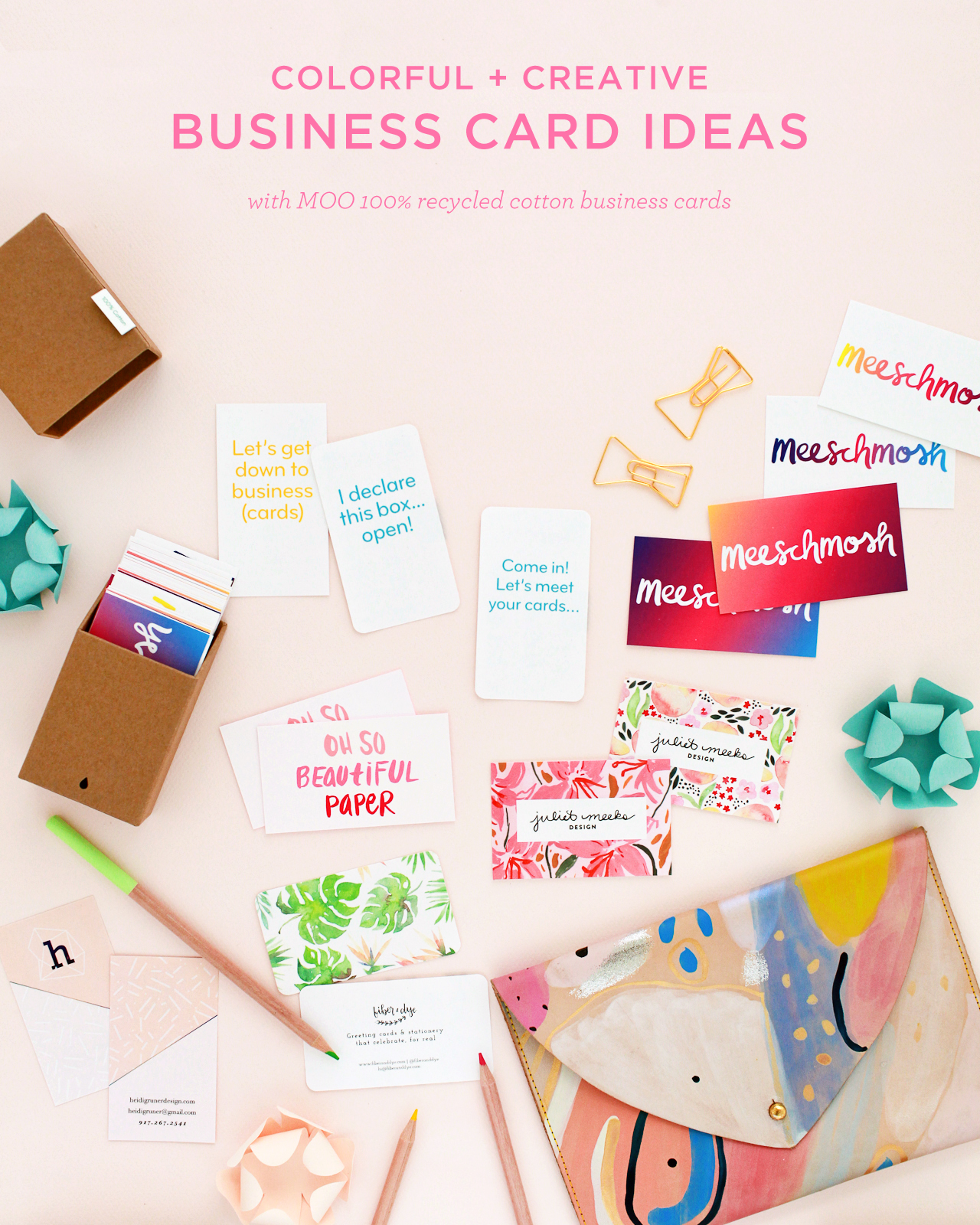
First, a bit more about the paper! MOO teamed up with one of the best paper mills in the country, Mohawk Fine Papers, to create a modern twist on a traditional cotton rag paper. Made from t-shirt offcuts, the paper is completely tree-free and reuses waste material from the fashion industry to create an archival quality paper at an affordable price point. The 100% recycled cotton paper is bright white, with a subtle texture that looks and feels great in person. And it prints vivid, saturated colors like a dream!

Colorful and Creative Business Cards with MOO Recycled Cotton Paper

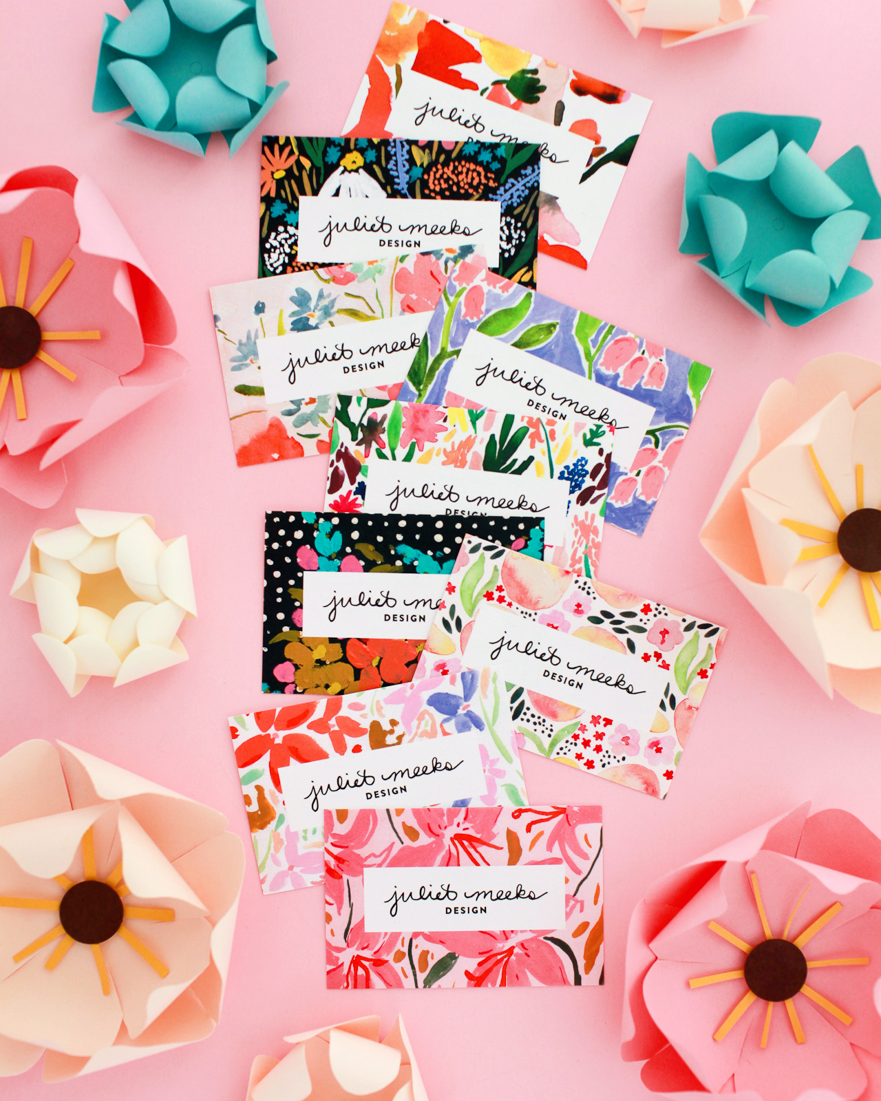
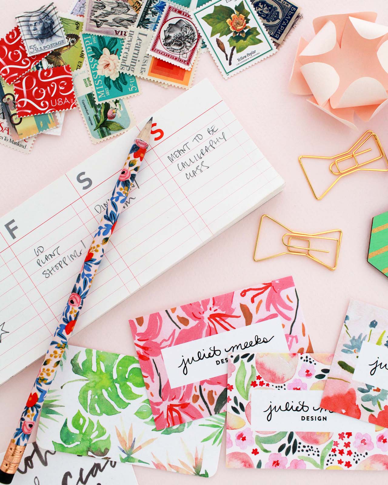
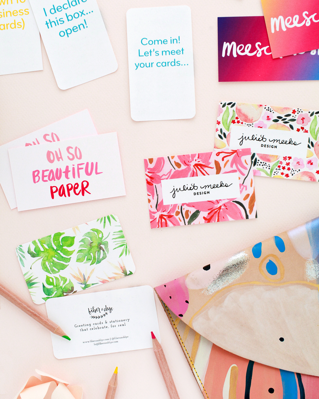
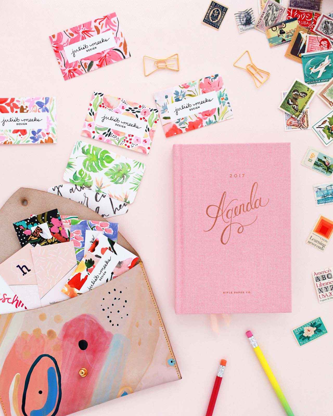
Business card design: Juliet Meeks

Nothing bums me out quite like a cheap, low quality business card, so I love that MOO makes quality paper available at an affordable price! And if you work in a design-related field, it’s especially important to have great business cards. Here are some tips for creating colorful and creative business cards.

1. Stay true to your personal style.

Business cards make a lasting impression and can tell the person on the other end a ton about you. Is your style bright and colorful? Minimalist? Romantic? What colors do you love? Are you playful or serious? Bright white recycled cotton paper allows for really bright, saturated color, which is perfect for colorful styles! Your business cards should reflect your style and personality. I love the way illustrator Juliet Meeks showcased her floral illustration work around her logo!

Colorful and Creative Business Cards with MOO Recycled Cotton Business Cards

2. Show your work

If your work is visual, show it on your business cards! This is a thousand times true for illustrators, calligraphers, photographers, and other artists, but I think it’s equally true for everyone from woodworkers to contractors to make up artists.

Colorful and Creative Business Cards with MOO Recycled Cotton Business Cards

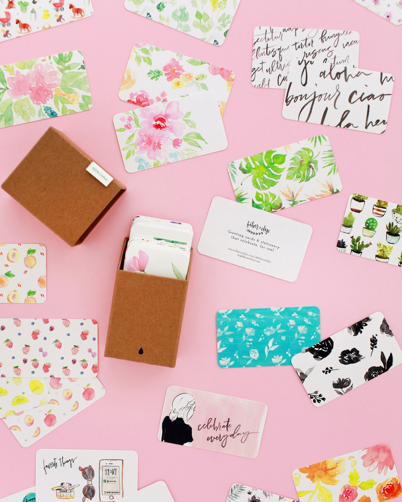
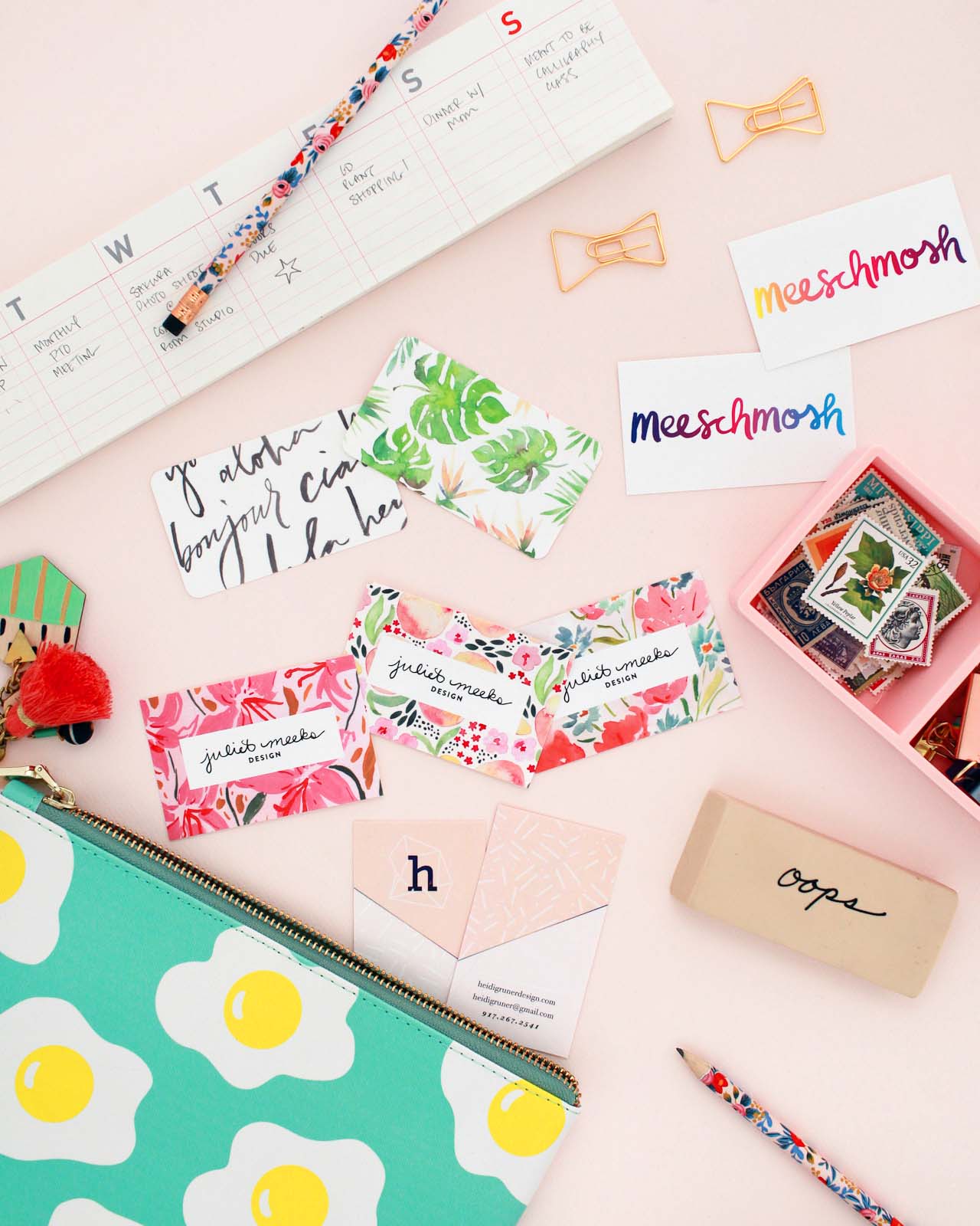
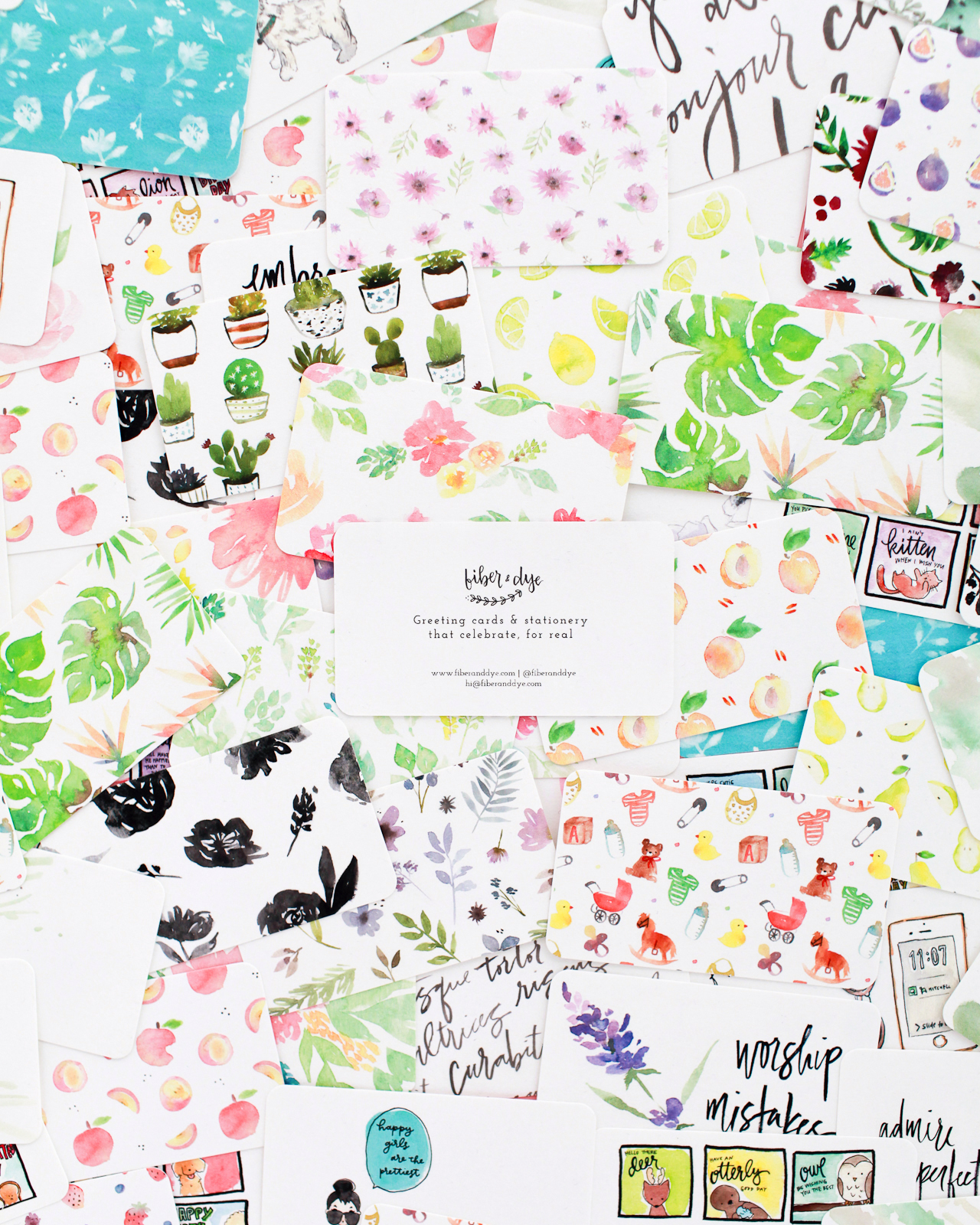
Business card design: Fiber & Dye

With double-sided printing, business cards are the perfect opportunity to show examples of your work! Lisa of Fiber & Dye used MOO’s Printfinity feature to print different examples of her illustration and hand lettering work on the back of each business card. You can also print professional photos instead of illustrations – just make sure the photos are properly edited and formatted to showcase your work in the best possible way.

3. Think outside the box

I’ve seen business cards of all shapes and sizes: rectangles, large squares, small squares, rounded corners, even circles and unique die cut shapes! The shape of your business card speaks to your personal style, and there’s no need to stick to a traditional rectangular format! Choose the shape that best shows your style and your work.

Colorful and Creative Business Cards with MOO Recycled Cotton Business Cards

4. Consider Both Sides

No one-sided business cards here! I’m personally a fan of putting contact info on one side and logo/artwork on the other side, but there are so many options for making that happen. Bright and colorful on one side, white minimalist on the other side? Artwork on both sides? Should the front and back designs mirror each other? MOO’s design guidelines allow for a full bleed on both sides of the card, so your design can go across the whole card without worrying about white edges. I’m loving these full bleed business card designs from Meeschmosh and Heidi Gruner Design.

Colorful and Creative Business Cards with MOO Recycled Cotton Business Cards

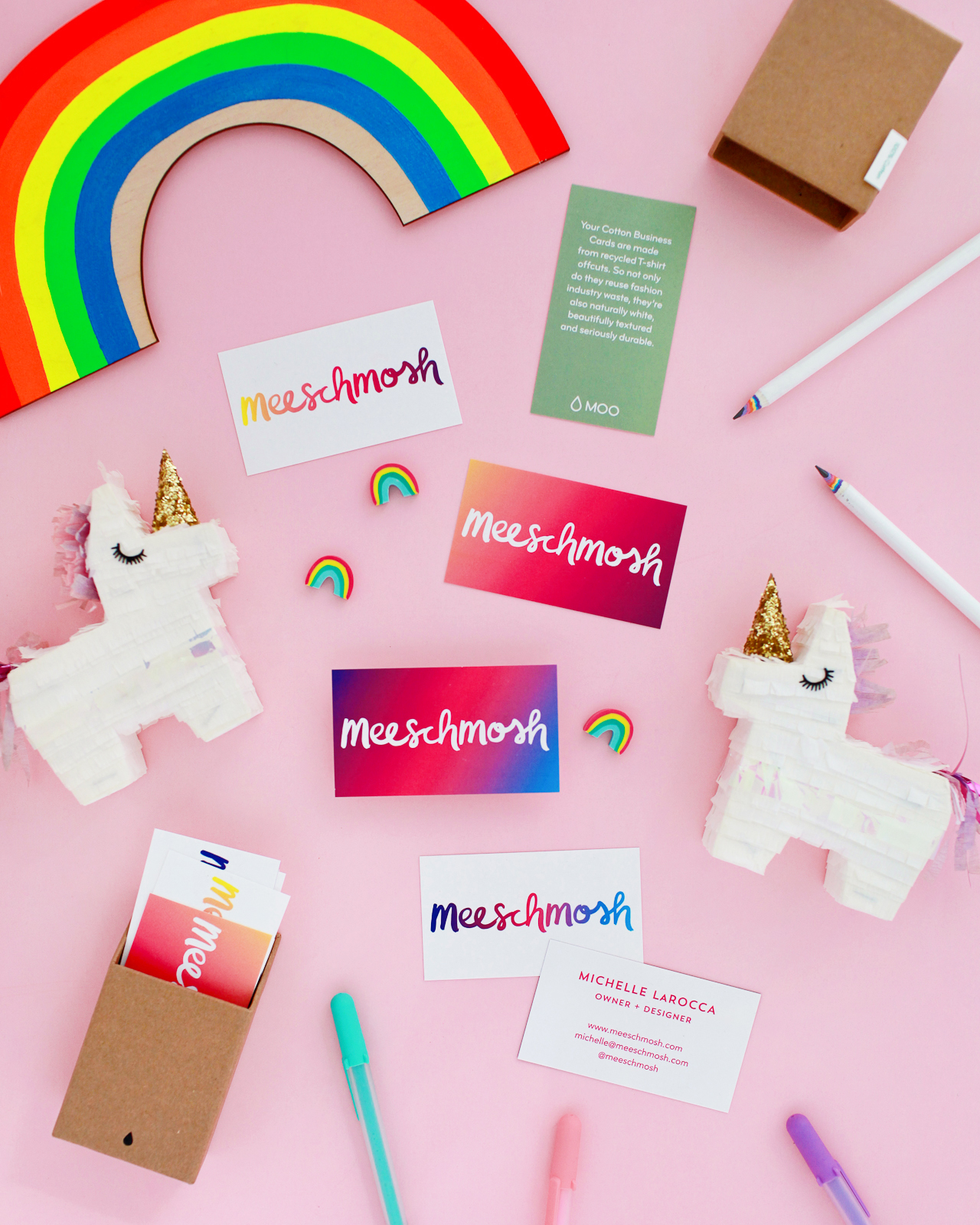
Business card design: Meeschmosh

Colorful and Creative Business Cards with MOO Recycled Cotton Business Cards

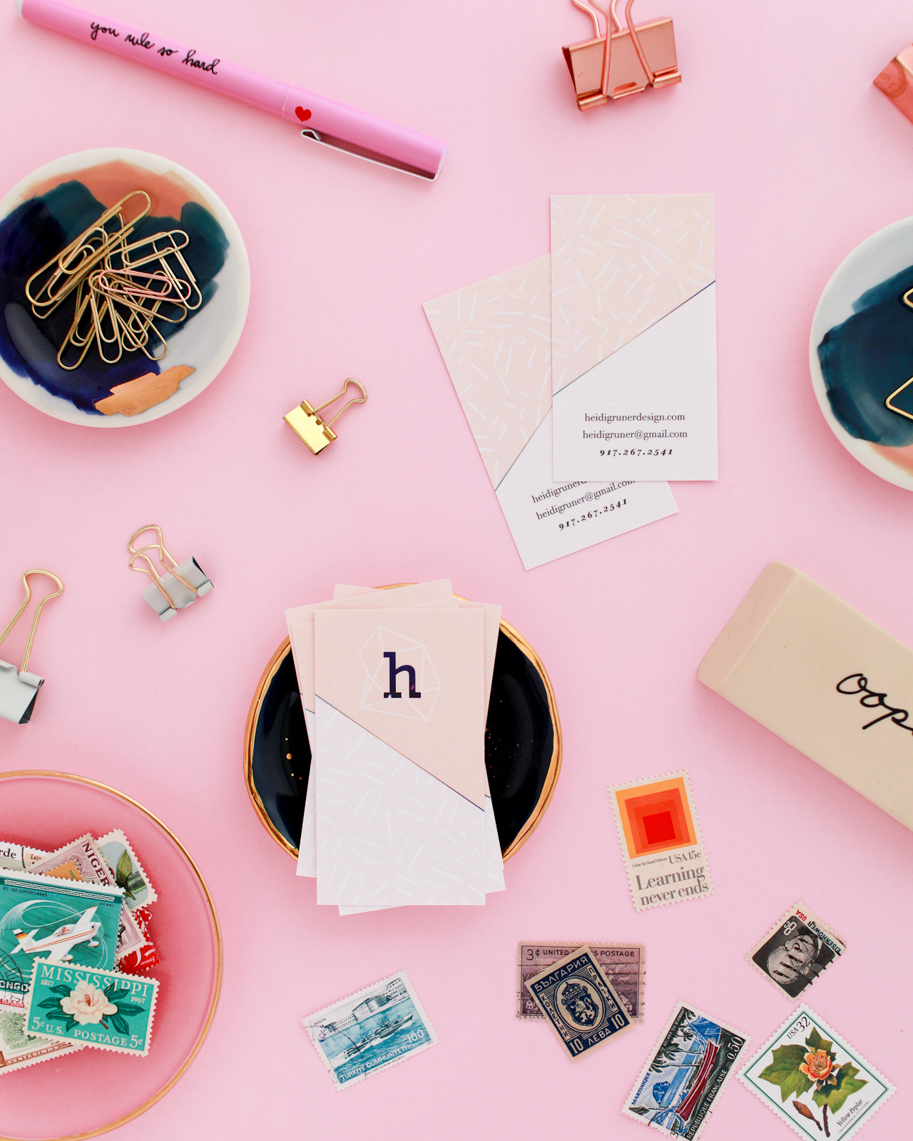
Business card design: Heidi Gruner Design

Colorful and Creative Business Cards with MOO Recycled Cotton Business Cards

Colorful and Creative Business Cards with MOO Recycled Cotton Business Cards

Colorful and Creative Business Cards with MOO Recycled Cotton Business Cards

Colorful and Creative Business Cards with MOO Recycled Cotton Business Cards

I’d love to hear your tips for creative and colorful business cards! Feel free to share a link to your business cards in the comments. And for new MOO customers out there – don’t forget that you can get 15% off Cotton Business Cards with the promo code OHSOMOO!

Photo Credits: Nole Garey for Oh So Beautiful Paper

This post is sponsored by MOO. All content and opinions are my own. Thank you for supporting the sponsors that make Oh So Beautiful Paper possible!