FONT: PaperCute
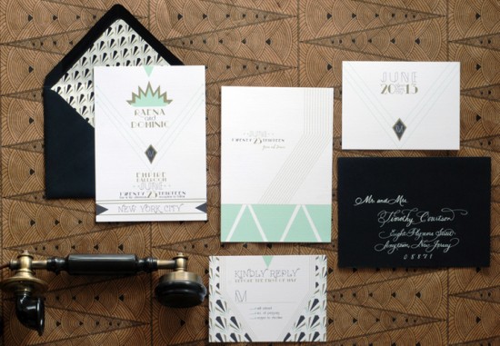
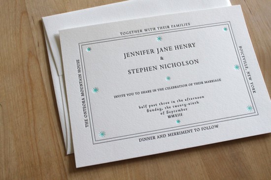
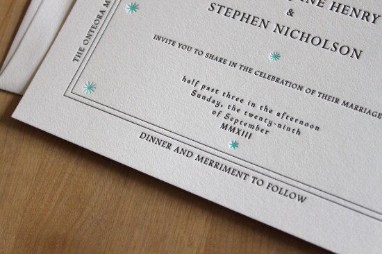
Raena + Dominic’s Art Deco Wedding Invitations
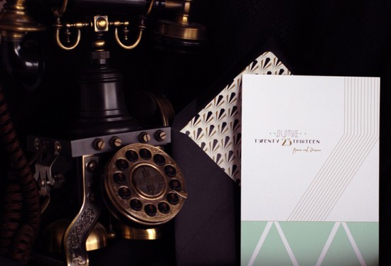
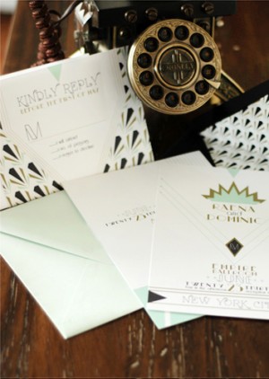
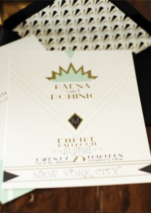
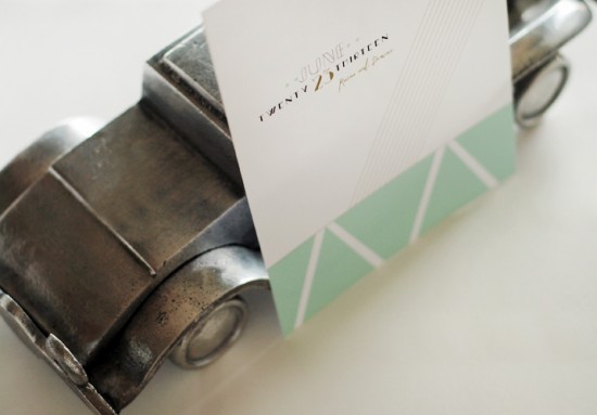
I love design inspired by the Art Deco era – particularly when paired with a modern color palette like these wedding invitations from Nicole at Umama! Nicole mixed Art Deco-inspired patterns and lines with a very now soft aqua and gold color palette mixed with classic black and white. So pretty!
From Nicole: For this suite, I was really inspired by so many beautiful art pieces I have seen from the art deco time period, from the clean lines of buildings, to the geometric jewelry, to the modern renditions of the time period. The design features clean lines, a geometric print, and a soft aqua infused throughout the suite.
Thanks Nicole!
Check out the Designer Rolodex for more talÂented wedÂding inviÂtaÂtion designÂers and the real inviÂtaÂtions gallery for more wedding invitation ideas!
Photo Credits: Umama
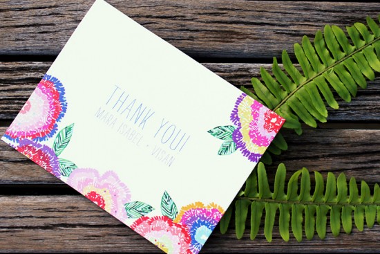
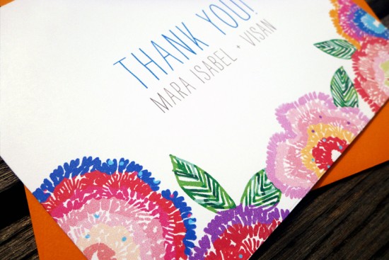
Wildflower Wedding Invitations from An Lim
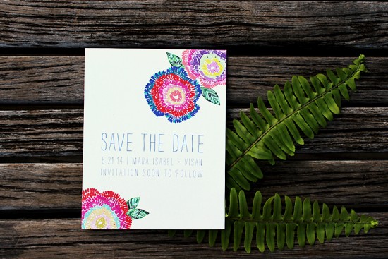
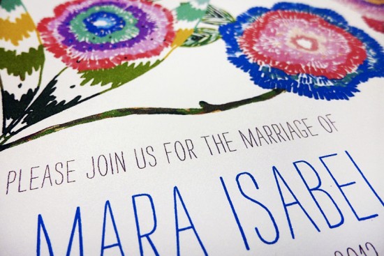
With spring right around the corner, I’ve been craving bright and vibrant color in any form. These wildflower wedding invitations from Vanessa An Lim are so perfect for spring and summer, with tons of saturated color and whimsical illustrations. So cheerful!
From Vanessa:Â As a former event planner, I have worked with many brides who wanted more than a two color palette for their weddings. They wanted something festive, colorful, and whimsical. I created this invitation so they could have fun with color. Something they could match with vibrant accents like paper flowers in an array of colors, mismatched china, or more organic accents like wood and simple greenery.
Thanks Vanessa!
Check out the Designer Rolodex for more talÂented wedÂding inviÂtaÂtion designÂers and the real inviÂtaÂtions gallery for more wedding invitation ideas!
Photo Credits: An Lim
Constellation Wedding Invitations by Moontree Letterpress
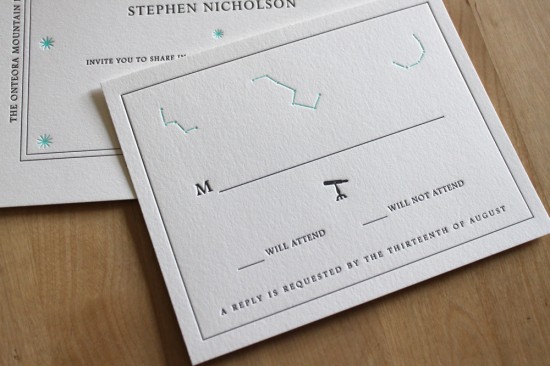
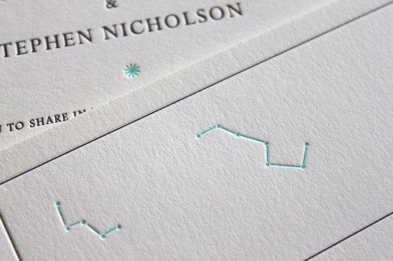
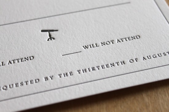
I’ve been slightly obsessed with anything constellation-related for a while now (evidence here and here), so I was seriously excited when I saw this beautiful new constellation wedding invitation in the Heritage Collection from Rebecca of Moontree Letterpress. Rebecca was inspired by the ceiling of Grand Central Station (hands down one of the most beautiful places in New York City), collaborating with Philadelphia designer Ed Brogna to create this beautiful star-filled invitation in her clean and classic design style.
From Rebecca: With Spring just around the corner, wedding invitation season is upon us once again. This year at Moontree we’ve added some new designs to the wedding invitation collection, inspired by the things that capture our imaginations and interests. Again this year I have teamed up with Philadelphia designer Ed Brogna to expand the Heritage Collection, which focuses on elements of the great outdoors, classic American design, typographical trends and vintage graphics.
Our new Constellation design came from our walk through one of my favorite places in New York, Grand Central Station. The entire ceiling of the main terminal hall features a breathtaking map of the night sky. And if that wasn’t special enough, the artist positioned the constellations so they read in reverse, in order for us to see the stars “as God would.” Â I’ve always loved that.
Thanks Rebecca!
Moontree Letterpress is a member of the Designer Rolodex – you can see more of their beautiful work right here!
Photo Credits: Moontree Letterpress
Deirdre’s Southern Charm Baby Shower Invitations
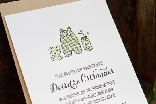
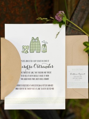
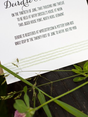
These baby shower invitations from Christa Alexandra are beyond cute. The new parents live in South Carolina, so Christa was inspired to incorporate a few southern details into the design, from a little bow tie to a seersucker pattern at the bottom of the invitation, all in a fresh mint green and charcoal gray color palette. So fun!
From Christa:Â I designed and printed this two-color letterpress baby shower invitation for the new mom of a little boy born in August. The family and friends organizing the party loved the idea of using mint and charcoal for the color palette.
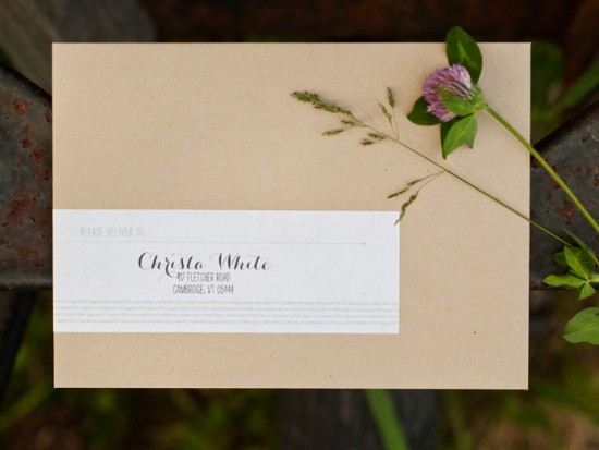
The parents live in Charleston, South Carolina, so I brought in a few southern elements: a bow tie on the onesie, a little Ball jar with “Boy” written instead, and a seersucker pattern that lines the bottom of the invitation (and with letterpress it actually feels like seersucker). I used a light kraft envelope with wrap-around address labels to coordinate with the invitation. The invitation was printed on my Chandler & Price 1918 press.
So cute! Thanks Christa!
Photo Credits: Christa Alexandra

