Romantic Wildflower Inspired Wedding Invitations

We love it when wedding invitation designers draw heavily upon the wedding venue for design inspiration! Michelle of Honey Paper (a member of our Designer Rolodex, naturally) designed these romantic wildflower inspired wedding invitations with the lush wildflower varieties of California’s Santa Ynez Valley in mind. From crisp honeysuckle to bristly blue fiesta flowers and pale leopard lilies, the delicate foliage in this suite is spot on – and so pretty paired with equally delicate text in pale green script!
Romantic Wildflower Inspired Wedding Invitations by Honey Paper

From Michelle: Nicholas proposed to Katherine under the open skies of California’s Santa Ynez Valley in Santa Barbara County as the heads of lupines and poppies unfurled like antique quilts shaken out and smoothed. As native Coloradans, the couple felt a connection to this peaceful land between the mountains and wanted to share the gentle, pastoral countryside and local culture with their loved ones on their wedding day.
Romantic Wildflower Inspired Wedding Invitations by Honey Paper

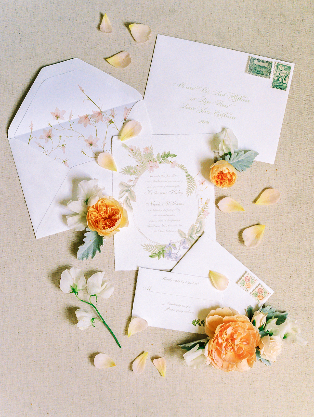
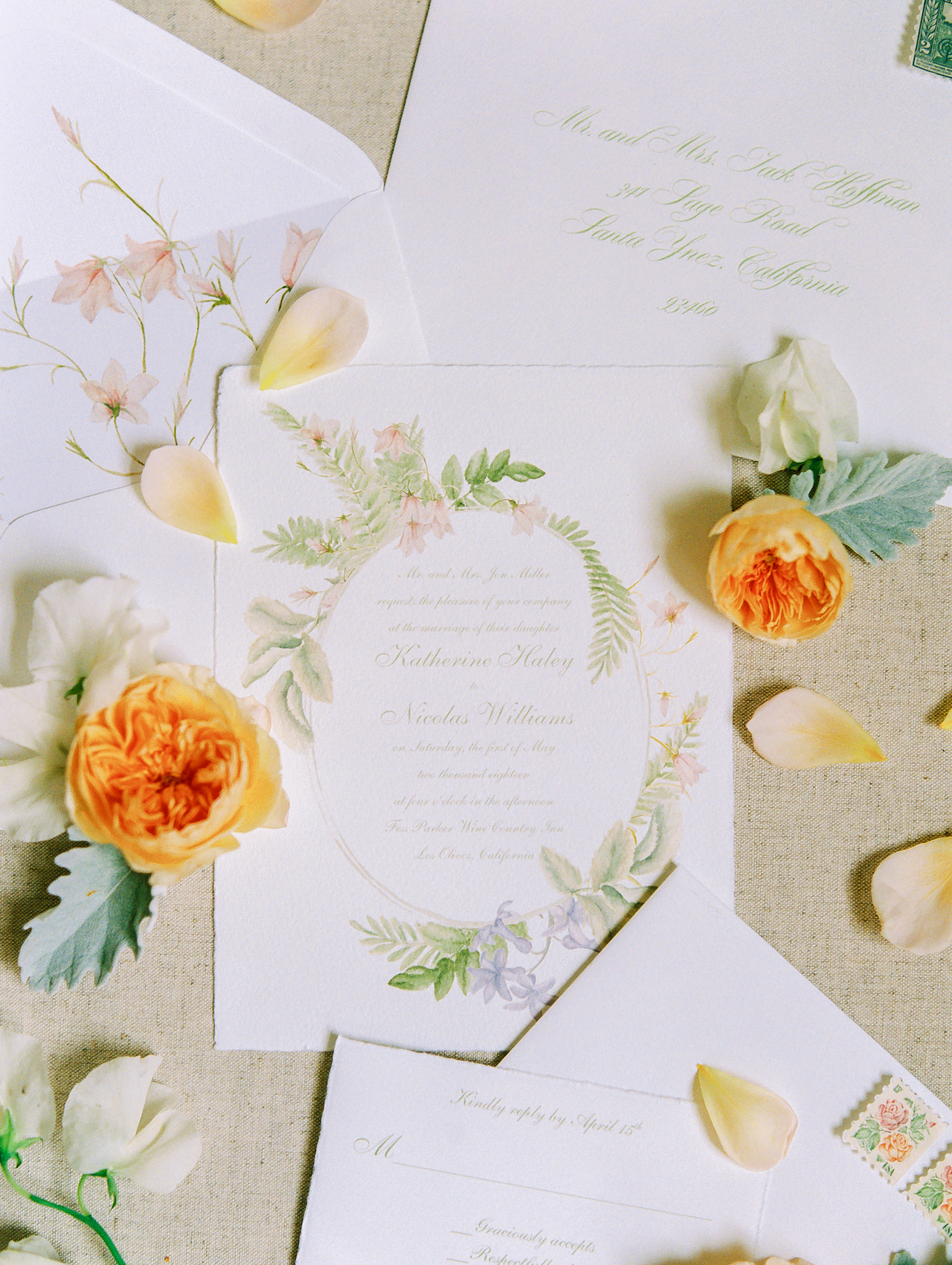
The venue, florals, stationery details, and seasonal menu all drew inspiration from the generous, natural beauty of the region and the couple’s shared interest in sustainable food and love of the outdoors. I created original watercolor illustrations for the stationery and dinner menu inspired by the wildflowers of the region. An oval wreath of native ferns, chaparral nightshade, lilies and blue fiesta flower with its bristly foliage encircled the text of the invitation. An elegant script in green, the color of weathered copper, suggests the wandering stems of California honeysuckle.
Romantic Wildflower Inspired Wedding Invitations by Honey Paper

The deckled edges of the invitation and response card highlight the artistry of the mould-made paper by Fabriano, a distinguished Italian paper company wholly dedicated to renewable energy and sustainable business practices.
Romantic Wildflower Inspired Wedding Invitations by Honey Paper

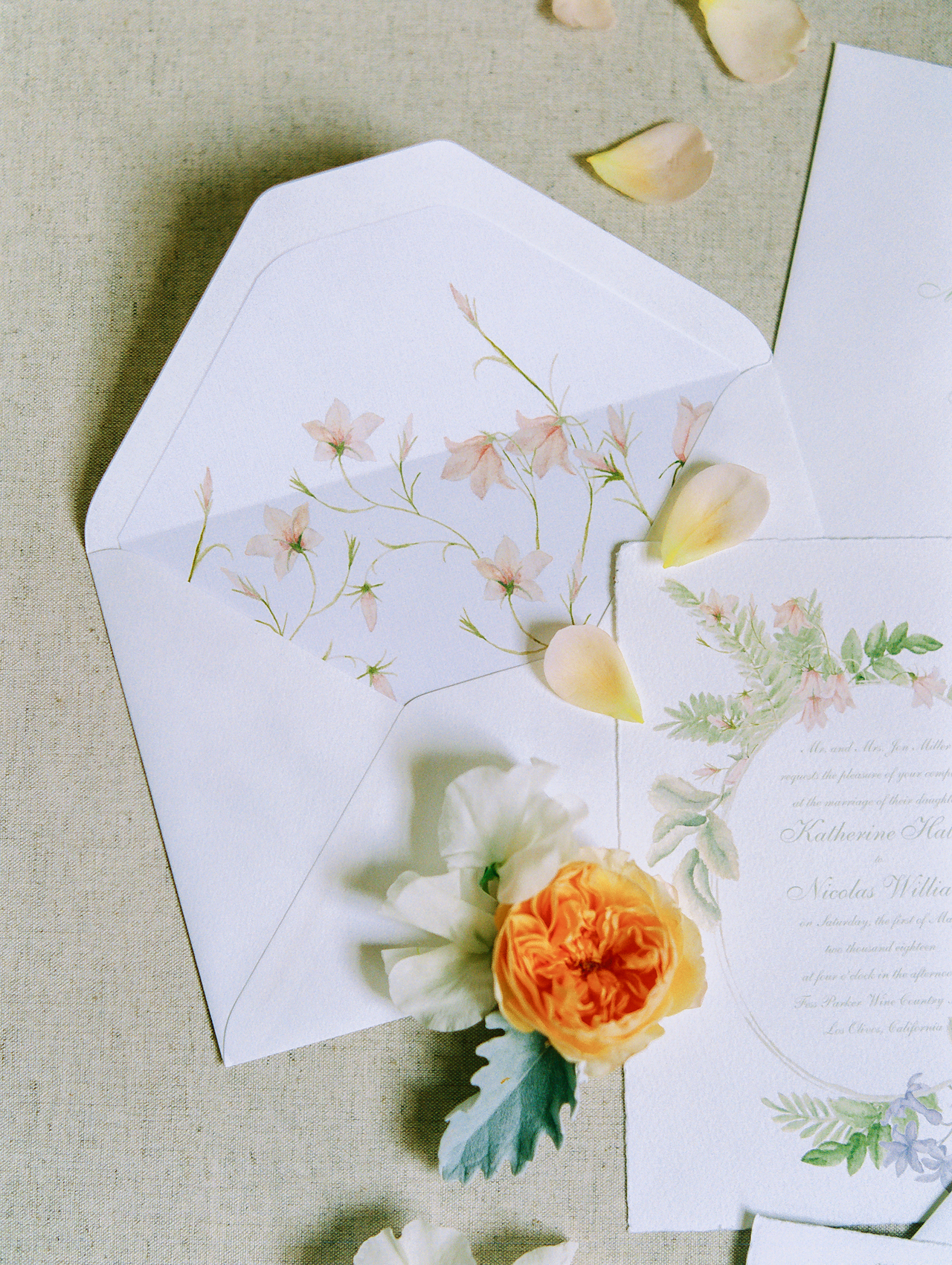
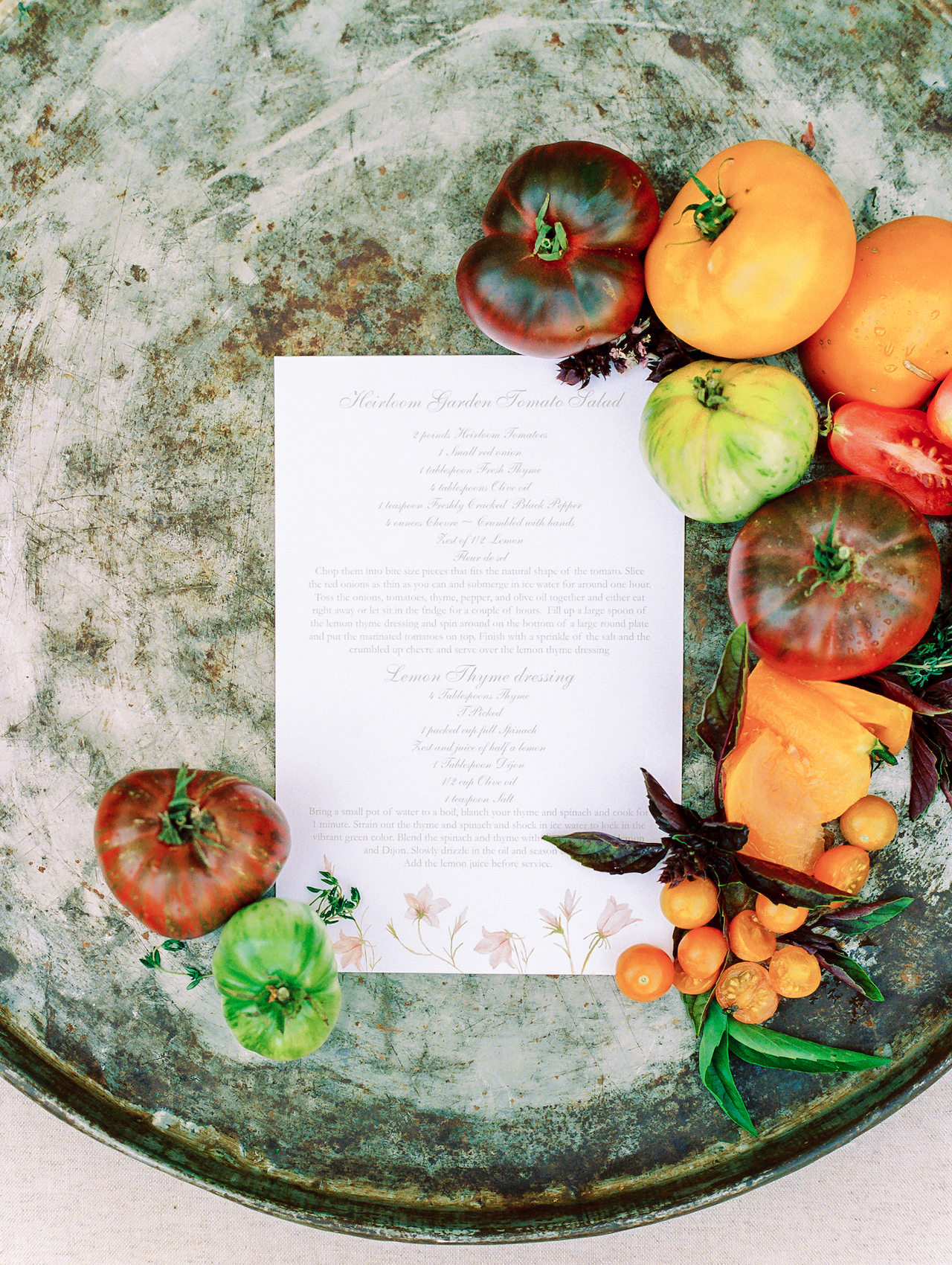
Bright white envelopes with old-world flaps were lined with my original watercolor illustration of the pale leopard lily, an abundant native plant often found alongside hedge nettles and stream orchid. Long, billowy stems with silky petals gracefully reach toward the first hints of the morning sun. Fess Parker Wine Country Inn and The Bear and Star were a perfect venue pair. Nestled among meadow, hill and stream, The Bear and Star restaurant boasts a closed-circuit ecosystem, meaning its menu is entirely crafted from the harvest yielded by Fess Parker Home Ranch. While quail, pig and cattle roam pasture, heirloom vegetables and fruit cling to vine and branch like baubles and gemstone.
Romantic Wildflower Inspired Wedding Invitations by Honey Paper

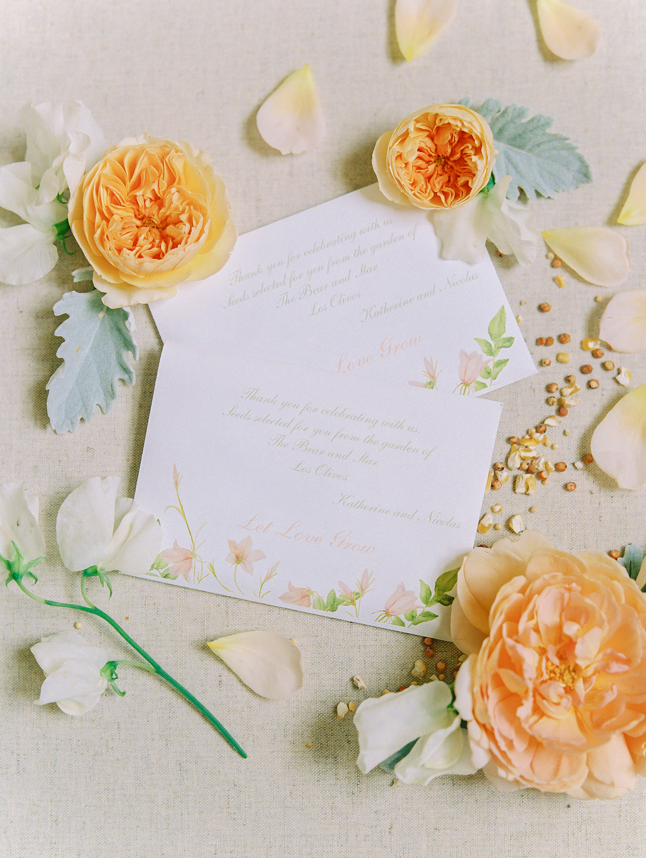
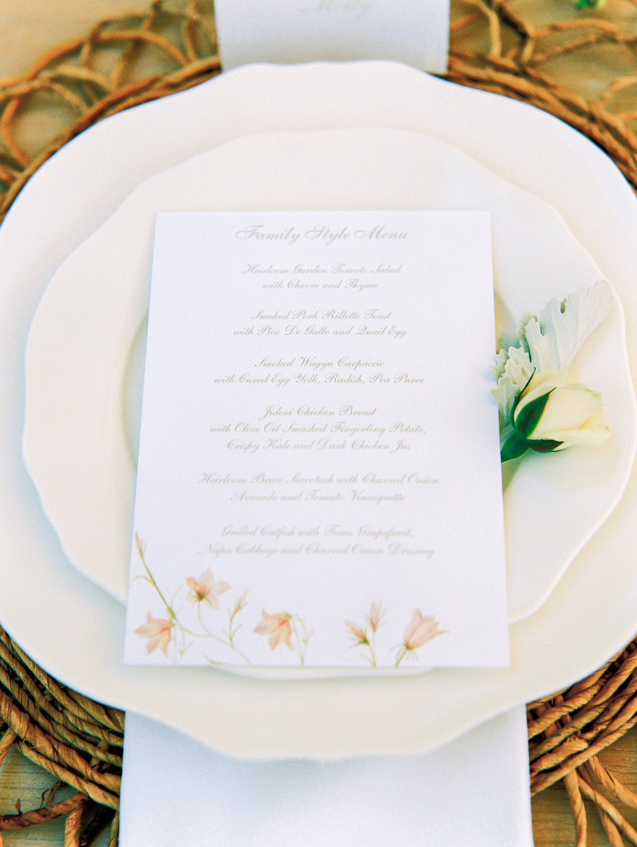
As favors, guests took home some of the garden spoils in packets filled with heirloom seeds from the year’s previous yield which read, “Let Love Grow,” with a running border of leopard lilies. The Bear and Star’s Chef John Cox prepared a family style dinner which started with a farm fresh hors d’oeuvres bar and the local Pinot Noir, Riesling and Syrah. Guests gathered at long tables on the veranda under a gentle sky and helped themselves to scoops of heirloom beans, quail egg and spring radish.
Romantic Wildflower Inspired Wedding Invitations by Honey Paper

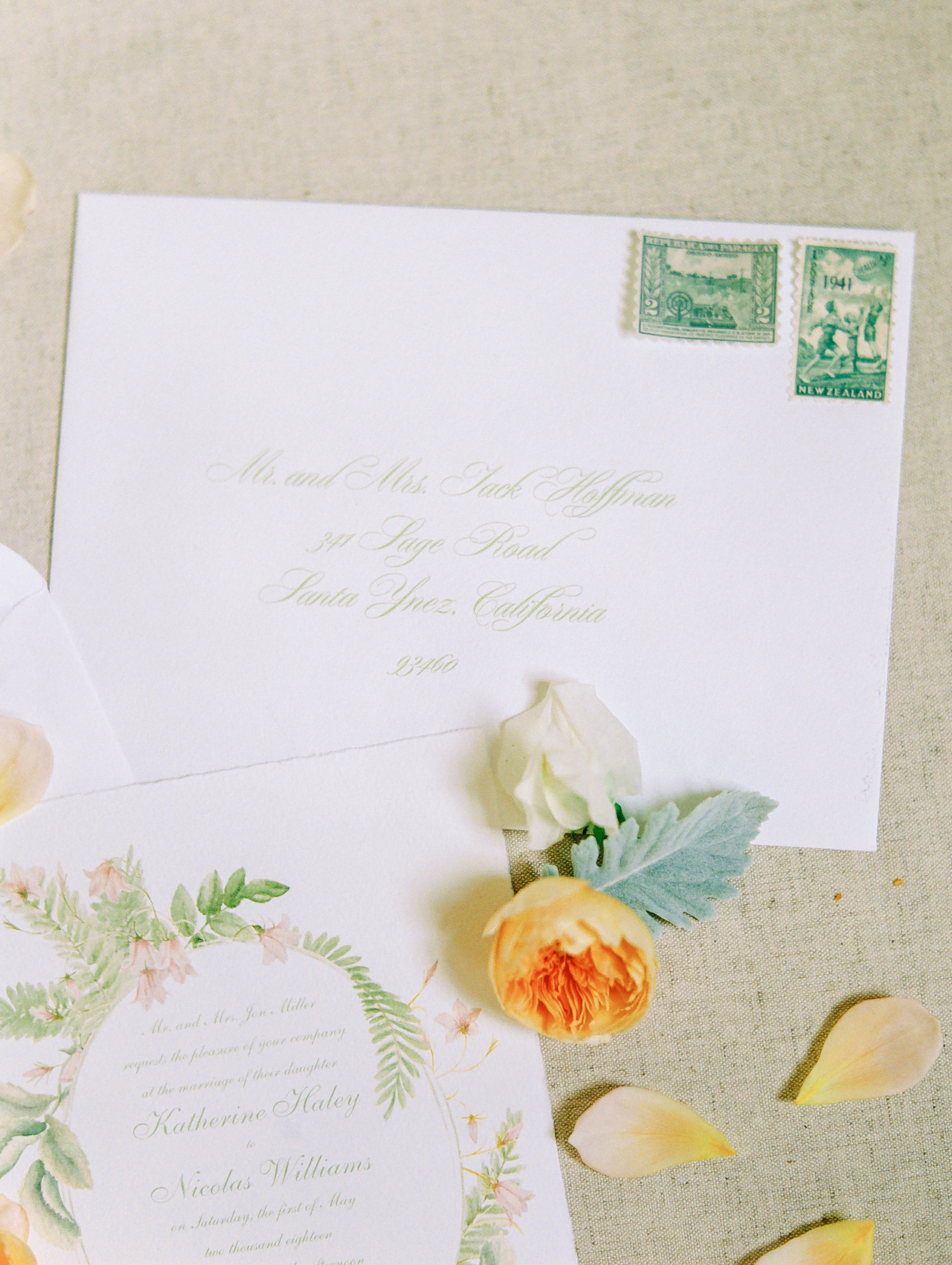
Envelopes were addressed using a romantic script the unmistakable green of spring’s first sweet pea shoots and paired with monochromatic vintage stamps. What an absolute delight to be part of this beautiful wedding day that was both a celebration of love and an homage to the riches of the earth.
Romantic Wildflower Inspired Wedding Invitations by Honey Paper

Thanks Michelle!

Design: Honey Paper
Paper: Fabriano Paper

Honey Paper is a member of the Designer Rolodex – check out more of their beautiful work right here or visit the real invi­ta­tions gallery for more wedding invitation ideas!

Photo Credits: Ashleigh and Erik

Common Room Studio: Design Inspiration!

This post was sponsored, and paid for, by SunTrust. All opinions are my own. Thank you for supporting the sponsors that make Oh So Beautiful Paper possible!

Alright y’all, it’s time to talk about the design inspiration for Common Room Studio! You’ve already seen some of the before photos, and today I want to share our color palette and the overall vibe for the space. November is National Entrepreneurship Month, so it feels like the perfect time to talk about this new facet of my business. I’m partnering with SunTrust to share some tips from their Small Business Best Practices Guide, including a few tips that I wish I’d known when I first started Oh So Beautiful Paper! As entrepreneurs and small business owners, our businesses are always evolving, so it’s never too late to incorporate good advice and best practices into your business plan!

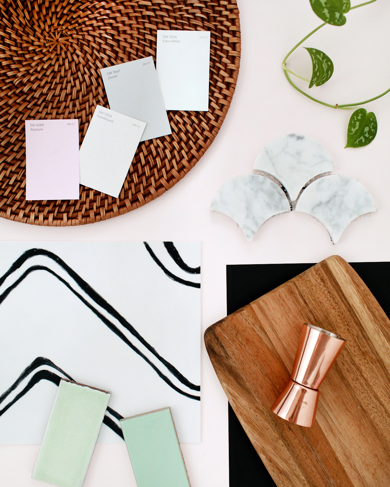
Common Room Studio Style Board and Color Palette

Some of the materials and colors for Common Room Studio: Sherwin-Williams paint in Alyssum, Snowbound, Zircon, Extra White // Scallop Marble Tile // Semihandmade Supermatte Black cabinet fronts // Butcher block kitchen countertop // Quadrostyle Harlow vinyl floor sticker (using these in the bathroom!) // Fireclay mint green tile samples

Because I started Oh So Beautiful Paper as a creative outlet, I spent the first couple of years treating the blog more like a hobby than a creative business. I didn’t even set up a business banking account until I had already quit my previous job to focus on Oh So Beautiful Paper full time. Oops! I wish I’d been able to read SunTrust’s Small Business Best Practices Guide when I first started my business; it definitely would have made things a lot easier in those early years. If I could go back and do things over, here are three things I would tell myself on day one based on what I know now:

  1. Establish good bookkeeping and banking practices from the very beginning. Keep all of your personal and business accounts totally separate, and invest in bookkeeping software that connects to your various financial institutions to keep track of expenses and spending habits. It can be a lot of work to set everything up at the very beginning, but it will save you so much time and energy down the road!
  2. As your business grows, focus your time and energy on the things that you enjoy the most and truly do best, then outsource the things that you either aren’t good at or really don’t enjoy. For most small businesses, bookkeeping is one of the first things that gets hired out. But you could also consider investing in a part time assistant to help manage your social media, or handle all shipping and mailing responsibilities.
  3. Review your pricing strategy on a regular basis to make sure your pricing reflects the full value of your products or services. If you’re a service-based business, remember that it’s totally okay to raise your prices as your business grows and evolves. Just because you start out offering a product or service for one price doesn’t mean that you’re stuck at that price forever!

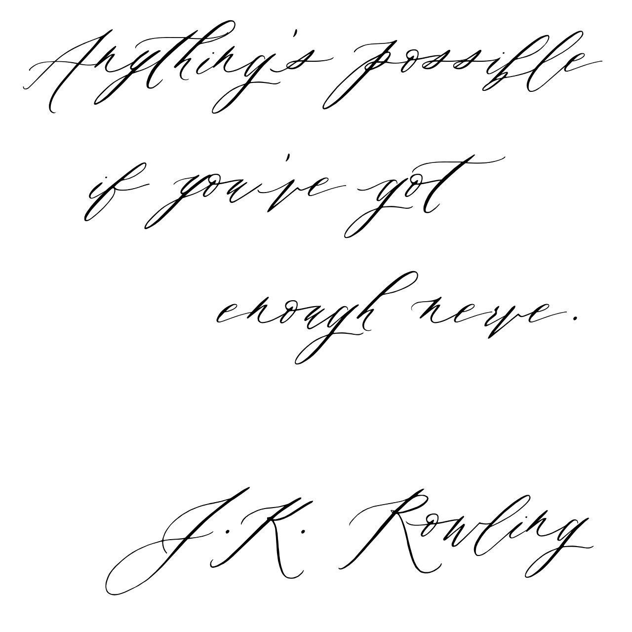
Anything's possible if you've got enough nerve - JK Rowling

The SunTrust Small Business Best Practices Guide covers six important financial management topics to help small business owners navigate their entrepreneurial journey. With the addition of Common Room Studio, I’m in a growth and expansion stage of my business – so I found the section on Growing Your Small Business to be really helpful. I was particularly interested in the points on evaluating options for accessing funds to finance business growth, because hello build-out expenses! There is lots of seriously good financial advice for entrepreneurs and small business owners at every stage in their business. You can check out the full guide here!

Start Somewhere

Start Somewhere

Now that the big construction phase is behind us at Common Room Studio, our current challenge is to finish decorating the space! I’ve decorated plenty of apartments and my current home, but I’ve never decorated a commercial space before. Turns out, the process for decorating a commercial space is quite different from decorating a house! I want Common Room Studio to be a bright and open space that can serve lots of different purposes, but I also want it to be an inspiring place that creates a warm and inviting impression the minute you walk inside. I started by thinking about the colors, materials, and textures that I wanted to bring into the space, along with how I wanted the space to function as a whole.

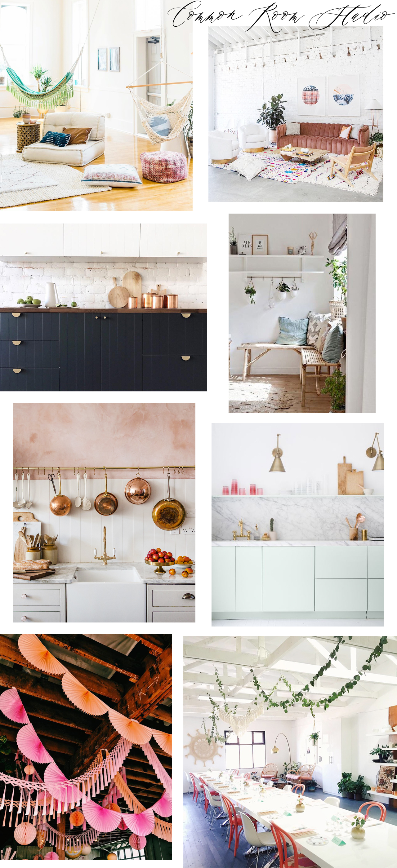
I always create moodboards to help define my vibe and guide future design decisions, but I also roped in my friend and interior stylist Michelle Solobay to help me finish the space. I’ve been collecting inspiration on this board since I first started hunting for studio spaces, and then continued adding to it with this particular space in mind once I had signed the lease. Here’s what we’ve got so far!

Common Room Studio Moodboard

Sources (clockwise from top left): Jenna Kutcher; Light Lab; My Scandinavian Home; Pigment‘s workshop space via Mon Voir; garlands in the Pigment retail space; pink plaster kitchen by Jersey Ice Cream Co.; Sarah Sherman Samuel

Here are my goals for the space:

– Create a bright and open space that can serve as a blank box for photo shoots, workshops, and other events. Furniture in the workshop space must be able to serve multiple purposes and be easily moved and/or easily taken apart and stored to suit the needs of different events. 

– Because the space needs to be visually neutral, our color palette is pretty limited: bright white walls and floors to bounce natural light around, with accents of pink, green, navy blue, and black. Copper, brass, and matte black for metal and hardware.

– Incorporate natural materials, textures, and plants to soften the industrial vibe of the space. Butcher block countertops for the kitchenette, wood chairs, woven baskets and pendants, and house plants in varying sizes scattered throughout the space.

– Hang garlands from the ceiling and woven wall hangings to bring in bright pops of color and add additional texture/visual interest.

– Create a cozy seating area in the front room to welcome guests and provide a space where people can sit and socialize during events.

So there you have it: Common Room Studio, coming very very soon! I am BEYOND excited to bring it to life and share the whole process here!! If you have any decorating or layout advice, lay it on me in the comments. I’m all ears!

Photo Credits: Nole Garey for Oh So Beautiful Paper

This post was sponsored, and paid for, by SunTrust. All opinions are my own. Check out the SunTrust Small Business Best Practices Guide right here!

November Desktop Downloads!

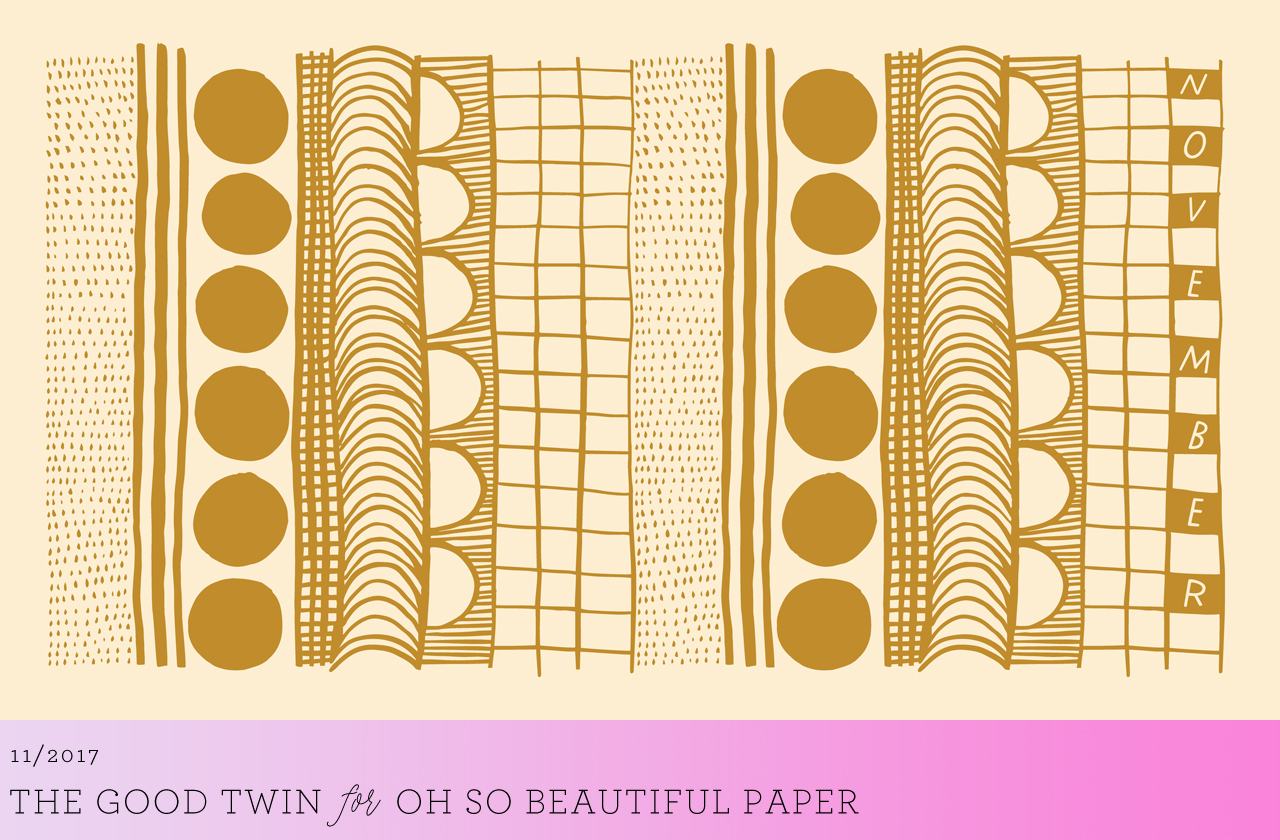
Welcome to November everyone! And somehow we’re left with only two more months in 2017?!?!? We’re having an unusually long and glorious fall season here in DC, so I’m just trying to soak in all the beautiful foliage and mild temperatures before the cold winter weather settles in. This month we have three beautiful illustrated wallpapers from The Good Twin and Home Again Creative for you to choose from.  As always, the wallpapers are available in both desktop and phone size, so you can pick your favorites – or even two different wallpapers for two different devices! Which one will you choose???

November Desktop Wallpaper / The Good Twin

Desktop | iPhone

November Desktop Wallpaper / The Good Twin

Desktop | iPhone

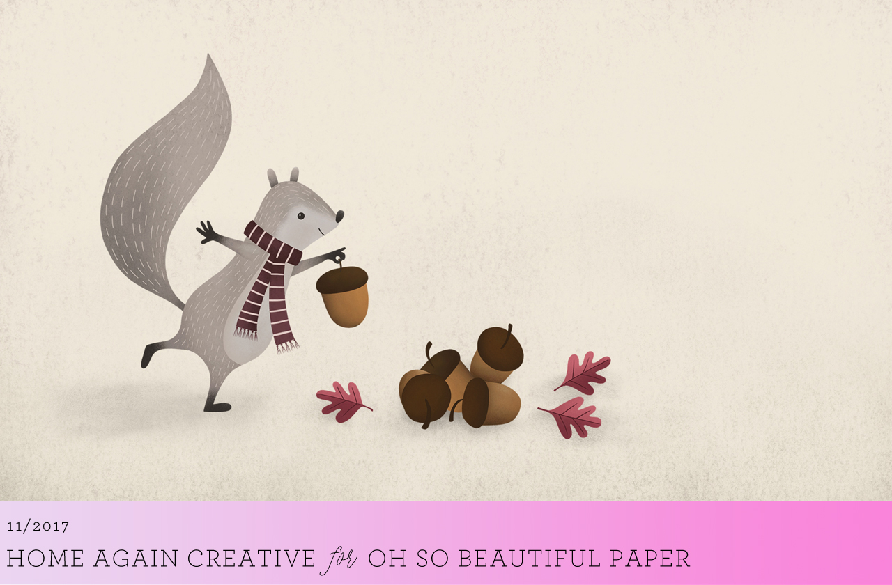
November Desktop Wallpaper / Home Again Creative

Desktop | iPhone

For personal use only. All illustrations by The Good Twin and Home Again Creative for Oh So Beautiful Paper

If you’re a designer or illustrator interested in contributing your own designs to this column, please email your design to submissions(at)ohsobeautifulpaper.com with the subject line “desktop downloads.” If it’s a good fit I’ll add it to the post for the following month!

Fall Cocktails: The Stone Fence

It’s Halloween! But the adults deserve treats, too. If you just spent the last few nights in a row working into the wee hours of the morning making your kids their perfect costumes, of if you just spent all night escorting your kids on a sugar rampage through the neighborhood, then treat yourself to a favorite fall cocktail: the Stone Fence. – Andrew

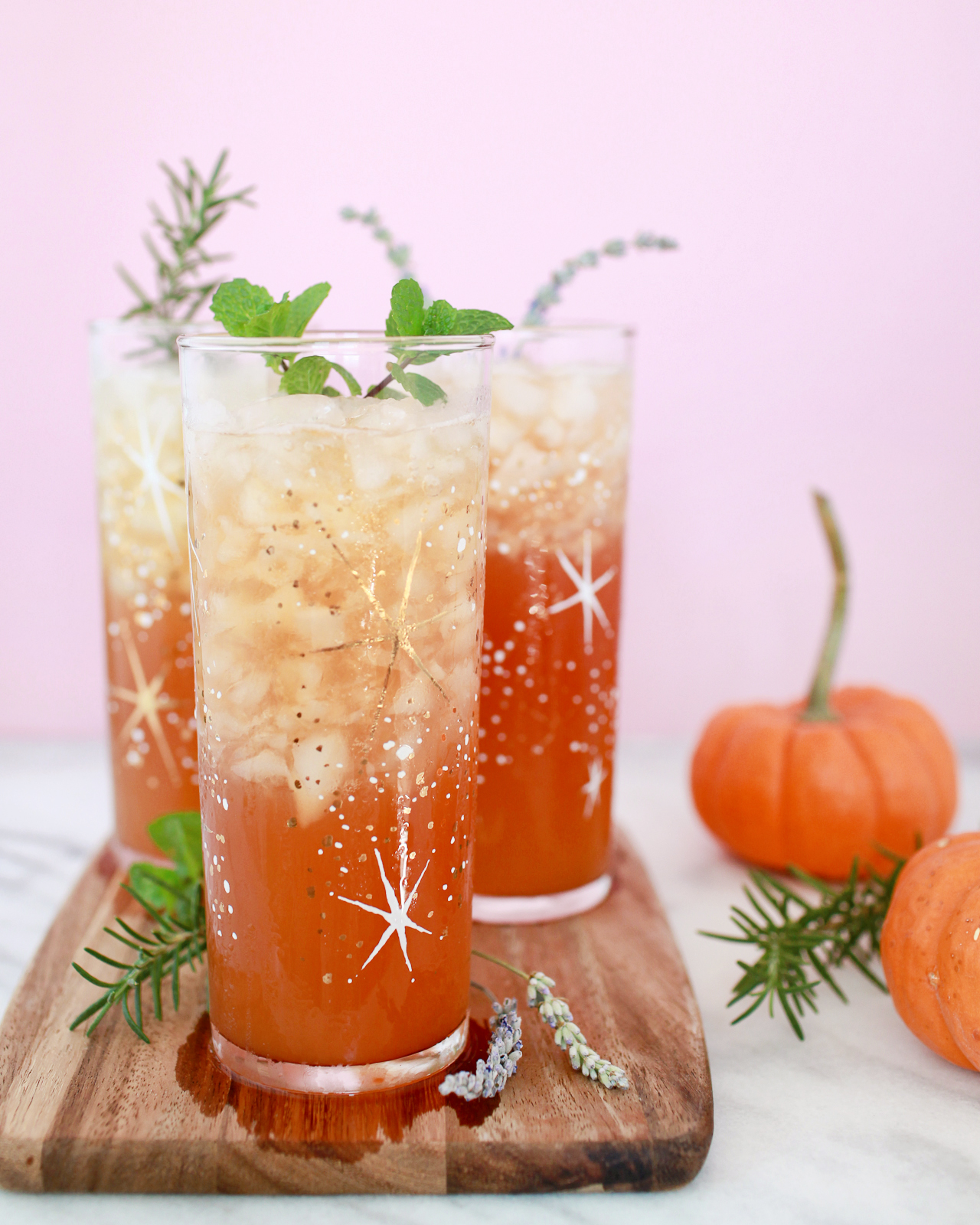
The Stone Fence Cocktail Recipe

The Stone Fence

2 oz Rye Whiskey
2 oz Sweet Apple Cider
2 dashes Boker’s Bitters
Dry Hard Cider

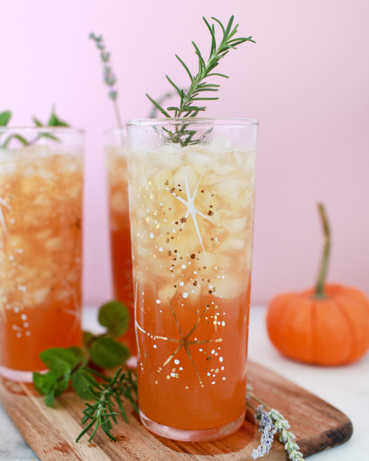
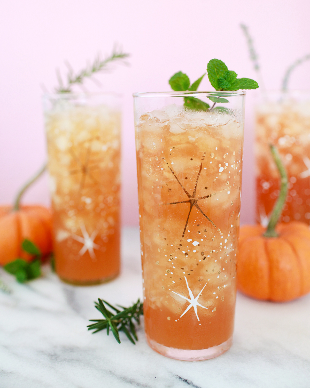
Combine the rye whiskey, sweet apple cider, and bitters in a highball glass filled with crushed ice. Top with the hard cider and give it a stir. Garnish with fresh mint or another handy herb and enjoy!

The Stone Fence Cocktail Recipe

We first featured the Stone Fence all the way back in 2012 and have revisited periodically since then, both because it’s an awesome drink with an awesome history* and because it’s a very versatile recipe that can be endlessly tweaked.

*Seriously, it’s an awesome history, playing a big role in Ethan Allen’s capture of Fort Ticonderoga in 1775. This is the drink that gave a bunch of backwoods militiamen the courage to drunkenly stumble into a military outpost of a global super power and successfully demand its surrender through sheer drunken outrageousness.

The Stone Fence Cocktail Recipe

The original recipe called for rye whiskey – America’s first love, before the Age of Bourbon – and hard apple cider. I’ve tried this version, and it’s ok, but a little bland; the cider and rye play up each other’s dryness and bitterness in a way that I don’t really love. I’ve also tried an updated version that pairs rye with sweet apple cider, the non-alcoholic stuff that most Yankee kids know just as plain “cider.” This version is pretty good, tart sweet and spicy, but it can feel a little…childish.

So I made the best of both worlds and added both sweet, non-alcoholic cider and a dry, sparkling hard cider. The result is sweet and tart and spicy, but the hard cider dries it out a bit and lightens the drink with effervescence. The hard cider also kicks up the proof just a bit, which helps balance out the sweet cider.

The Stone Fence Cocktail Recipe

We went with Boker’s bitters – a long-lost bitters recipe heavy on the cardamom that used to be ubiquitous in drinks, then vanished from the record, and was recently resurrected. This adds some warm baking spice notes, always welcome in a fall drink featuring apple. If you don’t have Boker’s bitters on hand, you could always try making your own cardamom bitters – or there’s always the old standby, Angostura bitters, that will add some complex spices to your Stone Fence.

The Stone Fence Cocktail Recipe

Recipe, glassware, and Boker’s Bitters: Liquorary – you can also follow along on Instagram for more cocktail recipes!

Photo Credits: Nole Garey for Oh So Beautiful Paper

This post contains affiliate links. By clicking on these links, you’ll help support Oh So Beautiful Paper while also purchasing some fantastic products. We only recommend products that we truly love and trust that you’ll love, too. Our full disclosure policy can be found here.

The Best Walls in DC

I’ve lived in DC for nearly 15 years, and gosh this city has changed a lot over those years. One of my favorite changes is the emergence of colorful walls and murals throughout the city, so today I thought I’d share some of my favorites with all of you! You should definitely consider this to be “The Best Walls in DC: Part 1,” because there are lots more seriously cool DC walls on my list. If you’re local, feel free to share your favorites in the comments below – and if you’re planning to visit DC in the near future, I hope you’ll include a stop at some of the walls below during your visit!

The Best Walls in DC

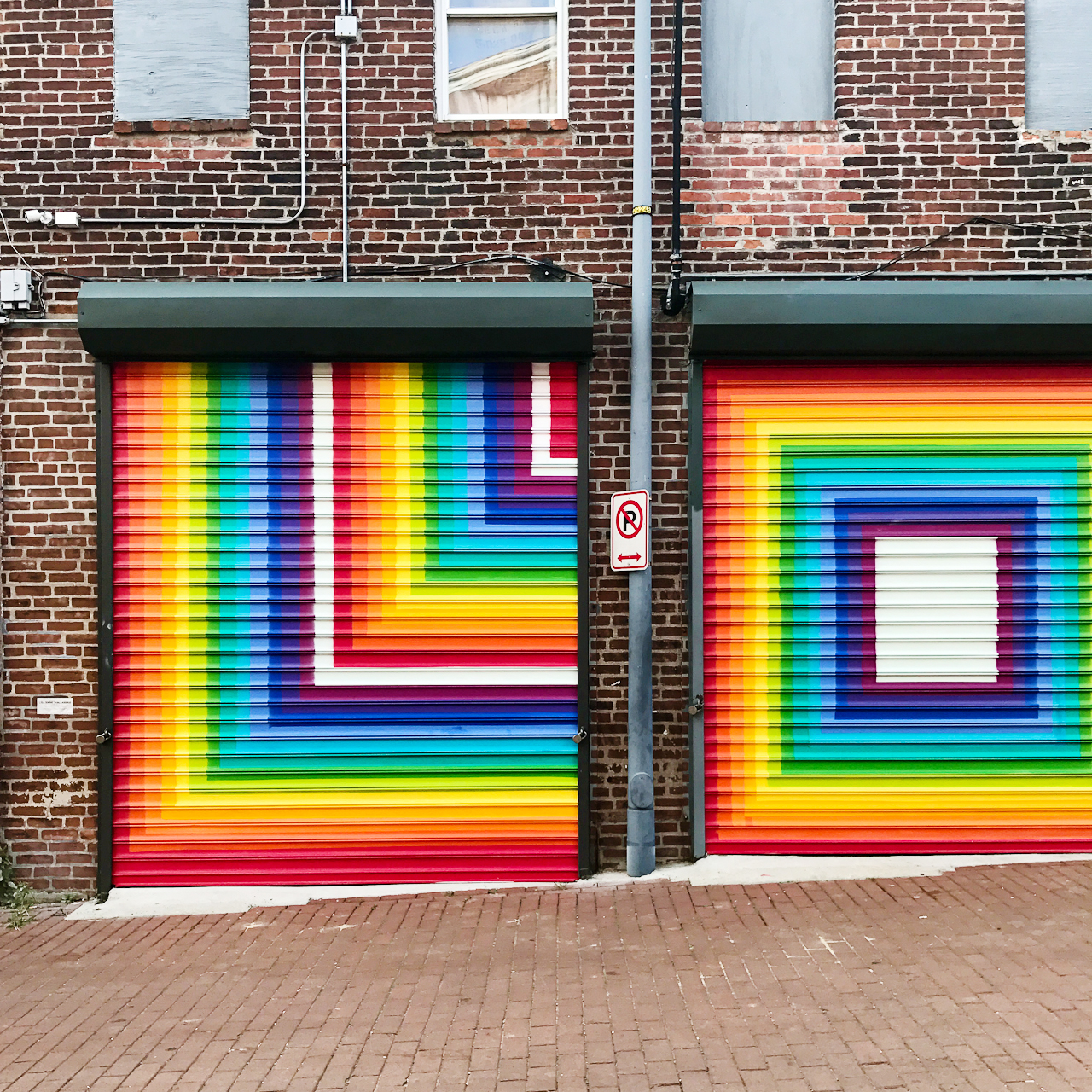
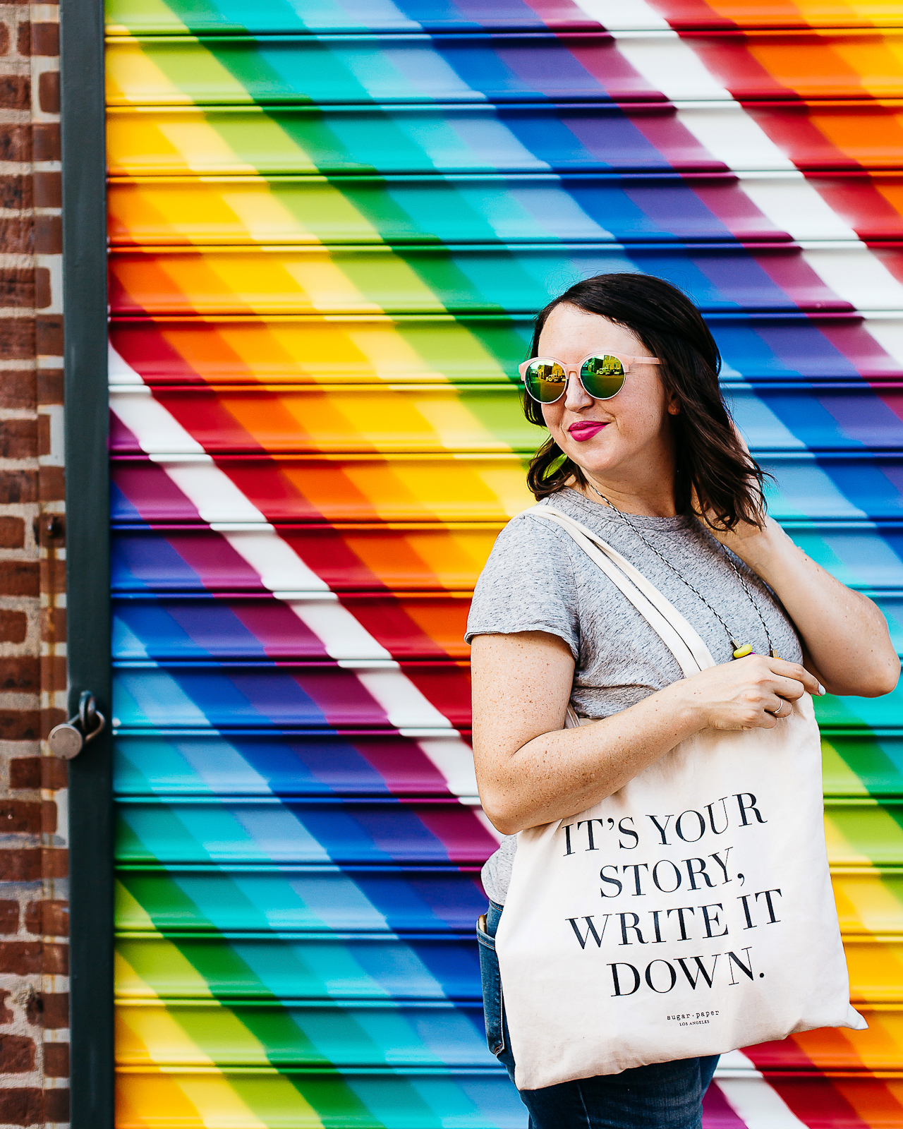
Let’s start with one of my favorites! Blagden Alley is full of murals, but my favorite is this rainbow mural by visual artist Lisa Marie Thalhammer that spells L-O-V-E over four painted garage doors. Bonus points if you stop to check out the murals on your way to one of the many restaurants and bars in the area, from the brand-new Calico to longtime favorite The Columbia Room.

The Best Walls in DC

The Best Walls in DC

Blagden Alley, between M and N Street NW and 9th and 10th Street NW

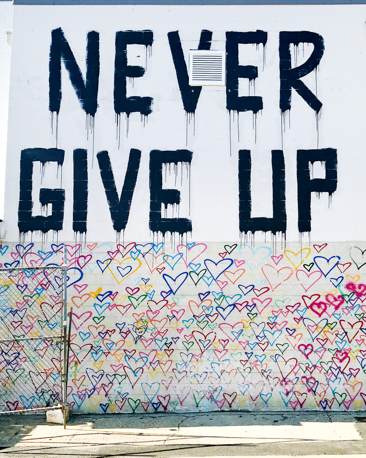
Union Market is one of our favorite spots in DC: we love grabbing a drink at Cotton & Reed, a quick bite to eat at one of the many food stalls, and shopping at Salt & Sundry or Little Leaf. But they also have two of my favorite murals in the city! The heart wall below was created by LA graffiti artist Mr. Brainwash in 2016 in honor of International Women’s Day. It’s so happy and colorful!

The Best Walls in DC

The Best Walls in DC

The Best Walls in DC

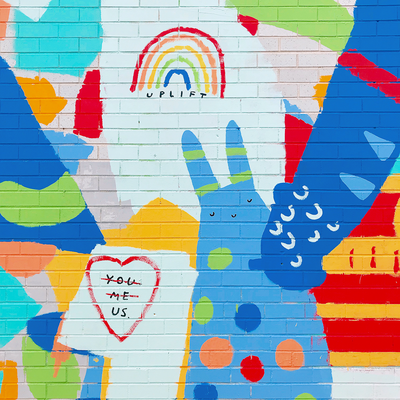
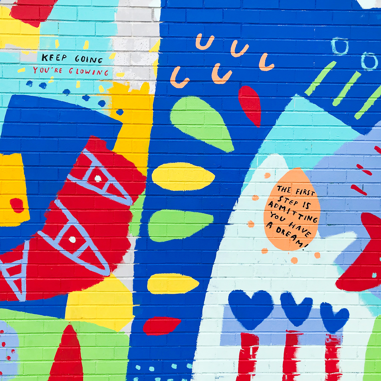
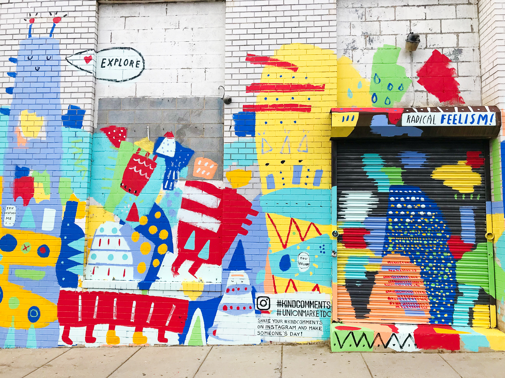
Just a few weeks ago, artist Dallas Clayton came to town to work his magic on another Union Market wall. This wall is in partnership with Instagram’s #kindcomments campaign, and is full of colorful shapes and happy messages.

The Best Walls in DC

The Best Walls in DC

The Best Walls in DC

The Best Walls in DC

Union Market, 1309 5th St NE

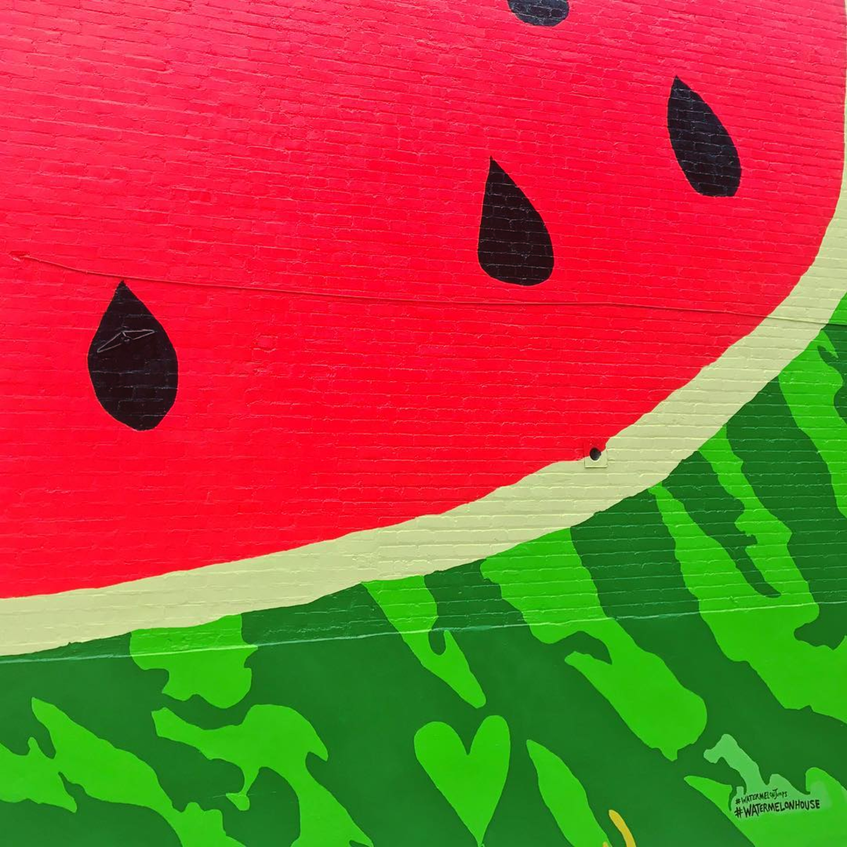
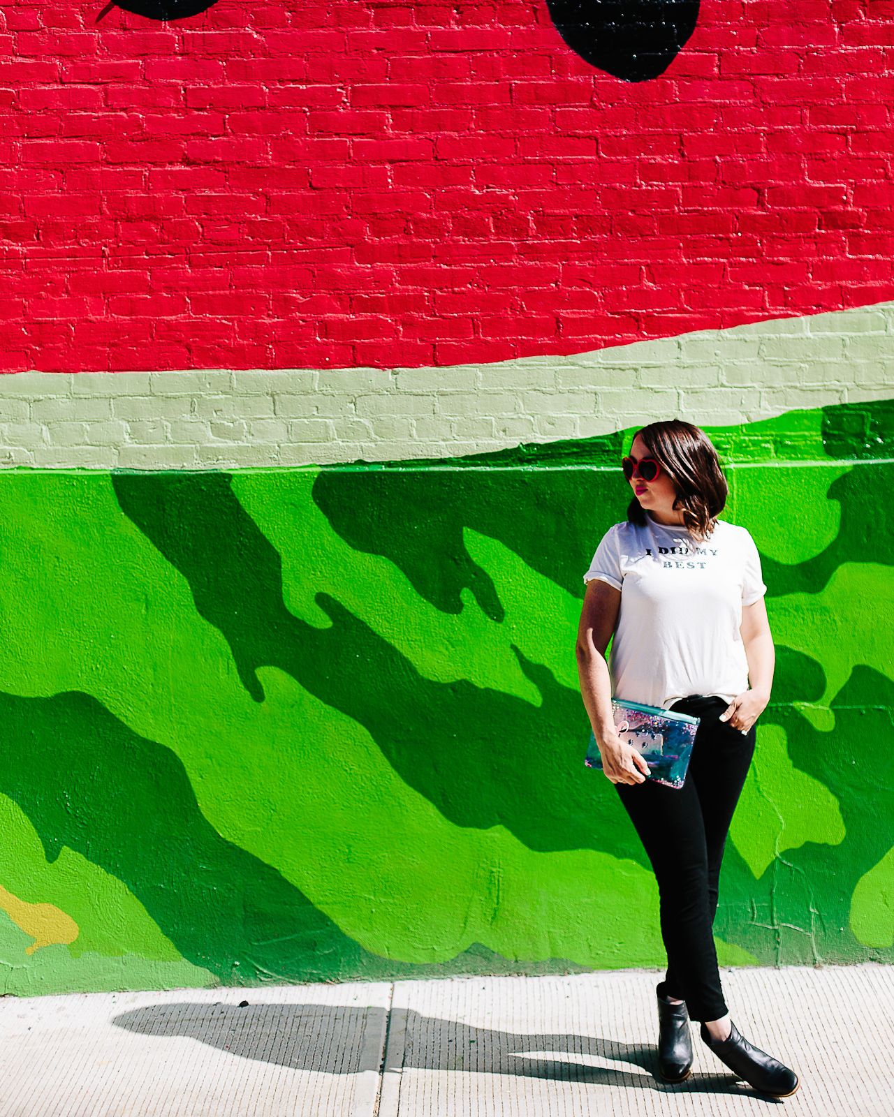
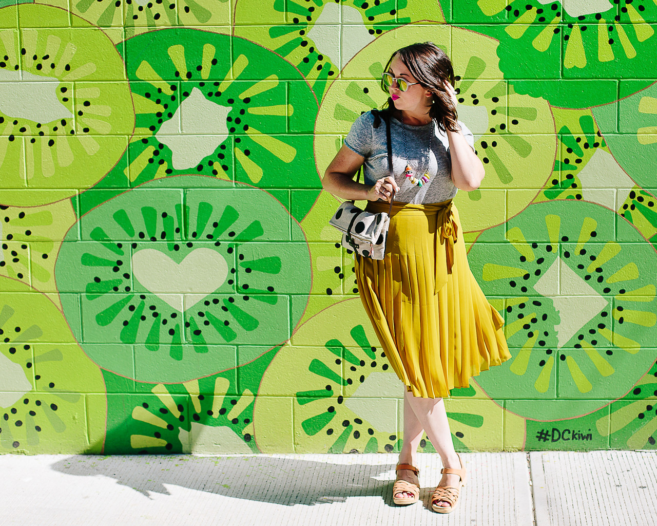
The Watermelon House is well on its way to being one of the most well known landmarks in DC. You can even find it on Google maps! The legend behind this wall (at least as told to me) is that the home was painted a bright pink back when the current owners bought it. They weren’t crazy about the shade of pink, so they decided to paint a few seeds and a green border on the side and turn it into a watermelon – and the rest is history! And if that wasn’t good enough, the DCKiwi wall is right behind the watermelon wall! It’s the cutest little fruit-filled alley in all of DC.

The Best Walls in DC

The Best Walls in DC

The Best Walls in DC

The Best Walls in DC

Watermelon House and DCKiwi Wall, 1112 Q Street NW

As much as I love rainbows and fruit murals, I’m completely obsessed with the lettering in this mural by Ricardo Gonzalez for Pow Wow DC at the AVA NoMa building. And those colors! I could stare at this one all day.

The Best Walls in DC

Image by Pow Wow DC

The Best Walls in DC

The Best Walls in DC

The Best Walls in DC

AVA NoMa, 55 M St NE

All photos by Nole Garey and Anna Meyer for Oh So Beautiful Paper