Happy Friday everyone!  Between plans to go blackberry picking and hanging out with good friends over the long 4th of July weekend, I haven’t been this excited for a weekend to kick off in a long time.  I really can’t believe it’s July already – the summer is flying by so quickly! I’m heading off to enjoy the weekend, but in the meantime…

…a few links for your weekend!
- Stunning woodcut printed wedding invitations!
- A ballet-inspired font (via chelsea)
- Love the blind impression on Sarah’s Aspen-inspired wedding invitations
- A yummy holiday treat idea from Kathleen
- Lavender + gray wedding invitations
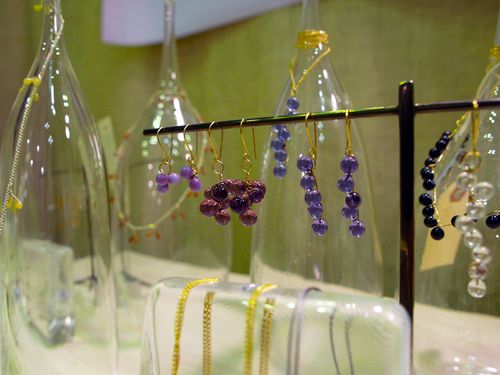
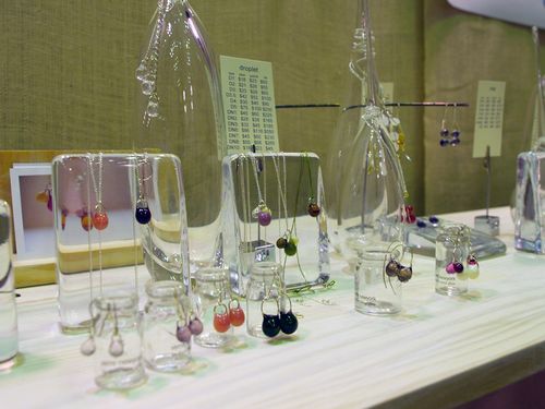
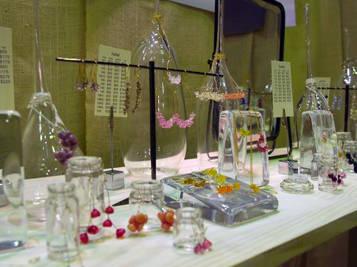
- I am completely in love with this mobile!
- Such a cool idea – handpainted stripes
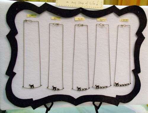
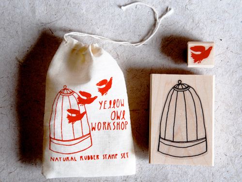
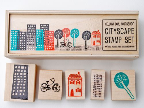
- Cute little hand-carved stamps
And in case you missed it, a few favorite posts from this week:
- Melissa and Jerome’s golf-inspired wedding invitations
- Lovely business cards
- Typography-inspired invitations that tell a story
- Awesome kid’s party invitations
- DIY seersucker wedding invitations
That’s it for me this week! Oh, and you all are totally awesome with the kids party invitations! I’ve received so many submissions that I’ll be doing a few more round-ups over the next couple of weeks. So keep them coming! I hope you all have a wonderful weekend, and I’ll see you all back here on Tuesday!
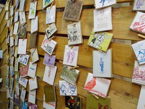
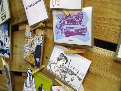
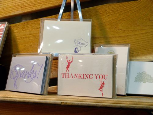
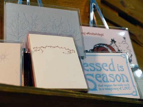
{image credits: snaphappyraa}