Julie + Spiro’s Bilingual Greek Wedding Invitations

Today’s real wedding invitations come to us from an incredibly adventurous bride, Julie, who was willing to not only learn how to letterpress print her own wedding invitations, but also to print the invitations in both Greek and English!

Greece-Bilingual-Gray-Yellow-Wedding-Invitation-Suite

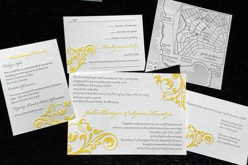
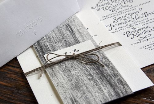
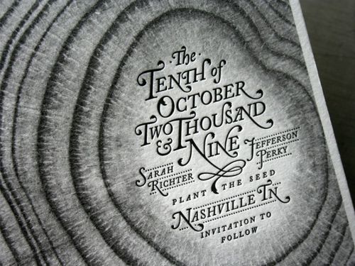
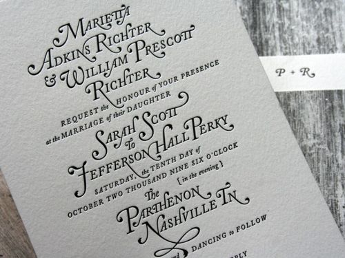
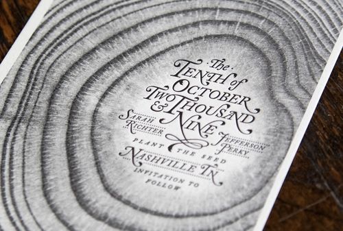
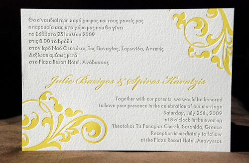
Julie fell in love with the tactile feel of letterpress invitations and decided to explore letterpress printing the invitations for her summer wedding in Greece.  Julie chose a beautiful color palette of yellow and gray for her invitation suite:

Greece-Bilingual-Yellow-Gray-Wedding-Invitation

From Julie:  I was a DIY bride in almost every aspect of planning my wedding, which happened on July 25, 2009 in Greece.  When it came to creating my wedding invitations I desperately wanted letterpress, but it was out of my price range.  So I decided to take some letterpress classes at a local printers museum.

Greece-Wedding-Itinerary-Enclosure-Yellow-Gray

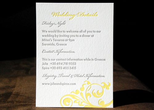
I designed all of the elements of my wedding suite (with a total of 5 pieces).  With the help of my instructor, who was kind enough to allow me to use her Vandercook presses at her print shop, my husband and I cranked out all 220 invitation suites in around 7 hours.

Greece-Gray-Yellow-Wedding-RSVP-English

Greece-Gray-Yellow-Wedding-RSVP-Greek
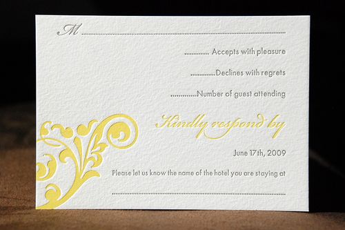
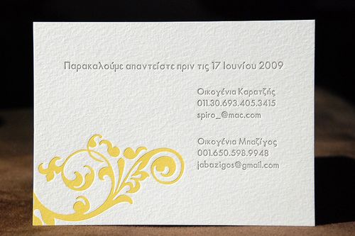
{above, the rsvp card in english; below, the greek rsvp card}

It was exhausting, but such a great experience for me that since then I’ve started up my own side business of creating letterpress invitations specializing in bilingual invitations (similar to mine, which is half Greek and half English).

Greece-Letterpress-Wedding-Map-Gray-White

Not only did Julie create beautiful wedding invitations, but I love that she had so much fun in the process!  You can read more about Julie’s letterpress adventures on her blog right here, and check out more of her bilingual letterpress wedding invitation designs on her website, Cartoules Letterpress.  Thanks Julie!

{image credits: cartoules letterpress}

{happy weekend!}

Happy Friday everyone!  Are you looking forward to something fun this weekend?  I seem to have come down with a cold this week, so I'm just looking forward to recuperating, and of course packing for our upcoming move.  I usually hate packing, but I think I'm so excited about moving to our new space that this time I'm actually having fun packing and getting rid of clutter that we've accumulated during the last 4 years in our current apartment.  I've got a long to-do list before Monday, but in the meantime…

Pink-bicycle 

Here are a few links for your weekend reading pleasure:

That's it for me this week!  But before I run off for the weekend, I also wanted to mention an amazing conference coming up at the end of the month in Salt Lake City — the Altitude Design Summit!

AltHeader3

So many of my favorite bloggers are scheduled to speak at the conference — and so many more will be attending.  I can't wait!  If you're interested in attending, you can check out the details right here.

{pink bicycle photo via flickr}

Whimsical Baby Shower Invitations + Announcements

After I posted these baby shower invitations a couple of weeks ago, I received the sweetest e-mail from Tovah at Brighten My Day studio.  Tovah creates entirely custom wedding invitations, Bar and Bat Mitzvah invitations, and — of course — baby announcements!  The amazing thing, particularly in this era, is that Tovah operates entirely by word of mouth and does not maintain a website (!) — and as a result, Tovah forms a personal relationship with each of her clients that is reflected in the final design.  Here are a few examples — along with some background from Tovah on each of the designs:

Orange-Floral-Letterpress-Birth-Announcement

LEAH WALDMAN

I have worked with this family for years, and was honored to create the invitation for their granddaughter’s naming ceremony.  They wanted an invitation that was warm and sophisticated, and while they wanted a little sweetness, they did not want the invitation to feel juvenile nor whimsical.  We letterpress printed the invitation on a heavy, nearly white board in a warm tangerine hue, a compliment both to the décor in their home and a match to the warmth of this family.  The invitation is monarch sized and paired with a kraft colored enveloped, also letterpress printed in the orange ink.  The floral image has a hand-drawn feel, and is carried through to wrap around the envelope flap.


Pink-Daisy-Letterpress-Baby-Announcement

JAREN ROSE

This is my daughter’s birth announcement.  I wanted some sweetness, but still clean and contemporary.  This one was a 4Bar announcement {petite and girly} letterpress printed in latté and petal inks.  The “relief” dot detail on the flowers has a great feel when letterpress-printed, and the pink was a translucent, delicate shade that I just loved.


Blue-Geometric-Letterpress-Baby-Announcement

NOAH SAGE

This is the birth announcement of my now 4-year old son.  I wanted something that felt modern, but with a softness that still felt ‘baby.’  The announcement was letterpress printed in light blue and chocolate inks on a gorgeous soft white stock.  His name was lettered by the amazing Gail Brill.


Pink-Floral-Letterpress-Baby-Shower-Invitation

Floral-Twins-Letterpress-Baby-Announcements

SCOTT AND SHANE

This couple had gone through the surrogate process and were soon bringing home twin baby girls.  We used their nursery — a contemporary room of orange and pink with vintage elements — as inspiration for the both their shower invitation as well as their baby announcement.  The shower invite (top) featured a floral illustration that was letterpress printed into heavy, nearly white board in blossom and tangerine inks.  The announcement (bottom) was a tri-fold design printed on fluorescent white 110 lb. cotton Lettra and featured a gorgeous black and white photo of the newborns. 


Blue-Elephant-Letterpress-Baby-Announcement

ZEV MATTHEW

This couple were using whimsical animals throughout Zev’s new nursery, so I used that as inspiration, knowing that Mom and Dad also had a clean, unfussy personal style.  They wanted to keep the design to  a single color {for budget reasons} and loved the sweetness of a 4-bar card.  The announcement was paired with bluebell envelopes, letterpress printed tone-on-tone in a deeper bluebell ink.

Thanks so much Tovah!  If you're interested in working with Tovah for baby announcements or Bar and Bat Mitzvah invitations, you can contact her via e-mail by clicking here!

{image credits: tovah glenn}

{happy new year!}

Rainbow

Happy (almost) New Year everyone!  I'm signing off for the weekend, but just wanted to wish you all a wonderful, warm, and safe New Year's Eve and fabulous 2010!  I also wanted to take a moment to send out a few thank you notes.  First, to all of my dear readers, for stopping by here everyday, for sending me your invitations and commenting on posts – you all make my day so much better!  Second, to all the designers, stationers, calligraphers, and artists that I've had the priviledge of getting to know over the past year, for allowing me to share your beautiful work.  And finally, I also have to thank all of my amazing sponsors for making so much of what I do on this blog possible!

I'll be back here next week, and I've got big plans and exciting changes for 2010 that I can't wait to start sharing with all of you!  In the meantime, if you're looking for inspiration, I've been updating my tumblr page like crazy this week – check it out right here.  Happy 2010 everyone! 

{image credits: little black umbrella}

Jefferson + Sarah’s Amazing Woodgrain Wedding Invitations

These invitations are another of my favorites from 2009 — the mix of woodgrain details and amazing typography just blow me away every time.  I first saw Jefferson and Sarah’s autumn Nashville wedding invitations on the Studio on Fire blog back in November, but when the designer (and groom!) Jefferson Perky sent over his take, I couldn’t resist sharing his perspective!

Woodgrain-typography-invitation-suite

From Jefferson: This invitation package was design for my own wedding. The idea was to create the feel of an elegant fall wedding with a hint of whimsy.  The growth of tree metaphor was carried out through the entire suite, from the Save the Date through the thank you cards.

Woodgrain-typography-letterpress-invitations
Woodgrain-typography-letterpress-invitation-detail

Everything but the envelopes was printed in a single color (black) on the same sheet and trimmed from there (a great cost saving technique).  Although I decided early on in the design process that the invitations would be letterpress printed, I still wanted to maintain a good range of value in the greyscale imagery.  So first we had the paper digitally printed to get the woodgrain imagery the way we wanted it before letterpress printing the text of the invitation.

Woodgrain-typography-letterpress-invitation-detail2
Woodgrain-typography-letterpress-invitation-type

The mix of digital and letterpress printing on soft cotton Lettra paper both allowed for the gradient detail in the tree rings and created subtle tactile differences in the invitation suite.

Woodgrain-typography-save-the-date

My wife teared up when they came back from the printer and we started assembly.  Happy tears. (Ed note: awwww… how sweet!)

Woodgrain-typography-thank-you-card

You can read more about these invitations over on Beast Pieces, and check out the Perky Bros website for lots of cool business collateral and print designs.  Thanks Jefferson!

{image credits: Studio on Fire and Perky Bros}