Eleanor + Armin’s Chipboard Wedding Invitations

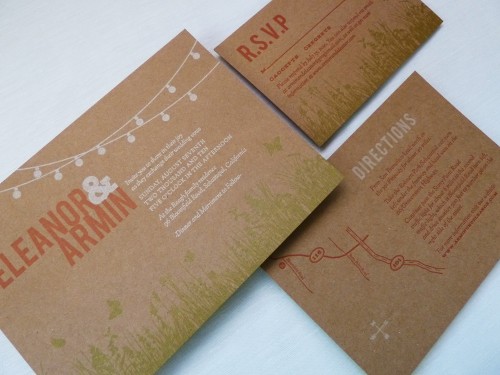
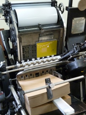
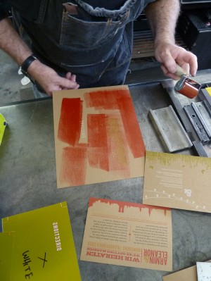
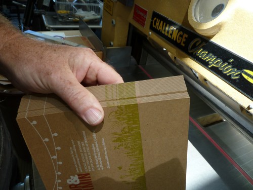
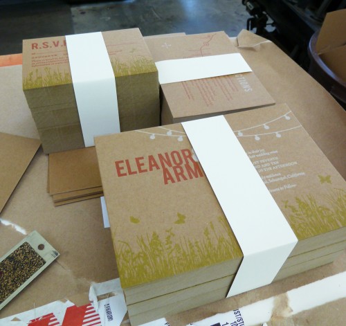
Today’s real invitations come to us from Eleanor, a graphic designer and recent bride whose father happens to be a letterpress printer (lucky girl!).  Eleanor knew that she wanted the invitations to reflect her wedding’s outdoor garden party theme, but chose to print on chipboard for a more relaxed feel.  Eleanor and her fiancé spent two days with her Dad in the print shop creating her three-color wedding invitation, and fortunately for us she documented the entire process!

Kraft-Chipboard-Wedding-Invitations

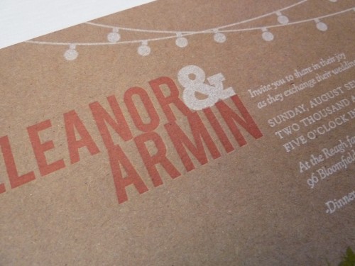
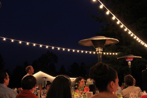
From Eleanor: My parents live on a 5 acre property in Sebastopol, which is not quite a backyard but not quite a farm, and I wanted the invitations to reflect the feeling of an outdoor, mid-summer, evening garden party.  I knew white string party lights would be a key element in our wedding reception décor and decided to make them a featured part of our invitation design.

Kraft-Chipboard-Wedding-Invitation-Detail

Outdoor-Wedding-Reception-Patio-String-Lights

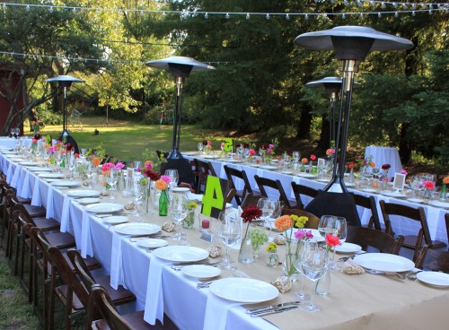
Outdoor-Wedding-Butcher-Paper-Table-Runner

The overall feel of the wedding was homemade and DIY with some of the print shop elements that I grew up with – butcher paper from my Dad’s shop for the table runners, chipboard for the invitations, and old wood type table numbers that we painted to go along with our color scheme.

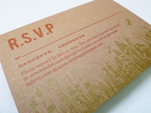
Kraft-Chipboard-Wedding-Invitations-RSVP

Kraft-Chipboard-Wedding-Invitations-Enclosures

I intentionally did not try to match everything perfectly, there was an overall look that tied everything together.

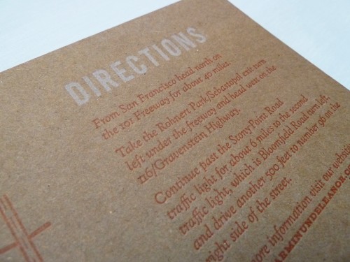
Kraft-Chipboard-Wedding-Invitation

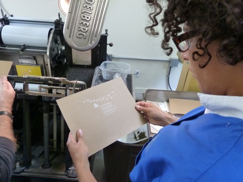
My dad is an longtime letterpress printer and is somewhat of a curmudgeon (he doesn’t even have a website!) – he makes a big point of refusing to print items such as wedding invitations.  He wanted me to see how much work goes into making the invitations I designed.

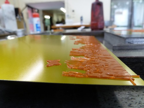
Letterpress-Wedding-Invitation-Making-Of1

Letterpress-Wedding-Invitation-Making-Of2

Letterpress-Wedding-Invitation-Making-Of3 Letterpress-Wedding-Invitation-Making-Of4

Letterpress-Wedding-Invitation-Making-Of5

If I had known how difficult it is to get white to read on chip board I would have never designed them that way!  It was indeed a good education.  I’m  very happy with how the invitations came out, but mostly what makes them so special is they are infused with so much love – as my dad, my husband and I bonded over those two days while his Heidelberg press huffed, puffed and clanked away in his shop.

Letterpress-Wedding-Invitation-Making-Of6

Eleanor has a ton more photos from the printing process, which you can find on her flickr page, and you can see more from Eleanor’s wedding over on her blog.  Eleanor has also created a printable version of her wedding invitation suite, which you can find available for purchase on her website right here!  Thanks so much Eleanor!

{image credits: Eleanor | E.M. Papers}

Frederick + Ana’s Grammercy Park Wedding Invitations

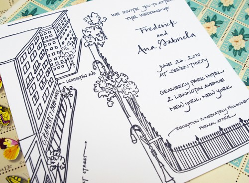
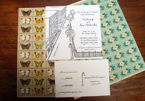
Happy Tuesday everyone!  This week I’m out of town on a blog field trip, which I can’t wait to tell you all about next week!  While I’m on the road I’ve got lots of fun things lined up for you, including a bunch of gorgeous real wedding invitations and a fabulous giveaway!  First up this week, a beautiful wedding invitation from Bryn at Paperfinger.  The invitation suite was letterpress printed in elegant black and white, with Bryn’s lovely calligraphy and illustrations:

New-York-Black-White-Calligraphy-Wedding-Invitation

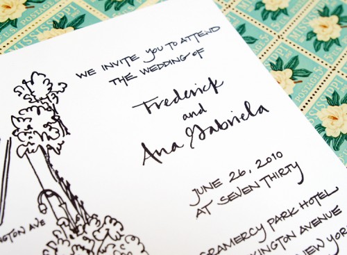
From Bryn: Ana wanted something that felt metropolitan and contemporary – nothing too frilly.  We decided that focusing on the reception site, none other than the Gramercy Park Hotel, would be a great approach.  I love drawing street scenes and neighborhood views and have been incorporating that perspective in a lot of invitations.

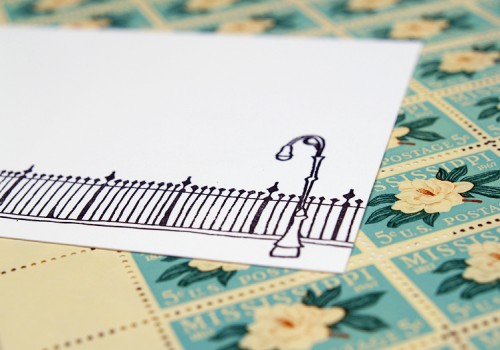
New-York-Black-White-Calligraphy-Wedding-Invitation-Detail

The wedding location is often a great way to capture the style and spirit of the couple.  This hotel is situated on a beautiful block facing Gramercy Park, so we made that view the focus of the invitation while using a clean, modern calligraphy style that was a perfect match for Ana and Frederick.

New-York-Black-White-Calligraphy-Wedding-Invitation

I had a lot of fun zooming into Google Maps street-level view to find details for the drawing.  The technology is amazing and makes this kind of illustration so much easier.  From the comfort of my studio, I can get just the right angle on the street or zoom in to see what the park fence is actually like up close.

New-York-Black-White-Calligraphy-Wedding-Invitation-RSVP

New-York-Black-White-Calligraphy-Wedding-Invitation-RSVP

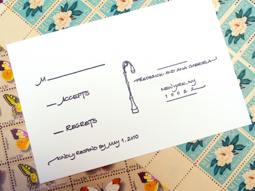
The fence itself was so appealing a graphic that I decided to tie it together with the reply postcard so that the two pieces could actually fit together as a diptych.

New-York-Black-White-Calligraphy-Wedding-Invitation

Ana was a self-proclaimed non-fussy, “no hearts” kind of girl, but we were both so excited after the invitations were printed (letterpress, black ink) that we couldn’t help but hug!

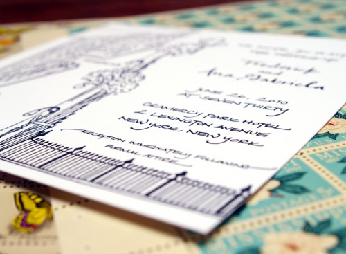
New-York-Black-White-Calligraphy-Wedding-Invitation-Back

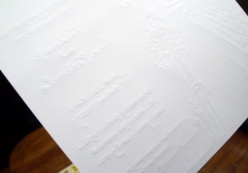
The invitation was printed on super-thick and luxurious cotton paper – I love Bryn’s crisp black and white illustrations and the texture of the letterpress impression on the back of the invitation.  Gorgeous work as always Bryn!

{all photos by me}

{happy weekend!}

Happy Friday everyone!  Are you all looking forward to the long holiday weekend?  I definitely am – it’ll be nice to have an extra day to catch up on things and it also happens to be my birthday this weekend!  I don’t usually make a big fuss over my birthday, but since I’ll be entering the last year of my twenties I’m paying a bit more attention this time around.  In other news, I haven’t been able to stop listening to the new Wolf Parade album – it’s so good!  The song below is my favorite (sorry, there’s no video, just the audio track) and I can’t wait until they come to the area on tour in a couple of months.  But in the meantime…

…a few links for your weekend!

And in case you missed it, a quick summary of this week’s posts:

That’s it for me this week!  Monday is a holiday here in the United States (and Canada), so I’ll be back on Tuesday – I hope you all have a wonderful weekend!

Sneak Peek – Martha Stewart Weddings Fall Issue

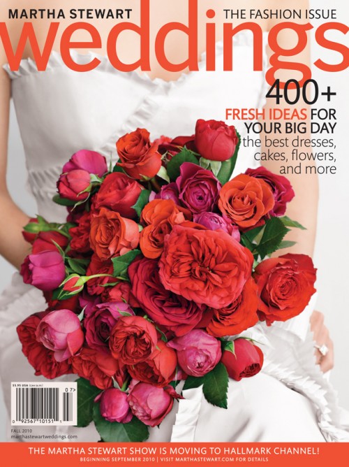
The new issue of Martha Stewart Weddings is coming to newsstands in just a few days, but in the meantime I have a little sneak peek to share with you!

Martha-Stewart-Weddings-Fall-2010-cover

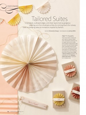
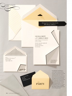
The Fall issue will be devoted to all things fashion (fitting for September, no?), and when it came to stationery the editors decided to focus on wedding invitation designs inspired by the elements of fashion, including pleats, scalloped edges, tuxedo details, sheer fabrics, fanciful flourishes, and stitching.  The story includes six of my favorite designers and three amazing calligraphers – I can’t wait to see everything in print!

Martha-Stewart-Weddings-Stationery-PleatsMartha-Stewart-Weddings-Stationery

By the way, have you been following the opalescent series on The Bride’s Guide?  I love this invitation suite from Sideshow Press.

{image credits: Cover by Ditte Isager and invitation photography by Johnny Miller/Martha Stewart Weddings, Fall 2010}

Wedding Field Guide Invitations

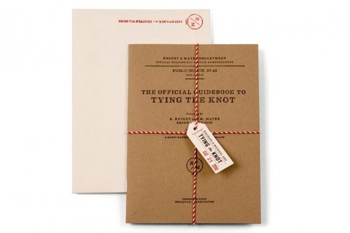
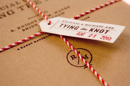
woodgrain-urban-modern-wedding-invitations

Sigh… today has kind of gotten away from me.  It’s one of those days where dealing with issues on the back end of the blog has eclipsed my focus on the front end.  Don’t we all have days like that?  So I leave you with these lovely woodgrain wedding invitations/wedding field guide by Urban Influences and promises to come back tomorrow (with a fun sneak peek at some of the stationery in the latest issue of Martha Stewart Weddings!).  Check out the full details of these invitations over at Benign Objects.

woodgrain-modern-wedding-invitations

In the meantime, I did a little Q and A session over at The B List blog – check it out right here!  Also of note, I had the opportunity earlier today to attend the swearing-in ceremony for my former boss and mentor – he’s heading off to be an Ambassador and I couldn’t be more proud of him.  It’s so nice to see good things happen for good people; makes my heart all warm and fuzzy.

{image credits: urban influences via benign objects}