Black and White Calligraphy and Watercolor Wedding Invitations

Black and white is a classic combination any time of year – but the high contrast feels especially dramatic in the winter, don’t you think? Victoria of Design House of Moira sent over these black and white calligraphy and watercolor wedding invitations, with flourished calligraphy text in stunning platinum foil on vellum, monochromatic watercolor floral details in the envelope liners, and a super dramatic 2 inch black wax seal. Just gorgeous for a black tie winter wedding!

Black and White Calligraphy and Watercolor Wedding Invitations by Design House of Moira

From Victoria: Winter weddings are often a palette cleanser after the spring and summer filled with pale blushes and French blues. I loved working with Rebecca on her winter wedding, which was held at the New York City Public Library. With hopes for snow on her wedding day, along with the neutral backdrop of the library, she chose a monochromatic palette of black and white with an accent of platinum foil for her wedding day. A true black tie wedding, her bridesmaids were in black gowns and the groomsmen in custom tuxedos.

Black and White Calligraphy and Watercolor Wedding Invitations by Design House of Moira

Black and White Calligraphy and Watercolor Wedding Invitations by Design House of Moira

With each bride we work with, the paper selection is such an important step in our creative process. For Rebecca, we suggested using a heavy weight vellum for her main invitation to reflect the semi-transparency of the snow she loves so much and her engagement ring of onyx and diamonds. Her entire suite was hand calligraphed and printed in platinum and black foil with some serious flourishing and formality throughout. All the calligraphy was designed diagonally across each piece.

Black and White Calligraphy and Watercolor Wedding Invitations by Design House of Moira

Black and White Calligraphy and Watercolor Wedding Invitations by Design House of Moira

The bride really loved all the artwork we create here at Design House of Moira, but was concerned that she would have to forgo watercolor details for her suite due to her limited color range. We suggested a monochromatic watercolor piece created entirely in black for her and we lined her mailing envelopes with the pattern. Her reply envelopes were lined with a heavy foil pattern created from the positive and negative space of her floral artwork.

Black and White Calligraphy and Watercolor Wedding Invitations by Design House of Moira

Black and White Calligraphy and Watercolor Wedding Invitations by Design House of Moira

The final suite included her invitation printed on vellum, the reply card printed in black foil on cotton paper, and her small reception card, printed in platinum foil on vellum and tucked into a tiny envelope for an added detail. The smaller pieces of the suite were bound in a remarkably smooth paper in the blackest of blacks, tied with metallic thread, and sealed with a custom 2″ black wax seal.

Her envelopes were all lined in her pattern, the back bore her return address in calligraphy and a wax seal sealed the envelope. Each envelope was hand addressed with matching calligraphy in black ink. The suite was finished off with two custom postage stamps designed with her artwork.

Black and White Calligraphy and Watercolor Wedding Invitations by Design House of Moira

Black and White Calligraphy and Watercolor Wedding Invitations by Design House of Moira

Thanks Victoria!

Design & Calligraphy: Design House of Moira
Foil Printing: Viking Printing 

Check out the Designer Rolodex for more tal­ented wed­ding invi­ta­tion design­ers and the real invi­ta­tions gallery for more wedding invitation ideas!

Photo Credits: Design House of Moira

Romantic Deckle Edge Wedding Invitations with Red Wax Seal

Ethereal calligraphy, soft deckled edge paper, and bold red wax seals? Yes, please! We’re loving these romantic deckle edge wedding invitations by Tricia of Fourteen-Forty! The clean, minimalist design is absolutely dreamy on the beautiful handmade paper – and the pop of red in the wax seal is so fun!

Romantic Deckle Edge Wedding Invitations with Red Wax Seal by Fourteen-Forty

From TriciaWhen my good friends Clara and Edward came to me for their invitations, all kinds of inspiration and ideas came to mind. They wanted something romantic and modern and throughout the process, was pleasantly surprised again and again by their attention to design and detail. In the end, this deckled edged suite was truly a labor of love!

Romantic Deckle Edge Wedding Invitations with Red Wax Seal by Fourteen-Forty

Up until now, our clients have always preferred a cleaner edge and thus we always hand tore our invitations. Clara and Edward fell in love with deckled edges and so we used them for both the invitation pieces and envelopes! We just love the texture and naturally frayed edges of deckled edge paper. After testing all kinds of combinations we decided ivory and lead gray were the perfect combination: subtle and modern. Their names were calligraphed and printed in gold foil. To top it off we added a vellum overlay tied to the invitation by gold string and a bold red wax seal.

Romantic Deckle Edge Wedding Invitations with Red Wax Seal by Fourteen-Forty

Romantic Deckle Edge Wedding Invitations with Red Wax Seal by Fourteen-Forty

It was clear from the start that calligraphy, both hand and digital, would play a large role in their suite. Each envelope was hand calligraphed and completed with an array of vintage stamps inspired by the couple’s personal interests. The bright colored stamps were a fun contrast to the subtle sparkle of the gold ink. For their day-of pieces we knew we couldn’t say goodbye just yet to the red wax seal and so we sealed both their menus and escort cards! Each escort card was sealed with the guests’ table number. On the day, it was so much fun seeing a hundred red seals side by side!

Romantic Deckle Edge Wedding Invitations with Red Wax Seal by Fourteen-Forty

We wanted to make sure that the details didn’t end there and so we also tied each program with the same gold string we used for their invitation. While it isn’t necessary to match your day-of pieces to your invitations, in this case, we were so glad Clara and Edward were excited to bring back aspects of their invitations on the day.

Romantic Deckle Edge Wedding Invitations with Red Wax Seal by Fourteen-Forty

Thanks Rachel!

Design: Fourteen-Forty
Calligraphy: Papersoul 
Floral Design: Days of May Florals 

Check out the Designer Rolodex for more tal­ented wed­ding invi­ta­tion design­ers and the real invi­ta­tions gallery for more wedding invitation ideas!

Photo Credits: Fourteen-Forty

Glamorous Mixed Metals Wedding Invitations

It’s the first wedding invitations of 2018 – and we’re going glam! These glamorous mixed metals wedding invitations from Taryn of Twinkle & Toast bring an extra dose of sultry drama, with gorgeous gold foil on matte black and metallic gray paper. And can you believe these invitations were created for a wedding in Malibu, California?? We love that Taryn and her clients chose to deviate from a typical bright and cheery aesthetic for a darker, moodier aesthetic. To round out the look she included amazing custom stamps and a custom watercolor envelope liner she painted herself!

Glamorous Mixed Metals Wedding Invitations by Twinkle and Toast

From TarynMelanie and Matt are both from the east coast, but currently reside in Southern California. Since many of their family and friends still live on the east coast, this was going to be a destination wedding for several of their guests, and they really wanted to create a special, effortless California evening. They found the most beautiful venue in Malibu: a working olive tree farm that overlooked the ocean in the rolling hills. It was romantic and charming with breathtaking views. Their wedding was in October, which called for lots of moody dark colors of burgundy, gray, and black with mixed metals and vintage flair. This couple had a laid-back attitude and a great eye for design (the groom is an art director himself).

Glamorous Mixed Metals Wedding Invitations by Twinkle and Toast

Glamorous Mixed Metals Wedding Invitations by Twinkle and Toast

The whole invitation suite featured custom oversized spot calligraphy throughout. The main invitation had a pale gold foil print on a super silky pitch-black noir paper. To incorporate some burgundy, we had custom painted deep florals featured on their RSVP card and insert card. The accompanying cards were printed on a smooth ivory paper to tie in their vintage touch. The main envelope was a metallic black and the RSVP envelope was metallic gray, which gave it a smoky dark feel. Both metallic envelopes had a pale gold foil stamp return address, with metallic gold pointed pen calligraphy ink for the guest address.

Glamorous Mixed Metals Wedding Invitations by Twinkle and Toast

Glamorous Mixed Metals Wedding Invitations by Twinkle and Toast

Glamorous Mixed Metals Wedding Invitations by Twinkle and Toast

We also designed custom postage stamps with the burgundy floral design on both envelopes. One of my favorite features was the custom painted envelope liner on the main envelope. We wanted to showcase the Malibu setting, but do it in a dark and moody way. Instead of a bright and airy sunset, I painted a sunset with hues of purple, black and blue, showing both the ocean and mountain setting surrounding Malibu.

Glamorous Mixed Metals Wedding Invitations by Twinkle and Toast

Glamorous Mixed Metals Wedding Invitations by Twinkle and Toast

Overall their vibe was moody, chic, sultry and romantic. The invite really set the tone for an intimate, elegant autumn evening for everyone meet in Malibu.

Glamorous Mixed Metals Wedding Invitations by Twinkle and Toast

Glamorous Mixed Metals Wedding Invitations by Twinkle and Toast

Thanks Taryn!

Invitation Design: Twinkle & Toast
Florals: Catalina Neal 
Ring Box: The Mrs. Box
Styling Surface: Simply Rooted Surfaces
Postage: Zazzle (custom designed) 
Rings: Marrow Fine

Check out the Designer Rolodex for more tal­ented wed­ding invi­ta­tion design­ers and the real invi­ta­tions gallery for more wedding invitation ideas!

Photo Credits: Jenna Joseph

Behind the Stationery: Baltic Club

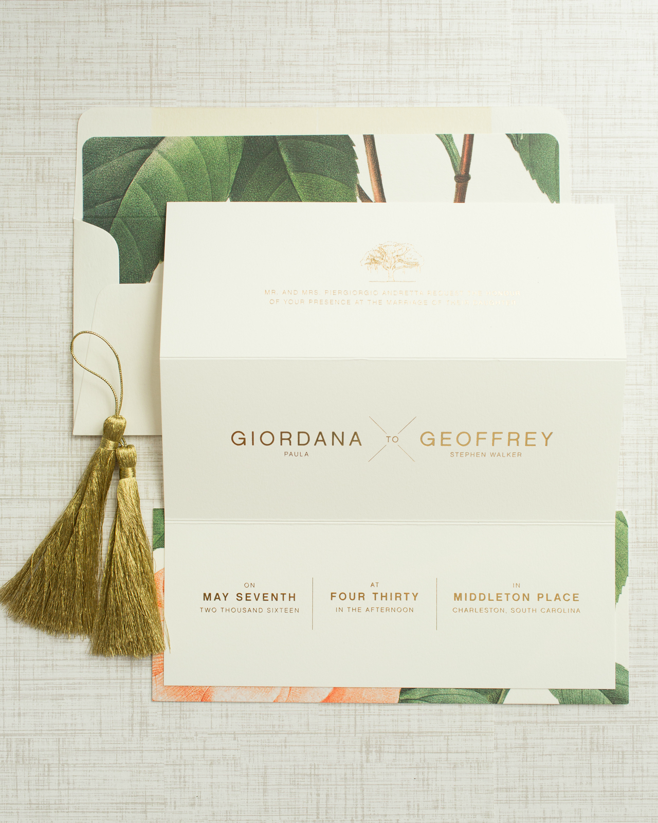
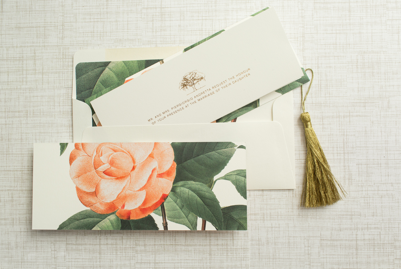
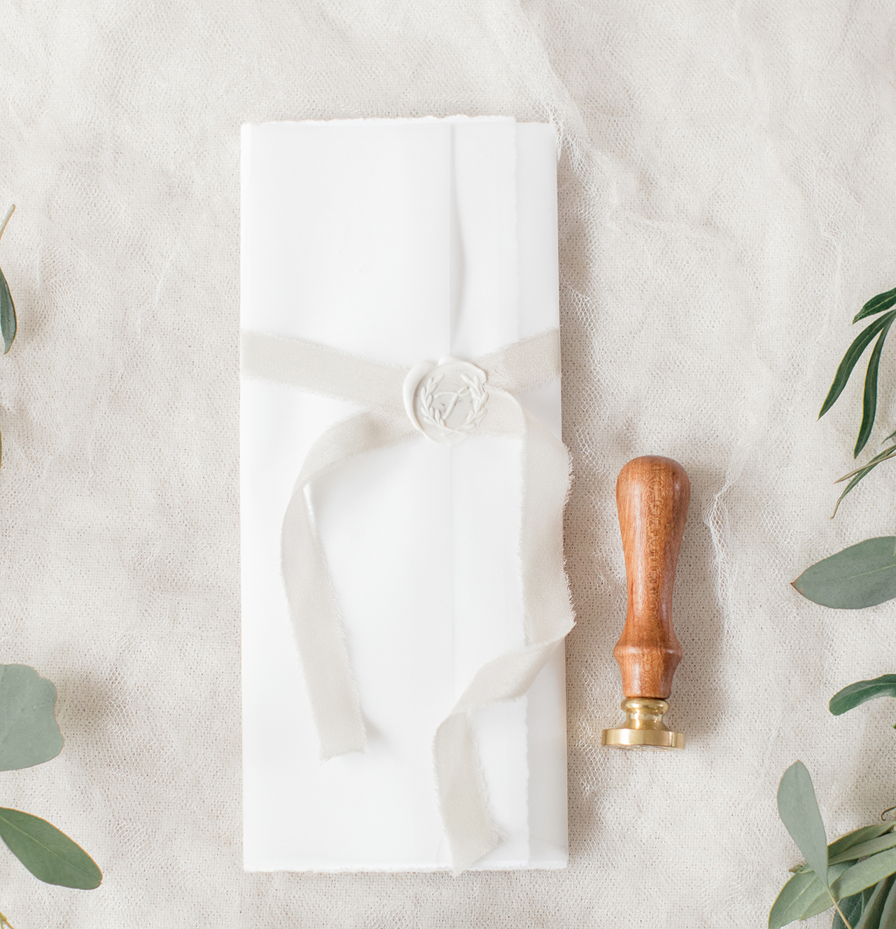
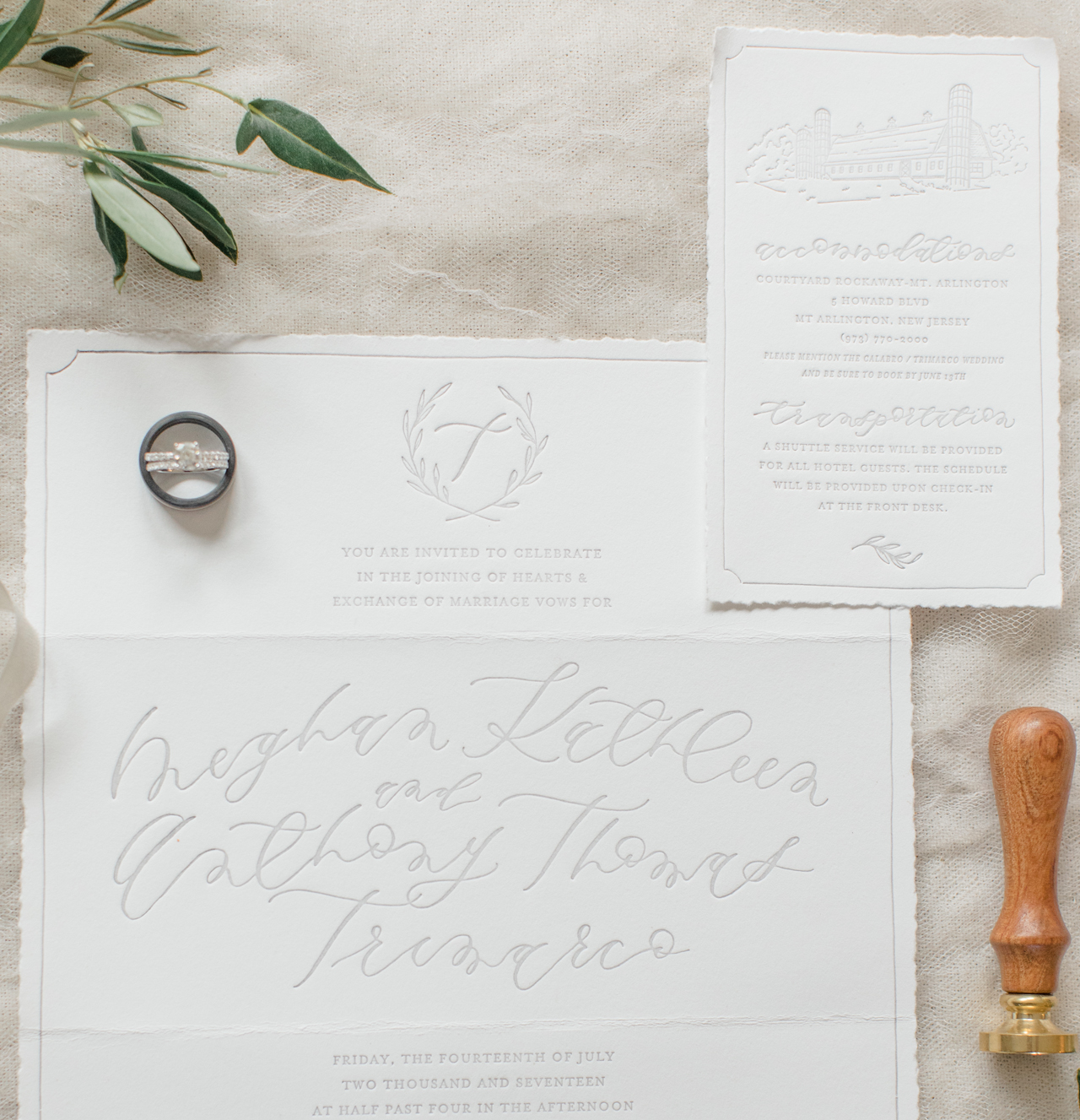
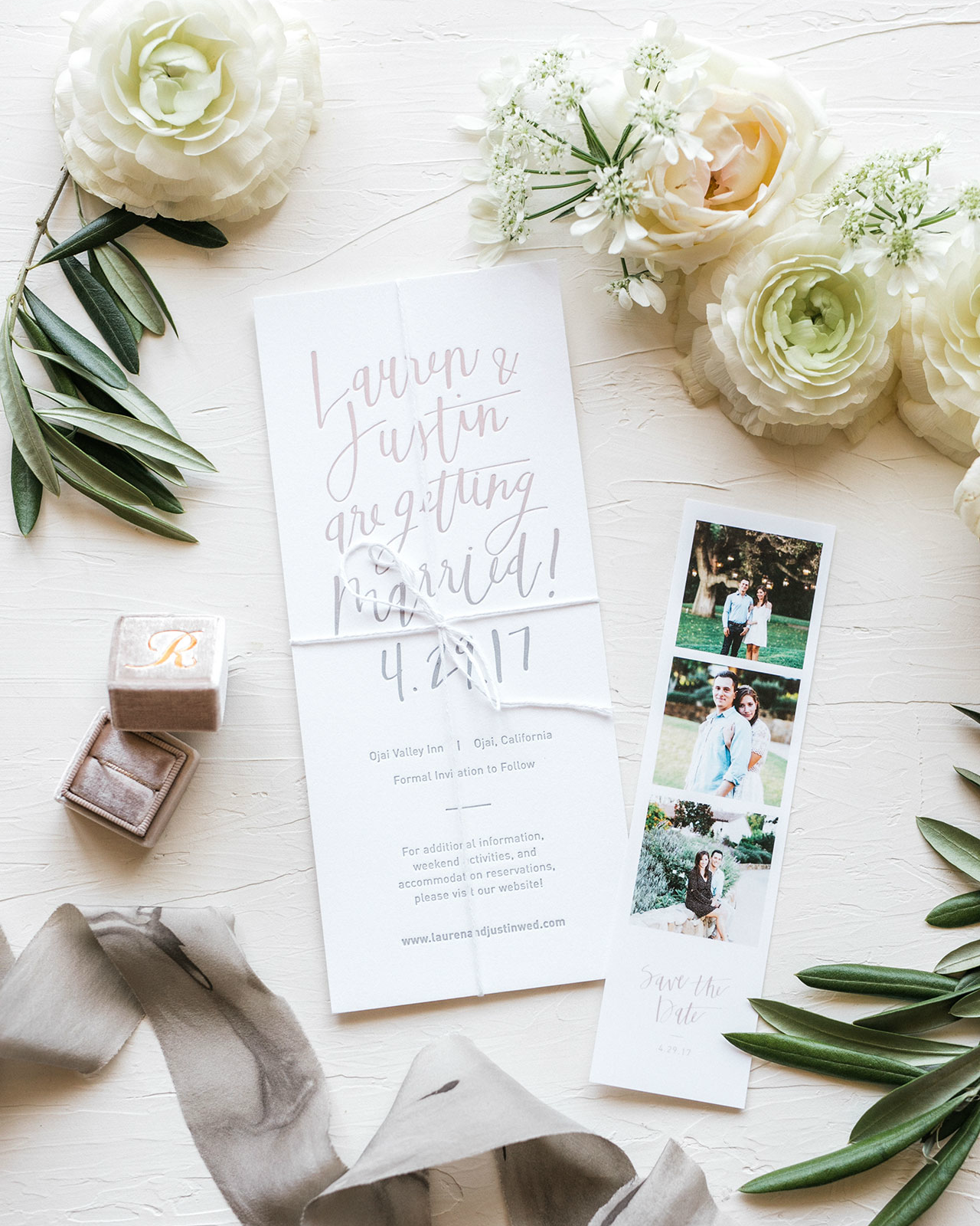
Happy 2018! We’re kicking off the new year with the duo Baltic Club based in one of my favorite neighborhoods in Montreal, Canada! Melanie and Brice transitioned from advertising into the stationery world and, since they began in 2014, they’re now to be the only fully vertically integrated stationery design studio in Eastern Canada. Their colorful studio is split into 3 areas: a workshop, retail shop, and back studio. Here to share their behind the stationery story is Brice! — Megan Soh

Behind the Stationery: Baltic Club

From Brice: Melanie and I met in 2013 in Montreal, Canada, in an advertising agency where she was Art Director and me, the Production Manager. We instantly connected because we share the exact same universe deep in our souls, plus Melanie is the funniest and talented person I’ve ever met in my life. Even in the first few weeks, we already shared about creating something but at this time, it was a more around a puff cream specialty gourmet bakery. A couple of months later, I had to quit my job and left Canada for personal reasons and, in a total upsurge of YOLO, Melanie quit her job too in order to join me and travel across Europe.

Behind the Stationery: Baltic Club

Behind the Stationery: Baltic Club

When we came back in Montreal, we had no job and no money so we founded our own design agency named Glasgow Studio, in which we had a lot of fun. Baltic Club was only a side project at this time but we enjoyed the freedom it brought us compared to the branding deadlined projects of the agency. We gave ourselves 12 months to turn Baltic Club into our main activity and stop all the rest. We succeeded in a bit less than 12 months and learned so much along the way.

Behind the Stationery: Baltic Club

We’re based in Montreal — a beautiful laid back metropole of Eastern Canada and our workshop is located in the heart of a very trendy area named the “Mile-End”. Since the time when we worked from the living room table of our apartment, we’ve moved 5 times in 3 years until we found the beautiful space where we are today. A vast back-store allows us to stock paper and host our homemade photoshoot studio.

Behind the Stationery: Baltic Club

The front part is divided into 2 open spaces: the workshop itself and the shop where the public can visit and interact with us and purchase our freshest products 7 days a week. We chose to sell our products almost exclusively with complementary items like pens or paper clips. The selection is made in a way that we have a unique selection of items that you can’t see anywhere else in town. Of course, Melanie did all the setup and the decoration, making this place gorgeous and so pleasant to work in.

Behind the Stationery: Baltic Club

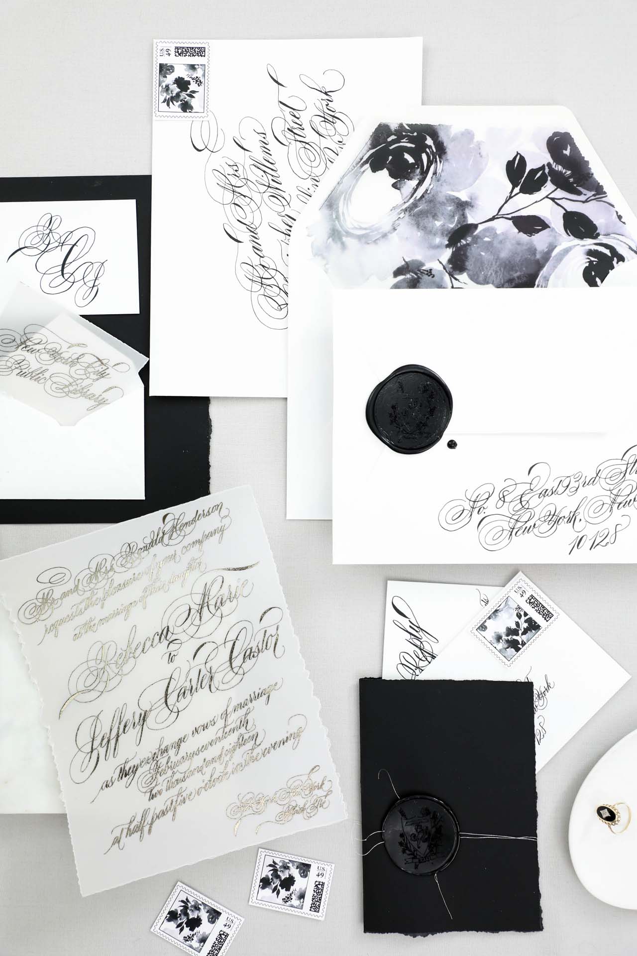
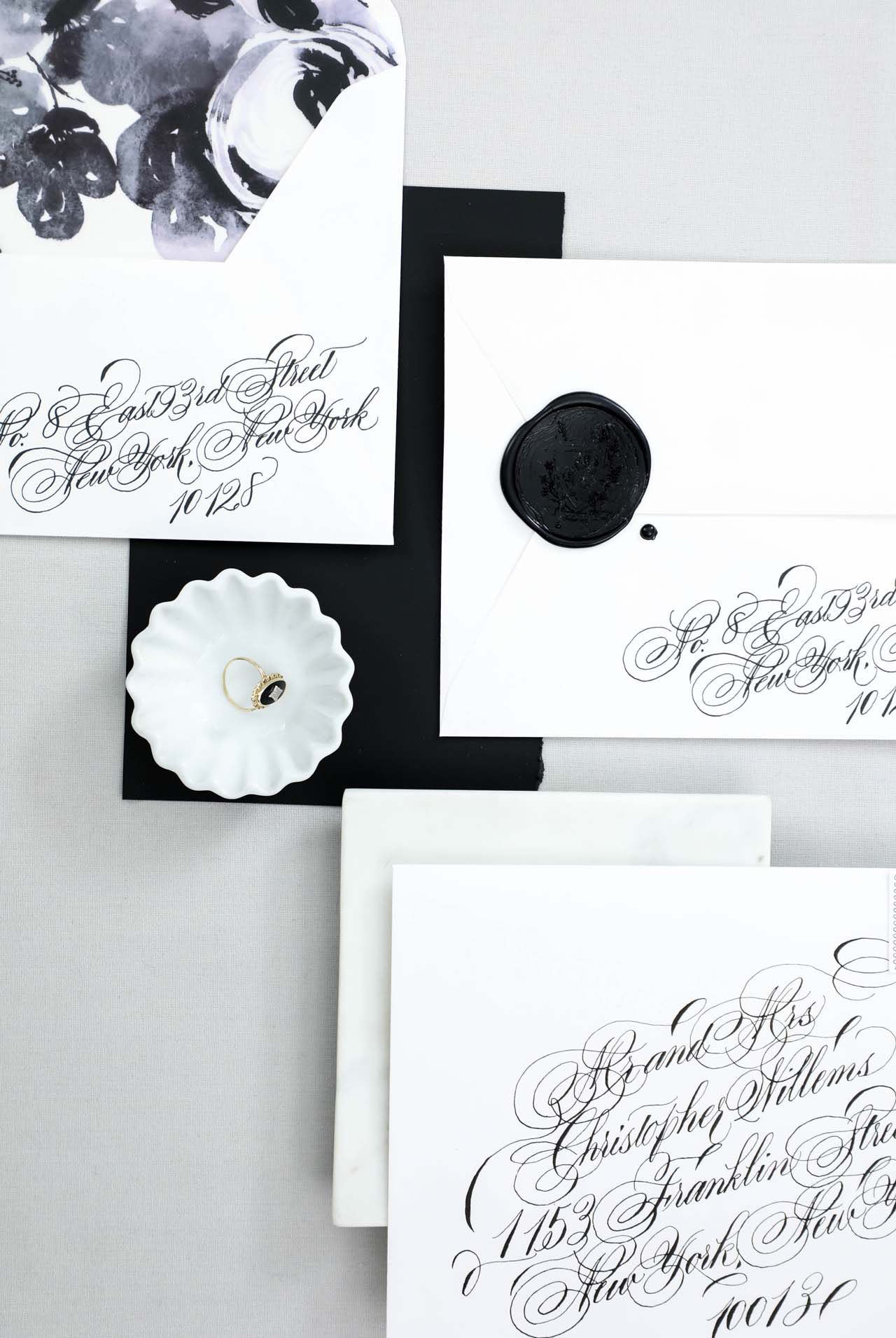
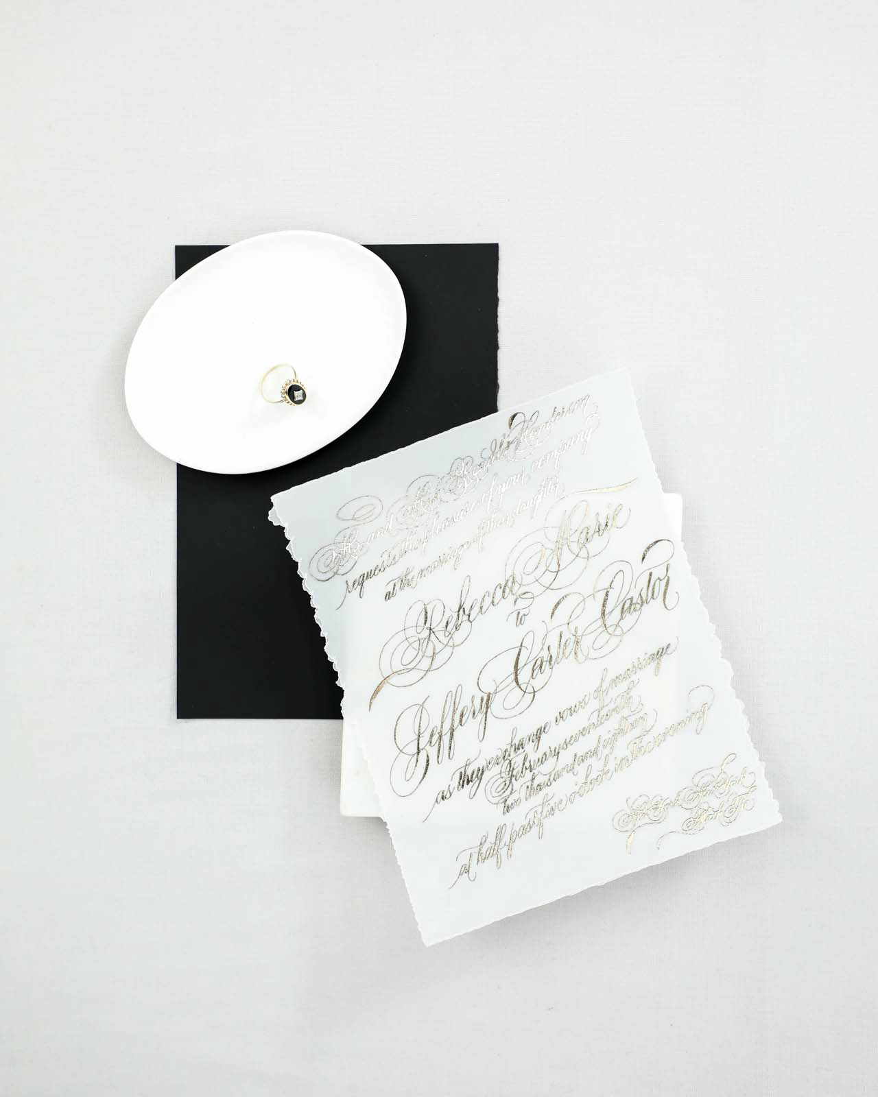
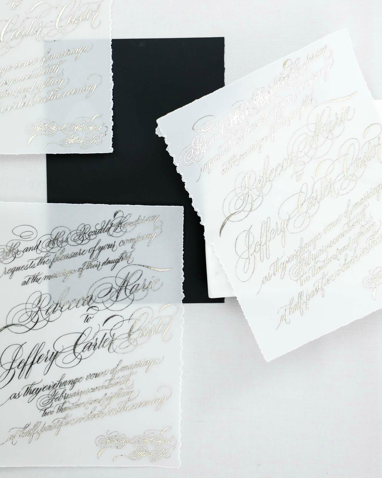
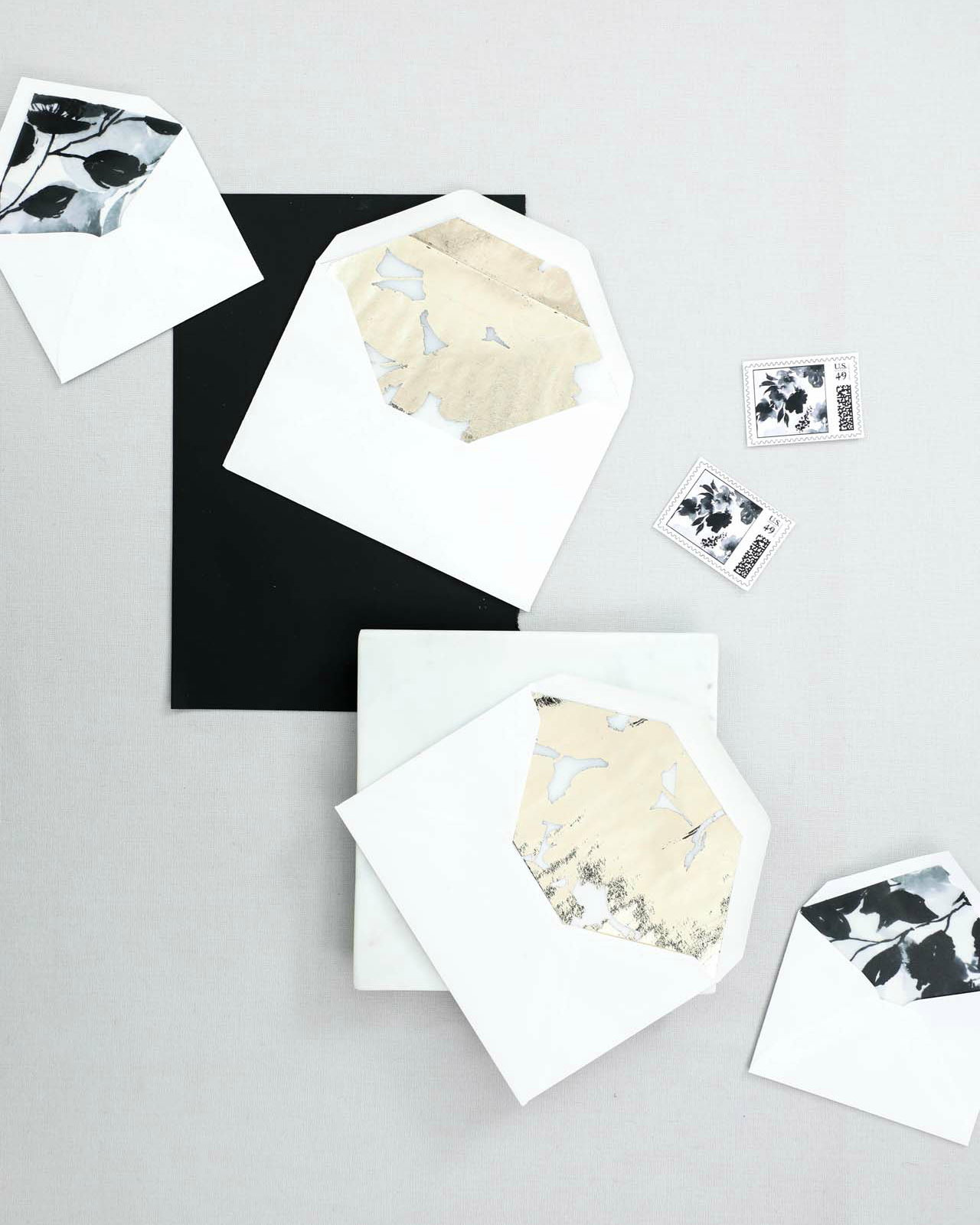
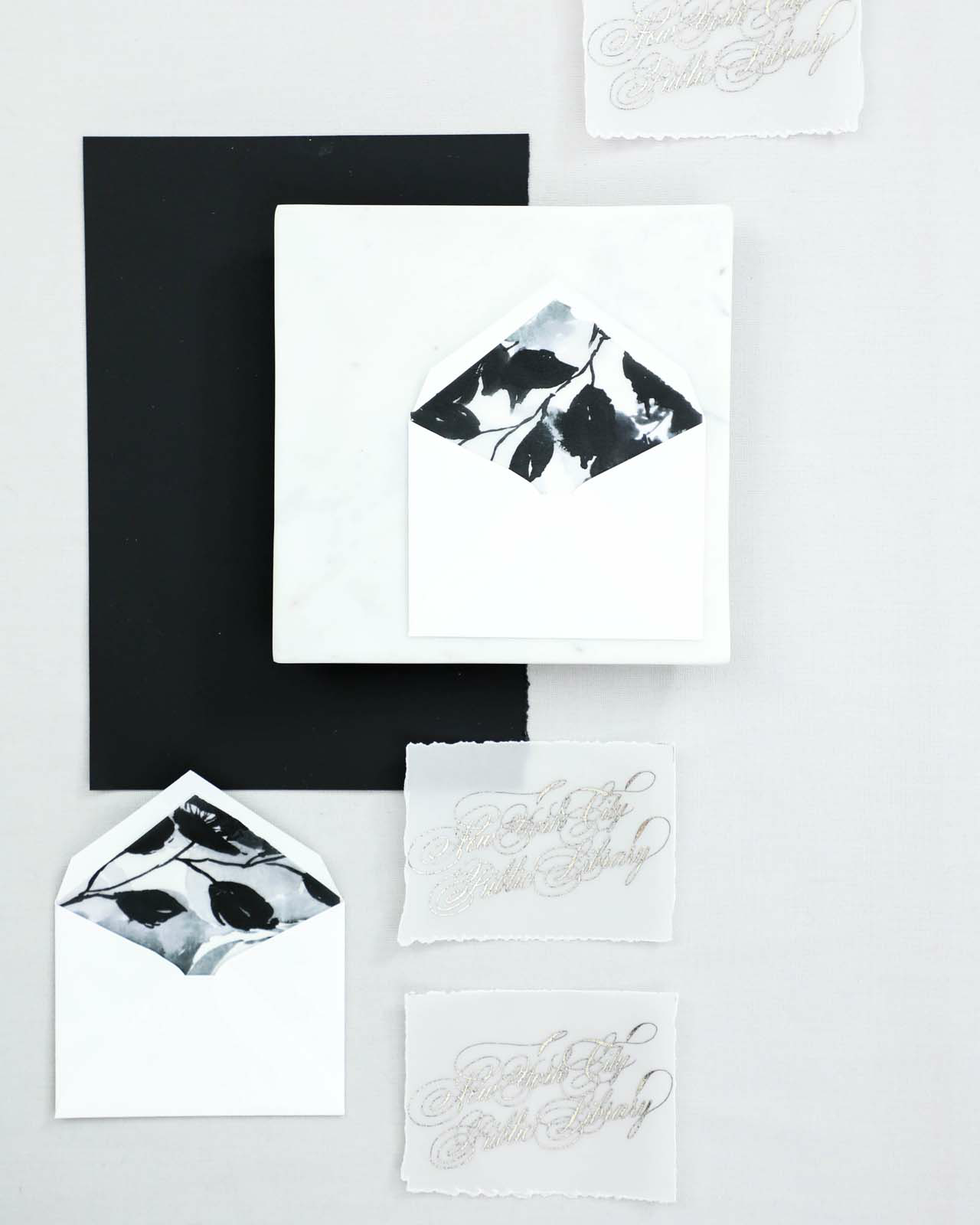
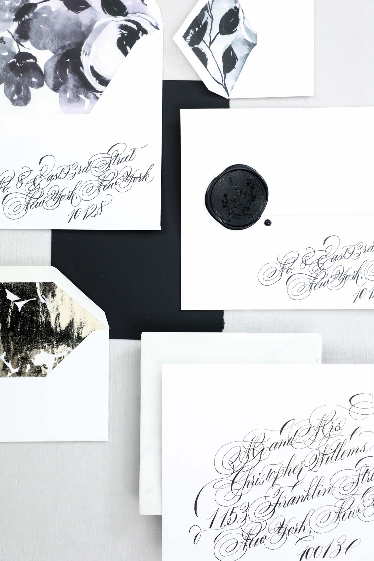
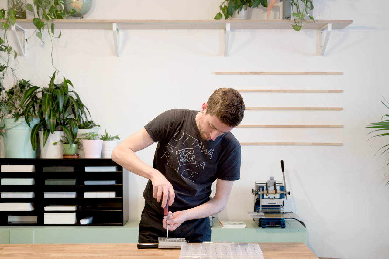
Our approach has always been to grow by ourselves so we began to buy our own equipment early on in our history. For instance, we recently had the opportunity to acquire a Risograph to explore new countries in terms of printing processes along with inkjet, numeric or offset printing we already use on a daily basis. “Charlene”, our hot foil stamping machine, “Billy” the corner cutter, or “Gordon”, our industrial blades are fantastic additions that allow us to create with even more fun, inspiration and flexibility. Oh, yes, we give names to our machines because we believe that they all have their own personality. Some of them even have eyes drawn on. Today, a lot of design companies, even stationery ones, come and see us in order to make their production. We are proud to be the the only stationery company in Eastern Canada capable of designing, printing, binding, packaging, selling our own products…at the same place!

Behind the Stationery: Baltic Club

Melanie and I are both as much into production methods as we are in design, hence we just can’t prevent ourselves from trying new printing or binding techniques as well as design orientations with the care of keeping an harmonious unicity.

Behind the Stationery: Baltic Club

We work a lot. We don’t feel like it’s really “working”, but we work from early in the morning to late at night. It’s more like living the life we always wanted to dream, enjoying each moment with excitement and dedication. In the morning, we concentrate more on the global picture and marketing moves before we reach the workshop for the opening to take care of our employees and support them in their tasks. We also pretend to be productive (ha!) but we need to be a bit more isolated for that. Phone calls, emails, basic design tasks, production follow ups are our 9 to 5 occupations. When everything turns calmer at the end of the day, we dive into administrative work and the most important design matters, sometimes until 10 or 11 without even noticing it. And, as a “mind purifier,” we fantasize about new projects we could invest our passion in, all along the way.

Behind the Stationery: Baltic Club

Nature documentaries are an infinite source of inspiration. We find them so interesting and always mind blowing! We also found out that when we add a touch of edginess and humour to the roughness and sincerity of what surrounds us, we usually obtain poetry, softness and strength at the same time. Our creative process often begins with a concept, emerged from this massive source of wonder that Melanie turns into something magical in just a couple of hours.

Behind the Stationery: Baltic Club

It is very rare that we come back on a design because we don’t like it and, for the vast majority of them, we use them on multiple supports. The most complicated things we face today is definitely the lack of focus due to multitasking and the cash flow management to support our self-generated growth. Having employees is a huge challenge too but since last summer, we are lucky to have a legendary team with us, relieving us from a significant pain.

If we had to sum up the meaning of Baltic Club’s sprit, we could say that our plan is to create even more each day and try to inspire with the willingness to becoming better humans at the same time.

Behind the Stationery: Baltic Club

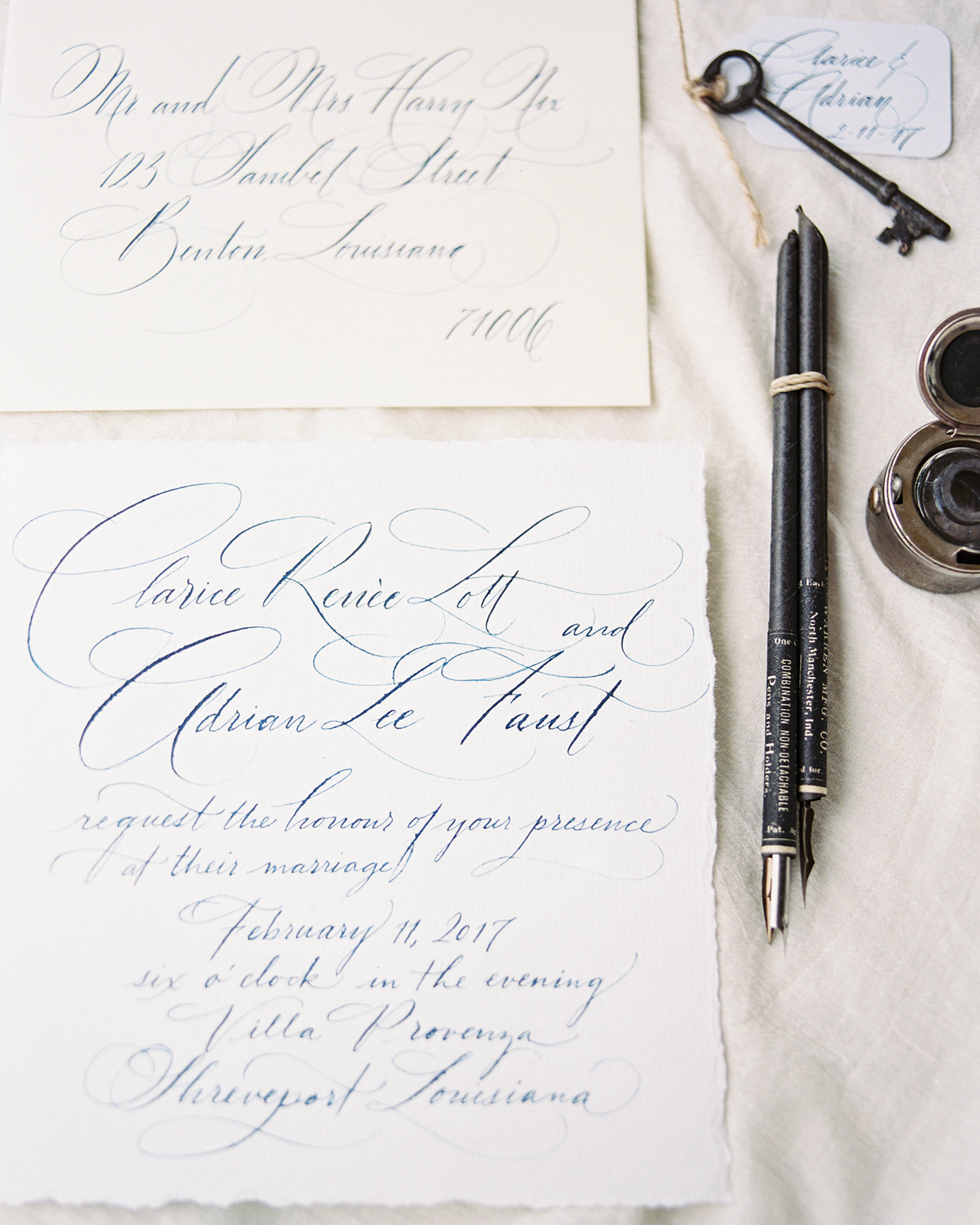
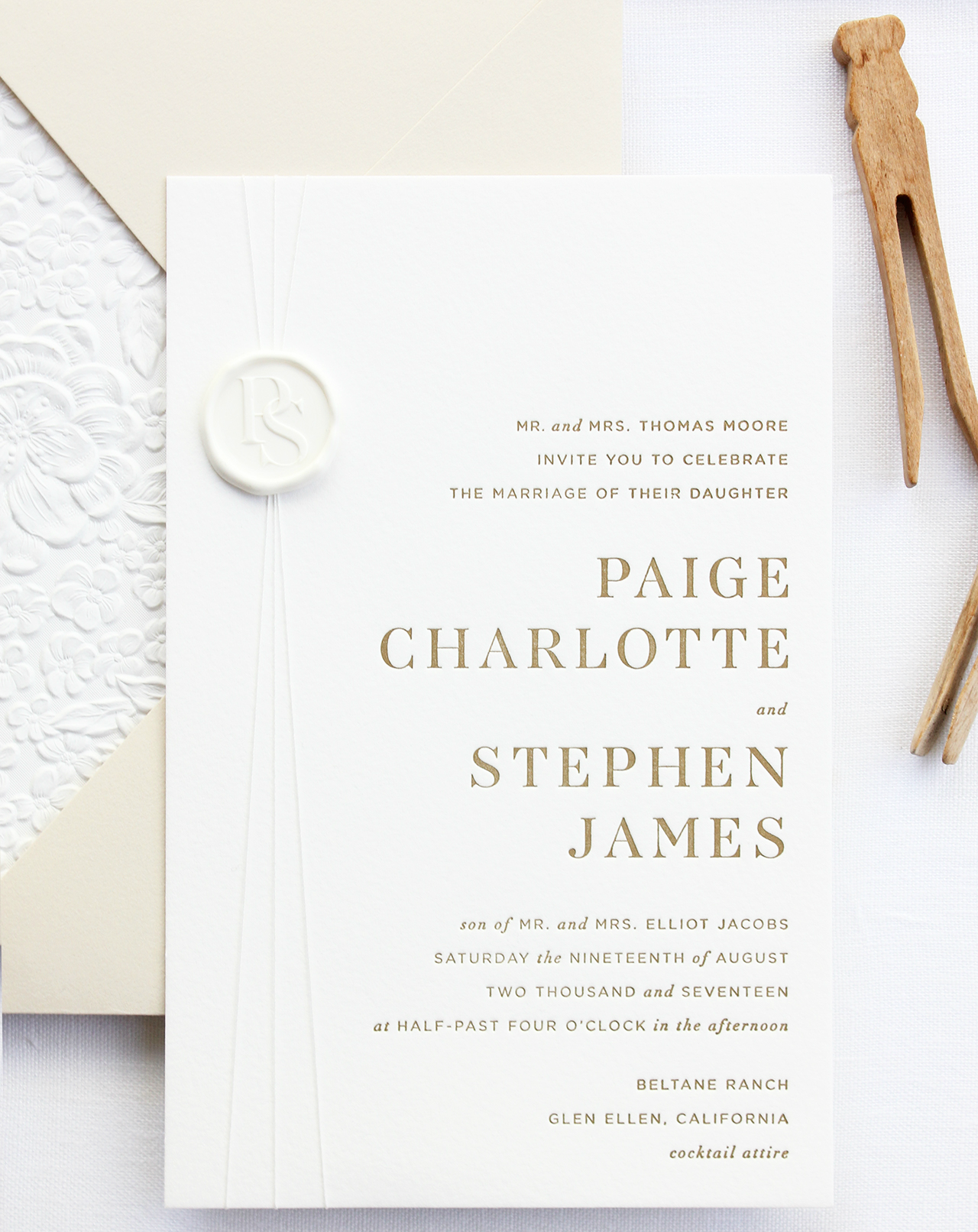
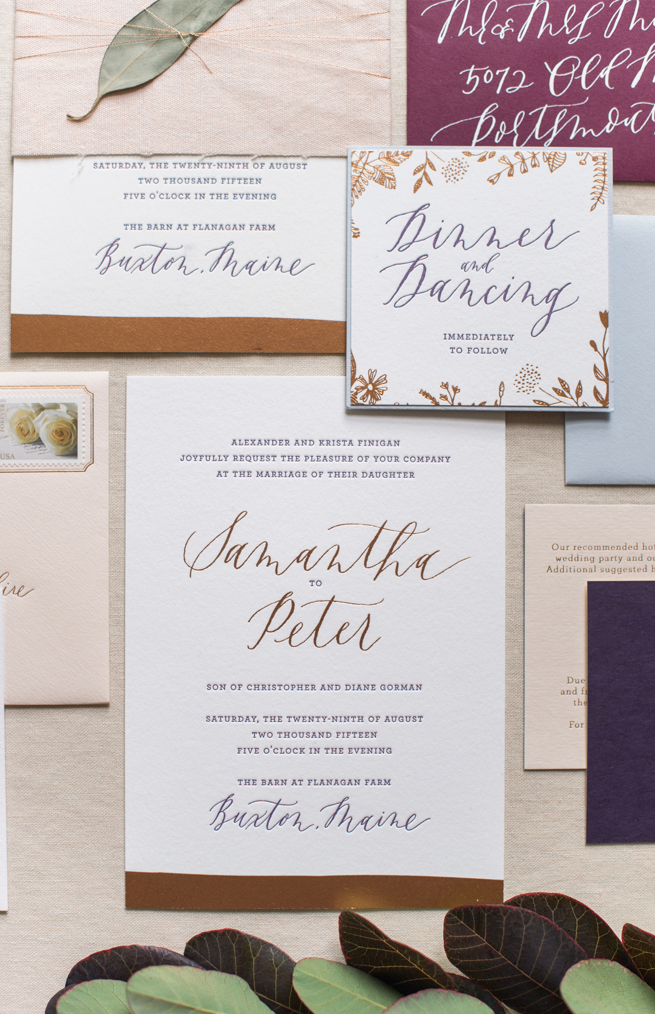
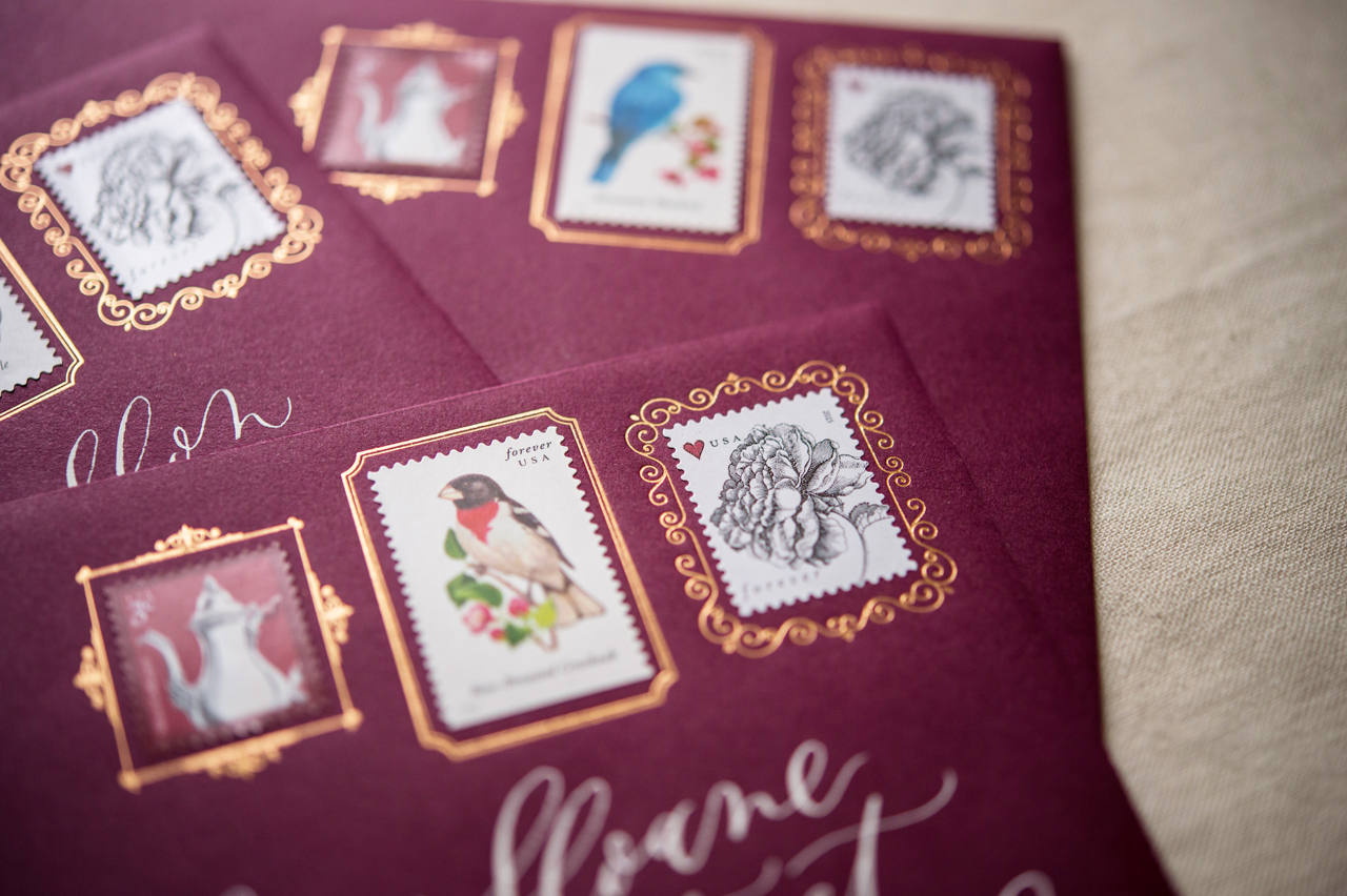
All photos courtesy of Baltic Club.

Want to be featured in the Behind the Stationery column? Reach out to Megan at megan [at] ohsobeautifulpaper [dot] com for more details.

Best of 2017: Understated and Romantic Wedding Invitations

After recapping some of our favorite playful and colorful wedding invitations of 2017, it’s time to turn our attention to the best understated and romantic wedding invitations of the year! Prepare yourself for some seriously stunning calligraphy, gorgeous textures, and beautiful details galore!

French Chateau Inspired Calligraphy Wedding Invitations by Paperglaze Calligraphy

These French Chateau-inspired wedding invitations by Brandi Smyth Photography and Paperglaze Calligraphy were easily some of the most romantic wedding invitations of the year. That calligraphed envelope liner! The hand torn edges! So beautiful.

French Chateau Inspired Calligraphy Wedding Invitations by Paperglaze Calligraphy

French Chateau-Inspired Calligraphy Wedding Invitations

A neutral color palette gives you the freedom to explore lots of different textures! I love, love, love the combination of traditional type selections with letterpress printing, a textured envelope, and white wax seal in these refined modern neutral letterpress wedding invitations from Bourne Paper Co.

Refined Modern Neutral Letterpress Wedding Invitations by Bourne Paper Co.

Refined Modern Neutral Letterpress Wedding Invitations

So many gorgeous details in these romantic copper foil wedding invitations from Samantha and Whitney of Gus & Ruby Letterpress! The modern copper foil “dip” on the main invitation, the sweet illustrated florals, and the incredible copper foil frames for the stamps on the envelope!

Romantic Copper Foil Wedding Invitations by Gus & Ruby Letterpress

Romantic Copper Foil Wedding Invitations by Gus & Ruby Letterpress

Romantic Copper Foil Wedding Invitations

A big YES to everything happening in these vintage-meets-modern floral wedding invitations from Atheneum Creative!

Vintage-Meets-Modern Floral Wedding Invitations by Atheneum Creative

Vintage-Meets-Modern Floral Wedding Invitations by Atheneum Creative

Vintage-Meets-Modern Floral Wedding Invitations

Meghan from 200 Spring wanted her wedding invitations to be an experience, so she created a gorgeous trifold invitation wrapped in vellum with a wax seal. The crisp white backdrop is the perfect canvas for her romantic gray calligraphy!

Romantic Gray Calligraphy Wedding Invitations with Deckled Edges by 200 Spring

Romantic Gray Calligraphy Wedding Invitations with Deckled Edges by 200 Spring

Romantic Gray Calligraphy Wedding Invitations with Deckled Edges

Love the understated blush-pink-to-gray ombré and non-traditional size in the save the dates from these blush and gray desert wedding invitations from Goodheart Design!

Blush and Gray Desert Wedding Invitations by Goodheart Design

Blush and Gray Desert Wedding Invitations

As always, you can visit the real invitations gallery for even more wedding invitation inspiration, and be sure to check out our curated gallery of wedding invitation designers – the Designer Rolodex – if you’re on the hunt for the perfect designer to make your own wedding invitations!