Amanda + David’s Whimsical Accordion Fold Wedding Invitations

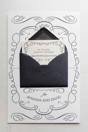
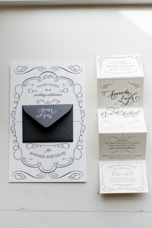
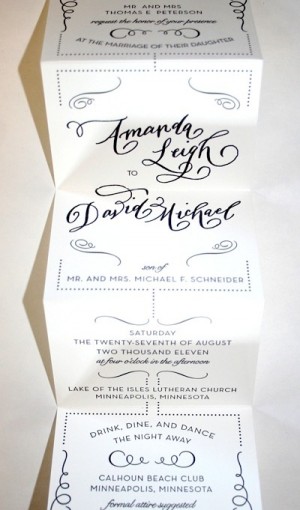
Amanda sent over the invitations from her wedding in Minnesota last summer – I absolutely adore the whimsical calligraphy and accordion fold layout!  Amanda worked with local stationers Watermark Stationery to create an invitation that was elegant yet non-traditional, ultimately settling on a sophisticated design with a playful pop-out for the main invitation.  The entire suite was letterpress printed in a single color and embellished with gorgeous calligraphy from Crystal Kluge.  So pretty!


From Amanda: The invitation sets the tone for a wedding, so we wanted to show our invited guests what type of event we had planned: formal, fun, glamorous and somewhat whimsical.  I worked with Gretchen Berry of Watermark Stationery in Excelsior, Minnesota to come up with a fun, unique way to present our wedding invitation.  We knew we didn’t want a traditional invitation; we wanted something unique, different and fun.  


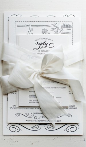
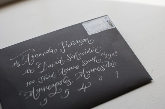
Once we came up with a design that we loved, we had some of the text elements custom done by local calligrapher, Crystal Kluge.  We loved the combination of the whimsical, yet formal letterpress calligraphy paired with our over-sized main invitation.  The invitation was paired with a mini envelope and fold-out accordion invitation, reply and direction cards, and a dark gray outer envelope with white ink calligraphy – all tied together with a white silk ribbon.  It was truly our dream wedding invitation.

Thanks Amanda!

Design and Letterpress Printing: Gretchen Berry, Watermark Stationery
Calligraphy: Crystal Kluge

Check out the Designer Rolodex for more tal­ented wed­ding invi­ta­tion design­ers and the real invi­ta­tions gallery for more wedding invitation ideas!

Photo Credits: Matt Blum Photography

Mauro + Emmy’s Travel-Inspired Destination Wedding Invitations

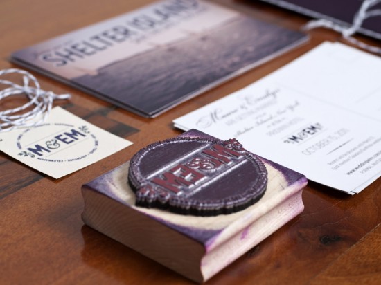
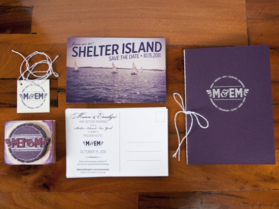
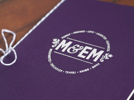
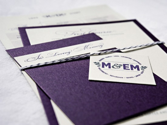
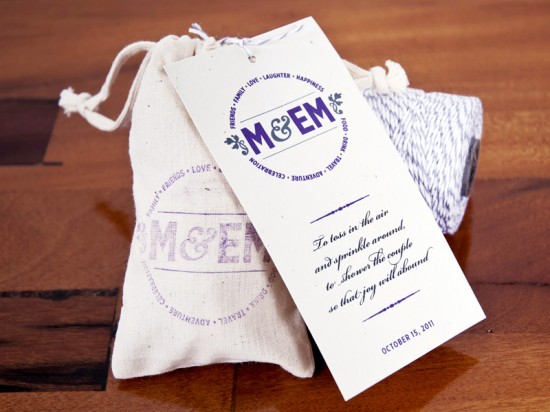
Lindsay from McMillian + Furlow sent over the beautiful wedding invitations and save the dates that she created for her brother’s wedding last fall.  Lindsay was inspired to create a destination-inspired suite, from postcard save the dates to passport-style invitations.  Lindsay also created a beautiful wedding logo based on the bride and groom’s initials; the logo was incorporated on nearly every detail, from the invitations to lavender sachet ceremony programs, and even the groom’s suit!

From Lindsay: We were inspired by the idea of having a mini destination wedding on Shelter Island, and by the rich history of the Pridwin Hotel.  I also developed the M&EM logo – a play on their initials – to use on all the materials, either printed or stamped on with the custom rubber stamp.  Mauro even had it embroidered into his suit jacket!

Working with the color palette that Mauro and Emmy had chosen, I designed the save the dates to be a sophisticated play on the classic “Greetings From…” postcards.

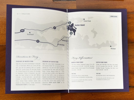
Traveling has been a way of life for them ever since they began dating, so it was natural that this passion would be incorporated into the wedding.  The invitations were designed as passports, issued on the day of Mauro and Emmy’s engagement.

They included all the information guests would need to know – from ferry schedules to and from Shelter Island, historic facts and maps, to ceremony information, lodging, and activities.  This proved to be very useful for all the guests that would be traveling from out of state (and Italy!)

Photo Credit: Joe Sanfilippo

The menus were tied together with a family remembrance card and a timeline of all their travels together.  The string was carefully chosen for it’s reference to the classic Italian pastry boxes.

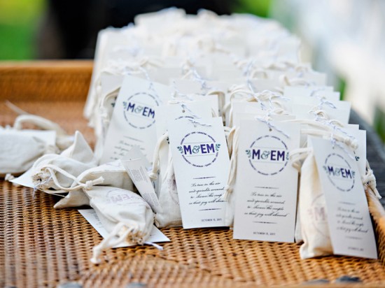
Bags of lavender were stamped and tied with all the ceremony information on the back.  This was our clever way of avoiding the use of a standard wedding program.

Photo Credit: Joe Sanfilippo

Thanks Lindsay!

Check out the Designer Rolodex for more tal­ented wed­ding invi­ta­tion design­ers and the real invi­ta­tions gallery for more wedding invitation ideas!

Photo Credits: Except where noted, all images by McMillian and Furlow

{happy weekend!}

Woah, this was quite a week.  The end of the weekend saw me completely flattened by a terrible 24-hour virus, which left me unable to do anything but sleep during the early part of the week.  Ugh.  Thankfully I recovered in time for my flight out to Salt Lake City for Alt Summit – which is where I am right now!  I’m enjoying the beautiful mountains and catching up with friends before heading back home to DC at the end of the weekend.  But in the meantime…

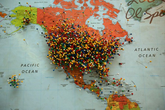
Photo Credit: Aaron Huey

…a few links for your weekend!

This week on Oh So Beautiful Paper:

Finally, don’t forget to enter the Valentine’s Day giveaway from One Plus One – the contest ends Sunday!  And as an added bonus, One Plus One is offering free shipping from their Etsy shop from now until Friday, January 27!  Yay!  Just use the code LOVEISINTHEAIR at checkout!

Check back soon for today’s cocktail recipe!  I’ll see you back here on Monday! xoxo

The Printing Process: Edge Painting

Every morning this week, I’m running a series of guests posts about different printing methods â€“ so if you’ve ever wondered why certain printing methods are best for certain kinds of designs (or cost more than others), this is for you!  You can read the previous installments covering digital printingengravingscreen printingletterpress printing with antique type, and foil stamping all right here.  Today Michael from Czar Press is here to walk us through edge painting!

What is Edge Painting?

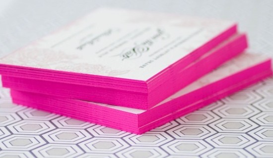
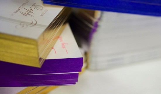
Edge painting at its surface sounds pretty simple – it’s a process by which color is applied to the edges of cards, invitations, even books or journals.  Edge painting can be done in any color, including metallics and foils (!), and is usually mixed by hand to be matched to a specific Pantone color.

I’m a huge fan of edge painting for a bold pop of color on business cards and wedding invitations, like the new invitation collections from Bella Figura, Dauphine Press, and many others.  While edge painting is a commonly used technique, there is a whole lot of mystery surrounding the process – and printers seem to have different methods or processes for applying edge paint.  Today we have Michael from Czar Press walking us through his edge painting process and removing some of the mystery from this popular technique!

The Process

The edge painting process takes place after all graphics and text have been printed and all paper materials cut down to size.  For this example, we’re focusing in on a recent business card project.  I like to make sure my blade is especially nice and sharp when trimming out cards that are going to be edge painted.

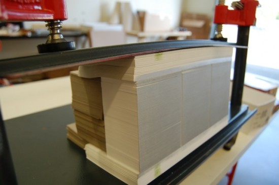
Edge painting involves a padding press (pictured above), ink, and a brayer.  The cards should be stacked on the padding press, making sure that the cards are pressed against one wall of the padding press as evenly as possible.  Crank down the vice(s) on the press, applying pressure to the cards, making them nice and snug.  Remove the outer wall off the padding press, leaving one side exposed.  This the side that will receive the ink.


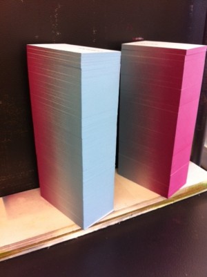
Then using just a little bit of ink, ink up your brayer.  Roll the brayer around and around on a piece of glass if possible in attempt to make the ink spread even across the brayer roller.  Then I apply the ink to the exposed side of the card, applying as little pressure as possible with the brayer to get good ink coverage on the cards.  Once the ink has been applied, I like to gently wipe down the inked side of the cards with a cotton cloth to remove any excess ink.


Let them dry for a while – maybe an hour, depending on conditions – until they are dry to the touch.  Put the outer wall back on the padding press, spin the cards around to the next side and repeat until all sides are complete.

Tips and Advice

Most printers recommend thicker papers – usually 160 lb and up – for maximum results with edge painting.  Edge painting can be done on thinner paper, but heavier (thicker) paper weights will better show the color and saturation of the ink color.

Similarly, most letterpress printers recommend darker or more saturated colors for edge painting.  Think bright red, cobalt blue, or even bright neon or metallic foils!  As with any custom process, most printers hand mix inks to match a specific Pantone color, so keep in mind that there may be slight variations in tone and saturation depending on the number of cards being painted.

Thanks Michael!  Check out more of Michael’s letterpress work right here!

Photo Credits: Example images via Bella Figura, process photos by Czar Press

DIY Rubber Stamp Vintage-Western Wedding Save the Dates + Invitations

It’s the ladies of Anti­quaria, back with their first fab­u­lous and cre­ative DIY project for you in the new year!  This week they’re sharing an awe­some DIY tutorial for Western rubber stamp wedding invitations and save the dates!

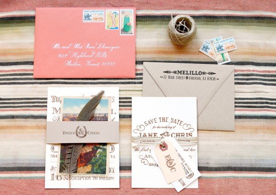
It really is true that the second you start sending out your save the dates, you begin setting the tone for your wedding.  It’s always important to think about your venue, colors and tone of the day before deciding on any of your wedding stationery.  Today’s DIY tutorial is for complementing save the dates and wedding invitations!  We utilized many different stamps & paper components to illustrate our theme: A Vintage-Western Wedding Fete!  Here’s how to put it all together:

DIY Rubber Stamp Western Save the Dates and Wedding Invitations

DIY Rubber Stamp Western Save the Dates and Wedding Invitations

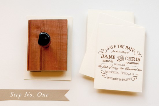
Step 1: Starting with the save the date, use A2 cards or cut paper to 4.25″ x 5.5″”.  Ink the stamp (we used our “Typography” Save the Date stamp) thoroughly and make a print.  When you are making the print, be sure to center the stamp on the paper.  You will want to apply moderate and even pressure to the stamp in order to get a good print.  Also, it is important to stamp on a solid and stable surface.  Any movement can cause shifting.  Let each print dry to avoid smearing.

DIY Rubber Stamp Western Save the Dates and Wedding Invitations

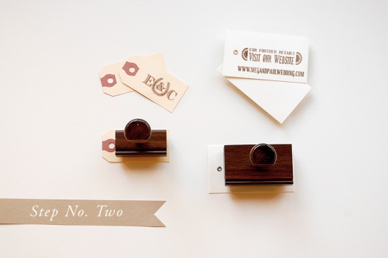
Step 2: Make the tags for the save the date.  We stamped our website card (“Old West” web card stamp) on a grommeted gift tag.  For our monogram tag, we used a small shipping tag and stamped our “Lucky in Love” Initial Monogram stamp on it.
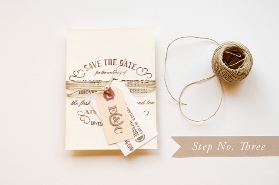
DIY Rubber Stamp Western Save the Dates and Wedding Invitations

Step 3: This save the date has a fabulous mix of textures and really sets the stage for the invitation and event to come.  To combine all the pieces, simply tie basic thin kitchen twine around the save the date, going around multiple times.  Secure it with a basic knot and trim the ends to desired length.
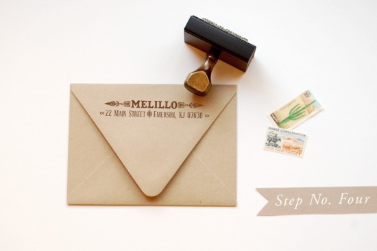
DIY Rubber Stamp Western Save the Dates and Wedding Invitations

Step 4: A great way to save a little money on your wedding paper (and who doesn’t love doing that!) is to get one return address stamp for all of your envelopes.  You will potentially be able to use it on your save the dates, invitations (even if you have them professionally printed), reply envelopes and lastly, your thank you notes.  It can really help your bottom line in the long run.  Once you’ve stamped your envelopes, simply address them, add postage (there are some fabulous new 2012 stamps out), and send them to your loved ones.
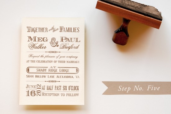
DIY Rubber Stamp Western Save the Dates and Wedding Invitations

Step 5: Now on to the Invitation suite!  Use and A6 card or cut paper into 4.5″ x 6.25″ rectangles.  Following the same steps as the save the date, make prints of the stamp (we used our “Old West” Invitation stamp) on your cards.
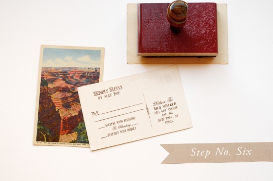
DIY Rubber Stamp Western Save the Dates and Wedding Invitations

Step 6: Vintage postcards are a great way to incorporate color and personality into your invitation suite.  We chose a great image of the Grand Canyon and had it copied on linen card stock.  On the back, we stamped our “Old West” Reply Postcard stamp.
DIY Rubber Stamp Western Save the Dates and Wedding Invitations

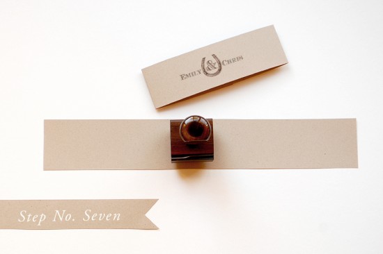
Step 7: To tie it all together, we chose to create a monogram belly band.  To do this, cut a piece of kraft card stock into 2″x11″ pieces (you’ll get 4 out of each 8.5″x11″ sheet).  Then stamp your monogram (we used “Lucky in Love” Name monogram) in the center.
DIY Rubber Stamp Western Save the Dates and Wedding Invitations

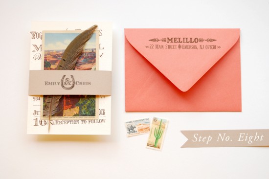
Step 8: Place the invitation, reply postcard, & a feather in a bundle.  Wrap the belly band around the suite, centering the monogram.  When you’re happy with the placement, make hard folds with your nail or a bone folder.  Flip the suite over and secure the belly band with a 1.5″ long piece of double stick tape.  Use the same return address (we used our “Navajo” return address stamp), stamping it this time on a beautiful coral envelope.  Again, address, add postage to your invitation and let the compliments roll in!!

Materials:

Customized Rubber Stamps:

“Typography” Save the Date

“Old West” Web Card

“Lucky in Love” Initial Monogram

“Navajo” Return Address

“Old West” Invitation

“Old West” Reply, postcard option

“Lucky in Love” Names Monogram

Stamp Pad (we used a combination of chestnut and cocoa throughout this tutorial)

A6 Ivory Cards

A2 Ivory Cards

A2 Kraft Envelopes

Pearl White Grommet Tags

Shipping Tags, small

Kitchen Twine

A6 Coral Envelopes

Linen Card Stock (you can find vintage designs online on websites like Café Press)

Kraft Card Stock

Scissors

Feathers

Bone Folder

Double Stick Tape

Anti­quaria is a mem­ber of the Designer Rolodex – you can see more of their beau­ti­ful work right here!

Photo Credits: Antiquaria

p.s. Have you entered the giveaway from One Plus One yet?  Check out the details right here!