FONT: MATCHMAKER


FONT: MATCHMAKER
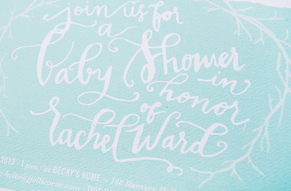
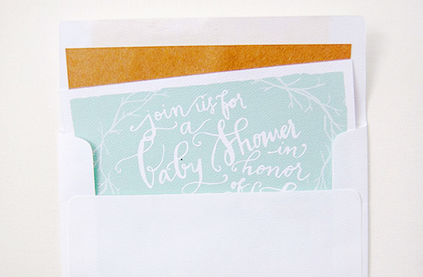
When it comes to baby shower invitations, sweet and simple will always win my heart. For her sister’s baby shower, Jessie from Gramercy Studio created a beautiful design with whimsical hand lettering and illustrated branches inspired by the outdoorsy nature of the parents-to-be. Beautiful!
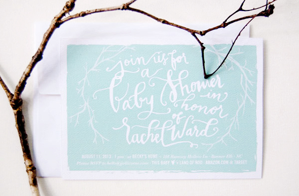
From Jessie: This invitation design was inspired by my sister Rachel and her husband Bryant, who are having a baby in just one month. They are a sweet and outdoorsy couple, so I wanted to create a design that was fun, whimsical and a little wild. Illustrated branches frame the custom lettering against an aqua background.Â
Thanks Jessie!
Photo Credits: Gramercy Studio
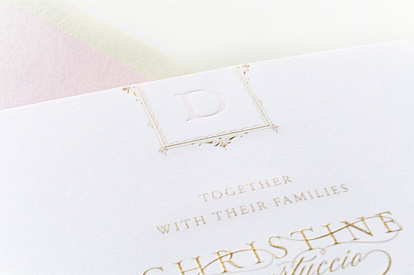
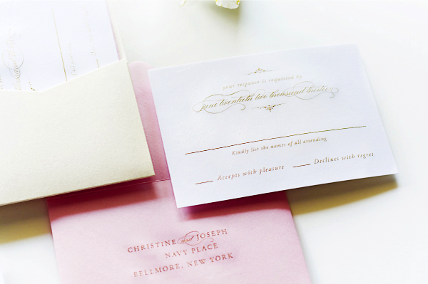
When designing the invitations for her cousin’s glamorous vintage-inspired wedding, Jackie of Sincerely, Jackie knew that she wanted to do something really special. The answer? An elegant invitation design with beautiful gold engraving and soft pink letterpress printing. Absolutely stunning!
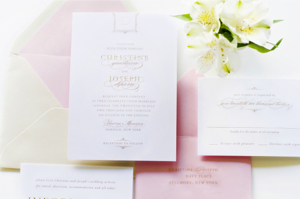
From Jackie:Â I created these invitations for my cousin, Christine, who’s also one of my best friends. Christine’s wedding took place just a few weeks ago was in a gold coast mansion on the Great South Bay of Long Island, New York. With such a breathtaking location, I knew the invitations needed to truly set the stage for the guests.
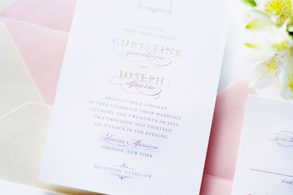
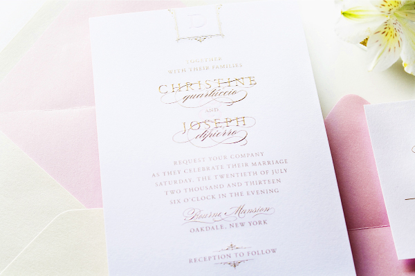
The wedding was inspired by all things vintage, romantic, and glamorous, with lots of gold and pink, so I knew immediately that I wanted to create a gold and pink invitation done with specialty printing. While I love, love, love gold foil, for Christine’s invitations I really wanted to go with something a little more unique and true to the feel of the venue.
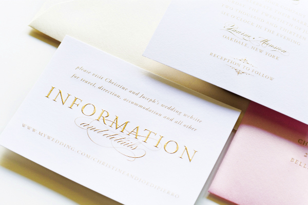
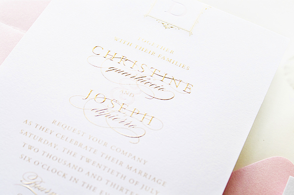
We decided to do a mix of printing methods: burnished gold engraving and soft pink letterpress accents. The gold engraving turned out to be the absolute perfect method for printing the invitations, and the contrast between the raised gold and the touches of soft pink letterpress is just divine.
Thanks Jackie!
Check out the Designer Rolodex for more talÂented wedÂding inviÂtaÂtion designÂers and the real inviÂtaÂtions gallery for more wedding invitation ideas!
Photo Credits: Sincerely, Jackie
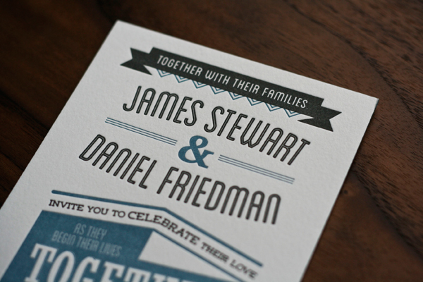
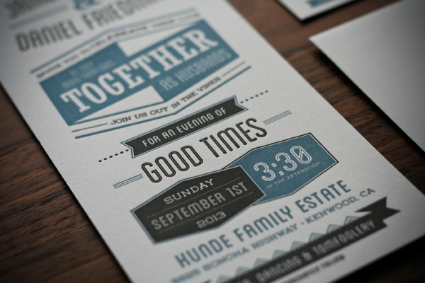
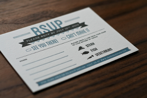
James and Daniel approached designer Chase Kettl looking for a masculine design for their wedding invitations. Chase created a modern two-color design with bold typography-inspired elements. Blue edge painting was the perfect finishing touch!
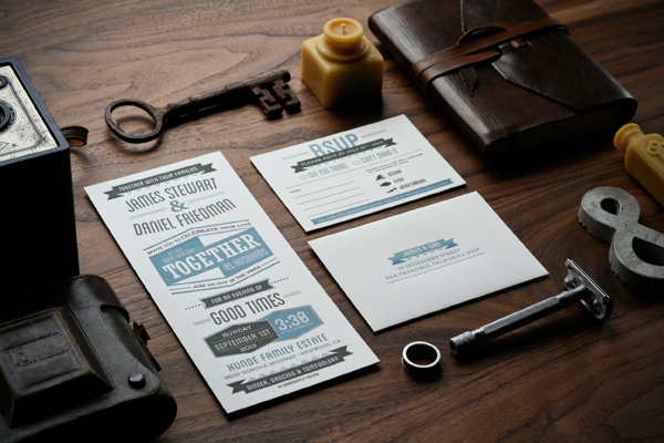
From Chase:Â James and Daniel contacted me looking for a masculine feel for their wedding invitations. Being a wedding of two men, they wanted to have a masculine feel as opposed to something flowery and frilly. I was thrilled to work with them! We decided to go with a two-color letterpress with bold design elements. We also decided to invest in blue edge painting to really give it a clean, dapper finish.
Thanks Chase!
Design: Chase Kettl
Letterpress Printing:Â Dependable Letterpress
Check out the Designer Rolodex for more talÂented wedÂding inviÂtaÂtion designÂers and the real inviÂtaÂtions gallery for more wedding invitation ideas!
Photo Credits: Chase Kettl
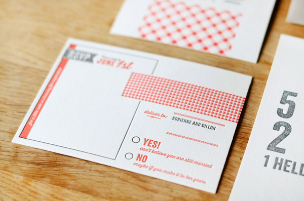
More than all the details and pretty invitations, the thing that I really love about parties is that they’re an excuse to get all of your favorite people together in one place. So naturally, I’m loving the spirit behind these 5th anniversary party invitations from Lisa at Good on Paper! Lisa incorporated gingham patterns and an icon of the Golden Gate bridge (which she originally used on their wedding invitations five years ago!), all letterpress printed by the talented team at Paper Monkey Press.
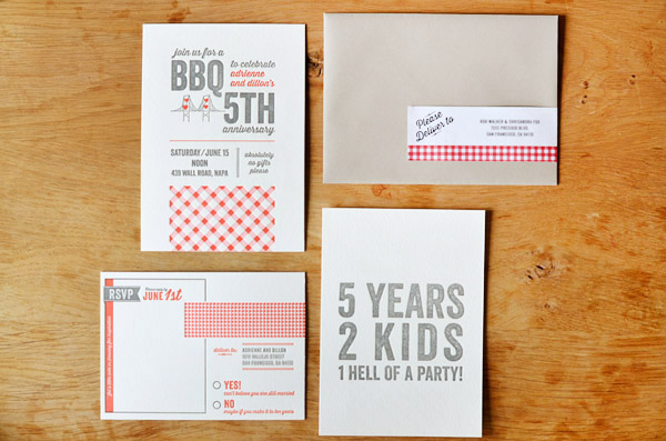
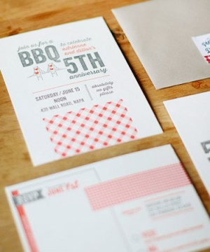
From Lisa: From their wedding invitation design to birth announcements for their second child, Adrienne and Dillon Rogers are the definition of repeat clients. For their 5th anniversary BBQ in Napa, I designed a modern rustic letterpress invitation set.
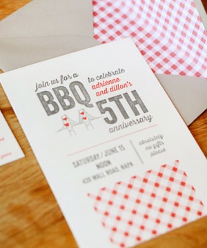 Â
 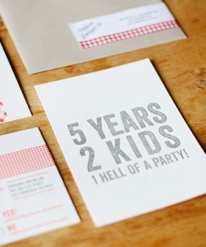
Graphic details included a pink and red gingham pattern, wood type fonts, and the San Francisco bridge + hearts icon originally used on their wedding invitations.
 Â
 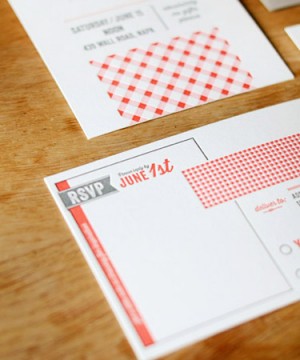
Guests were encouraged to write or draw a little inspiration on the RSVP postcard. I also designed gingham envelope liners, custom wraparound address labels, place cards, menus, and wood mounted party signs.
Thanks so much Lisa!
Design: Good on Paper
Letterpress Printing: Paper Monkey Press
Good on Paper and Paper Monkey Press are members of the Designer Rolodex – you can see more of beautiful work from Good on Paper here and from Paper Monkey Press right here!
Photo Credits: Good on Paper