Inspiring Calligraphers: Bien Fait Calligraphy

Hey everyone! If you’re someone who pores over the little details, (like I do), I think you’re in for a real treat today. When I was choosing images for this post, spotlighting calligrapher Joi Hunt, I just couldn’t narrow down all the images of oh-so-pretty envelopes. Because when you think about it, an envelope is often the very first impression of the big event. Let’s go look at some beautiful lettering work! Here’s a peek at Bien Fait Calligraphy. Jen

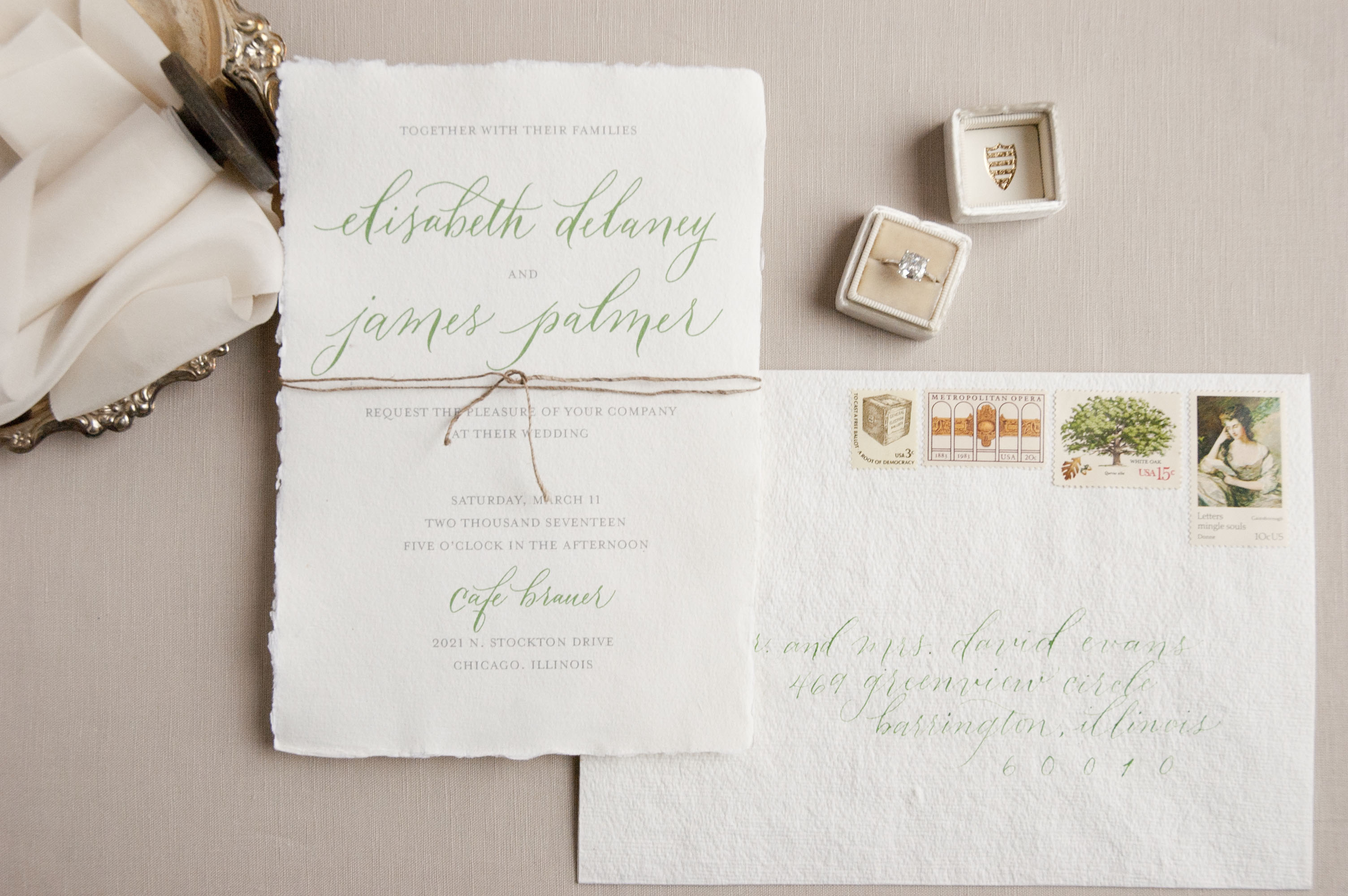
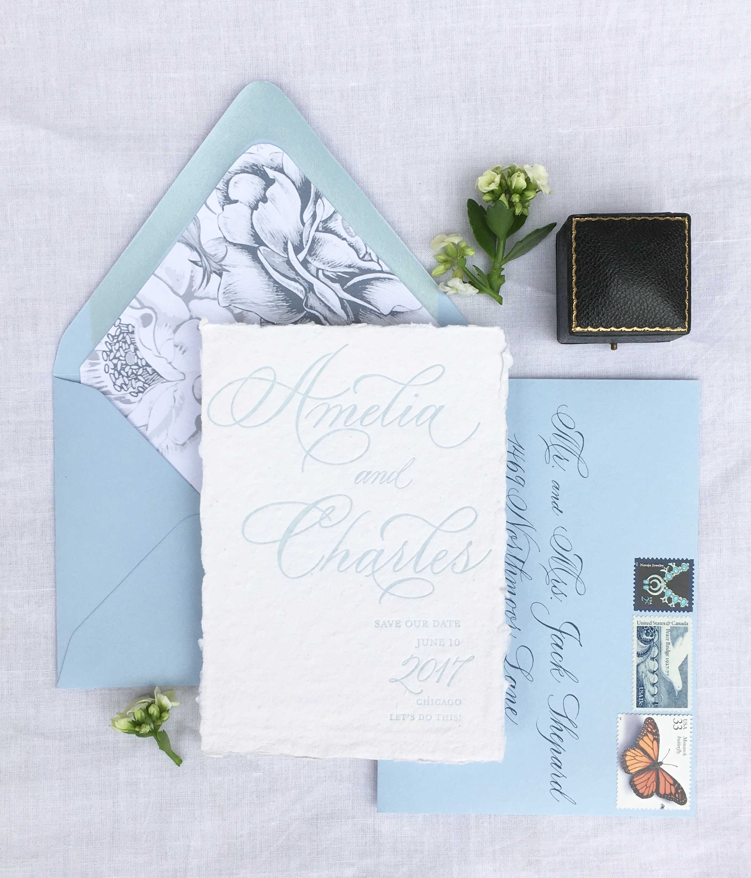
Deckle Edge Calligraphy Wedding Invitations / Bien Fait Calligraphy

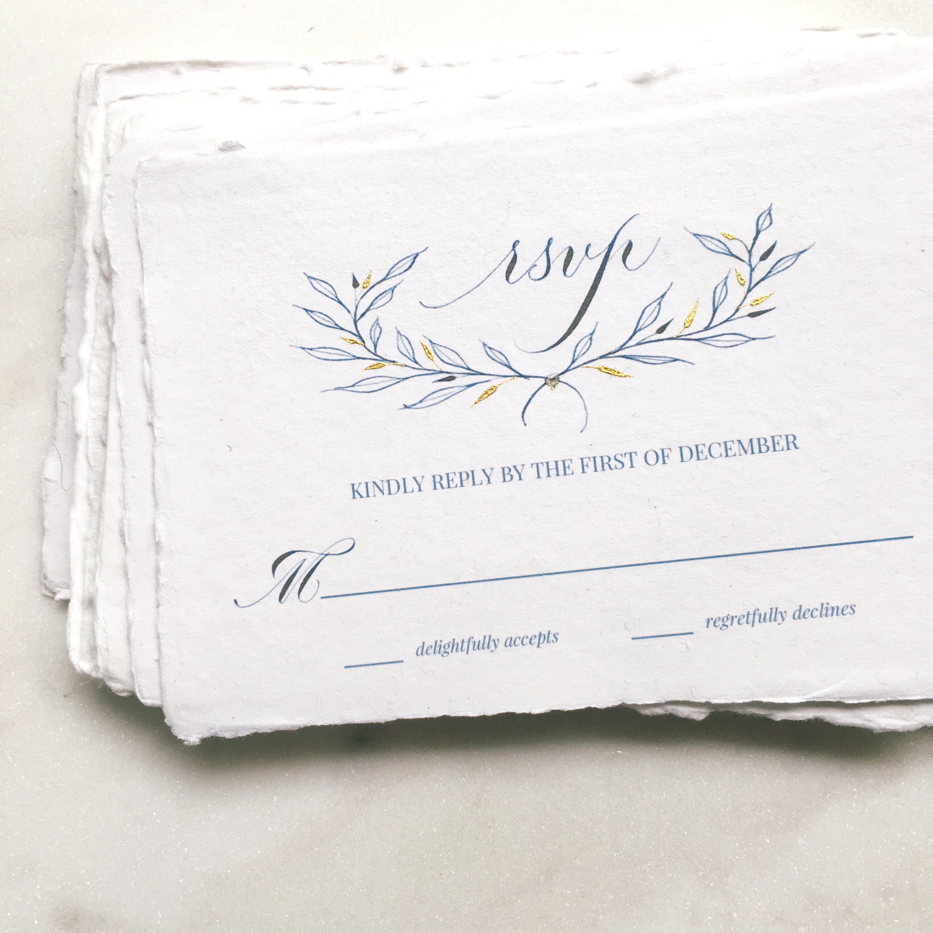
Calligraphy RSVP Card / Bien Fait Calligraphy

What’s in a name? Bien Fait is a French phrase that means “made well”, which is a nod to the way Joi approaches calligraphy — made well and made with love. Joi specializes in pointed pen calligraphy styles. Favorite projects? Says Joi: “My favorite projects are collaborations between other creatives, like stationery designers and watercolor artists. All our strengths come together to create something more beautiful than each individual element.”
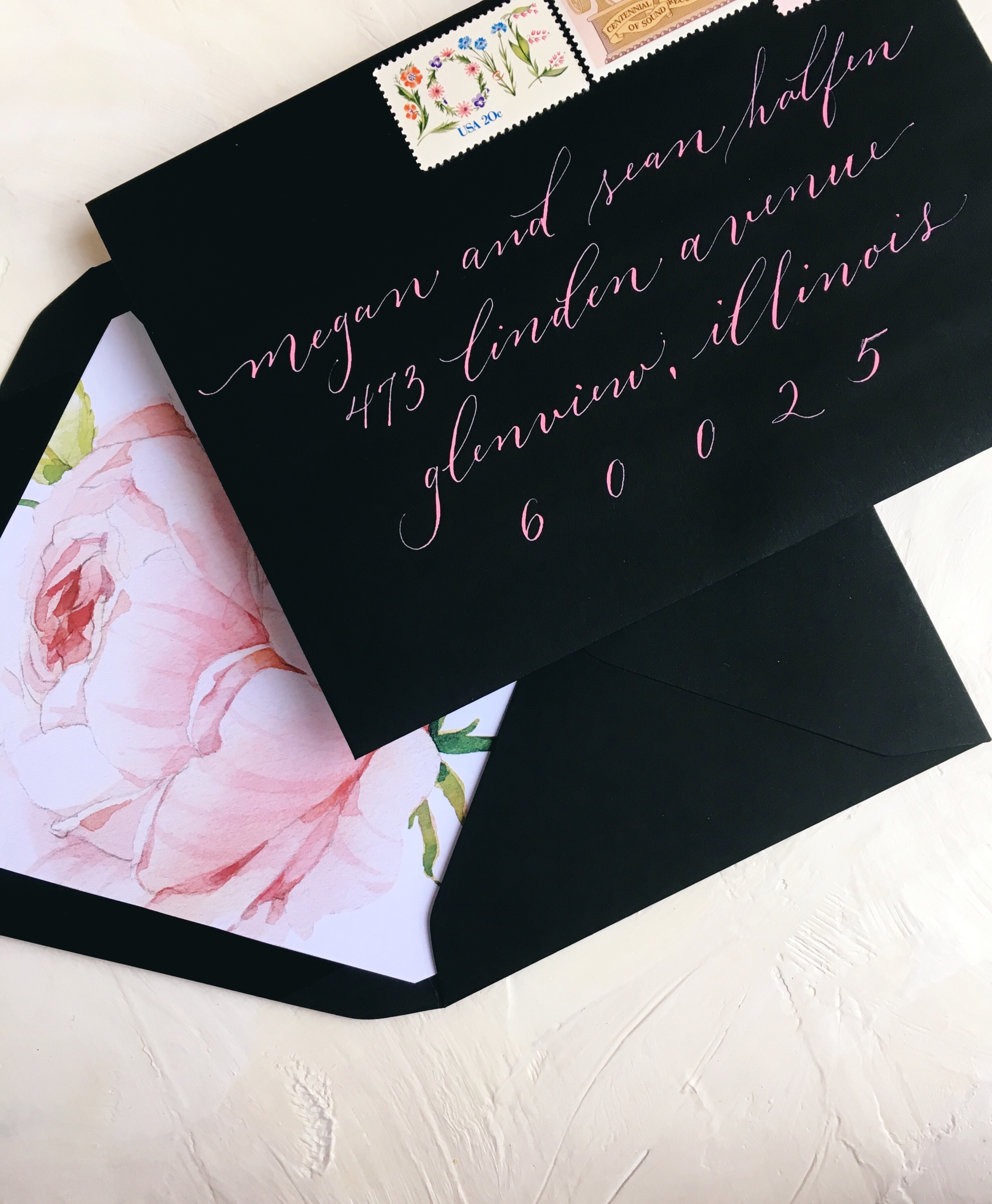
Black Envelope with Pink Calligraphy / Bien Fait Calligraphy

Calligraphy Wedding Invitations / Bien Fait Calligraphy

Joi considers herself a classically trained calligrapher, but that doesn’t mean she’s a perfectionist. “The beauty of handwritten script is the variation, the personality and emotion that comes through mind, heart, and hand, onto paper,” says Joi.
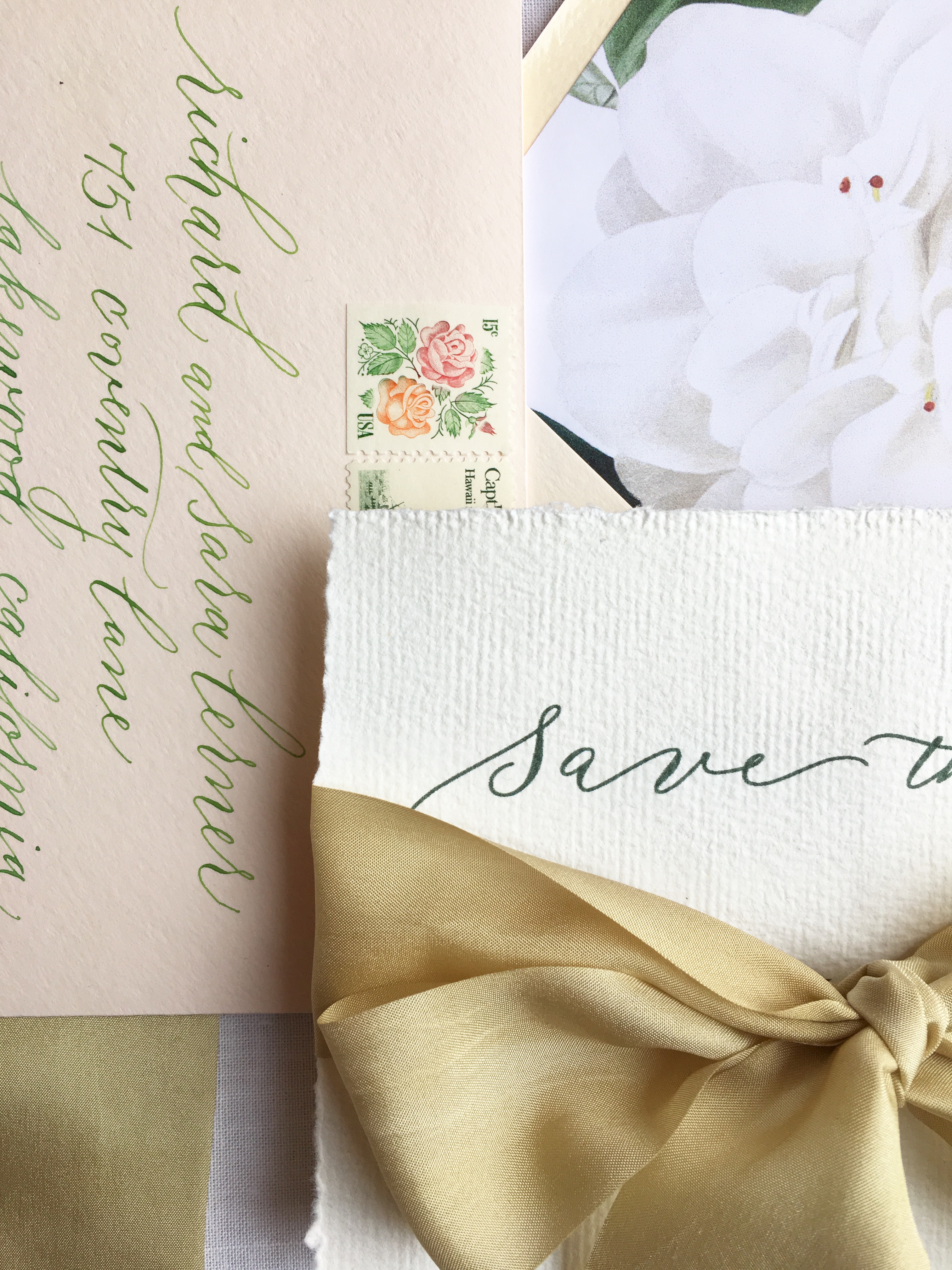
Calligraphy Save the Date / Bien Fait Calligraphy

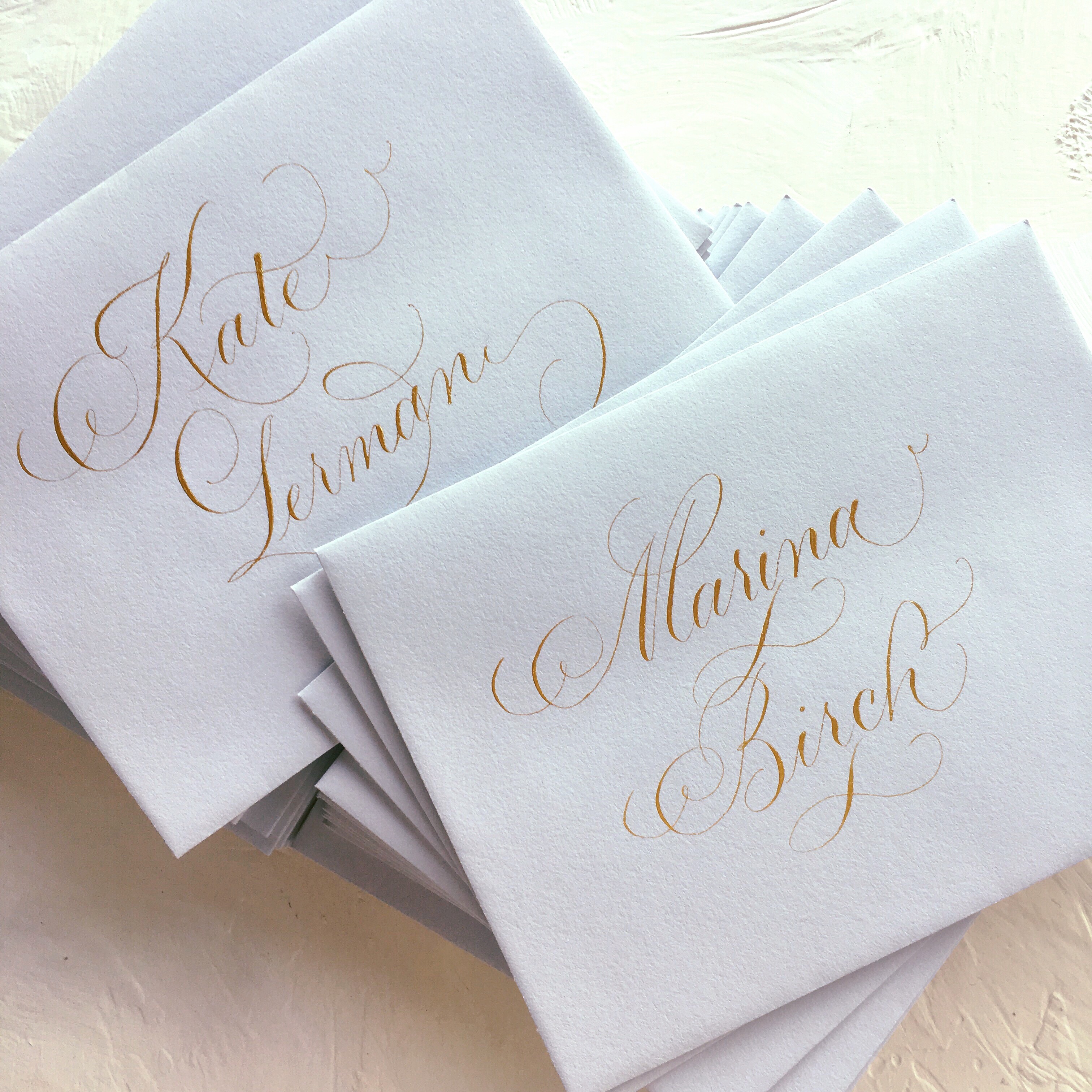
Gray Envelopes with Gold Calligraphy / Bien Fait Calligraphy

On envelopes, Joi says, “I love to address envelopes! Each one is a little piece of art, totally unique and a labor of love. A client that gives me the freedom to flourish a name or address is a bonus.” And of course, it’s so special to see a name beautifully penned.
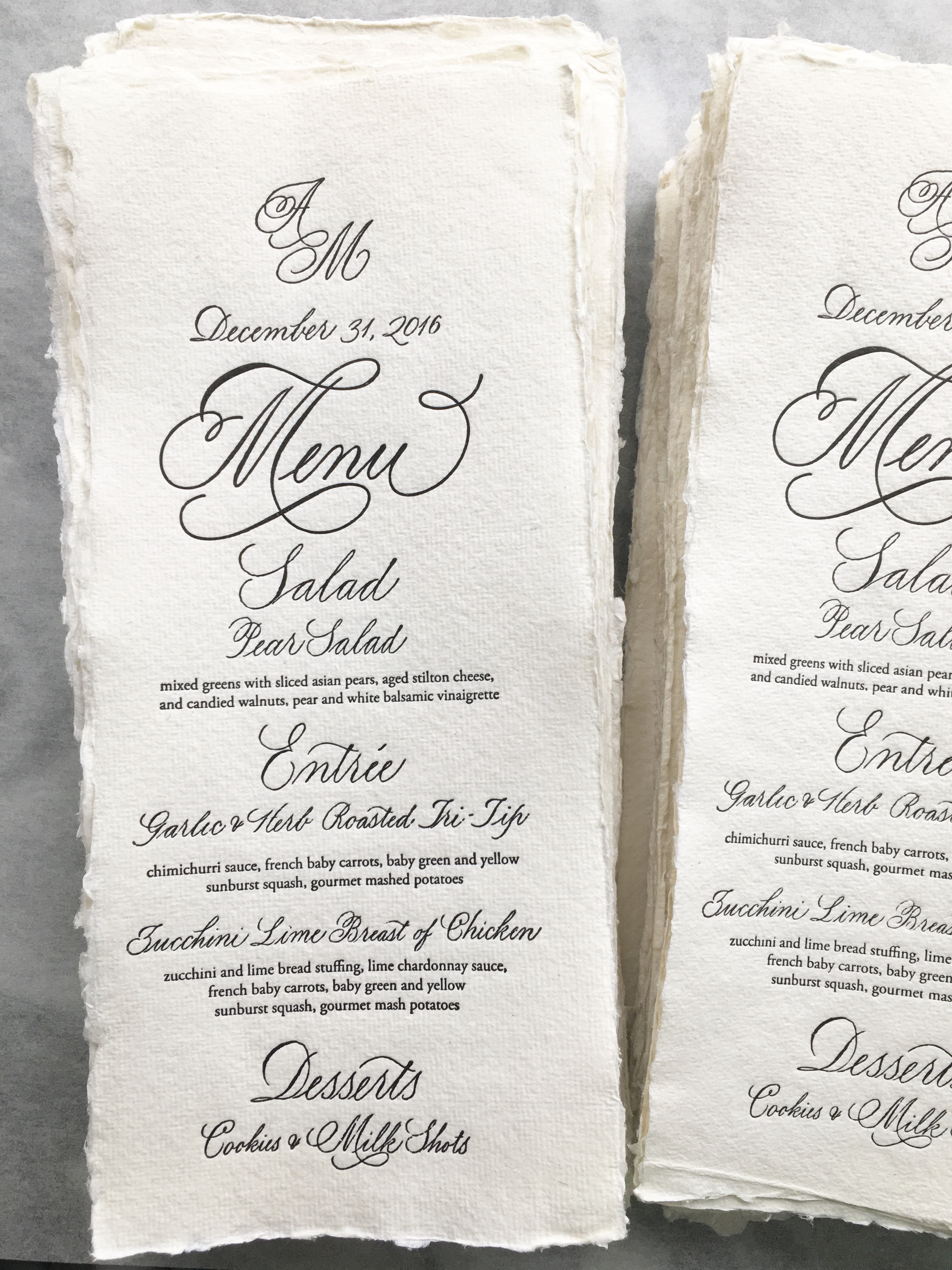
Menu Calligraphy / Bien Fait Calligraphy

Joi finds inspiration for her lettering work from historical examples. “I love to study calligraphy books and I am lucky to own quite a few vintage books. I could spend hours with my nib, dipping it into ink, and listening to the sound of that nib on paper,” she shares.

Sending a big thanks to Joi of Bien Fait Calligraphy for sharing a look into her fanciful, beautiful lettering work!

p.s. Even more inspiration from more inspiring calligraphers right here!

All photos via Bien Fait Calligraphy

Watercolor Floral Baptism Invitations

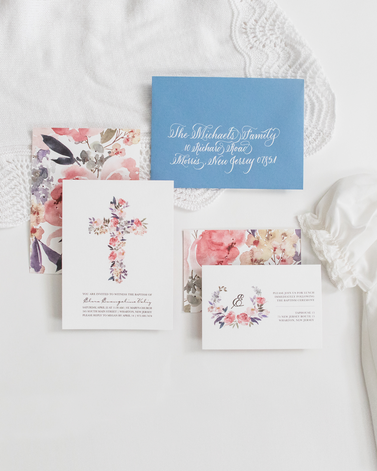
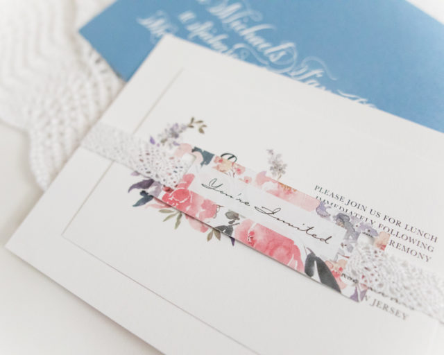
These charming watercolor floral baptism invitations are so sweet! Megan of Honeybee Paper Co. created these invitations for her daughter Elora’s baptism – drawing inspiration from the peace, joy, and serenity that Megan feels as Elora’s mother. We love the cheerful color palette, bespoke calligraphy, and well balanced white space that make the watercolor floral illustrations truly shine. What a beautiful and symbolic suite!

Floral Baptism Invitations by Honeybee Paper Co.

From Megan: When it came time to have my daughter, and first child, baptized we really wanted the invitation suite to reflect the feelings she gave us — serenity, peace, and joy. We wanted a soft color palette to represent the beautiful sacrament she would receive.

Floral Baptism Invitations by Honeybee Paper Co.

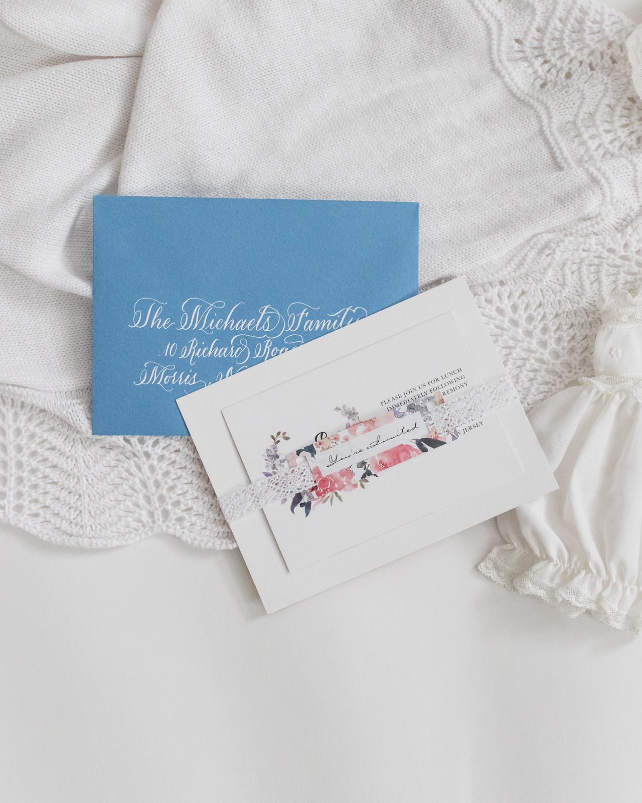
She was baptized in the same gown I wore when I was christened as a baby, so I wanted to pull inspiration from the delicate lace that trimmed the gown. I chose to use crochet ribbon to wrap the invitation and enclosure as a gentle nod to the gown, which threaded through the matching “You’re Invited” tags. The cards were printed on white cotton paper to add an additional layer of texture.

Floral Baptism Invitations by Honeybee Paper Co.

Floral Baptism Invitations by Honeybee Paper Co.

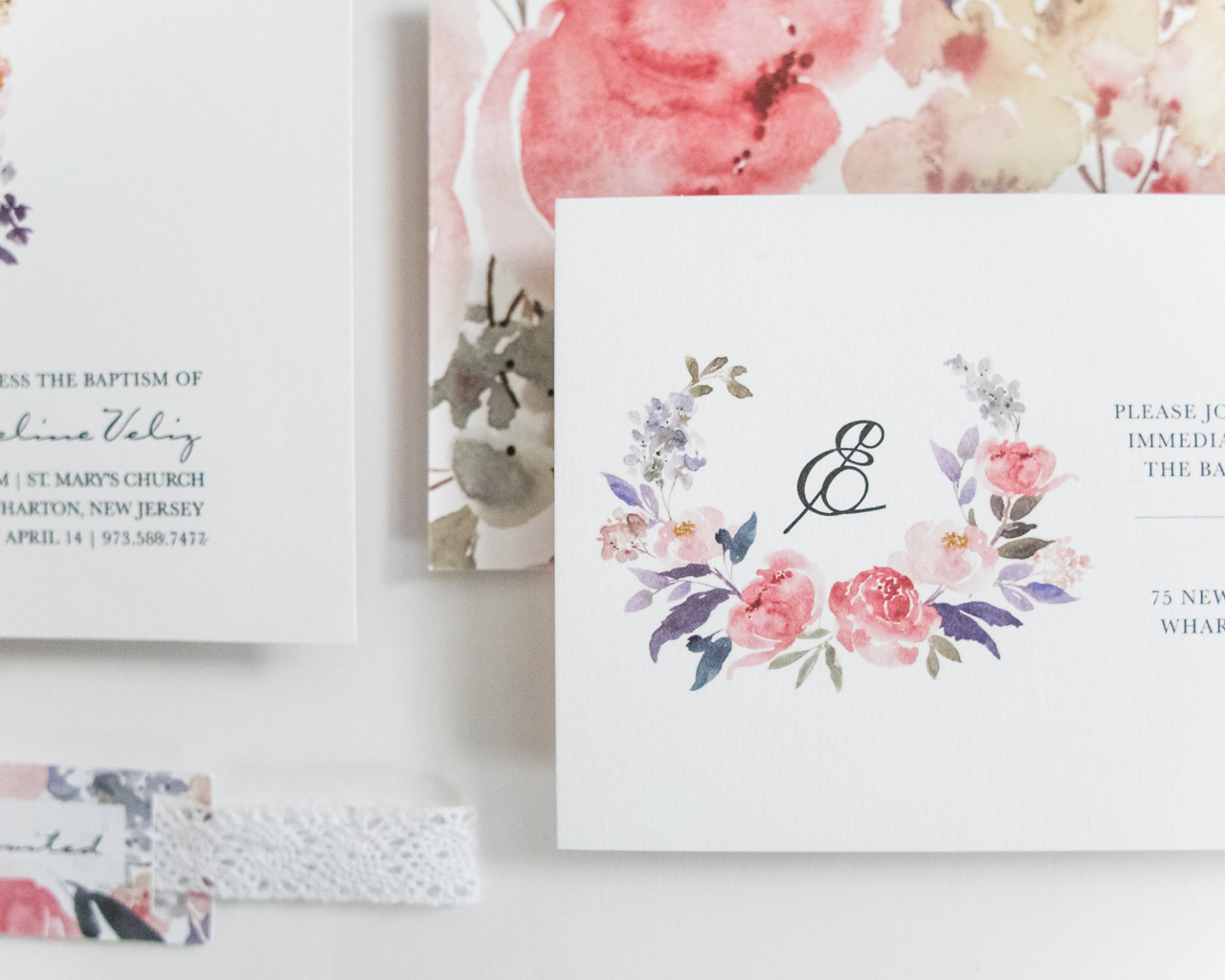
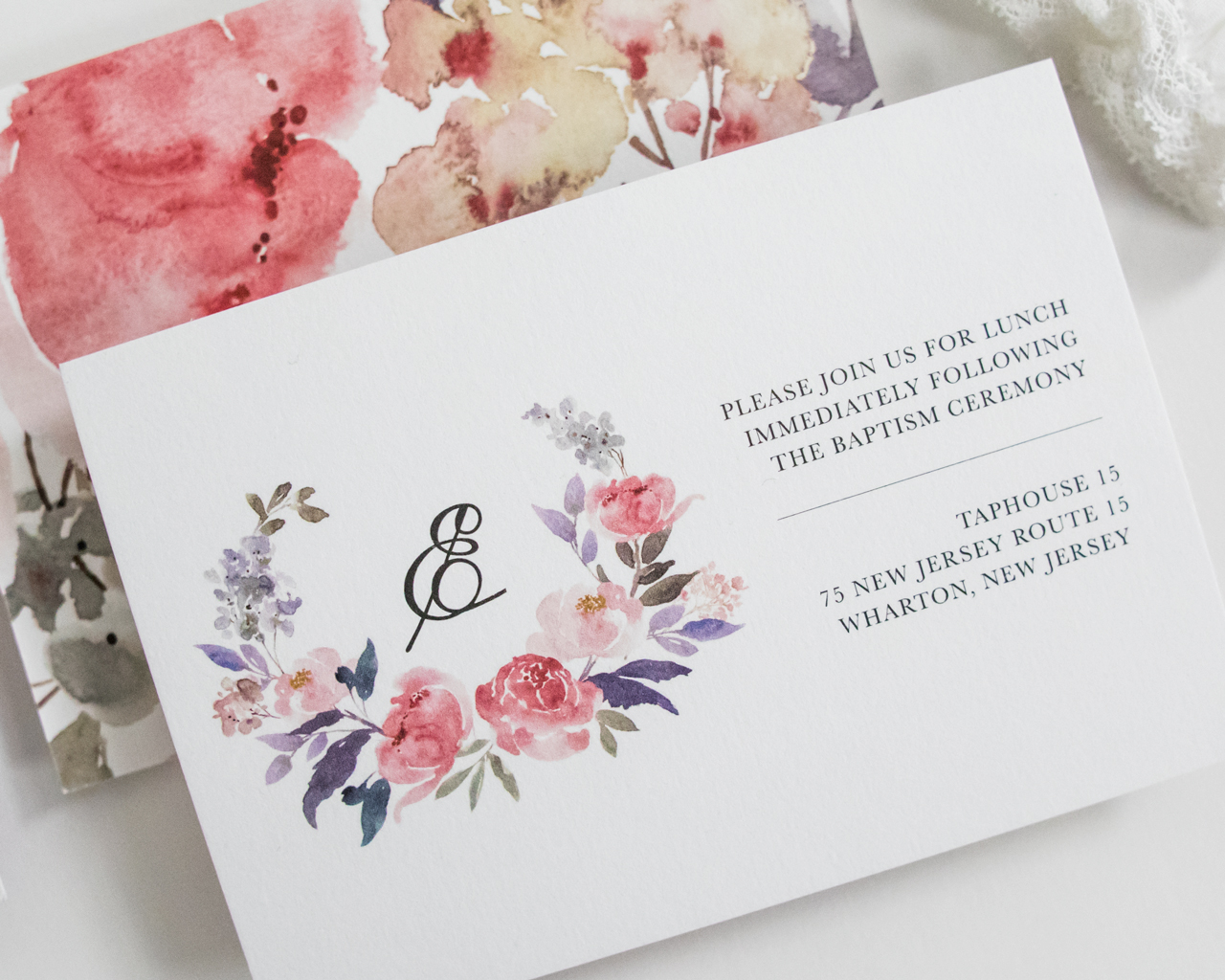
All the watercolor flowers were placed individually to create the shape of the cross, and I wanted to keep a lot of white space to let them shine. For the enclosure, we wanted to use her initial in the design, as my husband and I love her rarely heard name, Elora.

Floral Baptism Invitations by Honeybee Paper Co.

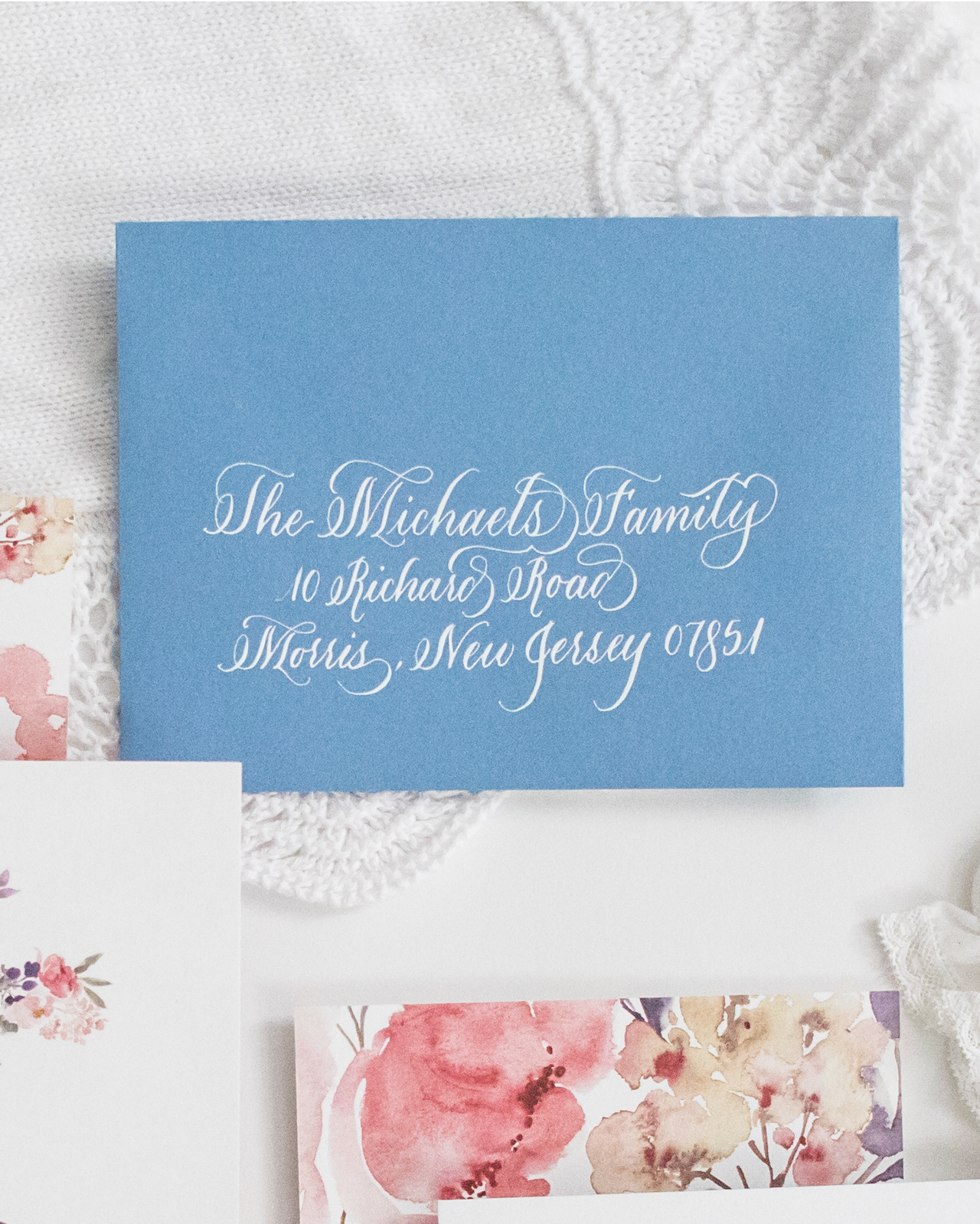
The backs of both the invitation and enclosure card featured the same florals enlarged, to create a nice contrast to all the white on the front. The light blue envelopes turned out to be a wonderful choice and were selected to complement the colors in the suite. The names and addresses of our friends and families were each calligraphed by myself in white ink.

Floral Baptism Invitations by Honeybee Paper Co.

This invitation was such a joy for me to design as it was meant to celebrate such an important little person. Each detail was delicately selected. I loved these watercolor botanicals so much I even had a custom cake topper ordered to match! These invitations set the tone for what turned out to be a wonderful day with friends and family to celebrate a truly wonderful little girl. 

Floral Baptism Invitations by Honeybee Paper Co.

Thanks Megan!

Design: Honeybee Paper Co. 
Printing: StationeryHQ

Photo Credits: Megan Veliz

Romantic Deckle Edge Wedding Invitations with Red Wax Seal

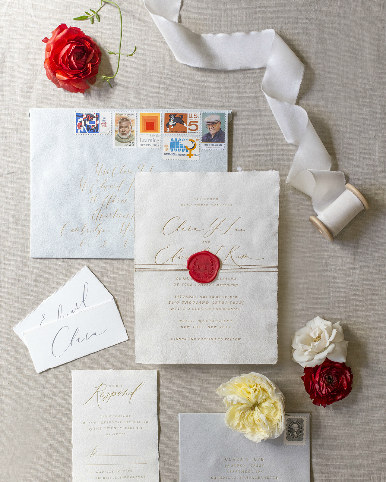
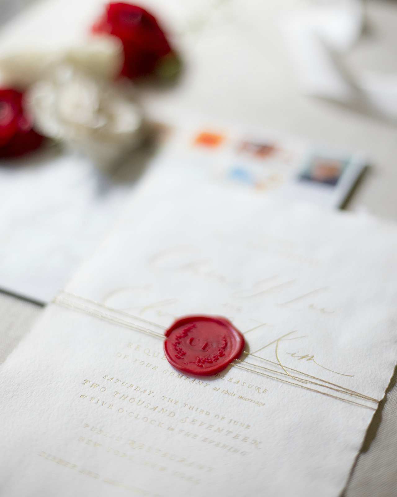
Ethereal calligraphy, soft deckled edge paper, and bold red wax seals? Yes, please! We’re loving these romantic deckle edge wedding invitations by Tricia of Fourteen-Forty! The clean, minimalist design is absolutely dreamy on the beautiful handmade paper – and the pop of red in the wax seal is so fun!

Romantic Deckle Edge Wedding Invitations with Red Wax Seal by Fourteen-Forty

From TriciaWhen my good friends Clara and Edward came to me for their invitations, all kinds of inspiration and ideas came to mind. They wanted something romantic and modern and throughout the process, was pleasantly surprised again and again by their attention to design and detail. In the end, this deckled edged suite was truly a labor of love!

Romantic Deckle Edge Wedding Invitations with Red Wax Seal by Fourteen-Forty

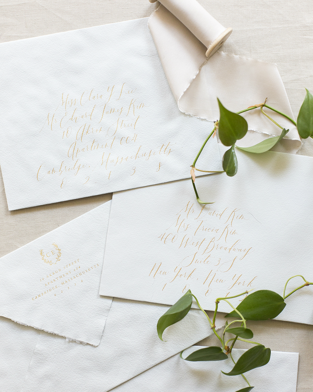
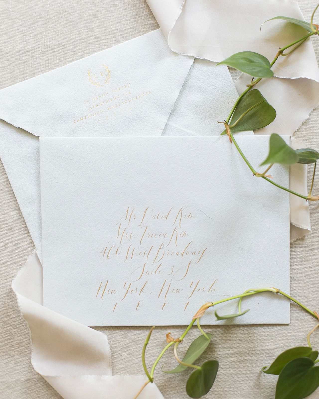
Up until now, our clients have always preferred a cleaner edge and thus we always hand tore our invitations. Clara and Edward fell in love with deckled edges and so we used them for both the invitation pieces and envelopes! We just love the texture and naturally frayed edges of deckled edge paper. After testing all kinds of combinations we decided ivory and lead gray were the perfect combination: subtle and modern. Their names were calligraphed and printed in gold foil. To top it off we added a vellum overlay tied to the invitation by gold string and a bold red wax seal.

Romantic Deckle Edge Wedding Invitations with Red Wax Seal by Fourteen-Forty

Romantic Deckle Edge Wedding Invitations with Red Wax Seal by Fourteen-Forty

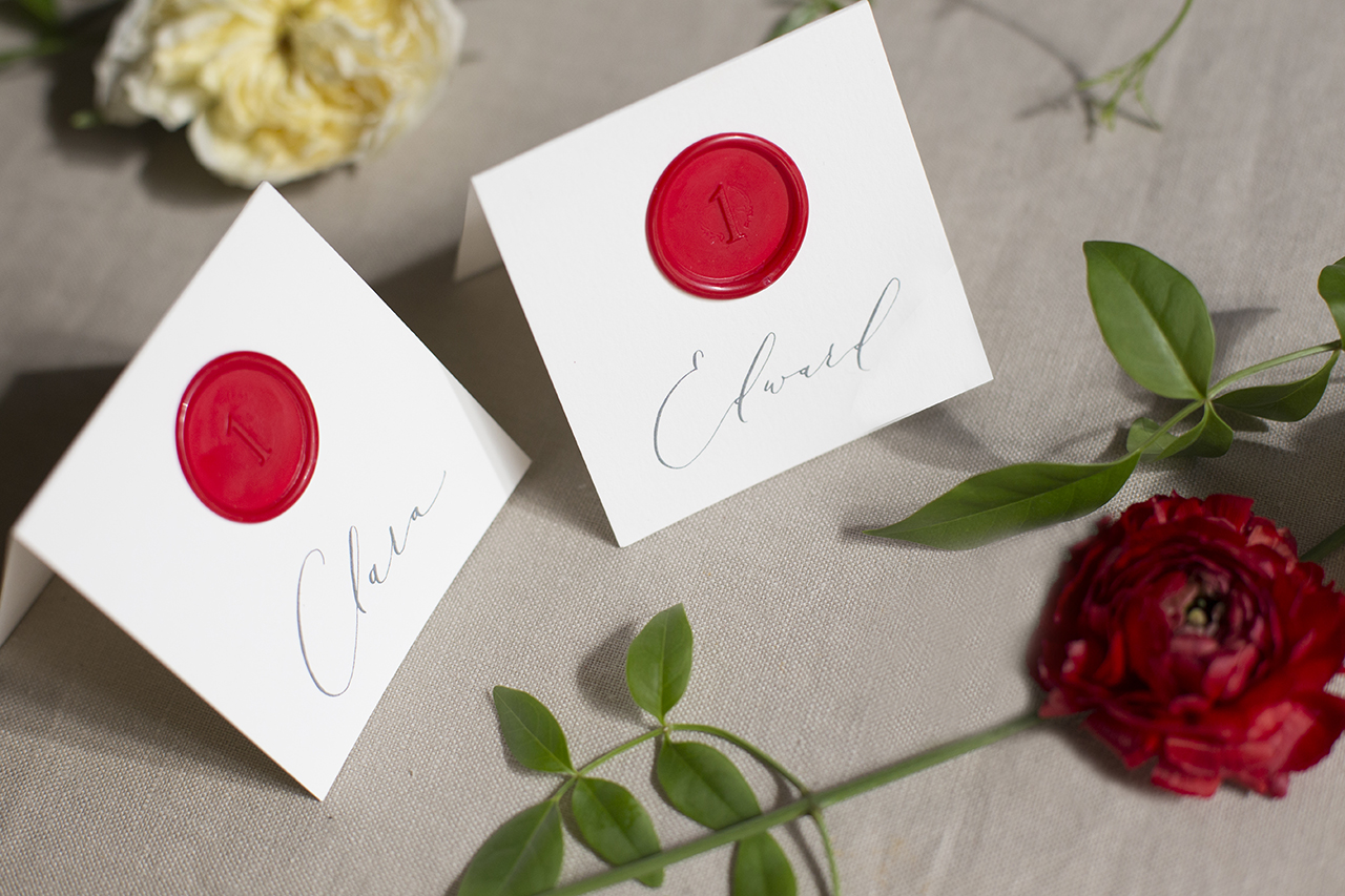
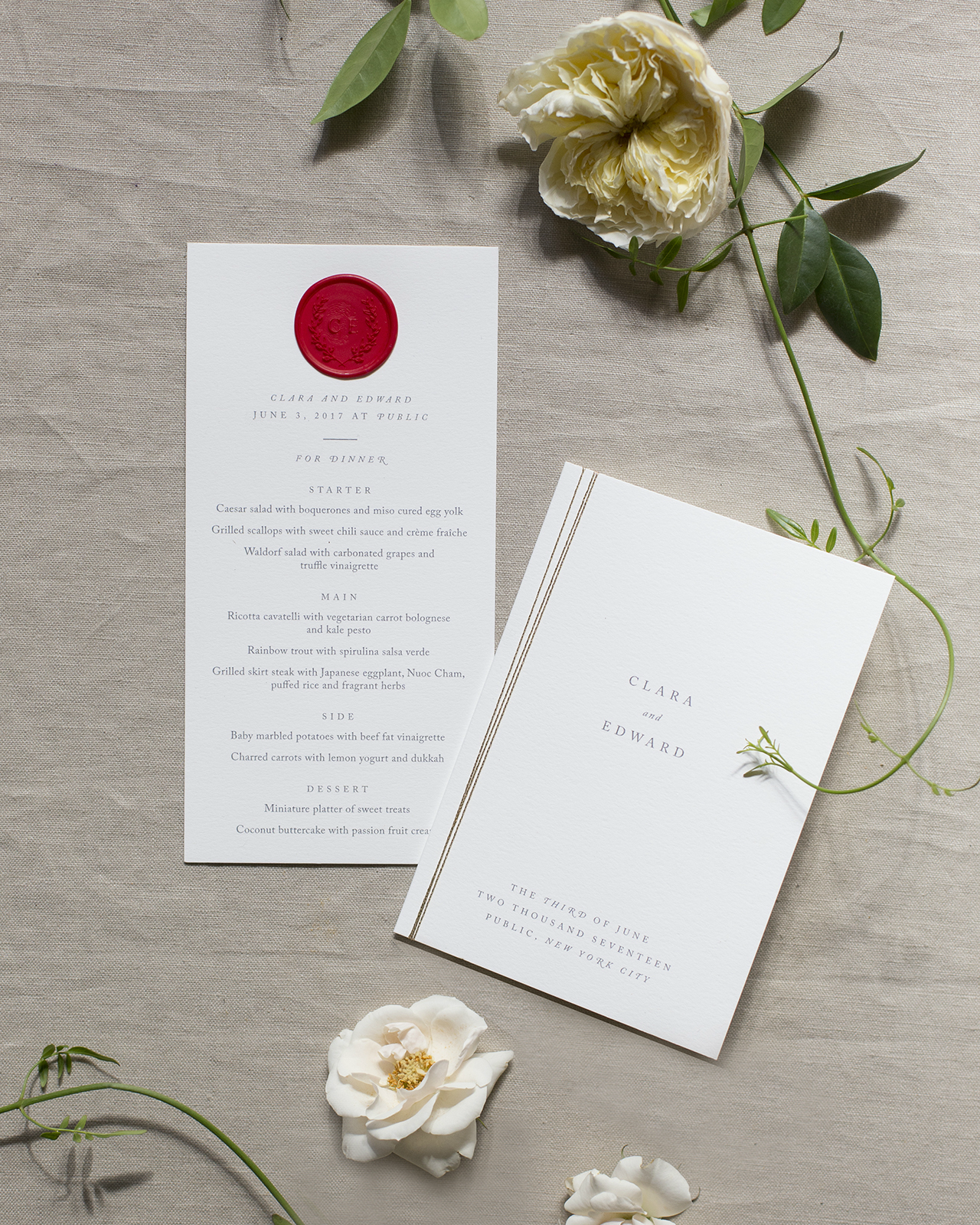
It was clear from the start that calligraphy, both hand and digital, would play a large role in their suite. Each envelope was hand calligraphed and completed with an array of vintage stamps inspired by the couple’s personal interests. The bright colored stamps were a fun contrast to the subtle sparkle of the gold ink. For their day-of pieces we knew we couldn’t say goodbye just yet to the red wax seal and so we sealed both their menus and escort cards! Each escort card was sealed with the guests’ table number. On the day, it was so much fun seeing a hundred red seals side by side!

Romantic Deckle Edge Wedding Invitations with Red Wax Seal by Fourteen-Forty

We wanted to make sure that the details didn’t end there and so we also tied each program with the same gold string we used for their invitation. While it isn’t necessary to match your day-of pieces to your invitations, in this case, we were so glad Clara and Edward were excited to bring back aspects of their invitations on the day.

Romantic Deckle Edge Wedding Invitations with Red Wax Seal by Fourteen-Forty

Thanks Rachel!

Design: Fourteen-Forty
Calligraphy: Papersoul 
Floral Design: Days of May Florals 

Check out the Designer Rolodex for more tal­ented wed­ding invi­ta­tion design­ers and the real invi­ta­tions gallery for more wedding invitation ideas!

Photo Credits: Fourteen-Forty

Happy Weekend!

Happy Friday everyone! Are we all feeling excited for February? Anything that gets us a little closer to spring, right? I’m heading out of town this weekend for a very quick trip to New York to attend an event with Minted, and I’ll also spend a few hours walking the NYNOW trade show while I’m in town. You can follow along on Instagram (mostly on Instagram Stories) if you want! But in the meantime…

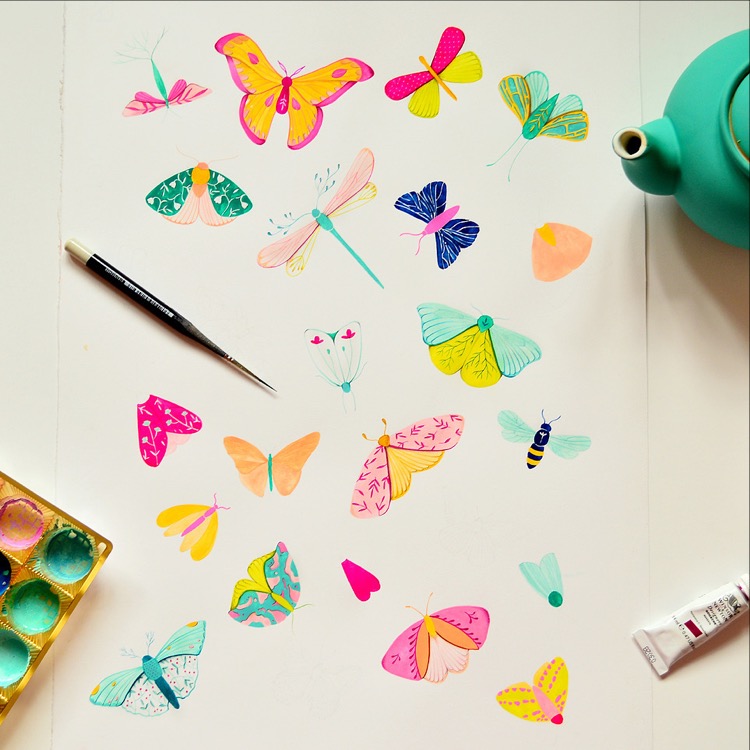
Butterfly Illustration by Ioana Petre

Butterfly illustration by Ioana Petre via #dailydoseofpaper

…a few links for your weekend!

DC friends! If you’re looking for something to do on February 24 – come to the DC Distillers Fest at Longview Gallery! You’ll get to sample more than 60 spirits from 20 distillers, and the lineup looks SO GOOD. 

Has Instagram come full circle? I’d love to hear your thoughts on this!

I’m all about long cardigans and cozy sweaters this winter. I’m loving this cardigan – and this cozy cable knit sweater comes in the prettiest shade of pink!

Tips for writing the perfect thank you note

Loving these cheeky DIY anti-Valentines

Confetti acrylic statement earrings! NEED.

I’m definitely going to make one of these DIY brass ring planters

Well, now I need to brulée some citrus for winter cocktails!


Common Room Studio: Modern Bohemian Style Round Up

You guys, we’re getting SO close to finishing the design for Common Room Studio. I actually did a little sneak peek tour of the space on my Instagram Stories yesterday – you can find me here if you want to take a look! We’ve been using the space as a photo studio for a while, but I was having trouble deciding on a layout and wall treatments for the front room, which functions as a kind of lounge/living room area for the entire studio. But I think I finally figured it out! Now I’m on the hunt for some specific pieces to help pull everything together, so I thought I’d share what I’ve found so far!

Click the widget above to go directly to an individual product page!

Chandelier // Wire Planter // Pink Planter // Rattan Cabinet // Ikebana Vase // Rug // Pink Sofa // Floral Art Print // Coffee Table // Plaid Stools

I shared our design plans and moodboard for Common Room Studio back in November, which is still guiding all of my design decisions in the studio. Our overall style is bright and airy with a little bohemian thrown in. Lots of textiles, rattan and natural textures, and light wood tones to soften some of the industrial edges of the space. I’m not really sure what to call this particular style – maybe Modern Bohemian? Works for me!

My main hang up involved some exposed electrical conduits in really awkward locations. The walls are all cinderblock, so the conduits can’t be easily moved, but working around them means I can’t use wallpaper to create an accent wall and paint alone didn’t feel like it was quite enough. The current plan is to use moulding strips to hide the conduits and help create some extra visual interest while remaining a fairly blank slate for photo sessions and events.

We have a couple of chairs and a loveseat in the room right now, but I’d love to add a sectional for extra seating. I absolutely love the pink velvet on this sofa, but I’m thinking leather would probably be more practical. This cabinet would be great for holding bottles and supplies during cocktail workshops. And I’ve been completely obsessed with this chandelier for a while now – if it doesn’t end up at the studio, it’ll end up somewhere in my house. Ha!

So there you go! I can’t wait to get this all finished up and finally share the full reveal with all of you! But I’m curious – how would you describe this style? Does Modern Bohemian work for you, or would you call it something else?