Casey + Blain’s Brewery Baby Shower Invitations

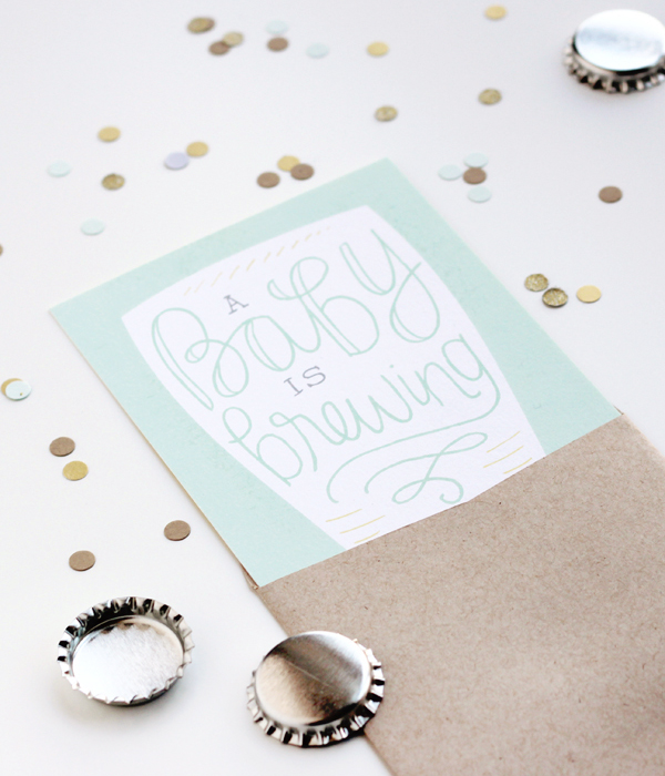
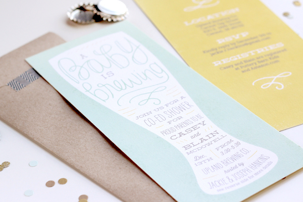
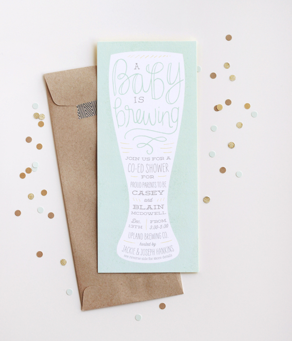
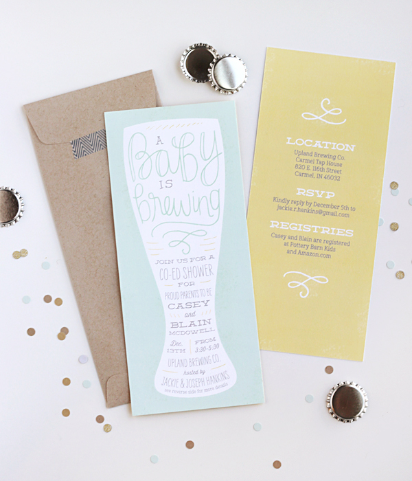
I love the idea of a laid-back baby shower – aka pre-baby party celebration! Laura from Duncan Park Papers drew inspiration from the venue (a brewery!) when designing these baby shower invitations, incorporating casual lettering in a silhouetted pilsner glass. So fun!

Brewery-Baby-Shower-Invitation-Duncan-Park-Papers2

From Laura: My brother-in-law and his wife, Jackie, came to me looking for an out of the ordinary baby shower invitation for Jackie’s sister Casey and her husband Blain. The event was a couples shower, hosted at a local brewery for a fun and laid-back vibe.

Brewery-Baby-Shower-Invitation-Duncan-Park-Papers

For the design, we went with a ‘baby is brewing’ theme. I chose a vertical layout inspired by a drink menu, and completed the look with a pilsner glass silhouette filled with hand drawn elements, subtle texture, and modern type. The mint green and yellow we used are the colors of the baby’s nursery: neutral, because the couple is waiting until the baby’s birth to learn the gender. Registry information and additional details were included on the back of the digitally printed invitation, and the package was completed with a top opening kraft envelope.

Brewery-Baby-Shower-Invitation-Duncan-Park-Papers9

This was one of my favorite custom projects to date, the location provided such an immediate inspiration and I love where it ended up!

 Brewery-Baby-Shower-Invitation-Duncan-Park-Papers5

Thanks Laura!

Photo Credits: Duncan Park Papers

DIY Tutorial: Floral and Lace Wedding Invitations

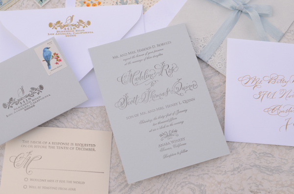
Today, we’re back with our first DIY of the new year! Hooray! This delicate floral and lace wedding invitation suite has been bouncing around in our brains for a while now – and the results exceeded even our expectations. Don’t you love it when that happens? We used a soft palette of misty blue, white, cream, and gold and incorporated some really fancy lace inner envelopes to bring it all together. With these fresh colors, it feels like spring is right around the corner! –Bailey and Emma of Antiquaria
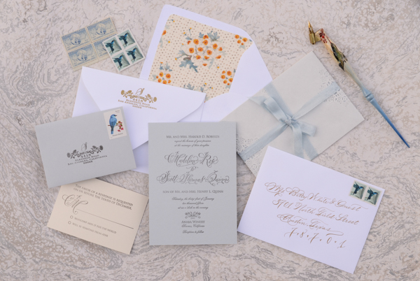
DIY Floral and Lace Wedding Invitations by Antiquaria for Oh So Beautiful Paper

DIY Floral and Lace Wedding Invitations by Antiquaria for Oh So Beautiful Paper

Materials

Floral Calligraphy Invitation Stamp

Floral Calligraphy Reply Card Stamp

Wildflowers Return Address Stamp

Lace Inner Envelopes

A7 Cards

A7 Envelopes, in Pure White

Chamomile Patterned Paper (for liner) and Liner Templates

4bar Card, (3.5″x5″ cut from our Chamomile Patterned Paper, Card Weight)

4bar Envelopes

Stamp Pad, black

Embossing Stamp Pad

Embossing Powder

Embossing Heat Tool

Tailors Ribbon
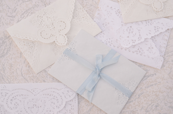
DIY Floral and Lace Wedding Invitations by Antiquaria for Oh So Beautiful Paper

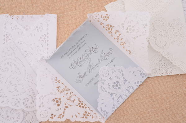
This stunning mix of lace paper inner envelopes from Modern Vintage Paperie really adds a touch of luxury to the suite and brings the whole look together!
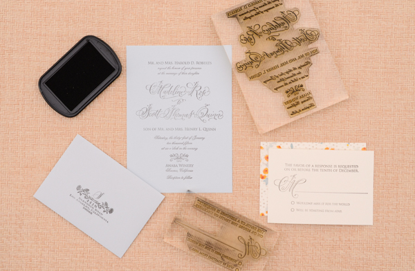
DIY Floral and Lace Wedding Invitations by Antiquaria for Oh So Beautiful Paper

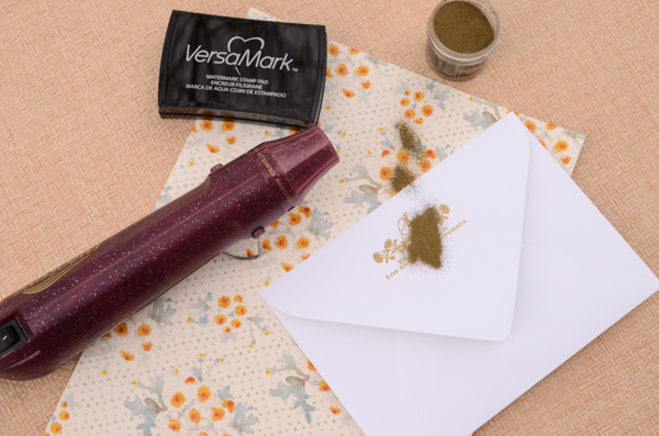
Step 1: First, stamp all of your invitation suite pieces. We used our Floral Calligraphy Invitation stamp, Floral Calligraphy Reply Card stamp and our Wildflowers Return Address stamp for these items. When stamping your cards, ink the stamp with the stamp facing you. Center the stamp over your card/envelope and press firmly and moderately (not too hard or the image will smudge) and gently lift the stamp off of the paper. Set aside to dry. Please watch this video for more information on inking and stamping an oversized stamp.
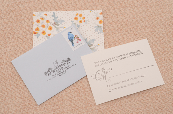
DIY Floral and Lace Wedding Invitations by Antiquaria for Oh So Beautiful Paper

DIY Floral and Lace Wedding Invitations by Antiquaria for Oh So Beautiful Paper

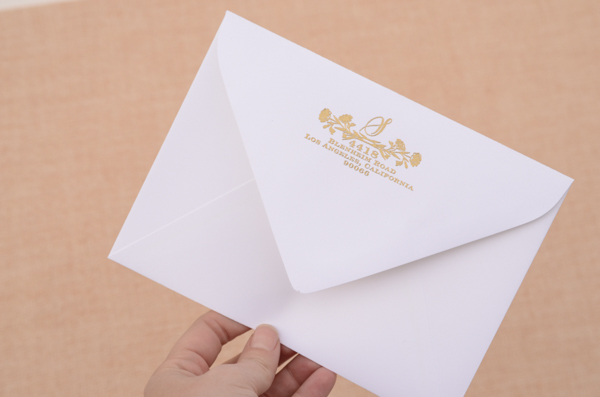
Step 2: Gold makes everything better, right? We decided to emboss our return address in gold to coordinate with the suite design and our addressing. Simply stamp your desired return address stamp on the back flap (either in matching ink or with Versamark glue ink, as pictured) dust the powder over it, tap off the excess and heat set the print. For more information about how to emboss using stamps, please watch this instructional video.
DIY Floral and Lace Wedding Invitations by Antiquaria for Oh So Beautiful Paper

DSC_5721

Step 3: Once all of your pieces are printed and dry, assemble them inside your lace paper inner envelope. We used assorted varieties of envelopes because we couldn’t decide on one, but you could select your favorite as well!
DIY Floral and Lace Wedding Invitations by Antiquaria for Oh So Beautiful Paper

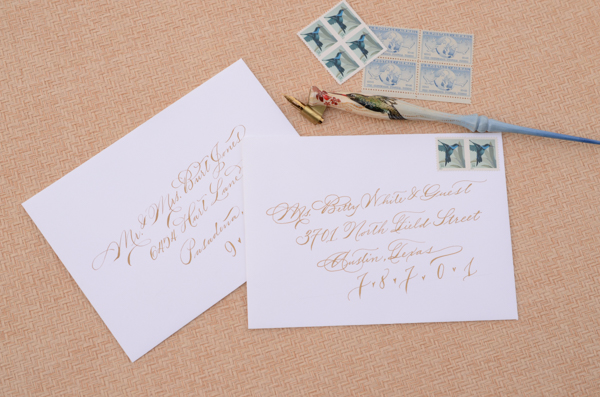
Step 4: Address the envelopes to your guests and add postage (we love those little hummingbird stamps). We used our favorite gold calligraphy ink, but to achieve a similar effect you could also use a gold gel pen and your prettiest handwriting!
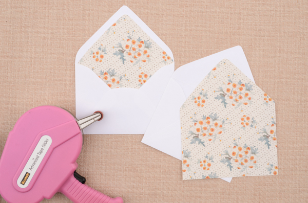
DIY Floral and Lace Wedding Invitations by Antiquaria for Oh So Beautiful PaperStep 5: Over time, we’ve learned that lining your envelopes after they’re addressed saves time and money! That way, if you mess up on an address, a liner isn’t wasted! Cut out your liner with a template or purchase pre-cut liners for your selected envelope if they’re available. To install the liner (we used our Chamomile Patterned Paper to make them), simply put a line of double sided tape or stick glue along the top edge (the triangle part) and slide it into the envelope. Once it’s positioned correctly, press to adhere the liner to the envelope.
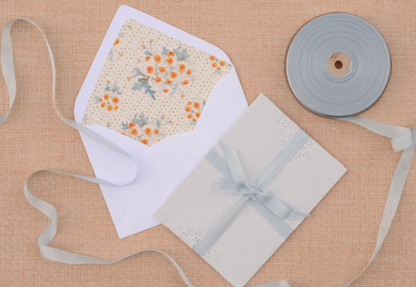
DSC_5726All that’s left  now is to tie up your invitation suite, put them into the envelope and send them along via snail mail!

Photography by Antiquaria for Oh So Beautiful Paper
Hello Brick & Mortar: Daydreams + Unprompted Requests, Part 2

Customers often visit Clementine and tell me what I should sell. Their ideas are well intended but often there’s a good reason that I don’t take the suggestion. As small business owners, we know our business best. We know our capacities and our style. We know what we like and where we want to invest. I, for example, don’t want to sell soap dispensers or small ceramic cat sculptures (actual suggestions). But sometimes someone makes a perfect suggestion and I dive in to explore its potential. I offer the daydreams with the chance they might click as something you want to invest in and because I would sell each of them. (None of you should make soap dispensers.) ~ Emily of Clementine

Brick + Mortar by Emily Blistein of Clementine for Oh So Beautiful Paper / Illustration by Emily McDowell

Illustration by Emily McDowell for Oh So Beautiful Paper

Part 1 of this post was my daydream pairings between a few favorite stationery and non-paper lines. This half looks at products you already make and imagines them as a new product. It is born mostly from instagram perusing and your introduction mailers.  Thank you for sharing your work through the mail and on social media. It’s why I complain about never getting anything done, but it’s also my favorite part of the day.

Ok, on to PART 2. You’d make a great…

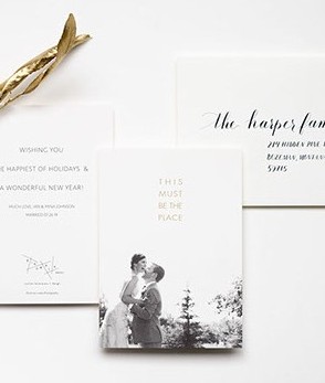
  • Birdwalk Press sent their beautiful holiday card – a snap from their wedding with gold foil embossed with the words THIS MUST BE THE PLACE. I pulled it out of the envelope and immediately said: I want this to be a print. Just the words (they’re a beautiful couple, but for marketability…). It would make a great card and an even better print (8″x10″ or larger). My imagination already has it framed over my bed.

Birdwalk Press Holiday Card

Birdwalk Press holiday mailer, photo by Lockie Photography

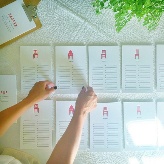
  • The Library Press. You know when an adult tells a kid “you’re so cute, I could eat you up,” and the kid looks back at the adult like they’re crazy? Well, picture the same exchange, but I’m the grown up and The Library Press’s tiny series of chairs is the kid. I mean, what don’t I want these little chairs on: cards, prints, wallpaper, stamps, some kind of custom candy? Yes, I could just eat them up.

The Library Press Perpetual Calendar

The Library Press, perpetual calendar

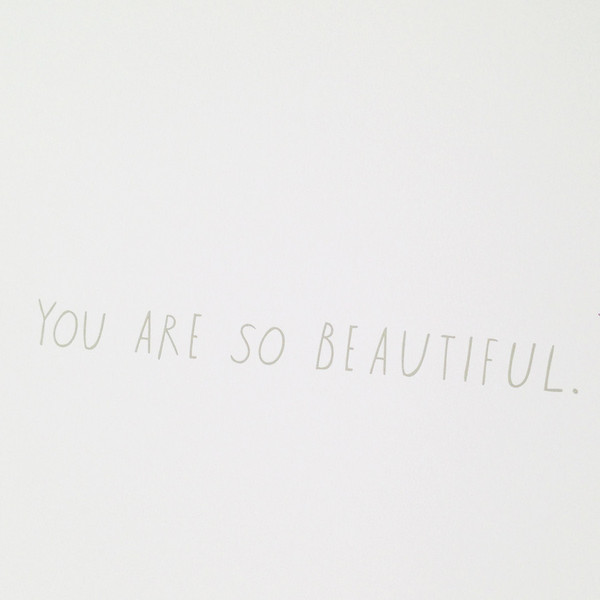
  • Shanna Murray’s illustrated decals. Shanna has hinted that her decals may be cards in the future. I’m happy to offer a little nudge. Recently she sent me a ‘You Are So Beautiful Decal’ affixed to a card. I happened to feature it in a store display and it gets more than a few requests (cough sneeze, hint nudge)…

Shanna Murray You Are So Beautiful Decal

Shanna Murray’s You Are So Beautiful Decal

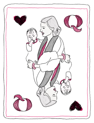
  • Nottene. I met Kimberly briefly at a recent Renegade Craft Fair and was pretty smitten with her booth. Her illustrations translate beautifully between mediums: wrapping paper, textiles, print. I would love to see her design a wallpaper collection, but I’d settle first for having some of her recent playing card illustrations turned into greeting cards. Take the Queen, is it not the perfect Mother’s Day card?

Nottene Queen of Hearts Playing Card

Nottene Queen of Hearts

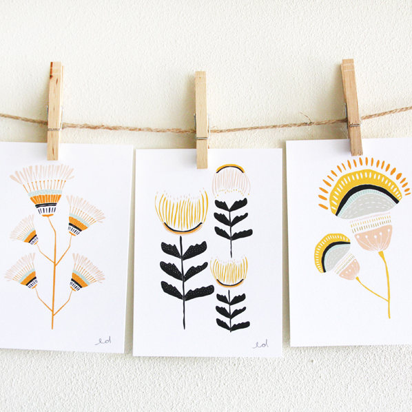
  • Leah Duncan, color trends: Leah Duncan is another whose work translates seamlessly from print to fabric to endless products, so what’s left for her to do? I’d settle for a bi-annual color chart where she tells me what colors to paint my house, or dress in, or simply sends a mailer of color chips to use as bookmarks.

LDflowercards

Leah Duncan ~ Desert Flowers

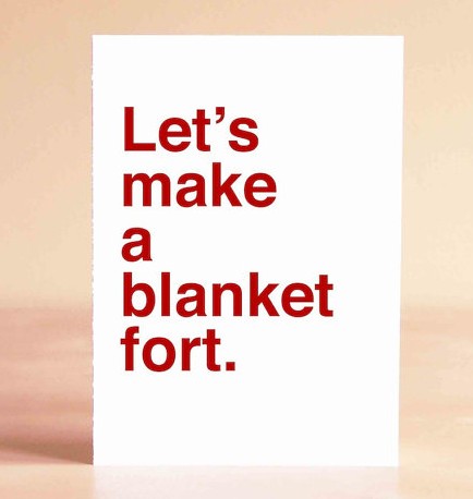
  • Sad Shop. Everybody loves an 8 x 10 print, but Katie’s cards, with their bold, clean, perfect sentiments should be bigger. I’d vote for 16 x 20+.  And, I know I’m already asking for something, but I’d love to have them letterpress printed too. Even though the space over my bed is getting crowded, I’d make room, because I like these cards, and naps.

SSblanketfort

Sad Shop Let’s Make A Blanket Fort

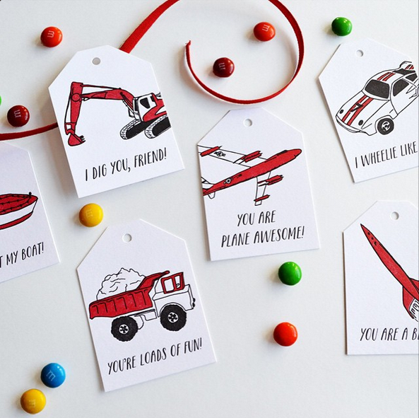
  • Wild Ink Press. Last year, I encouraged Happy Cactus Designs to make mini-Valentines (and she did, and they’re fantastic!). This year, I saw Wild Ink Press’s mini classroom notes and thought: ug, these are so good, make them full size cards! There are so few cards for young kids, especially boys (not that diggers and trucks are only for boys…) to give or receive. Each of Rebekah’s designs below would make a perfect birthday or hello card. I wheelie like them.

Screen Shot 2015-01-27 at 11.35.10 PM

Wild Ink Press Classroom Valentines

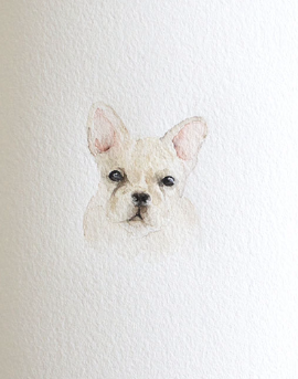
  • 200 Lemons. Megan spends a bit of time each week at Clementine, arranging fresh and paper flowers and generally saving me from the chaos of my desk. Lately, watercolor pet portraits have appeared in her feed. I would love to see this series of sweet faces become card sets: dogs, sea creatures, wildlife, flora, fauna. But to be completely honest, my endgame is a storybook with her watercolors illustrating some lucky adventurer and their trusted animal friend. I think this guy agrees:

Screen Shot 2015-01-27 at 11.11.02 PM

200 Lemons French Bulldog

Since social media is such a big part of where these daydreams arise, I linked to the artists above with their social handles and internet sites. Go follow them and tell me who your current favorites are below!

Yours in daydreams and adventures ~ xo Emily

Watercolor and Gold Foil Ocean-Inspired Wedding Invitations

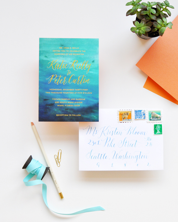
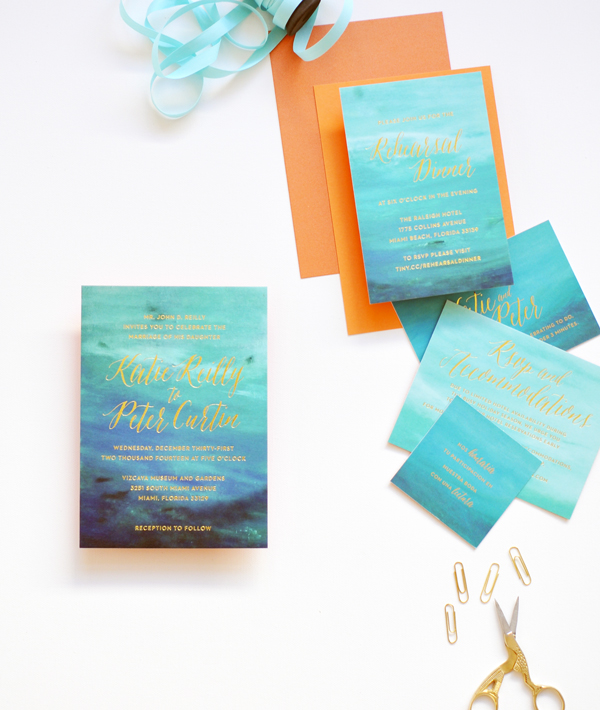
It’s usually right around this time of year that I begin wishing that I lived in a tropical climate – preferably right on the beach. For now I’ll just have to settle for these gorgeous watercolor and gold foil wedding invitations from Smitten on Paper inspired by the beaches in Miami!

Watercolor-Gold-Foil-Ocean-Wedding-Invitations-Smitten-on-Paper-OSBP2

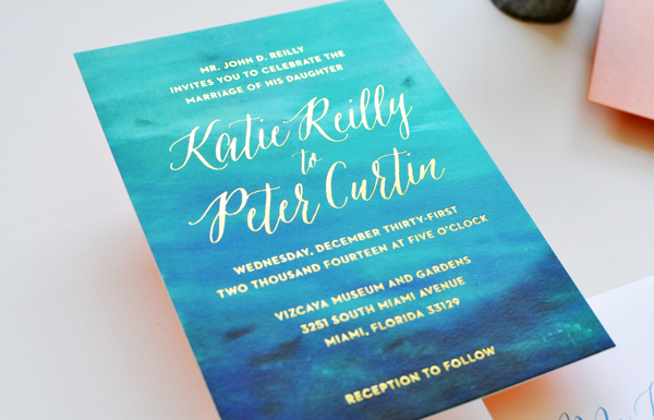
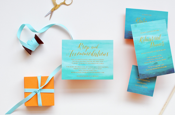
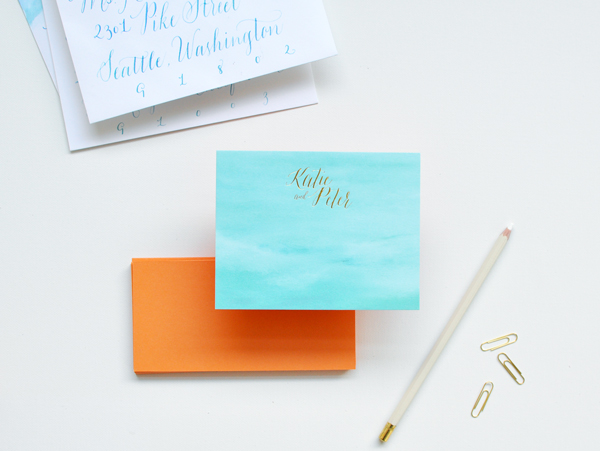
From Amy and the Smitten on Paper team: Katie and Peter wanted the invitation suite for their New Year’s Eve wedding to reflect the surroundings and atmosphere of their amazing venue, a waterfront museum with beautiful gardens and views off the coast of Miami. We worked with Eileen from Beauty in the Making to create a suite that is elegant and breathtaking, combining watercolor, gold foil, and calligraphy.

Watercolor-Gold-Foil-Ocean-Wedding-Invitations-Smitten-on-Paper-OSBP3

An artist friend of the couple painted the background, which we scanned in and used in different ways throughout the suite. Each piece is duplexed with a pop of orange paper so they are double thick and then gold foil stamped with a mix of modern type and loose calligraphy.

Watercolor-Gold-Foil-Ocean-Wedding-Invitations-Smitten-on-Paper-OSBP9

Watercolor-Gold-Foil-Ocean-Wedding-Invitations-Smitten-on-Paper-OSBP5

Watercolor-Gold-Foil-Ocean-Wedding-Invitations-Smitten-on-Paper-OSBP8

Watercolor-Gold-Foil-Ocean-Wedding-Invitations-Smitten-on-Paper-OSBP6

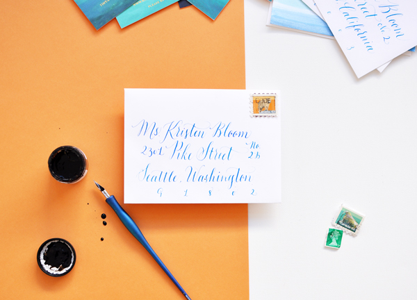
We love how all of the pieces in the suite create their own sense of movement and really evoke the ocean’s rhythms. The whole project is finished with hand addressed calligraphy envelopes in watercolor hues.

Watercolor-Gold-Foil-Ocean-Wedding-Invitations-Smitten-on-Paper-OSBP7

Thanks ladies!

Design: Smitten on Paper

Check out the Designer Rolodex for more tal­ented wed­ding invi­ta­tion design­ers and the real invi­ta­tions gallery for more wedding invitation ideas!

Photo Credits: Smitten on Paper