Rebecca + Gregory’s Rustic Illustrated Wreath Wedding Invitations

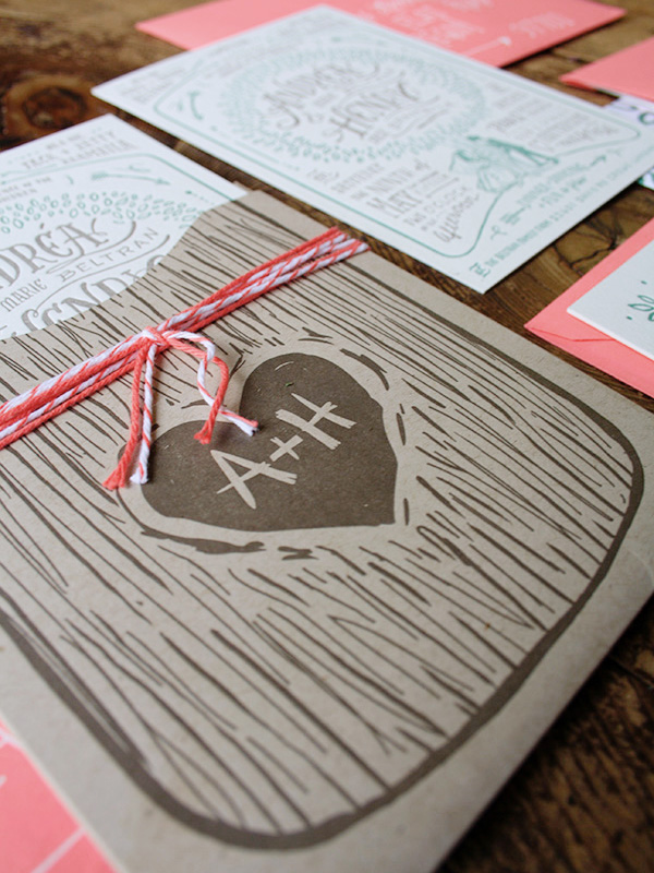
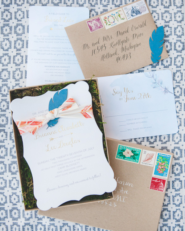
I love everything about the invitations that Rebecca created for her own wedding last year – from the affordable production to the beautiful illustrations and the meaning that Rebecca imbued into each element. And the simple color palette of black, white, and kraft? So perfect for a late fall (early winter?) wedding!

Wreath-Motif-Wedding-Invitations-Rebeccamade-OSBP4

From Rebecca: When you’re a graphic designer, and you’ve been analyzing wedding announcements your whole life, it makes paper planning for your own wedding rather difficult. A few years ago, I decided I would have lace on my wedding invitations. I started making sketches and comps so that I would be ready with the perfect design when the day came. After Greg and I got engaged, I opened up those old files and knew it wasn’t quite right. It seemed outdated and not really “us.”

Wreath-Motif-Wedding-Invitations-Rebeccamade-OSBP6

So I started designing. Well I tried to start designing, and every time I tried, I got too nervous. I always over-analyze wedding invitations and so I would imagine people analyzing our wedding invitations and I would panic. But one night when I had some downtime, I sat down with just my sketchbook and my favorite pen. I drew all of my favorite things. The first was a loop-de-loop.

Wreath-Motif-Wedding-Invitations-Rebeccamade-OSBP5

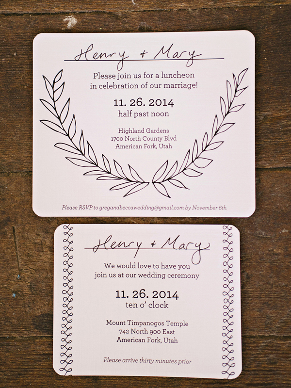
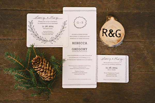
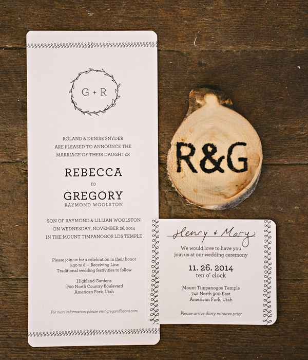
When I had been going through my lace phase, I was also going through a loop-de-loop phase, but the loop-de-loop stuck with me. I would always sketch an ongoing infinity symbol back and forth on my sketch books. Always. I experimented with all sorts of weights and styles and lengths, I thought they were so pretty. And then the more I analyzed it, the more I thought it was the perfect motif for a wedding invitation. It was never ending. There were ups and downs, but it was always connected. The line might be thinner in some spots and thicker in others. In my sentimental, symbolic view, I decided it was perfect. I explained it to Greg about our relationship and future union would be eternal and always bound and connected. That there would be ups and downs, but we would always be together. So we knew the loop-de-loops had to stay.

Wreath-Motif-Wedding-Invitations-Rebeccamade-OSBP10

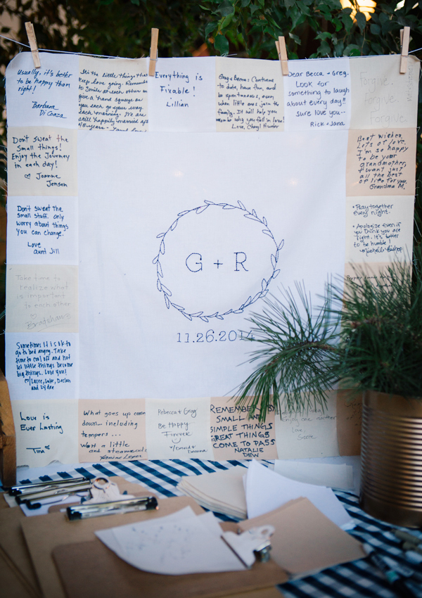
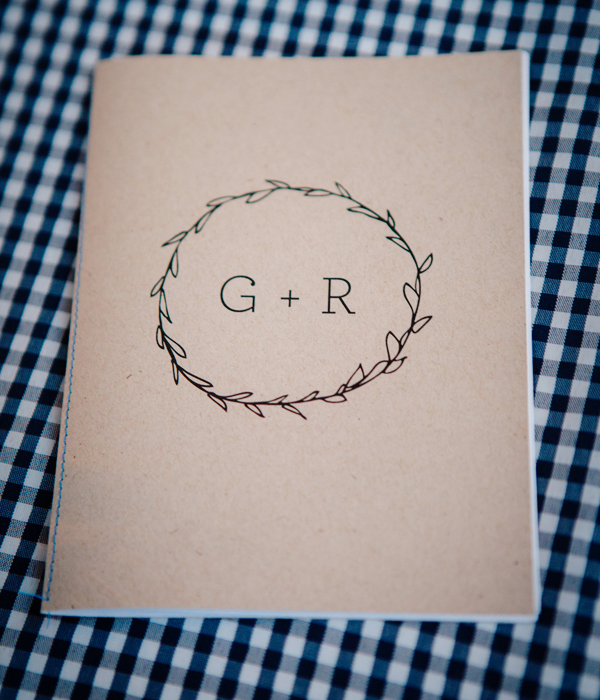
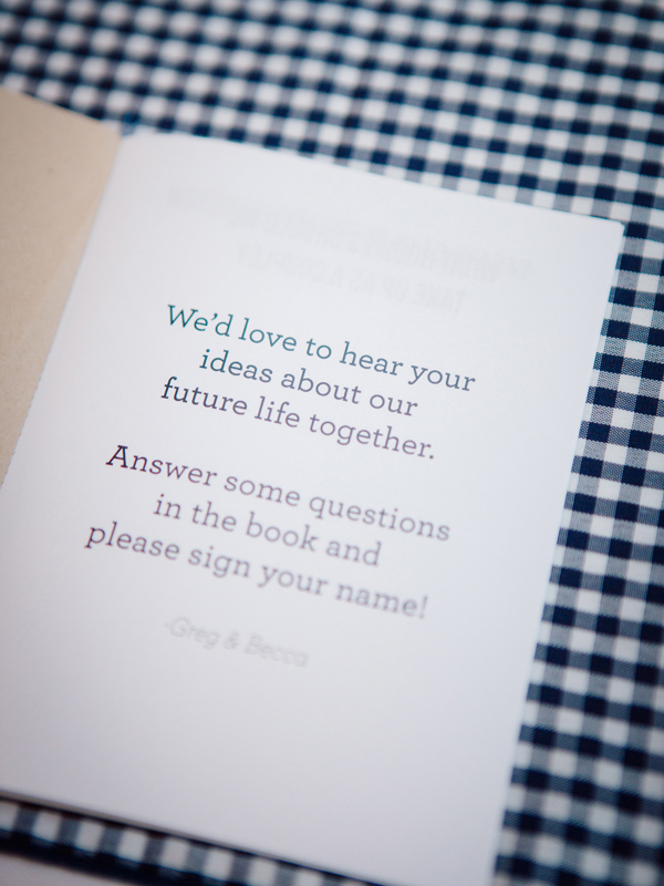
But I also really love circles. And I wanted the circle to be involved too. I went back to my sketches and showed them to my sister, Melissa. She loved the wreath I had made with our initials. She stopped at the wreath and said,”Yes, yes. That is so you.” So we put it on a quilt, some notebooks, our invitation, etc. It became the branding of our union. I’ve always loved linen paper, so that was an obvious choice for both the paper and the envelopes. I wrote out all the addresses with some of my favorite fancy pens and used a stamp that my parents already had as the return label.

Wreath-Motif-Wedding-Invitations-Rebeccamade-OSBP11

In the end, it was really nice to make our own wedding invitations. It was a special experience and I’m so glad that I was able to make something super affordable and with lots of meaning.

Wreath-Motif-Wedding-Invitations-Rebeccamade-OSBP8

Wreath-Motif-Wedding-Invitations-Rebeccamade-OSBP9

Thanks Rebecca!

Design: Rebeccamade

Printing: BYU Print & Mail

Check out the Designer Rolodex for more tal­ented wed­ding invi­ta­tion design­ers and the real invi­ta­tions gallery for more wedding invitation ideas!

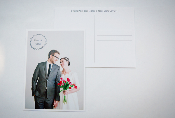
Photo Credits: Mikki Platt and Claire Marika Buys

Brianne + Lee’s Eclectic Watercolor Feather Wedding Invitations

These boho wedding invitations from Smitten on Paper are so pretty! This invitation suite combines watercolor, feather illustrations (and real feathers), and gold foil details, along with kraft paper and a beautiful die cut shape for the invitation. So fun!

Eclectic-Watercolor-Feather-Gold-Foil-Wedding-Invitations-Smitten-on-Paper-OSBP2

From Amy and the Smitten on Paper team: We worked with Rhi from Hey Gorgeous Events to create this super fun, eclectic, and bohemian feeling wedding suite for Brianne and Lee’s camp style wedding in Michigan. The weekend of events was held at Camp Blodgett. The couple really wanted a wedding suite and accessory pieces that represented the homespun feel of going away to camp, along with a more boho vibe.

Eclectic-Watercolor-Feather-Gold-Foil-Wedding-Invitations-Smitten-on-Paper-OSBP

Eclectic-Watercolor-Feather-Gold-Foil-Wedding-Invitations-Smitten-on-Paper-OSBP3

We combined watercolor, feathers and gold foil elements to create all of the goodies for their big day. The invitation uses a feminine fancy die cut shape and gold foil stamping along with a soft and dreamy feather illustration. We added in touches of kraft paper, twine and real leaves and feathers to give it a rustic, campy feel.

Eclectic-Watercolor-Feather-Gold-Foil-Wedding-Invitations-Smitten-on-Paper-OSBP8

Eclectic-Watercolor-Feather-Gold-Foil-Wedding-Invitations-Smitten-on-Paper-OSBP5

The whole suite was sent out in a kraft box mailer with the addresses calligraphed in white ink and a mix of vintage postage. The bright pop of patterned ribbon tied onto the invitations and the moss in the mailers were the perfect finishing touches.

Eclectic-Watercolor-Feather-Gold-Foil-Wedding-Invitations-Smitten-on-Paper-OSBP7

Eclectic-Watercolor-Feather-Gold-Foil-Wedding-Invitations-Smitten-on-Paper-OSBP9

Eclectic-Watercolor-Feather-Gold-Foil-Wedding-Invitations-Smitten-on-Paper-OSBP10

Eclectic-Watercolor-Feather-Gold-Foil-Wedding-Invitations-Smitten-on-Paper-OSBP11

Thanks ladies!

Design: Smitten on Paper

Check out the Designer Rolodex for more tal­ented wed­ding invi­ta­tion design­ers and the real invi­ta­tions gallery for more wedding invitation ideas!

Photo Credits: Smitten on Paper

Behind the Stationery: Belle & Union

I have a soft spot for this next stationery team I’m about to introduce. For one, they’re based out of the great state of Texas (where I’m from) and two, the boss lady and I share the same name. I remember seeing Belle & Union at their first booth at the National Stationery Show, and ever since then I’ve enjoyed seeing the growth of their line as they continue to branch into new product categories. No matter what it is, they are committed to manufacturing 100% handmade in the USA products and walk us through the why’s and how’s of that process. Here’s Meg and Josh! —Megan

InStudio

Howdy y’all! Meg and Josh of Belle & Union, here to give you a small peek into our studio and small business life. We are a husband and wife team, Meg, the boss lady and doodler, and Joshua, the press whisperer, with moral support from our fur baby and shop dog, Ellie. Our studio is based in sunny College Station, Texas (whoop!), on the first floor of our carriage house apartment. We are busting at the seams with our new inventory, but are trying to make it work for the next few years before we settle somewhere post-graduation (for Josh, who is currently studying food science and technology. Yum!). We hope to open a little shop someday as part of our studio, and maybe even a little café next door.

Inventory+Cards

Desk

We letterpress print all of our greeting cards in house (over 100 of them!) on our 10×15” Chandler & Price letterpress. Every product we make starts with pen to paper, where one of my doodles comes to life. We’ve got a soft spot for vintage American wit and wisdom, and goods that tote a bit of a foodie twist. To us, the kitchen is the heart of the home and the memories made in it feed our souls.

TeaTowels+Recipes

Our recipe? Start with all-American ingredients: the papers we print on, the cotton in our textiles, and the wood in our handcrafted gifts. Mix in my doodles and season with Josh’s mechanical moxie. Everything we do is handmade right here in the USA of American materials. It is what makes our line a little something extra special. Josh served as a soldier in the United States Army, sacrificing his time and many comforts of home while on deployments in Afghanistan and Korea. It became important to us to honor our soldiers and their efforts, and valuing American Made gave us that purpose. Our commitment to American Made is written on our hearts.

Our tea towels are notably something we are proud of. We spent eight months creating our own supply chain, taking the raw West Texas cotton, watching it become greige then finished fabric in the Carolinas, moving along to Georgia where it is stitched into blanks in preparation for its final phase, the addition of our graphics in an array of beautiful screen printed colors, all before heading back to us in Texas for packaging, coming full circle. The business is truly a labor of love and pure homegrown goodness.

IfaLittleIsGood

While we love everything we create, the heart of our collection is rooted in our letterpress greeting cards. The cards are as storied as the words that get written on them. Many are based on Southern phrases and Americanisms handed down from generation to generation – meant to evoke a smile, a laugh, or even raise an eyebrow or two. I am always jotting down things I hear when out and about. One of my favorites is our “If a little is good, a lot is better” card – a phrase often heard in my grandmother’s kitchen. Usually a response to a little bit too much of an ingredient being added while cooking, specifically when a *certain* one of her granddaughters is adding sugar into suga – a sweet Italian spaghetti sauce, a family favorite for Sunday gatherings. Though I am sure she never meant it in reference to candles on a cake, it sparked a card and now hangs as a little art print in her kitchen, a place of honor.
Tea Towels
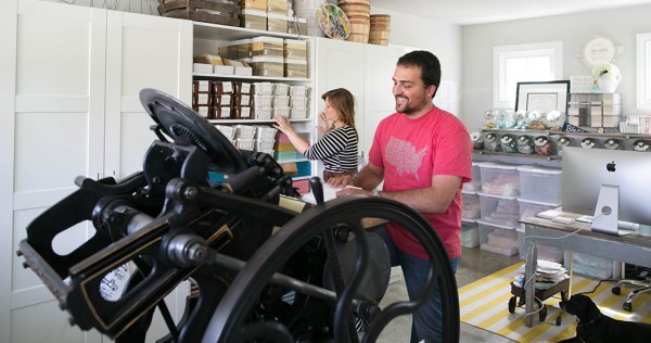
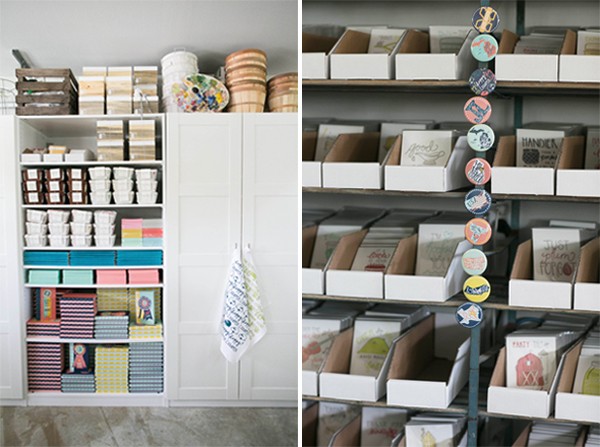
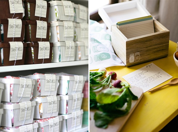
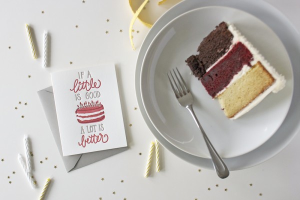
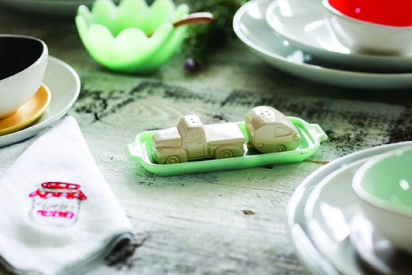
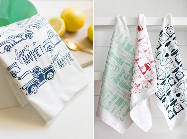
We’ve really enjoyed taking our favorite greeting card phrases and breathing new life into them across various product categories, most notably seen in the kitchen. Josh loves to cook and I love to eat, so it is a natural extension of the brand, something really fun to see the doodles come to life in three-dimensional form. Included in the photos are some of our newest wares to the collection, including hand-carved kitchen utensils featuring our favorite phrases, laser-cut cake toppers, and even a ceramic salt and pepper shaker set (my personal favorite!).

Product_KitchenWares Product_SaltPepperSet

WithDog
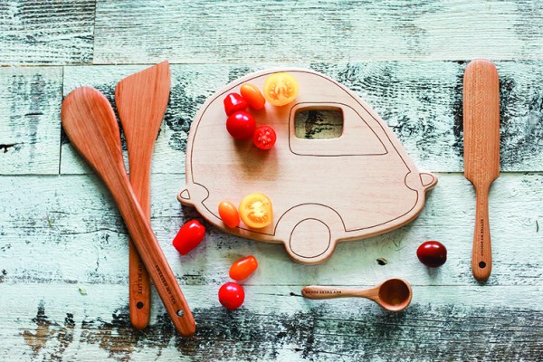
Follow along on our journey, @belleandunionco and @presswhisperer on Instagram and Twitter. All photos by Amanda Marie Portraits.

Interested in participating in the Behind the Stationery column? Reach out to Megan at [email protected]

Andrea + Henry’s Illustrated “The Giving Tree” Wedding Invitations

So many of us have wonderful childhood memories of The Giving Tree by Shel Silverstein – and today we get to see that book re-imagined in wedding invitation form! Clayton Beltran is the in-house illustrator at Smudge Ink and created these invitations for his sister’s wedding. The entire team at Smudge Ink helped bring these invitations to life, from design guidance to letterpress printing!

Illustrated-The-Giving-Tree-Wedding-Invitations-Smudge-Ink-OSBP

From Clayton: My sister’s favorite children’s book growing up, and surely still to this day, would hands down be none other than beloved Shel Silverstein’s “The Giving Tree.” Our Uncle (and her godfather) gifted her first and only copy when she was just a wee little whipper snapper still rocking the Punky-Brooster-esque pig tails. Flash forward 28 plus years… one of her most sentimental possessions has now become the inspiration for her wedding and her wedding invitations.

Illustrated-The-Giving-Tree-Wedding-Invitations-Smudge-Ink-OSBP4

Illustrated-The-Giving-Tree-Wedding-Invitations-Smudge-Ink-OSBP2

Illustrated-The-Giving-Tree-Wedding-Invitations-Smudge-Ink-OSBP6

Illustrated-The-Giving-Tree-Wedding-Invitations-Smudge-Ink-OSBP7

The designing and execution of these invitations has definitely been a family affair involving my blood-related family on the West Coast and my new family of creatives here on the East Coast here at Smudge Ink. Sabrina and Emily at Smudge provided guidance and an injection of realism into my initial overly ambitious layout — especially given the stingy two-week time frame I allotted myself. My bosses at Smudge, Deb and Kate, were so understanding as to let me take last minute half days during the crunch time of production!

Illustrated-The-Giving-Tree-Wedding-Invitations-Smudge-Ink-OSBP9

Illustrated-The-Giving-Tree-Wedding-Invitations-Smudge-Ink-OSBP8

Thanks Clayton!

Invitation Design: Clayton Beltran of Smudge Ink

Letterpress Printing: Margaret and Emily of Smudge Ink

Die Cutting: Classic Letterpress in Billerica Massachusetts

Calligraphy: Marilyn Sarasqueta

Paper: Soho Paper

Envelopes: letterpresspaper.com

Custom Postage Stamps: Zazzle

Coral Baker’s Twine: Whisker Graphics

Smudge Ink is a member of the Designer Rolodex – you can see more of their beautiful work right here or visit the real invi­ta­tions gallery for more wedding invitation ideas!

Photo Credits: Clayton Beltran

Spring Cocktail Recipes

Yay Spring! As the taste tester of many of Andrew‘s cocktail recipes, this is one of my favorite seasons for cocktails! Things start growing again, which means lots of fresh ingredients to incorporate – from mint to strawberries – and a move towards lighter, fruity flavors as temperatures warm up. Here are a few of our favorite Spring cocktail recipes from the archives!

Spring Cocktail Recipe Round Up by Oh So Beautiful Paper

1. Cucumber-Mint Gimlet

2. The Aviation

3. Strawberry Tequila Daisy (aka Strawberry Margarita)

4. The Scidmore

5. French Gimlet

6. Basil-Mint Julep