Rustic Moonrise Kingdom-Inspired Wedding Invitations

Rubber stamps are such an underutilized method for printing wedding invitations! Michael of Anticipate Invitations created these Moonrise Kingdom-inspired wedding invitations for a rustic wedding in Maine – and almost the entire suite is printed using rubber stamps! I love the attention to detail in these wedding invitations, right down to the vintage postcard hexagon tag!

Rustic Rubber Stamp Wedding Invitations by Anticipate Invitations / Oh So Beautiful Paper

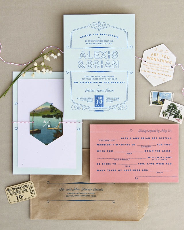
From Michael: Alexis and Brian drew inspiration for their custom wedding invitation from Wes Anderson films (think Moonrise Kingdom and Grand Budapest Hotel) and the vibe of their rustic venue, Josias River Farm in Cape Neddick, Maine. It had to be colorful—but not bold, vintage—but not campy, and modern—but not unwelcoming. Although with the venue being a farm it could skew rusticly romantic, the couple requested something a bit more unexpected. We were happy to accept the challenge and the couple was a breath of fresh air to work with. They were able to articulate what it was they wanted their guests to feel, and that was a great starting point from which to jump from.

Moonrise Kingdom-Inspired Wedding Invitations by Anticipate Invitations / Oh So Beautiful Paper

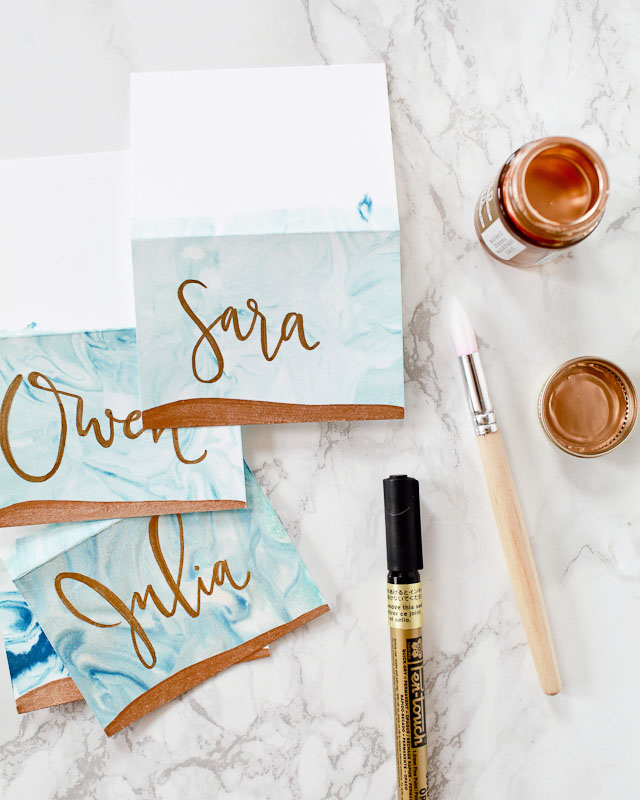
Since materials were just as important as the design to the couple, we turned to the beautiful handmade quality that only rubber stamps can give for printing. The printing was done on large sheets of paper and then later cut down to size so that less precision was needed to ensure they were printed straight. Aside from the full-color vintage postcard hexagon card, all the pieces were printed using this method.

Moonrise Kingdom-Inspired Wedding Invitations by Anticipate Invitations / Oh So Beautiful Paper

The invitation card was printed on pale blue paper, backed with an off-white, speckled recycled paper for thickness, and then printed using an extra-large custom rubber stamp. The coral RSVP postcard was cleverly written in a Mad Libs style and was also backed with a contrasting paper color to give it rigidity and cohesiveness. All the pieces were packaged together with coral bakers twine and a hexagon card made from a vintage Maine postcard. A brown kraft pastry bag stood in for an envelope and added just the right amount of quirkiness and vintage flair.

Moonrise Kingdom-Inspired Wedding Invitations by Anticipate Invitations / Oh So Beautiful Paper

Return address labels were printed on the same blue green paper as the invitation and sealed the pastry bag closed for mailing. A collection of nature-themed, vintage postage stamps were sourced by the bride and completed the whole package.

Moonrise Kingdom-Inspired Wedding Invitations by Anticipate Invitations / Oh So Beautiful Paper

Moonrise Kingdom-Inspired Wedding Invitations by Anticipate Invitations / Oh So Beautiful Paper

Thanks Michael!

Check out the Designer Rolodex for more tal­ented wed­ding invi­ta­tion design­ers and the real invi­ta­tions gallery for more wedding invitation ideas!

Photo Credits: Anticipate Invitations

Finding the Paper: Type Twenty Seven

When Parse & Parcel settled into our sample studio we made sure to carve out a space conducive to Friday happy hours with our office mates. We knew after a busy week of making mockups, packing parcels and shipping samples we’d be ready for a cocktail (or two). Of course it’s stocked with all the necessary essentials – booze, barware, mixers and ice – all that’s been missing is the perfect coaster set. Then we came upon The Mixed Up Alphabet of Cocktails. In this installment of Finding The Paper, we’ll see how Type Twenty Seven combined their love of type and print with cocktails. – Jill

Finding the Paper: Type Twenty Seven / Parse & Parcel for Oh So Beautiful Paper

On the second floor of a converted, mid-town Cleveland warehouse is Type Twenty Seven, a graphic design and letterpress studio. Type Twenty Seven is known for mixing modern technology with lead type and vintage printing presses. It’s little wonder that when it came time for the studio to do a self-promotion, a type driven design would be at the center of the concept.

Finding the Paper: Type Twenty Seven / Parse & Parcel for Oh So Beautiful Paper

The Mixed Up Alphabet of Cocktails incorporates unique illustrations and custom typography to showcase classic and modern cocktails for each letter of the alphabet. That’s twenty six different cocktails, or six months of weekly happy hours. This self promotion consists of poster, coaster set and packaging design that showcases the beauty of letterpress printing. The use of a toothy, cotton paper adds a layer of tactility to the piece and is a perfect choice for packaging design. Haptics (the science of touch) has become a hot topic in packaging design of late. Did you know that packaging featuring tactile papers and print techniques like letterpress actually increases a product’s perceived value?

The Mixed Up Alphabet of Cocktails features a limited edition poster and packaging sleeve letterpress printed on Reich Savoy 100% Cotton in 92# Natural White cover stock, produced using a 1967 Vandercook Universal III printing press. This process produces a highly tactile feel where the ink is pressed into the surface, creating an impression. Savoy is a bit different from some other 100% cotton papers commonly used for letterpress printing in that it works well when scoring and folding – something that can be troublesome on bulkier, softer stocks. The choice of basis weight was smart as well, just enough heft to give the poster and box sleeve body and sturdiness, but not too heavy so as to create print production difficulties.

Finding the Paper: Type Twenty Seven / Parse & Parcel for Oh So Beautiful Paper

The coasters were letterpress printed on a high absorbent, heavy 2.0mm coaster stock with black ink. Produced on two vintage presses, a 1924 C&P Pilot printing press, and an 1890’s C&P hand-feed printing press. They’re almost too pretty to use!

The inspiration for the project was fueled by Type Twenty Seven’s love of cocktails. The idea that anybody can mix and match ingredients to make their own cocktail led to creating a set of coasters that would encourage people to try new recipes. They wanted it to be fun to read, playful, and—most of all—perfect for any party. Showcasing some more unique and lesser known cocktails might encourage people to interact with their drink coasters more often.
Finding the Paper: Type Twenty Seven / Parse & Parcel for Oh So Beautiful Paper

Finding the Paper: Type Twenty Seven / Parse & Parcel for Oh So Beautiful Paper

Not only are they a fab print sample to have on hand but they also do double duty for our Friday happy hours!

DIY Marbled Indigo and Gold Place Cards

I’ve been wanting to try paper marbling for so long – and I finally did it! I just love the soft swirls and unique patterns in marbled paper. Marbling is a beautiful (and easy!) way to spruce up your table décor for the holidays, or really any time of year! I put these marbled holiday place cards together with blue food coloring and a bit of liquid gold gilding, and I absolutely LOVE the way it turned out. I can’t wait to use these to set our holiday tables, but they’d be a wonderful addition to any dinner party throughout the year!

DIY Marbled Holiday Place Cards / Oh So Beautiful Paper for eBay

DIY Marbled Place Cards / Oh So Beautiful Paper

Supplies

  • Blank Place Cards
  • Foam Shaving Cream
  • Food Coloring
  • Liquid Gold Gilding
  • Gold Paint Pen
  • Paintbrush
  • Paper Towels
  • Washi Tape (optional)

DIY Marbled Indigo and Gold Place Cards

To make the DIY marbled indigo and gold place cards:

Step 1. Add a thick layer of foam shaving cream to a bowl or rectangular baking dish (I used a disposable baking pan). Then add a few drops of food coloring in your color choice. Use the back of a spoon or a spatula to spread the food coloring around the shaving foam, creating soft swirly patterns.

Step 2. Press a place card into the shaving foam, making sure that the place card makes as much contact with the shaving foam as possible. I chose to only press the front side of my place cards. You could also use washi tape along the top middle edge of the place card to create a crisp line between the marbled and non-marbled section.

Step 3. Gently lift the place card out of the shaving foam. Set the place card on a work surface covered with paper towels (food coloring will leave stains!). Use a ruler or knife to scrape as much of the shaving cream as possible off the place card onto paper towels. Use a fresh paper towel to blot away any remaining shaving cream and set aside to dry.

Step 4. Once the place cards are dry, use a size 14 round paint brush and liquid gilding to paint the front bottom of the place card. Write the name of your guest using a gold paint pen – and voila!

DIY Marbled Indigo and Gold Place Cards

DIY Marbled Indigo and Gold Place Cards

DIY Marbled Indigo and Gold Place Cards

DIY Marbled Indigo and Gold Place Cards

DIY Marbled Indigo and Gold Place Cards

DIY Marbled Place Cards / Oh So Beautiful Paper


DIY Marbled Place Cards / Oh So Beautiful Paper

There you have it! Super easy, with a vibrant pop of color and a bit of shimmer! What could be better??

p.s. How to make marbled paper and printable hand lettered wedding favor stationery

This post was created in partnership with eBay. All content and opinions are my own. Thank you for supporting the sponsors that make Oh So Beautiful Paper possible!

“Dinner With Thieves” Menus and Paper Goods

Well, these are super cool! Shanleigh of August & Osceola created these beautiful paper goods for a mysterious dinner party, including menus, questionnaire cards, and event calling cards. The menus feature gold foil on black paper and were individually hand washed and distressed for an even more mysterious vibe and unique texture!

"Dinner with Thieves" Menus and Paper Goods by August & Osceola / Oh So Beautiful Paper

From Shanleigh: I love when a client has a vision that really challenges me creatively. Jessie (House of James Parker) and Heather (RTTO Events) were looking for custom paper goods to accompany their design of a “Dinner with Thieves.” Picture an evening with an abundance of delectable meat platters and a mysterious vibe. The paper elements had to be the perfect complement: masculine yet intricate; refined yet worn-in. 

"Dinner with Thieves" Menus and Paper Goods by August & Osceola / Oh So Beautiful Paper

I posted a picture on Instagram a while back of my business cards that had taken a trip through the washing machine — a happy accident. We used this as inspiration for a menu design that was heavy on texture and full of character. Each menu was foil stamped in gold and then very carefully washed and distressed by hand. The process left the paper feeling like leather and looking like it had been around for years. In addition to the menu, we designed questionnaire cards for guests to fill out and contact cards that were edge painted in gold. These were a labor of love.

"Dinner with Thieves" Menus and Paper Goods by August & Osceola / Oh So Beautiful Paper

"Dinner with Thieves" Menus and Paper Goods by August & Osceola / Oh So Beautiful Paper

"Dinner with Thieves" Menus and Paper Goods by August & Osceola / Oh So Beautiful Paper

"Dinner with Thieves" Menus and Paper Goods by August & Osceola / Oh So Beautiful Paper

"Dinner with Thieves" Menus and Paper Goods by August & Osceola / Oh So Beautiful Paper

Thanks Shanleigh!

Photo Credits: August & Osceola