When Parse & Parcel settled into our sample studio we made sure to carve out a space conducive to Friday happy hours with our office mates. We knew after a busy week of making mockups, packing parcels and shipping samples we’d be ready for a cocktail (or two). Of course it’s stocked with all the necessary essentials – booze, barware, mixers and ice – all that’s been missing is the perfect coaster set. Then we came upon The Mixed Up Alphabet of Cocktails. In this installment of Finding The Paper, we’ll see how Type Twenty Seven combined their love of type and print with cocktails. – Jill
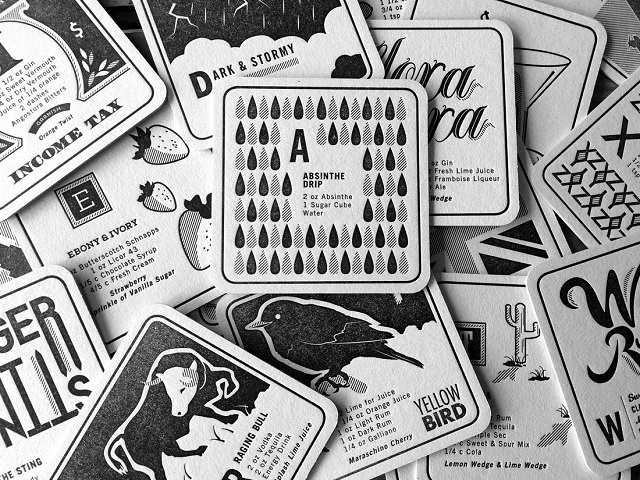
On the second floor of a converted, mid-town Cleveland warehouse is Type Twenty Seven, a graphic design and letterpress studio. Type Twenty Seven is known for mixing modern technology with lead type and vintage printing presses. It’s little wonder that when it came time for the studio to do a self-promotion, a type driven design would be at the center of the concept.
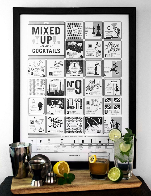
The Mixed Up Alphabet of Cocktails incorporates unique illustrations and custom typography to showcase classic and modern cocktails for each letter of the alphabet. That’s twenty six different cocktails, or six months of weekly happy hours. This self promotion consists of poster, coaster set and packaging design that showcases the beauty of letterpress printing. The use of a toothy, cotton paper adds a layer of tactility to the piece and is a perfect choice for packaging design. Haptics (the science of touch) has become a hot topic in packaging design of late. Did you know that packaging featuring tactile papers and print techniques like letterpress actually increases a product’s perceived value?
The Mixed Up Alphabet of Cocktails features a limited edition poster and packaging sleeve letterpress printed on Reich Savoy 100% Cotton in 92# Natural White cover stock, produced using a 1967 Vandercook Universal III printing press. This process produces a highly tactile feel where the ink is pressed into the surface, creating an impression. Savoy is a bit different from some other 100% cotton papers commonly used for letterpress printing in that it works well when scoring and folding – something that can be troublesome on bulkier, softer stocks. The choice of basis weight was smart as well, just enough heft to give the poster and box sleeve body and sturdiness, but not too heavy so as to create print production difficulties.
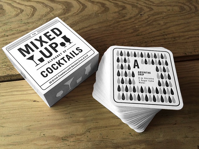
The coasters were letterpress printed on a high absorbent, heavy 2.0mm coaster stock with black ink. Produced on two vintage presses, a 1924 C&P Pilot printing press, and an 1890’s C&P hand-feed printing press. They’re almost too pretty to use!
The inspiration for the project was fueled by Type Twenty Seven’s love of cocktails. The idea that anybody can mix and match ingredients to make their own cocktail led to creating a set of coasters that would encourage people to try new recipes. They wanted it to be fun to read, playful, and—most of all—perfect for any party. Showcasing some more unique and lesser known cocktails might encourage people to interact with their drink coasters more often.
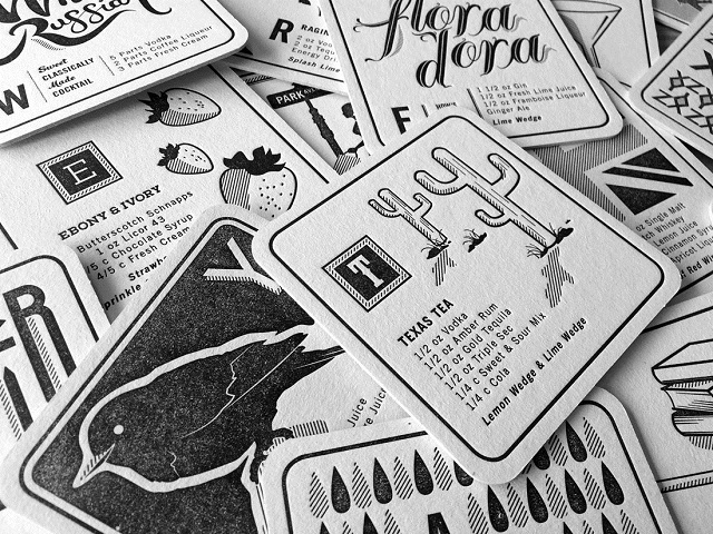
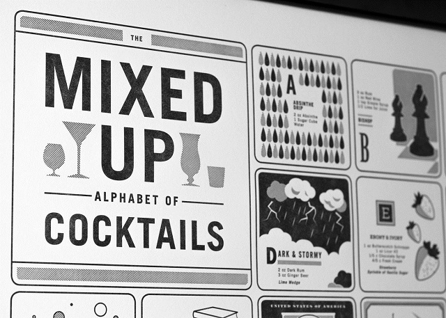
Not only are they a fab print sample to have on hand but they also do double duty for our Friday happy hours!

That is a great idea!…I love my Yellow Birds!
Jolanta – I think it is such a fun self-promotion for a letterpress printer. Planning to work my way through the alphabet of cocktails, may have to skip around though to try a yellow bird first 😉