Brynne + Guy’s Modern Vineyard Wedding Invitations

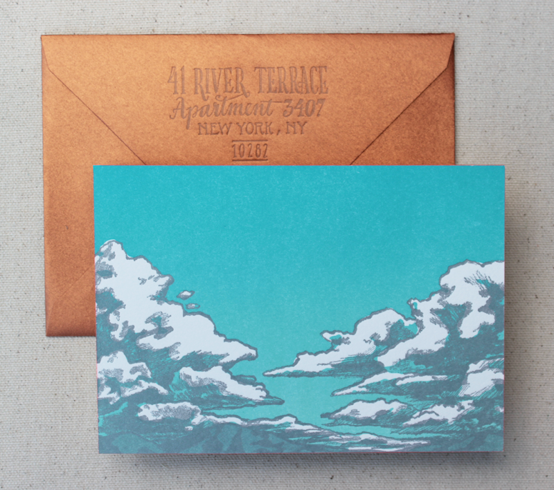
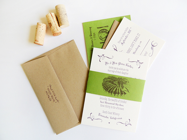
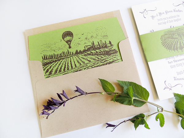
Happy Monday everyone! We’re kicking off the week with these beautiful invitations from Brynne of Harken Press for her own upcoming wedding! As with her save the dates, Brynne drew her inspiration from the vineyard wedding venue in Southern California. I’m loving the nature-inspired color palette along with the wonderful illustrated envelope liner and belly band featuring the venue’s endless rows of grapevines.

Rustic-Vineyard-Letterpress-Wedding-Invitations-Harken-Press6

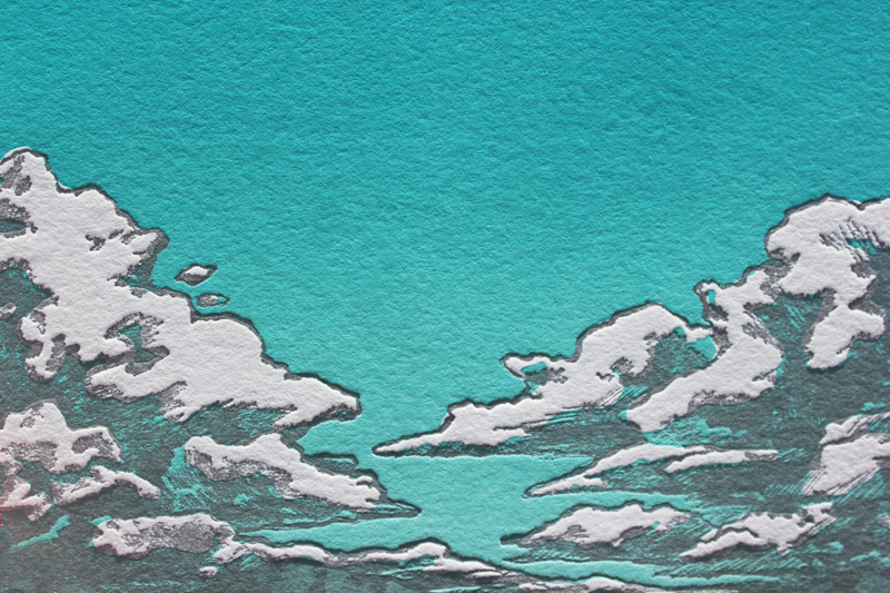
From Brynne: Nothing sets the scene for romance like a vineyard. Our wedding invitation suite has modern typography with whimsical flourishes and illustrations. The color palette – plum, forest green, kraft brown, and pearl white – came from the rich colors of the vineyard where our wedding will take place in the fall.

Rustic-Vineyard-Letterpress-Wedding-Invitations-Harken-Press2

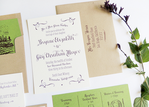
Much like our vineyard save the date, the design was inspired by our wedding venue in Temecula wine country in Southern California. The hand drawn style of the illustrations convey the casual, easy-going vibe of the event. Since the grape vines are literally growing all over the property of the resort, we wanted to get our guests excited by showing the rows of vines and the hot air balloons in the sky in the mornings.

Rustic-Vineyard-Letterpress-Wedding-Invitations-Harken-Press8

Rustic-Vineyard-Letterpress-Wedding-Invitations-Harken-Press5 

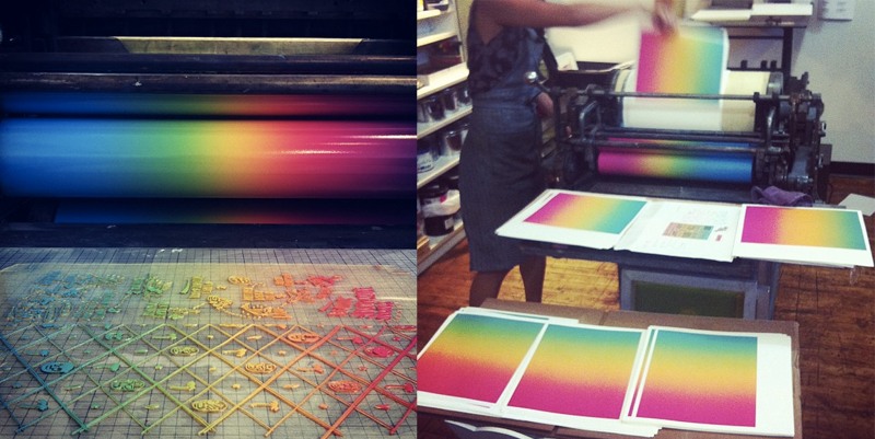
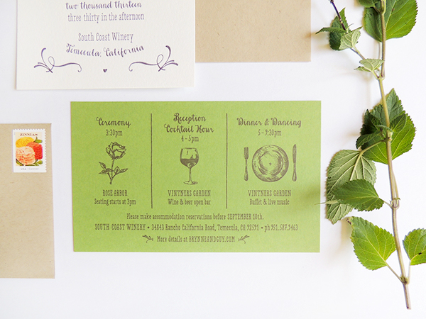
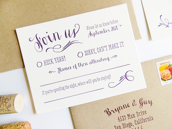
The vineyard invitation suite includes an invitation, reply card, guest information card, kraft envelopes, and a belly band to hold all the pieces together. The invitation and reply card are letterpress printed, while the other pieces are digital printed.

Rustic-Vineyard-Letterpress-Wedding-Invitations-Harken-Press4

Rustic-Vineyard-Letterpress-Wedding-Invitations-Harken-Press3

Thanks Brynne!

Design: Harken Press

Digital Printing: Harken Press

Letterpress Printing: Quality Letterpress

Check out the Designer Rolodex for more tal­ented wed­ding invi­ta­tion design­ers and the real invi­ta­tions gallery for more wedding invitation ideas!

Photo Credits: Harken Press

Kristen + Austin’s 1950s-Inspired Lake Tahoe Wedding Invitations

Ooooh, laser engraved wood wedding invitations! For these destination wedding invitations, Courtney from Swiss Cottage Designs paired the wood invitation with colorful accents inspired by the venue – Lake Tahoe! With her fabulous eye for detail, Courtney incorporated lots of cute and quirky elements into the day-of wedding stationery, from custom camp-inspired patches to welcome tote bags.

Wood-Lake-Tahoe-Wedding-Invitations-Swiss-Cottage-Designs

From Courtney: This suite was inspired by 1950s Lake Tahoe with a modern twist: so think Rat Pack, martinis and camping in retro cabins under the stars. Lake Tahoe is notoriously blue so it was natural to have cobalt blue be the star of the show. The bold yellow color complemented the blue and helped play into the ’50s inspiration.

Wood-Lake-Tahoe-Wedding-Invitations-Swiss-Cottage-Designs3

When it came to the invitation, Kristen wanted to do something with wood to represent the nature of Tahoe. I found an amazing vendor to laser engrave these on double thick wood. It was a great touch and the invites actually smelled a bit like firewood which was an awesome bonus element! With the RSVP card, we wanted it to feel like a post card you would grab when traveling through the area on vacation.

Wood-Lake-Tahoe-Wedding-Invitations-Swiss-Cottage-Designs2

Since this was a destination wedding, we wanted the save the date to act as an incentive package to guests. I created a two fold brochure filled with fun facts about Tahoe as well as travel details, hotel info. and more. With destination weddings, the save the dates always end up being a bit more important as guests need to book early. As an extra element to help tie suite together, we came up with the idea of doing an actual patch like you might get at camp. I ended up working with a great vendor who created the patches (2.5″ x 2.5″) with iron-on material on the back. Some guests even showed up with the patches adhered to their outfits. Brilliant!

Wood-Lake-Tahoe-Wedding-Invitations-Swiss-Cottage-Designs5

My favorite element is the envelope liner. Lake Tahoe is the second deepest Lake in the country so I thought it might be cool to highlight that with a depth chart. Depth charts aren’t exactly the most exciting thing but by using different shades of cobalt and placing it against the clean white paper, it was a great design element that really added to the suite.

Wood-Lake-Tahoe-Wedding-Invitations-Swiss-Cottage-Designs6

For the day of elements, we played with cocktail napkins, drink stirrers, buttons, custom kazoos (weird, but fun!), “Keep Tahoe Blue” stickers, and silk screened tote bags.  I’m a firm believer that the day of elements really help round out the event. It’s such a fun way to bring all the great details from your save the date and invitation into the big day!

Wood-Lake-Tahoe-Wedding-Invitations-Swiss-Cottage-Designs4

Thanks Courtney!

Design: Swiss Cottage Designs

Swiss Cottage Designs is a member of the Designer Rolodex – you can see more of Courtney’s amazing work right here or visit the real invi­ta­tions gallery for more wedding invitation ideas!

Photo Credits: Courtney Jentzen | Swiss Cottage Designs

Lauren + Paul’s Rustic Screen Printed Fabric Wedding Invitations

There is something so romantic in these screen printed fabric invitations from designer Jessi Evans. Inspired by the natural beauty of the wedding venue, the invitation features a single color screen print on muslin fabric and fold-out enclosure, complete with farm-inspired illustrations. Sweet, simple, and ridiculously beautiful.

Rustic Fabric Barn Wedding Invitations by Jessi Evans via Oh So Beautiful Paper (5)

From Jessi: These screen printed fabric invitations were inspired by the natural beauty of the Pennsylvania farmland. I wanted to capture the raw essence of the wedding venue, while celebrating the simplicity of the countryside.

Rustic Fabric Barn Wedding Invitations by Jessi Evans via Oh So Beautiful Paper (4)

The materials include a screen printed muslin invitation partnered with a three panel foldout that includes a detachable RSVP postcard printed on recycled, post-consumer paper stock in a milkweed color.

Rustic Fabric Barn Wedding Invitations by Jessi Evans via Oh So Beautiful Paper (1)

My favorite details include an illustration of the barn in which Lauren and Paul will be wed, their favorite song lyric, a wheat pattern and silhouettes of iconic farm animals. 

Rustic Fabric Barn Wedding Invitations by Jessi Evans via Oh So Beautiful Paper (2)

Rustic Fabric Barn Wedding Invitations by Jessi Evans via Oh So Beautiful Paper (3)

Thanks Jessi!

Check out the Designer Rolodex for more tal­ented wed­ding invi­ta­tion design­ers and the real invi­ta­tions gallery for more wedding invitation ideas!

Photo Credits: Jessi Evans

Bid adieu to Ladyfingers Letterpress with a Stationery Giveaway!

This giveaway is now closed. Thanks to all who entered!

Dear Diary. Day 5 of blogging on OSBP. Energy levels good. Eyeballs a little dry from staring at the internet for so long. Not enough ice cream. But spirits are high. Psyched to read the comments and make new friends. Sad that this is our last day guest blogging. Been a good go. Wondering if Nole will ask us to come back? Note to self: send a Thank You card.

Well, it’s been fun, guys! To celebrate all of the good times we’ve spent together for the past five days, we’re doing a Very Special Stationery Giveaway. See, although we’ve been all chatty about custom wedding invitations, that’s not all we do! This past May, we had our first ever booth at the National Stationery Show where we debuted our brand new line of social stationery! We had a blast meeting our favorite stationer friends, shops, printers and designers and were psyched with the response to our work. You can now find our work in over 50 stores across the country (and the world!) – but also on our newly redesigned online shop! Before we get going with the giveaway details, we’d like to share with you a recap of some of our best sellers from NSS 2013. â€“Arley-Rose and Morgan of Ladyfingers Letterpress

Letterpress Greeting Cards and Stationery by Ladyfingers Letterpress via Oh So Beautiful Paper (1) Letterpress Greeting Cards and Stationery by Ladyfingers Letterpress via Oh So Beautiful Paper (8)

Letterpress Greeting Cards and Stationery by Ladyfingers Letterpress via Oh So Beautiful Paper (2) Letterpress Greeting Cards and Stationery by Ladyfingers Letterpress via Oh So Beautiful Paper (6)

Letterpress Greeting Cards and Stationery by Ladyfingers Letterpress via Oh So Beautiful Paper (7)

Letterpress Greeting Cards and Stationery by Ladyfingers Letterpress via Oh So Beautiful Paper (4) Letterpress Greeting Cards and Stationery by Ladyfingers Letterpress via Oh So Beautiful Paper (9)

Letterpress Greeting Cards and Stationery by Ladyfingers Letterpress via Oh So Beautiful Paper (5) Letterpress Greeting Cards and Stationery by Ladyfingers Letterpress via Oh So Beautiful Paper (3)

Now for the info you’ve all been waiting for! To enter our giveaway, visit the Ladyfingers Letterpress online shop and browse the collection of social stationery. Select your 3 favorite single cards, flat or folded. Then come back here and leave a comment with your selection! You’ll have until 11:59 p.m. EST on Tuesday, July 23rd to enter the giveaway. One winner will be selected randomly and notified via email.
 
*This giveaway is courtesy of Ladyfingers Letterpress. Giveaway only valid for mailing addresses within the United States. Official sweepstakes rules here.

Rainbow Rolls, Split Fountains, and Flats, Oh My!

Well, hello again! You may think that we here at Ladyfingers Letterpress love repetition – because well, we’re printmakers and we are in the business of making multiples, after all, but that doesn’t mean we don’t love a good challenge! We started our business because we love to make unique, one-of-a-kind things, so we continue to – pardon the pun – push the envelope and experiment with ways to make awesome things… AWESOMER. –Arley-Rose and Morgan of Ladyfingers Letterpress

We’re huge fans of color and are always looking for ways to bring in more pop into our designs. We like to pull a good book off the shelf sometimes for technical ideas and design inspiration. One of the most historic printing techniques is called Bokashi, which was employed by Japanese woodblock printers and features large flats of more than one color, mixed by hand and applied by hand to woodblocks.

Bokashi and Rainbow Roll Examples
A resurgence of this idea can be seen in 1970s screenprinted and letterpressed rock posters, which feature a colorful technique that is known as a “Rainbow Roll” or “Split Fountain.” This method is achieved by inking the roller on a press with multiple colors and as the roller spins, the colors naturally blend together. Note that this can only be done on cylinder presses like a Vandercook or Heidelberg.

Split Fountain by Ladyfingers Letterpress

Below are some of our most recent forays into printing flats of Rainbow Rolls! Also, see yesterday’s post with Jeremy and Joe’s fabulous Mexican Broadside invitation!

Jessie and Alex’s Southwest Cloudburst:

Jessie and Alex

Jessie and Alex

Jessie and Alex

Mary and Chris’s Colorful Wine Country Invitation:

Mary and Chris

Mary and Chris

Mary and Chris

Colton Almquist’s Vibrant Sunscape Birth Announcement:

Colton Almquist

Colton Almquist

Colton Almquist

Colton Almquist

Ladyfingers Letterpress is a member of the Designer Rolodex – check out more of their beautiful work right here or visit the real invi­ta­tions gallery for more wedding invitation ideas!

Photo Credits: Ladyfingers Letterpress