Modern Industrial Rehearsal Dinner Invitations

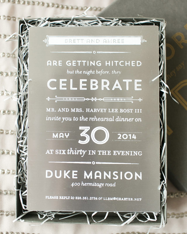
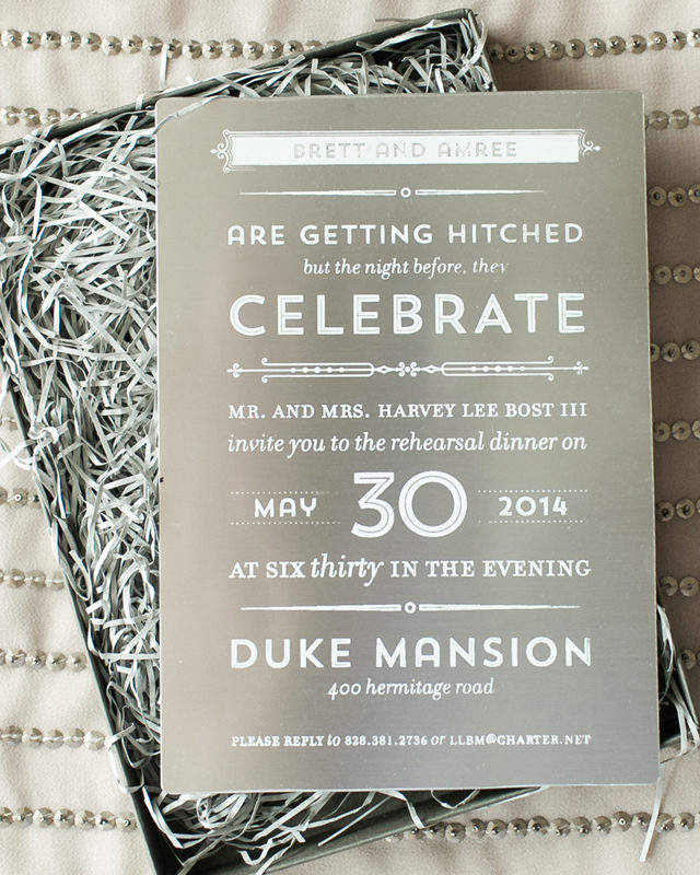
Okay. Now I’ve officially seen it all. These modern industrial rehearsal dinner invitations from Melissa at Atheneum Creative were created by screen printing the design on individual pieces of thin sheet metal! So cool!

Modern Industrial Rehearsal Dinner Invitations by Atheneum Creative / Oh So Beautiful Paper

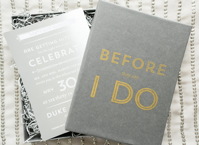
From Melissa: We were asked to create a rehearsal dinner invitation that reflected the very modern and industrial feel of the event. The groom’s family is in the box making business, so we knew right away that we had to work with a design that would not only be mailed in a box, but also allow the box to be part of the overall design – making sure that the box itself was more than just a vessel to mail the invitation.

Modern Industrial Rehearsal Dinner Invitations by Atheneum Creative / Oh So Beautiful Paper

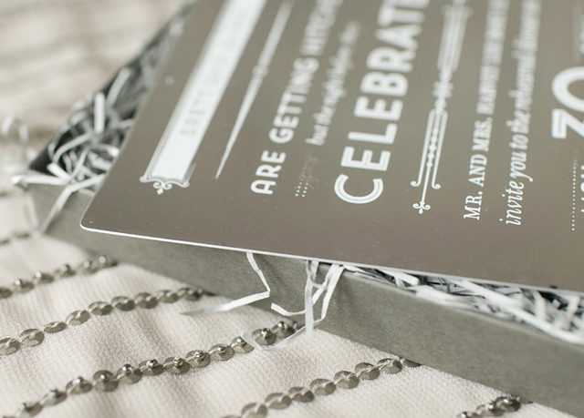
We know we wanted to incorporate metal into the overall design as that would speak right to the look and feel of the day. We cut large sheet metal down to size and rounded the corners to create the invitation cards. We tried a couple different printing methods, but in the end screen printing worked the best for both design and budget. The rehearsal dinner venue itself is not industrial, so to balance the very modern look of the metal and the vintage feel of the venue we added some vintage design elements (like the dividers) to break up the text.

Modern Industrial Rehearsal Dinner Invitations by Atheneum Creative / Oh So Beautiful Paper

Since we wanted the box to be a part of the keepsake, we sourced gray boxes that would be strong enough not to get crushed and screen printed “Before They Say I Do” on the cover in gold — which set the tone for the invitation itself. The invitations were filled with shredded gray paper to keep with the industrial look.

Modern Industrial Rehearsal Dinner Invitations by Atheneum Creative / Oh So Beautiful Paper

Thanks Melissa!

Design: Atheneum Creative

Atheneum Creative is a member of the Designer Rolodex – you can see more of their beautiful work right here or visit the real invitations gallery for more wedding invitation ideas!

Photo Credits: Chelsea Davis Photography

Behind the Stationery: Printerette Press

For today’s Behind the Stationery, the fun and whimsical Printerette Press is letting us in on their traditional design process as they incorporate hand painted and hand drawn elements into all of their designs. You may recognize their work from Sophie’s 1st Birthday invitations. Catherine shares about going from fashion to stationery, her team, and how they balance their calendar to split the wholesale and custom parts of the business. –Megan

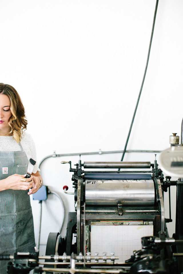
Behind the Stationery: Illustrated and Hand Painted Letterpress Stationery by Printerette Press / Oh So Beautiful Paper

Behind the Stationery: Illustrated and Hand Painted Letterpress Stationery by Printerette Press / Oh So Beautiful Paper

As a little kid I always wanted to be a clothing designer. I got an art degree in Fashion Design and a job right out of college designing clothing for a big box retailer here in Minneapolis. Funny though — after working in my “dream job” for a few years, it just didn’t feel like my thing any more. The stars sort of aligned when a friend asked if I had any interest in her aging dad’s print equipment. I thought it was the weirdest, most random thing I’d ever been approached with. I had almost zero print experience and immediately told her I wasn’t interested, but then I went back to my little cubicle and ruminated on it for a while. Eventually I decided I couldn’t live without letterpress in my life. (I’m really hot and cold – can you tell?). I printed on the side while keeping my job for a year or so and eventually made the leap to full-time Printerette. The rest is inky, greasy history.
Behind the Stationery: Illustrated and Hand Painted Letterpress Stationery by Printerette Press / Oh So Beautiful Paper

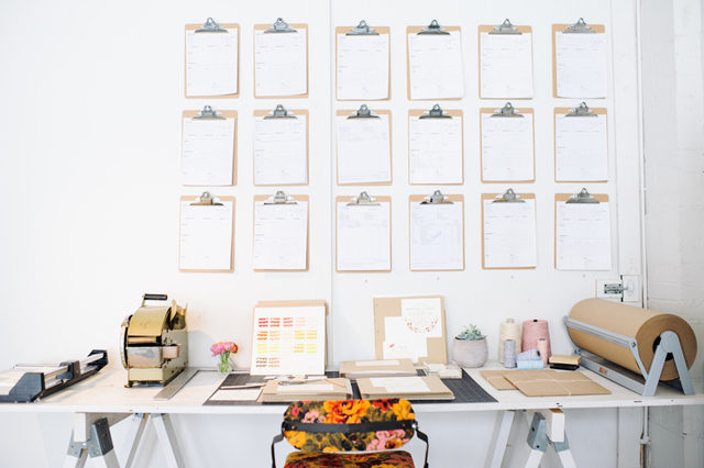
We’re located in the Seward neighborhood of lovely Minneapolis — a neighborhood famous for the enormous amount of backyard chickens per capita. Depending on the day, our little shop is either a beautifully sunny, breezy, and an inspiring place to be or it’s a blazing-hot, steamy inferno. Depends. Today it’s the latter.
Behind the Stationery: Illustrated and Hand Painted Letterpress Stationery by Printerette Press / Oh So Beautiful Paper

We are a letterpress print shop and so that’s our specialty. We also do some flat printing and actually love to combine the two methods to get both the color impact of flat printing and the textural impact of letterpress printing. Our combo print method wedding suites are our big thing right now.
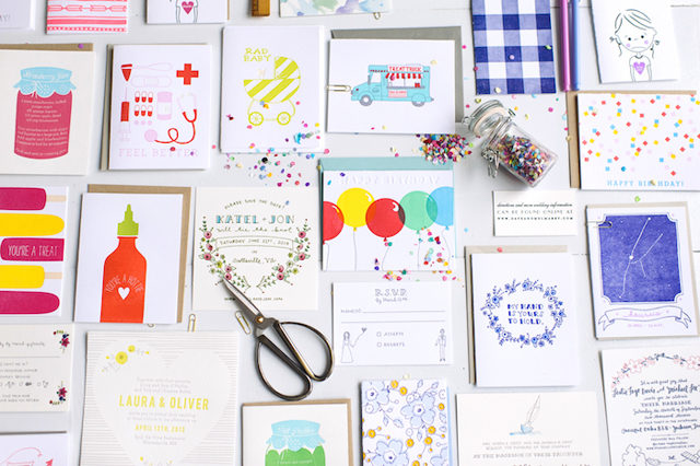
Behind the Stationery: Illustrated and Hand Painted Letterpress Stationery by Printerette Press / Oh So Beautiful Paper

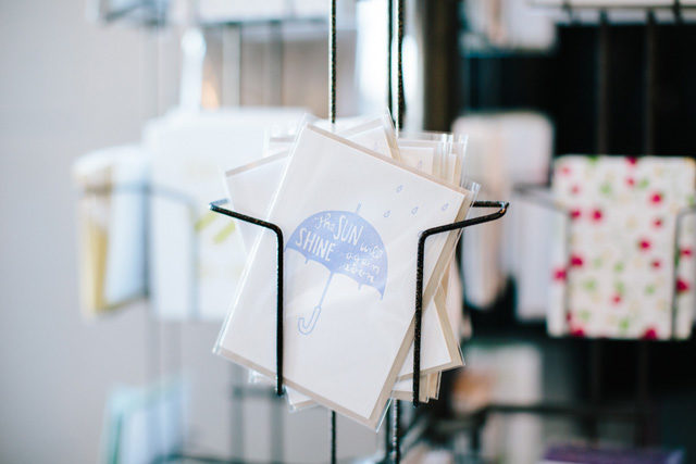
Our product line is in two parts: We have a small line of ready-made items like greeting cards, letter sheets, and note pads and we also have a custom line for weddings and social events. The combo really keeps us busy and on our toes! We really focus on weddings during the spring and early summer. Then, when our custom business slows down a bit, we ramp up our wholesale ready-mades. It’s a nice balance!
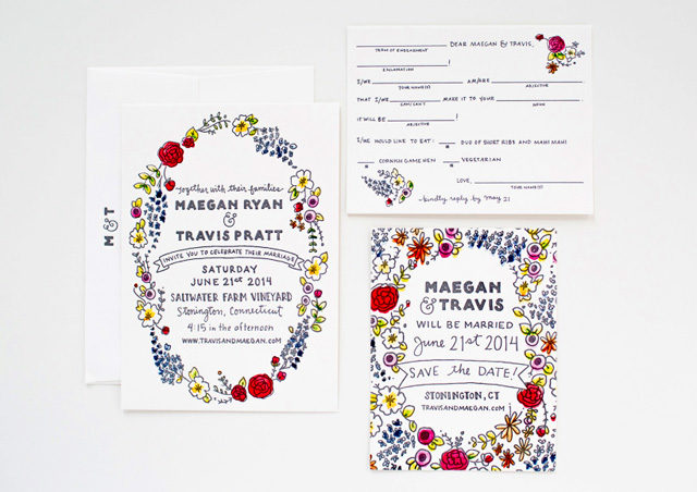
Behind the Stationery: Illustrated and Hand Painted Letterpress Stationery by Printerette Press / Oh So Beautiful Paper

Our design process for custom orders starts with a casual consultation. We like to get to know our clients and their event as much as possible before throwing in our two cents about how to create the perfect paper for them. When I’ve gathered as much info as I can, I take it to my sketchbook. Nearly all of our designs start on paper with regular old pencil, pen, and paint which is what gives our work its signature hand-illustrated and whimsical look. I only bring my sketches to the computer for small layout tweaks. Otherwise, it’s done old-school style.
designing2

My design process always starts in my sketchbook where I love to combine brushwork and pen work into my illustrations. I hand draw and hand paint all of our designs and only really digitize them when we’re ready to make plates and go to print, so you’ll see a lot of charming irregularity in my illustrations.
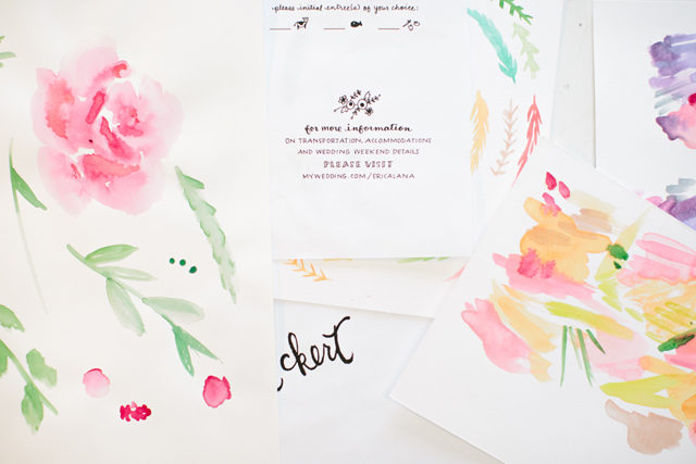
Behind the Stationery: Illustrated and Hand Painted Letterpress Stationery by Printerette Press / Oh So Beautiful Paper

Behind the Stationery: Illustrated and Hand Painted Letterpress Stationery by Printerette Press / Oh So Beautiful Paper

When we’re on press and the design is coming to reality, we’ll sometimes make some last minute color or placement tweaks as a team. Being able to do that is a big part of why I love letterpress printing so much; it’s such a hand-done method that the design process really doesn’t stop until the product is totally complete. We’re making design decisions all the way up to completion; where with modern printing, designing stops the moment you click “print”. Just today we decided to add just a spot of neon ink to one of our new card designs to make it pop a little more than I originally designed it to.
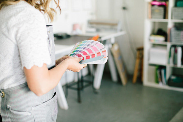
Behind the Stationery: Illustrated and Hand Painted Letterpress Stationery by Printerette Press / Oh So Beautiful Paper

Behind the Stationery: Illustrated and Hand Painted Letterpress Stationery by Printerette Press / Oh So Beautiful Paper

Behind the Stationery: Illustrated and Hand Painted Letterpress Stationery by Printerette Press / Oh So Beautiful Paper

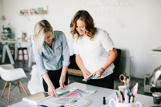
There are three of us in the studio at Printerette. Judith is the studio manager. She handles all inquiries and most Printerette correspondence. She’s the one who takes the orders and gets the orders out when they’re produced. Judith also handles all of our social media and blogging. Molly handles most of the printing. She’s the one who makes sure colors are mixed perfectly, registration is perfectly aligned, and impression is perfect. She’s one bad-ass print maker and everything that goes out the door has her seal of approval. I oversee everything creative and do most of the designing and concepting.

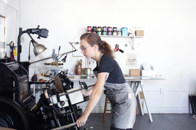
Behind the Stationery: Illustrated and Hand Painted Letterpress Stationery by Printerette Press / Oh So Beautiful Paper

Behind the Stationery: Illustrated and Hand Painted Letterpress Stationery by Printerette Press / Oh So Beautiful Paper

Behind the Stationery: Illustrated and Hand Painted Letterpress Stationery by Printerette Press / Oh So Beautiful Paper

I get inspiration from lots of stuff! But lately — summer time! I’m a Minnesota gal that really lives for warm weather and I think you can see it in so much of what I make. Also, my clothing designer brain is still very much in action and I find a lot of inspiration for Printerette in clothing trends, especially with color and pattern.

Behind the Stationery: Illustrated and Hand Painted Letterpress Stationery by Printerette Press / Oh So Beautiful Paper

We’re very active on social media and as we increase followers, our client base has increased as well. We get lots of “I saw this thing you did on Instagram” inquiries which is awesome. We’ve haven’t done the National Stationery Show for a couple of years, but find it to be a great way to build name recognition. And in the wedding business, we find that word of mouth is a big player in growing our client base.

Behind the Stationery: Illustrated and Hand Painted Letterpress Stationery by Printerette Press / Oh So Beautiful Paper

Photos by 2nd Truth Photography and Printerette Press.

Interested in being featured on the Behind the Stationery column? Shoot an email to Megan at [email protected].
 

Colorful and Gold Foil Brush Lettered Wedding Invitations

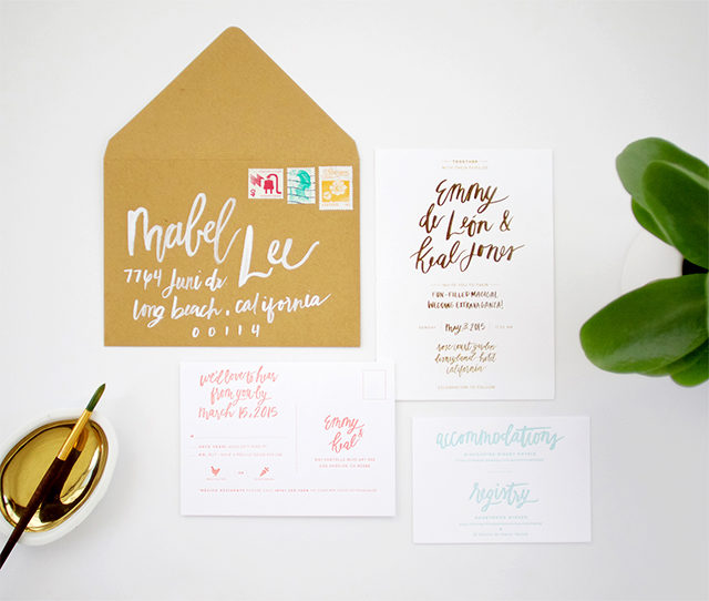
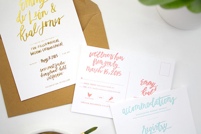
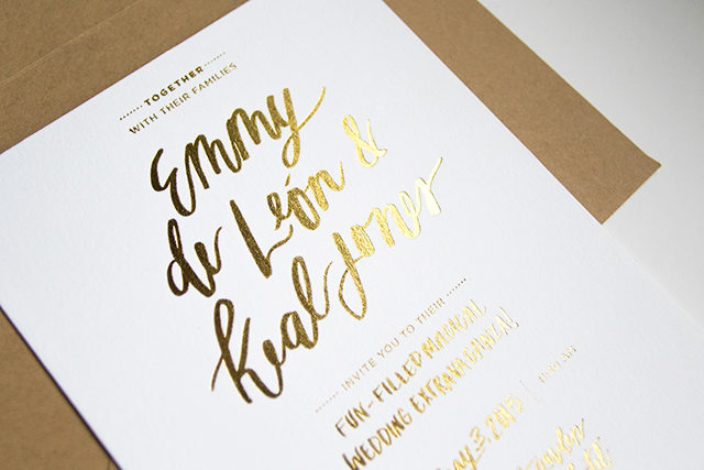
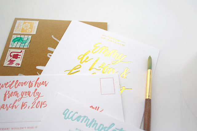
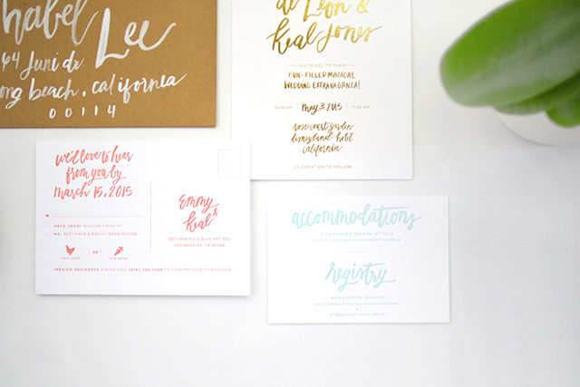
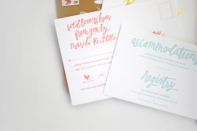
This is such a great way to combine color and gold foil! Alex from Goodheart Design created these brush lettered wedding invitations for a couple married at Disneyland in California. With each piece printed in a different color and featuring Alex’s signature lettering, this wedding invitation suite has such a fun and whimsical vibe!

Colorful and Gold Foil Hand Lettered Wedding Invitations by Goodheart Design / Oh So Beautiful Paper

From Alex: I had so much dun designing for this couple! They were married at Disneyland in the Rosecourt Garden, so they wanted something fun and whimsical. Usually people want their wedding invitation suite to be all one color to keep it simple and cohesive, but this couple wanted to jazz it up a little bit and have each piece printed a different color.

Colorful and Gold Foil Hand Lettered Wedding Invitations by Goodheart Design / Oh So Beautiful Paper

The main invitation is gold foil and the other two pieces are each one color letterpress. They also strayed away from the typical rsvp card and did a fun postcard, which gives the invitations a little more of a casual vibe.

Colorful and Gold Foil Hand Lettered Wedding Invitations by Goodheart Design / Oh So Beautiful Paper

Colorful and Gold Foil Hand Lettered Wedding Invitations by Goodheart Design / Oh So Beautiful Paper

Colorful and Gold Foil Hand Lettered Wedding Invitations by Goodheart Design / Oh So Beautiful Paper

Colorful and Gold Foil Hand Lettered Wedding Invitations by Goodheart Design / Oh So Beautiful Paper

Thanks Alex!

Design + Lettering: Goodheart Design

Letterpress Printing: Czar Press

Goodheart Design is a member of the Designer Rolodex – you can see more of Alex’s beautiful work right here!

Photo Credits: Goodheart Design

August Desktop Downloads!

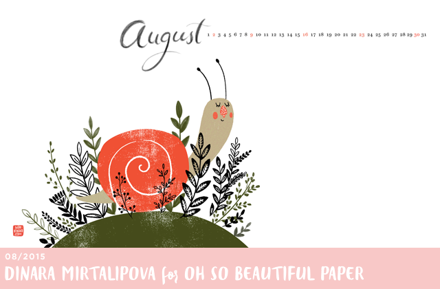
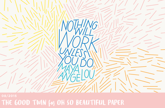
Happy August everyone! Here are a few new wallpapers to brighten your phones and computers!

August Wallpaper / Dinara Mirtalipova for Oh So Beautiful Paper

Download DINARA MIRTALIPOVA’S July wallpaper: DESKTOP | iPhone5 | iPhone6

・・・

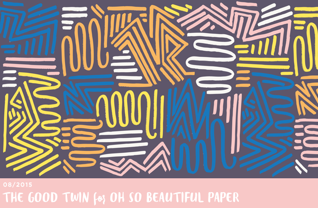
August Wallpaper / The Good Twin for Oh So Beautiful Paper

Download THE GOOD TWIN’S Nothing Will Work Unless You Do Wallpaper: DESKTOP | iPhone5 | iPhone6

・・・

August Wallpaper / The Good Twin for Oh So Beautiful Paper

Download THE GOOD TWIN’S Stripes Wallpaper: DESKTOP | iPhone5 | iPhone6

・・・

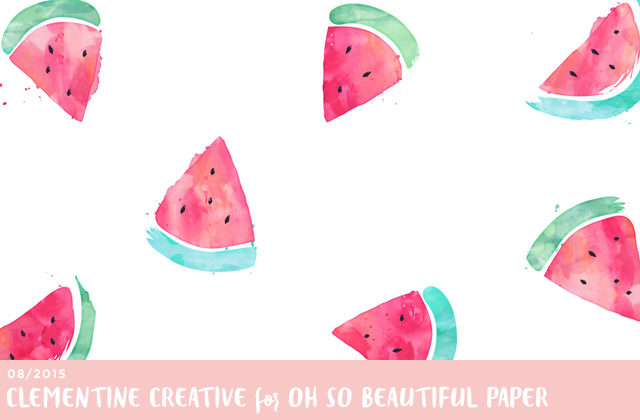
Watermelon August Wallpaper / Clementine Creative for Oh So Beautiful Paper

Download CLEMENTINE CREATIVE‘S Watermelon Wallpaper: DESKTOP | iPhone5 | iPhone6

・・・

If you’re a designer or illustrator interested in contributing your own designs to this column, please email your design to submissions(at)ohsobeautifulpaper.com with the subject line “desktop downloads.” If it’s a good fit I’ll add it to the post for the following month!

For personal use only. All illustrations by The Good Twin, Dinara Mirtalipova, and Clementine Creative for Oh So Beautiful Paper

South Seas Sling

The Singapore Sling is a pretty solid cocktail. It’s sweet and tart and complex and layered, and it tends to get lumped into the family of “Tiki drinks.” But there’s a lot of aficionados of classic Tiki who dispute the Singapore Sling’s status as a Tiki drink: it was invented in Singapore (naturally) probably around the turn of the 20th Century or so, and not in the heartland of classic Tiki culture, California, in the 1940s and 1950s, when guys like Don the Beachcomber and Trader Vic were inventing drinks like the Zombie and the Jet Pilot. And you know what? Nitpicking over the status of a drink seems like one of the least Tiki things you can do. Just saying. So here’s a variation on the Singapore Sling that pays homage to the layered, tropical, spicy flavors of the original, the South Seas Sling. – Andrew

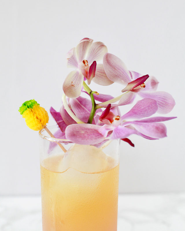
South Seas Sling Tiki Cocktail Recipe / Liquorary for Oh So Beautiful Paper

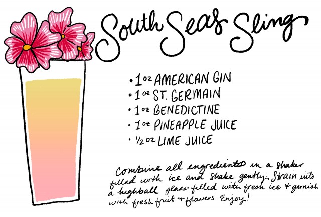
South Seas Sling Tiki Cocktail Recipe Card / Shauna Lynn Illustration / Recipe by Liquorary for Oh So Beautiful Paper

Illustration by Shauna Lynn for Oh So Beautiful Paper

The South Seas Sling

1 oz American Gin
1 oz St-Germain
1 oz Benedictine
1 oz Pineapple Juice
1/2 oz Lime Juice

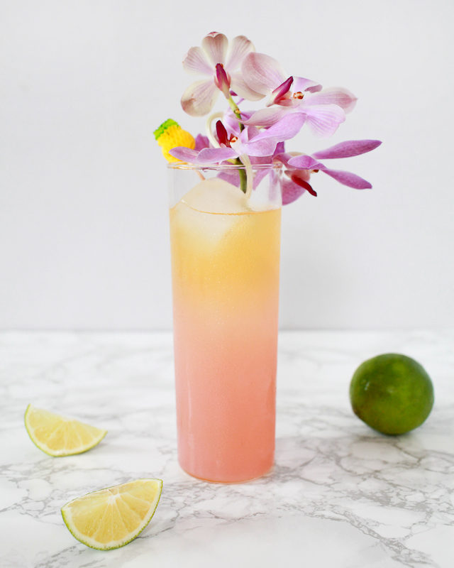
Combine all the ingredients in a shaker filled with ice and shake gently. Strain into a highball glass filled with fresh ice and garnish with fresh fruit and flowers. Enjoy!

South Seas Sling Tiki Cocktail Recipe / Liquorary for Oh So Beautiful Paper

(In general, drinks like this served over ice – which will melt, adding more water to the drink – should only be shaken gently and for less time than you’d use for a drink served straight up. Your goal is to mix up the booze and fruit juice but avoid diluting the drink too much.)

The original Singapore Sling is a wondrous mix of sweet and sour and complex, vaguely medicinal botanicals. This version replaces the dry gin with an American gin, like Hendricks, which emphasize other botanicals alongside juniper. It also replaces the original’s cherry liqueur with St-Germain’s floral fruitiness. The result is a softer, fruitier, and snappier drink than the original.

We left the original’s Benedictine – a sweet, enormously complex herbal liqueur – alone. It seems like an odd choice for a Tiki drink, since Benedictine tends to turn up more in boozy, old school drinks like the Vieux Carre. But the uniqueness of the Singapore Sling as a Tiki drink seems to hinge on its unusual pairing of all these complex botanical flavors with the big tropical fruit flavors.

South Seas Sling Tiki Cocktail Recipe / Liquorary for Oh So Beautiful Paper

Pineapple is a nice complement to these flavors, but a bit of lime lends a really necessary acidity; we tried a version without lime that ended up very limp. So don’t forget the lime and, in general, remember that an unbalanced recipe can often benefit from a touch of acid that can cut through and clarify a jumbled flavor profile.

So is the South Seas Sling – and its predecessor, the Singapore Sling – a Tiki drink? It’s fun and fruity and builds layers of complex flavors, all of which make it Tiki in my book. But ultimately, policing drinks is for squares. Don’t be a square. Just have fun.

(Don’t forget to follow us on Instagram, where we’ve been posting our experiments before they make their way onto this column!)

Glassware by Liquorary

Photo Credits: Nole Garey for Oh So Beautiful Paper