Emily and Eric’s wedding invitation design is one of my favorites! They were such a fun couple with a great eclectic design style. And today I wanted to add a little something extra and share a little from behind the scenes of this particular design. –Kim from Bright Room Studio
This design is completely hand-lettered, which means lots of sketching, drawing and scanning! I switch off between using tracing paper and just regular printing paper (often scrap paper from something else) for my lettering, depending on how much I want to sketch before hand. I also use a high-quality marker paper when I use a pointed calligraphy pen. This pile of scans became a bunch of different designs for the bride to choose from.
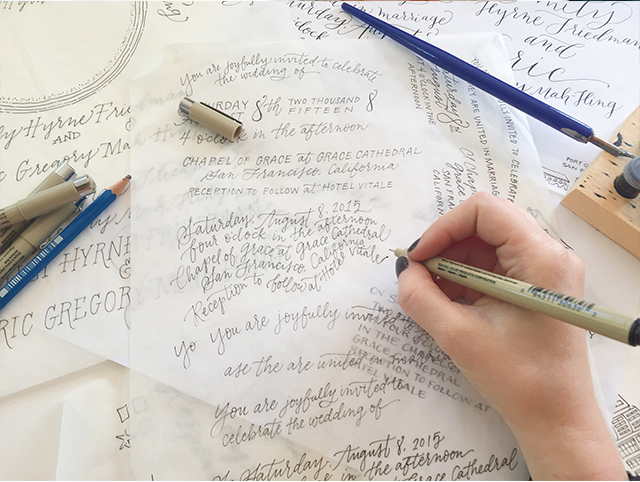
I typically explore a bunch of different design directions and present many different options to my clients. I think it really helps for them to see a variety of ideas… some that are more formal, more rustic, or more whimsical, depending on the vision they initially share with me. I find that even the designs that the clients don’t choose help them hone in on their aesthetic. From there, we narrow it down, tweak, mix and match until the design is perfect. But not everything makes the cut! The ones that don’t sometimes become elements of the RSVP or details card, sometimes are repurposed for other designs – and sometimes just go to the design graveyard.
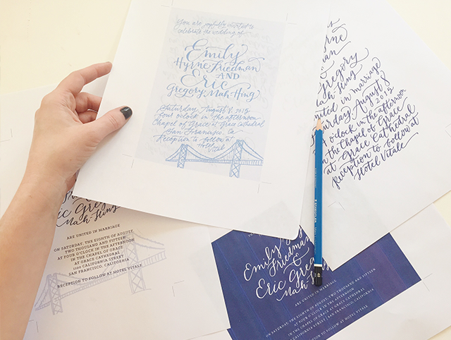
My clients and I work together to refine the invitation suite until it is perfect. To me that means that it is cohesive, unique, clean and special. We finesse the little details like envelope color and twine as that can really make a difference in the whole product.
Here is where we landed with Emily and Eric. I like to call this one “Midnight in San Francisco.†I love the personal details, unique textures and cool California vibe.
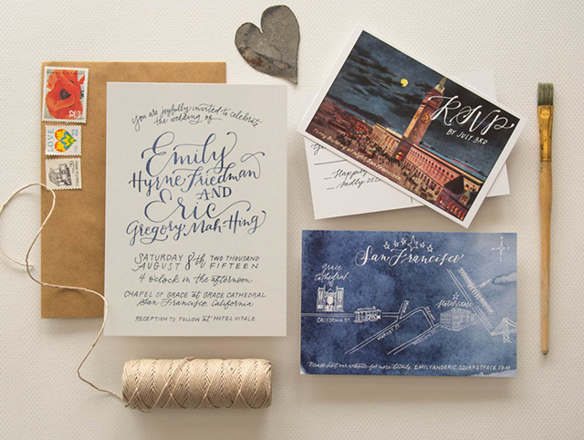
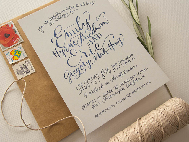
The design was digitally printed to  showcase the depth of the watercolor textures. I love how the map has a subtle feeling of tie-dye, which winks at San Francisco’s Summer of Love.
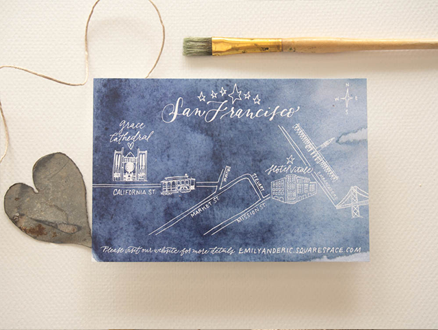
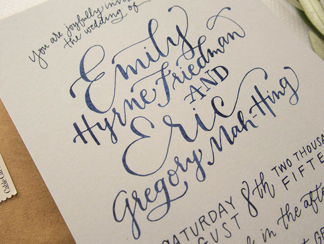
The details really brought this together. The perfectly sourced vintage stamps, old postcard and subtly-rustic details made this eclectic suite come to life!
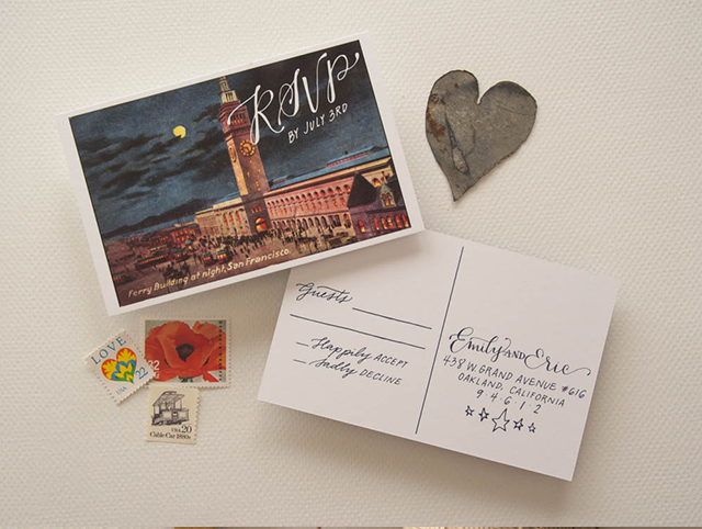
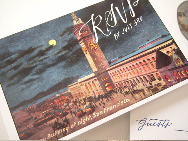
Design by Bright Room Studio
Printing by Mercurio Brothers
Bright Room Studio is a member of the Designer Rolodex  – you can see more of Kim’s beautiful work right here or visit the real inviÂtaÂtions gallery for more wedding invitation ideas!
Photo Credits: Bright Room Studio


