Seasonal Stationery: 2016 Calendars, Part 4
I just couldn’t resist one last 2016 calendar round up! In case you missed them, you can find my earlier 2016 calendar round up installments right here, including food-inspired calendars, painterly artistic calendars, and illustrated calendars. This round up includes a little bit of everything, from a gorgeous color blocked monthly calendar to a copper foil moon phase wall calendar to a pretty painted floral calendar. So hard to choose just one!
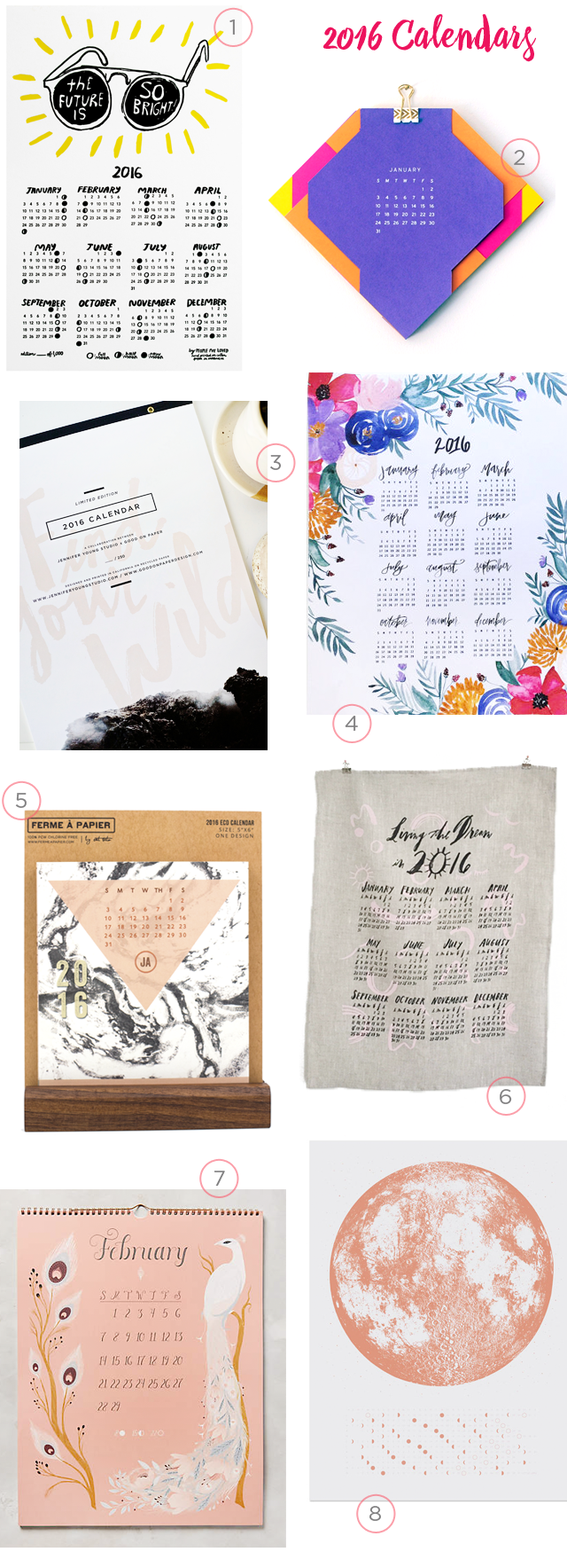
1. The future is bright in this limited edition letterpress printed calendar from People I’ve Loved
2. How cool is this color blocked cut out calendar from Plane Paper?! So bright and colorful!
3. Loving this Find Your Wild calendar collaboration between Lisa of Good on Paper and Jennifer Young Studio! The calendar features Jennifer’s images paired with Lisa’s lettering and copper foil text.
4. A beautiful floral calendar from Shannon Kirsten
5. Love all the patterns in this monthly desk calendar from Ferme à Papier
6. A gorgeous tea towel calendar from Linea Carta that you can continue to use year after year!
7. This Metamorphosis calendar is so pretty
8. This moon phase wall calendar from Little Lark is printed in beautiful copper foil!
p.s. More calendar round ups right here, and you can find even more calendars in the Market List here!
Hand Lettered San Diego Wedding Invitations
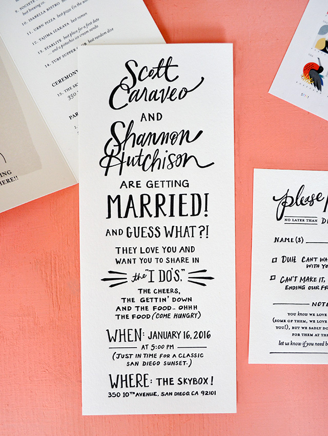
How fun are these hand lettered San Diego wedding invitations from Katie at Odd Daughter Paper Co.?!? I’m completely obsessed with every detail in this invitation suite, from the playful invitation wording, to the modern hand lettering, to the illustrated map of San Diego food spots. I wish every wedding invitation came with an illustrated food map – don’t you?
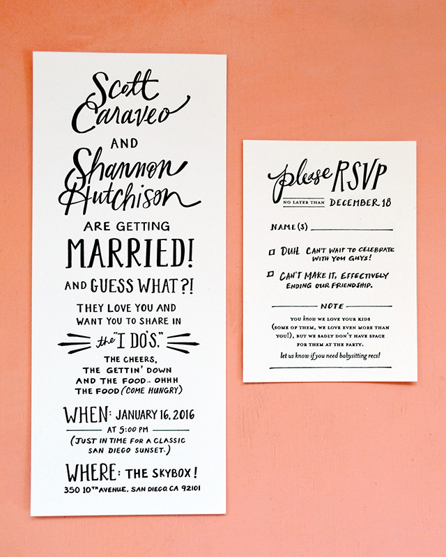
From Katie:Â This San Diego wedding invitation suite was all about hand lettered type and a custom illustrated map. The couple is hysterical and had awesome wording for the invitation and reply card. I wanted their wording and the hand lettering to shine so I kept the design fairly simple with black text on white paper. Czar Press did an amazing job on these letterpress pieces and I think the simplicity of the design also highlights the beauty of letterpress printing.
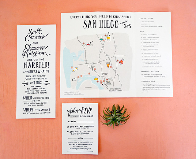
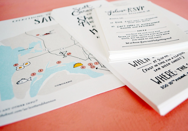
In addition to their love for each other, the couple LOVES food. And their city! Did I mention they were so fun to work with?! We decided a map highlighting the best food spots in San Diego was the perfect way to personalize the invitations AND give their out of town guests the inside scoop on the best places to eat. I chose to do a tri-fold piece so that we could fit the map, all of the food descriptions, and a few additional wedding details all in one place. The bride requested little hand drawn illustrations at each spot on the map (“I’m picturing a tiny bowl of noodles and a tiny beer bottle… etc.”) and this is where I was able to add some little pops of color. The map was printed digitally on cotton paper by Czar Press, which gives it a luxurious feel without the cost of multiple letterpress colors.

The invitation suite was finished with a custom address stamp that included the couple’s names in hand lettering combined with a simple serif font. For envelopes, we went with a classic gray #10 envelope for the invitation and a sweet coral 4bar for the reply card. All that to say, it was such a fun invitation. I had such good wording and content to work with!!
Thanks Katie!
Design and Hand Lettering: Odd Daughter Paper Co.
Printing: Czar Press
Check out the Designer Rolodex for more talÂented wedÂding inviÂtaÂtion designÂers and the real inviÂtaÂtions gallery for more wedding invitation ideas!
Photo Credits: Odd Daughter Paper Co.
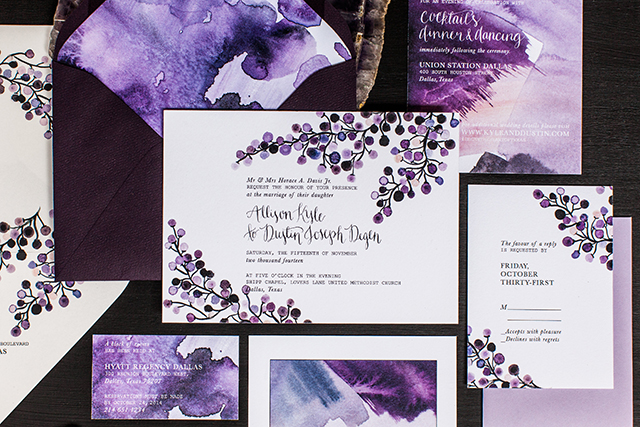
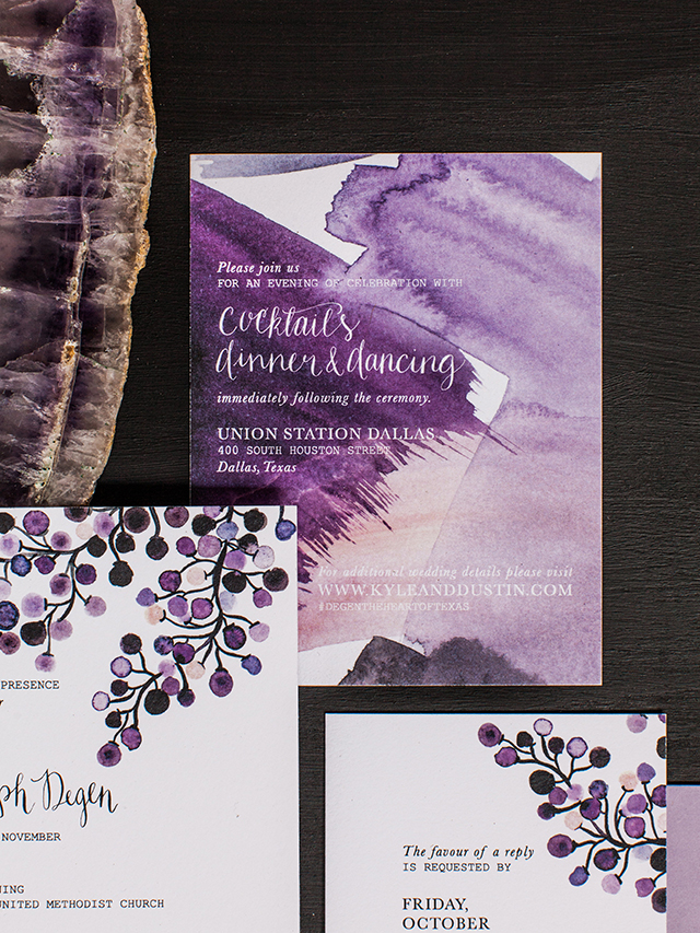
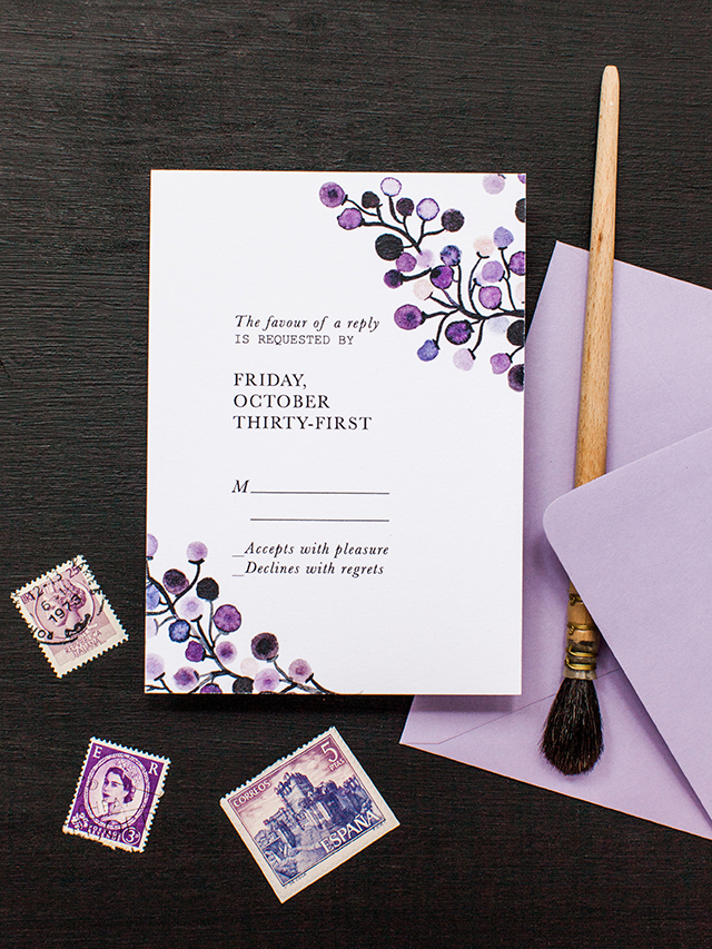
The Art of Opposites Watercolor Wedding Invitations
These beautiful watercolor wedding invitations from Caroline at Lovely Paper Things kind of defy genre descriptions, which seems appropriate for invitations reflecting the love of two opposite personalities! The invitations combine custom calligraphy with hand painted floral elements and abstract watercolor patterns. And I love that the invitation features a favorite poem printed on the reverse side!
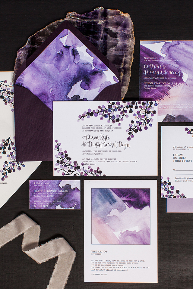
From Caroline: Some couples just have such an incredible spark that you can feel it from miles away. And oh my goodness, Kyle and Dustin are one of those amazing, wonderful, and kind couples who are truly meant to be together. During one of our initial conversations Kyle mentioned that she & Dustin loved both art & unusual juxtapositions in the world around them. While brainstorming concepts for their suite, we fell in love with the concept of The Art of Opposites, which became the heart & soul of the design.
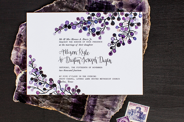
Kyle, a city girl from Dallas & Dustin, a country boy from Montana came from two very different worlds. But like contrasts in art and nature, sometimes opposites create the most breathtaking combinations and complements. Their stunning suite incorporates custom calligraphy, hand painted floral designs, and unique abstract watercolor paintings in the most lush antique plum inspired color palette.
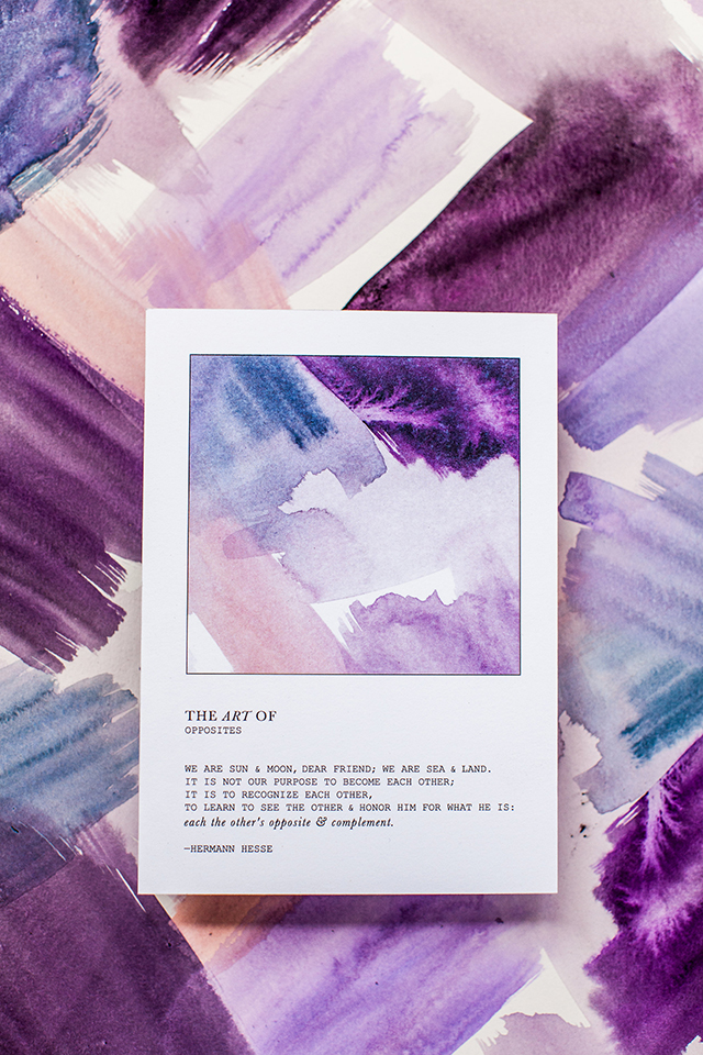
The double-sided invitation includes a custom art print & a quote we found that perfectly ties everything together:
“We are sun & moon, dear friend; we are sea & land.Â
It is not our purpose to become each other;
it is to recognize each other.
To learn to see the other &Â honor him for what he is:
Each the other’s opposite & complement”
-Hermann Hesse
It was a truly magical suite that makes my heart so happy, for a marvelous couple! Cheers to opposites attracting!
Thanks so much Caroline!
Design: Lovely Paper Things
Printing: Czar Press
Styling: To La Lune
Check out the Designer Rolodex for more talÂented wedÂding inviÂtaÂtion designÂers and the real inviÂtaÂtions gallery for more wedding invitation ideas!
Photo Credits:Â Ashley Kelemen Photography
Seasonal Stationery: Valentine’s Day Cards, Part 3
Happy Monday everyone! We’re still VERY much snowed in after getting almost two feet of snow over the weekend, and I’m already starting to get a bit stir crazy after so many days inside (and the kiddos out of school!). So today I thought I’d start the week off with a big dose of happy in the form of Valentine’s Day cards! This round up is full of some gorgeous copper and gold foil, hand lettering and hand painted elements, and food and gems – even enameled pins! And in case you missed them, you can find my previous round ups right here!
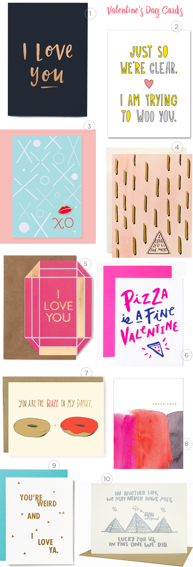
1. A gorgeous card from In The Daylight with coper foil on black paper
2. This card from Near Modern Disaster is perfect for the occasion
3. Send this XO pin and post card from The Good Twin to your bestie – the enameled pins make a sweet gift!
4. I love the subtle desert vibes and matte gold foil in this card from Antiquaria
5. Obsessed with this gold foil gem card from BerinMade London
6. Truth from The Paper Cub
7. For all the donut lovers out there from Hello Small World
8. Sweet and beautiful simplicity in this card from E.Frances Paper with hand painted watercolor details and copper foil text
9. This card from Farewell Paperie tells it like it is!
10. Such a sweet card from People I’ve Loved
p.s. More Valentine’s Day card round ups right here!