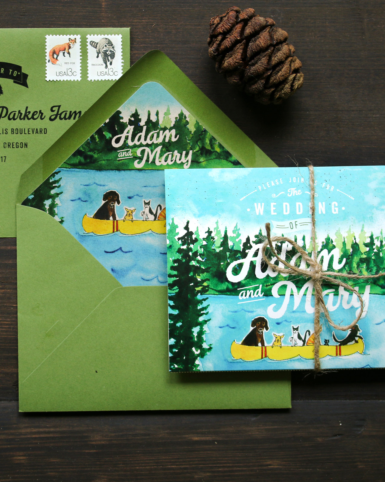
Happy Weekend!

Ugh. So as I write this, the government has shut down for the second time in less than a month. (Ed Note: Congress passed a spending bill and reopened the government this morning – but still!) My husband is a federal employee, and these repeated shutdowns are both financially scary and really demoralizing. And sadly, it looks like this might be our new normal for a while. So! If you’re interested in supporting Oh So Beautiful Paper and giving my family a boost during this uncertain time, please consider purchasing one of our limited edition art prints in collaboration with Mon Voir. Shipping is free! But in the meantime…

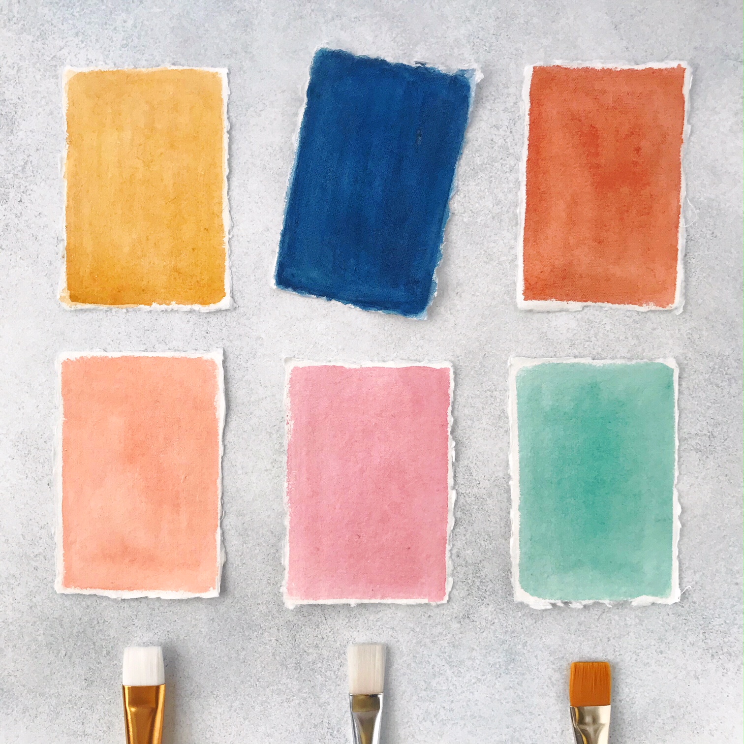
Watercolor Color Swatches / Oh So Beautiful Paper

…a few links for your weekend

OMG, I love the gingham skirt on this super cute dress for little girls!

Loving these cute (and candy free!) printable Valentines

Sending Valentine’s Day cards? Don’t forget your printable envelope liners!

I just bought this striped midi skirt and LOVE it

Need these blue velvet party heels

Give your socks a makeover!

A philanthropically funded Universal Basic Income experiment in California

This is heartbreaking and completely unacceptable: A mother of two young children (a 1 year old and 4 year old) has been detained by ICE since mid-January, when she went in to apply for citizenship. 

On immigration: “But if you get a specifically merit-based system… I wouldn’t be here, and chances are neither would you.”

Also, over the past decade, refugees have contributed $63 billion more in government revenues than they cost.


That’s it for me this week. Have a fantastic weekend and I’ll see you here on Monday! xoxo

Inspiring Calligraphers: Bien Fait Calligraphy

Hey everyone! If you’re someone who pores over the little details, (like I do), I think you’re in for a real treat today. When I was choosing images for this post, spotlighting calligrapher Joi Hunt, I just couldn’t narrow down all the images of oh-so-pretty envelopes. Because when you think about it, an envelope is often the very first impression of the big event. Let’s go look at some beautiful lettering work! Here’s a peek at Bien Fait Calligraphy. Jen

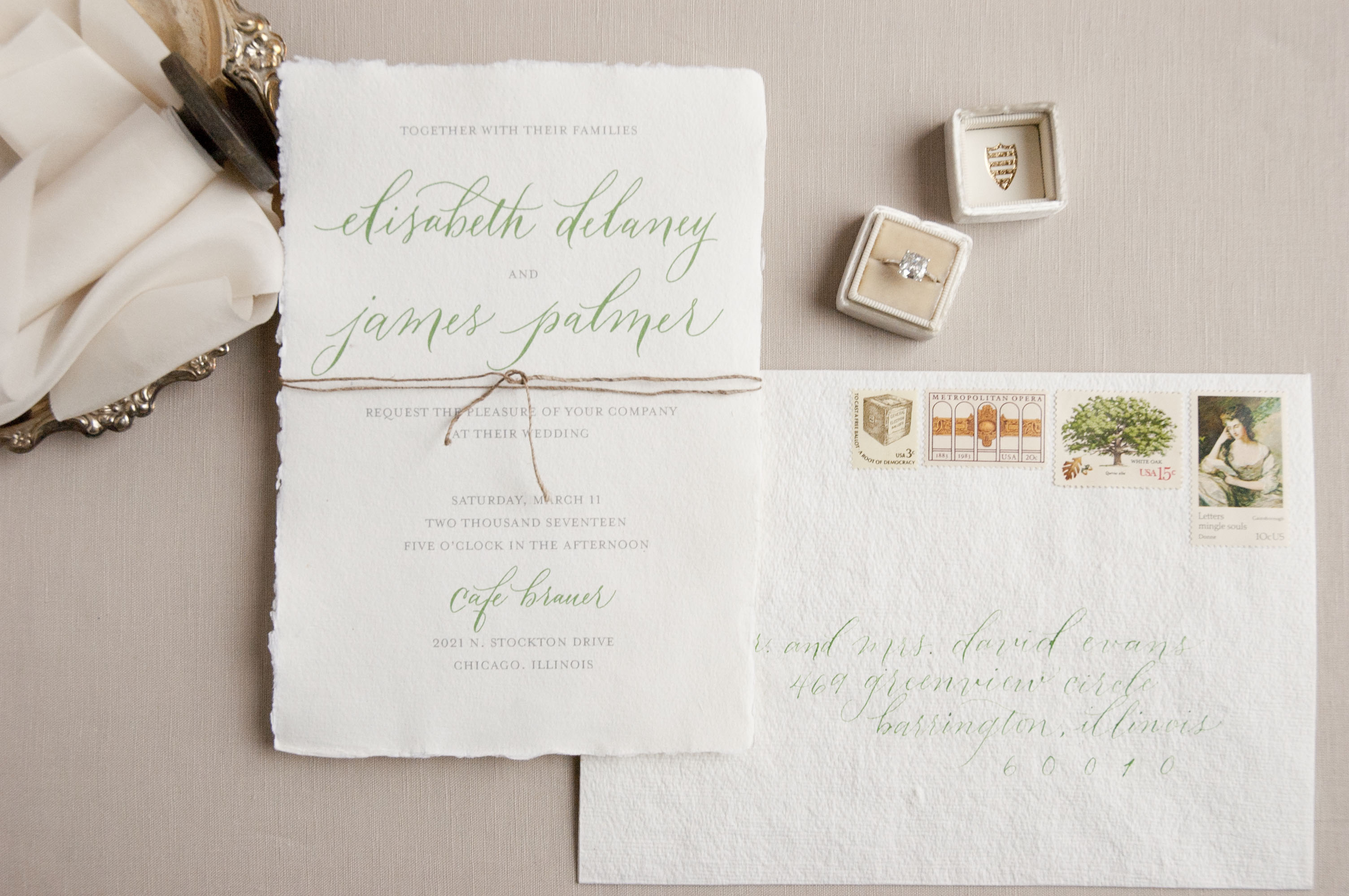
Deckle Edge Calligraphy Wedding Invitations / Bien Fait Calligraphy

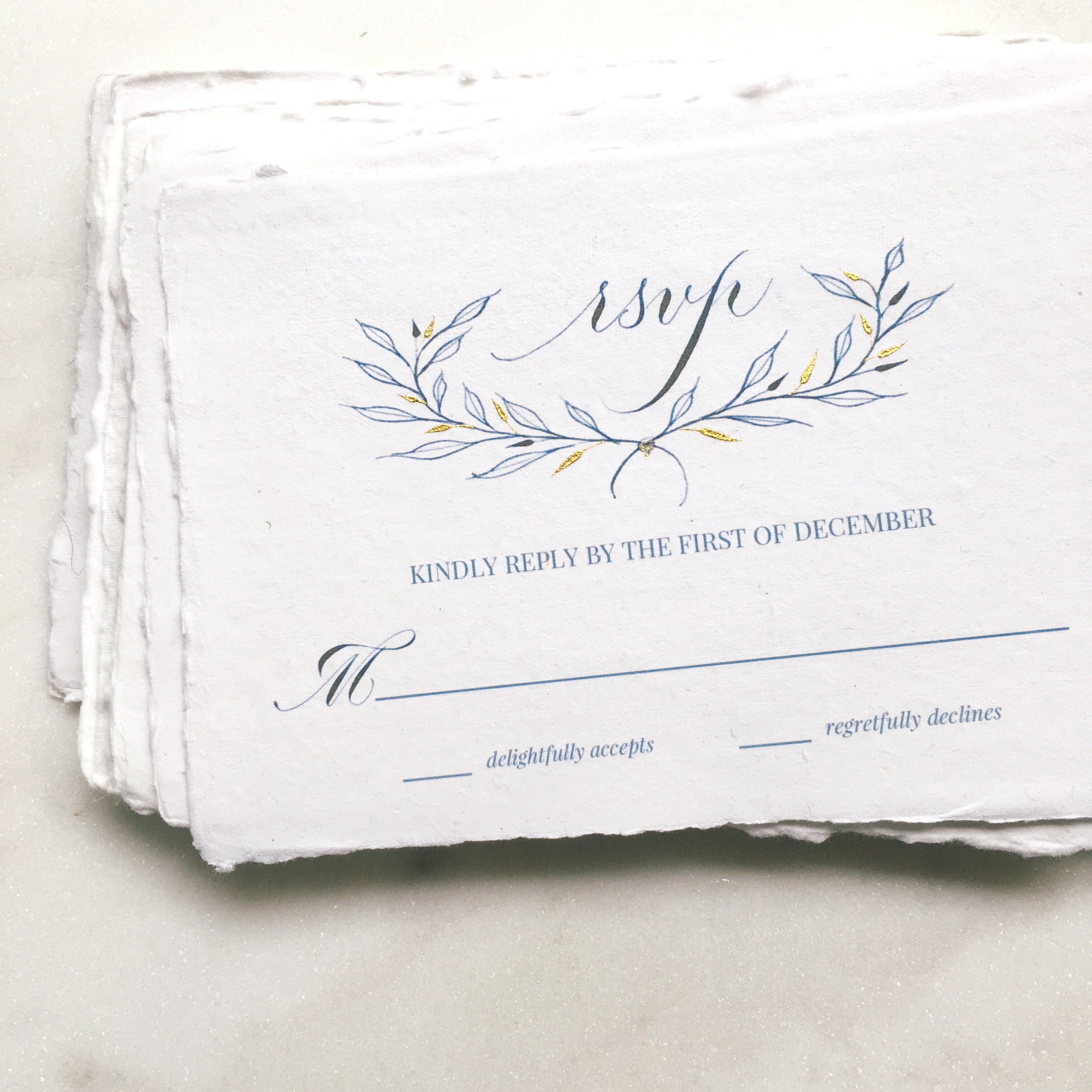
Calligraphy RSVP Card / Bien Fait Calligraphy

What’s in a name? Bien Fait is a French phrase that means “made well”, which is a nod to the way Joi approaches calligraphy — made well and made with love. Joi specializes in pointed pen calligraphy styles. Favorite projects? Says Joi: “My favorite projects are collaborations between other creatives, like stationery designers and watercolor artists. All our strengths come together to create something more beautiful than each individual element.”

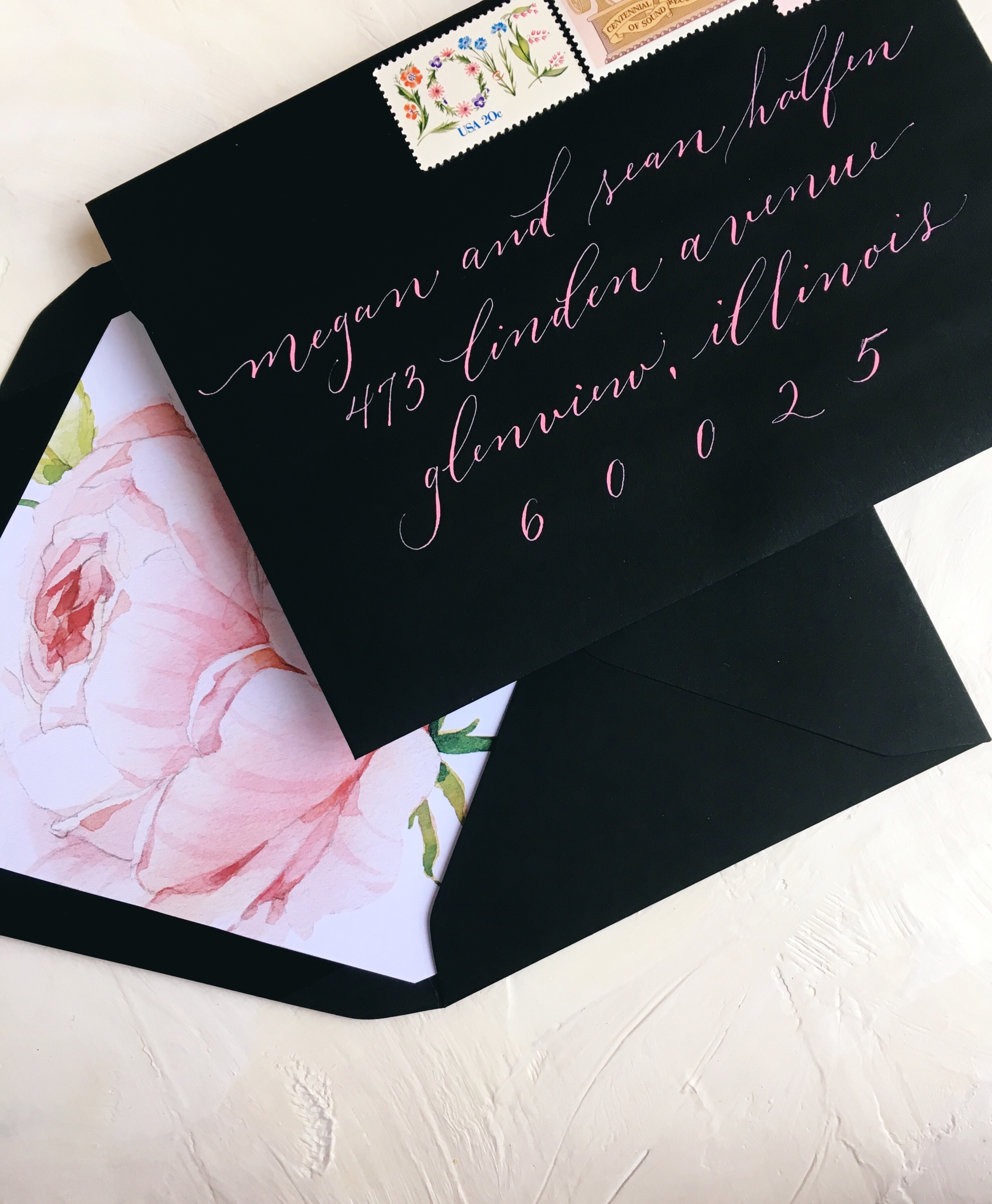
Black Envelope with Pink Calligraphy / Bien Fait Calligraphy

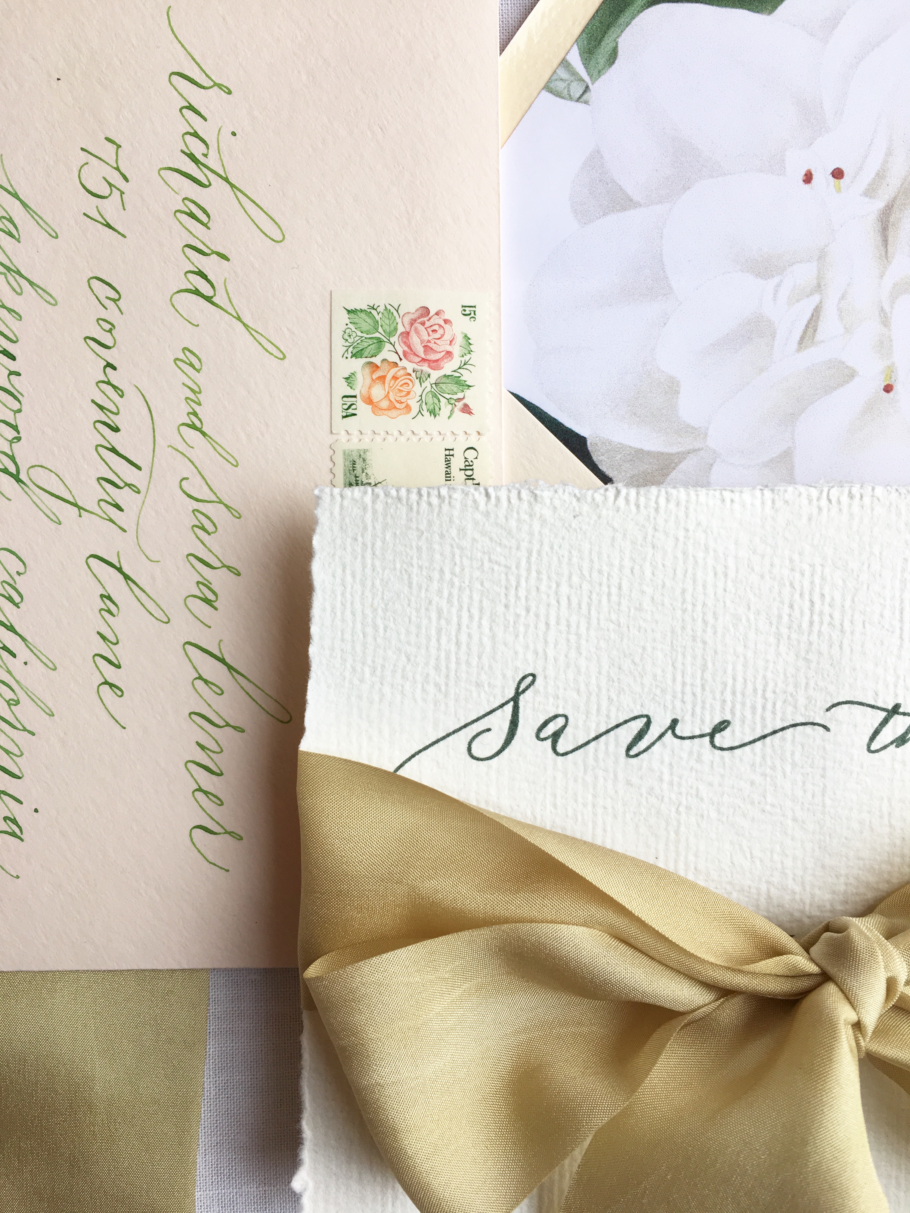
Calligraphy Wedding Invitations / Bien Fait Calligraphy

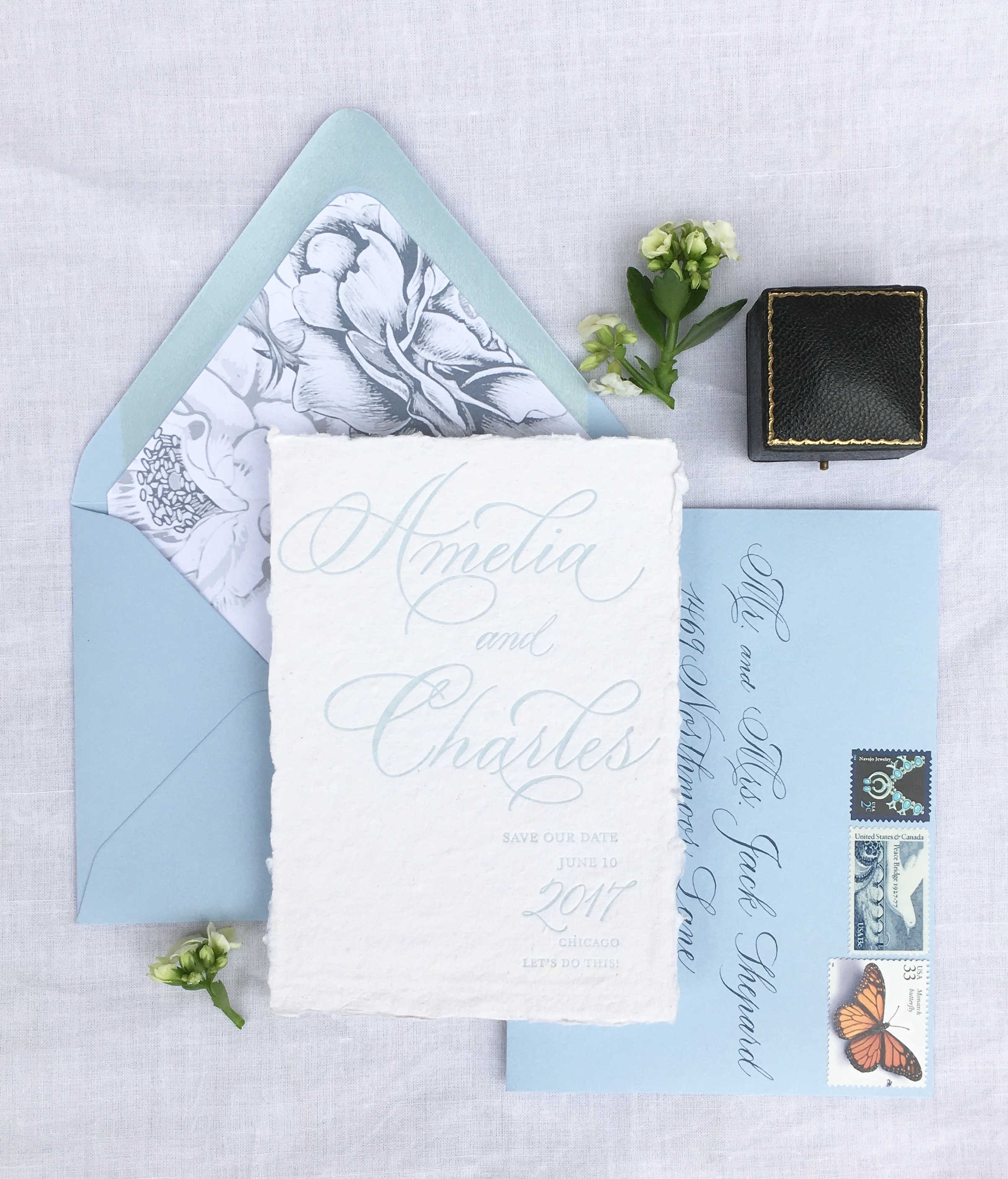
Joi considers herself a classically trained calligrapher, but that doesn’t mean she’s a perfectionist. “The beauty of handwritten script is the variation, the personality and emotion that comes through mind, heart, and hand, onto paper,” says Joi.

Calligraphy Save the Date / Bien Fait Calligraphy

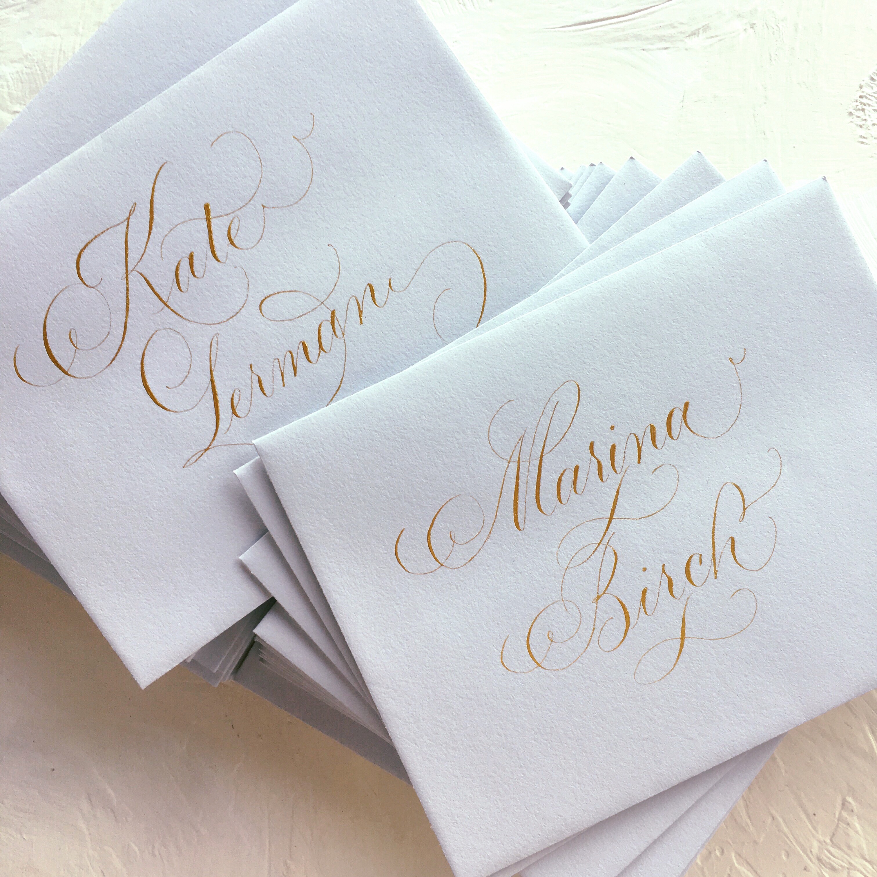
Gray Envelopes with Gold Calligraphy / Bien Fait Calligraphy

On envelopes, Joi says, “I love to address envelopes! Each one is a little piece of art, totally unique and a labor of love. A client that gives me the freedom to flourish a name or address is a bonus.” And of course, it’s so special to see a name beautifully penned.

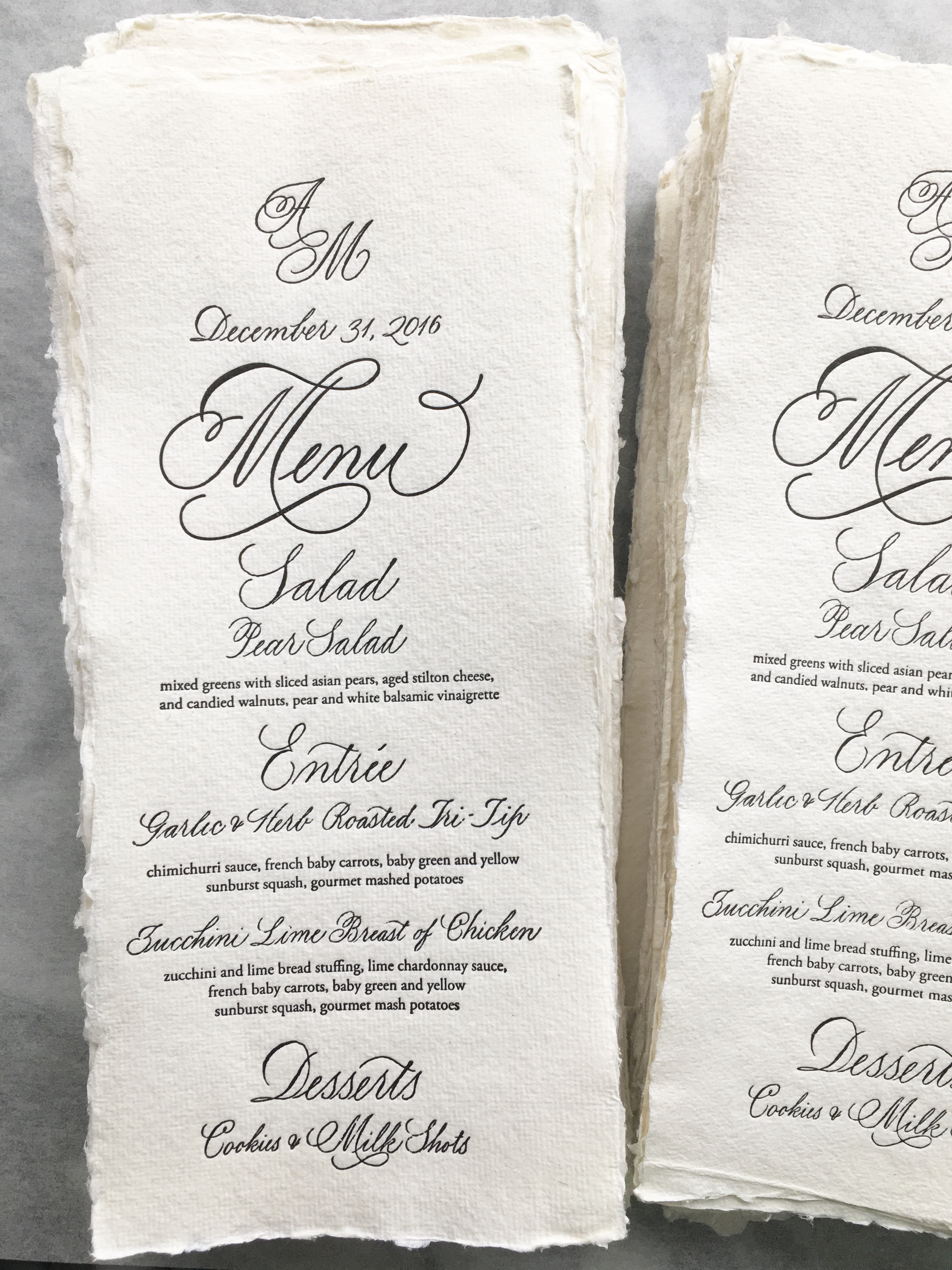
Menu Calligraphy / Bien Fait Calligraphy

Joi finds inspiration for her lettering work from historical examples. “I love to study calligraphy books and I am lucky to own quite a few vintage books. I could spend hours with my nib, dipping it into ink, and listening to the sound of that nib on paper,” she shares.

Sending a big thanks to Joi of Bien Fait Calligraphy for sharing a look into her fanciful, beautiful lettering work!

p.s. Even more inspiration from more inspiring calligraphers right here!

All photos via Bien Fait Calligraphy

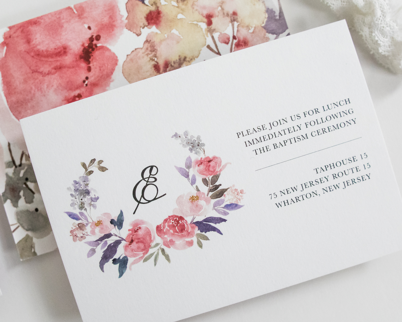
Watercolor Floral Baptism Invitations

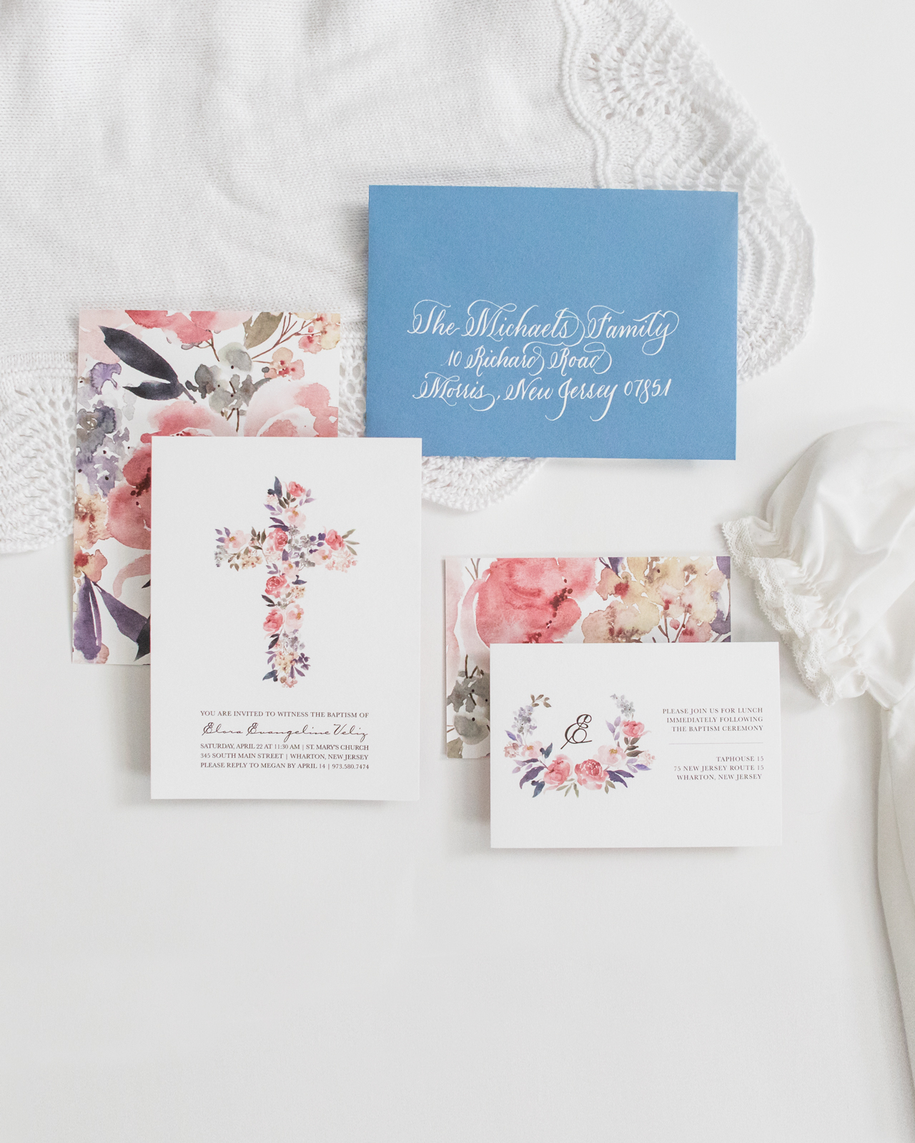
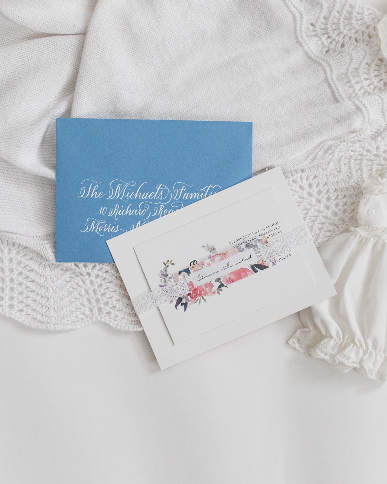
These charming watercolor floral baptism invitations are so sweet! Megan of Honeybee Paper Co. created these invitations for her daughter Elora’s baptism – drawing inspiration from the peace, joy, and serenity that Megan feels as Elora’s mother. We love the cheerful color palette, bespoke calligraphy, and well balanced white space that make the watercolor floral illustrations truly shine. What a beautiful and symbolic suite!

Floral Baptism Invitations by Honeybee Paper Co.

From Megan: When it came time to have my daughter, and first child, baptized we really wanted the invitation suite to reflect the feelings she gave us — serenity, peace, and joy. We wanted a soft color palette to represent the beautiful sacrament she would receive.

Floral Baptism Invitations by Honeybee Paper Co.

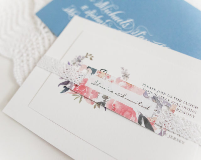
She was baptized in the same gown I wore when I was christened as a baby, so I wanted to pull inspiration from the delicate lace that trimmed the gown. I chose to use crochet ribbon to wrap the invitation and enclosure as a gentle nod to the gown, which threaded through the matching “You’re Invited” tags. The cards were printed on white cotton paper to add an additional layer of texture.

Floral Baptism Invitations by Honeybee Paper Co.

Floral Baptism Invitations by Honeybee Paper Co.

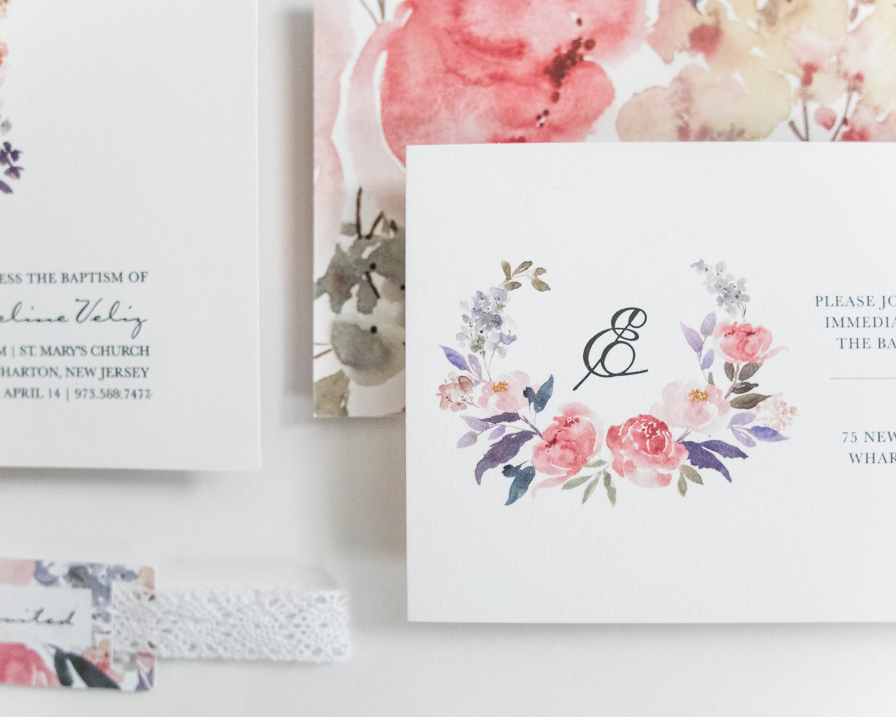
All the watercolor flowers were placed individually to create the shape of the cross, and I wanted to keep a lot of white space to let them shine. For the enclosure, we wanted to use her initial in the design, as my husband and I love her rarely heard name, Elora.

Floral Baptism Invitations by Honeybee Paper Co.

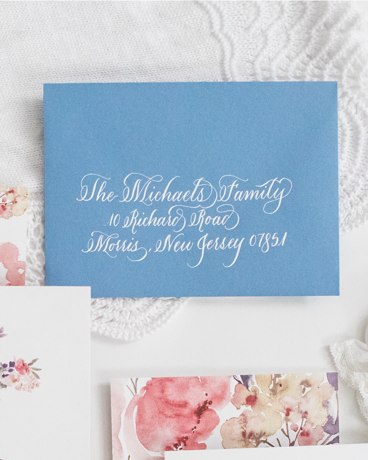
The backs of both the invitation and enclosure card featured the same florals enlarged, to create a nice contrast to all the white on the front. The light blue envelopes turned out to be a wonderful choice and were selected to complement the colors in the suite. The names and addresses of our friends and families were each calligraphed by myself in white ink.

Floral Baptism Invitations by Honeybee Paper Co.

This invitation was such a joy for me to design as it was meant to celebrate such an important little person. Each detail was delicately selected. I loved these watercolor botanicals so much I even had a custom cake topper ordered to match! These invitations set the tone for what turned out to be a wonderful day with friends and family to celebrate a truly wonderful little girl. 

Floral Baptism Invitations by Honeybee Paper Co.

Thanks Megan!

Design: Honeybee Paper Co. 
Printing: StationeryHQ

Photo Credits: Megan Veliz

Bright and Cheerful Floral Watercolor Wedding Invitations

With spring (hopefully) around the corner, we’re loving these bright and cheerful floral watercolor wedding invitations from J. Gregory of Grey Snail Press! This beautiful suite features illustrated florals inspired by the bride’s wedding flowers – including on the envelope liner! – and whimsical hand lettering. The pink and navy blue envelope colors are a fun added element and everything ties together in such a fun and festive way!
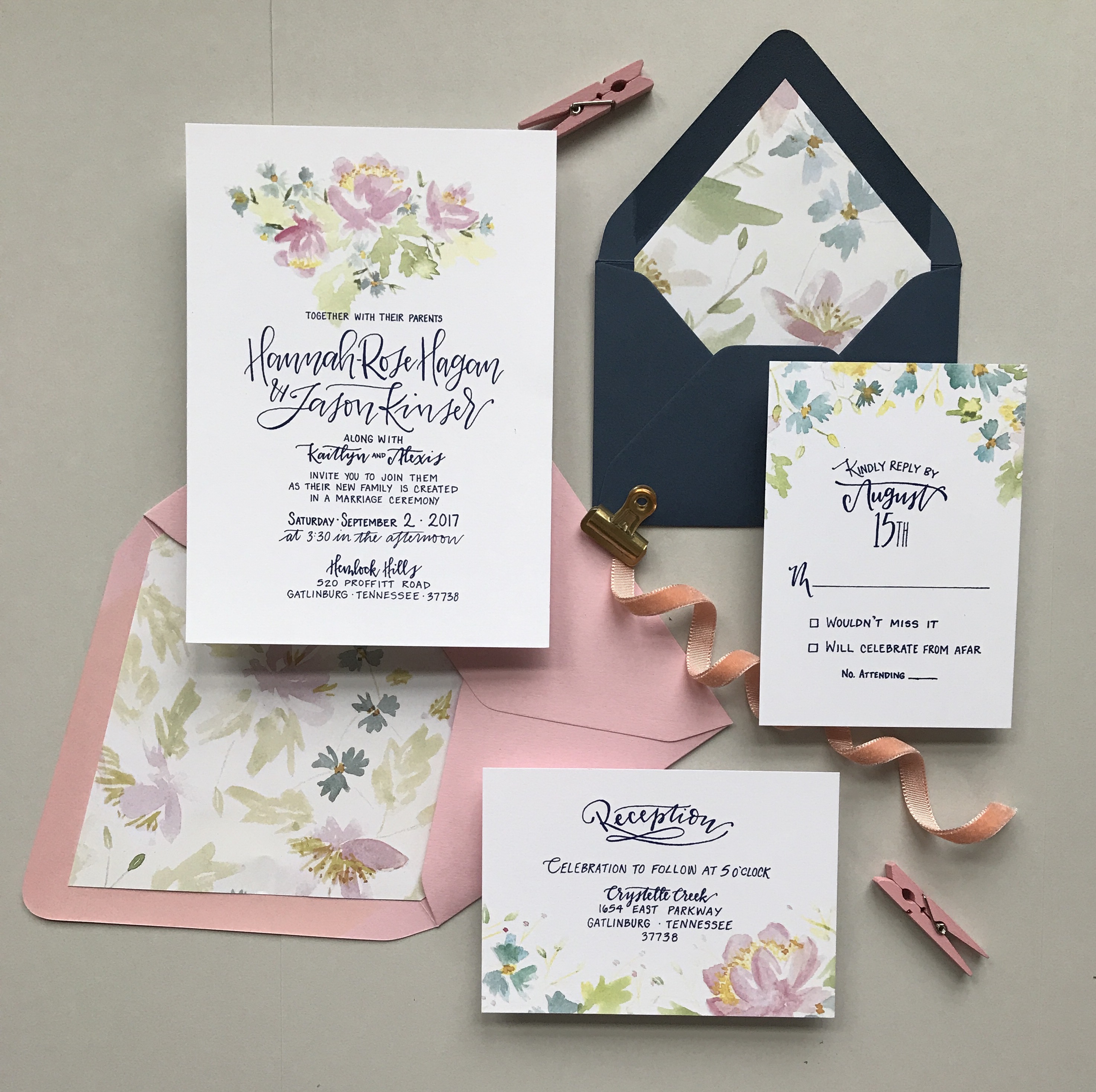
Bright and Cheerful Floral Watercolor Wedding Invitations by Grey Snail Press

From J Gregory: I’ve had the pleasure of knowing this sweet bride for several years, so I was thrilled when I was asked to create the wedding invitations for her wedding in the Smokey Mountains. Hannah is unfussy by nature and really down-to-earth. To say she was easy to work with is an understatement; she was completely open and flexible with the design, letting me take her ideas and run with them.
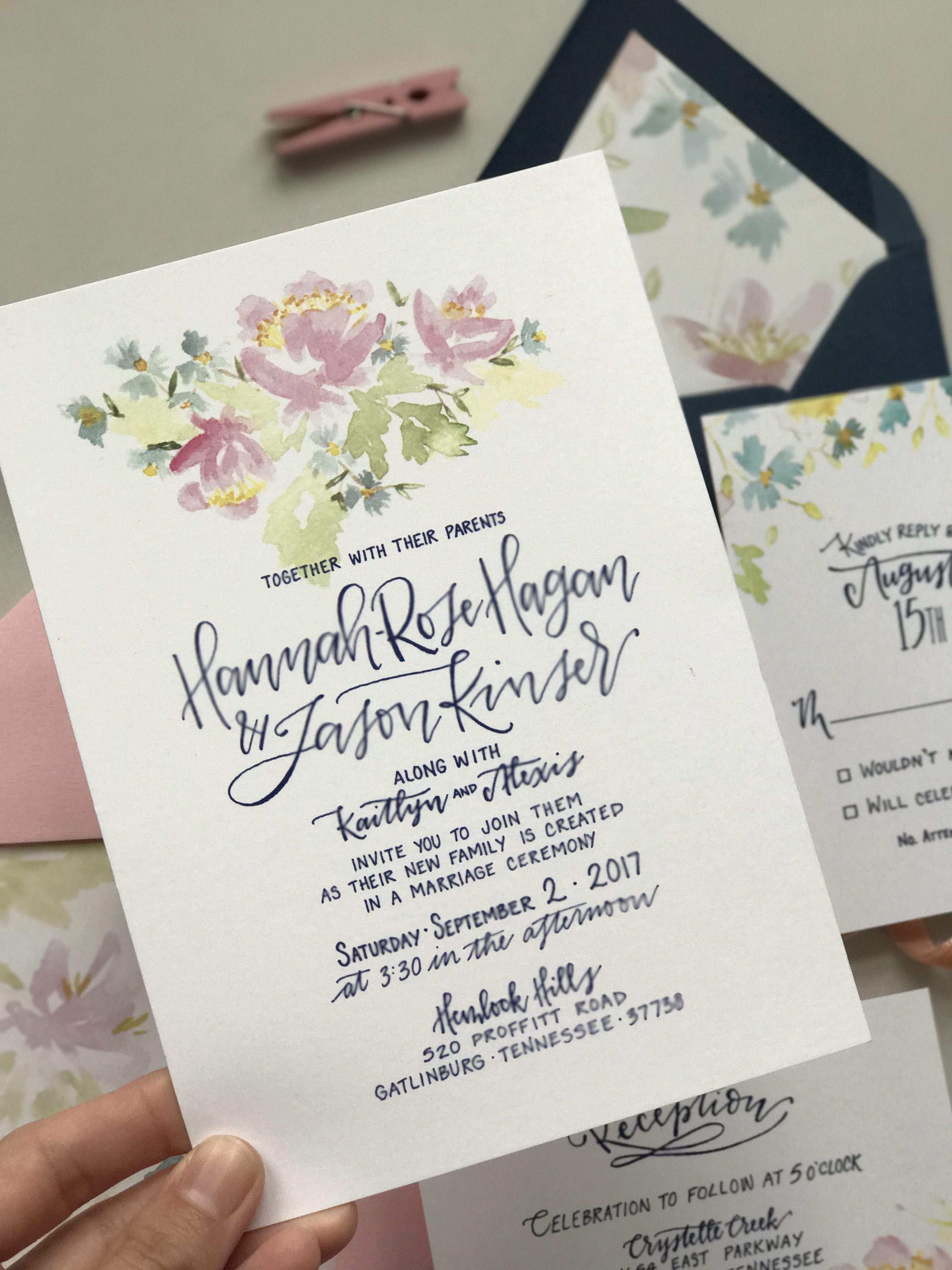
Bright and Cheerful Floral Watercolor Wedding Invitations by Grey Snail Press

She elected not to do a rustic or mountain-themed invitation suite, despite their mountain venue. Instead, she wanted something simple, that would include her wedding colors of navy and pink, with lovely, loose florals. I was immediately inspired to get out my watercolors (my new obsession) and start painting. I painted a variety of pink and blue flowers with greenery for the invitation itself, being careful to tie in the colors of her wedding palette. I chose different portions of the original floral design to carry over onto the other cards, focusing on smaller blue flowers for the rsvp card cascading off the top and sides of the card.
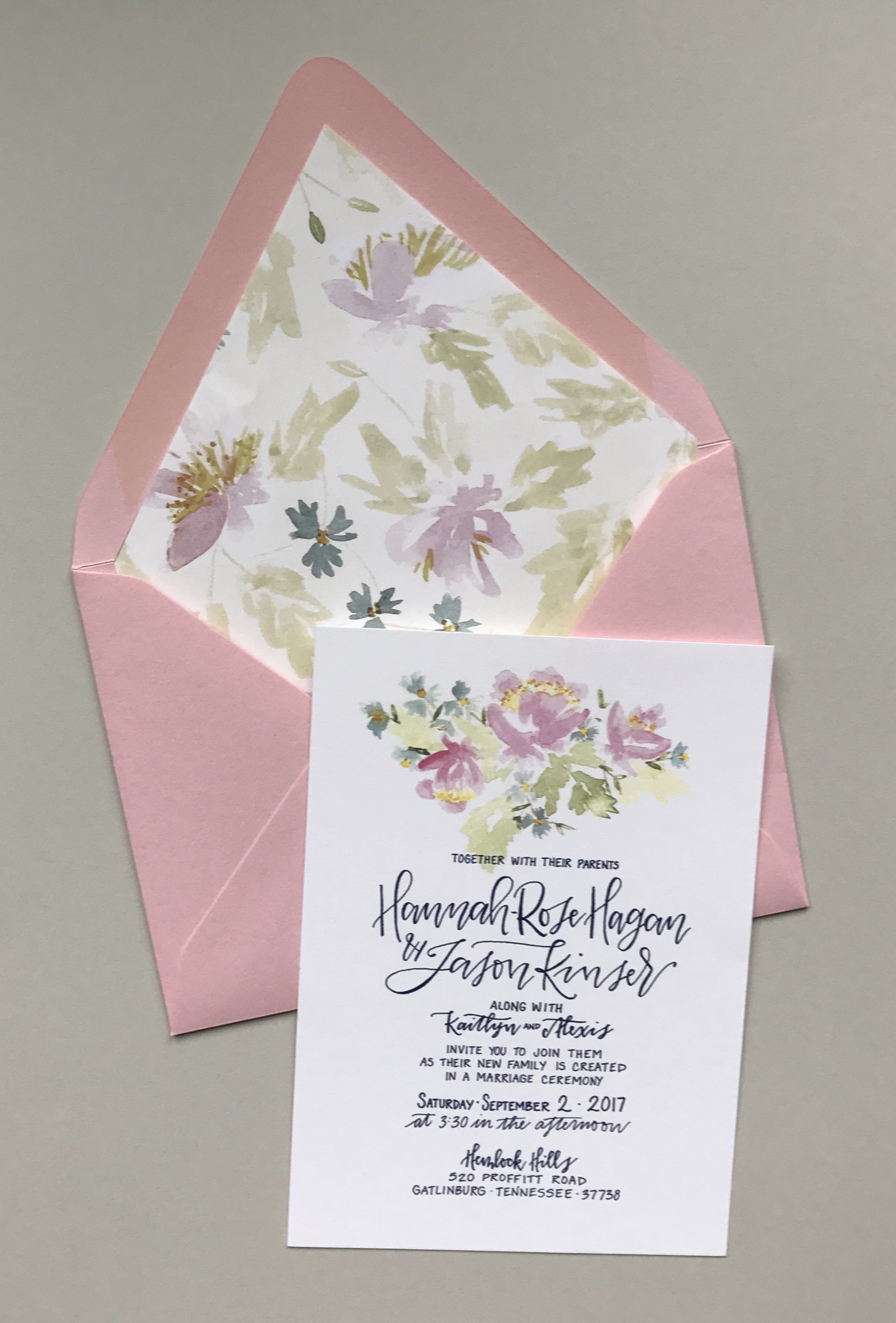
Bright and Cheerful Floral Watercolor Wedding Invitations by Grey Snail Press

All lettering was done by hand and kept very simple and clean with a mix of script and print. We chose to print all text in navy blue ink. Hannah even came up with her own creative wording for the invitation to make it special for them.
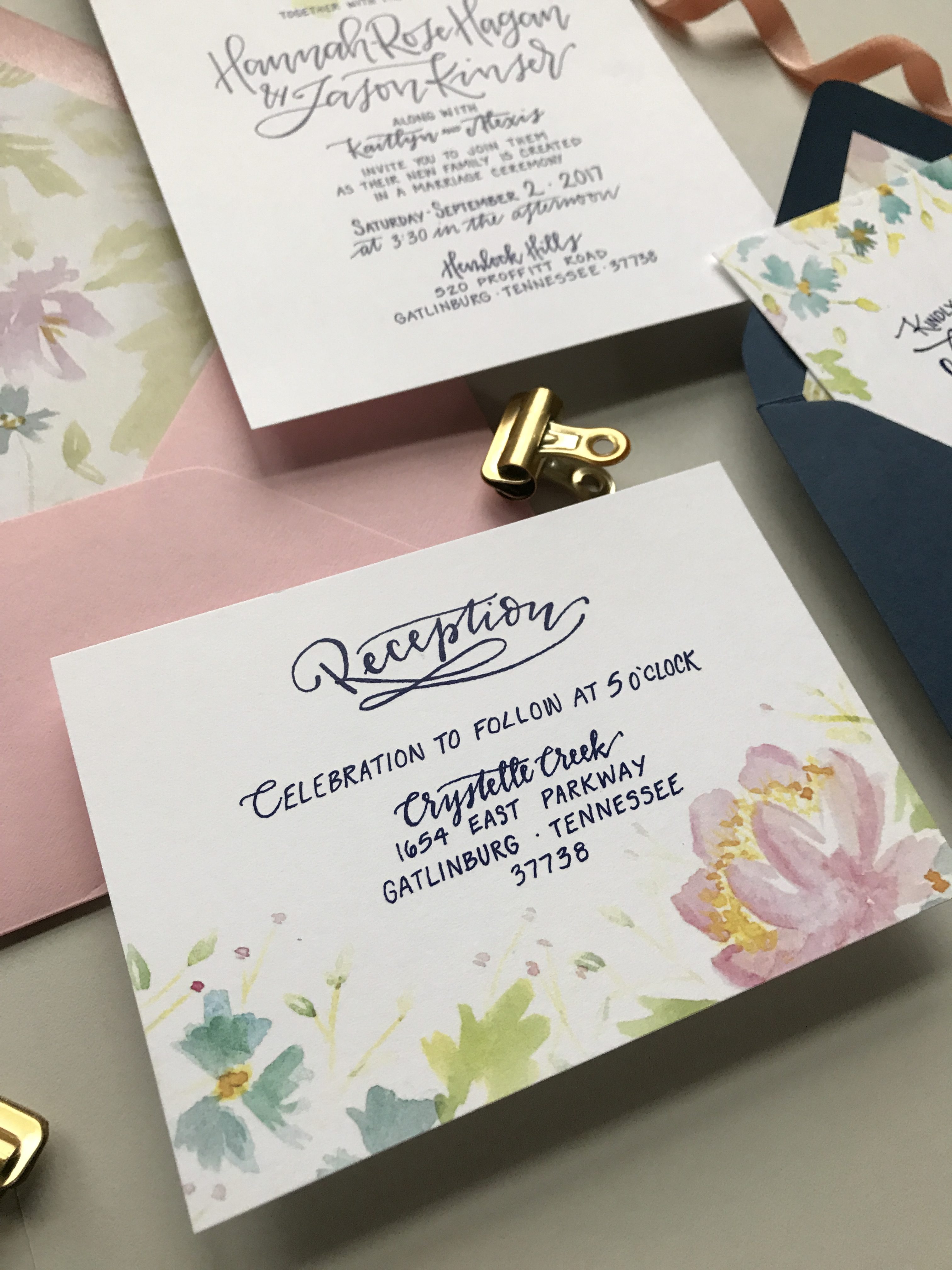
Bright and Cheerful Floral Watercolor Wedding Invitations by Grey Snail Press

Invitations and the corresponding rsvp and reception cards were all printed digitally on white 110lb. Classic Crest card stock, so they were nice and thick. The bright white provided the perfect background for the watercolor florals to really shine while keeping with the simplicity she desired.
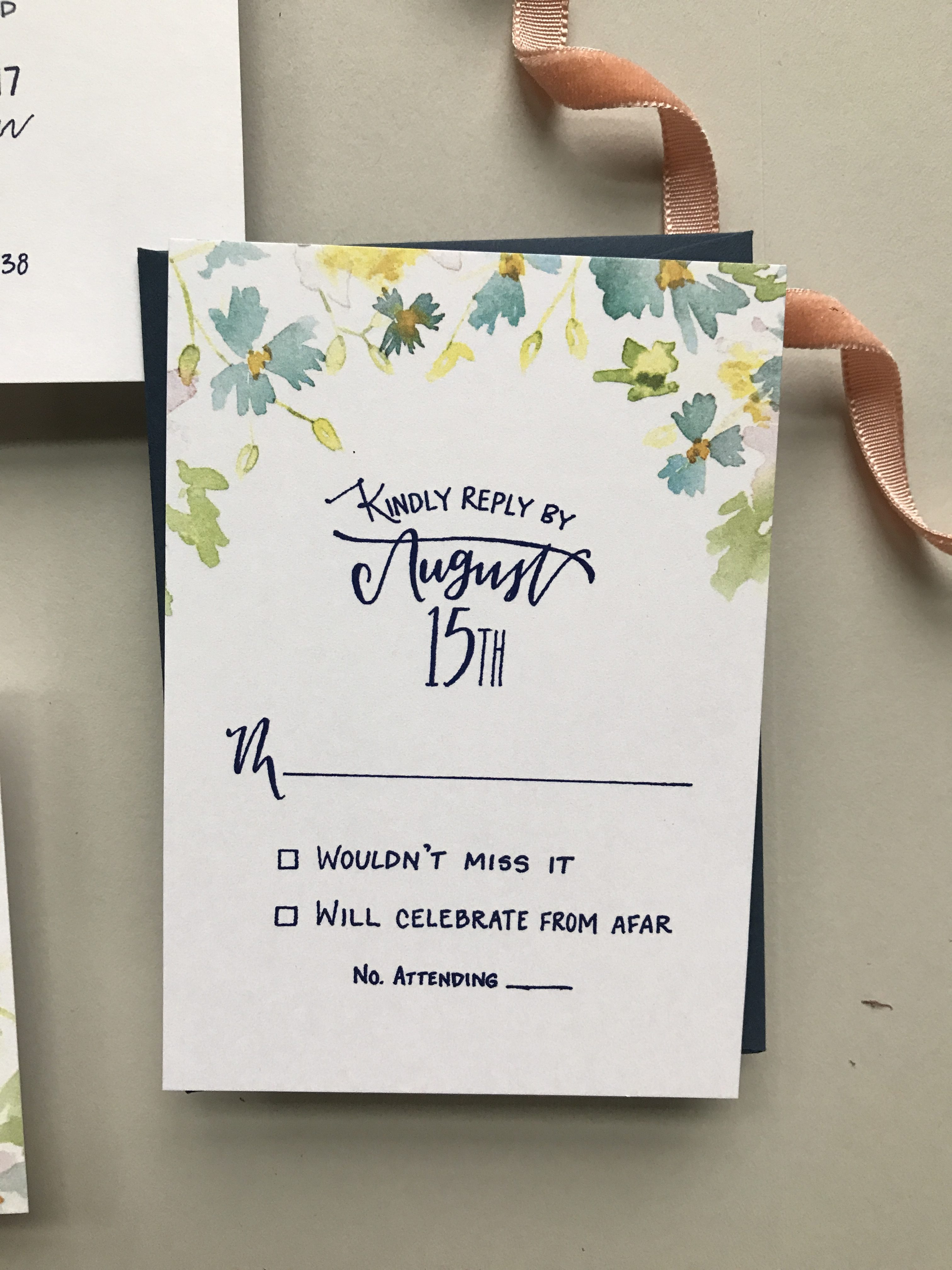
Bright and Cheerful Floral Watercolor Wedding Invitations by Grey Snail Press

With a little input from her mom and sister, the bride chose a cotton candy pink outer envelope for the invitation and navy envelope for the rsvp card. She elected to include a matching floral envelope liner for the invitation envelope. I was so pleased when I discovered that because of the shape of the envelopes, we could actually get an additional envelope liner for the smaller rsvp envelope out of the scrap paper left over from the larger liner. What a bonus not to have any waste!
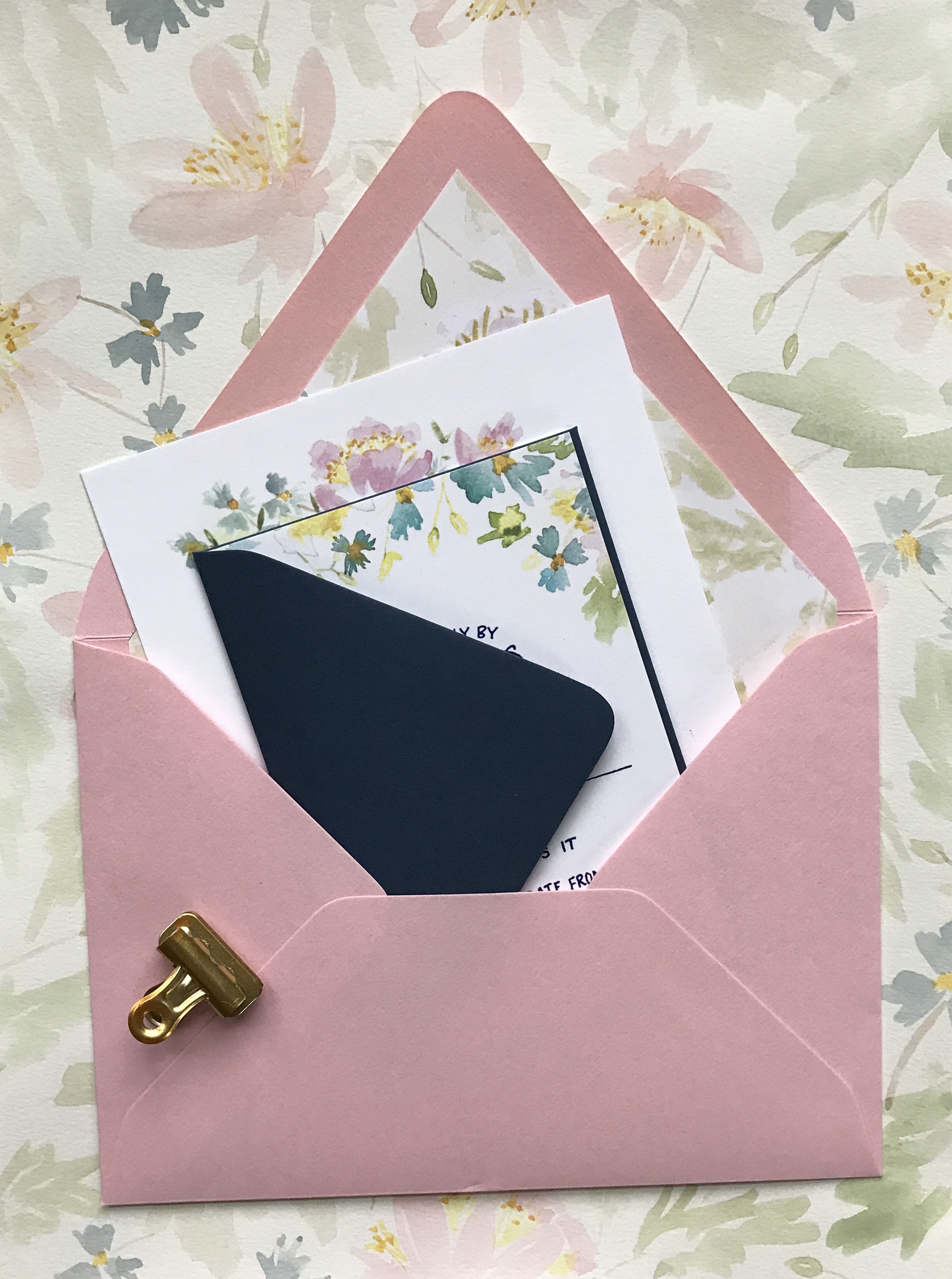
Bright and Cheerful Floral Watercolor Wedding Invitations by Grey Snail Press

Instead of having the rsvp envelopes calligraphed, we placed a rectangular return address label on the rsvp envelopes with some flowers peeking around the edges to complete the suite. This can be a fun way to save a little money in the budget. Plus, they’re super easy to assemble and completely customizable. It was truly a labor of love creating this suite for Hannah and Jason, and I really love how they turned out!
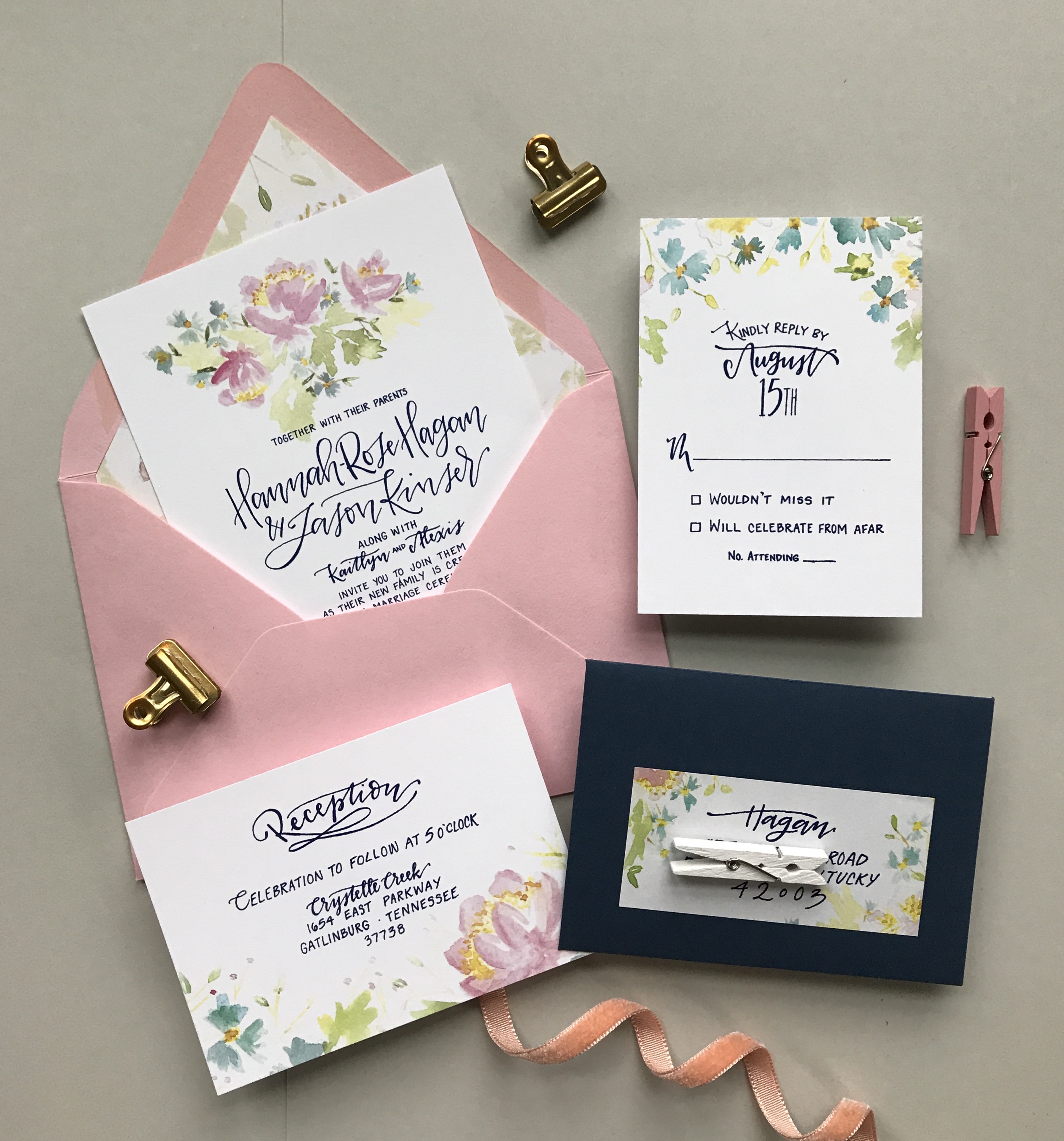
Bright and Cheerful Floral Watercolor Wedding Invitations by Grey Snail Press

Thanks J!

Design: Grey Snail Press
Printing: Zebra

Check out the Designer Rolodex for more tal­ented wed­ding invi­ta­tion design­ers and the real invi­ta­tions gallery for more wedding invitation ideas!

Photo Credits: Grey Snail Press
Quirky Camping-Inspired Watercolor Wedding Invitations

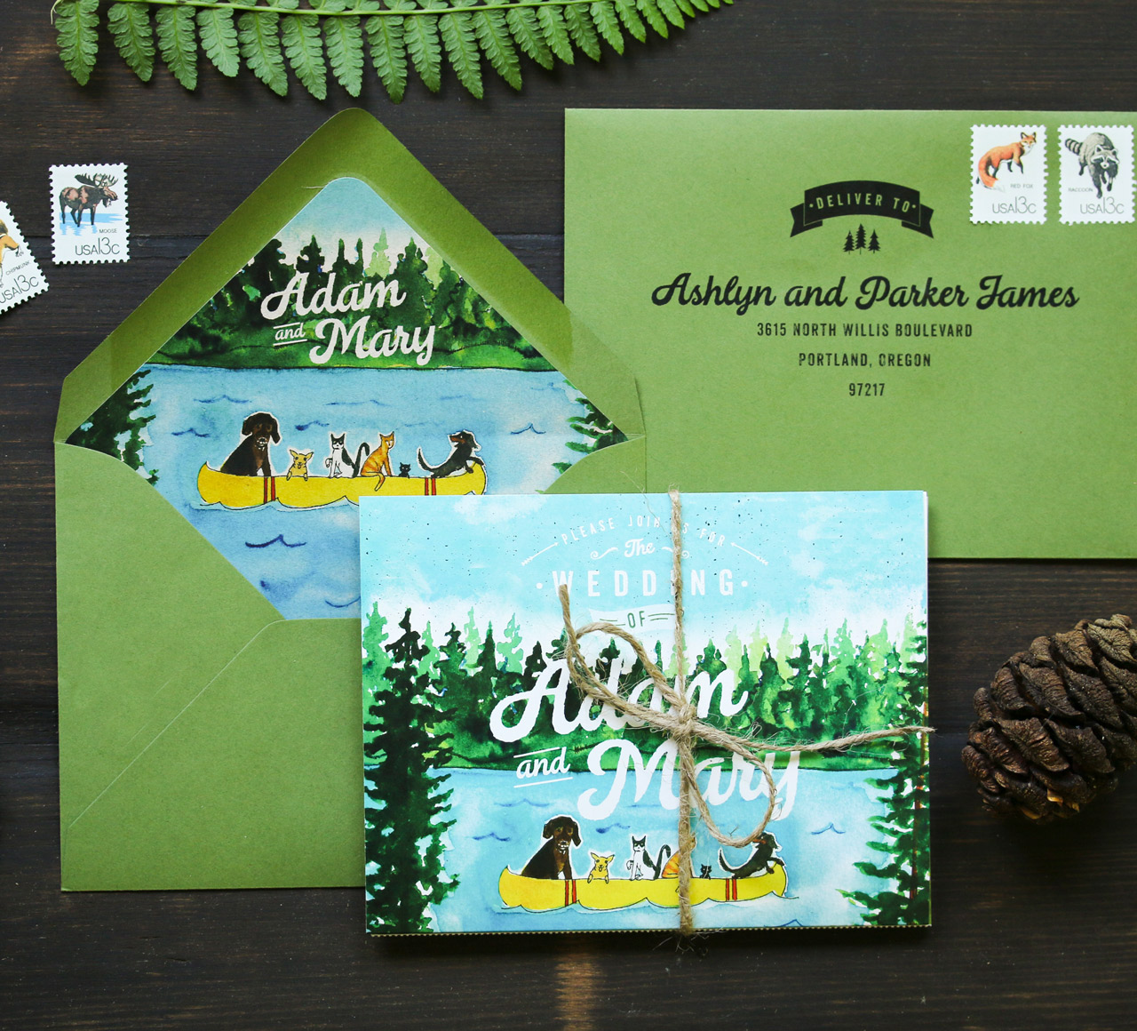
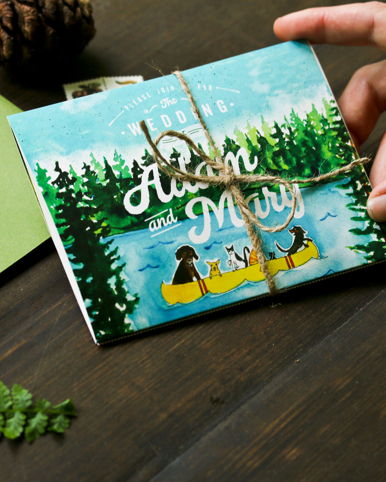
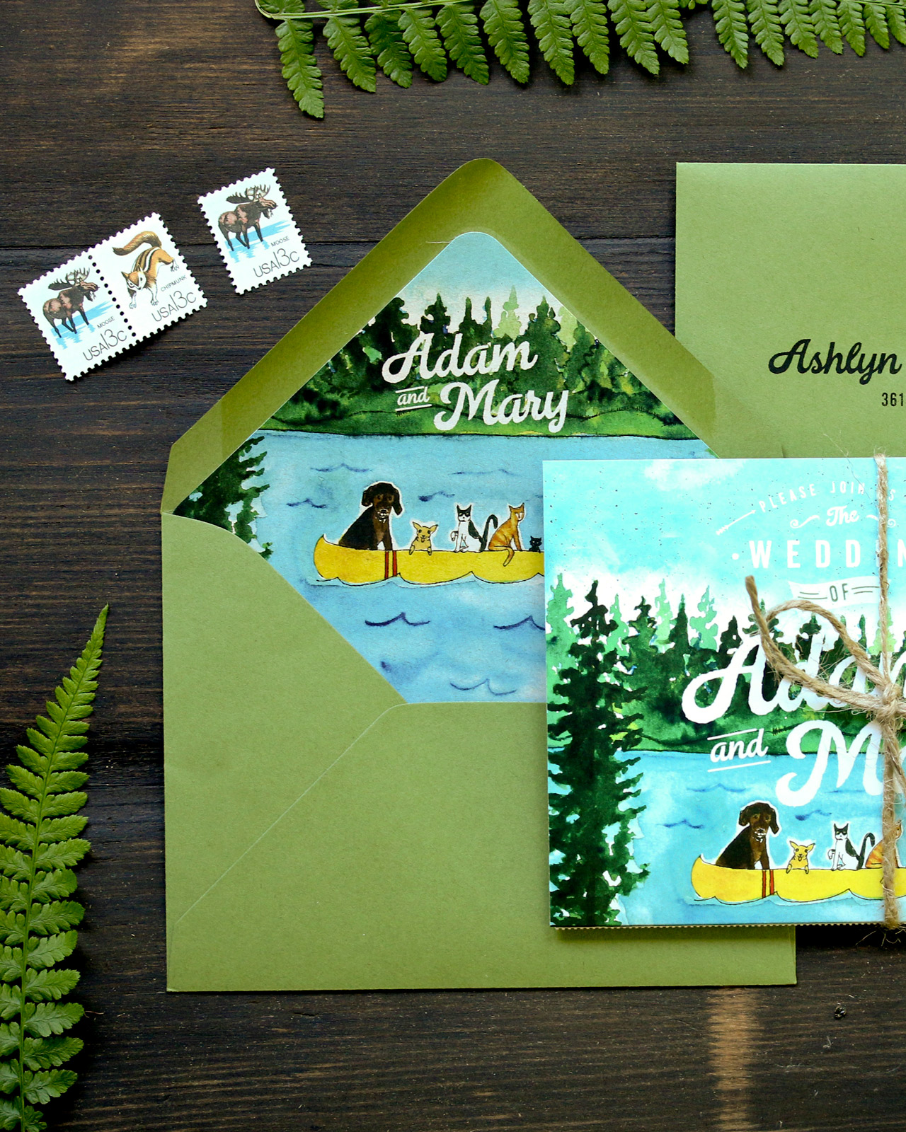
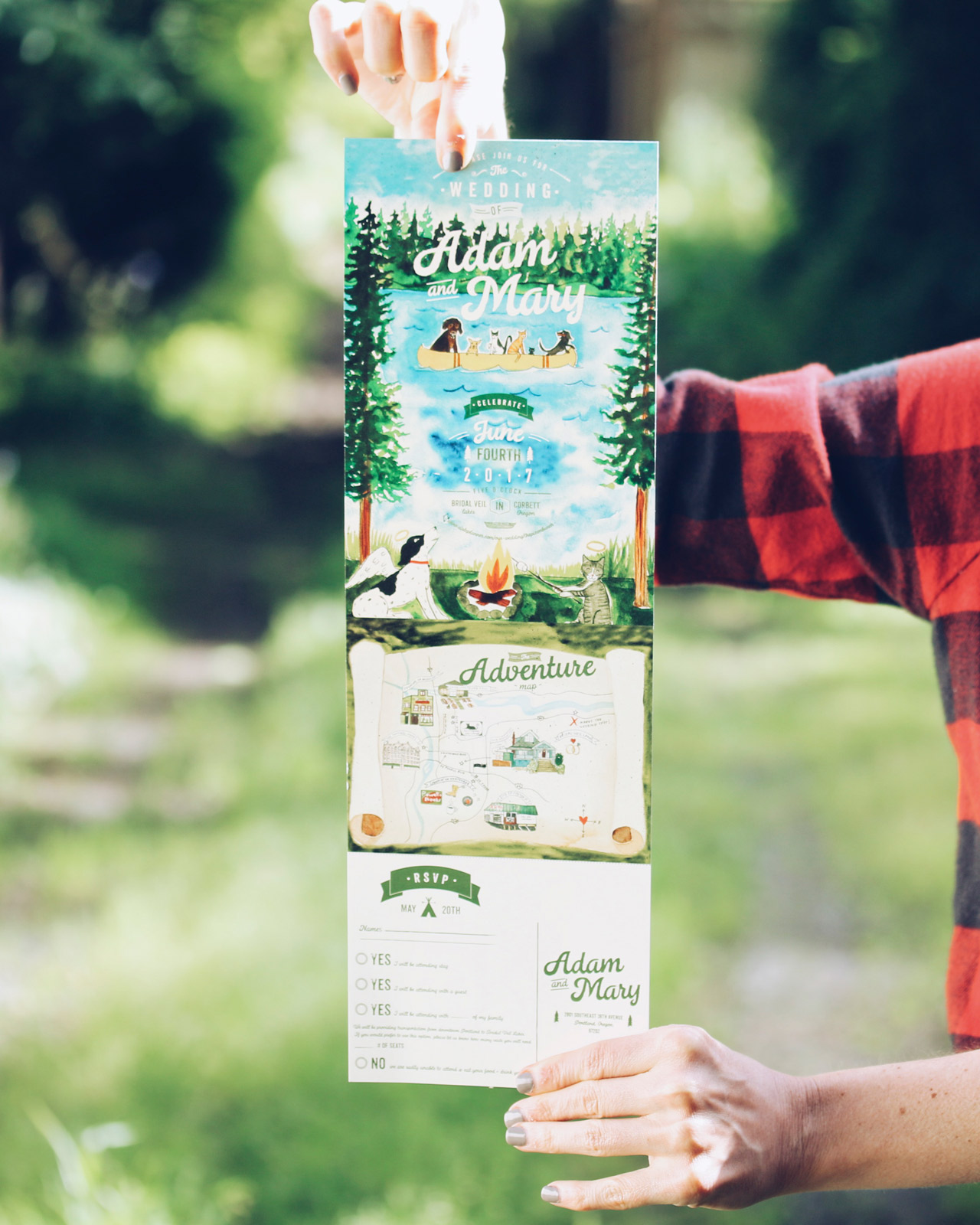
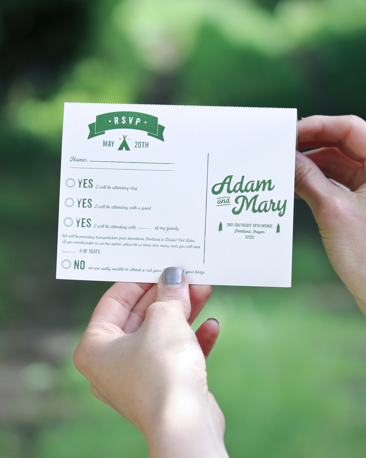
There’s nothing more quirky and adorable than a watercolor illustration of woodland creatures on a mountain lake canoeing adventure! Designer Rolodex member Amanda of Wide Eyes Paper Co. dreamt up these quirky camping-inspired watercolor wedding invitations for a woodsy wedding in the Pacific Northwest. The invitation features a folded 4-panel design, including a custom watercolor illustration with the bride and groom’s beloved pets (so sweet!), keepsake map, and perforated RSVP card!

Quirky Camping-Inspired Watercolor Wedding Invitations by Wide Eyes Paper Co.

From Amanda: In the lingering months of winter, it’s time to start enjoy your buffalo check flannel a few more times and enjoy all the hot cocoa as you start organizing the details of your upcoming wedding. Let the adventure begin! was the motto that this Portland outdoorsy couple chose to tell their story and we loved the idea of creating an invitation that guests would cherish even after the wedding.

Quirky Camping-Inspired Watercolor Wedding Invitations by Wide Eyes Paper Co.

Quirky Camping-Inspired Watercolor Wedding Invitations by Wide Eyes Paper Co.

Mary and Adam were adamant about sending something to their guests that would both stand out in the mail and truly capture the quirky essence of who they are as a couple. This four-paneled format allowed them to express their wedding adventure as a creative narrative, all while keeping everything organized on one piece of elegant paper. You may choose to see the whole, unfolded invitation as one canvas, or treat each panel as its own snapshot. Mary and Adam wanted to be sure to have a custom watercolor that walked their guests through the wedding details in a fun and whimsical way, with the custom watercolor of their pets in a canoe as the beginning panel and the second panel opening up to complete a more classic 5×7 invitation.

Quirky Camping-Inspired Watercolor Wedding Invitations by Wide Eyes Paper Co.

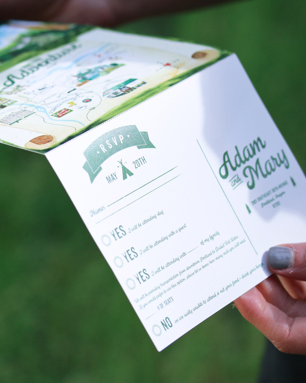
With four panels over two sides, the couple was able to customize up to eight different panels. The option to add vintage perforation allows for a portion to be torn off and mailed back without the hassle of keeping several different pieces of paper together (I know I am guilty of losing a rsvp card or two before they even make it to the mail).

Quirky Camping-Inspired Watercolor Wedding Invitations by Wide Eyes Paper Co.

Quirky Camping-Inspired Watercolor Wedding Invitations by Wide Eyes Paper Co.

One of the panels is a custom watercolor map created to highlight the important spots of the wedding day while keeping the adventure fun and fresh just like a treasure hunt or trail guide. The map will become a memorable keepsake for their guests as they help the happy couple write their love story on their special day.

Quirky Camping-Inspired Watercolor Wedding Invitations by Wide Eyes Paper Co.

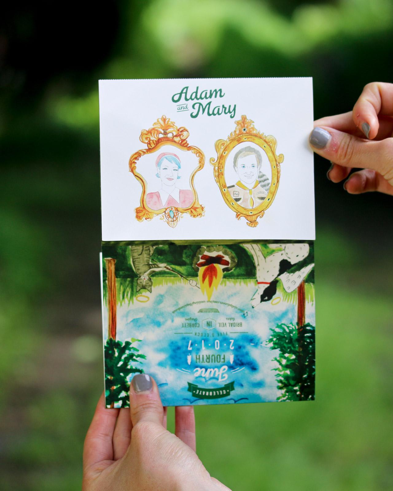
Inspired by Wes Anderson’s Moonlight Kingdom we hand-painted the couple with portraits in a quirky camp inspired motif.  Adam even had his own Davy Crockett hat! We finished off this set by creating a custom logo for Mary + Adam which is printed on the rustic brown kraft envelopes and custom watercolor envelope liners.

Quirky Camping-Inspired Watercolor Wedding Invitations by Wide Eyes Paper Co.

Thanks Amanda!

Design: Wide Eyes Paper Co.
Printing: Paper Jam Press

Wide Eyes Paper Co. is a member of the Designer Rolodex – you can see more of their beautiful work right here or visit the real invi­ta­tions gallery for more wedding invitation ideas!

Photo Credits: Amanda Franz