Eclectic Jewel Tone Geometric Wedding Invitations

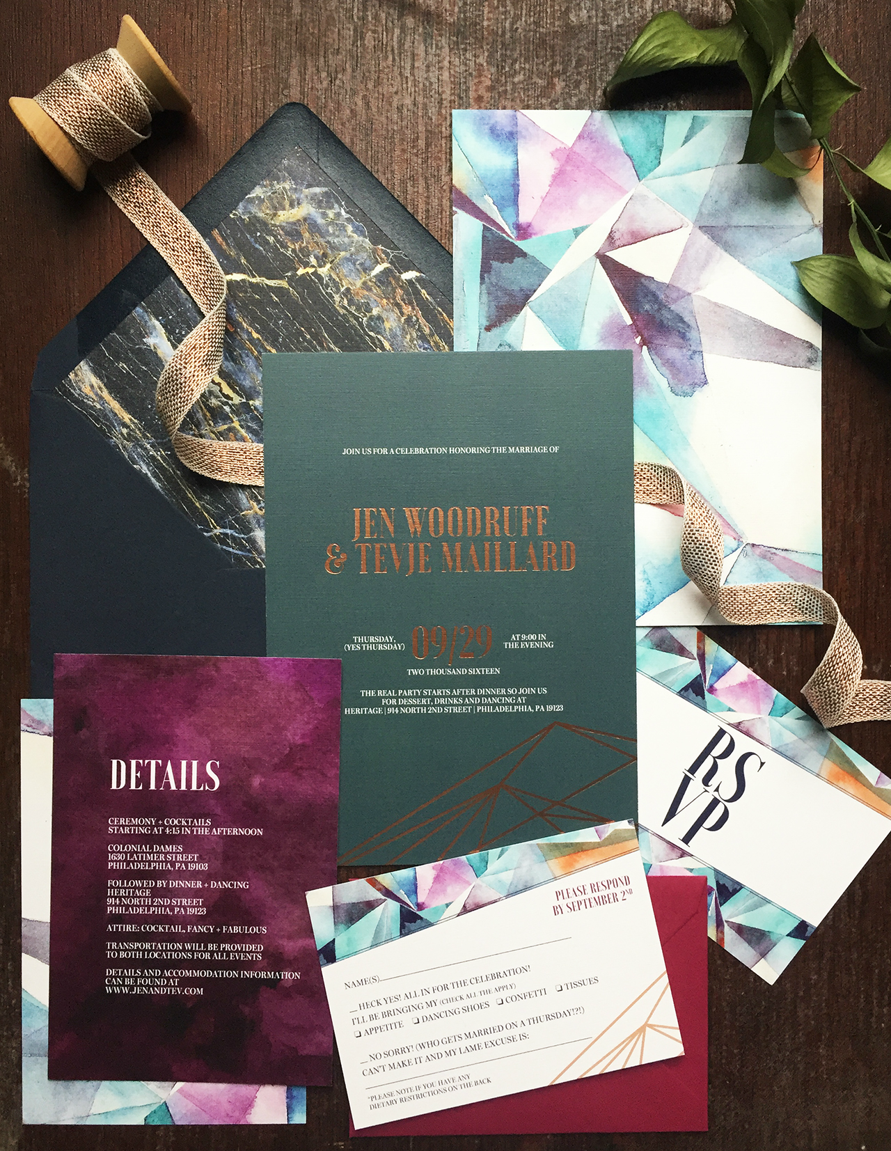
Christy from Papertree Studio worked with photographer Jen Woodruff to create these eclectic jewel tone geometric wedding invitations with copper foil printing for Jen’s offbeat mid-week (so fun!) wedding. Christie incorporated geometric lines, multiple patterns, pops of copper, and a super cool marbled envelope liner to match Jen’s unique and modern aesthetic. I’m loving all the details in this suite!

Eclectic Jewel Tone Geometric Wedding Invitations by Papertree Studio

From Christy: This past fall I was approached by a talented photographer in the industry, Jen Woodruff, to meet and discuss the vision she had for her offbeat Thursday wedding. Jen wasn’t finding anything she liked online so she decided custom was the way to go. After chatting with Jen, I had my fingers crossed that I would get to design her wedding invitations!

Eclectic Jewel Tone Geometric Wedding Invitations by Papertree Studio

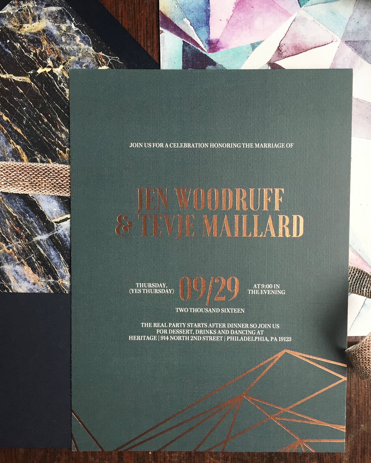
Jen wanted to use rich jewel tones paired with a metallic color and wanted to incorporate different patterns throughout her invitation suite.  Jen really wanted her invitations to be unique and fun, but also high end. I couldn’t wait to get started! I began the design process with the invitation. I pulled in a very simple geometric line art drawing and decided on a rich green background with copper foil accents.

Eclectic Jewel Tone Geometric Wedding Invitations by Papertree Studio

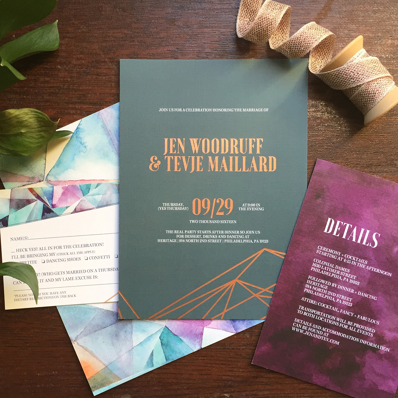
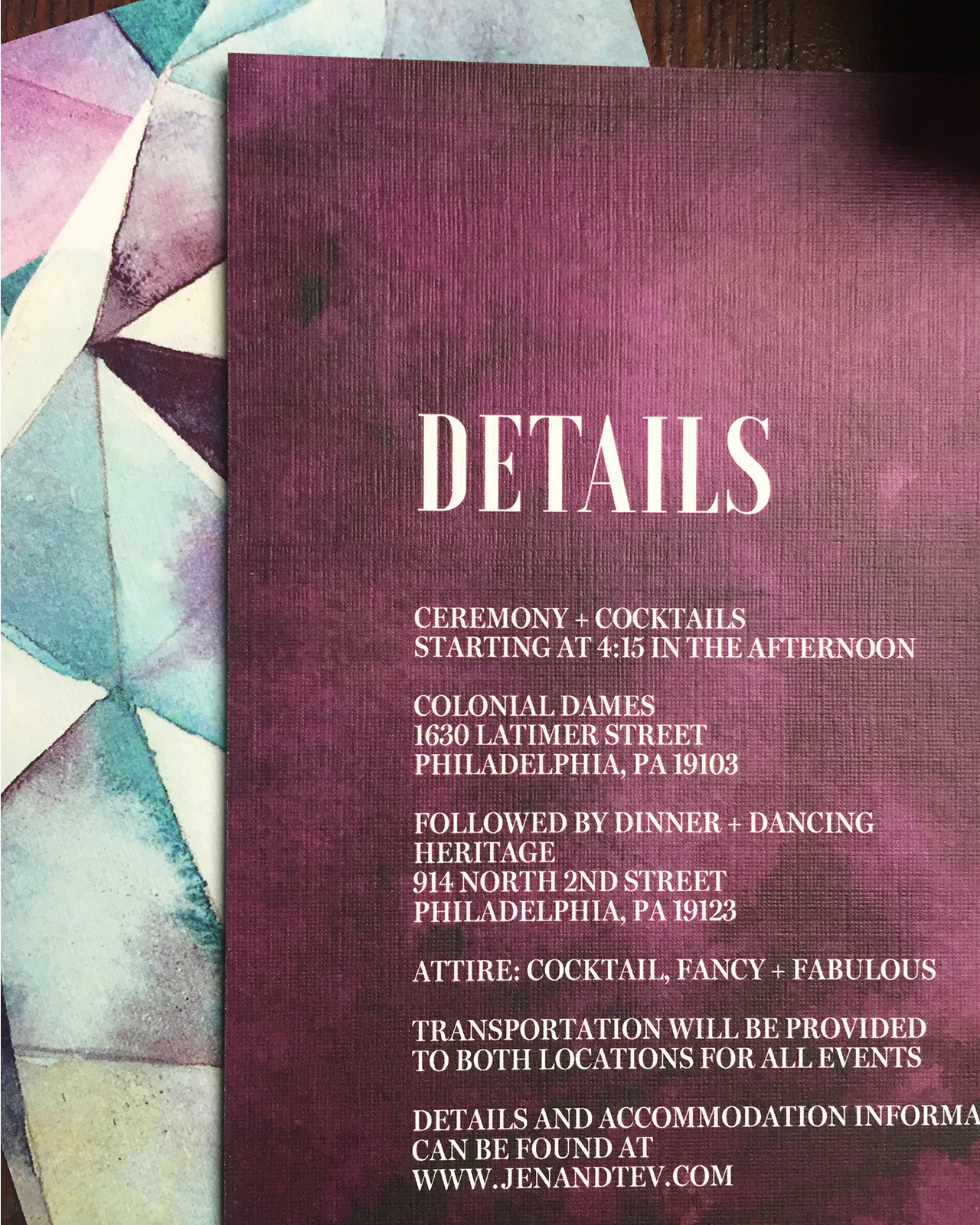
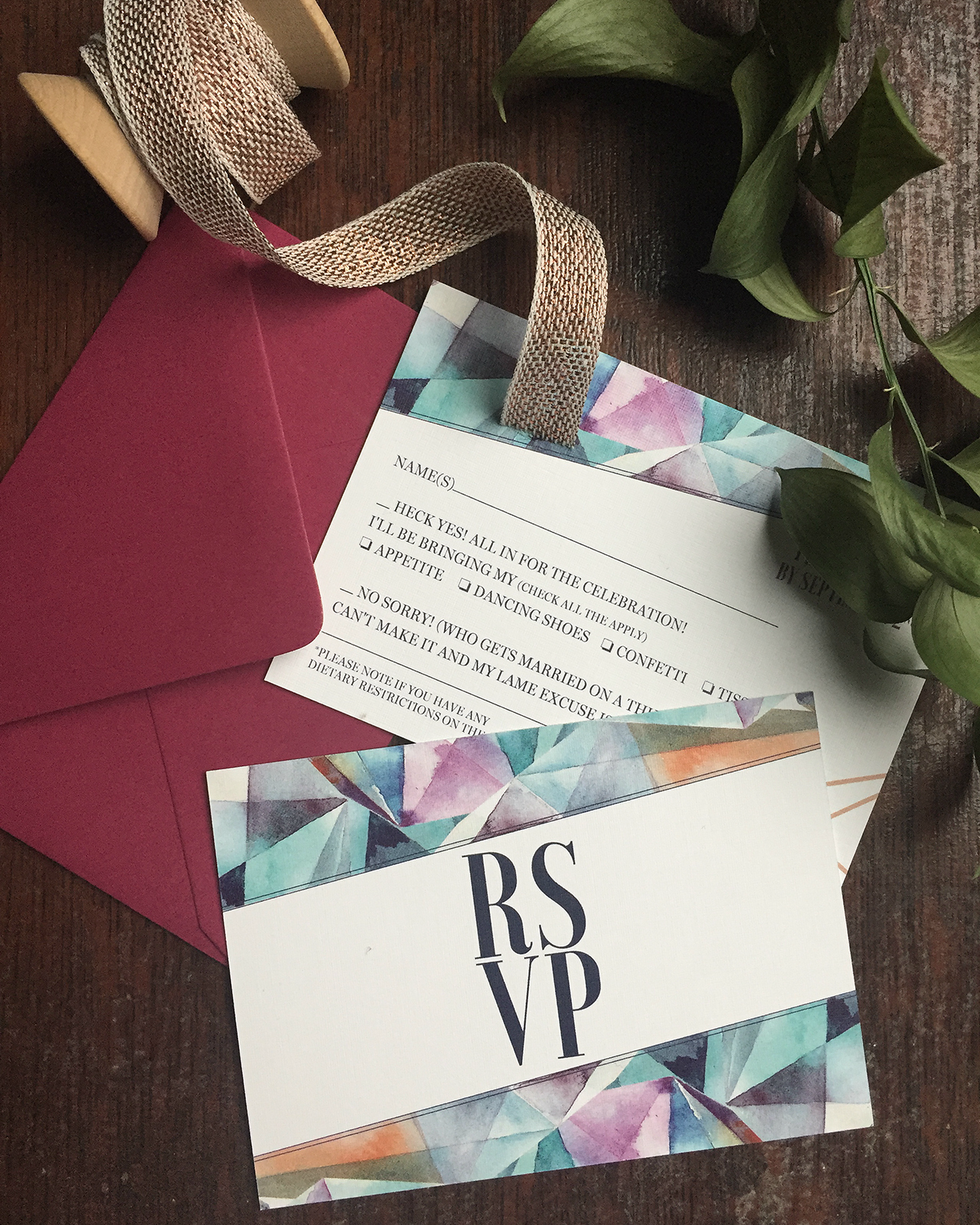
To add an element of surprise, we put a beautiful and colorful pattern on the back to pull in more colors that were in our palette. Also pulling details from that pattern, I designed the response card and details enclosure card. Both of the pieces also had the geometric pattern on the back.

Eclectic Jewel Tone Geometric Wedding Invitations by Papertree Studio

Eclectic Jewel Tone Geometric Wedding Invitations by Papertree Studio

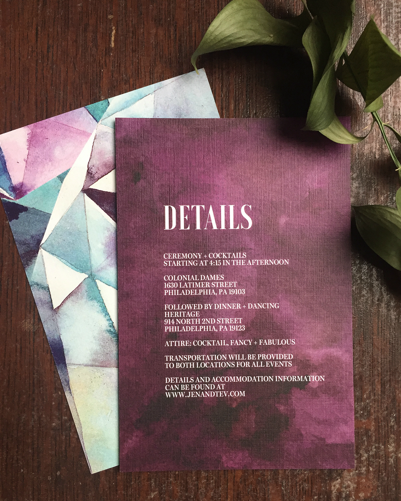
The invitations were printed on a heavy 130lb white linen paper. I thought a rich navy outer envelope with a cool marble patterned envelope liner would add to the eclectic mix and decided to bring in that pink jewel tone again with the response envelope. I used a copper loose weave cotton ribbon from Studio Carta to complement the copper foil in the invitation.

Eclectic Jewel Tone Geometric Wedding Invitations by Papertree Studio

Thanks Christy!

Design: Papertree Studio

Paper: Neenah

Envelopes: Soho Paper

Printer: The Chambers Group, Malvern

Ribbon: Studio Carta

Check out the Designer Rolodex for more tal­ented wed­ding invi­ta­tion design­ers and the real invi­ta­tions gallery for more wedding invitation ideas!

Photo Credits: Christy Howton

Romantic Gold Foil Calligraphy Wedding Invitations

We may be heading into winter, but Spring will always be my favorite season in my heart. I adore the combination of spring floral illustrations and  whimsical calligraphy in these romantic gold foil calligraphy wedding invitations by Kara Anne Paper. Kara designed this invitation suite for her own wedding and incorporated many meaningful nods to her family, including her new family crest and an illustration of her father’s home. What a special invitation suite that will certainly be treasured for a long time to come!

Romantic Gold Foil Calligraphy Wedding Invitations by Kara Anne Paper

Romantic Gold Foil Calligraphy Wedding Invitations by Kara Anne Paper

From Kara: Designing my own wedding invitation suite came easy! After finalizing our wedding style and color scheme, the late night invitation doodles began. Staying cohesive with all the paper details was important to me.

Romantic Gold Foil Calligraphy Wedding Invitations by Kara Anne Paper

Romantic Gold Foil Calligraphy Wedding Invitations by Kara Anne Paper

William and I wanted a chic backyard wedding filled with beautiful spring colors and a touch of gold accents. I felt introducing an original watercolor invitation cover was just the perfect touch for our gold foil calligraphy invitation. The invitation was printed on 220# Crane’s Pearl White Lettra with gold painted edges. We also included a tri-fold reply card with our new family crest on the front and an illustration of the ceremony location and reception venue. This design was letterpress printed on 110# Pearl White Lettra. Our special wedding suite was all tied together beautifully with silk blue ribbon and placed inside a Crane’s Royalty envelope. The front of the envelope was graced with gold calligraphy to match the invitation.

Romantic Gold Foil Calligraphy Wedding Invitations by Kara Anne Paper

Romantic Gold Foil Calligraphy Wedding Invitations by Kara Anne Paper

The wedding program was one of my favorites! The small booklet included a cover page with a pop-up illustration of my father’s house, where I was raised and where William and I first met. To tie the program back in with the wedding suite the cover was a blind embossed printed impression of the same floral pattern used on the invitation cover. Behind the pop-up, on the inside page was the illustration of the pond and dock where William and I exchanged vows. The pages that followed included the ceremony and wedding party details.

Romantic Gold Foil Calligraphy Wedding Invitations by Kara Anne Paper

Romantic Gold Foil Calligraphy Wedding Invitations by Kara Anne Paper

Although our rehearsal dinner was indoors we wanted it to have a fresh spring, outdoor feel. We had fresh flowers that matched the watercolor paintings used on both invitations. The invitation was placed inside a wood and glass box with preserved green moss laid nicely on the bottom. The top of the box included the guest names with a pretty blue silk ribbon tied around it. Our closest friends and family were invited so we wanted these invitations to be extra special and personalized.

Romantic Gold Foil Calligraphy Wedding Invitations by Kara Anne Paper

Romantic Gold Foil Calligraphy Wedding Invitations by Kara Anne Paper

Thanks Kara!

Design: Kara Anne Paper

Check out the Designer Rolodex for more tal­ented wed­ding invi­ta­tion design­ers and the real invi­ta­tions gallery for more wedding invitation ideas!

Photo Credits: Kara Anne Paper and Kim Box Photography

Classic Gray and French Blue Letterpress Wedding Invitations

Romantic elegance will never go out of style! These classic gray and french blue letterpress wedding invitations from Lauren of Darling + Pearl feature a custom crest illustration, an illustrated map of the wedding venue, and elegant type selections – all letterpress printed on cool gray and white paper with hand torn edges. We’re loving the combination of classic serif type with an elegant script that conveys the look of modern, organic calligraphy. What a lovely, and classic, invitation suite!

Classic Gray and French Blue Letterpress Wedding Invitations by Darling and Pearl

From Lauren: I find that clients with a clear, cohesive vision are just as much fun to work for as the clients that really want to put the creative power directly in my hands. Both creative “scenes” are the birthplace for beautiful design that really, in the end, reflect each couple and stationery that fits their history as well as their event.

Classic Gray and French Blue Letterpress Wedding Invitations by Darling and Pearl

Kara first contacted me with a very clear vision for her wedding invitations. Kara and her fiancé, Andrew, were planning their October 2016 wedding at Fernbrook Inn and Farms in central New Jersey. Fernbrook is a stunning farmhouse style wedding and event venue and we really wanted to encompass an organic and classy experience within their wedding stationery. The venue is a gorgeous 1750s Georgian Manor House in the middle of a 250 acre active farm with tented reception area.

Classic Gray and French Blue Letterpress Wedding Invitations by Darling and Pearl

The list of Kara’s must haves in regards to their invitations included: mature modern style script, torn edges, and the cherry on top was an illustrated map of the grounds complete with parking areas, outlines of several ceremony options, the reception area, and T-Bone, the farm mascot.

Classic Gray and French Blue Letterpress Wedding Invitations by Darling and Pearl

The weather vane crest was taken in part from the groom’s own artwork. We added a more detailed and textured rooster and they both couldn’t have been more blown away with the final result. Not to mention, I really enjoy that little guy looking towards the future, how fitting for a union of two amazing people!

Classic Gray and French Blue Letterpress Wedding Invitations by Darling and Pearl

Classic Gray and French Blue Letterpress Wedding Invitations by Darling and Pearl

The entire wedding invitation suite was letterpress printed with french blue ink on a combination of cool grey and natural white 100% cotton stock. And naturally, ALL the edges were hand torn. These were an absolute pleasure to design, have on press and see through for the final result. Congrats Mr. and Mrs. Robinson!

Thanks Lauren!

Design: Darling + Pearl

Map Illustration: Erin Niehenke

Darling + Pearl is a member of the Designer Rolodex – you can see more of their beautiful work right here or visit the real invi­ta­tions gallery for more wedding invitation ideas!

Photo Credits: Lauren Reed of Darling and Pearl

Happy Weekend!

Well, I meant to write my usual weekly round up last Friday, but we decided to take advantage of the Veterans Day weekend and escape DC for a few days at my dad’s house in New Jersey (boy, did we need it!). But honestly, despite my intentions I’m not sure I actually could have written my usual post last week. I try to keep a positive tone here, and I think I needed more time to wrap my head around everything that has happened in our country in the last couple of weeks. I rarely discuss political issues here, but I couldn’t move forward without acknowledging that this has been a very difficult time for many of us, myself included. I posted this on Instagram the day after the election, when I felt the need to be quiet, to listen and process. Two weeks later, I’m still feeling pretty unsettled, and I want to send a giant virtual hug to everyone out there who might be feeling the same way. But life moves forward and this too shall pass, and in the meantime I’ll do my best to bring a smile to your face by sharing beautiful stationery that helps celebrate life’s special occasions and encourages us to connect with each other in a meaningful way.

Anne Robin Calligraphy / Throw Kindness Around Like Confetti

Image (and print) by Anne Robin Calligraphy via Instagram

A few links for your weekend:

Recently on Oh So Beautiful Paper:

That’s it for us this week! I’ll see you back here next week! xoxo

Modern Tropical Destination Wedding Invitations

After the turbulence of the last couple of weeks, I think we could all use a quick mental vacation to the Caribbean – don’t you agree? Well, Nichole of Coral Pheasant is coming to our rescue with these modern tropical destination wedding invitations for a wedding in Barbados! The invitation suite features a color palette inspired by the island, with lush greens, pops of coral, and vibrant citrus tones, along with some gorgeous spot calligraphy and the most perfectly curated postage stamps. I’m also loving the fun and playful language in the RSVP and rehearsal dinner invitation!

Modern Tropical Destination Wedding Invitations by Coral Pheasant

From Nichole: Jessica and Matt came to me by way of the fabulous Jubilee Events, who created the vision for their destination wedding in Barbados. Out of the gate I knew Jessica was my kind of gal when she expressed that it was important for their invitations to celebrate the sacrament of marriage while also being fun and surprising. Yes gurl, yes! Let’s do this! The tropical celebration they were planning embraced the natural surroundings of Barbados and more specifically their reception venue, Cobblers Cove, whose tag line reads “English elegance with Caribbean character.”

Modern Tropical Destination Wedding Invitations by Coral Pheasant

For their invitation suite we incorporated bright, vibrant colors inspired by the island: the lush green gardens, the coral colored plantation and cheerful pops of citrus. Gorgeous calligraphy by Everly Calligraphy was paired with modern fonts and fun language. The main invitation was letterpress printed on double thick eggshell stock and the enclosure cards were flat printed on matching, lighter weight cover stock.

Modern Tropical Destination Wedding Invitations by Coral Pheasant

Modern Tropical Destination Wedding Invitations by Coral Pheasant

With their wedding being a multi-day destination event, it was important to share all the details with their guests in a cute and concise way. To do that, we created a tri-fold itinerary with custom illustrations by Social Alchemy highlighting the what, when and where. Contrasting patterns inspired by the tropical English aesthetic of Cobblers Cover were layered into the design as seen in the watercolor leaves on the itinerary and the lattice-like design on the envelope liner.

Modern Tropical Destination Wedding Invitations by Coral Pheasant

Tropical themed vintage stamps and a lemon yellow silk ribbon added texture and color to the suite. Bringing the paper story full circle, we used the custom illustrations from the itinerary on cheerful colored cocktail napkins for the various weekend events.

Modern Tropical Destination Wedding Invitations by Coral Pheasant

Modern Tropical Destination Wedding Invitations by Coral Pheasant

Thanks Nichole!

Invitations and Styling: Coral Pheasant
Calligraphy: Everly Calligraphy
Building Illustrations: Social Alchemy

Coral Pheasant is a member of the Designer Rolodex – you can see more of Nichole’s beautiful work right here or visit the real wedding invitations gallery for more invitation inspiration!

Photo Credits: Charlotte Jenks Lewis