Stationery A-Z: Father’s Day, Part 2

If you missed our initial round-up of father’s day greeting cards last week, not to worry! We’ve got a brand new selection to round out our top picks. From cheeky illustrations to new-fangled printing techniques, we’ve got a whole bunch of fun choices to ensure that your top pop (or stepdad or grandfather for that matter) knows he’s your number one. Peruse our curated Father’s Day card round up below and let us know how you’ll be celebrating your dad on June 18th! â€“ ShaunaFather's Day Card Round Up!

From top right:

1. There was a number of really great outer space themed Father’s Day cards in the ether, but this Lucky Horse Press design included smiling popcorn as well as a talking UFO. Win!

2. For a variation on the aforementioned outer space theme, check out this star-filled take from Heartswell Co.

3. Last and final out of this world themed Fathers Day greeting card is this sweet message (with Andy Warhol lookalike dad) from Quill & Fox by Yas Imamura.

4. Up your dad joke game with this hand-lettered design from Hennel Paper Co. Extra points if you sent the same sentiment to your mom.

5. Reward your dad for his hard work raising you with this cringeworthy yet hilarious message from McBittersons.

6. I know I promised no beer-themed cards, but I really liked this retro-inspired design from Anemone Letterpress.

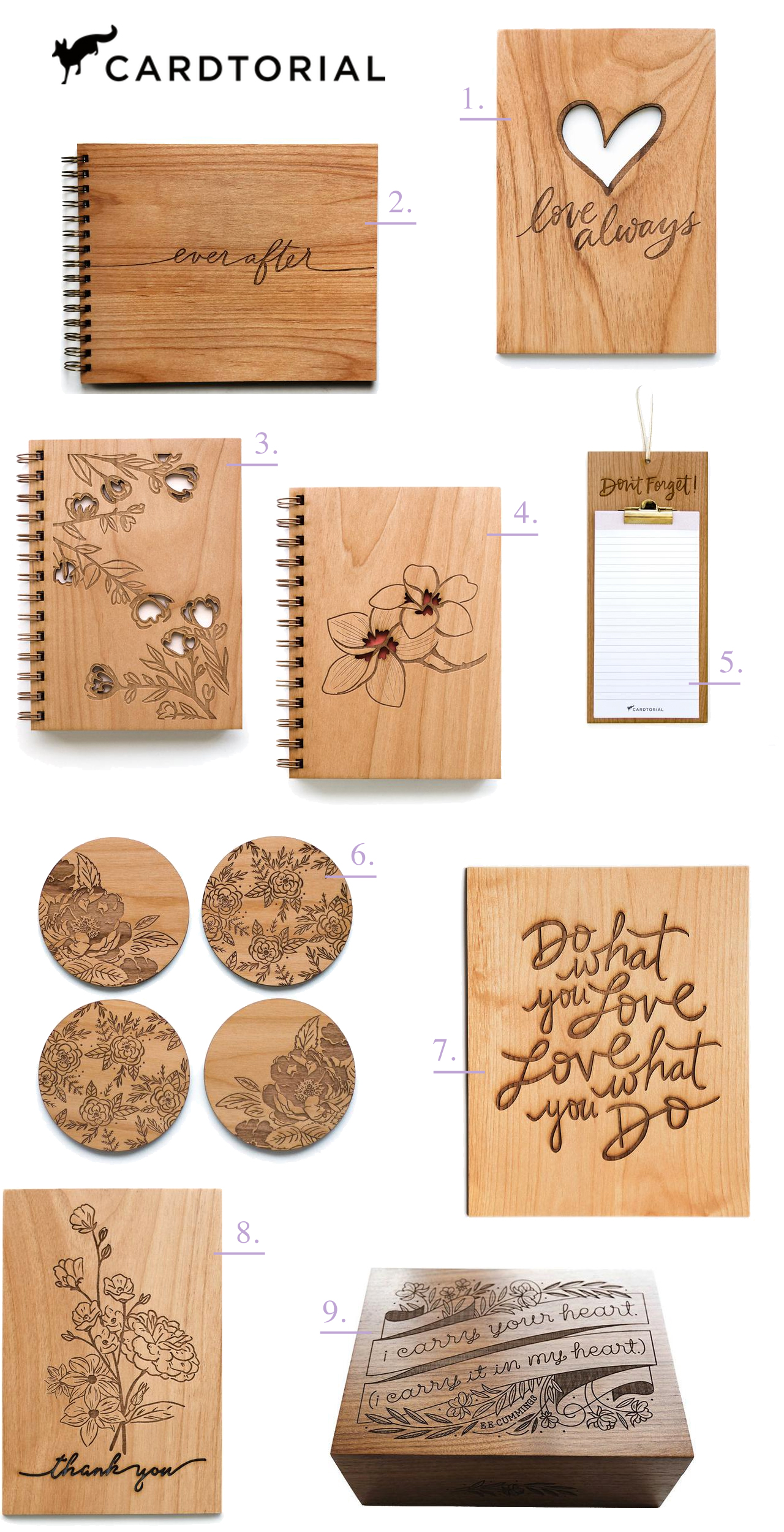
7. Fishing isn’t every dad’s pastime, but if yours happens to partake, please consider this technological impressive laser cut wood design from Cardtorial.

8. Literally, this was my most favorite card I saw at the National Stationery Show this year. Thank you, Gemma Correll (for Ohh Deer).

9. Don’t forget your step-dad! Thanks to Egg Press for their inclusive parental commemoration.

10. Last but certainly not least, send an extra special note of fatherly love to your grandfather (after all, that pipe isn’t going to smoke itself). By Fugu Fugu Press for Paperless Post.

Refined Powder Blue and Vellum Baby Announcements

We love love love watching our Designer Rolodex friends celebrate milestones, like adding to their families! And today is truly a special day, because we get to share the baby announcements that Jackie of Sincerely, Jackie designed for her little guy Richie’s welcome into the world! Jackie is known for her elegant invitation design, so it’s no surprise that she created these stunning and refined powder blue and vellum baby announcements for her own sweet boy. Congrats to the happy, and adorable, family!

Refined Powder Blue and Vellum Baby Announcements

From Jackie: We wanted these announcements to be a simple declaration of both Richie’s birth and his coming home, over three months later. When I was first hospitalized with HELLP Syndrome, my husband and I made the decision to be public with our journey. Many, many people kept us in their thoughts and prayers after our son was born 14 weeks early. We ended up mailing several hundred birth announcements, and I never shared the sentimental story behind them.

Refined Powder Blue and Vellum Baby Announcements

They may be overly simple, but they’re more meaningful than they appear. I purposefully kept the typography clean, and the colors subtle because I did not want to detract from the three most important things: Richie’s announcement, our two favorite photos, and the song that planted itself in my heart.

Refined Powder Blue and Vellum Baby Announcements

The announcements were digitally printed in a soft blue-grey on cotton paper, and contained two cards, each with a photo on one side, and typography on the other. The first, smaller card was our actual announcement containing both the date Richie was born (May 26, 2016, weighing 2lbs 2oz, and only 13.75″ long), and the day he came home from the NICU, 99 days later (September 1, 2016, weighting 7bs 6oz, and 20.25″ long) . The second card contained the lyrics from “Amazing Grace.”

Refined Powder Blue and Vellum Baby Announcements

When you go through something as life-changing as what my little family endured, you find peace anywhere it is offered. For me, I found that peace driving to the NICU one morning when “Amazing Grace” was playing on the radio. I hadn’t really cried before that. Not like, cried cried, if you know what I mean. But in the car that day, I had to pull over to the side of the highway to catch my breath. I felt an overwhelming sense that we’d be alright. Nearly every day after that, I would listen to any version of “Amazing Grace” that I could find on YouTube. About halfway through our NICU stay, little Richie was transferred from an isolette (incubator) to an open crib. A nurse, Patti, found a mobile in a storage room and felt compelled to get it to start working again. She stayed late that day to fiddle with the mobile, and proudly announced the next day that she had gotten it to work. The first song it played was “Amazing Grace.” I remember just standing there, in awe, as my little miracle baby slept peacefully under the mobile in his crib.

Refined Powder Blue and Vellum Baby Announcements

After Richie came home, I sang “Amazing Grace” every single night while I rocked him to sleep. It’s become the melody of our journey, and I felt it was important to include that in Richie’s birth announcement, although not many people knew the story behind it.

Refined Powder Blue and Vellum Baby Announcements

In addition to the two birth announcement cards, we added the invitation to our son’s baptism, which was sent to a select few family members. The baptism invitation featured a verse on one side, and the baptism details on the other, neatly slipped into a vellum envelope.

Refined Powder Blue and Vellum Baby Announcements

Thanks Jackie!

Design: Sincerely, Jackie

Styling: Kristen Poissant

Sincerely, Jackie is a member of the Designer Rolodex – you can see more of their beautiful work right here or visit the real invi­ta­tions gallery for more wedding invitation ideas!

Photo Credits: Charlie Juliet Photography

Blue Agate-Inspired Watercolor Wedding Invitations

A bit of agate-inspired prettiness to brighten your Wednesday! Agate slices and jewel tones are having quite a moment these days, don’t you think? First these gorgeous purple-hued agate-inspired invitations a few weeks ago, and now these vibrant blue agate-inspired watercolor wedding invitations from Debbie Wong Design! The watercolor does a great job of mimicking the unique and varied nature of agate stones. And the hand painted watercolor is even more beautiful when paired with deckle edge paper and modern calligraphy in white ink!

Blue Agate-Inspired Watercolor Wedding Invitations by Debbie Wong Design

From Debbie: The aesthetic and rich jewel tones of agate were the main inspiration for this invitation suite. Blue is incredibly versatile and a beautiful color to use year-round, no matter how seasonal trends may change.

Blue Agate-Inspired Watercolor Wedding Invitations by Debbie Wong Design

Since agate stones come in so many different patterns, the background for the invitation and response card were also unique from one to another, due to the handmade nature of watercolors. Another unique element of agate slices that we wanted to highlight was the unique crystal design at the center of each stone.

Blue Agate-Inspired Watercolor Wedding Invitations by Debbie Wong Design

I decided modern calligraphy was an appropriate style to use for this fun invitation suite, and white ink was the perfect choice to stand out the most against the dark blue tones of the suite. The invitation suite was created on hand deckled cotton rag paper to get a gorgeous texture. Then, the invitation and the response card were tied together with a soft dusty blue silk ribbon from Silk and Willow, before inserting them into a light blue envelope.

Blue Agate-Inspired Watercolor Wedding Invitations by Debbie Wong Design

Vintage stamps were another fun detail we incorporated. Blue stamps fit the theme, but we added a couple of brightly colored stamps to make the envelopes stand out in a fun and vibrant. A blueberry stamp was also incorporated, and this motif tied in with the menu card.

Blue Agate-Inspired Watercolor Wedding Invitations by Debbie Wong Design

The reception was going to be a cocktail style affair, so the menu items were hors d’oeuvres instead of a full seated dinner. The menu was also made on the same hand deckled cotton paper, with a little blueberry painted on the top as the header. We used watercolor to write the appetizer names onto these cards. I knew using watercolor would give the menu cards an organic look with the colors varying slightly from word to word.

Blue Agate-Inspired Watercolor Wedding Invitations by Debbie Wong Design

We used actual agate slices as food labels for the stations at the reception. Brilliant white ink with modern calligraphy was used to match the invitation suite’s calligraphy. I purposely chose three distinctive looking agate stones for the appetizer cards, as no two agates are exact, just like a hand painting. This was such a fun project to orchestrate and I love how it came together!

Blue Agate-Inspired Watercolor Wedding Invitations by Debbie Wong Design

Thanks Debbie!

Design, calligraphy, & hand painting: Debbie Wong Design

Ribbon: Silk and Willow

Check out the Designer Rolodex for more tal­ented wed­ding invi­ta­tion design­ers and the real invi­ta­tions gallery for more wedding invitation ideas!

Photo Credits: Debbie Wong

Ethereal Vellum Wedding Invitations

We aren’t exactly shy about our love of vellum here at OSBP, and today we’re loving these ethereal vellum wedding invitations from Raymond of KidGolightly Calligraphy! Combine beautiful translucent vellum with handmade cotton paper, deckled edges, and romantic calligraphy, and you’ve got a recipe for one seriously gorgeous invitation suite!

Ethereal Vellum Wedding Invitations by KidGolightly Calligraphy

From RaymondAn invitation suite represents the whole wedding, giving guests even more insight into the couple’s love story and glimpse of the mood and theme of the upcoming wedding. I imagined a classic and romantic wedding on a vineyard, and that led me to create this ethereal invitation design with vellum and handmade paper.

Ethereal Vellum Wedding Invitations by KidGolightly Calligraphy

I always find myself drawn to features with muted tones, soft color palettes, and organic textures. I wanted to create a timeless piece so I stayed with a traditional classic layout. The focal point is the names of the bride and groom, so I used my signature gossamer-like calligraphy style in lithe movement for that elegant and delicate feel.

Ethereal Vellum Wedding Invitations by KidGolightly Calligraphy

I was drawn to the romance of the vineyard venue as I designed this suite. The highlight this inspiration an illustration of the venue is the main element on the details page. I imagined the couple on a swing under a jasmine vine with flowers delicately falling on them as the swing. This image in my mind’s eye is what led to the falling jasmine on the vellum overlay. I also carried this accent on to the main card as well.

Ethereal Vellum Wedding Invitations by KidGolightly Calligraphy

Ethereal Vellum Wedding Invitations by KidGolightly Calligraphy

To complete the design, I used a geometric sans serif font throughout the suite just to give it a little modern twist. The invitation is printed entirely in a soft muted gray. Since there were so many other delicate details, I didn’t want an overwhelming color palette that detracted from the design. The invitation is printed on a 100% cotton rag handmade paper from Fabulous Fancy Pants, leaving the natural deckled edges untouched for that organic textural element.

Ethereal Vellum Wedding Invitations by KidGolightly Calligraphy

The envelope was addressed with walnut ink, which was also used on the vellum place cards, to keep that nostalgia flowing. This was the perfect chance to pay homage to the original queen of romantic movies, Audrey Hepburn, with a curated vintage postage stamp. Tying everything together is an exquisite raw silk and soft blush dyed ribbon from Shastabell.

Ethereal Vellum Wedding Invitations by KidGolightly Calligraphy

Thanks Raymond!

Design & Calligraphy: KidGolightly Calligraphy

Handmade paper: Fabulous Fancy Pants

Ribbons: Shastabell

Check out the Designer Rolodex for more tal­ented wed­ding invi­ta­tion design­ers and the real invi­ta­tions gallery for more wedding invitation ideas!

Photo Credits: My Sun & Stars Co.

Quick Pick: Cardtorial

It’s been a while since I checked in with the ladies of Cardtorial – they make the prettiest laser cut and engraved wooden gifts and keepsake stationery! Each item is crafted from certified sustainable wood and is built to last, so it can be treasured by the recipient for years to come. Maybe it’s the explosion of Spring flowers all around me, but I’m particularly loving some of their new floral-inspired pieces, including journals, coasters, keepsake boxes, and greeting cards. Here are a few favorites!

Cardtorial Wooden Gifts and Keepsake Stationery

From top right:

1. This Love Always card is just so beautiful – and perfect for sending love to friends and family on a variety of occasions!

2. Looking for an elegant, yet modern wedding guest book? I’m loving this option with a sweet and simple message.

3. + 4. These floral journals are just ridiculously gorgeous, and there are so many designs to choose from! The traditional rose branch illustration and the modern and tropical Plumeria are my two favorites. 

5. This wood clipboard and notepad is the perfect place for jotting down quick reminders. Hang it by your bedside for late night inspiration, or by the door for a quick memory jogger before you head out for the day.

6. Oh, HELLO there, floral laser engraved wood coasters

7. A laser cut wood art print with one of my favorite mottos in beautiful script lettering.

8. Even the most beautiful thank you card is better with flowers!

9. Is this not the prettiest keepsake box you’ve ever seen? I love this as a gift for brides and grooms or for new parents!


You can check out more from Cardtorial right here!