September 2018 Wallpapers!

Well hello there! Happy September everyone! Did you have a restful Labor Day weekend? I’m personally wishing it could have been just ONE day longer, but it was still a lovely weekend. Anyway, after our August hiatus, I’m excited to jump back into things with some brand new wallpapers! Oh, and guess what?? Starting this month, we’re introducing iPad wallpaper sizes! I’m admittedly a bit late to the iPad train, but we finally got one before traveling to Iceland and I realized how badly I needed a cute wallpaper for the home screen. So here you go! We’ve got three beautiful designs from Copper Paper Co. and Australian stationer In the Daylight – pick your favorite below, or download a couple options for different devices!

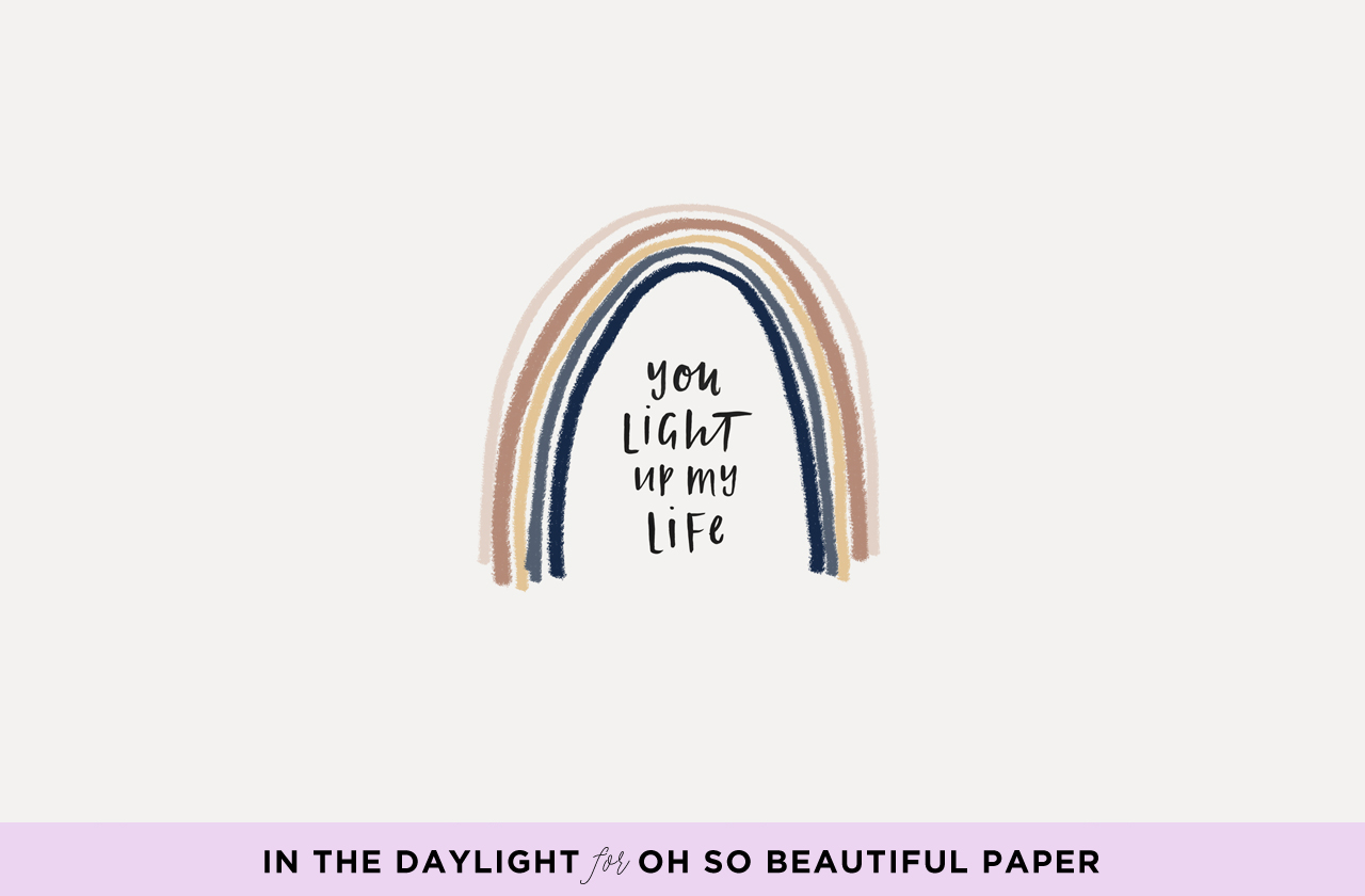
September Rainbow Wallpaper / In The Daylight for Oh So Beautiful Paper

iPhone | iPad | Desktop

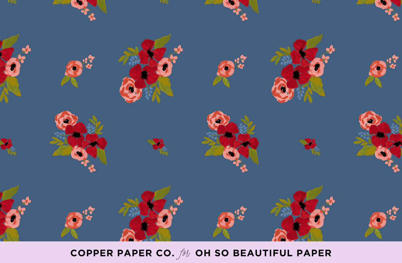
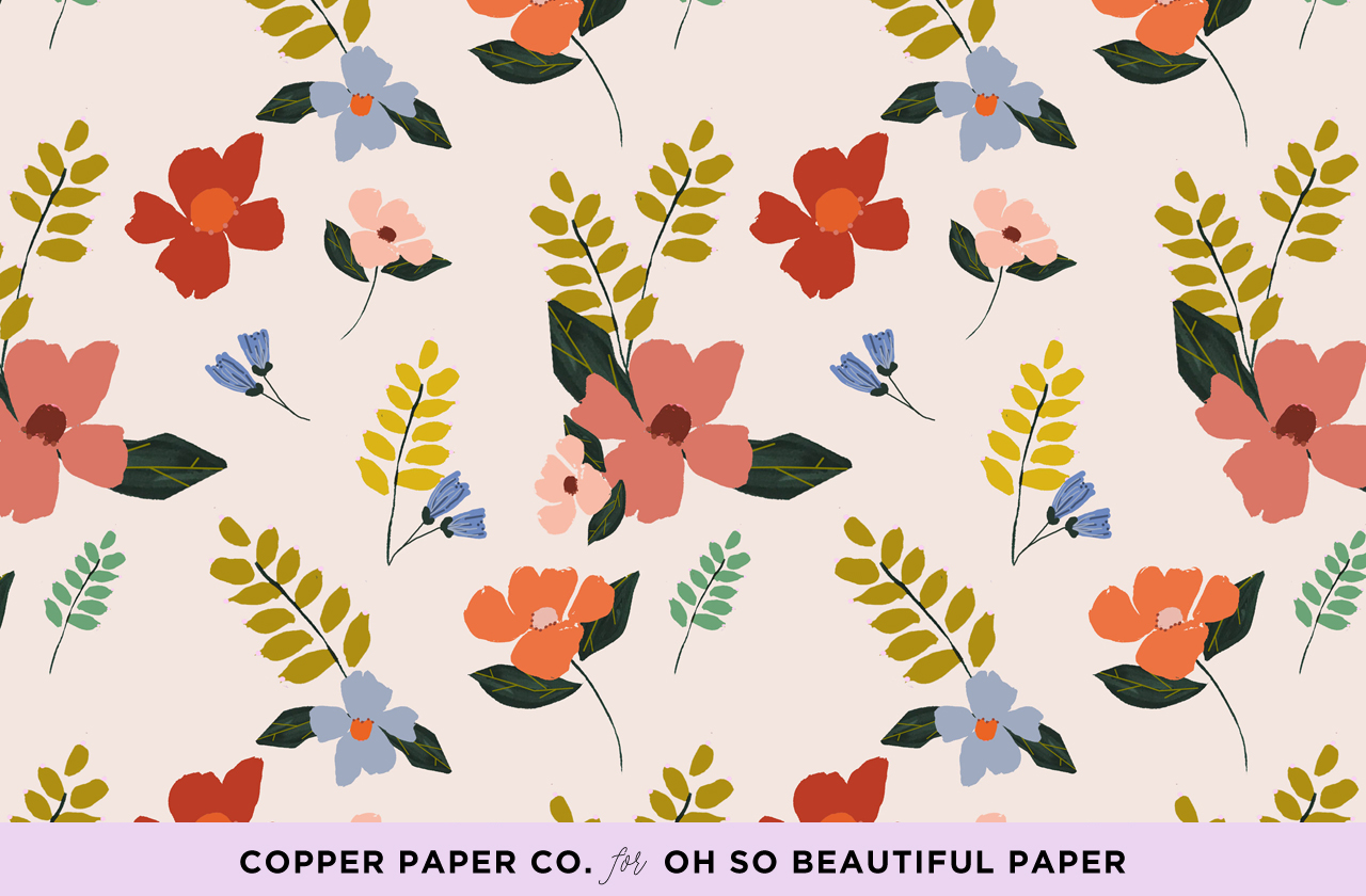
September Floral Wallpaper / Copper Paper Co. for Oh So Beautiful Paper

iPhone | iPad | Desktop

September Rose Wallpaper / Copper Paper Co. for Oh So Beautiful Paper

iPhone | iPad | Desktop

For personal use only. All illustrations by In the Daylight and Copper Paper Co. for Oh So Beautiful Paper

p.s. If you’re interested in walking down memory lane a bit, here are the wallpaper designs from September 2017, September 2016, and September 2015!

If you’re a designer or illustrator interested in contributing your own designs to this column, please email your design to hello(at)ohsobeautifulpaper.com with the subject line “desktop downloads” and image files in both desktop and iPhone retina screen sizes. If it’s a good fit I’ll add it to the post for the following month!

Friday Faves + August Hiatus

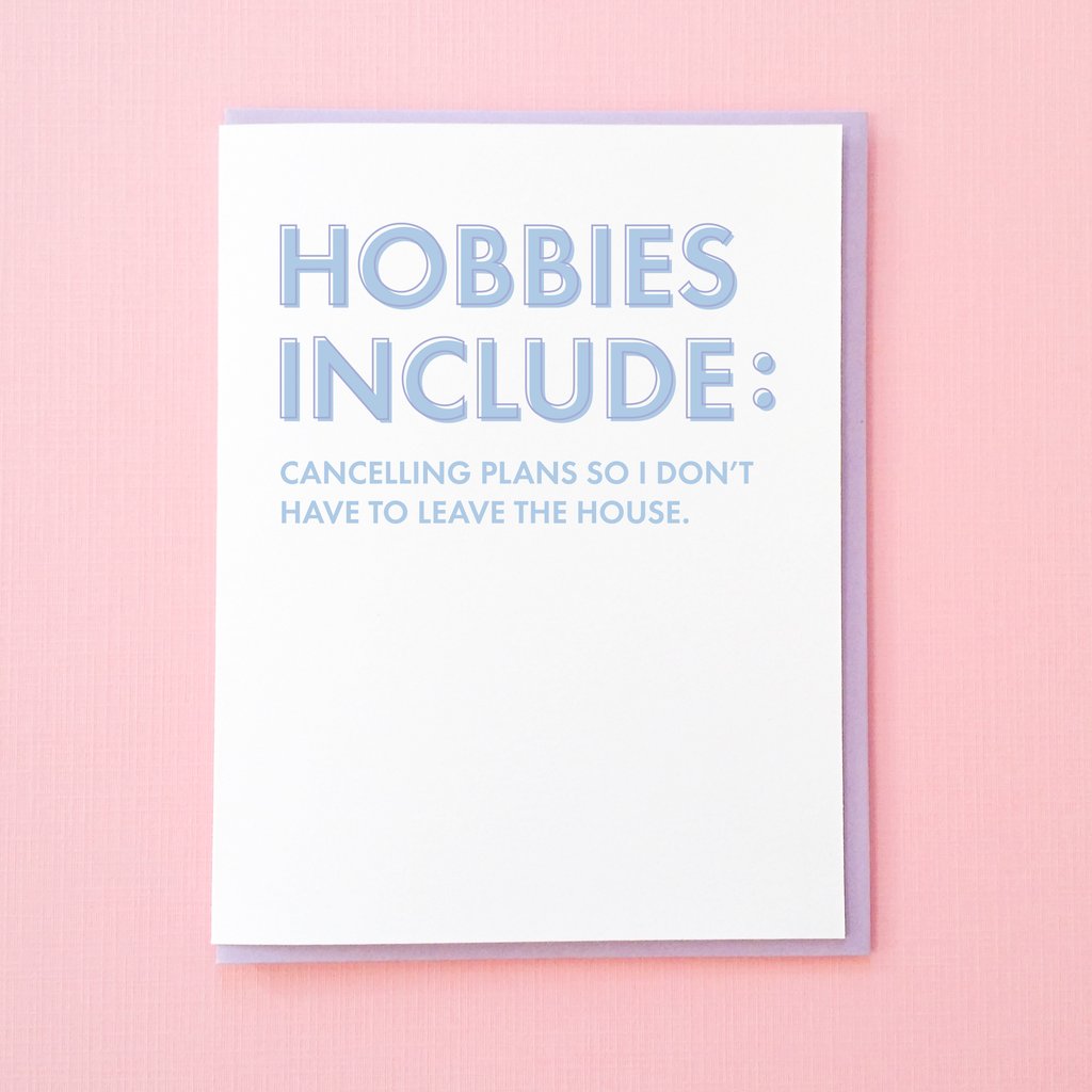
Tick Tock Press: Cancelling Plans Card

Card by Tick Tock Press

Happy Friday everyone! This has been a whirlwind of a week for my little household. On Monday, we returned from a 6-day trip to Iceland (!!) – I’m planning to edit our photos from the trip and share our recommendations next month, but in the meantime you can check out some highlights on Instagram here. This was also our last week of summer vacation for our two girls. My older daughter starts first grade on Monday, and my younger daughter has her first day of PreK4 on Thursday! (DC offers public preschool beginning at three years old). For the next couple of weeks, I’ll be on my annual summer hiatus to get my girls settled at school and take care of a few odds and ends at home – we’ll be back with fresh new posts after Labor Day!

In the meantime, I’ve been doing a bit of early fall shopping. I’m so ready for sweater weather! I’m loving all the sweaters at Boden this season, particularly this ruffled sweater, this pale pink sweater (and lots of other colors) with contrasting sleeve detail, and this super cute sweatshirt. I’m also loving this cute polka dot skirt and this paperbag skirt (it looks SO good with boots!!)

So excited to be hosting our very first paper flower workshop at Common Room Studio! You can sign up right here!

I want to go to this summer golden hour dinner party!

Statement earrings! Loving these fringey hoops and these tiered tassel earrings from Madewell (on sale for only $17!) and these tortoise shell earrings from J.Crew.

Have you seen the preview of Color Factory in NYC? It looks so great! I can’t wait to see it in person next month – you can get tickets right here!

Inspiring Calligraphers: Li Ward Calligraphy

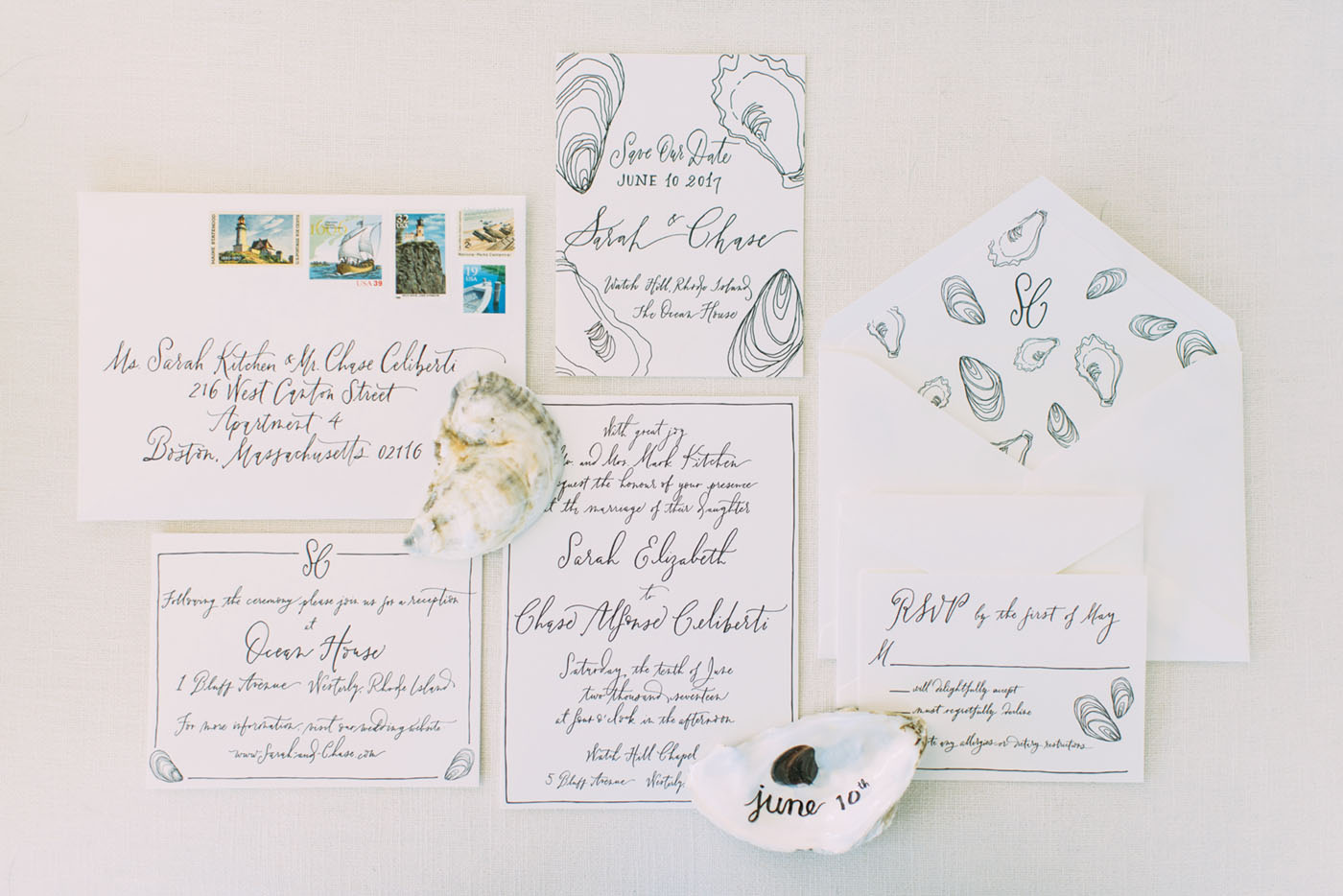
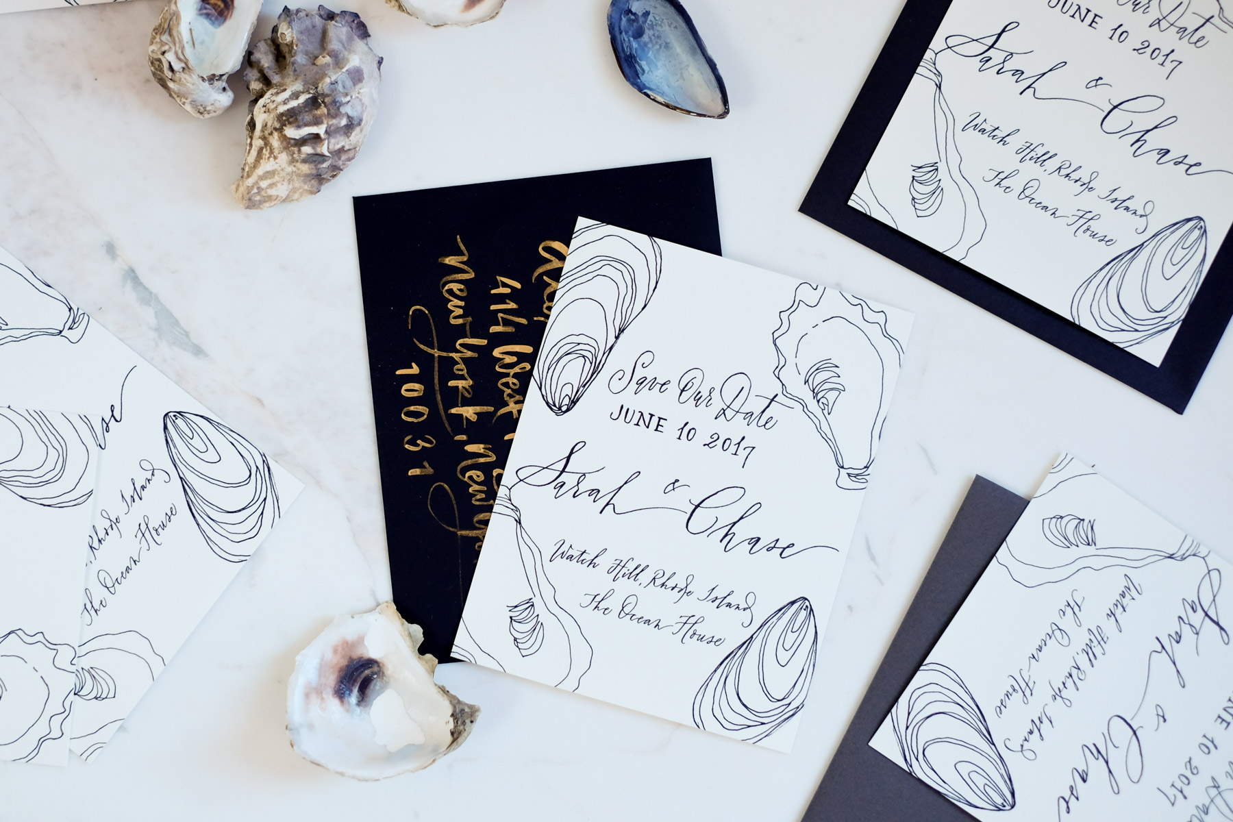
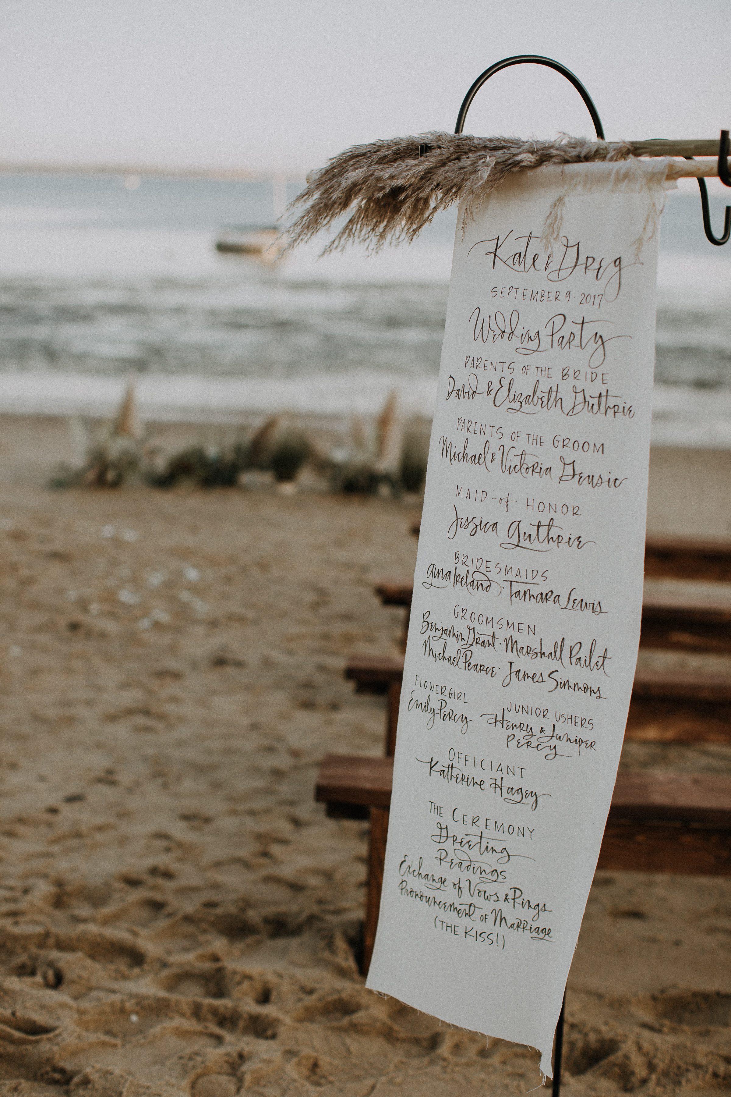
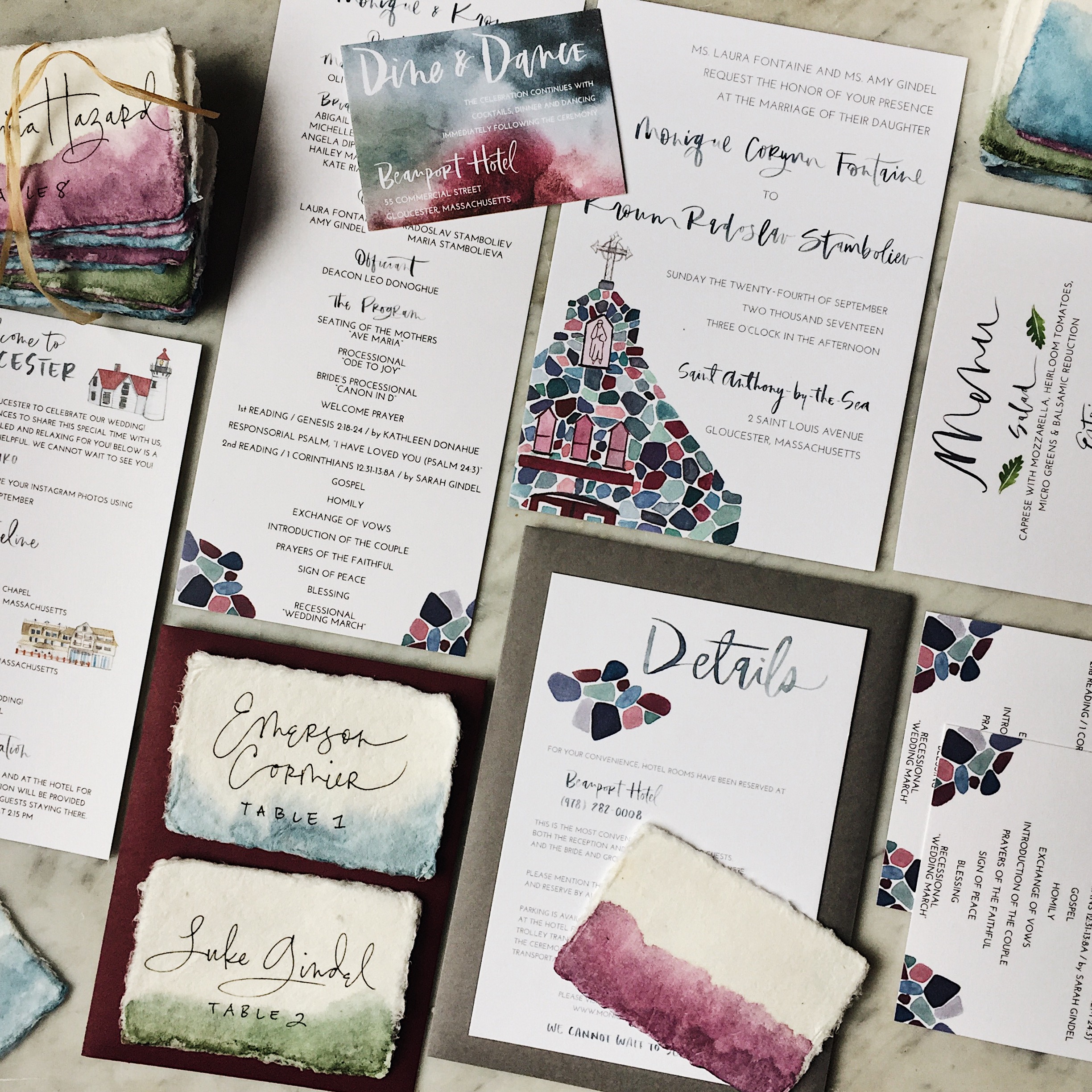
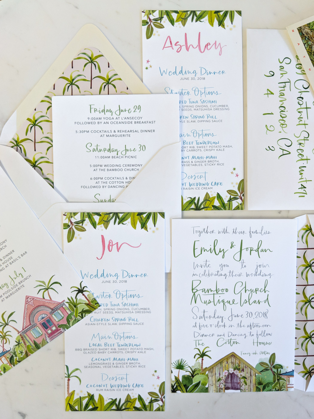
Hey everyone! It’s been a hot summer in many places so I thought it only fitting to pull some inspiring calligraphy work with a true summertime vibe. Here’s a look at the work of Li Ward Calligraphy. I love the mix of her lettering work and watercolor and illustration, and how each wedding suite looks so fitting for the destination. With that, let’s grab a lemonade and check out Li’s beautiful calligraphy! Jen

Inspiring Calligraphers: Li Ward Calligraphy

Photo Credit: Cambria Grace Photography

Inspiring Calligraphers: Li Ward Calligraphy

On how she got her start, Li shares:

I started calligraphy about 6 years ago, using traditional pens with nibs that you dip into ink. I started doing spot lettering for other stationery designers whose clients requested some hand lettering for their invitations. Two years ago when I began dabbling in watercolors, I decided to go “full service” with invitation design: I would take care of not just lettering, but full design which would include watercolor illustrations, hand lettering, envelope liner design, paper choice, and printing.

Inspiring Calligraphers: Li Ward Calligraphy

Inspiring Calligraphers: Li Ward Calligraphy

What inspires Li? She gets inspiration from Jane Austen, scratchy old-fashioned script, Edward Gorey’s irreverent sense of humor, Matisse’s bold color palettes, stained glass designs — just to name a few. “I’m still really new to this and constantly trying new things out,” says Li.

Inspiring Calligraphers: Li Ward Calligraphy

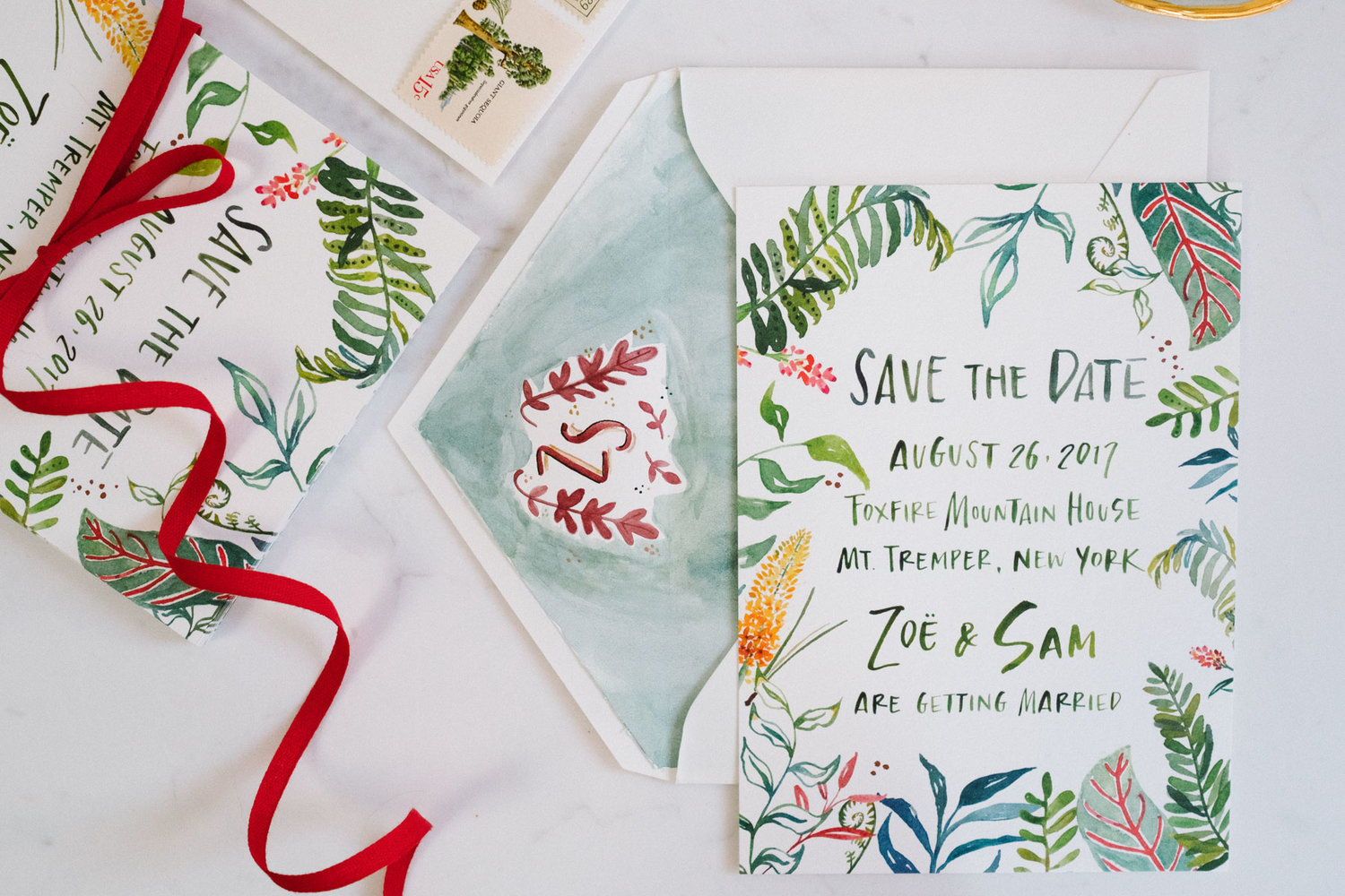
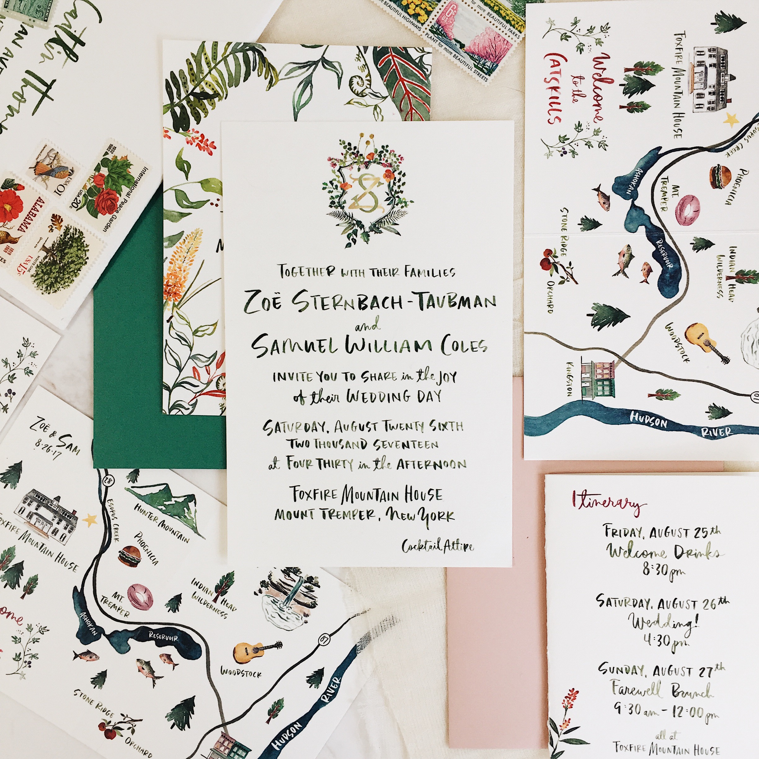
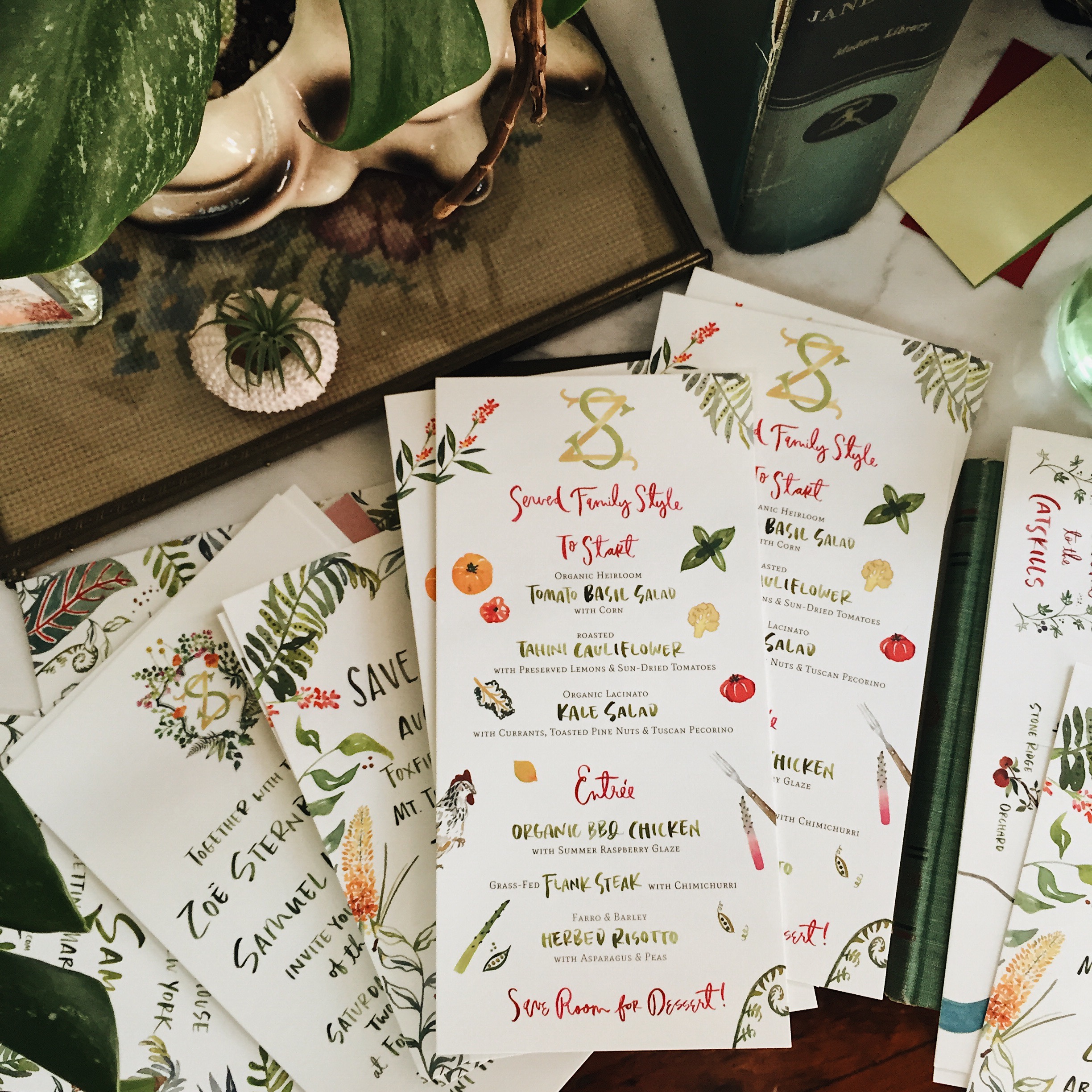
“One of my favorite suites is the Catskills wedding suite (Zoe and Sam), which included Save the Dates, folded maps, and illustrated menus,” says Li. “The couple had already commissioned Happy Menocal to design their crest. Happy just happens to be one of my favorite artists, so I was really thrilled when they asked me to design the rest of the suite that would complement Happy’s design. I took inspiration from Edward Gorey’s illustration style and Happy’s of course, threw in block font mixed with cursive, went with a more is better frame of mind. And it’s kind of been the basis of my style going forward. I’m definitely all about bold colors and shapes!”

Inspiring Calligraphers: Li Ward Calligraphy

Inspiring Calligraphers: Li Ward Calligraphy

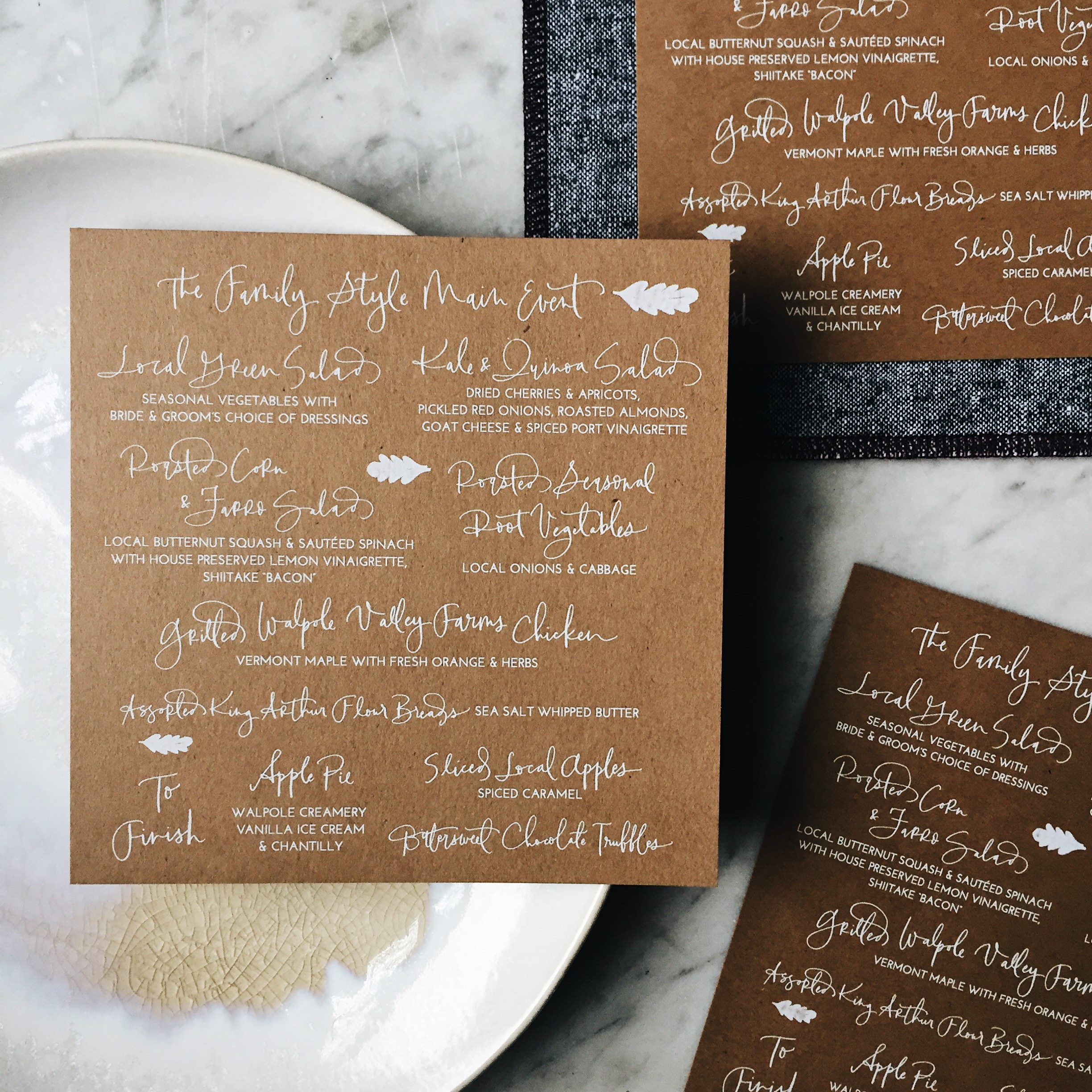
As much as I love Li’s illustration work, I’m also a big fan of this kraft brown wedding suite she designed. The white lettering on kraft brown paper has a modern organic vibe that feels casual, yet cool.

Inspiring Calligraphers: Li Ward Calligraphy

Inspiring Calligraphers: Li Ward Calligraphy

Another favorite style? Li loves to do “seamless” designs. “If you were to put two cards side by side, the design from one card would match up with the design on another,” says Li.

Big thanks to Li Ward for sharing a a peek into her world of lettering!

All photos by Li Ward, except where noted

Want to be featured in our calligraphy column? Reach out to us at submissions [at] ohsobeautifulpaper [dot] com with the subject line “Calligraphy Feature” for more details!

Behind the Stationery: PleaseNotes

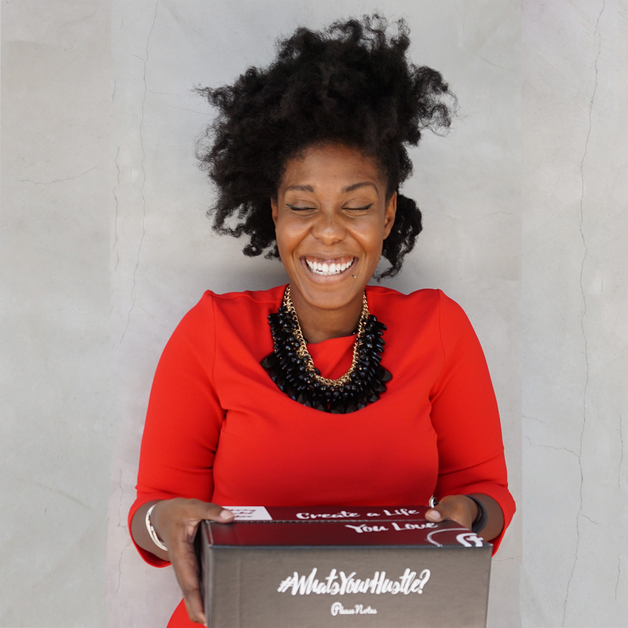
For our next Behind the Stationery feature, I’m excited to have Cheryl Sutherland’s share her empowering story behind PleaseNotes. Cheryl’s journey is rooted in realness and self-discovery, which is an important part of the business that isn’t always talked about. She talks about everything from exploring her manufacturing options to exploring herself to discover what she wanted to her line to become. Take it away, Cheryl! —Megan Soh
Behind the Stationery: Please Notes

From Cheryl: I would’ve never thought that I would be interviewing anyone, especially not an internationally acclaimed speaker like Les Brown, but as I was adjusting the lighting rig in his hotel room in Toronto it hit me. My life had unfolded in a way that I could of never expected based on one decision to follow my inspiration.

Growing up my family unit was pretty ordinary. My parents were from St. Vincent, a small island in the Caribbean, and had divorced shortly after I was born. The youngest of three, I noticed how much emphasis my parents put on working to support themselves and additional family back home without regard for their own personal enjoyment in their work. When it was time for me to go to university, I wanted to be different from my parents and to choose something that interested me, that aligned with my personality and gave me the ability to grow. That decision making process is what got me through school, into some great positions, and drove my decision to move to Los Angeles from Canada.
Behind the Stationery: PleaseNotes

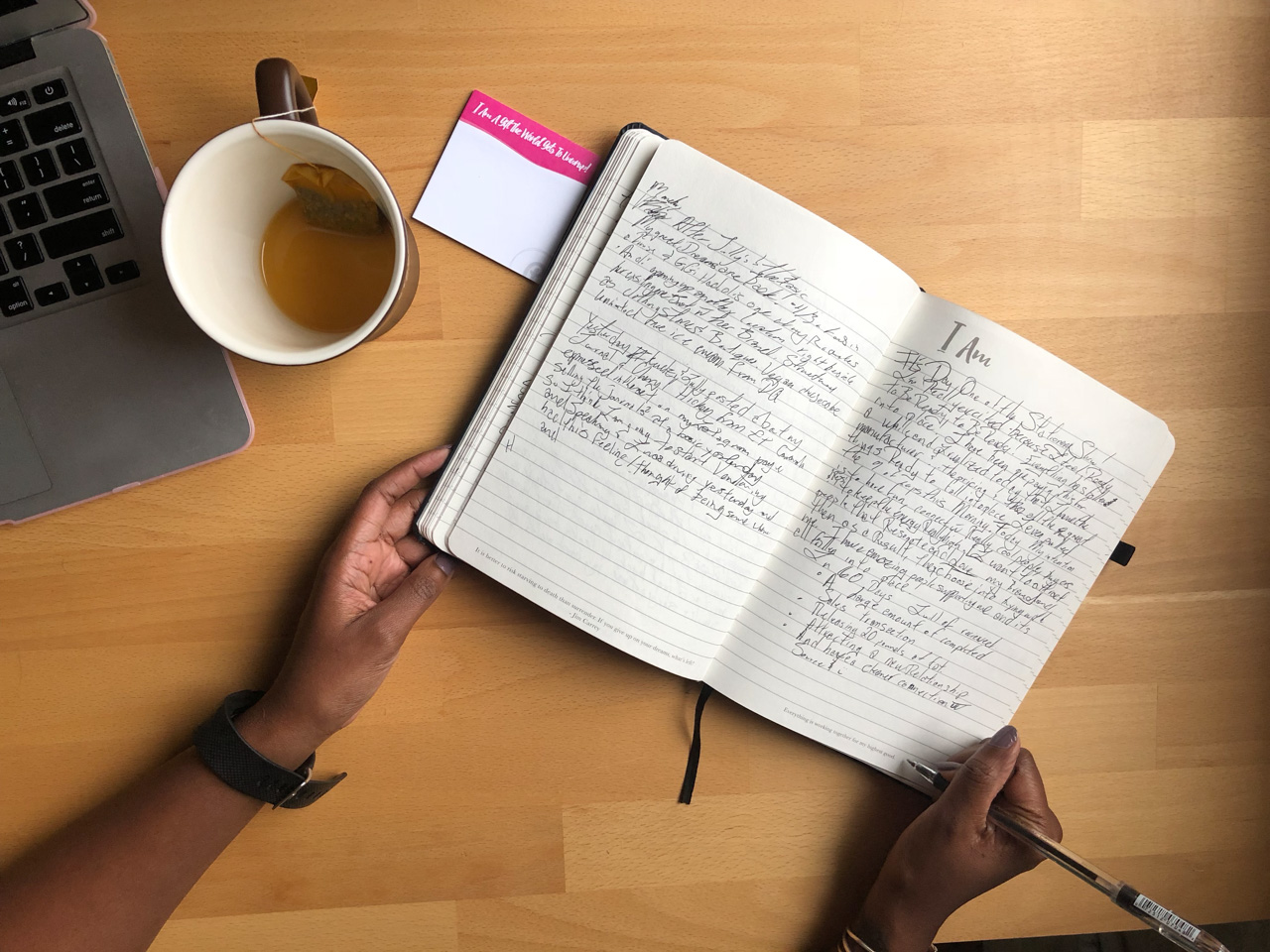
I got the idea for PleaseNotes after reaching the end of the road with my last employer. At that point I wanted to work on something I was really passionate about, learn new things, and feel excited and confident when I spoke about work. I had always seen myself as a great second in command, but not good enough to actually run a business or even have a good idea for one. I knew in order to level up I needed to make a huge shift. I took a leap of faith, quit my job and focused on changing myself. I knew I had something important to contribute, so I worked with affirmations, read amazing books, and started journaling. I had taken and supported tons of personal growth courses in Canada and the USA, and journaling allowed me to realize what thought processes I had that were detrimental, and replaced them with ones that encouraged me to believe in myself and see myself in a bigger, bolder way.
Behind the Stationery: PleaseNotes

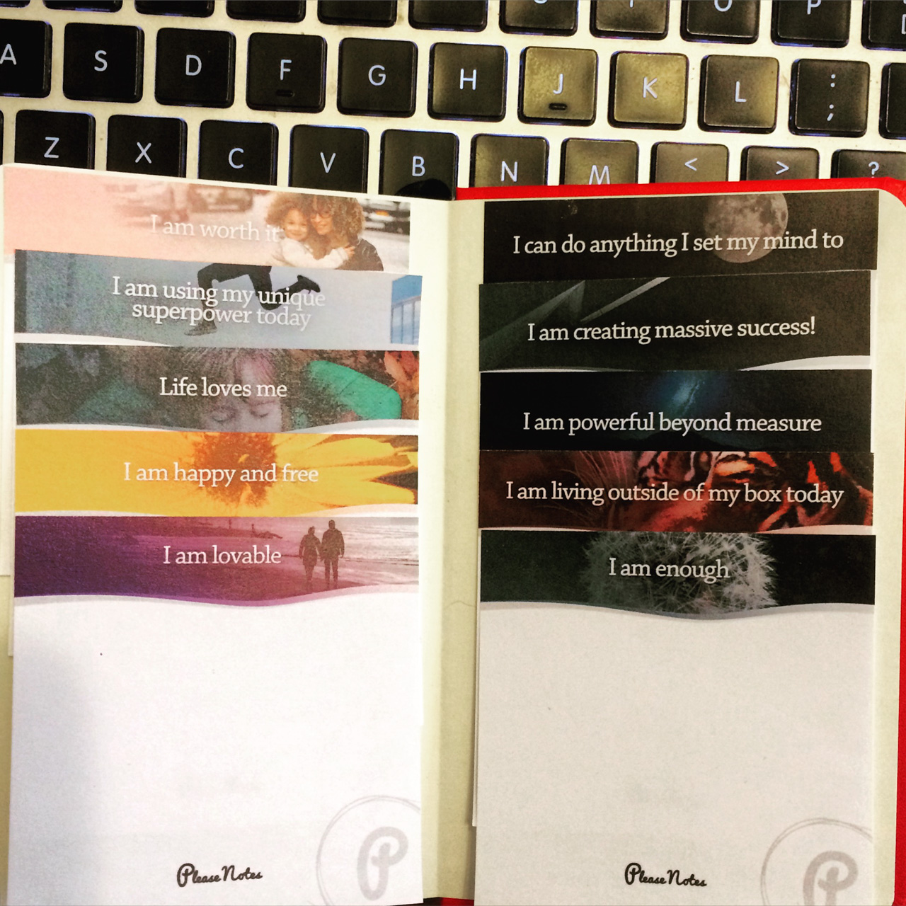
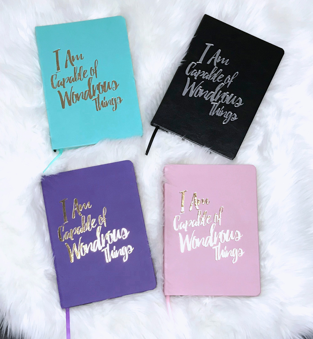
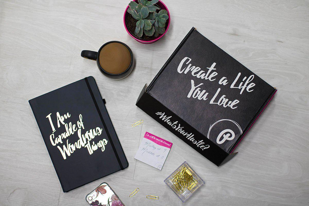
I wished there were a way to surround myself with reminders of who I really was and stay positive, and that’s when I got the idea for the PleaseNotes Sticky Notes which had a different affirmation or sweet message on each page. After a couple months, I realized that I had another really great idea to take the work a little bit deeper through a guided journal. I poured processes and exercises that I loved and used when I was “finding” myself into it and added tons of secret messages, affirmations, and extra love and care into it. I decided to launch it as a Kickstarter and it was an amazing success—shipping to the US, Canada, UK, Spain and Asia! A couple more ideas flowed in to round out the whole product line. I wanted to make my line tailored yet inclusive, so the products outside of the Journals are color coded and fall in one of three themes.
Behind the Stationery: PleaseNotes

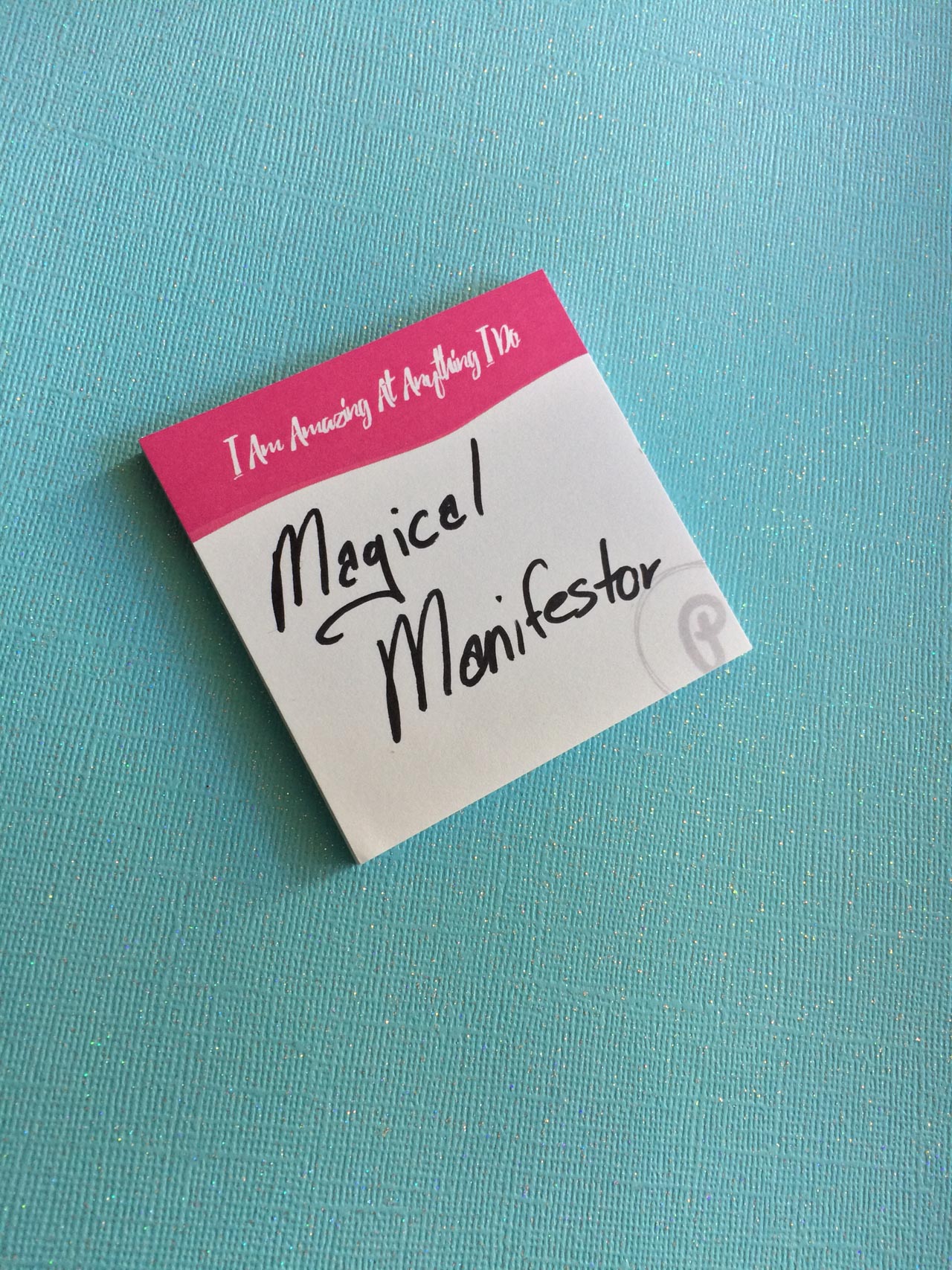
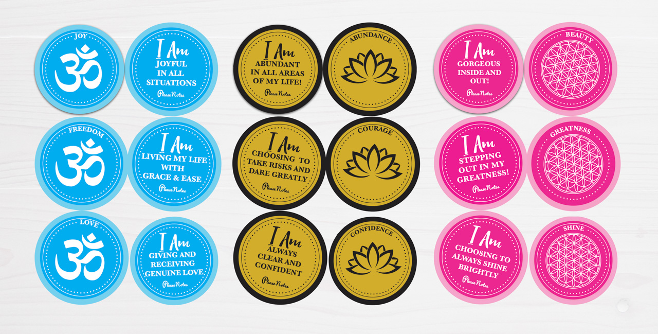
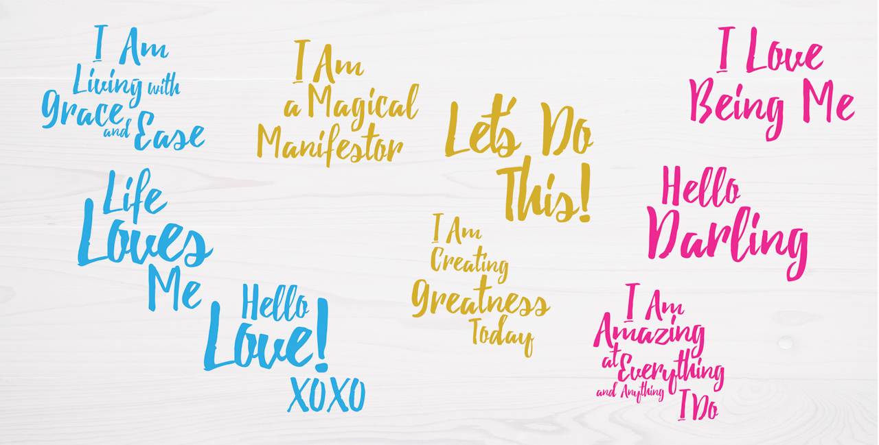
Since people have different things they want to work on I called the bright blue Carefree, and filled with messages of “I Am Living With Grace and Ease” and “ Life Loves Me” that are great for those struggling with anxiety or that want to have more fun every day. The bright pink is Cheeky, filled with messages that are more sarcastic like, “I Am A Gift The World Gets To Unwrap” and “ I Am Amazing At Everything And Anything I Do.” Lastly, the Confident collection is black and gold and is filled with grounding messages of “I Am Powerful Beyond Measure” and “I Am A Magical Manifestor.” These are reflected in the sticky notes, the mirror decals, and these really cool dual-sided water bottle labels. The thing I love about my company is it’s not just aesthetically beautiful, it has the ability to catalyze someone into changing the way they feel about themselves and their world. Being able to go into a situation and say “I can do this” versus “ I can’t do this” is literally the ability to change the whole course of someone’s life, and I feel so grateful that I get to do this.
Behind the Stationery: PleaseNotes

My creative process is pretty holistic. I’m really grateful that I read Elizabeth Gilbert’s “Big Magic” because it helped me set new expectations and grow as an entrepreneur coming out of the corporate space. I get an idea and then ask myself if it is something I can do or not, which the answer has always been yes! If it’s a brand new item, I start sketching, decide on the medium and logistics, and send it to my amazing graphic designer friend for feedback and revision. After I get it back, I tweak it until I feel really good about it usually in InDesign or Illustrator. At the same time, I look for a manufacturer. Since the Journal and Sticky Notes are highly customized, it took a while to find manufacturers I liked who also had the ability to scale and maintain the same level of quality. My favorite part of working with manufacturers is getting samples and going back and forth in the creative process. That’s allowed me to see, experience, and notice nuances like paper color and texture, ribbon and elastic characteristics and different textured covers. I want people to have a authentic, safe, luxury-like self care experience, and it shows itself in the details. You may notice little things I’ve tucked in like sacred geometry and symbolism, and there’s a bunch that only myself and my manufacturers are aware of. It’s like a little blessing for the user and based on feedback, that feeling comes through.
Behind the Stationery: PleaseNotes

When I found out about the National Stationery Show, I thought it would be an amazing chance to really get my name out there. I walked it in 2017, exhibited in 2018, and I loved the experience of being there, seeing what other companies were doing, and getting great feedback about the line from “real” stationery people that my line was as great as I thought it was. I really wanted to connect with people who “got it” such as stationery reps, wholesale buyers, retailers and media. There were some really great contacts that I connected with and I’m excited to build great relationships.
Behind the Stationery: PleaseNotes

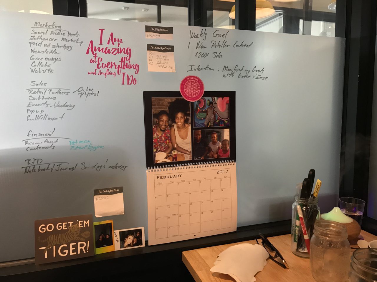
My day is pretty go with the flow. I primarily work from home or a co-working space like WeWork or Make Lemonade here in Toronto. This allows me to go to the gym, meditate and eat properly. I usually have a list of things I want to complete this week or month and knock them out or add to them. I tend to work best between 10am – 7pm. Right now my main focus has been marketing. I’m still figuring out how to best convey and connect people to the magic, so I’ve been playing a lot with influencer marketing, videos on IGTV and YouTube, and creating new exercises that people can download. I really enjoy working on custom journals and right now I just started a new project with one of my influencers that I know people will love that is super authentic for both her brand and mine! I use a fulfillment center in California to ship out the goods since they get a better rate then I would.
Behind the Stationery: PleaseNotes

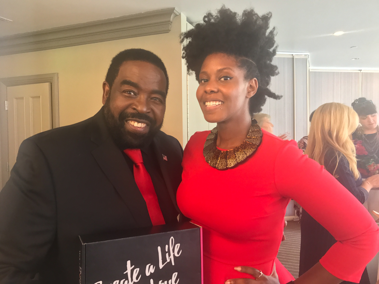
Flashing back to September 14, 2017, I was setting up my booth at an E-Women Network event in Orange County and I was feeling great being there. I always loved the women that attended and the vibe. That day shouldn’t have been any different, however they ended up having a surprise last minute attendee. I heard whispers about Les Brown and I thought it was hilarious because I actually have a couple of his quotes included in my Journal. When he came in, the room became his as he walked around, shook hands and took pictures. Eventually he ended up at my table and I was able to tell him about my line. That day was one of my proudest moments because someone who was such a noted icon in the industry that I respected not only loved my brand, gave me a endorsement, he also offered to do a Facebook Live with me to share PleaseNotes with his followers!
Behind the Stationery: PleaseNotes

This was just one of the amazing things that have happened to me because I chose into following this dream and I’m so grateful for all the things I’ve been able to see and do as a result of building PleaseNotes. If I had to give advice to anyone thinking about going down this path it would be to expect great things to happen to you, dwell on the positives and breathe in the great moments.
Behind the Stationery: PleaseNotes

All photos courtesy of Cheryl Sutherland.

Want to be featured in the Behind the Stationery column? Reach out to Megan at megan [at] ohsobeautifulpaper [dot] com for more details.
Aquamarine Watercolor and Letterpress Wedding Invitations

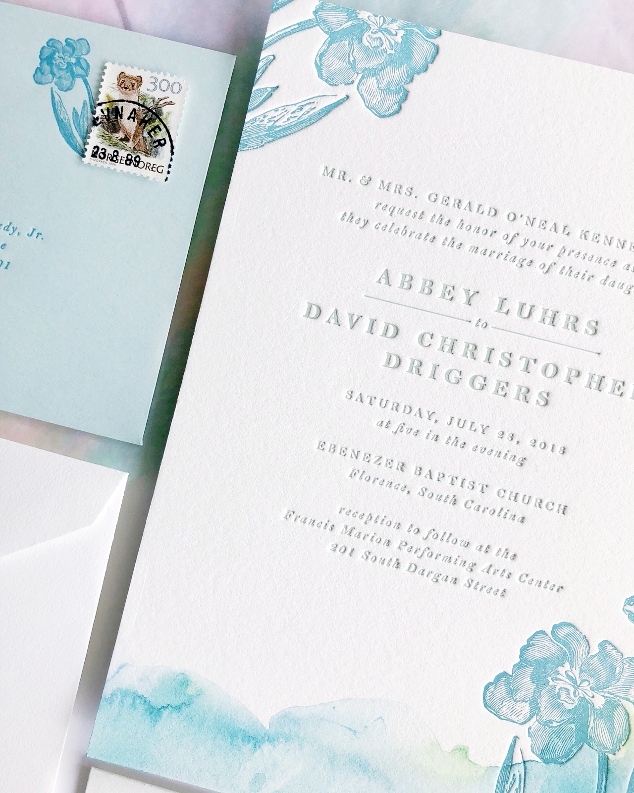
Whenever I look at a wedding invitation, I always look for that one special detail that stands out from everything else. Sometimes it’s hand lettering or calligraphy. Sometimes it’s the carefully chosen vintage stamps. In the case of these gorgeous aquamarine watercolor and letterpress wedding invitations from Shana of Iris and Marie Letterpress, it’s the beautiful and ethereal hand painted details that Shana added to each invitation. So perfect for an oceanside wedding!

Aquamarine Watercolor and Letterpress Wedding Invitations by Iris and Marie Letterpress

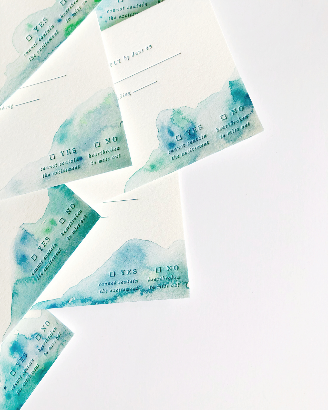
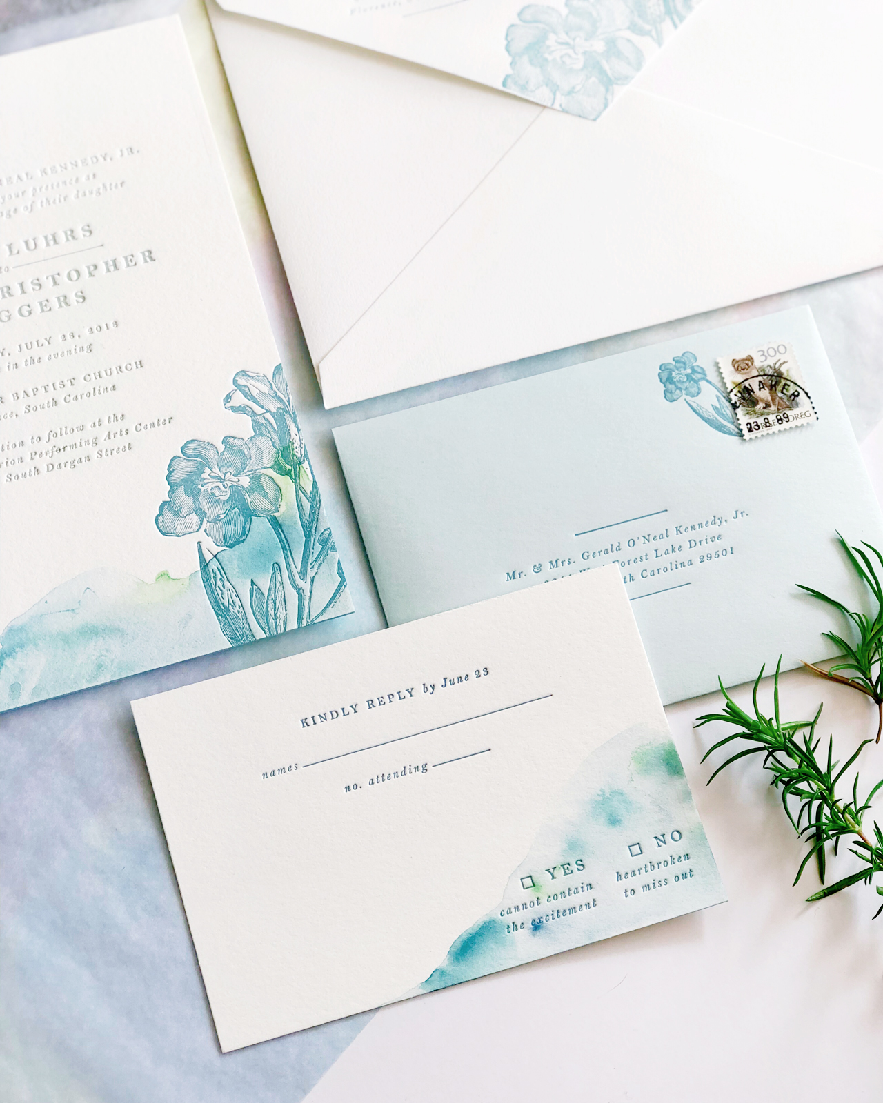
From Shana: Abbey’s July wedding in Florence, South Carolina was hot, but these cool ocean blues and greens gave her guests a breath of fresh air before the big day. Each invitation and reply card was hand painted with acrylic paint using a special water technique. The design was letterpress printed on a 1920s Chandler & Price letterpress using Crane Lettra cotton paper for the invitation and Cards & Pockets Aquamarine envelopes for the reply envelopes. Three colors were used throughout the suite: medium dusty teal, dark dusty teal & grey-green.

Aquamarine Watercolor and Letterpress Wedding Invitations by Iris and Marie Letterpress

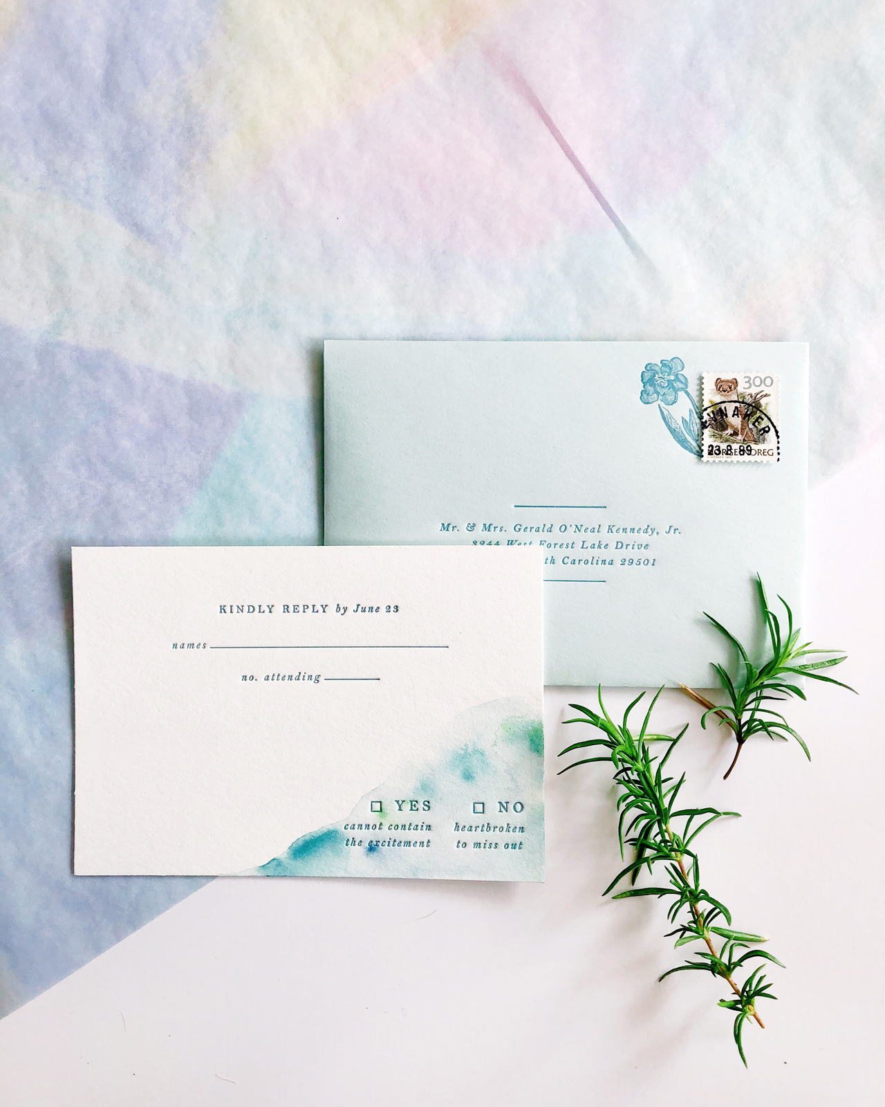
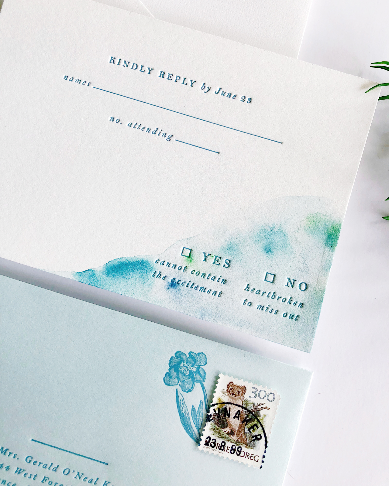
The reply card and envelope featured the darker teal of the suite, where as the invitation and outer envelope featured the medium dusty teal that Abbey picked out. The dusty teal used matched her bridesmaids’ dresses perfectly! To go along with her chill vibe, the grey-green was used on the text of the invitation to compliment the blues going on everywhere else.

Aquamarine Watercolor and Letterpress Wedding Invitations by Iris and Marie Letterpress

At the bottom of each invitation is the hazy water painting created uniquely for each invitation with subtle hints of a bright green. The grey-green ink really helped pull those bright greens out & made the invitation colors flow together. The really cool thing about hand painting each piece of paper is that each guest gets a different suite which in turn makes each invitation feel like its own art piece.

Aquamarine Watercolor and Letterpress Wedding Invitations by Iris and Marie Letterpress

Abbey definitely was excited to see each suite come together and see how every invitation was different than the next. She also wanted to add a floral element, but didn’t want them to overpower the hand painted details. So we printed floral illustrations on top of the painted piece to add extra texture.
Aquamarine Watercolor and Letterpress Wedding Invitations by Iris and Marie Letterpress

Can you spot the other little floral element peeking out from the stamp? Instead of having a plain corner of her reply envelope where a stamp would go, we opted to have a cute little flower coming out of the stamp for some extra personality. Flowers were also added to the outer envelopes by being printed to bleed off the envelope flap to give guests a little insight to what is inside.

Aquamarine Watercolor and Letterpress Wedding Invitations by Iris and Marie Letterpress

There are so many fun elements going on in this one suite that you might think that this wedding definitely does not have a “relaxed” vibe. Heck yes it does! Don’t the blue-greens make you want to sit by the ocean? If I were to give this wedding a new theme it would be: relaxed by the ocean with a flower in one hand and sea glass in the other.

Aquamarine Watercolor and Letterpress Wedding Invitations by Iris and Marie Letterpress

Thanks Shana!

Design and printing: Iris and Marie Letterpress

Envelopes: Cards & Pockets

Looking for more wedding invitation inspiration? Visit our wedding invitations archive for more custom wedding invitation ideas!