My Faves from the UO Home Collection

Did you guys catch the reveal of the tiny bathroom at Common Room Studio yesterday? When I set out to decorate Common Room Studio, I wanted to create a space that felt quirky yet welcoming. Because it isn’t my home, I felt like I had a lot of creative freedom to do pretty much anything I wanted décor-wise, which was both fun and intimidating at the same time! But I’m also on a budget, so I spent a lot of time looking for pieces that added a fun dose of personality or texture without being crazy expensive. And guess what turned out to be one of my favorite shopping resources for cute and quirky items: the Urban Outfitters Home Collection! I love that they sell a combination of products from designer-makers, like my beloved The Magic Is In You banner from Secret Holiday Co., along with cute and affordable accessories. UO Home has become my favorite place to find unique planters, pillows, and even shelves! Here are a few of my current favorites from UO Home:

Woven Baskets | Ceramic Planter | Tufted Lumbar Pillow

Googly Eye Planters | Velvet Chair | Mirror

Triangle Shelf | Tufted Pom Rug | Cane Chair

Round Pillows | Woven Bench | Winky Pillow

OMG I WANT THOSE CHAIRS SO BADLY. The velvet chair for sure, maybe as a home office chair? That shade of green is just so good. And that cane chair would be perfect for our living room. I’m obsessed. Those round velvet pillows are basically my fall color palette and I just want to stare at them all day long. I already have the googly eye planters and the winky pillow, but several of the items above are already on their way to me for some home updates that I can’t wait to share! Do you have any favorites from UO Home?

Common Room Studio: The Bathroom

Common Room Studio: Bright and Airy Modern Half Bathroom Before & After

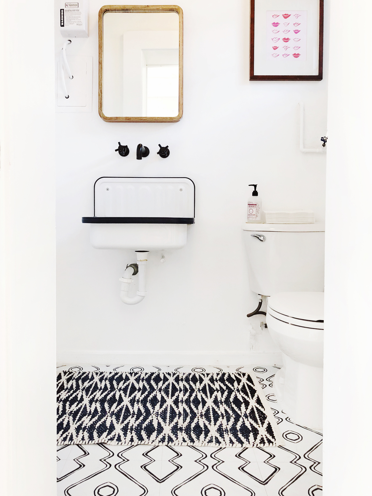
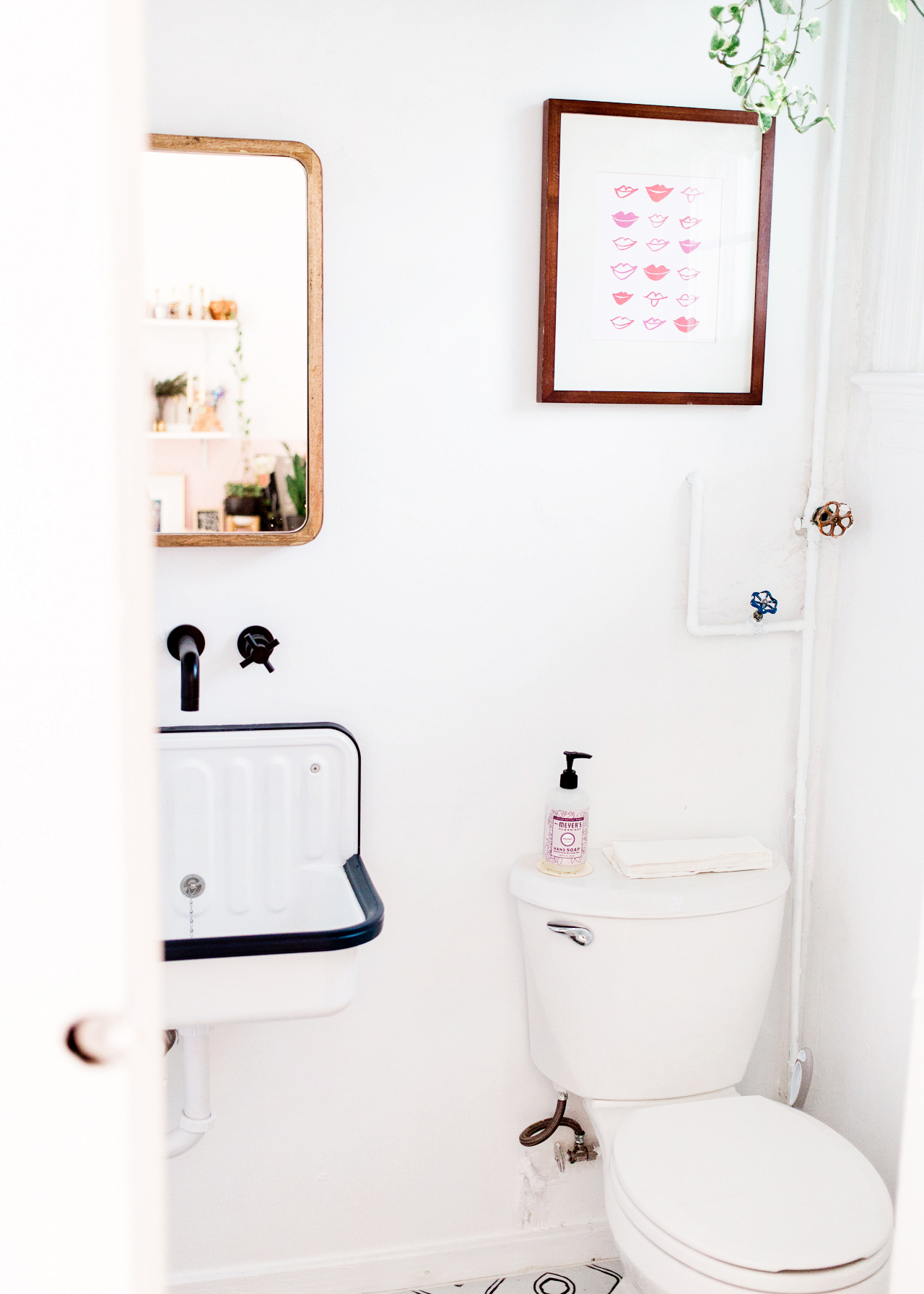
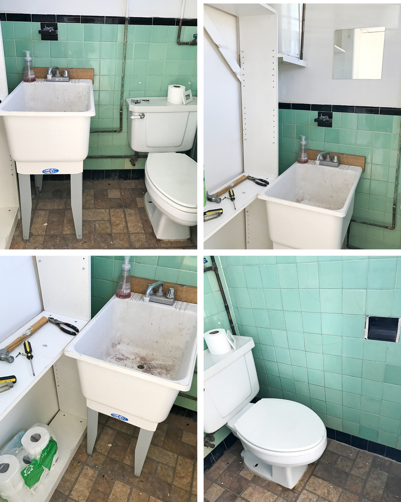
Today I’m excited to continue the tour of my new studio space, Common Room Studio! I shared the living room and main photo shoot area a while back, and today’s installment is all about the transformation of our bright and airy modern half bathroom! I never thought I would be this excited to share a bathroom reveal with you guys, ha! But despite being the tiniest room in the studio, it was probably the most dramatic transformation in the entire space. What is now a light and airy (but still teeny tiny) bathroom originally started out as a super dirty mess.

Common Room Studio: Bright and Airy Modern Half Bathroom Before & After

Now let’s take a quick look at the before photos:

Common Room Studio Bathroom BEFORE

Oh man, that dirty old sink still gives me the heebie jeebies! The mint green vintage tiles were super cute, but the previous tenant had already ripped out an entire wall of tile to put in a shelving unit (whyyyyyy?????), and a bunch of the other tiles were cracked and damaged. We tried to salvage as much as we could and replace the broken tiles, but tiles just kept breaking – especially once we switched out the sink and had to move plumbing around. So we decided to start fresh and take down the remaining tiles and paint everything white!

Common Room Studio: Bright and Airy Modern Half Bathroom Before & After

Okay, so first off – I have to give a giant shoutout to my amazing handyman, Jorgé, who basically took the bathroom down to the studs, hid most of the previously exposed plumbing in the wall, put a fresh coat of plaster on the walls, painted everything, and installed the new sink, faucet, and toilet for me. He’s my hero. If you live in the DC area and need an awesome handyman, I’m happy to pass along his contact info!

Common Room Studio: Bright and Airy Modern Half Bathroom Before & After

Common Room Studio: Bright and Airy Modern Half Bathroom Before & After

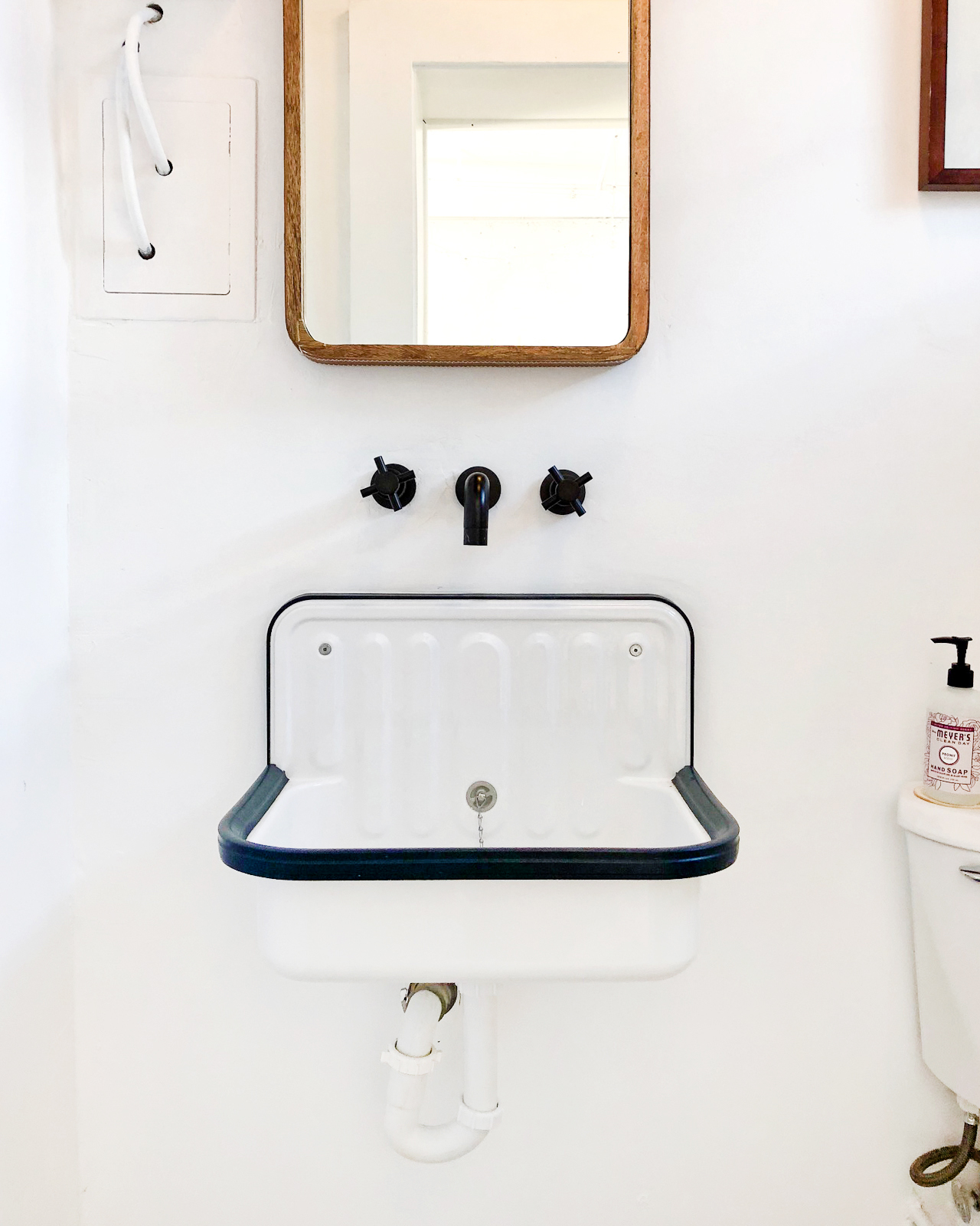
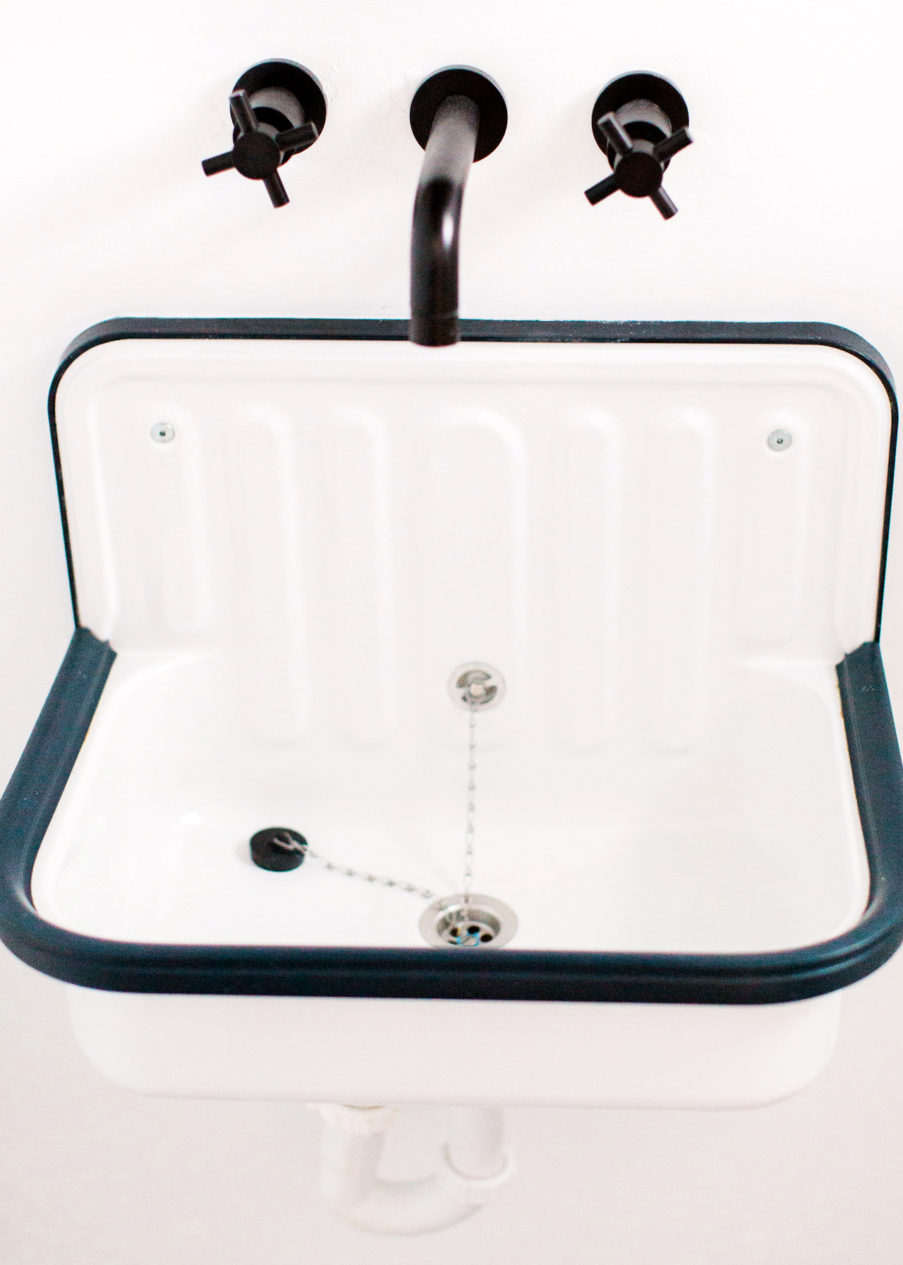
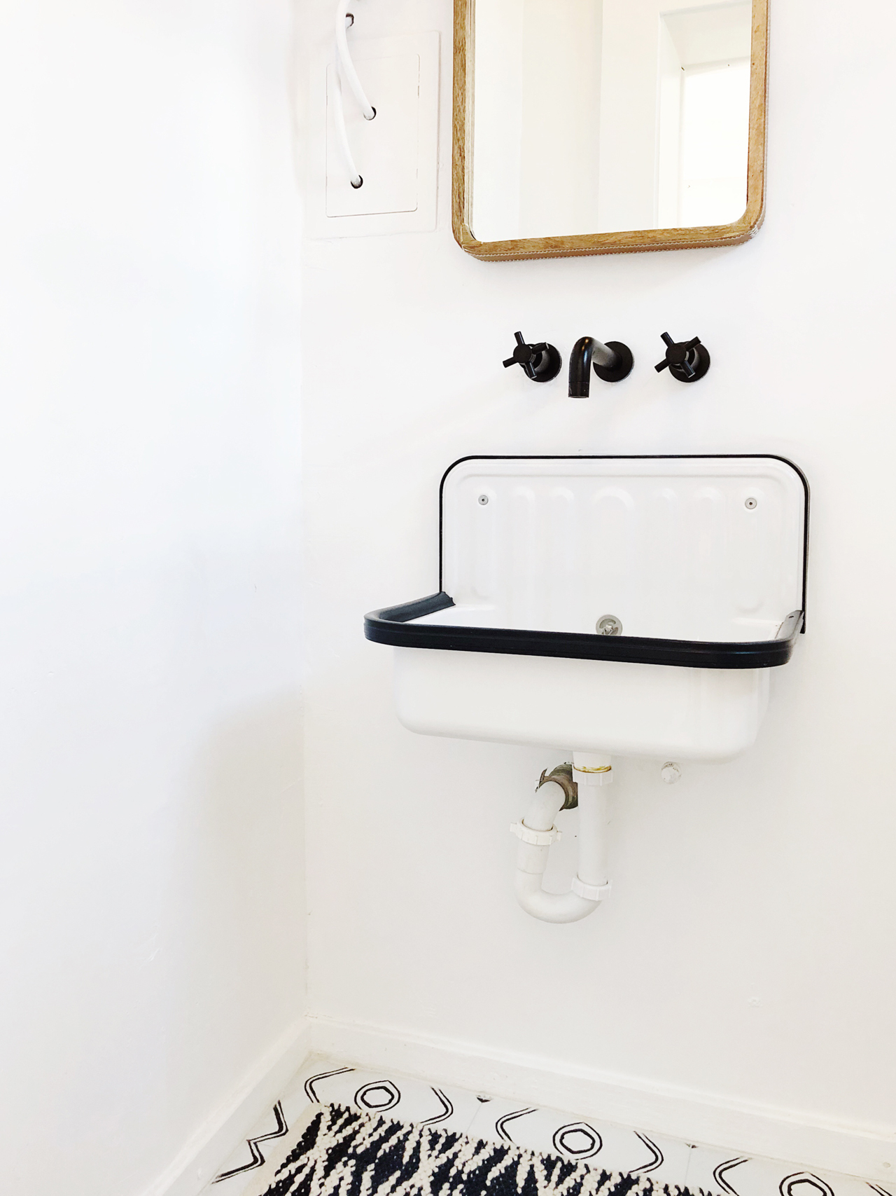
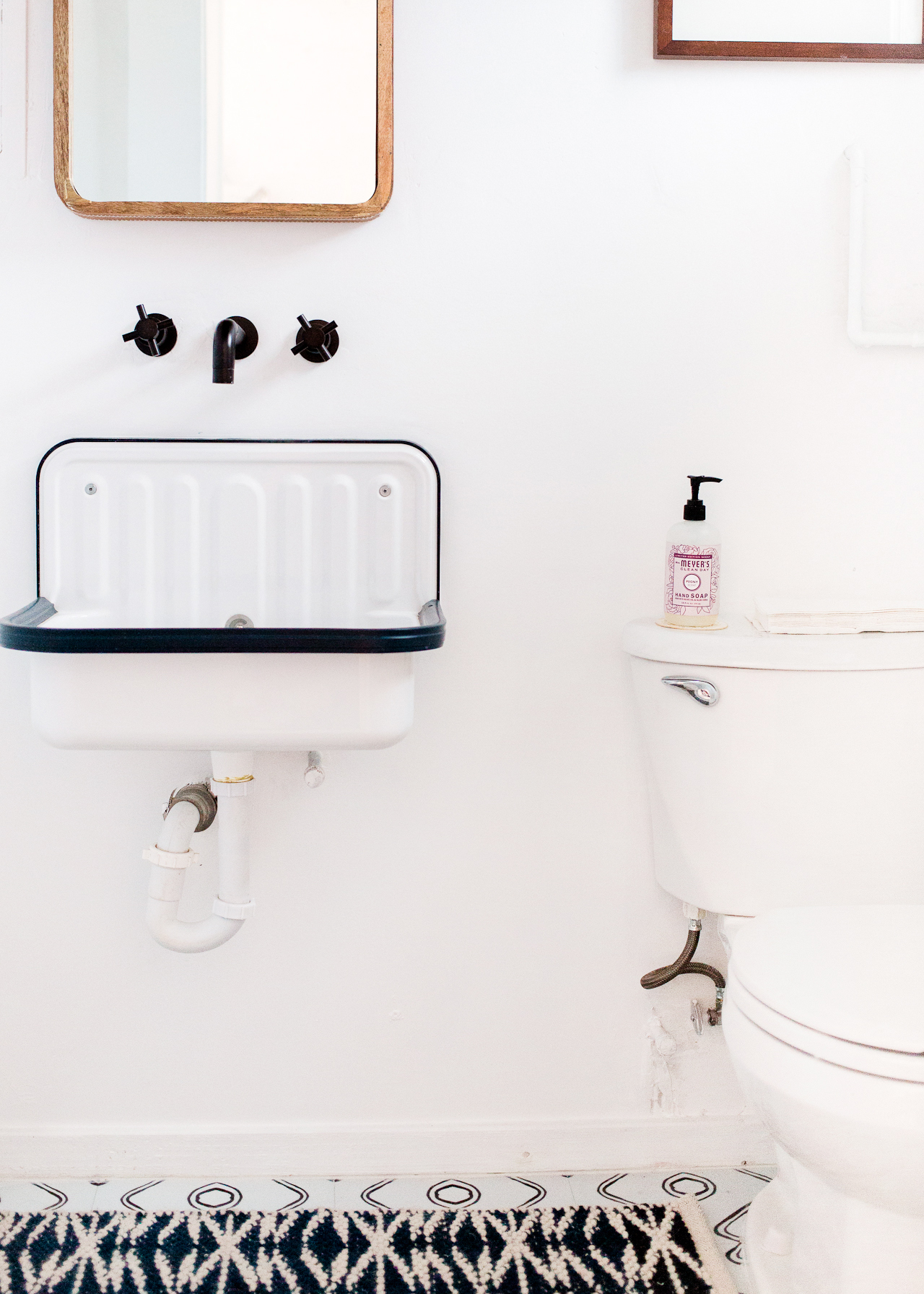
I have so many favorite details, but the Alape bucket sink is definitely at the top of the list. It’s made in Germany and I love the vintage-industrial look! This bathroom is super small, so I love having a wall mounted sink that doesn’t take up a lot of space. I ordered this wall mounted faucet to go with the sink and it’s absolutely perfect.

Common Room Studio: Bright and Airy Modern Half Bathroom Before & After

When it came time to do the floors, I wanted to do something with a pattern to add a bit of graphic interest in the small space. I love the playful patterns of cement tiles, but I needed something budget friendly. So we laid these peel and stick vinyl tiles from Quadrostyle right over the existing laminate (after giving it a good scrubbing, of course). It’s been almost a year since we first installed the vinyl tiles, and they’ve held up really well!

Common Room Studio: Bright and Airy Modern Half Bathroom Before & After

Common Room Studio: Bright and Airy Modern Half Bathroom Before & After

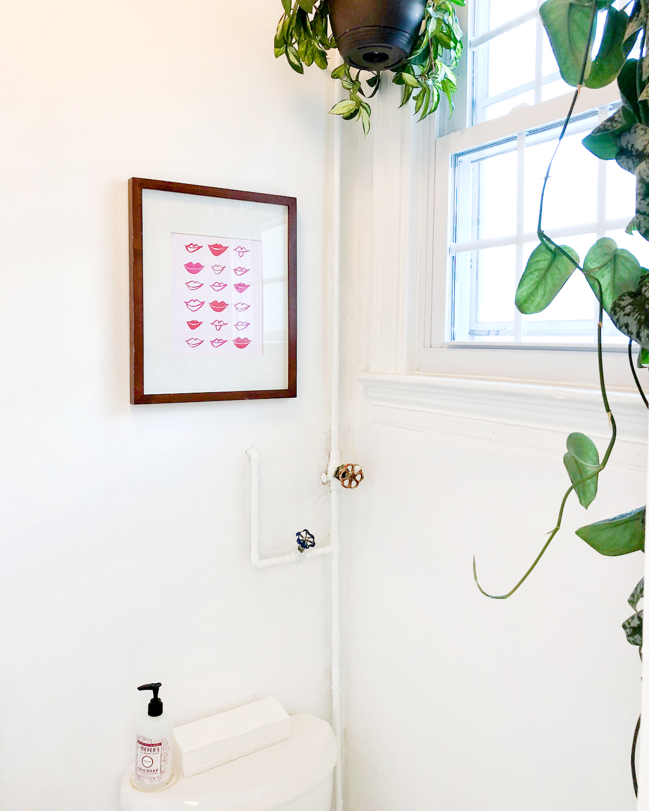
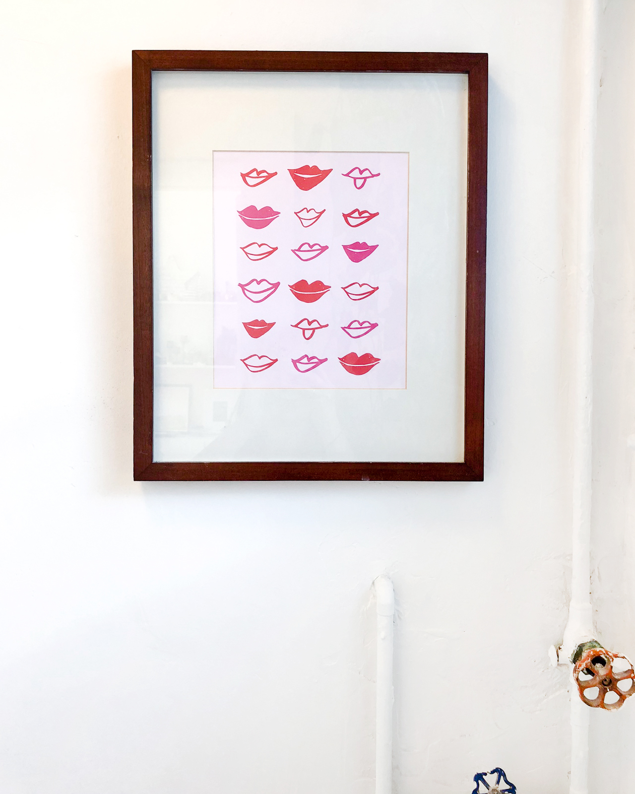
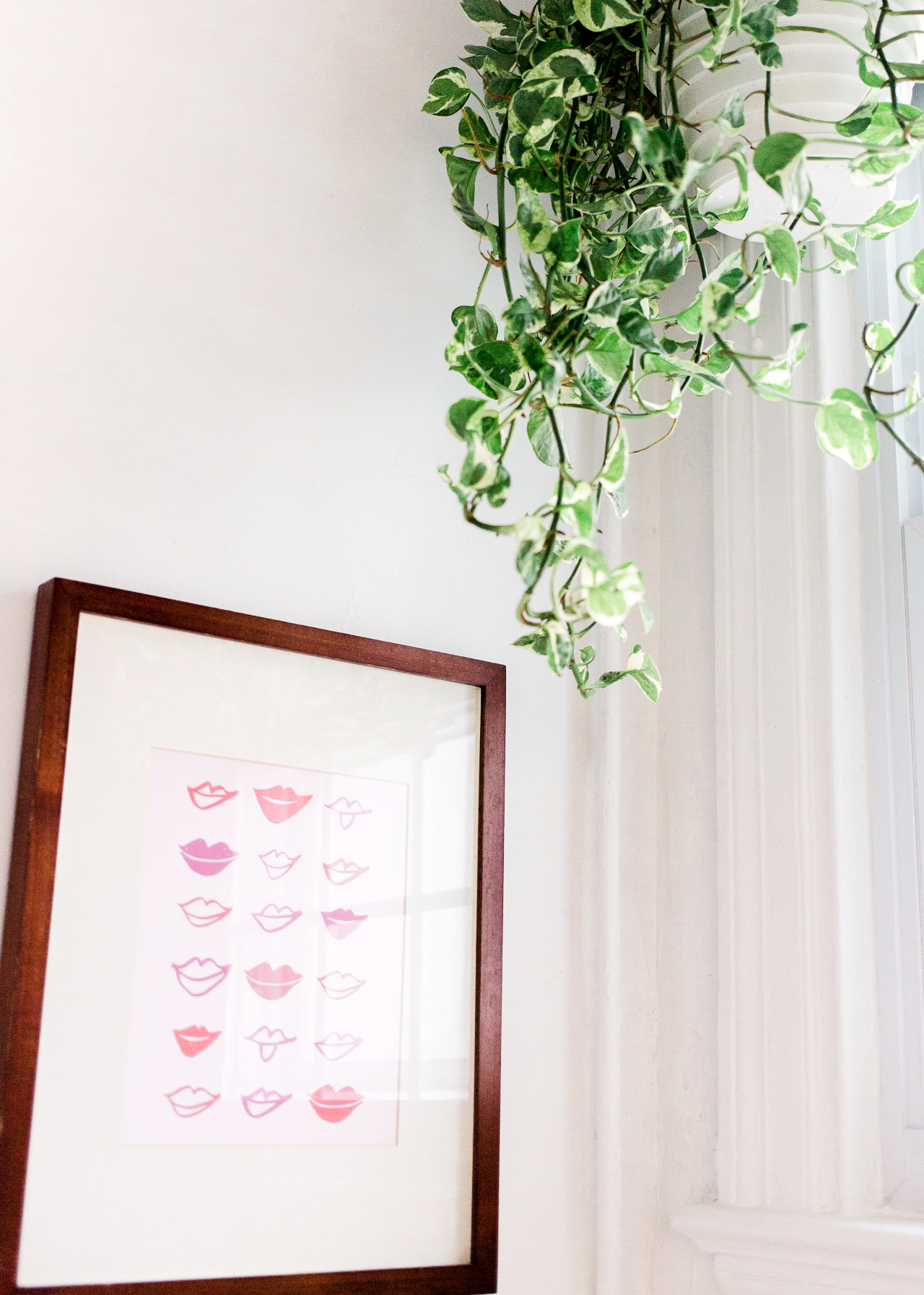
Lips art print by Thimblepress

Common Room Studio: Bright and Airy Modern Half Bathroom Before & After

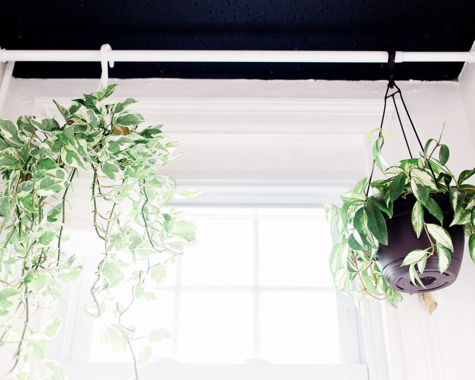
I knew I wanted to bring plants into the bathroom, but I didn’t think the acoustic tile ceiling could handle the weight of a ceiling hook and hanging plant. So we put up a pressure mounted shower rod by the window, and voila! We also painted the ceiling tiles black to help mask the texture, which turned out to be another favorite feature in the room!

Common Room Studio: Bright and Airy Modern Half Bathroom Before & After

The only other thing I might do is add a small shelf above the toilet for the paper towels and soap. What do you guys think?

Common Room Studio: Bright and Airy Modern Half Bathroom Before & After

Kind of a crazy transformation, right? If you’re in the DC area, I hope you’ll stop by for one of our upcoming workshops – and we also now offer weekday co-working if you’re looking for a fun spot to hang out at during the day!

Alape bucket sink available via Rejuvenation / Mirror (similar) / Wall mount cross handle faucet

Quadrostyle floor tilesThimblepress Lips art print

Photo Credits: Meghan Marie Photography and Nole Garey for Oh So Beautiful Paper

Behind the Stationery: Free Period Press

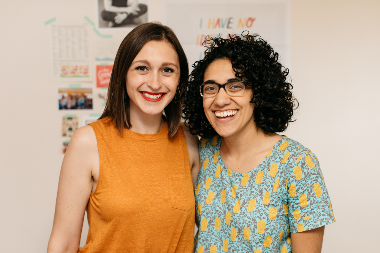
Our next installment of Behind the Stationery takes us to Cleveland, Ohio to chat with Lora of Free Period Press. Bringing a different perspective to the stationery business, Lora works with different designers to make her creative ideas come to life while running the business and fulfillment side of things in her spare time. Here to share about how she ideates and works with designers, here’s Lora! —Megan Soh
Behind the Stationery: Free Period Press

From Lora: Hi there! I’m Lora, the founder of Free Period Press, based in beautiful Cleveland, Ohio. We make nice paper things for a thoughtful and creative life, and I’m honored to share our story on Oh So Beautiful Paper today! The name “Free Period Press” comes from the free periods you get when you’re in school — those times when you can choose whatever you’d like to do. We want to create more space for adulthood free periods — and make them as fulfilling as possible.
Behind the Stationery: Free Period Press

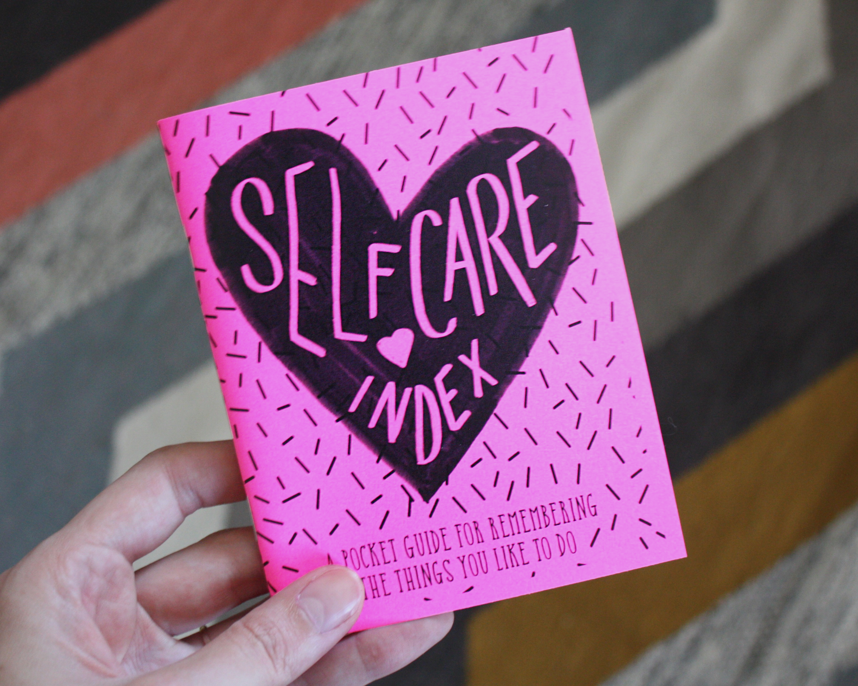
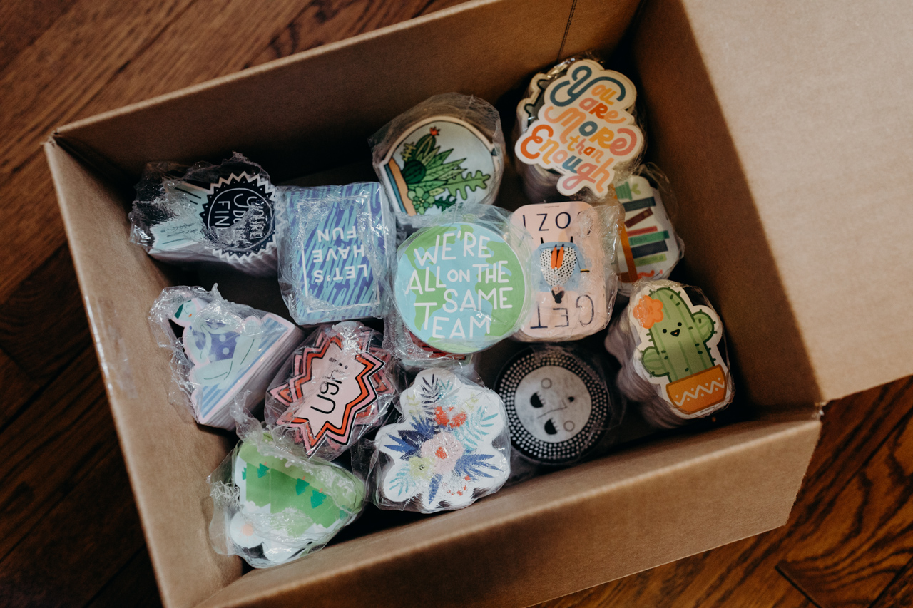
I started Free Period Press a few years after graduating college, when I realized that I had a bunch of creative product ideas that I wanted to see in the world. I’m not a designer, so instead of going back to school for design, I asked my artist-friends to collaborate with me in the creation of Free Period Press’s product line. It’s been so fun to see how my buddies take my initial ideas to the next level, making them better than I could have ever imagined. Katie Daugherty is my most frequent collaborator and has illustrated our Self Care Zine, stickers, and postcards for writing elected officials.
Behind the Stationery: Free Period Press

Our first product was one of the first coloring books for adults. Adult coloring books may sound like a cliche now, but at the time it felt like a major innovation! Since then, we’ve evolved into making products that are more self-improvement focused. I love thinking about the aspects that make up a fulfilling life (nature, relationships, play…) and creating products that help you make those a priority. I’m constantly getting inspiration from authors like Gretchen Rubin, Cal Newport, and Adam Grant.
Behind the Stationery: Free Period Press

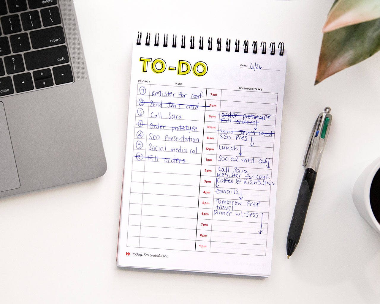
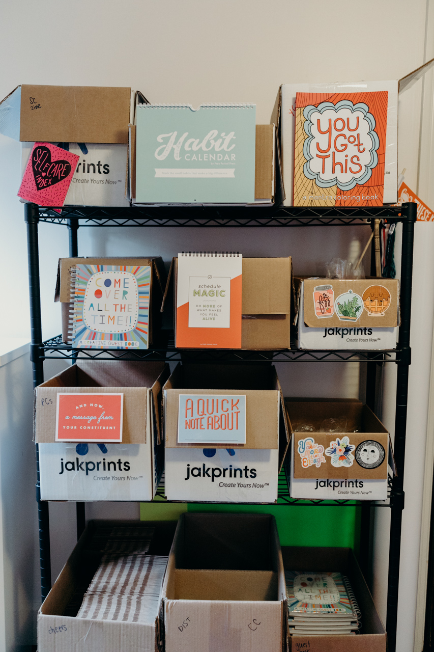
For example, in Gretchen Rubin’s Better than Before, she talks about the power of tracking habits, which was a major inspiration for our Habit Calendar. And since I pride myself in being a master list-maker, I turned the way I prioritize my own to-do list into our Schedule Magic notebook and notepad.
Behind the Stationery: Free Period Press

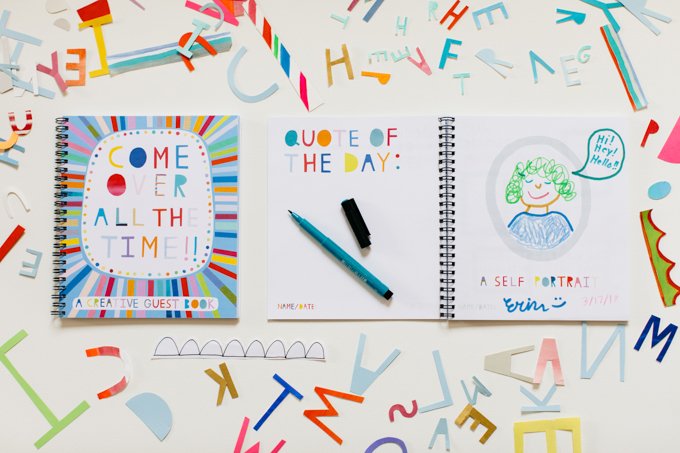
Our most recent product is Come Over All the Time: A Creative Guest Book, which is all about capturing everyday moments with the people you love.

My favorite part of the creative process is that initial moment of inspiration when a new idea strikes. I keep track of new product ideas in a pocket notebook that I take everywhere. I don’t just write down my idea, I also note where I was and what I was doing when I thought of it. I’m a creativity dork like that – I try to see patterns in where I am when I have these moments of inspiration. In case you’re curious, most of my ideas come when I’m in the shower, washing dishes, listening to a podcast or audiobook, or in that right-before-I-wake-up dream state. I even keep a notepad next to my bed for those middle-of-the-night ideas that I don’t want to lose (most of those don’t make ANY sense in the morning!).

Behind the Stationery: Free Period Press

I often let my new product ideas marinate for year or more before I act on them. I pay attention to what ideas I can’t stop thinking about, but I also give myself room to see the idea from different perspectives and let it evolve. At the end of every year, I go through and rank these ideas on a bunch of factors: how much energy I have around the idea, profit margin estimates, ease-of-execution, and informal feedback from friends and followers.

Behind the Stationery: Free Period Press

This process helps me identify the products I want to develop the following year. By this point, I usually have an idea of the designer that would be the best fit for each product, so I’ll approach them and ask if they want to collaborate. Once we’re on the same page, I like to outline every little task that will go into bringing the product into the world. This makes the process seem a little less daunting and gives us a clear game plan of where to start. Then we just start chipping away! I try to spread out our product releases so that we’re releasing something new every quarter, but inevitably there’s a mad dash to get things released before the holidays.

Behind the Stationery: Free Period Press

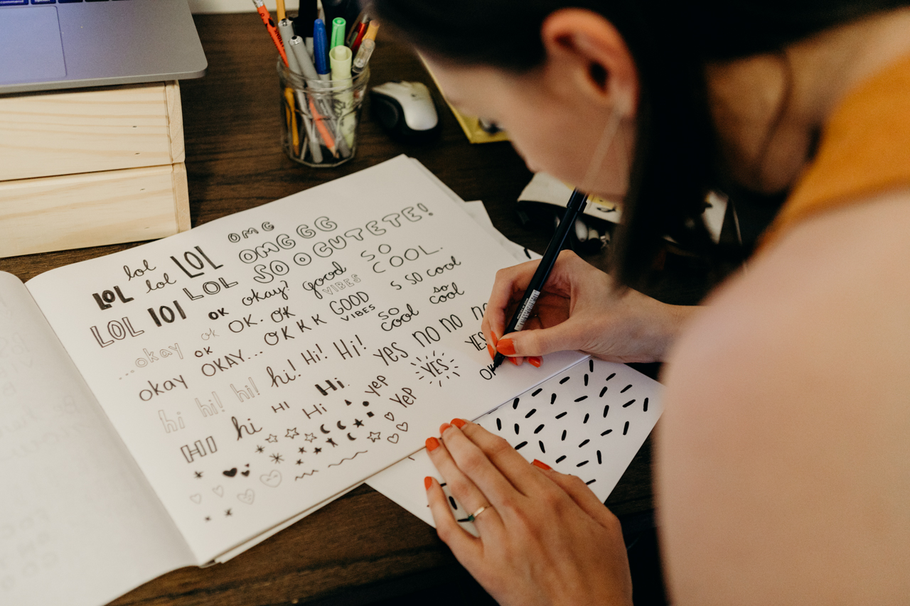
We partner with a few different printers in Cleveland depending on the complexity of the project. When looking for a manufacturing partner, we have to find someone that has the capabilities we need (binding, finishes, etc.) but we try to stick with smaller companies where we can have a face-to-face contact. We’re lucky enough to have Jakprints in Cleveland, and have developed a great relationship with their team. We still use a couple of mom-and-pop printers for smaller projects like postcards and marketing materials.
Behind the Stationery: Free Period Press

Free Period is still my side hustle at this point. While there are days that I daydream about taking Free Period full-time, I love the freedom that my full-time job gives me – it allows me to experiment in ways that would be harder to do if I were relying on it to pay my bills.

Of course, this also means I’m living that side-hustle life, squeezing Free Period tasks into every spare second of the day. I’m a morning person, so I prefer getting up early to email stockists, fill orders, and work on new products. Having a home-office makes that much easier, especially now that my wife and I moved into a house and are no longer being suffocated by inventory in our one-bedroom apartment!
Behind the Stationery: Free Period Press

Since the time I have to work on Free Period is limited, I really have to stay focused on my goals and prioritize my to-do list. It’s a constant juggle between growing wholesale, branding directly to consumers, and developing new products. When looking at the tasks on my list, I find it helpful to think about which tasks could have the biggest potential to move the needle towards my goals.

That’s Free Period in a nutshell! Thanks so much for taking the time to learn about our labor of love. You can find us at freeperiodpress.com and on Instagram at @freeperiodpress – please come say hi!

Photos courtesy of Hilary Bovay Photography.

Want to be featured in the Behind the Stationery column? Reach out to Megan at megan [at] ohsobeautifulpaper [dot] com for more details.

Neutral Modern Minimalist Wedding Invitations

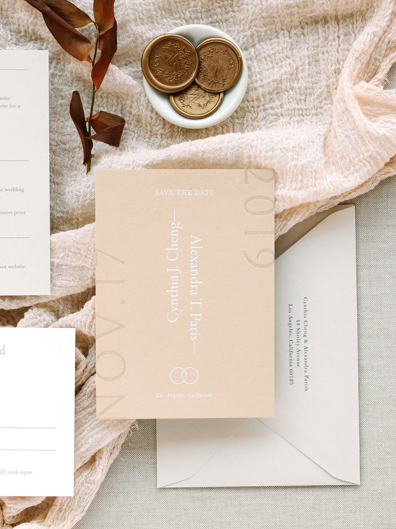
I’ve been on a bit of a minimalist design kick lately. I first caught sight of the gorgeous save the dates in these neutral modern minimalist wedding invitations from Cindy of Owl Post Calligraphy and fell in love with the way Cindy had played around with the type size and orientation, not to mention the beautiful white foil over a slightly darker neutral paper. I asked Cindy if she’d be willing to share the full suite with all of you, and luckily she agreed! In addition to the fun minimalist type, I love the way Cindy combined slightly different paper colors for a beautiful and tonal neutral color palette. So perfect for fall!

Neutral Modern Minimalist Wedding Invitations by Owl Post Calligraphy

From Cindy: This suite is one of my semi-custom invitation collections called “Sacred Vows.” I was inspired by the traditional vows that are said during the wedding ceremony – hence the name!

Neutral Modern Minimalist Wedding Invitations by Owl Post Calligraphy

Unlike many of my other suites, this one does not contain any calligraphy and was done with all typographical design concepts. The suite is meant for the minimalist but not “boring” couple. Playing with text placement, direction, and size, the element of play is what makes this suite one of my favorites!

Neutral Modern Minimalist Wedding Invitations by Owl Post Calligraphy

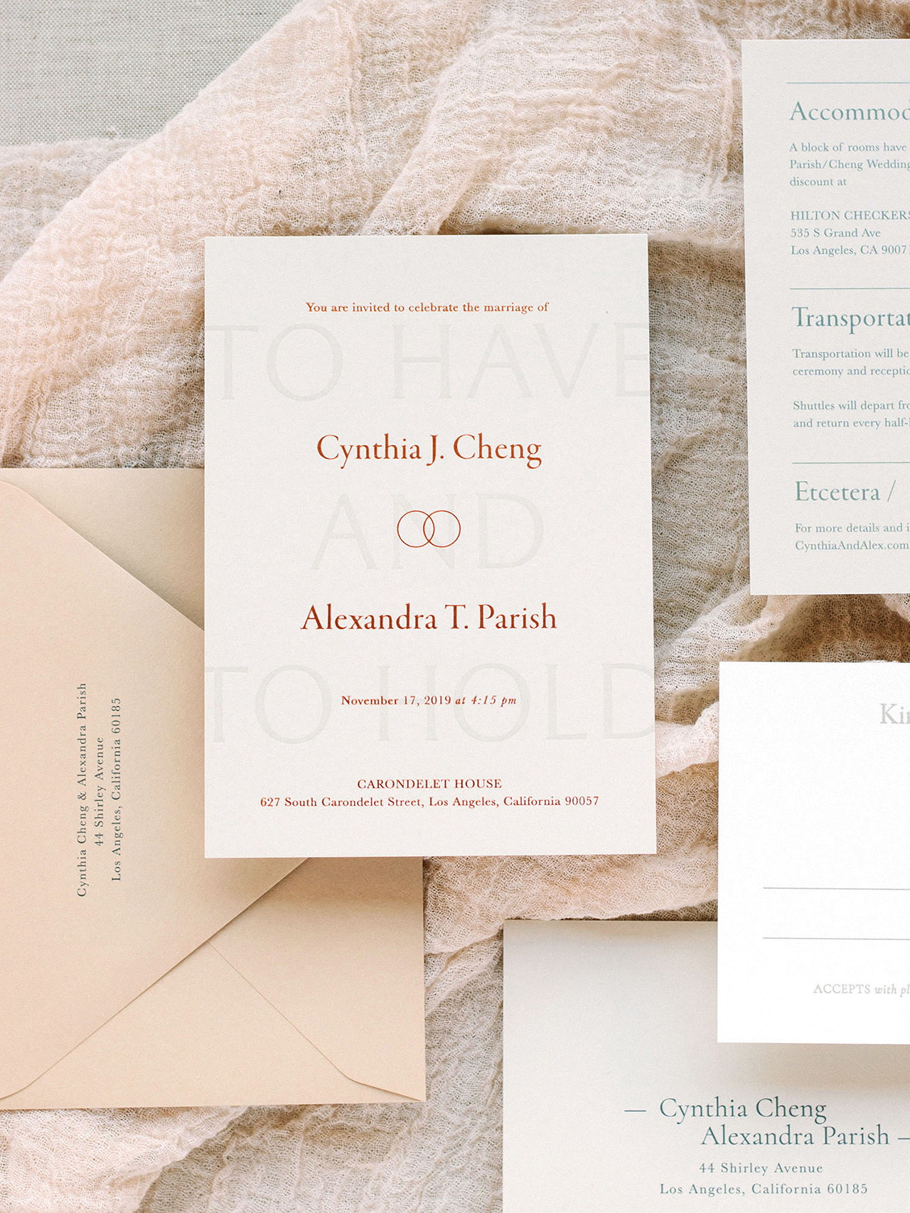
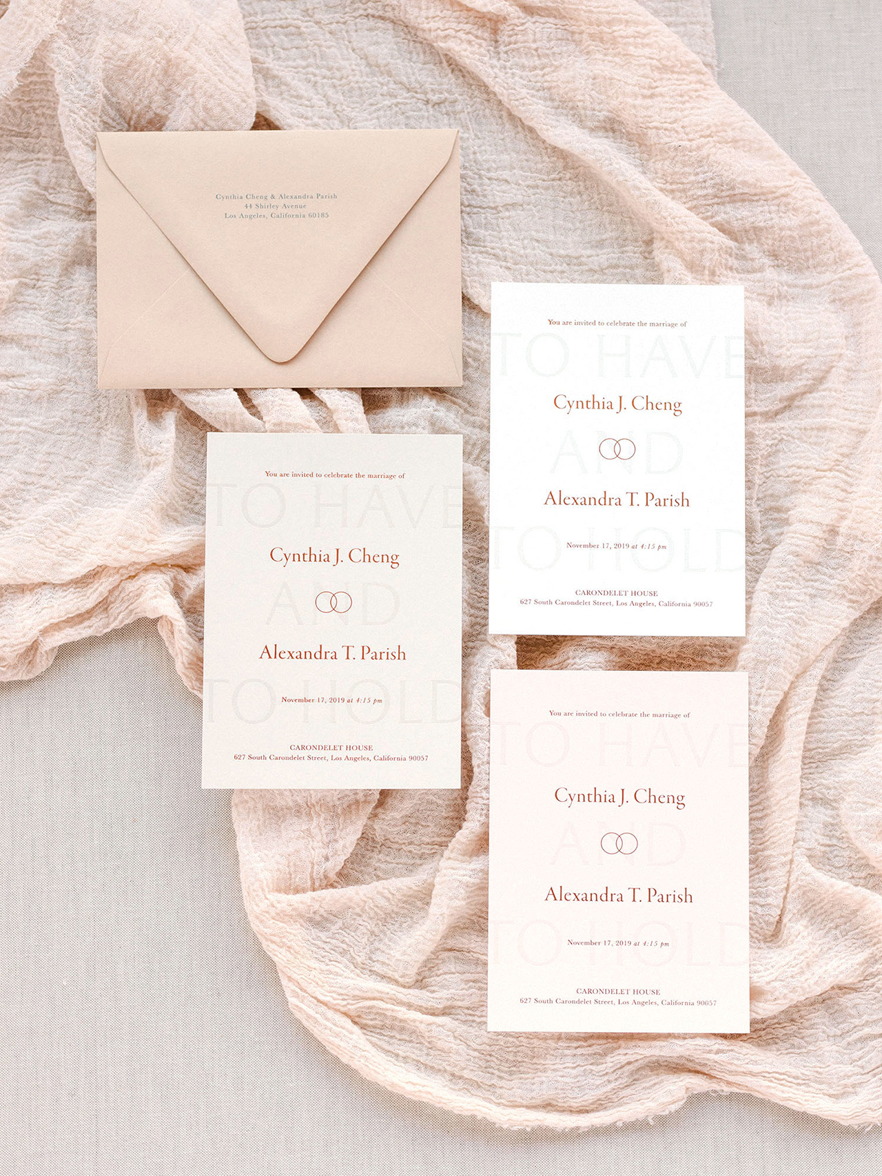
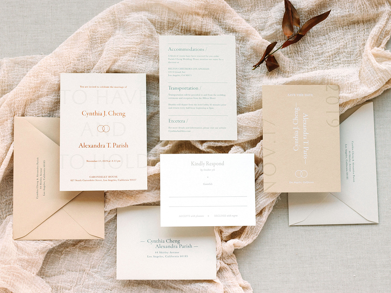
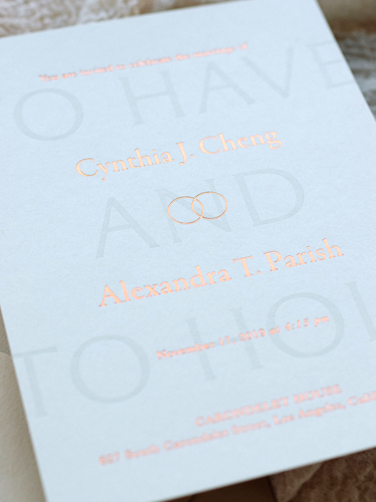
The save the date and main invitation card have multiple print processes (foil and letterpress) to add dimension. The details card and reply card are simple and clean so as to not overpower the rest of the suite. The theme of two rings runs throughout the suite as a small emblem on the invitation card and save the date. The age old saying “to have and to hold” is letterpress printed onto the background of the main invitation card.

Neutral Modern Minimalist Wedding Invitations by Owl Post Calligraphy

This suite can be printed in multiple ink and foil colors and paper colors, but the photos I have included represent a beautiful neutral palette that is not the usual eggshell white suite but still neutral enough for timeless elegance. It is the perfect palette for fall weddings! A lot of couples think that all cards and all envelopes have to be the same color but switching it up a bit can really add a lot of intrigue to a suite! If you are afraid of it looking too complicated with all the colors, my favorite this to implement is a tonal palette (like this one) where the papers are only slightly different in the same color family. When creating my semi-custom collections for this year, I really wanted to cater to ALL couples so I made sure that I had same-sex couples represented, including this one!

Neutral Modern Minimalist Wedding Invitations by Owl Post Calligraphy

Thanks Cindy!

Design: Owl Post Calligraphy

Printing: Copper Willow Paper Studio

Looking for more wedding invitation inspiration? Visit our wedding invitations archive for more custom wedding invitation ideas!

Photo Credits: Owl Post Calligraphy

Friday Faves

Color Factory New York City / Oh So Beautiful Paper

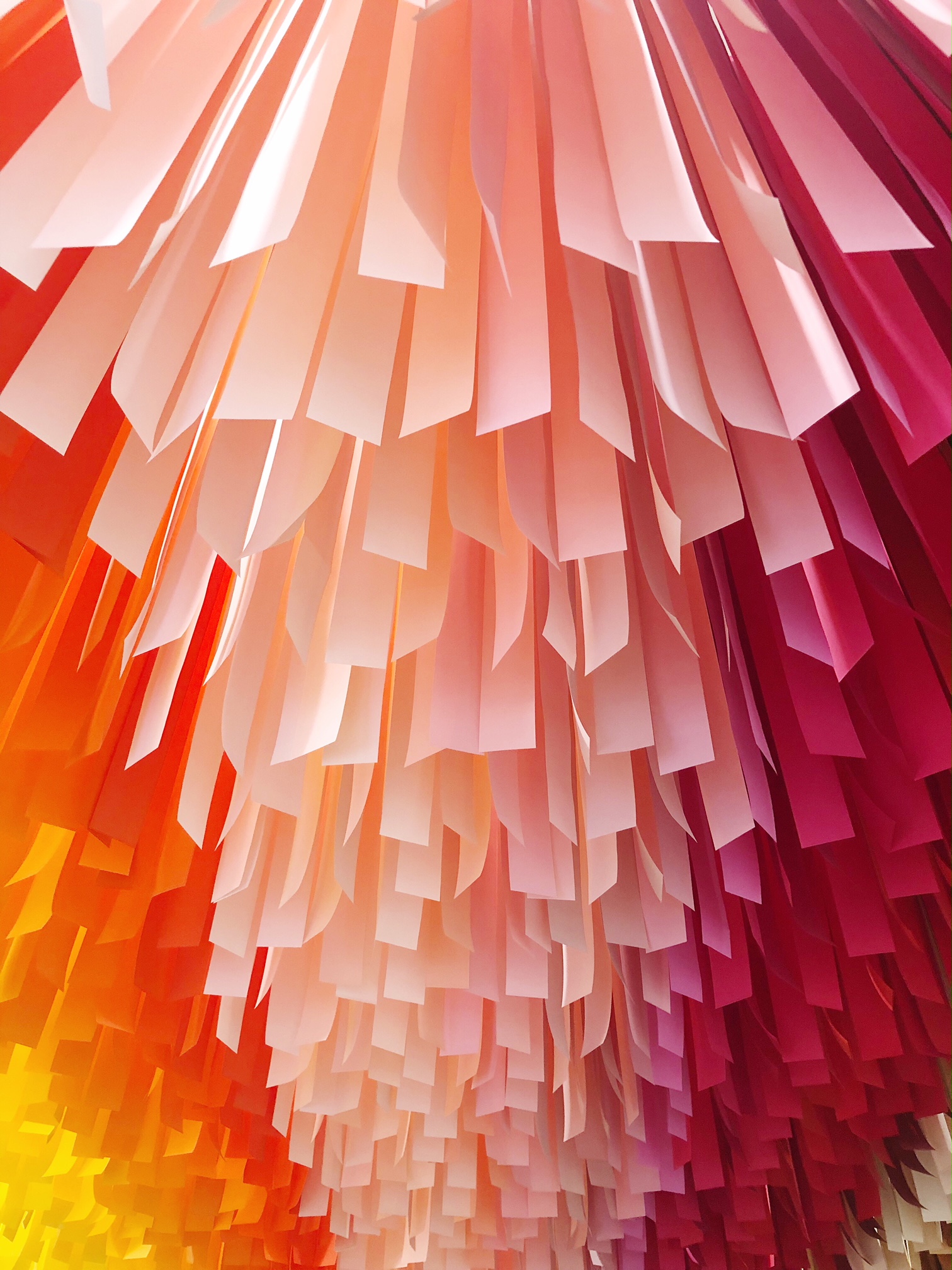
Happy Friday everyone! Last Friday, I escaped up to New York City with a friend for a quick day trip. I’m up in the city frequently for trade shows and meetings, but I never get the chance to just go out and explore the city. We went to Color Factory, walked the High Line, grabbed lunch in Soho, and met up with a couple other friends before jumping on the train back home to DC. It was great! This weekend, I’m celebrating my daughters’ birthdays (they turn 4 and 6!) and looking forward to a quiet weekend at home.

My friend Gabrielle wrote an amazing thread on men and unwanted pregnancies. You should read it!

How are we feeling about the 2019 Sherwin-Williams Color of the Year? I personally think it’s very trendy, but best used sparingly in accents and details. For example, I love it as a pop of color in this pillow – but probably not on an entire wall. 
Modern political ads: Viral videos are replacing pricey political ads

I think about this every time I’m in New York: the empty storefronts of New York City

You guys, how COOL is this iridescent table lamp??

There are whales alive today who were born before Moby Dick was written (!!)

This shocked me: Deaths from 9/11 diseases will soon outnumber those lost that day

This image sums up my fall color palette

I was in Target earlier this week and fell in love with this sweater knit blanket. A bunch of you messaged me to say that you have one and love it! Well, they’re currently on sale in a bunch of colors. I’m particularly loving the light gray color, but it also comes in pink, charcoal, and navy! Here are a few other things I’m loving this week:

xoxo