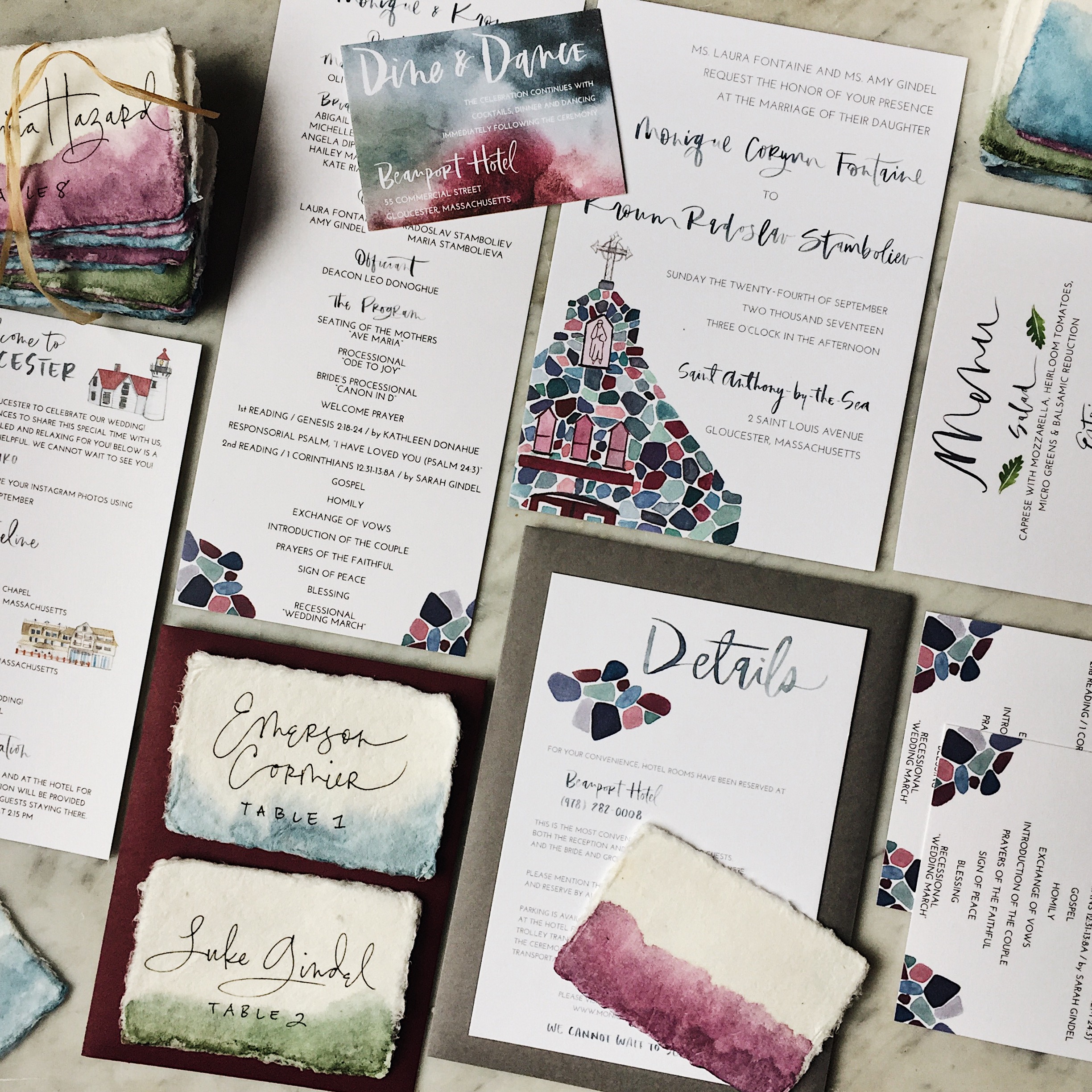
Hey everyone! It’s been a hot summer in many places so I thought it only fitting to pull some inspiring calligraphy work with a true summertime vibe. Here’s a look at the work of Li Ward Calligraphy. I love the mix of her lettering work and watercolor and illustration, and how each wedding suite looks so fitting for the destination. With that, let’s grab a lemonade and check out Li’s beautiful calligraphy! – Jen
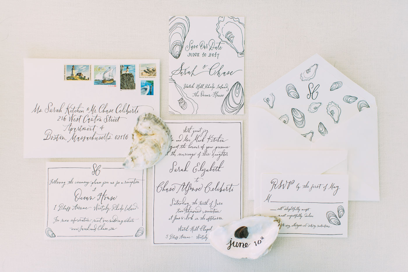
Photo Credit: Cambria Grace Photography
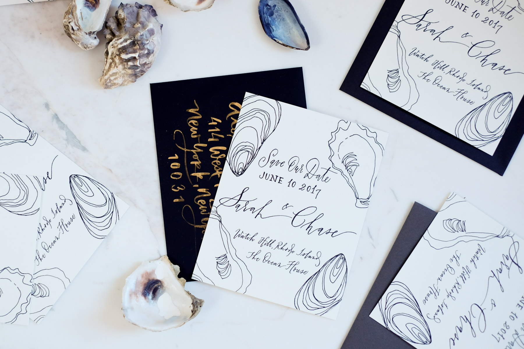
On how she got her start, Li shares:
I started calligraphy about 6 years ago, using traditional pens with nibs that you dip into ink. I started doing spot lettering for other stationery designers whose clients requested some hand lettering for their invitations. Two years ago when I began dabbling in watercolors, I decided to go “full service†with invitation design: I would take care of not just lettering, but full design which would include watercolor illustrations, hand lettering, envelope liner design, paper choice, and printing.
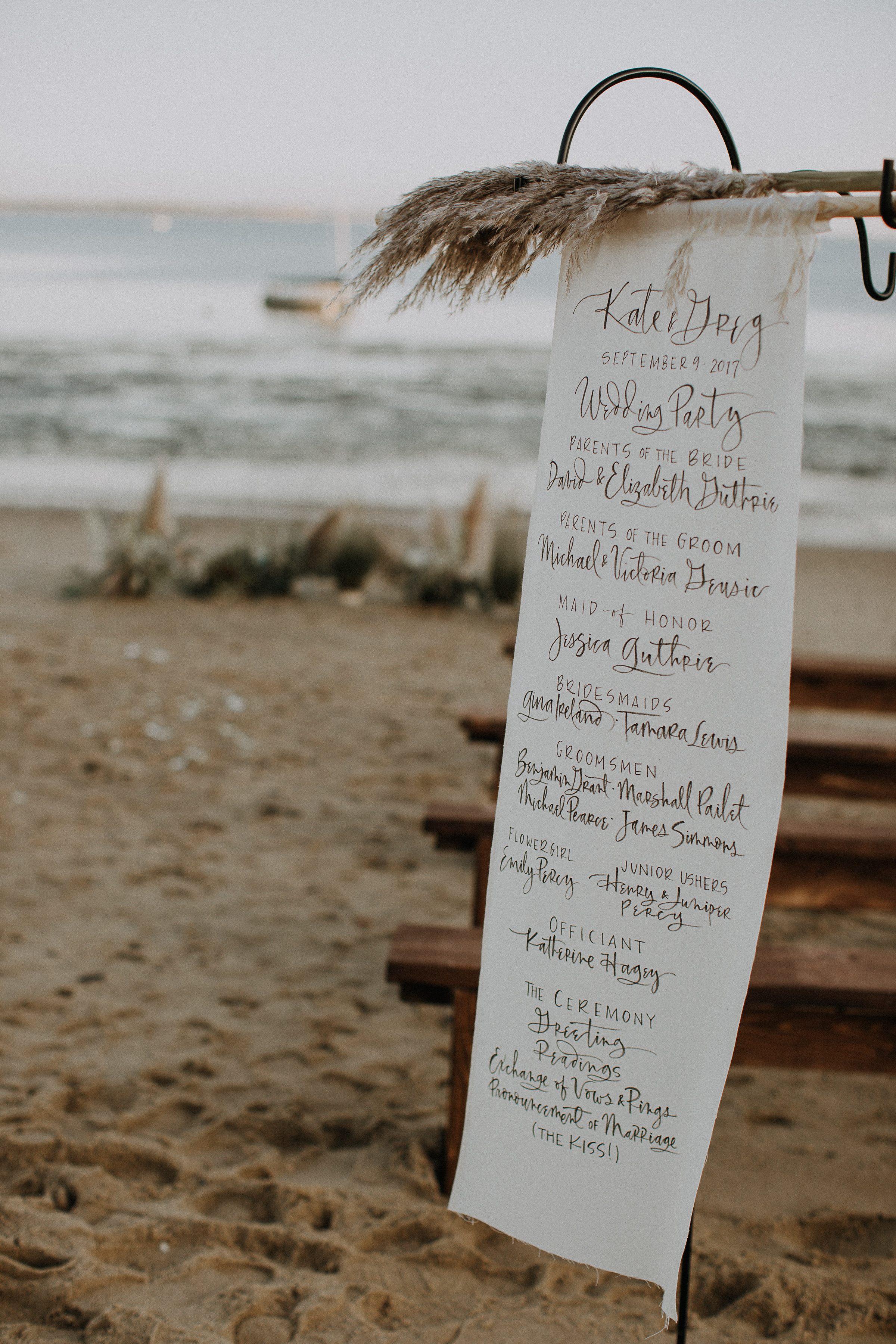
What inspires Li? She gets inspiration from Jane Austen, scratchy old-fashioned script, Edward Gorey’s irreverent sense of humor, Matisse’s bold color palettes, stained glass designs — just to name a few. “I’m still really new to this and constantly trying new things out,” says Li.
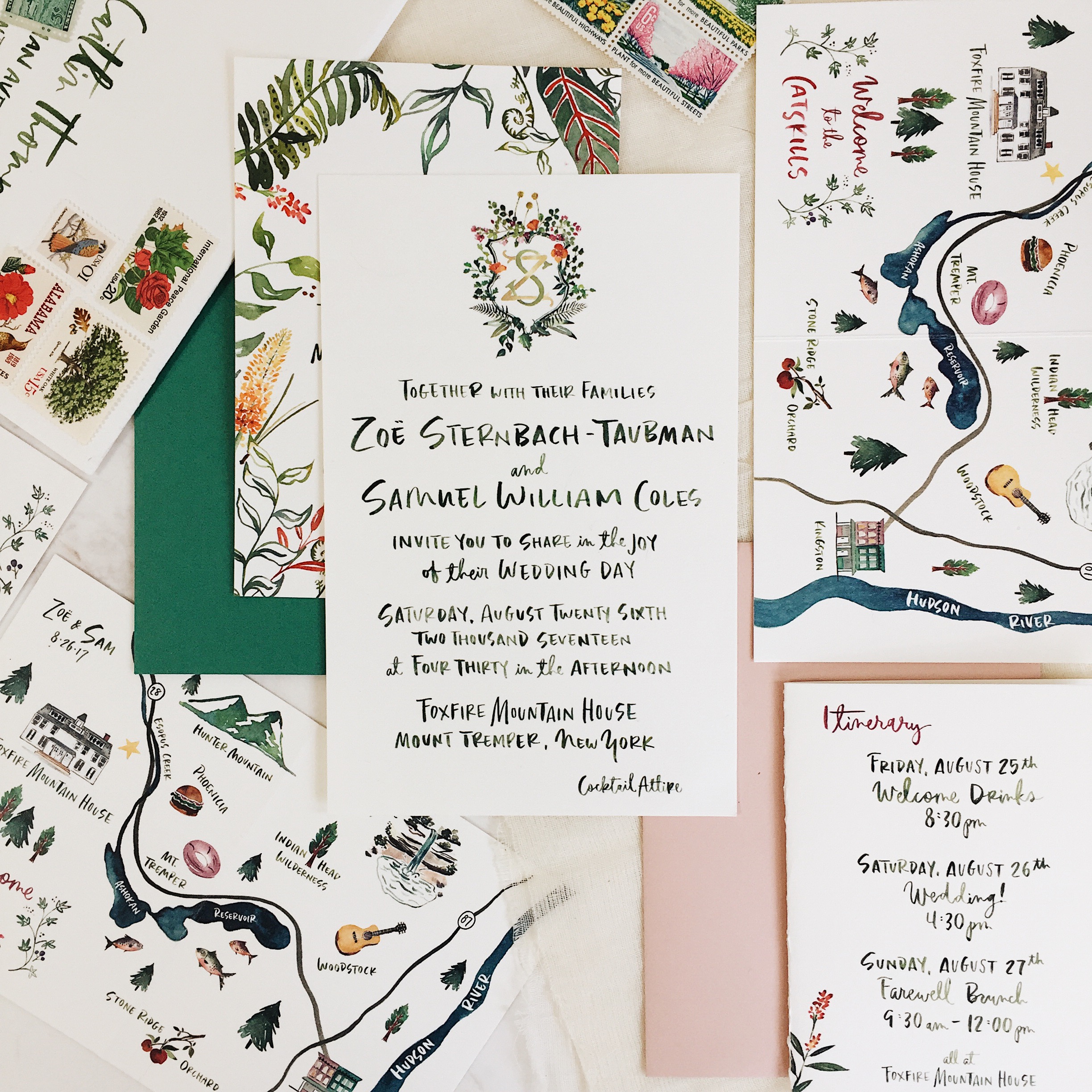
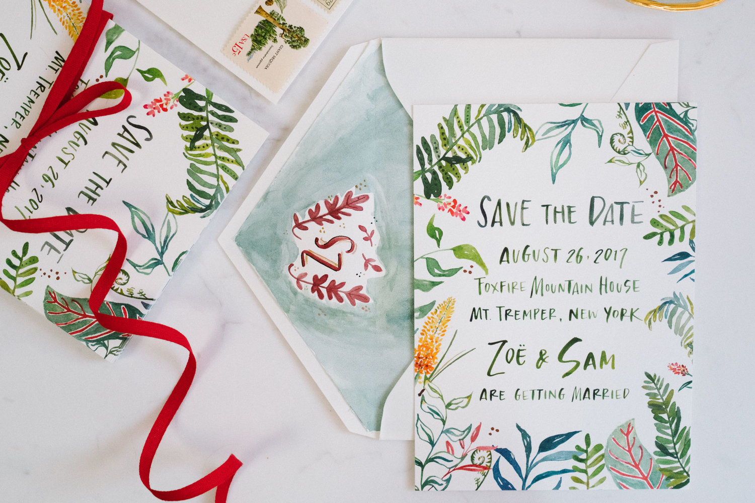
“One of my favorite suites is the Catskills wedding suite (Zoe and Sam), which included Save the Dates, folded maps, and illustrated menus,” says Li. “The couple had already commissioned Happy Menocal to design their crest. Happy just happens to be one of my favorite artists, so I was really thrilled when they asked me to design the rest of the suite that would complement Happy’s design. I took inspiration from Edward Gorey’s illustration style and Happy’s of course, threw in block font mixed with cursive, went with a more is better frame of mind. And it’s kind of been the basis of my style going forward. I’m definitely all about bold colors and shapes!”
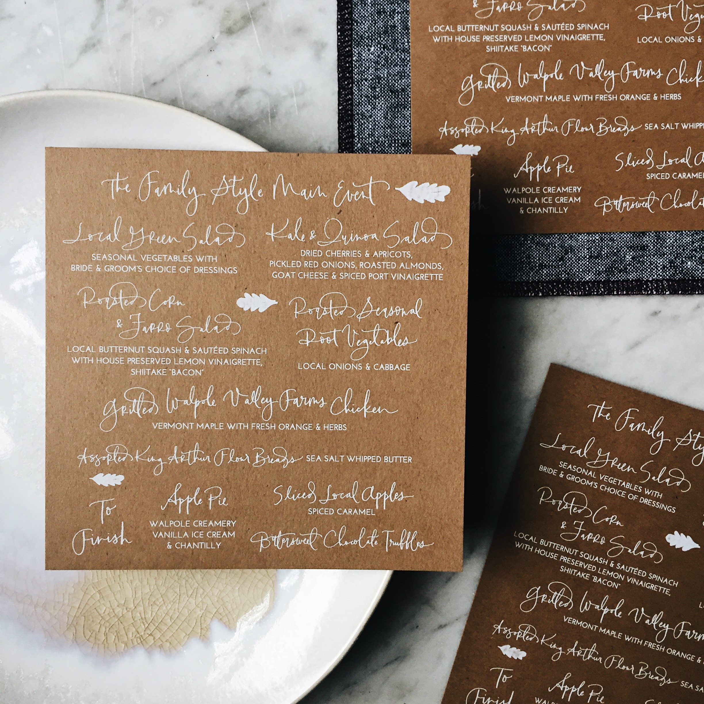
As much as I love Li’s illustration work, I’m also a big fan of this kraft brown wedding suite she designed. The white lettering on kraft brown paper has a modern organic vibe that feels casual, yet cool.
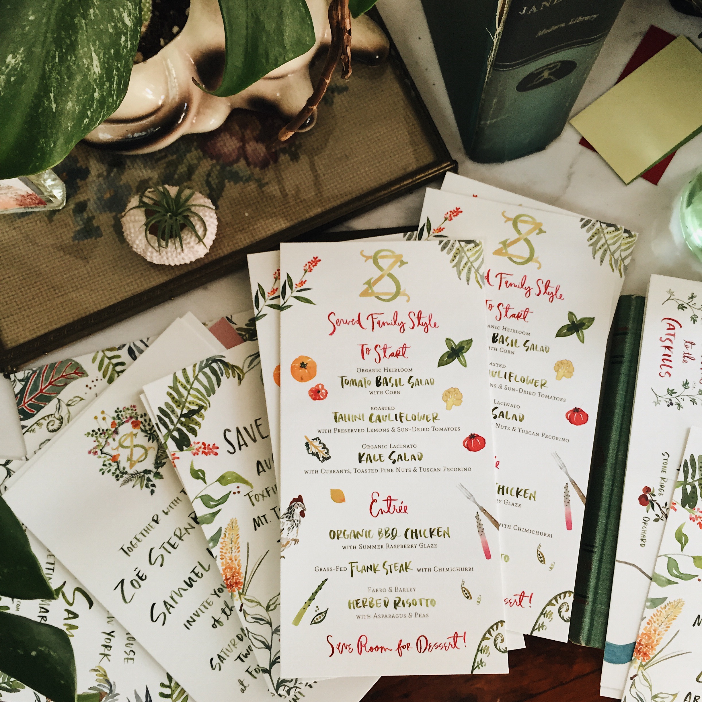
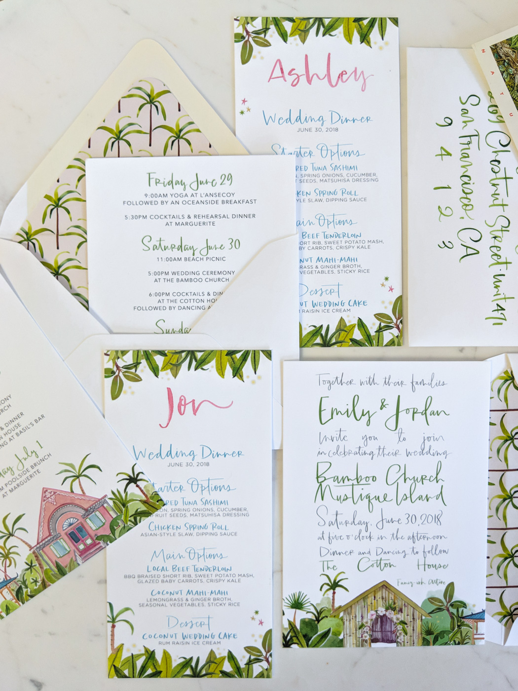
Another favorite style? Li loves to do “seamless” designs. “If you were to put two cards side by side, the design from one card would match up with the design on another,” says Li.
Big thanks to Li Ward for sharing a a peek into her world of lettering!
All photos by Li Ward, except where noted
Want to be featured in our calligraphy column? Reach out to us at submissions [at] ohsobeautifulpaper [dot] com with the subject line “Calligraphy Feature†for more details!

Absolutely amazing! some of them are masterpieces. I love to see the creativity growing 🙂
Awesome logo Great design, very different from the typical wedding invitations.
Beautiful!!! I love it ))
Georges.Great ideas with such and ideal wedding card will remembered !
Great my friend, you have brains. You have shared some truly fabulous ideas in this blog post.
I am soooo grateful to have discovered your blog! It’s an invaluable jewel. â¤
Your blog is fantastic! Thanks for the information
Appreciable post it is..!!! â¤