Travel-Inspired Letterpress Business Cards from A Fine Press

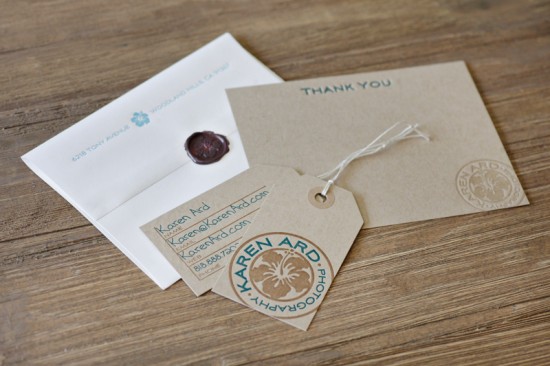
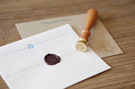
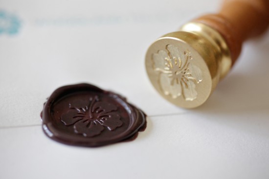
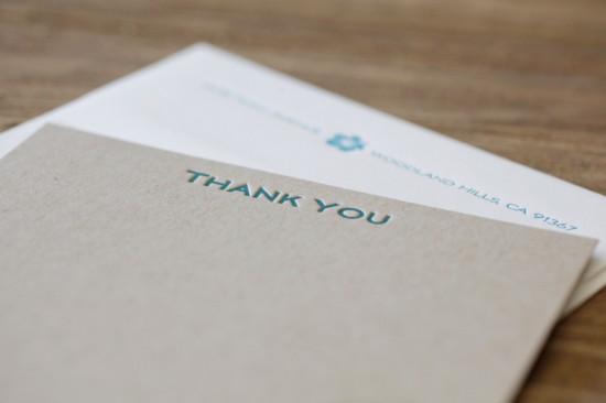
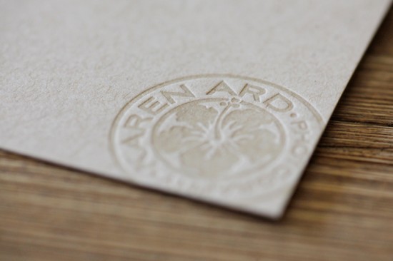
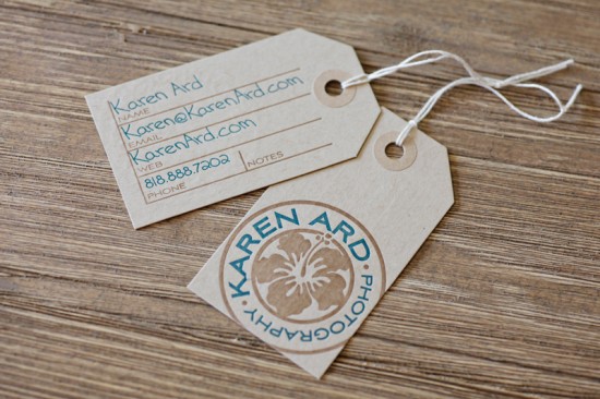
Matthew from A Fine Press sent over the fabulous business identity and stationery that he recently designed for wedding photographer Karen Ard.  Karen loved the idea of incorporating a wax seal (such a great detail!) and doing something travel-inspired, so Matthew came up with an identity inspired by Southern California surf culture and business cards inspired by luggage tags.  The entire suite was letterpress printed on kraft paper in soft and beachy colors.  So lovely!

From Matthew: Karen was particularly drawn to the idea of a wax seal to bring her business stationery together.  She approached me with the idea of doing a travel-inspired visual identity and stationery suite that maintained a nod to her SoCal location.

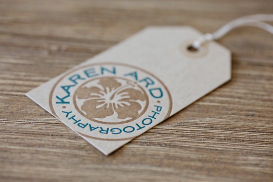
For inspiration, we drew heavily from postage and postmarks from around the world.  We loved the idea of using the circle of a postmark as our starting point.  A friend’s surf video got me thinking about all the great surf-culture branding out there and the image of a hibiscus blossom on a longboard provided us with a clear direction.

Karen wanted colors to reflect the beach and had suggested we start with seaglass colors.  From there, we settled on teal, with brown as a second color along with cream and kraft-substrates.  For a typeface, we went with the Deco-styled Aviano Sans, which I found extremely evocative of vintage travel.

The print pieces were done on French Paper’s Muscletone Kraft with PopTone Whip Cream envelopes.  In addition to Karen’s official colors, I printed her 1-color logo in transparent white on her thank you cards to make it pop while keeping it neutral in color.  Her luggage tag-inspired business cards were printed with her handwriting filling in the important details.

Thank you so much Matthew!

Photo Credits: Karen Ard
Beth + Michael’s Chevron Stripe Calligraphy Save the Dates

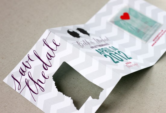
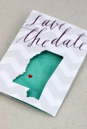
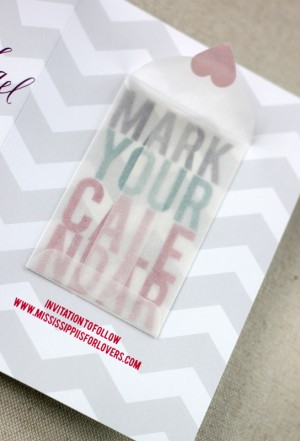
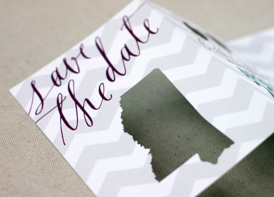
My oh my, I’m seriously in love with these save the dates. Created by Sarah of August Blume, Beth and Michael’s modern and whimsical save the dates combine beautiful lettering from Feast Calligraphy, chevron stripes, a fun interactive layout, and cut-out details. So cute!

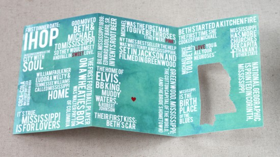
From Sarah: I had the pleasure of designing a save the date card (and getting extra creative) for photographer Beth Morgan and her beau, Michael, for their spring 2012 wedding.  With a palette of teal, plum, fuchsia & slate (and the occasional red heart), we mixed their “Mississippi is for Lovers” theme with custom silhouettes and a muted chevron pattern.

We wanted a unique, interactive save the date to set the tone for their April wedding and to get guests excited about traveling to the South.  The couple met and fell in love in Mississippi so we included little-known-facts about the couple and their state on the back of the trifold card with a teal watercolor background.


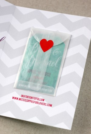
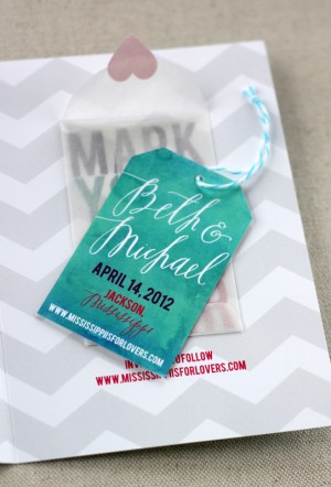
The last panel features a mini glassine envelope holding a hang tag so guests can mark their calendar!  The calligraphy was penned by the very talented Alissa of Feast Calligraphy.  The cards were digitally printed on solar white cover stock and each Mississippi was individually cut using my Silhouette Cameo.

I love it!  Thanks Sarah!

Check out the Designer Rolodex for more tal­ented wed­ding invi­ta­tion design­ers and the save the date gallery for more beau­ti­ful cus­tom save the dates!

Photo Credits: August Blume

Wood + Foil NASCAR Invitations from Lettered Olive

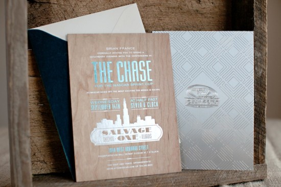
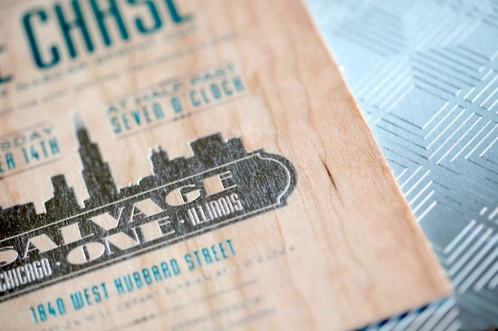
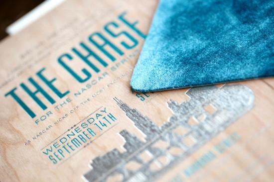
I’m used to gushing over the beautiful wedding invitations from the ladies of Lettered Olive, but today they’re sharing something a bit different – NASCAR invitations!  These gorgeous mixed media invitations were created for a celebratory party for the NASCAR Sprint Cup.  Inspired by the industrial event space in Chicago, these invitations combine wood, etched metal, and beautiful metallic foils.

From Christine at Lettered Olive: We recently worked with NASCAR to create an invitation for a celebratory evening kicking off the Chase for the NASCAR Sprint Cup.  This event was at a fabulous space in Chicago called Salvage One.  The space is industrial, with wood beams, brick walls, and exposed metal.  We just loved the space and found it so inspiring!  So we created the invitation for a “Legendary” evening (the dinner entertainment was John Legend!).

The invitation was metallic blue and silver foil on wood, backed with etched metal.  The great thing about this job is that it allowed us to get in touch with our “masculine side” – this invitation was all about clean lines, the mixed materials, and total sophistication.  To add another luxe element to the invitation, we foil stamped the envelope and created a teal velvet envelope flap to mimic the amazing vintage velvet sofas at the venue.

So amazing!  Thanks ladies!

Lettered Olive is a mem­ber of the Designer Rolodex – you can see more of their beau­ti­ful work right here!

Photo Credits: Melanie Mauer for Lettered Olive

p.s. I have an awesome giveaway coming up a bit later, so check back soon!


Kat + Ben’s Modern Flowchart Wedding Invitations

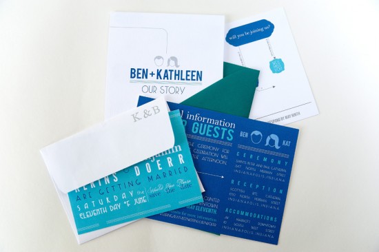
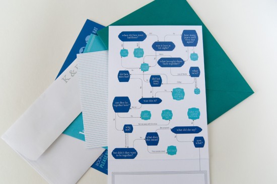
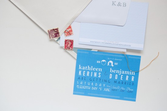
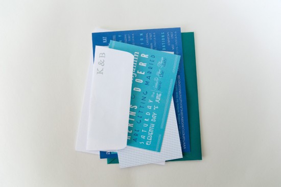
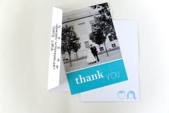
Every invitation tells a story, but these flowchart invitations from Three Fifteen Design take storytelling to a whole new level!  Ravyn from Three Fifteen Design worked with shades of blue (a nod to the groom’s service with the Air Force) and a variety of typefaces to create this fun and modern wedding invitation suite.

Modern-Flowchart-Weddding-Invitation-Suite

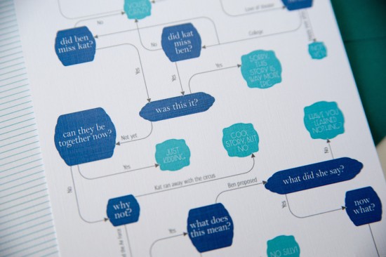
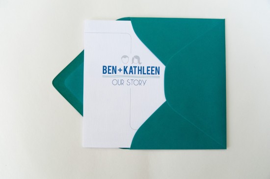
From Three Fifteen Design: Ben & Kat are an amazing couple!  They’ve known each other since kindergarten and have been dating since high school.  After college, Ben joined the Air Force, so they’ve been spending the last few years as a long distance couple.  Their story is unique and since they’ve known each other for so long, they loved the idea of incorporating a timeline into their wedding suite. The idea for the flowchart came about as we were bouncing the storytelling element around; it was a great way to make this invitation fun and interactive for their guests.

Modern-Flowchart-Weddding-Invitation-Chart

Modern-Flowchart-Weddding-Invitation-Chart-Detail

Modern-Flowchart-Weddding-Invitation-Save-the-Date

From the beginning (the save the date), I was really interested in using several different typefaces to further illustrate the ‘fun’ side of this couple.  Their color palette was simple: teal, white, and, of course, Air Force blue.  We used the save the date and the custom accommodations card as the color block cards to showcase the blue & teal.

Modern-Flowchart-Weddding-Invitation-Package

We decided to keep the invitation white: even though the flowchart was fun & funky, we liked the idea of the pretty traditional invitation at the bottom.  We went with a folded 5×7 invitation to once again add to that interactive element of the invitations.

Modern-Flowchart-Weddding-Invitation-Envelope

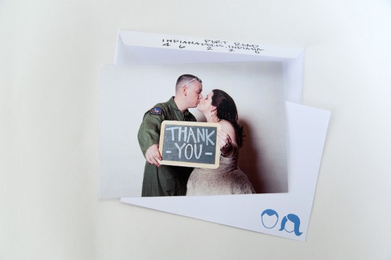
Each piece of the suite was tied together by the typefaces, colors, and my favorite part: the little icon of Ban & Kat.  We used it in different forms on all of the pieces.  They even used it on little jam jars at the wedding.  It was a way to make this suite all their own!

Modern-Flowchart-Weddding-Invitation-RSVP

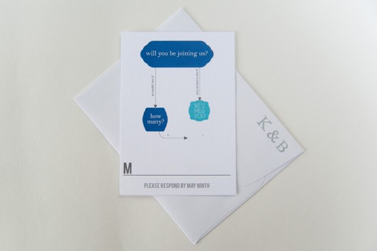
The response card was another play on the flowchart idea.  We used images from their wedding on two different thank you cards. Everything was printed on linen paper & finished with beautiful teal envelopes from Paper Source.

Modern-Flowchart-Weddding-Invitation-Thank-You

Modern-Flowchart-Weddding-Invitation-Thank-You-Photo

Thanks Ravyn!

Photo Credit: Jim and Ravyn Photographers

DIY Hand Watercolored Save the Dates + Thank You Cards

It’s the ladies of Anti­quaria, back with another fab­u­lous and cre­ative DIY project for you all!  This project is for wed­ding save the dates, but you can eas­ily apply this tuto­r­ial to any party invi­ta­tions or announcements!

These Save the Dates and matching Thank You Cards combine the use of our custom rubber stamps with hand painted watercolor accents.  This DIY project is inspired by Emma’s reception invitations that we did a while back, after her wedding.  The calligraphy ended up having variegated shades, giving the illusion that it was watercolored.  We ended up loving the way that the calligraphy looked and Emma embellished the invitations with a bit of color on one side, changing the look of the whole thing!

Using beautiful turquoise and blue shades of watercolor and our custom rubber stamps, this DIY save the date looks modern and organic at the same time.  The best part of this is just how easy it is to do!!  You don’t have to be an artist to master these painting techniques.  Also, we love how using different color combinations or shapes yield different results – making each card totally unique and its own little work of art.

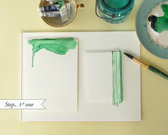
Step One: On pre-cut pieces of watercolor paper, get creative with painting.  We played with uneven painted stripes for the thank you cards and organic watery shapes for the save the dates.

Painting Tip: Go easy on the water to achieve a nice flat card.  Too much water will make your paper buckle or ripple when drying.

Watercolor Save the Dates: Step 1

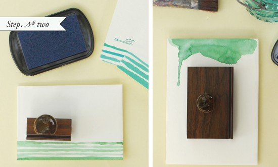
Step Two: Once your paint has dried, on a hard surface, ink your stamp and place it in the center of the card.  Apply even pressure and remove the stamp from the card.

For the Save the Date, we used the “Vintage Label” custom save the date stamp.  For the thank you notes, we used the “Simple but Sophisticated” monogram stamp – using a monogram stamp for your thank you notes can be a fun way to personalize them without breaking the bank after the wedding!

Watercolor Save the Dates: Step 2

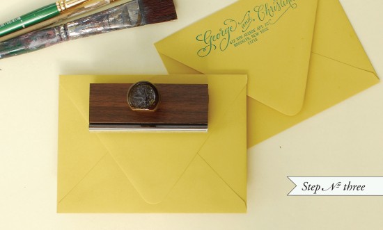
Step Three: We used the “Calligraphy Accent” return address stamp to finish everything off.

Now all that’s left is stuffing and addressing your envelopes!

Watercolor Save the Dates: Step 3

Materials List:

Custom Save the Date & Monogram rubber stamps.  The ones used in this tutorial are:

“Vintage Label” Save the Date Stamp,  “Simple but Sophisticated” Monogram Stamp,  “Calligraphy Accent” Return Address Stamp

Color Box Stamp Pad (we used a variety of teals and blues for this project)

Watercolors and brushes (you can purchase at any craft or art store)

A small dish and a jar of water (used to mix paint and wash brushes)

A6 Envelopes (shown above in Curry)

B4 Thank You Card Envelopes (shown above in Peacock)

Paper Options:

You can have large watercolor sheets or pads – the thicker the better, (purchased from your local art store) cut to size at your local print shop.

Just tell them the dimensions you need based on your envelope choice, the cut cards should be at least 1/4″ smaller than the envelope measurement.

If you are using the Paper Source A6 and B4 sizes that are shown above, ask for your pieces to be cut to

6 1/4″ x 4 1/2″ (A6) and 3 1/2″ x 5″ (B4).

If getting paper cut is too much of a hassle, you can use the luxe papers from Paper Source and buy them pre-cut.

Just be careful with how much water you use with your paints.  If you are using lightweight (90 lb) watercolor paper or the luxe papers from Paper Source, these papers will tend to buckle if you use too much water.

Photo Credits: Antiquaria