FONT: ASTERISM


FONT: ASTERISM
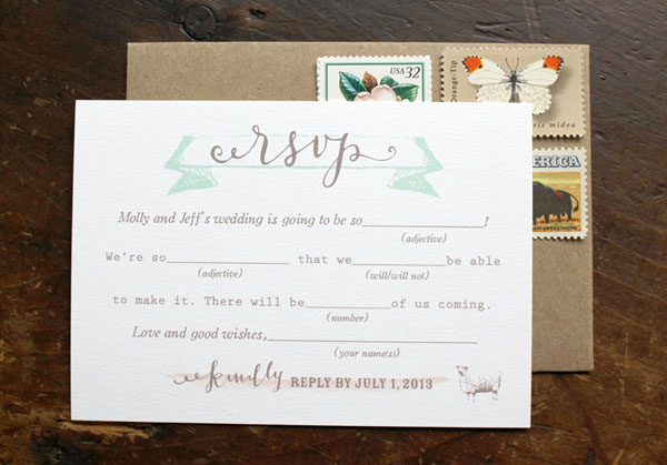
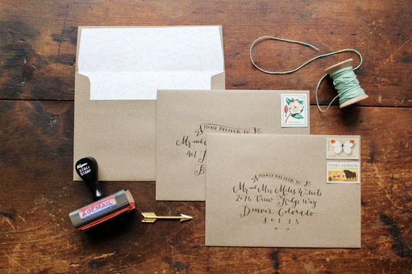
Fall may be just around the corner, but I couldn’t resist sharing these sweet summer wedding invitations from Sally of la Happy. Inspired by the farmette wedding venue, Sally created these invitations using her whimsical custom calligraphy and vintage farm motifs, all in shades of mint green and brown. Kraft envelopes and vintage postage are the perfect finishing touch!
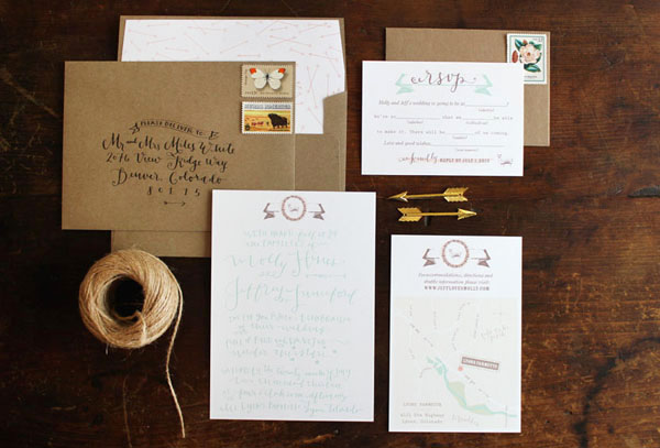
From Sally: This invitation suite was designed for an adorable vintage farm wedding at Lyons Farmette in Lyons Colorado. The design was inspired by the vintage sweetness of the farmette wedding venue, but we also wanted a feminine and somewhat fancy feel to invitations.
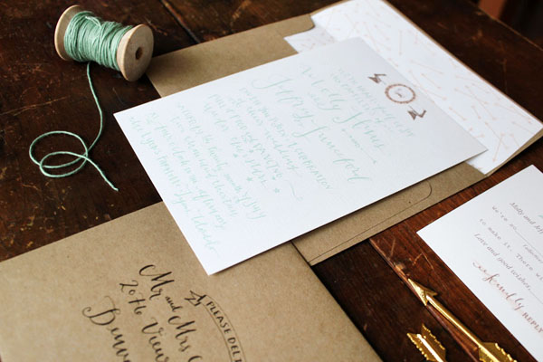
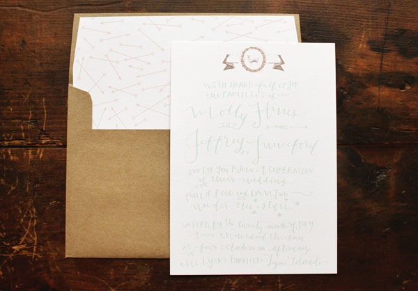
The invitation suite features my calligraphy, vintage engravings of a lamb, an adorable typewriter typeface for the mad lib rsvp card, and a sweet green twine to tie it all together. The set includes a calligraphy invitation, response card, custom illustrated map, and coordinating envelopes. The outer kraft paper envelope has a custom arrow envelope liner with calligraphy addressing in sepia ink and vintage stamps. The invitation set was digitally printed on white cotton paper.
Thanks Sally!
la Happy is a member of the Designer Rolodex – check out more of Sally’s beautiful work right here or visit the real inviÂtaÂtions gallery for more wedding invitation ideas!
Photo Credits:Â la Happy
Shades of blue, anchor motifs, ships and rope… you could say that we are a pretty obsessed with nautical design. In this invitation suite, we created a stamped, fold out invitation with nautical details in mind. After discovering how easy and useful a fold out card is in a previous tutorial, we wanted to explore the format more and translate it into a full invitation. This would be perfect for a nautical seaside affair! To make this week even more fun, we’ve included a free download of the watercolor ocean-scape to make this tutorial a breeze. Enjoy! – Bailey and Emma of Antiquaria
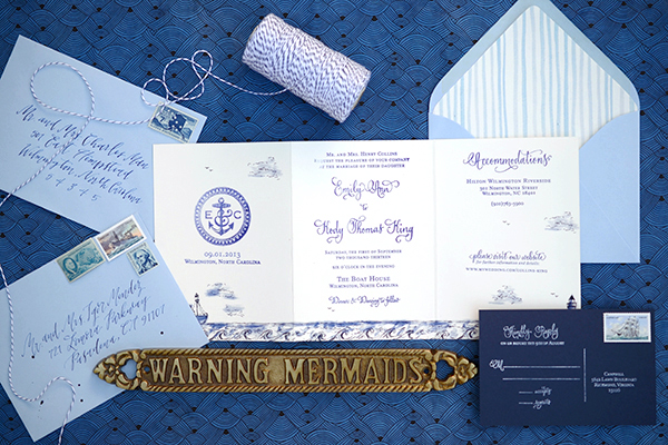
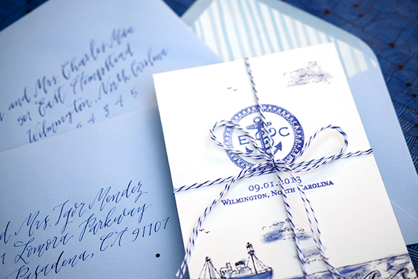
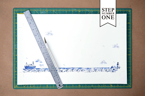
Step One: After downloading and printing the nautical tri-fold design (see bottom of post for download link). You will need 11″ x 17″ card stock to print the ocean scape. Next trim the card down at the crop marks to reach the final size (15″ x 7″). We used a self healing mat, metal ruler and craft knife for this step. If cutting many cards, we recommend taking them to a local printer to have them cut them all at once with an industrial cutter.
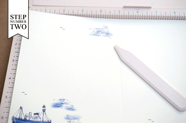
Step Two: Score the card twice: once at the 5″ mark and the other at the 10″ mark. Those will be your fold lines for the card but do not fold it yet!!
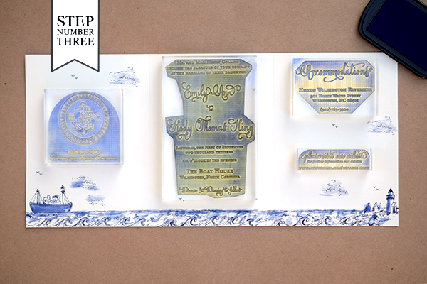
Step Three: Gather all of your stamps and lay them out to make certain that you have a stamping plan. The stamps we used for this design, from left to right are our Anchor Monogram Wedding Date Stamp, Vintage Calligraphy Invitation Stamp, Calligraphy Accent Accommodations Stamp and Calligraphy Accent Website Card Stamp. Once you have your plan, you will ink each stamp and align it into its appropriate space. For a step-by-step video tutorial about the stamp printing process go here.
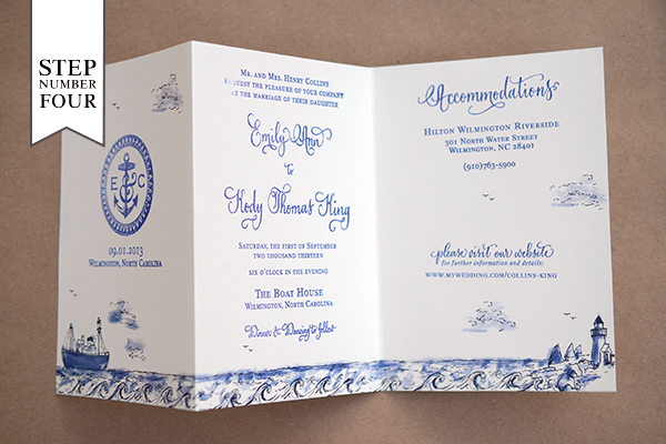
Step Four: Fold the card at the score marks. Use a bone folder to create crisp folds.
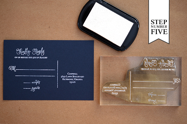
Step Five: Since the reply card will need to be sent back to you, we designed it as a separate piece. We used a white stamp pad with our Calligraphy Accent Reply Postcard Stamp on a navy A6 card (4″ x 6″).
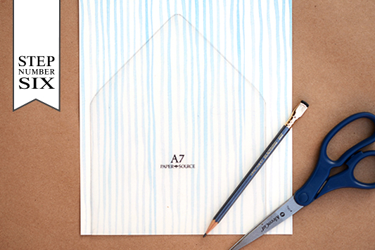
Step Six: Adding a printed envelope liner is a great way to add color and pattern to your save the date design. To make the liner, trace the template onto your printed paper (we used our  Watercolor Stripe in Ocean text weight) and cut it out with scissors. To install, simply use stick glue or double sided tape to adhere them into your envelope.
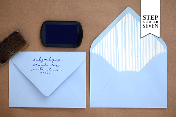
Step Seven: Next, you will stamp your return address on the back flap of your A7 envelope. We used our Scripted Return Address Stamp with navy blue ink for this design.
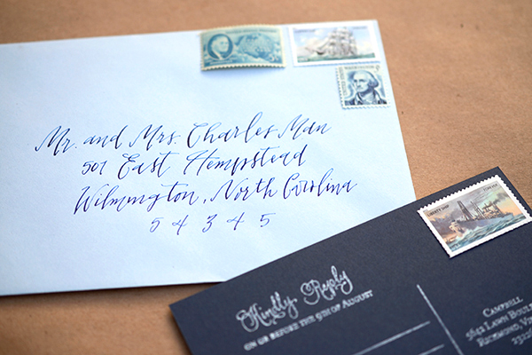
All that’s left is to add some gorgeous vintage postage (ours is from Verde Studio) and address them to your guests! We guarantee that they will be stoked to receive them in the mailbox and will be counting the days until your celebration!
Materials
Anchor Monogram Wedding Date Stamp
Vintage Calligraphy Invitation Stamp
Calligraphy Accent Accommodations Stamp
Calligraphy Accent Website Card Stamp
Calligraphy Accent Reply Postcard Stamp
Stamp Pad in Midnight and Frost White
Watercolor Stripe Patterned Paper in Ocean Text Weight
Nautical Tri-Fold printed sheet (printed on 11×17 card stock), download file HEREÂ Note: digital download is for personal use only**
Self Healing Mat, Metal Ruler and Craft Knife
AntiÂquaria is a memÂber of the Designer Rolodex – you can see more of their beauÂtiÂful work right here or visit the real wedding invitations gallery for more wedding invitation ideas!
Photo Credits: Antiquaria
Happy Monday everyone! Let’s start this week off with something ridiculously pretty, shall we? These wedding invitations come to us from Lauren Chism Fine Papers and were created for the wedding of Lauren’s sister. The invitations combine classic calligraphy and a beautiful lace-inspired blind letterpress impression with a modern pop of metallic gold foil. Hello gorgeous!
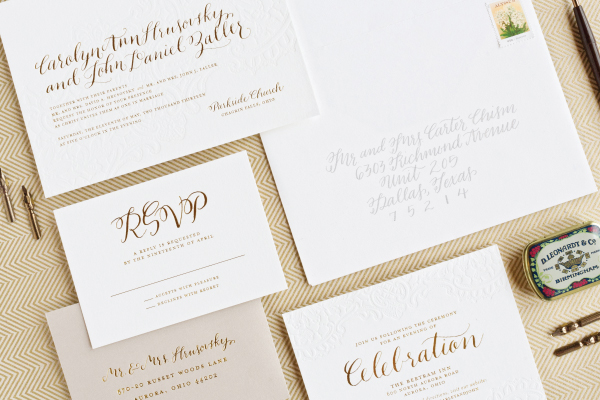
From Lauren: When my baby sister, Carley got engaged, I began scheming right way about her wedding invitations. She really gave me free reign to design whatever I wanted, but I wanted to stay true to her wedding style. Carley and John were having a traditional church ceremony, so I wanted her invitations to be current in design, but classic in papers and printing.
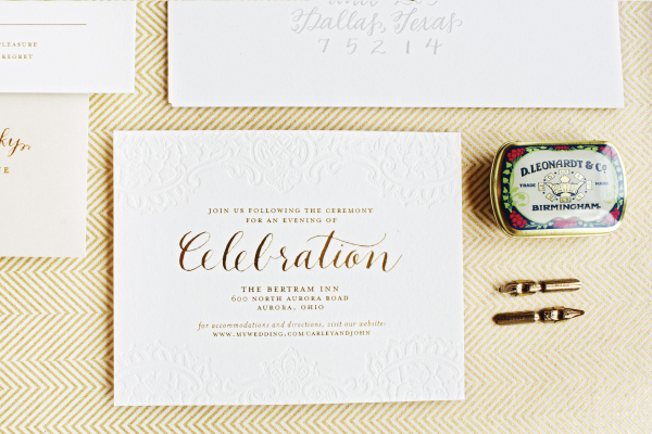
With her metallic color scheme, I knew foil would be the perfect wow factor. Carley chose a gorgeous lace wedding dress, so I brought that element into the paper with a blind letterpress impression. The gold and lace ended up being the perfect combination and really set the tone perfectly for her big day.

I also wanted to have a little bit of an unexpected element, so I chose Arturo Stone Grey for the RSVP envelopes and tied the gray in with the envelope calligraphy.
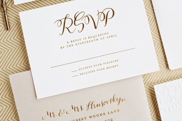
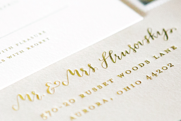
I love the gold and gray combination! And then, of course, no regular font would do, so I sought the amazing talents of Courtnie Johnson of Poppy Pedals to give them a true one-of-a-kind feel. I know Courtnie through Minted and have always admired her work. Her style is chic, with a little touch of whimsy in her letter swirls. As you can see, she is so so talented – we are certainly going to see more of her in the future!
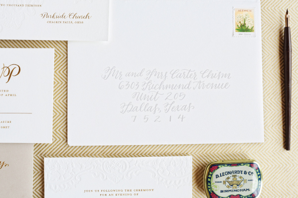
This suite ended up being one of my favorites to date. It was a labor of love, and a real collaboration. The soft feel of the gray and lace, stunning gold foil, and charming calligraphy – I don’t know if it gets any better than that!
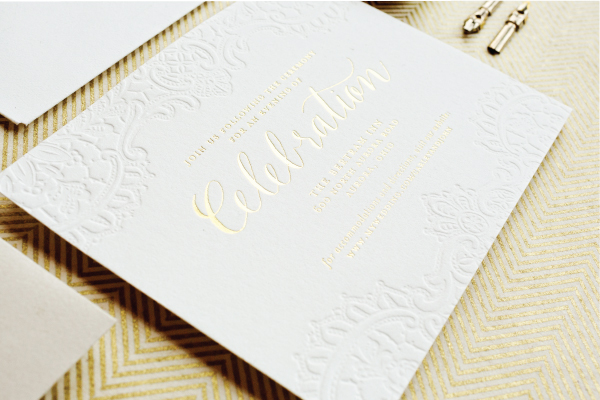
Thanks Lauren!
Design: Lauren Chism Fine Papers
Calligraphy : Courtnie Johnson of Poppy Pedals
Letterpress Printing :Â Czar Press
Lauren Chism Fine Papers is a member of the Designer Rolodex – you can check out more of Lauren’s work right here or visit the real inviÂtaÂtions gallery for more wedding invitation ideas!
Photo Credits:Â Perez Photography
September is my big milestone month. Yesterday I celebrated my 32nd birthday. Sophie’s first birthday (!!!)Â is a week from today. On Sunday, Oh So Beautiful Paper will celebrate its 5th anniversary. Oh, and while I’m at it, Andrew and I celebrated our 5th wedding anniversary in May and I celebrated 3 years of self-employment in early July. Anyway, I normally reserve my goal setting for the end of the year, but I’ve been in an introspective mood these last few weeks. So, a few thoughts before we get to our weekly round up…
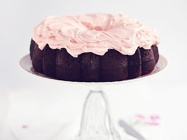
Photo Credit: Sweetapolita
The truth is: as many wonderful things happened in my 31st year, it has been quite a struggle. I’ve struggled to find my footing as a working mother, struggled to manage caring for my child with growing my business, and struggled to regain a sense of normalcy after our big move back in March. I made it through Sophie’s first year of life, but just barely. So today I’m looking forward to a new age and a new year, hopefully filled with a little less anxiety and a bit more peacefulness. I don’t like to focus on anything negative here because, well, this blog is my happy place, but like anyone else I need to grow and evolve. Reflect and make changes. I’d like to share some of those changes here, with all of you. I’ve always shared things that inspire me beyond invitations and stationery, but I’d also like to share a little bit more of me here. I mean, it’s been five years… it would probably be nice if you actually knew me, right? I don’t entirely know what that means just yet, but stay tuned!
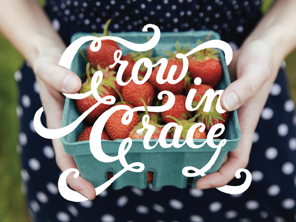
Image Credit: Todd Wendorff and Anna Zajac
As always, a few links for your weekend:
This week on Oh So Beautiful Paper:
A big welcome to the newest member of the Designer Rolodex: Julie Song Ink!
Check back soon for this week’s cocktail! I hope you all have a wonderful weekend, and I’ll see you back here next week! xoxo