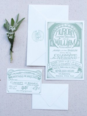
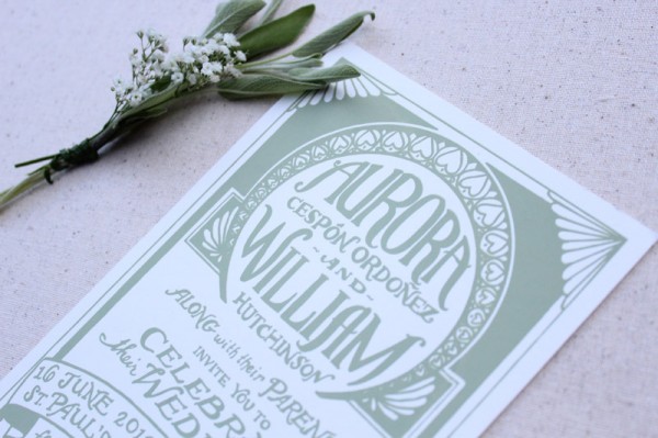
These screen printed invitations from Mikaela at The Hungry Fox are proof that you don’t have to sacrifice great design to achieve a budget-friendly wedding invitation. Just print the design in a single color! The text takes center stage in this design, with decorative elements inspired by the Art Deco vibe of the wedding and printed in a lovely shade of sage green. Beautiful!

From Mikaela: Aurora was planning a wedding with a loose 1920s theme. She wanted to create a very relaxed festival feel but with a glamorous old world Art Deco-inspired edge. Her palette was sage green, light pink and creamy white.


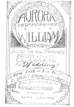
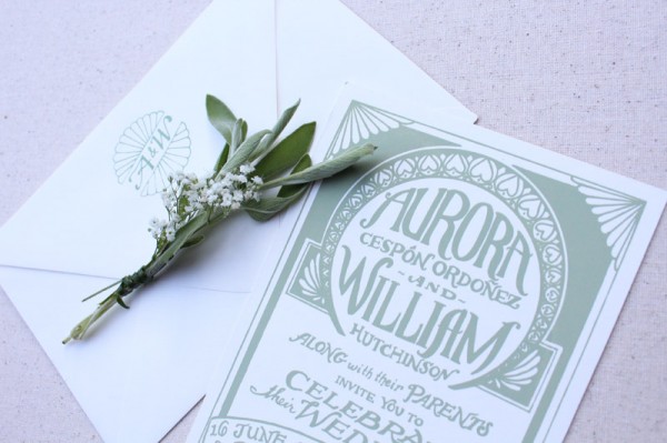
Here is an initial sketch I made and a picture of the screen I made to print them. I enjoyed designing an invitation that was mostly about the lettering, with decorative touches. Aurora also wanted a monogram, and I made several for her to choose from. I printed the one we chose on the back flap of each envelope. I thought the sage green on the creamy white envelopes was a nice touch. This suite shows that a person on a budget can still get lovely hand printed invitations by choosing a one color design.


It was slightly complicated communicating about things like paper thickness, because in the UK they talk about paper thickness in gsm instead of pounds as we do here in the U.S. We resorted to saying things like “Oh, about the thickness of 10 sheets of computer paper stacked together.” The invitations were printed on French Muscletone Paper in Whip Cream.

Thanks Mikaela!
Check out the Designer Rolodex for more talÂented wedÂding inviÂtaÂtion designÂers and the real inviÂtaÂtions gallery for more wedding invitation ideas!
Photo Credits: The Hungry Fox

Beautiful lettering, and I love the insight into the process too!
Wow, this hand lettering is simple gorgeous! I’d love to see more posts that show the initial sketches, as it’s wonderful to see the evolution from drawing to final suite. Lovely, lovely work!