Happy Friday everyone! I’m feeling soooooooo much better after my little surgery on Monday and looking forward to really getting back in the swing of things after a couple of rough weeks. Right now, I’m sending lots of positive vibes to our friends in the Southeast with the arrival of Hurricane Matthew. Stay safe everyone! But in the meantime…
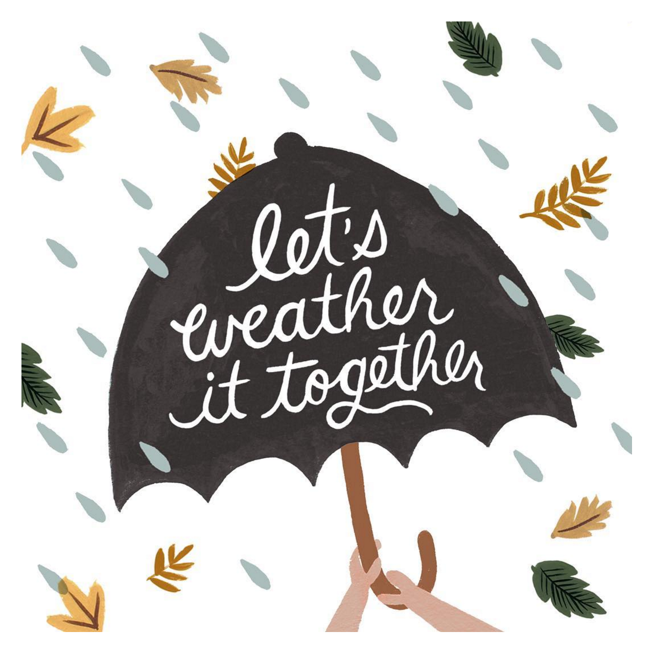
Image by Rifle Paper Co. via Instagram, and you can buy a version of this illustration as a card here
…a few links for your weekend:
- This is a heavy one, but I think it’s important to pay attention. More than 100 children have died in Syrian and Russian attacks in eastern Aleppo in the last two weeks. History will judge the international community for their actions (or lack of action) over the coming months.
- VOTE! Voter registration ends on Tuesday, October 11 – sign up today!
- The gorgeous branding that Christine Wisnieski created for Molly Taylor Co.
- Also, I’m pretty sure my next business cards will need to involve holographic foil
- People now spend 50% of their time online in apps. Is this true for you?
- Oh, HELLO there, gorgeous chandelier.
- When designers move in, and how to style a reading nook.
- Wishing these iridescent high tops came in my size
- How cool are these marbled indigo pumpkins?
- I pretty much live in basic tee shirts – I love the pink dots on this one!
This week on Oh So Beautiful Paper:
- New illustrated desktop and phone wallpapers for October!
- Classic blush pink and rose gold foil baby announcements
- Unicorn and gemstone birthday party invitations
- A round up of my favorite Bourbon cocktail recipes from the archives
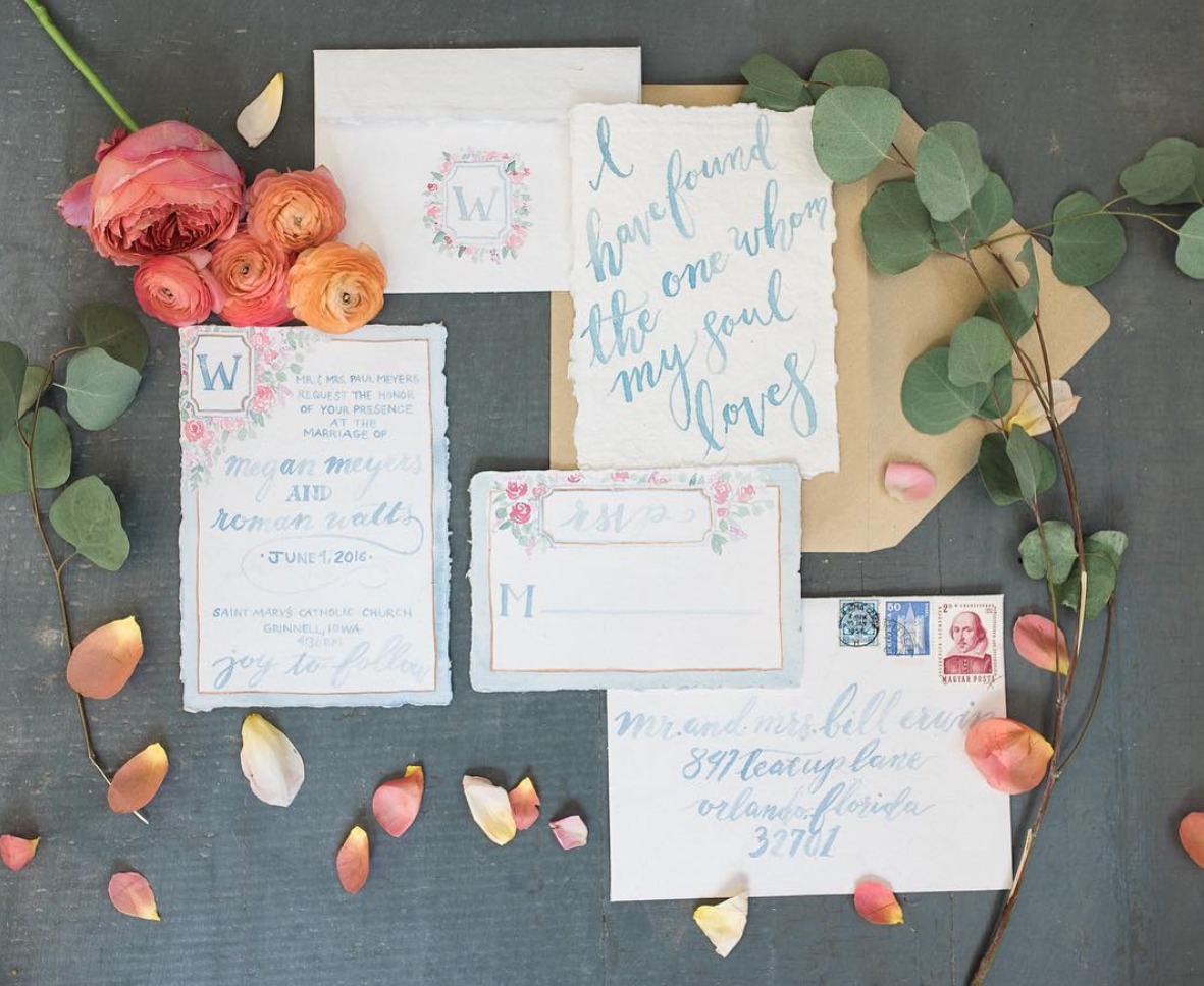
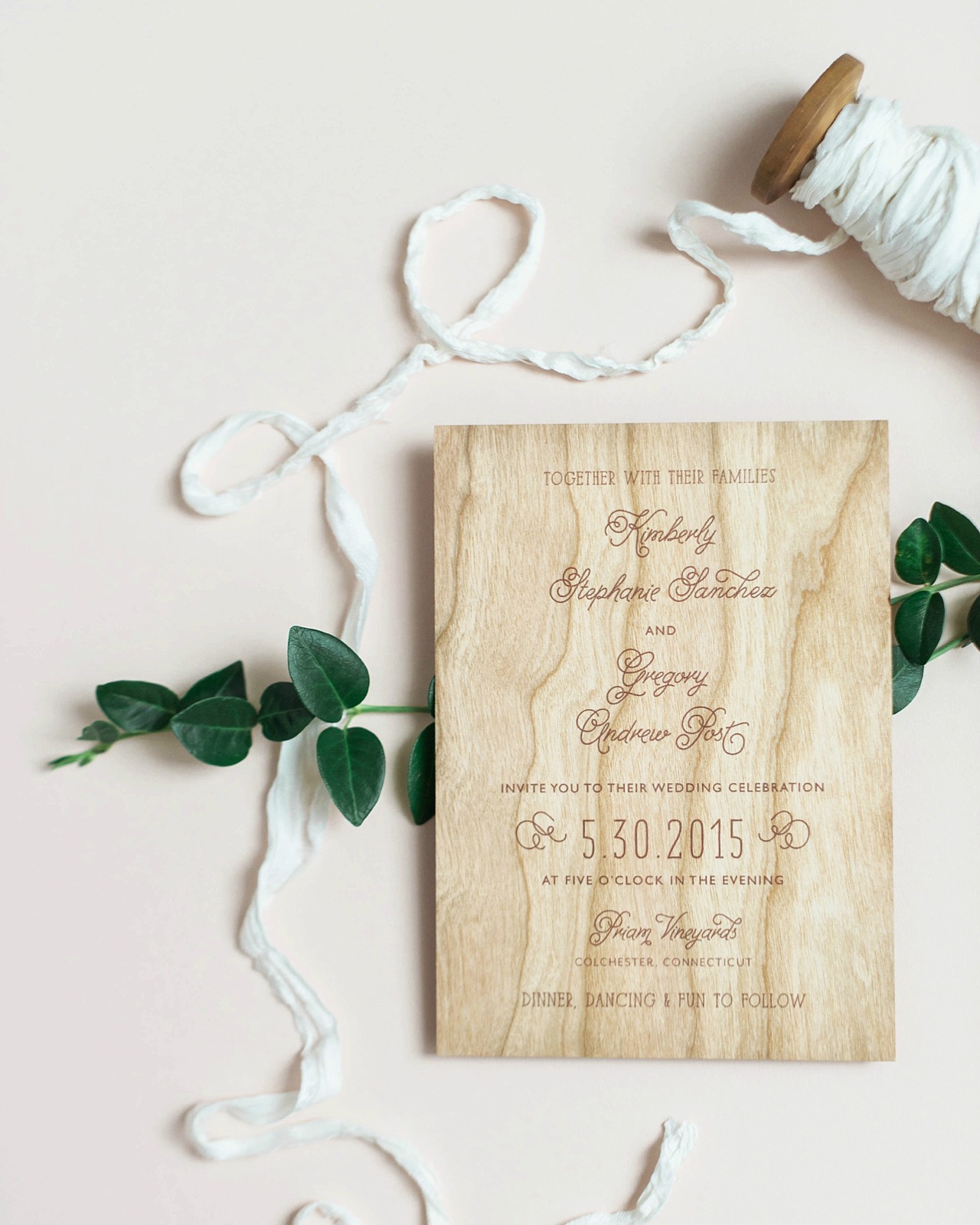
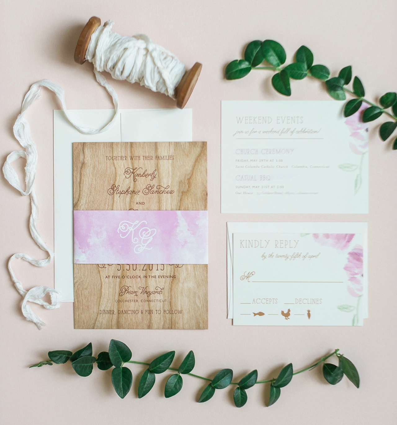
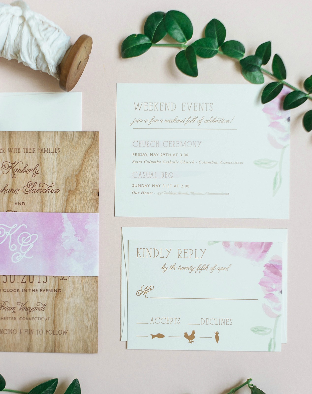
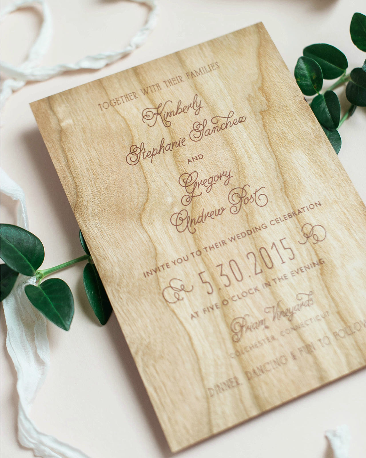
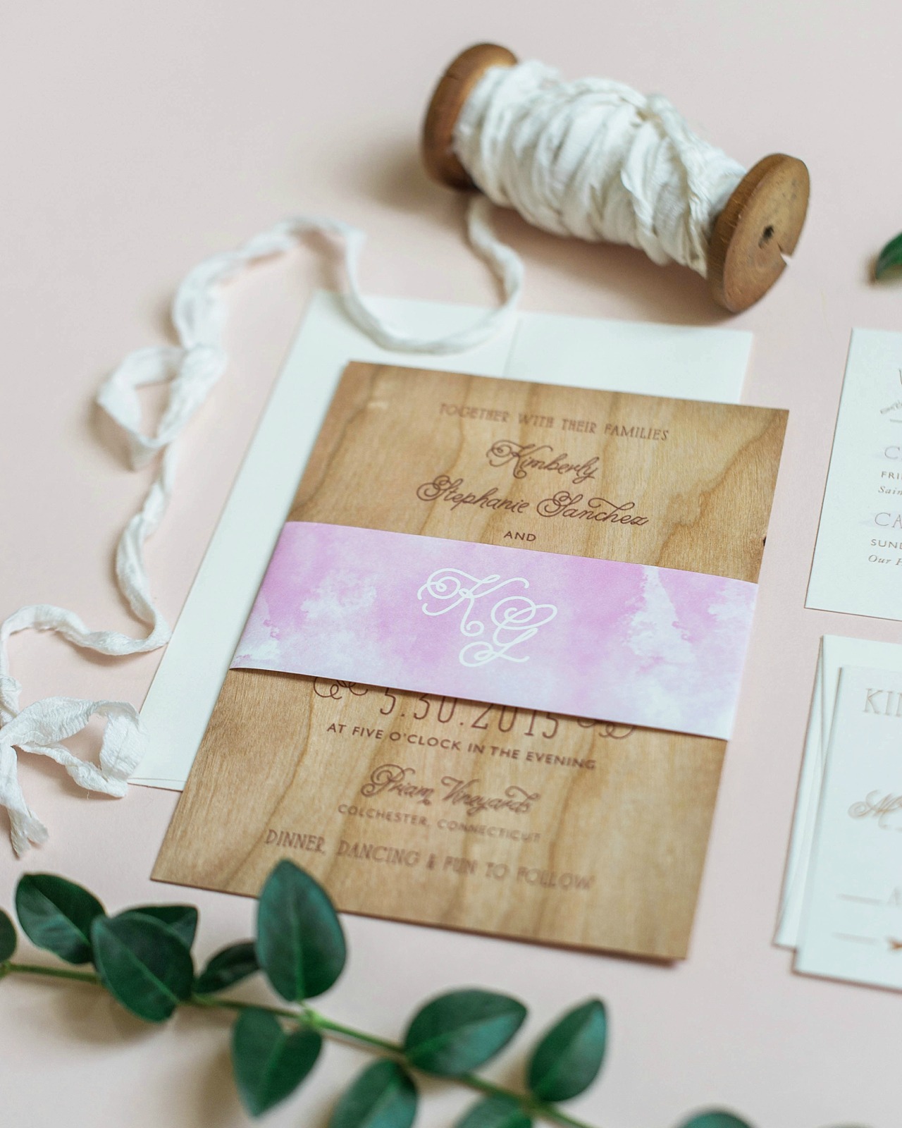
- Sweet and simple wood veneer and watercolor wedding invitations
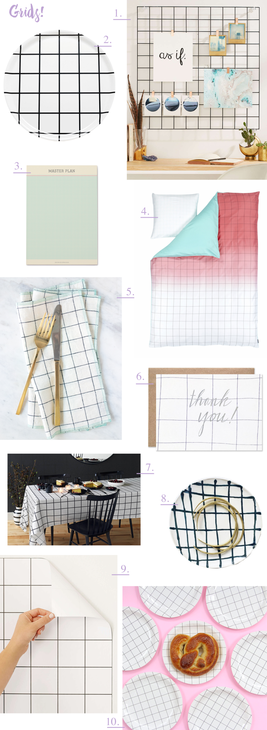
- Feeling inspired by grid patterns!
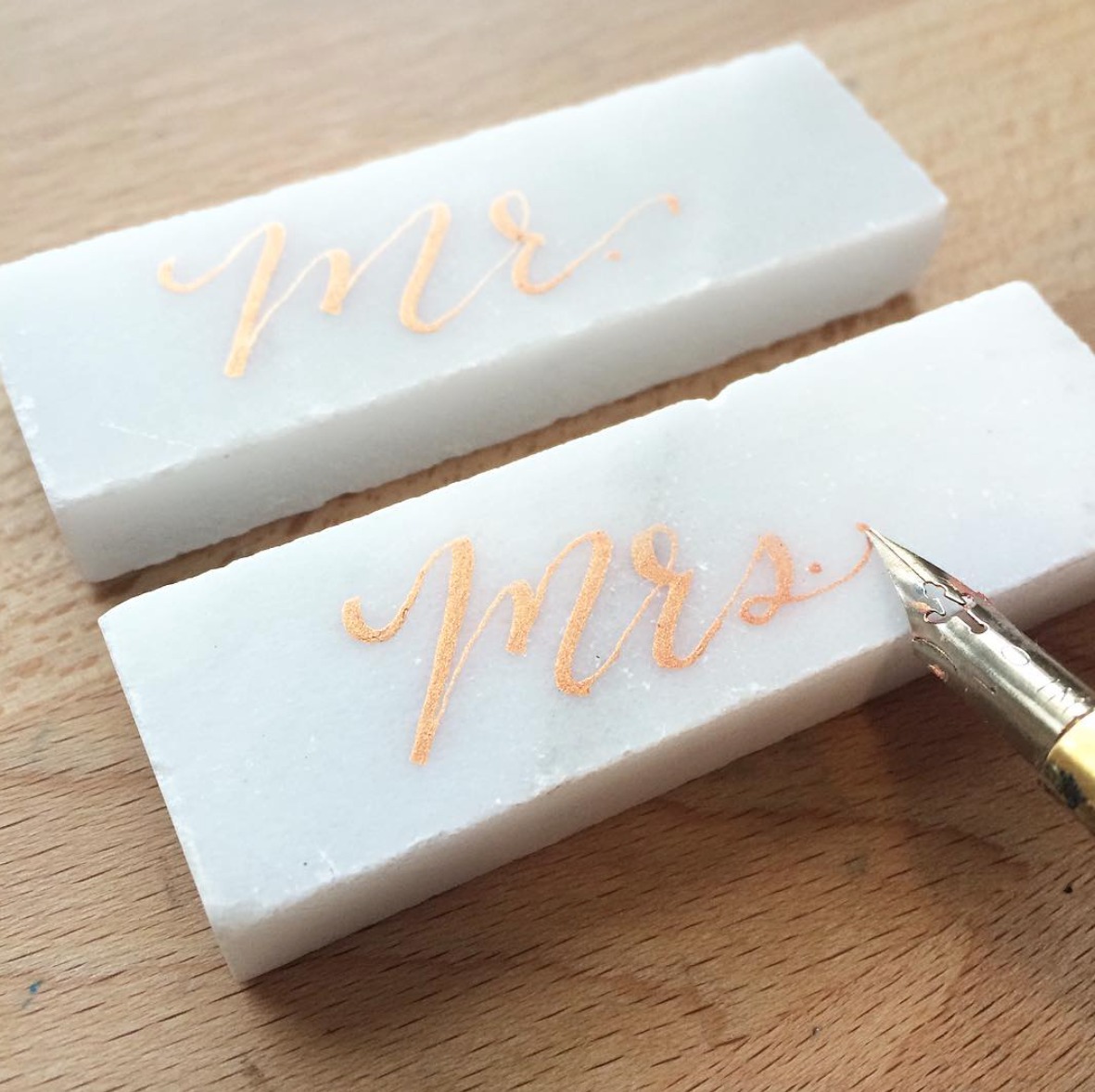
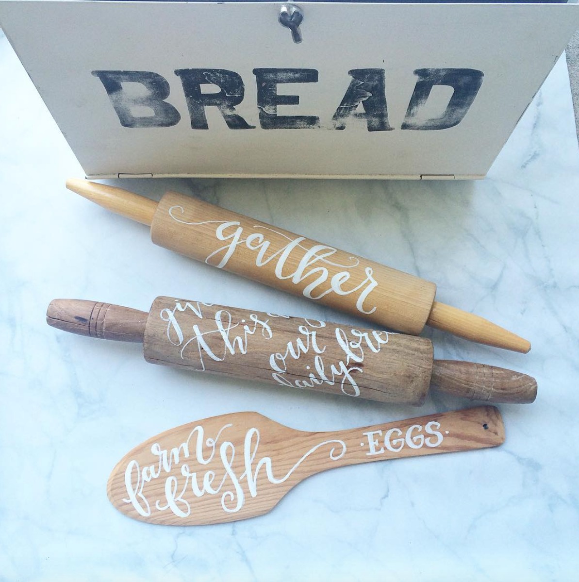
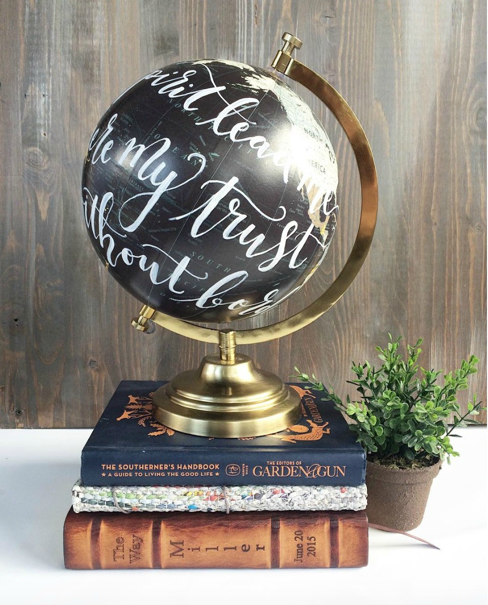
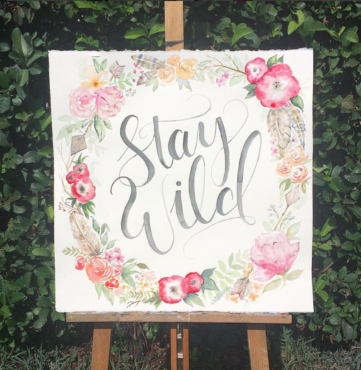
- Calligraphy Inspiration: Cami Monet
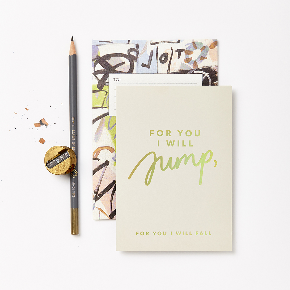
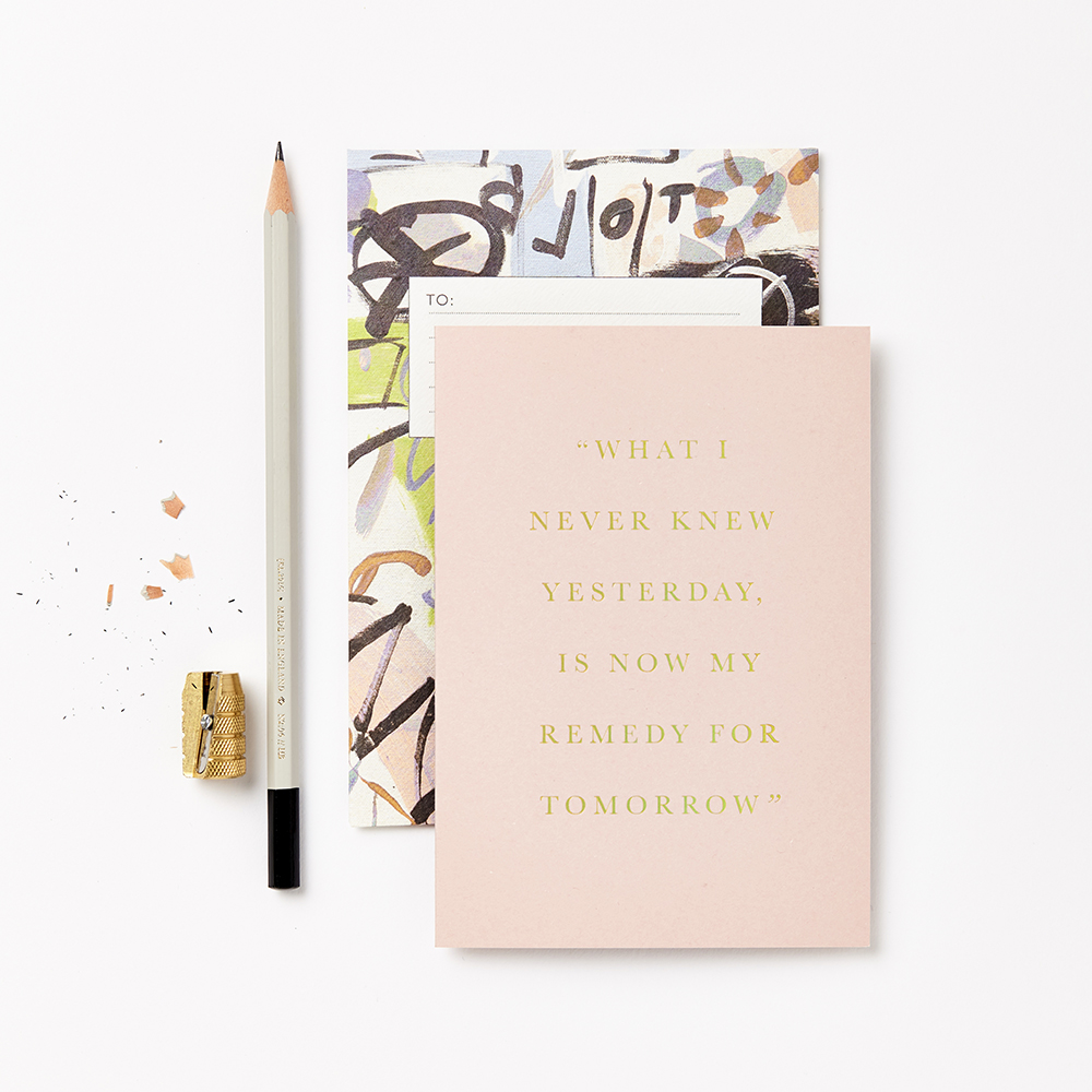
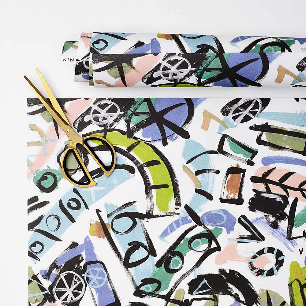
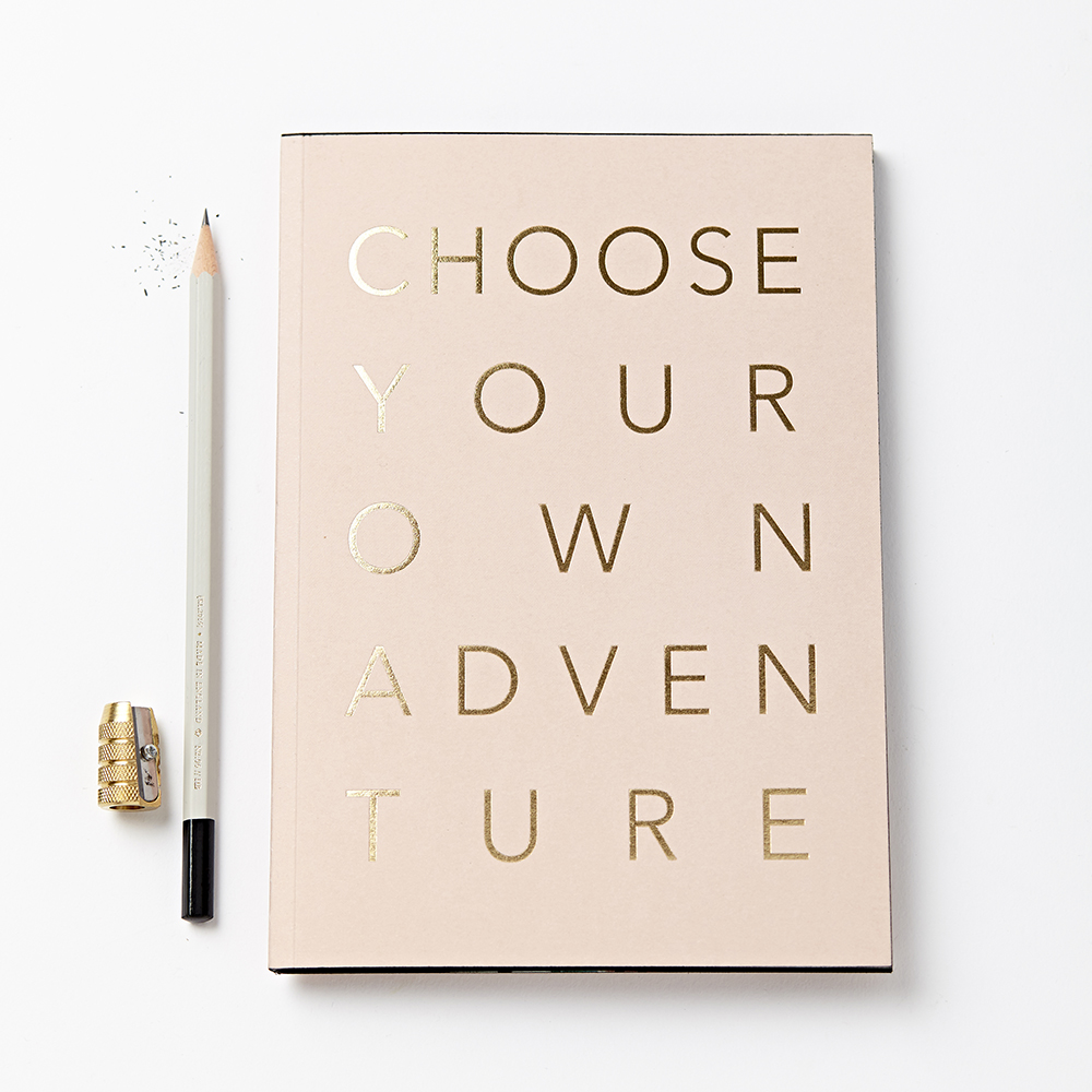
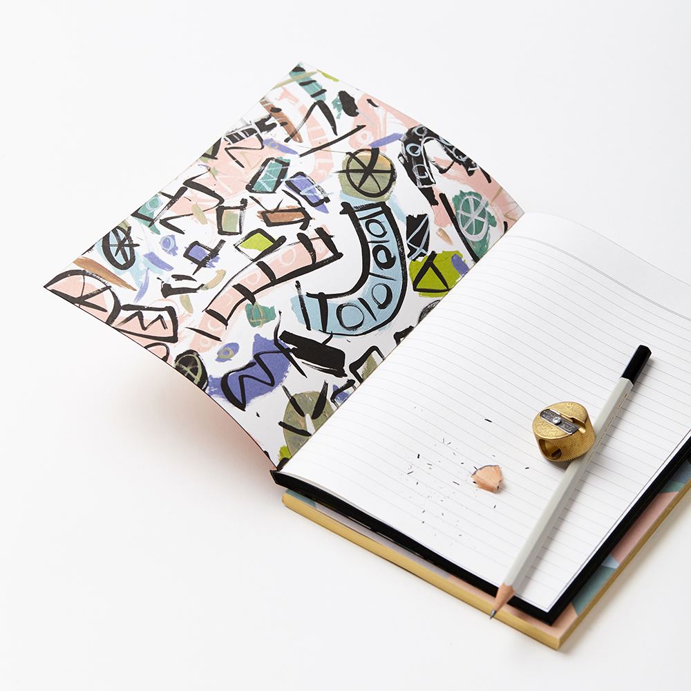
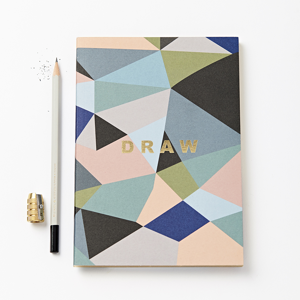
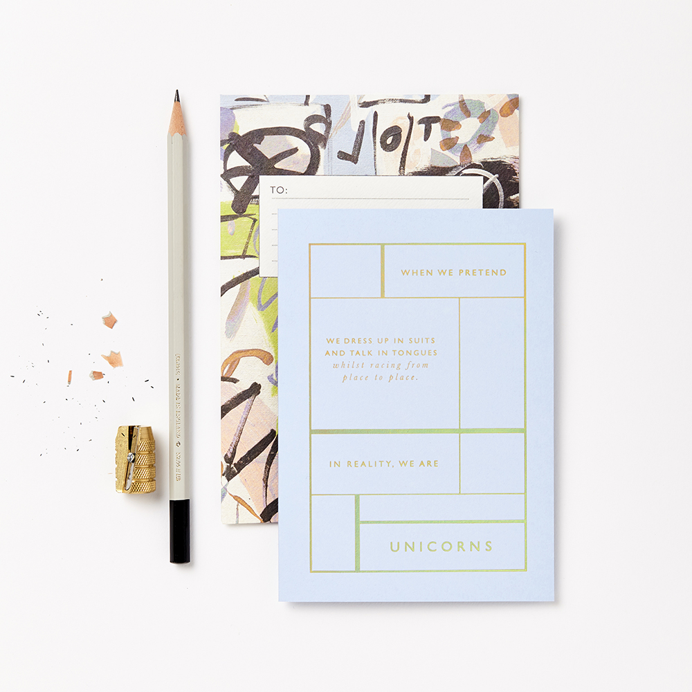
- Loving the new KIN collection from Katie Leamon
That’s it for us this week! I hope you all have a fun and relaxing long weekend, and I’ll see you back here next week! xoxo