New Giveaway! Paper Party 2014 Tote Bags!

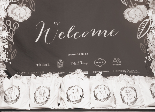
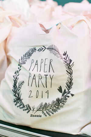
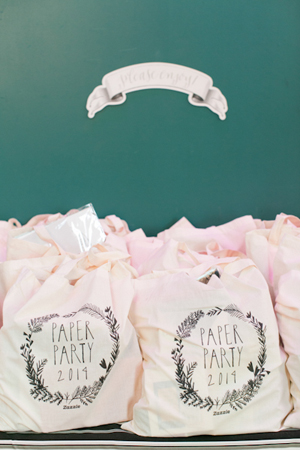
The gift tote bags are always a popular item at my annual Paper Party. I was absolutely thrilled to partner with Zazzle this year – they printed our custom design from Mr. Boddington’s Studio on their eco-friendly 100% cotton tote bags. Oh, and the gift bags were full of lots of great things, too!

OSBP-Paper-Party-2014-Charlie-Juliet-Photography-1

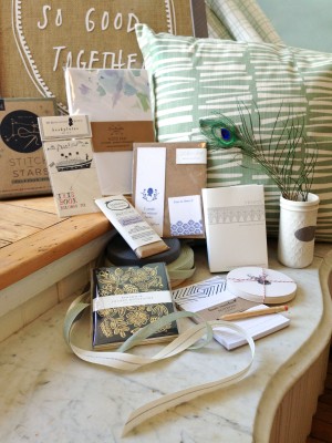
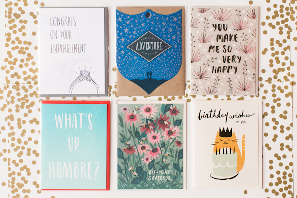
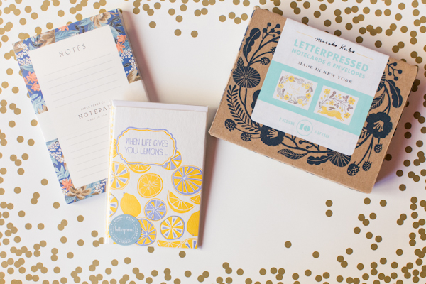
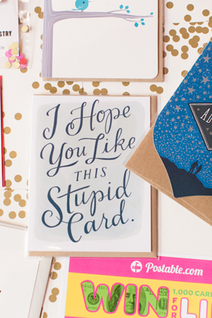
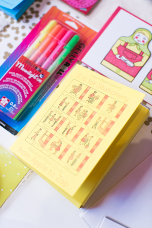
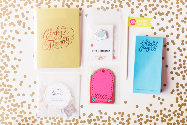
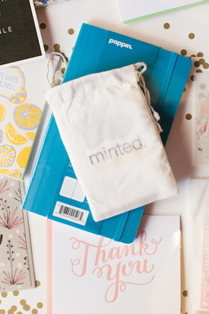
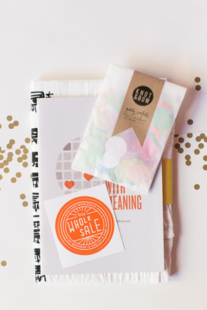
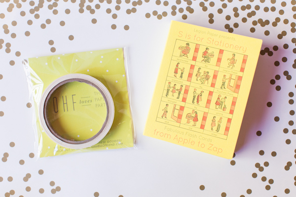
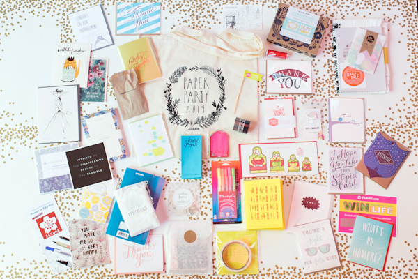
This year’s gift bags were stuffed with the most amazing items from some of my favorite stationers: Ladyfingers Letterpress, Moglea, Rifle Paper Co., Wild Ink Press, Emily McDowell, Parrott Design Studio, Hammerpress, Iron Curtain Press, Chronicle Books, Sycamore Street Press, Red Cap Cards, Idlewild Co., Maginating, Oh, Hello Friend, Tattly, Enormous Champion, Antiquaria Design Studio, Albertine Press, Belle & Union, Fig. 2 Design Studio, Mailchimp, Tradeshow BootcampSakura of America, Artifact Uprising, Mohawk, Legion Paper, Minted, Ladies of Letterpress, Postable, Poppin, Liddabits, Alexis Mattox Design, City of Industry, Three Potato Four, Angela Liguori, and a selection of goodies from Etsy Wholesale sellers!

OSBP-Paper-Party-2014-Charlie-Juliet-Photography-214

OSBP-Paper-Party-2014-Charlie-Juliet-Photography-37OSBP-Paper-Party-2014-Charlie-Juliet-Photography-36

The 125 party gift bags may have disappeared in under 15 minutes, but you’re in luck – because today I’m giving away a tote bag full of stationery awesomeness to to five lucky readers!

OSBP-Paper-Party-2014-Charlie-Juliet-Photography-9

To enter, just leave a comment below – any comment! You’ll have until 11:59 p.m. on Monday, June 2, 2014 to enter the giveaway. Five winners will be selected randomly and will each receive one tote bag. Bonne chance!

OSBP-Paper-Party-2014-Charlie-Juliet-Photography-8

OSBP-Paper-Party-2014-Charlie-Juliet-Photography-6OSBP-Paper-Party-2014-Charlie-Juliet-Photography-5

OSBP-Paper-Party-2014-Charlie-Juliet-Photography-7

OSBP-Paper-Party-2014-Charlie-Juliet-Photography-2OSBP-Paper-Party-2014-Charlie-Juliet-Photography-10

OSBP-Paper-Party-2014-Charlie-Juliet-Photography-11

Photo Credits: Charlie Juliet Photography

*Sorry, limited to U.S. readers only. Limit one entry per person. Please do not leave your email or web address in the body of the comment, only in the allotted boxes. $150 approximate total retail value. Winners will be contacted via email after comments close.

DC Guide: Where to Eat, Part 2

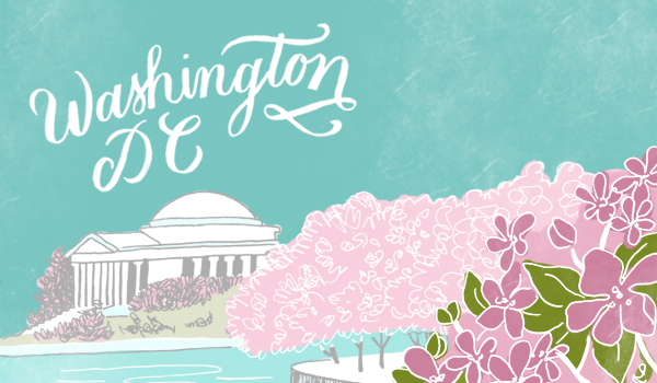
A couple of years ago, we shared our very first mini guide to DC – including some of our favorite restaurants in the District. And with the cherry blossom season only a few weeks away, I thought it might be time to share a little update for any of you planning Spring trips to DC. Now, our dining habits have changed quite a bit in the last two years thanks to Sophie, so most of these are either in our Capitol Hill neighborhood or the nearby H Street corridor – but luckily they’re all really good! And while we might not be the best at keeping up with the trendiest new restaurants, we can offer a few tried-and-true recommendations.

Molly-Jacques-DC-Guide-Illustration-Oh-So-Beautiful-Paper

Illustration by Molly Jacques for Oh So Beautiful Paper

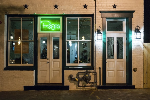
Rose’s Luxury: I don’t think I could possibly say enough good things about Rose’s Luxury. This amazing restaurant opened up in our neighborhood just a few months ago and has earned rave reviews from every single food critic in town (examples here and here). We visited Rose’s Luxury shortly after their October opening with Sophie in tow, and it’s easily the best meal we’ve had in recent memory. They also have an amazing drink menu with several seriously delicious cocktails. And if all of that wasn’t enough, the staff was amazing with Sophie – even taking her on a little tour of the restaurant so we could have a few more minutes to enjoy our meal! Go, and you won’t regret it.

Roses-Luxury-EaterDC

Rose’s Luxury via EaterDC

The Red Hen: It’s surprisingly difficult to find good pasta in DC (or good Italian food, for that matter), so we were pleasantly surprised when we visited The Red Hen a few weeks ago. We focused in on the pasta, but based just on our one experience I’d wager that everything on the menu at this Italian-influenced American restaurant is incredible. You’ll also definitely want to save room for dessert: Sophie was a big fan of the maple custard with hazelnut crumble. We saw several other families dining there during our visit, and they even have counter-height high chairs for tiny patrons so you don’t have to wait for a table!

Union Market: Union Market isn’t a single restaurant, but rather a large market comprised of shops, artisan vendors, and multiple casual dining options. It’s one of our favorite spots for a casual lunch or dinner. We’re partial to the sandwiches from Red Apron Butcher, the Korean tacos from TaKorean, and the hummus from DC Mediterranean Corner, but you’re bound to find something you love at Union Market.

Graffiato: Graffiato is probably the only non-kid-friendly restaurant on this list, but it’s worth a special night out. We indulged in our last pre-Sophie night out meal at Graffiato and still talk about it today. We went with the tasting menu, but you can’t go wrong here. Just be sure to make a reservation well in advance: it’s one of DC’s most popular spots!

District Taco: For a casual family night out, we’re big fans of food truck turned brick and mortar restaurant District Taco. Everything is simple, made daily from fresh ingredients, and really delicious. From fish tacos to quesadillas to soft tacos, you can’t go wrong here.

Beuchert’s Saloon: We were so happy when this restaurant opened in our neighborhood last year! A re-imagining of an 1800s saloon and Prohibition-era speakeasy, Beuchert’s devotes equal focus to both its food and drink menus. On the food side, Beuchert’s sources most of its ingredients from local farms and co-ops with delicious results, while the house cocktail menu includes several throwbacks to the restaurant’s long saloon history. So good!

Batter Bowl Bakery: Located along the H Street corridor, Batter Bowl Bakery is one of our favorite neighborhood lunch and brunch spots. The menu includes a variety of breakfast platters and open faced sandwiches, along with a range of freshly baked pastries. If you’re a coffee drinker, you’ll love Batter Bowl Bakery: the lattes are some of the best we’ve found in DC yet.

Founding Farmers: Speaking of brunch, we would be remiss if we didn’t recommend brunch at Founding Farmers. You’ll need to make reservations well in advance, but the menu of farmhouse hashes, cast iron skillets, and signature breakfast dishes is well worth the advance planning. We visited with my in-laws just before Sophie’s first birthday, and everyone at the table (Sophie included!) was a big big fan.

p.s. DC is lucky to have two amazing food critics, so if you’re planning a visit to DC you’ll definitely also want to check out both the Washingtonian and Washington Post restaurant sections and even some of the DC foodie blogs like Metrocurean and Eater DC for the latest openings and reviews.

OSBP at Home: Our Old Apartment (Tour!)

I’m still easing my way back into a normal schedule after the holidays, and after two mid-week holidays I don’t have a regular Friday round up post to share today. So instead I’m doing something a bit different and sharing a little glimpse into my home(s), with a quick tour of our old apartment and a little introduction to our “new” house. First up, our old apartment! Considering it has been more than nine months since we moved out, this is way way way overdue – but better late than never, right? Also, I ran around taking photos of the apartment as we packed it up the last couple of weeks before the move, so these aren’t styled photos. You’ll see cords, remotes, and some ugly appliances – but hey, that’s life, right?

OSBP-Apartment-Tour-112

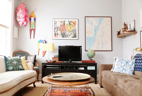
Starting in the front of the house with our living room. We spent most of our time in this room, and it’s probably the room that I miss the most now. It had three large southern-facing windows that let in the most beautiful morning and afternoon light, and it was just the right size for having friends and family over. Sigh. The furniture is a mix of flea market finds (like the brass tray and tribal rug), heirlooms that I inherited from my grandmother (the couch and chair on the left, both of which I’d eventually like to restore and recover), and modern items. If you have any specific questions about where we found something, please leave them in the comments and I’ll do my best to answer!

OSBP-Apartment-Tour-114OSBP-Apartment-Tour-116

OSBP-Apartment-Tour-113

OSBP-Apartment-Tour-118

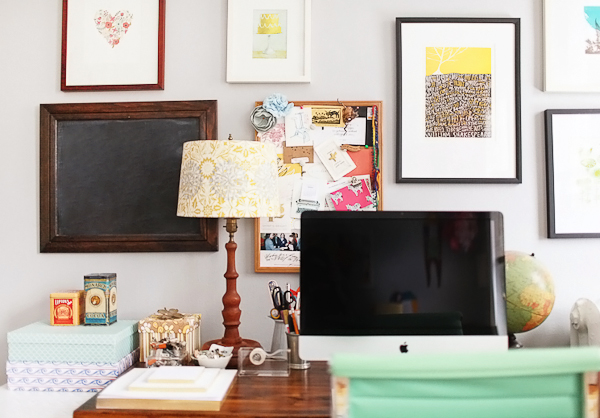
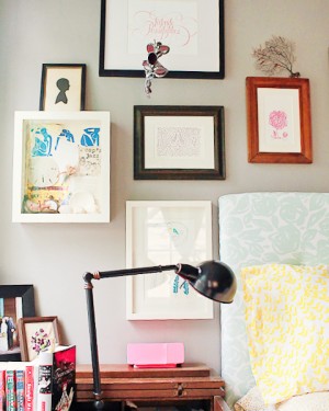
After Sophie arrived, we converted the second small bedroom into a nursery and I moved my office into a corner of the living room. It wasn’t a huge amount of space, but it worked at the time!

OSBP-Apartment-Tour-127OSBP-Apartment-Tour-125

OSBP-Apartment-Tour-124OSBP-Apartment-Tour-122

OSBP-Apartment-Tour-27

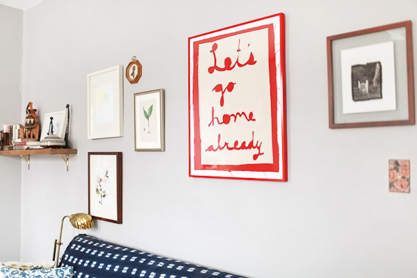
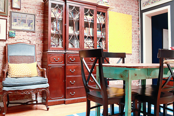
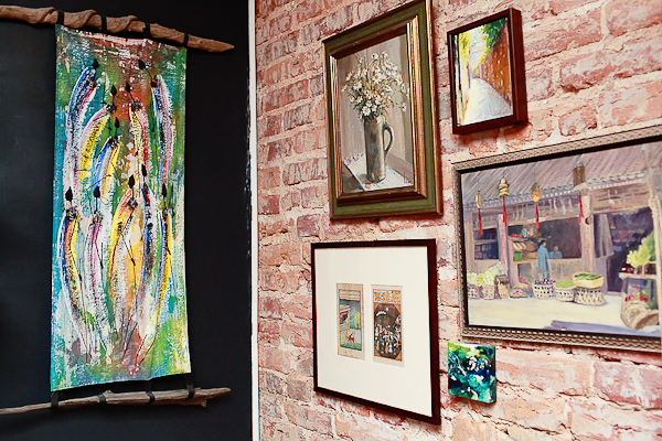
Moving towards the back of the house, we have our dining room. This room had a giant skylight, which avoided the typical dark middle room of DC rowhouses and made us feel so incredibly lucky to have a second floor apartment. The landlords exposed the brick wall years ago, and I painted the rest of the walls in black chalkboard paint to showcase our art collection. The large china cabinet and ornate chair are more heirlooms inherited from my grandmother, which she inherited from her mother. I love carrying pieces of them with me into my own home.

OSBP-Apartment-Tour-1

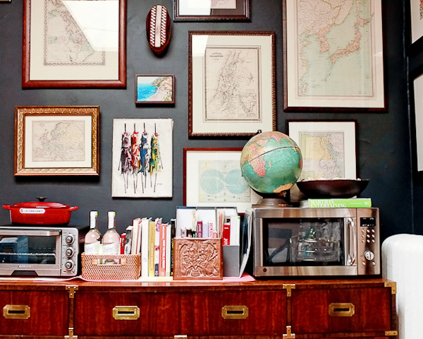
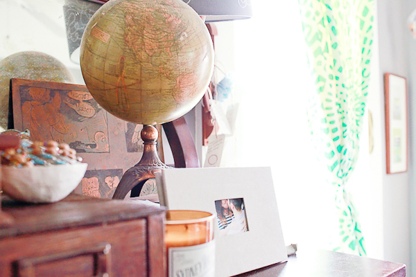
I didn’t manage to get any good photos of our kitchen, which lies directly to the right of this photo. The kitchen was pretty basic and small, so we moved the microwave and toaster oven out into the dining room to avoid taking up precious countertop space. The campaign dresser is one of my all time favorite flea market finds! Oh, and you might notice that we have a bit of a thing for antique maps and globes. It comes with the territory when two people with international backgrounds decide to get married.

OSBP-Apartment-Tour-23

OSBP-Apartment-Tour-9OSBP-Apartment-Tour-13

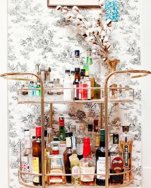
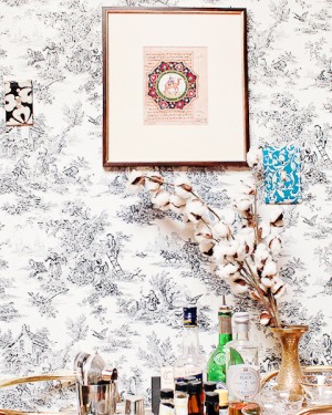
Our bar cart! I found this vintage brass beauty on craigslist: it was missing the original glass so we had pieces of acrylic cut down to fit the shelves instead. I used a combination of double-sided tape and painters tape to hang toile wallpaper (in a renter-friendly removable way) on this short little wall that connected our dining room and kitchen. This was another favorite nook of our old apartment.

OSBP-Apartment-Tour-108

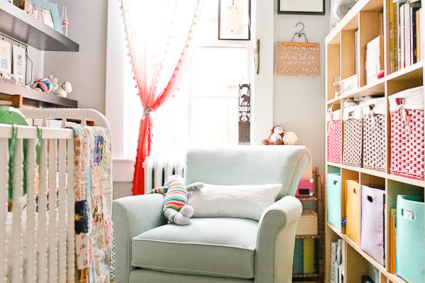
Next up, Sophie’s nursery! This room was so very tiny – we could barely fit the glider in next to the crib – so in retrospect I’m glad we didn’t have to use this room once Sophie was mobile. Hidden just to the right of the Expedit is a small vintage dresser that we used as our changing table.

OSBP-Apartment-Tour-87OSBP-Apartment-Tour-111

OSBP-Apartment-Tour-78OSBP-Apartment-Tour-75

OSBP-Apartment-Tour-79OSBP-Apartment-Tour-69

OSBP-Apartment-Tour-64OSBP-Apartment-Tour-62

OSBP-Apartment-Tour-73

OSBP-Apartment-Tour-31

And finally, our bedroom! Also a small room and difficult to photograph without a wide angle lens (oops), but the room consisted of our bed, two nightstands, a dresser opposite the bed, and a closet with hanging storage and another dresser. This room had three north facing windows and also let in the most beautiful morning light. I do miss all those windows!

OSBP-Apartment-Tour-34OSBP-Apartment-Tour-55

OSBP-Apartment-Tour-46

And that’s it! Photos of our new house coming up next!

Photo Credits: Nole Garey for Oh So Beautiful Paper

Hello Brick & Mortar: How to Get a Shop Owner’s Attention

Ed Note: You guys, I could not be more excited to introduce this new column! Each month, Emily Blistein – owner of the amazing gift, baby, vintage, home decor, and stationery shop Clementine in Middlebury, Vermont – will be stopping by to share wisdom from the retail perspective. We have lots planned for this column, from gift pairings to retail trends and everything in between. But the best part? Emily is willing to answer questions! So read through her first post below, then leave your questions for Emily in the comment section! –Nole

As a grown-up, mail is not always fun. You, Dear Stationery Artists and Lovers of Letterpress, make mail-time like Valentine’s Day in elementary school. I adore you for it. When I opened Clementine three years ago I had two stationery lines, now I have nearly two dozen. Customers fawn over the card selection so much that stationery has become the heart of my shop. I love watching it grow and dream of days spent drinking coffee and making orders. In reality, my to-do list is often longer by the end of the day.  Things get lost in the shuffle. Here is my best advice for growing your wholesale line by grabbing the eye of busy shop-owners. – Emily of Clementine
Brick and Mortar: Retail Advice for Stationers via Oh So Beautiful Paper

1. Do you like-like me?

You may have a well-organized list of potential shops to contact or you just blog-hopped your way to a new shop.  This whole thing is a bit like dating. It can be really exciting and slightly awkward. At the core we’re both asking: are we good for each other (even if it’s just seasonal)?

This is a good stage to do a bit of friendly social media stalking. You might find a window to connect that traditional introductions don’t allow. Just refrain from making your first hello a post on Instagram that says: “love your shop, would love to show you my line!”

If you like a shop, you can learn a lot about what we like in a quick website, blog and social media search. If you like what you see, then by all means, say hello!
Brick and Mortar: Retail Advice for Stationers via Oh So Beautiful Paper

2. Would you maybe want to get some coffee sometime?

You want to introduce your line but do you email, call, send a packet, or stop in?  No matter the method, make your first hello quick and memorable.

If you’re stuck, follow this: Use my first name, say how you found me and what you like about my shop. Tell me a few sentences about you. Make a date to follow up. Say a gracious good-bye. Decorate a nice envelope. Remember to actually follow up when you say you will. (I prefer email).

  • Introduce yourself by post mail if: You really like my shop, think your cards would be a perfect fit and you can afford it.
  • Introduce yourself by email if: You’re more comfortable over email and it’s easier to get out the door.
  • Call if: You want to make me flustered and awkward. Your currency is visual; I want to see it first.
  • Visit if: You’re in the area. I love in person visits. I do not love unannounced visits to talk about your line, which you happen to have in your car.
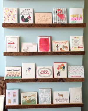
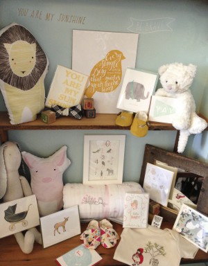
OSBPHappyBirthdayCards2 OSBPbaby2

3. Be memorable and follow up:

I don’t have to tell you how to make it personal. This is where you excel, but here are a few things that often make a difference to me:
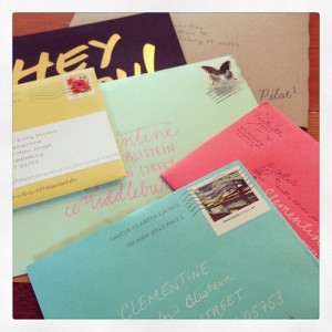
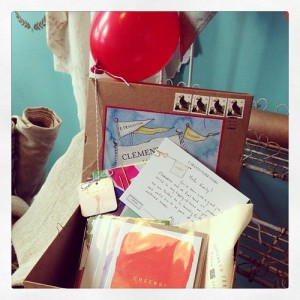
Brick and Mortar: Retail Advice for Stationers via Oh So Beautiful PaperBrick and Mortar: Retail Advice for Stationers via Oh So Beautiful Paper

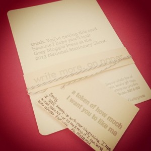
Showstoppers: A day of mail just before the 2013 National Stationery Show / The recent introduction package from E. Frances

  • Your envelope is the first thing I see. You are in a sea of incredible envelope addressers. Stand out in a vibrant way that fits your aesthetic.
  • Let your work do the talking. Include 2-4 images (by email) or 4-5 cards (by post) of your best work. You don’t have to tell me why your cards would be perfect in my shop; I’ll take care of that.
  • Use my first name and make it personal. Shop owners take pride in curating their lines, personalizing your introduction shows that you understand that. (Do beware of ‘cut and paste.’)
  • Offer to send samples. This will make me look at your line, and it gives you an obvious reason to follow-up. I don’t suggest that all vendors send samples, but cards can look very different in person.
  • Consider offering an incentive, like free shipping. This won’t make me order, but may sway me to increase my order and take chances.
  • Sometimes you catch me at the right moment and I reply immediately. Be prepared with immediate follow up and clear (hopefully flexible) instructions for how to place an order.
  • Use your connections. I adore and trust my current vendors and friends. If you know them and they tell me to look at you, I will. You are in the best, most supportive and collegiate industry around, use it!
  • Timing. Remember Thanksgiving through Christmas is crazy for retail shops. Consider following the National Stationery Show timeframe even if you’re not going. I keep a folder of NSS cards and April is when I’m most tuned in to new lines. January is also great, things slow down and I’m ready to think about Valentine’s Day. (I love to think about Valentine’s Day)

4. It’s not you, it’s my toddler. Silence does not mean I’m not interested. I know you put a lot of effort in to your submissions. I try to reply to all of the (thoughtful) submissions I get. But I wrangle a two-year-old, so my days are long, and my “I have to email that person back” list is longer. Don’t be afraid to send a follow up note. I have a huge stack of orders waiting to be written. Often a well-timed email about new items or a special makes an order happen.

5. Don’t be shy. If you like a shop, stay on our radar. I’ve brought on many lines months or years after the first introduction. Social media can be a great way to build a connection. If you mail an introduction packet, remember to include your social media handles. I get a lot of submissions that are fantastic, but aren’t quite right for the shop. I will happily tweet/instagram a quick photo of a great package. (And don’t be afraid to follow up!)
Brick and Mortar: Retail Advice for Stationers via Oh So Beautiful PaperBrick and Mortar: Retail Advice for Stationers via Oh So Beautiful Paper

Brick and Mortar: Retail Advice for Stationers via Oh So Beautiful PaperBrick and Mortar: Retail Advice for Stationers via Oh So Beautiful Paper

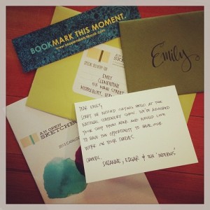
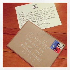
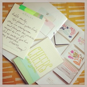
Perfectly personalized packages (clockwise from top left): Grey Moggie, MogleaInk Meets Paper, An Open Sketchbook

Brick and Mortar: Retail Advice for Stationers via Oh So Beautiful PaperOSBPscoutshonor

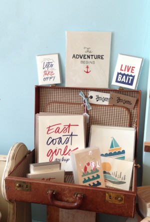
A family of favorites at Clementine and Scout’s Honor Co’s little nook. 

I love growing the family of print at Clementine. Your ideas and experiments make this possible and I’m constantly grateful (and pretty darned impressed).

Each little shop is unique, but I hope these are some helpful bits to expand your wholesale business. If you have specific questions, ask away! That’s where the fun happens, and maybe where future posts are born. I can’t wait to hear from you. xx Emily

Photo & Instagram credits: Emily Blistein, Clementine.
Aurora + William’s Art Deco Screen Printed Wedding Invitations

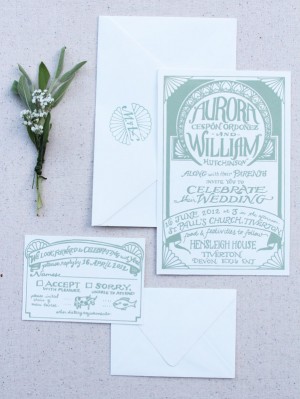
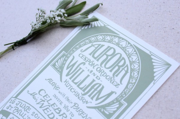
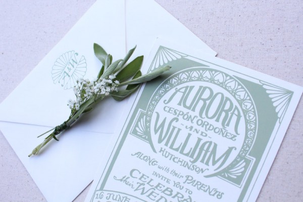
These screen printed invitations from Mikaela at The Hungry Fox are proof that you don’t have to sacrifice great design to achieve a budget-friendly wedding invitation. Just print the design in a single color! The text takes center stage in this design, with decorative elements inspired by the Art Deco vibe of the wedding and printed in a lovely shade of sage green. Beautiful!

From Mikaela: Aurora was planning a wedding with a loose 1920s theme. She wanted to create a very relaxed festival feel but with a glamorous old world Art Deco-inspired edge. Her palette was sage green, light pink and creamy white.
Here is an initial sketch I made and a picture of the screen I made to print them. I enjoyed designing an invitation that was mostly about the lettering, with decorative touches. Aurora also wanted a monogram, and I made several for her to choose from. I printed the one we chose on the back flap of each envelope.  I thought the sage green on the creamy white envelopes was a nice touch. This suite shows that a person on a budget can still get lovely hand printed invitations by choosing a one color design.

It was slightly complicated communicating about things like paper thickness, because in the UK they talk about paper thickness in gsm instead of pounds as we do here in the U.S. We resorted to saying things like “Oh, about the thickness of 10 sheets of computer paper stacked together.” The invitations were printed on French Muscletone Paper in Whip Cream.

Thanks Mikaela!

Check out the Designer Rolodex for more tal­ented wed­ding invi­ta­tion design­ers and the real invi­ta­tions gallery for more wedding invitation ideas!

Photo Credits: The Hungry Fox