Timeless Black and White Wedding Invitations

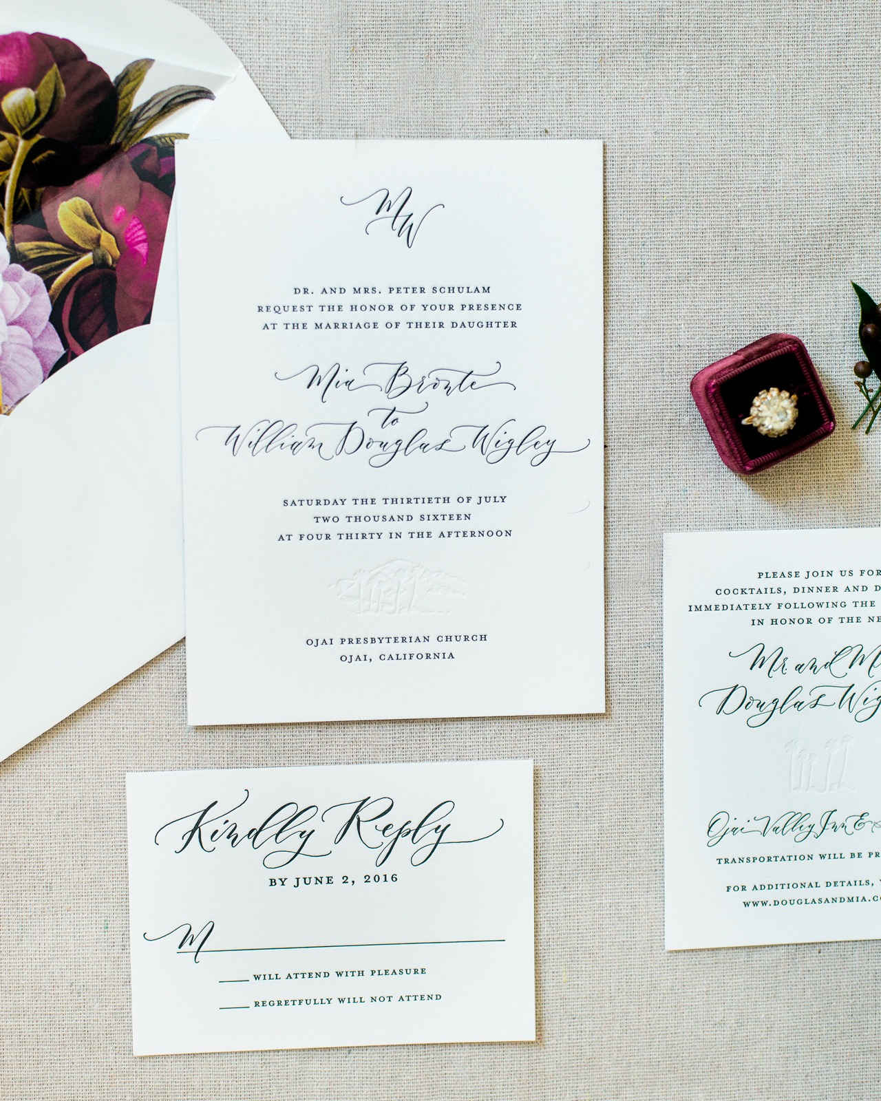
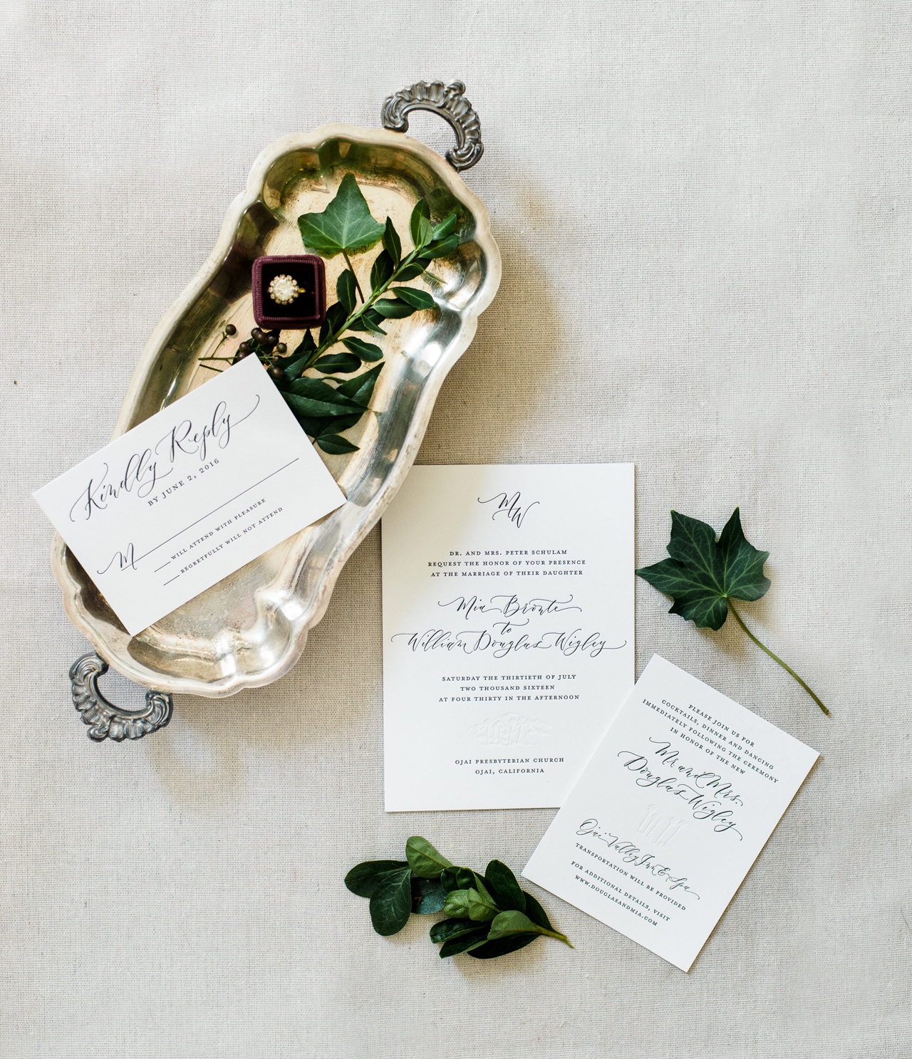
When it comes to timeless wedding invitations, it really doesn’t get any better than classic black and white with a dose of gorgeous calligraphy. These timeless black and white wedding invitations from Megan of Ruby the Fox feature black letterpress printed text, spot calligraphy from Angelique, Ink, blind impression palm trees and mountains inspired by the Ojai, California wedding location! Add in a couple of modern touches, including black edge painting and colorful botanical envelope liners, and you’ve got one seriously gorgeous invitation suite!
Timeless Black and White Wedding Invitations by Ruby the Fox

From Megan: This Ojai Valley Inn wedding for Mia and Douglas was an absolute DREAM to work on! I was contacted by Amber Weir Events to create this timeless suite for the most lovely bride. Her vision was super refined, yet organic, and I was honestly smitten with every element of her big day.
Timeless Black and White Wedding Invitations by Ruby the Fox

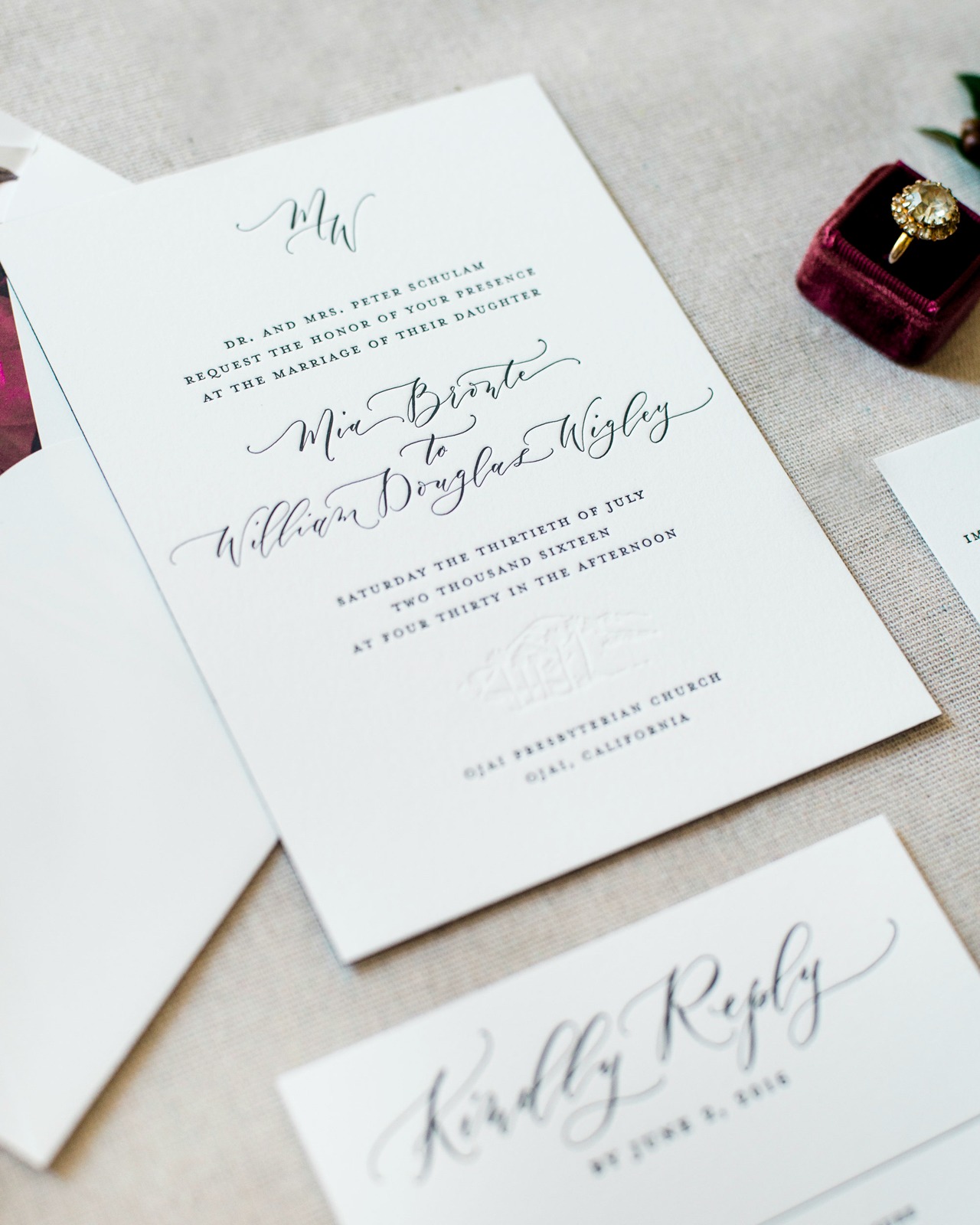
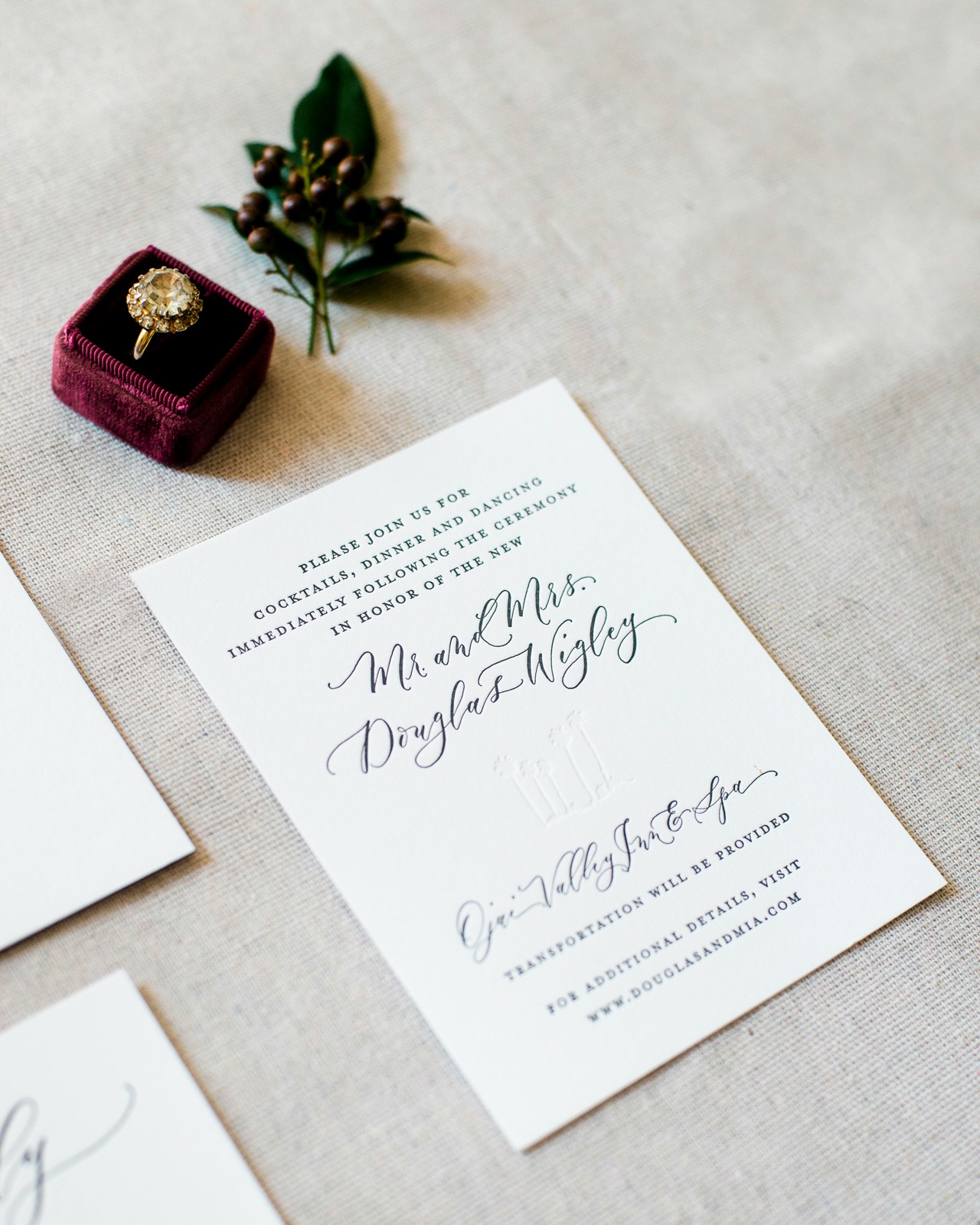
We started the design process with a pared down palette of black, white, and pops of red. After the bride had mentioned she wanted her out-of-town guests to really embrace and enjoy the beautiful venue, we decided to incorporate a blind (no ink) letterpress printed silhouette of the mountains and palm trees. This touch pulled in the gorgeous California scenery while still letting the design feel really fresh and clean. It was such a treat to work on a black and white design that was honestly a bit out of my design element (in the very best possible way!).
Timeless Black and White Wedding Invitations by Ruby the Fox

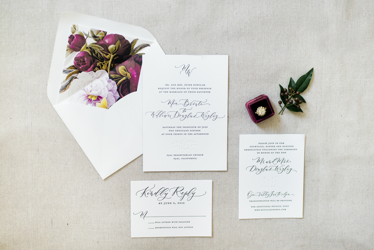
We utilized stunning modern calligraphy from Angi Phillips of Angelique, Ink for the names of the bride and groom, the addresses, and the venue titles. The rest of the invitation text was done in a classic serif font. Using spot calligraphy is one of my FAVORITE ways to really personalize a design. The cards were letterpress printed on white extra heavy cotton stock and were finished with a bold black edge painting. The letterpress printing was done in black ink and a blind (no ink) impression — really showcasing the impression and letting the process shine!
Timeless Black and White Wedding Invitations by Ruby the Fox

The crisp white envelopes were lined with a beautiful vintage botanical print, which gave the perfect pop of color and mimicked the flowers used at the ceremony and reception! The bride’s vision came together perfectly and I must say, this is one of my favorite wedding invitations to date.
Timeless Black and White Wedding Invitations by Ruby the Fox

Thanks Megan!

Design: Ruby the Fox

Printing: Steracle Press

Calligraphy: Angelique, Ink

Styling: Caitlin Kruse

Wedding Planner: Amber Weir Events

Ruby the Fox is a member of the Designer Rolodex – you can see more of their beautiful work right here or visit the real invi­ta­tions gallery for more wedding invitation ideas!

Photo Credits: Krista Jones Photography

Rustic Boho Wood and Copper Foil Wedding Invitations

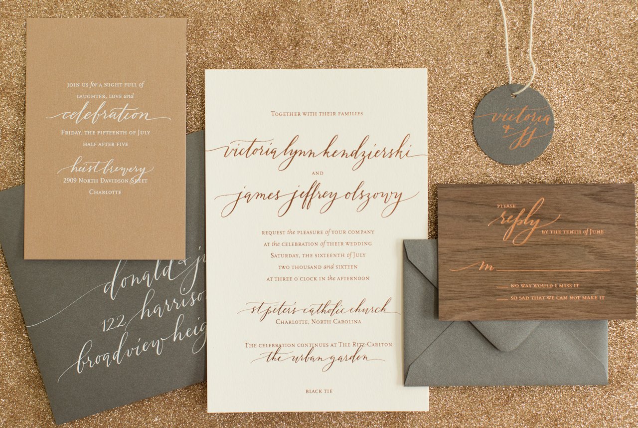
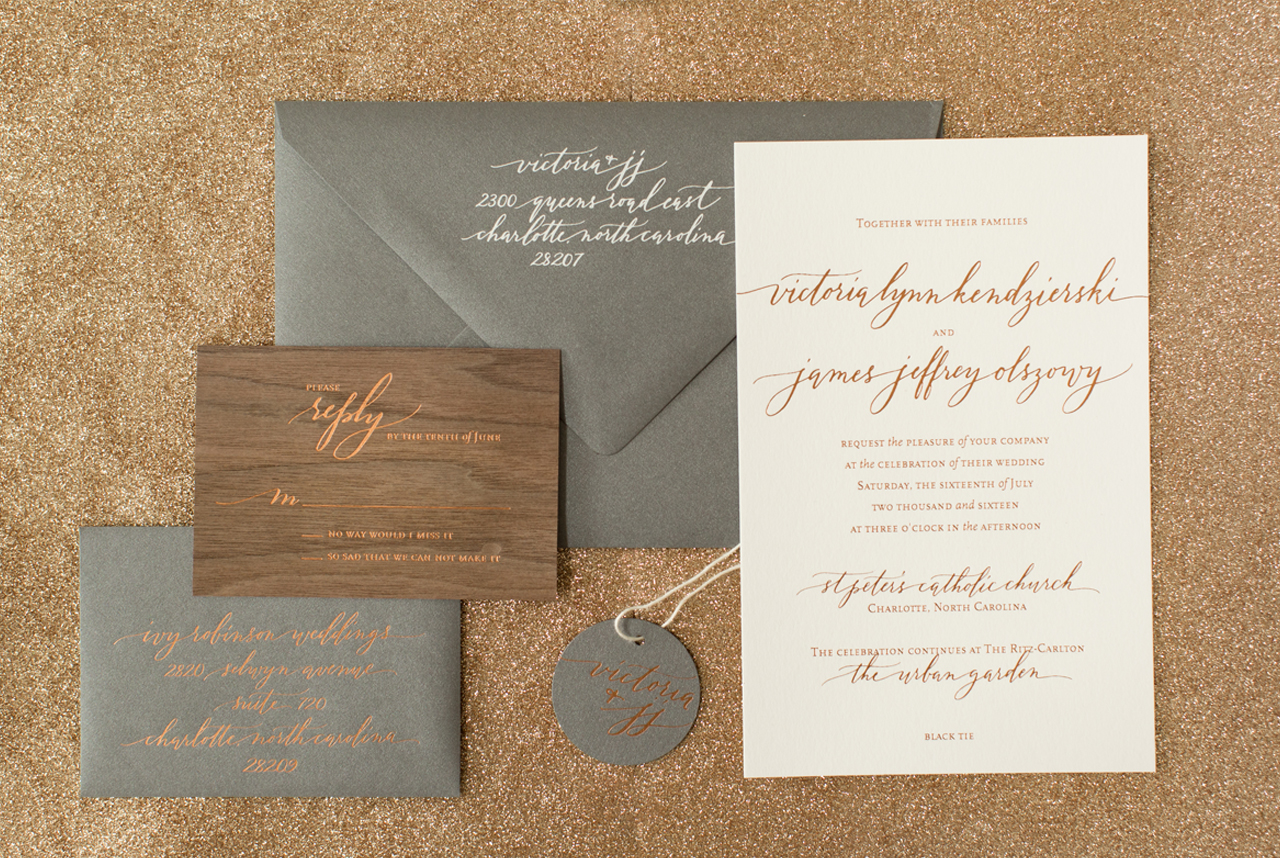
With fall in full swing and the leaves starting to change, we just love the warm hues of today’s rustic boho wood and copper foil wedding invitations. Melissa from Atheneum Creative is always coming up with new designs and ingenious printing combinations – and we love her for it! These wedding invitations are both sleek and bohemian, while featuring rustic touches and copper foil finishes!

Rustic Boho Wood and Copper Foil Wedding Invitations by Atheneum Creative

From Melissa: Copper on gray… no problem! Copper on white, no problem! Copper on a deep walnut wood… let’s do it! I love it when a client challenges us to try something new and to push the limits – and this invitation definitely meets that challenge!

Rustic Boho Wood and Copper Foil Wedding Invitations by Atheneum Creative

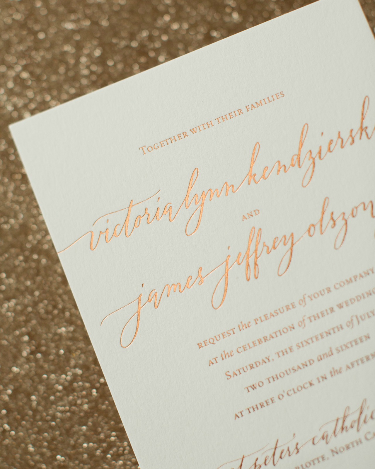
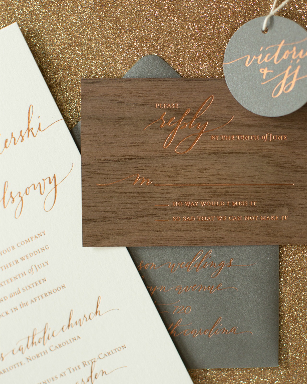
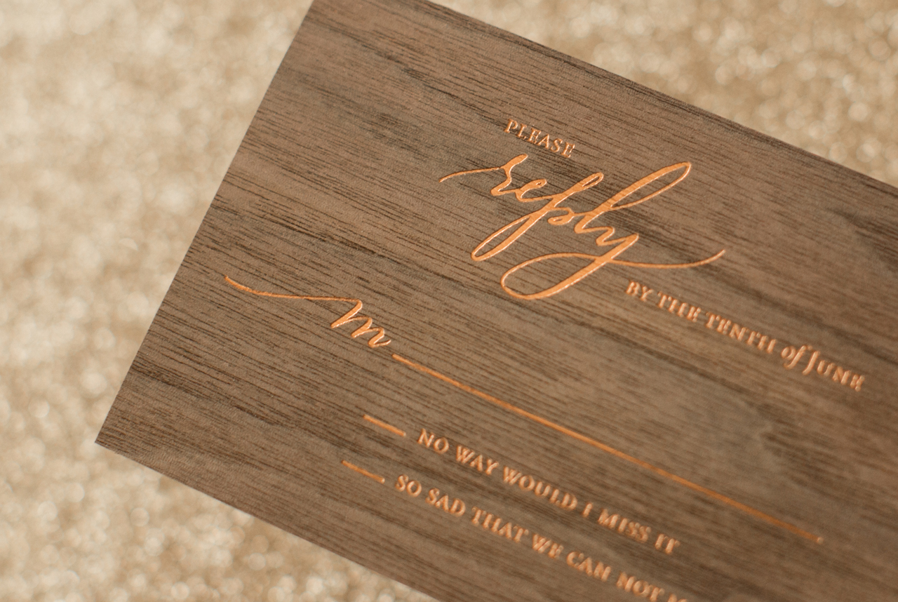
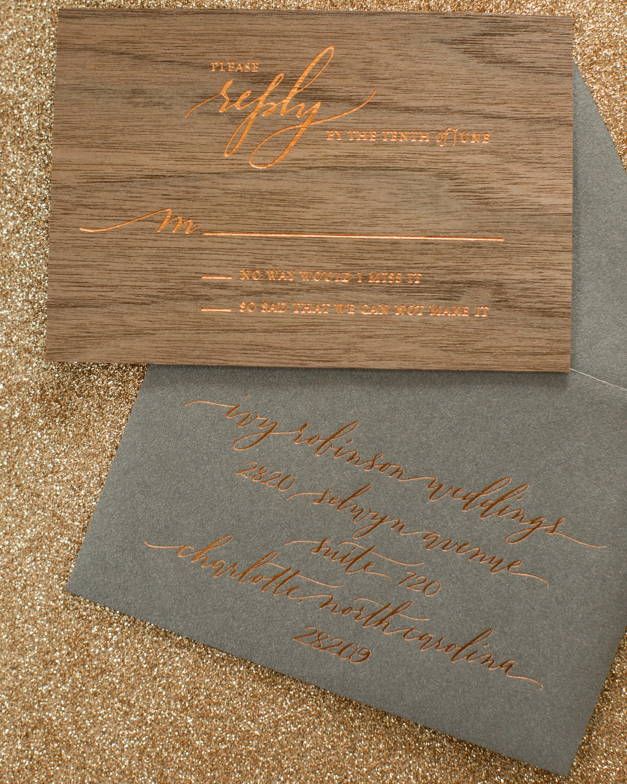
Victoria wanted something modern, something unique, something sleek (and let’s say it.. sexy) for her invitation, all while touching on a rustic boho vibe. The invitation was printed with a mix of white and copper foil printing on the deep gray metallic paper, metallic cappuccino paper, white paper, and a walnut wood veneer. We had to test the copper on the wood to make sure it would print well, especially for a reply card, but it printed great and really ties the whole invitation suite together.

Rustic Boho Wood and Copper Foil Wedding Invitations by Atheneum Creative

Rustic Boho Wood and Copper Foil Wedding Invitations by Atheneum Creative

The wording of an invitation also sets the tone for the event, and we love the phrase “join us for a night full of laughter, love and celebration” used on the reception card. A reception card allows your invitation to remain more traditional while bringing in an element that is a little more fun. Because the wedding reception was held at a local brewery, we felt the reception card worked well printed on cappuccino colored paper.

Rustic Boho Wood and Copper Foil Wedding Invitations by Atheneum Creative

Copper foil gave us the perfect amount of warmth without being super orange. It has a nice deep balance and of course it’s metallic – and who does not love metallics? It was subtle enough to give us the look we wanted on the wood, but also had just the right amount of pop to make it legible.

Rustic Boho Wood and Copper Foil Wedding Invitations by Atheneum Creative

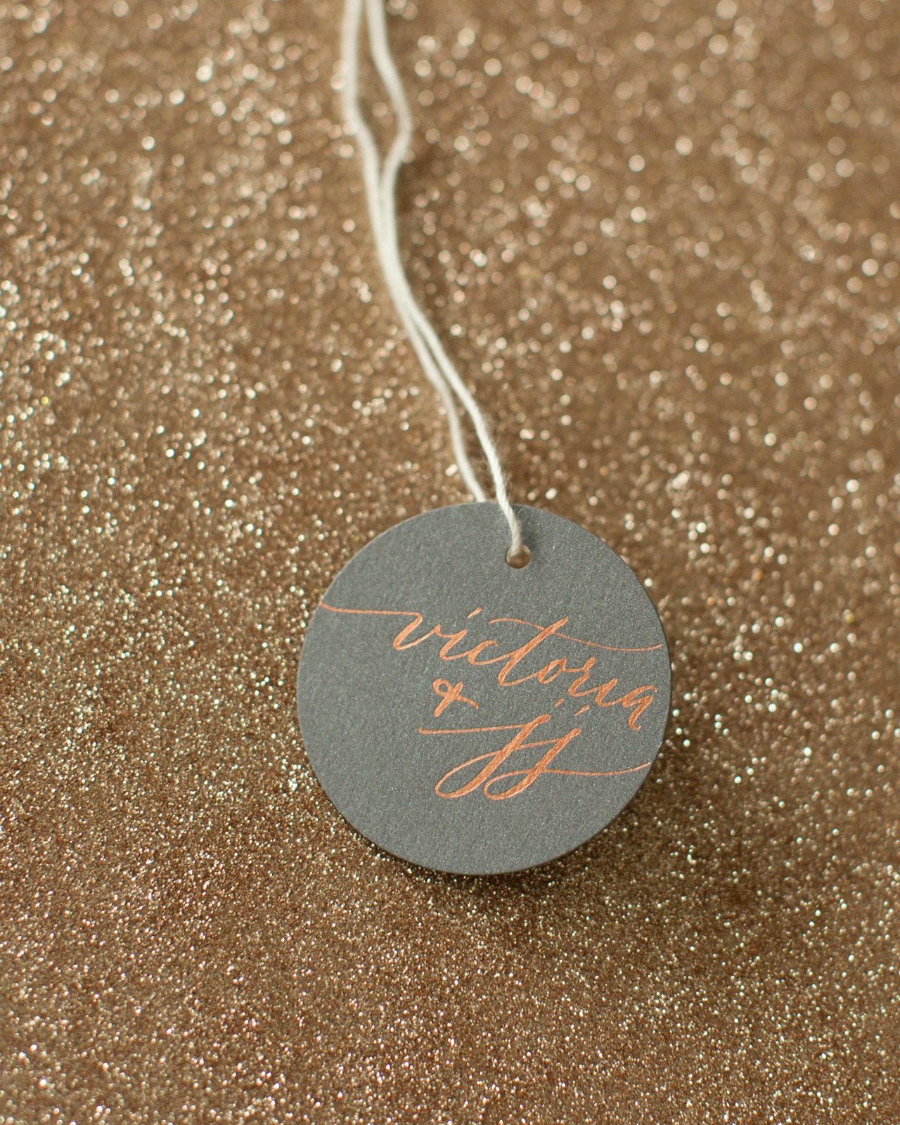
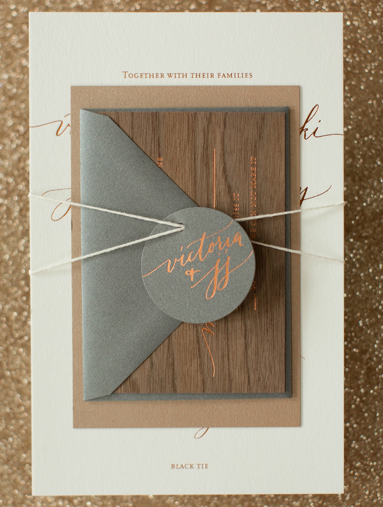
We love how this invitation has the perfect mix of being sophisticated and sleek with the metallic foil, but also brings a rustic touch with the wood veneer and cappuccino paper. The invitation suite was packaged with twine and a hang tag, and mailed in a dark gray envelope addressed by Anne Robin Calligraphy in white ink!

Rustic Boho Wood and Copper Foil Wedding Invitations by Atheneum Creative

Rustic Boho Wood and Copper Foil Wedding Invitations by Atheneum Creative

Thanks Melissa!

Design: Atheneum Creative

Calligraphy: Anne Robin

Atheneum Creative is a member of the Designer Rolodex – see more of their beautiful work here or visit the real invi­ta­tions gallery for more wedding invitation ideas!

Photo Credits: Chelsea Davis Photography

Happy Weekend!

Happy Friday everyone! I’m feeling soooooooo much better after my little surgery on Monday and looking forward to really getting back in the swing of things after a couple of rough weeks. Right now, I’m sending lots of positive vibes to our friends in the Southeast with the arrival of Hurricane Matthew. Stay safe everyone! But in the meantime…

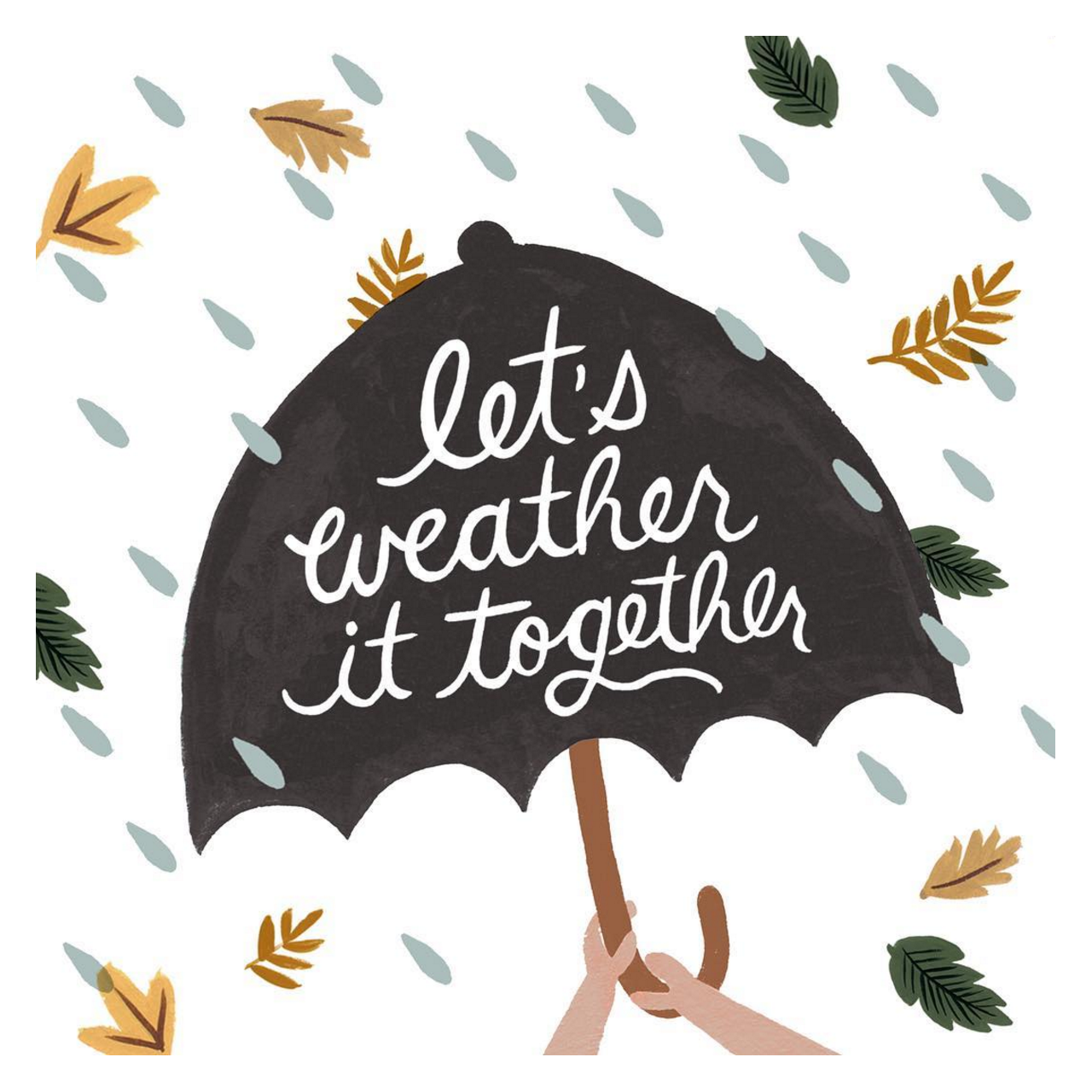
Rifle Paper Co. / Let's Weather It Together

Image by Rifle Paper Co. via Instagram, and you can buy a version of this illustration as a card here

…a few links for your weekend:

This week on Oh So Beautiful Paper:

That’s it for us this week! I hope you all have a fun and relaxing long weekend, and I’ll see you back here next week! xoxo

Calligraphy Inspiration: Cami Monet

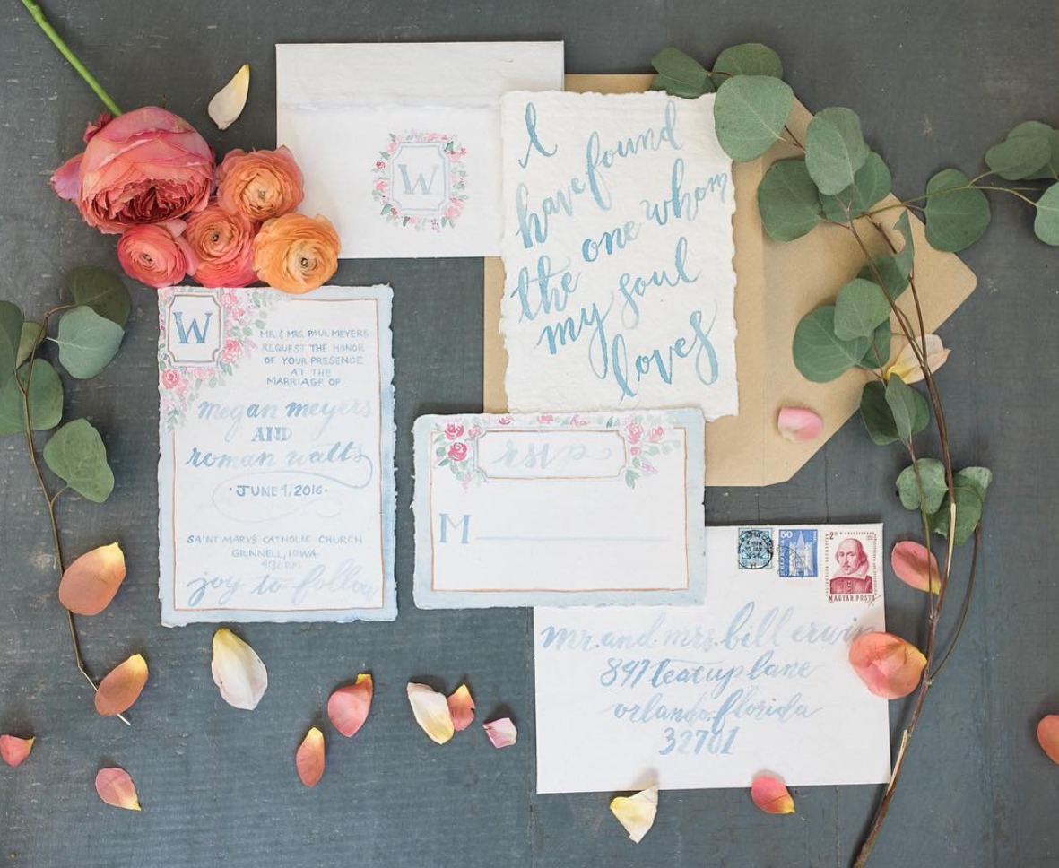
Hello! I’m excited to be here with a column that scouts calligraphy artists and inspiring examples of modern lettering. Many moons ago, I lived in New York and went to my first Stationery Show as an editor at Real Simple. Back then, letterpress seemed to be all the rage with modern stationery, but in recent years, I’ve watched calligraphy step out of its former just-for-wedding typecast and into the modern paper world. You see examples of calligraphy everywhere now from bar menus to home décor — wherever you find type (including tattoos!). I’m kicking off my first installment with the work of calligraphy artist Cami Monet Miller. Her style feels organic, soulful, and so artistic. She often works in watercolor and uses deckled-edge papers that adds a modern handmade touch. Be sure to check out her Instagram for even more beautiful calligraphy! Jen

Calligraphy Inspiration: Cami Monet

I’m just in love with everything in this photo, including the color palette. Photo by Jennifer Weinman.

Calligraphy Inspiration: Cami Monet

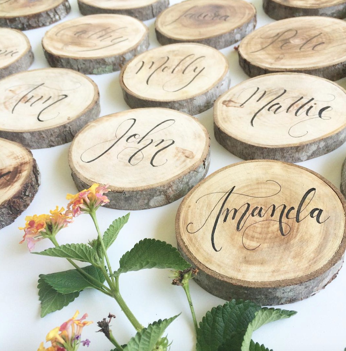
I’ve always been drawn to the rustic woodland style in decorating (long before moving to Maine.) These placeholders (which double as coasters!) feel like a woodland fairy tale. The wood slices with their textured bark add a natural simplicity to the table. Then the black brushstroke calligraphy creatures a sweet, flirty contrast.

Calligraphy Inspiration: Cami Monet

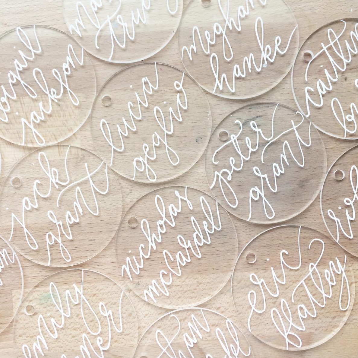
Cami just posted these acrylic place cards on her Instagram, which are going to be tied around napkins for a wedding. The mix of the modern clear acrylic with the white brushstroke calligraphy — heart-eye emojis all the way.

Calligraphy Inspiration: Cami Monet

Calligraphy Inspiration: Cami Monet

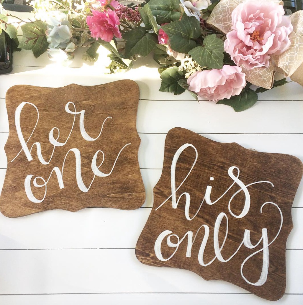
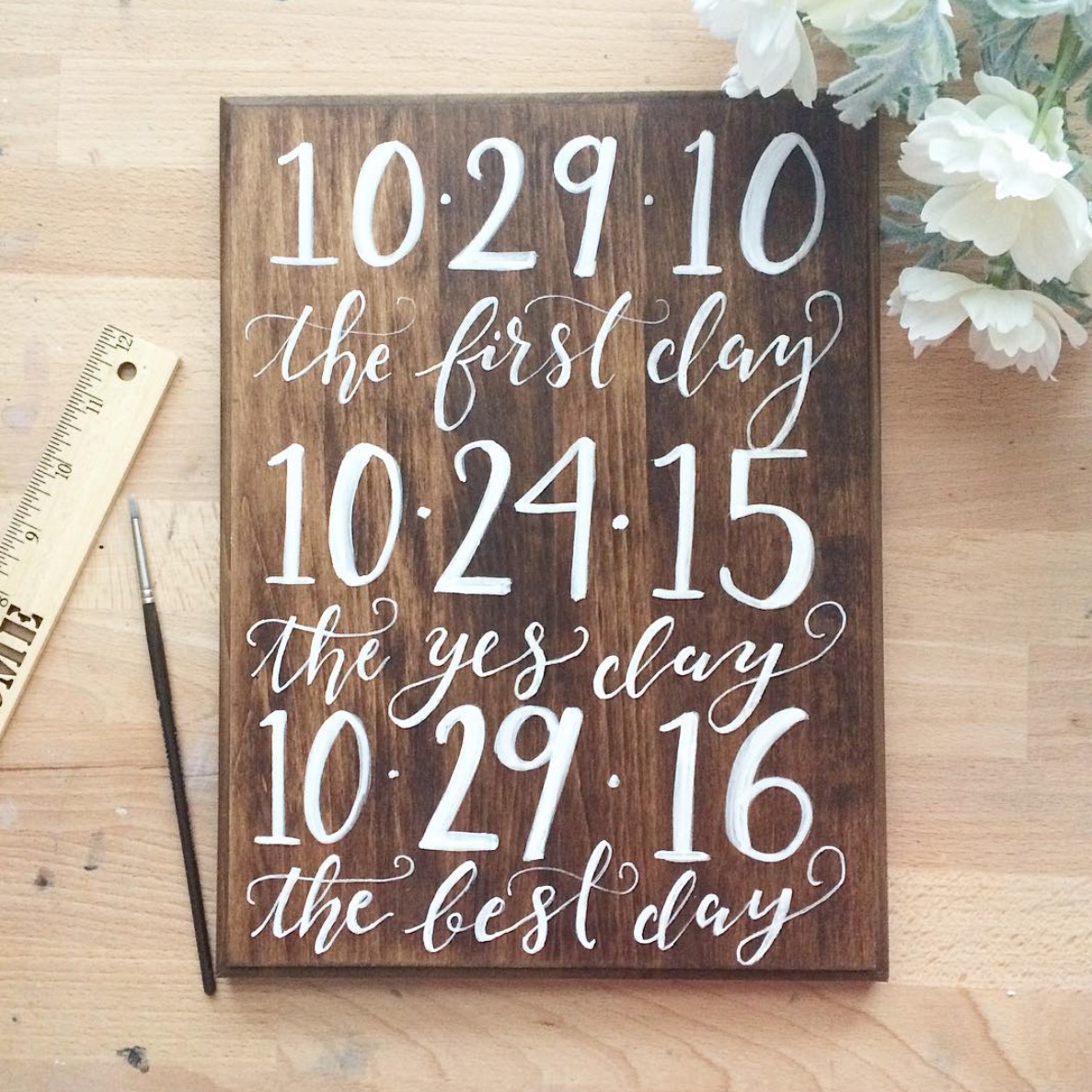
What really caught my eye as I browsed through Cami Monet’s work is the sheer variety of pieces and ways that she plays around with her organic brushstroke calligraphy. Each snap seems to feature something new, unique, and special to that particular event, which I imagine is no easy feat for an artist running a small business.

Calligraphy Inspiration: Cami Monet

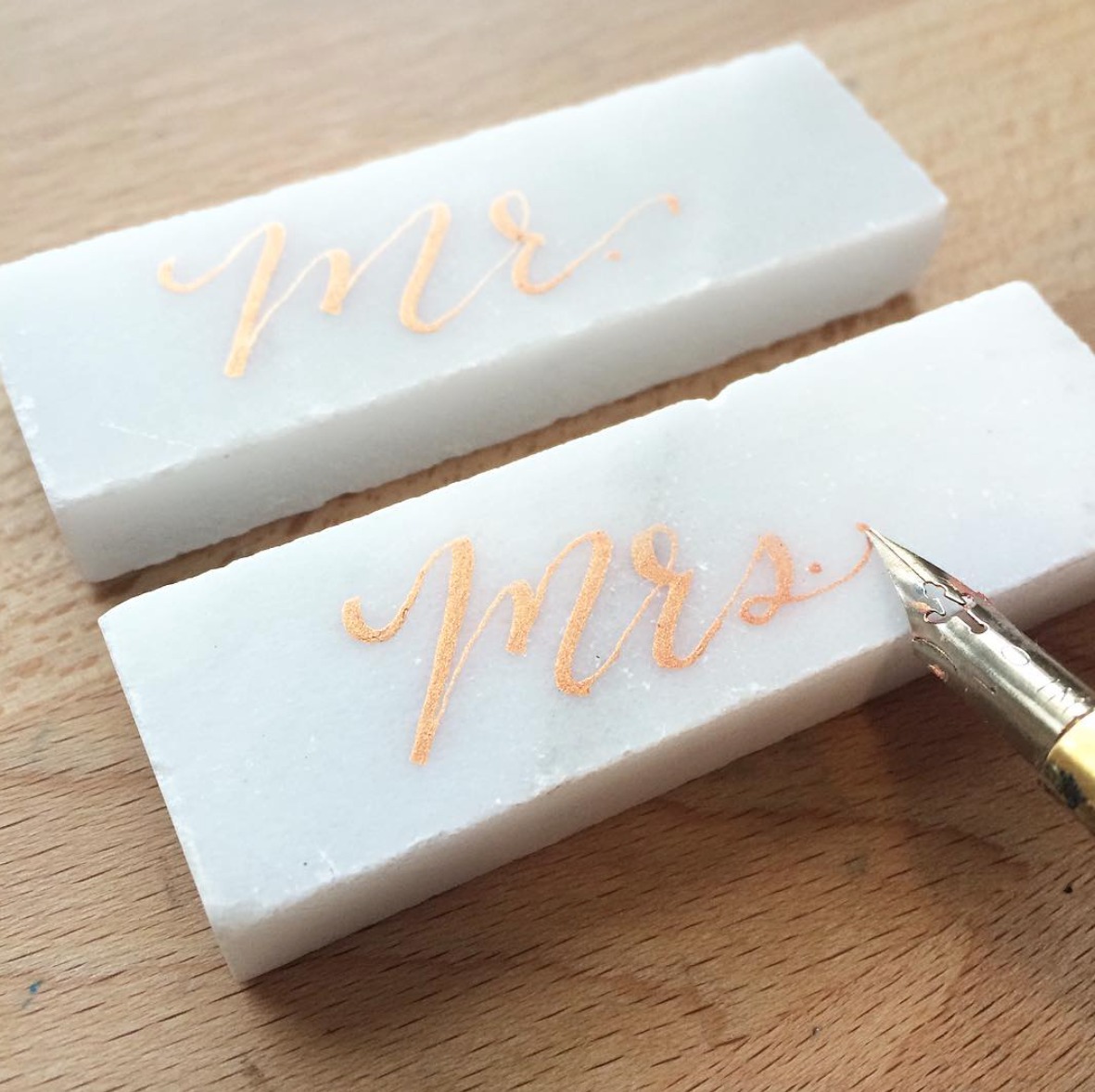
Gold ink calligraphy on white backsplash tiles — what a wow detail for wedding place cards!

Calligraphy Inspiration: Cami Monet

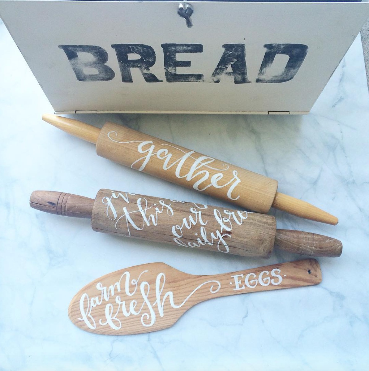
I am a sucker for anything with that modern vintage vibe, so this snap rose to the top of my favorites. Cami created these home décor goodies for a pop-up shopping market, and I can think of several people on my holiday shopping list who would love those rolling pins.

Calligraphy Inspiration: Cami Monet

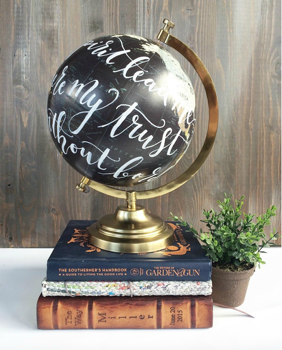
I know calligraphy on globes is not the newest idea, but I had to share here because I still have one on my wish list. Such a beautiful addition for an office or living room.

Calligraphy Inspiration: Cami Monet

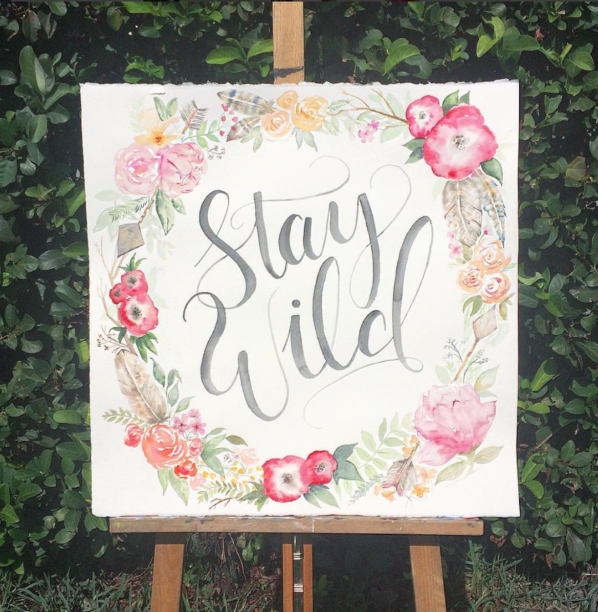
Cami Monet has an Etsy shop where you can purchase readymade watercolor and calligraphy creations, or order custom wedding invitations. You’ll find prints —  like this boho sweet Stay Wild printed sign — paper goods, and even mugs with quips in calligraphy (for the prettiest morning cup of joe.) Anyone else itching to throw a dinner party with some fancy calligraphy place cards now?

Photo Credits: Cami Monet, except where noted

Inspired By: Grid Patterns

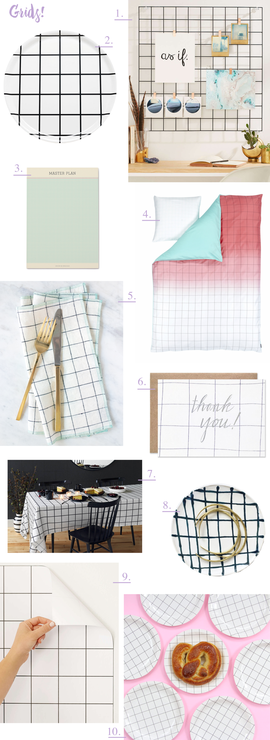
All of a sudden, I feel like I’m seeing grid patterns everywhere! From large scale windowpane grid patterns to smaller scale grids reminiscent of old school graph paper, I’m seeing grids on bedding, kitchen textiles, removable wallpaper, and, of course, stationery. Grid patterns look fantastic mixed with solid colors – especially pastels and neutrals – and they definitely make a big graphic statement whether you’re using them in party décor or at home. Today I thought I’d share a quick grid pattern round up with some of my current favorites!

Trendspotting: Grid Pattern Round Up

  1. I have this wire wall grid in my own office as an inspiration board! I have the copper version, but it also comes in the classic black version pictured above and in white.
  2. Unison Home seriously has the best selection of grid pattern products, from trays to textiles. This grid platter would be so perfect for dinner parties
  3. A Master Plan grid notepad from Snow & Graham
  4. This ombré grid bedding from Hay is super cool! I also like the large scale windowpane pattern bedding from Brooklinen and these smaller scale grid pattern sheets from West Elm.
  5. The most beautiful navy windowpane linen napkins from The Everyday Co.
  6. Silver foil thanks over an illustrated grid pattern from Hartland Brooklyn
  7. This grid tablecloth from Unison Home makes a huge graphic statement for dinner party table décor. I also picked up this budget version (with a smaller scale pattern) during one of my latest trips to Ikea.
  8. A pretty ceramic ring dish with a hand painted grid pattern from A Sensible Habit
  9. Removable grid wallpaper in a black and white pattern – also available in dark gray/light gray and white on black here. 
  10. Super cute grid pattern paper plates from Bash Party Goods (they have lots of other grid pattern items in their party collections!)

Are any of you feeling the grid pattern vibe these days? Share your favorite grid finds in the comments!