Stationery A-Z: Engagement Congratulations

Wild guess, but do you know someone who just got engaged? I’ll bet you do, as we’re currently in the midst of engagement season (no, really – 40% of all couples get engaged between the months of November and February). Before all the bridal showers, bachelorette parties, and actual real life weddings start consuming the majority of your free time, why not sit back, pick up your trusty pen, and send that dear, newly engaged friend a heartfelt letter of congratulations? Today we’re sharing a quick engagement congratulations card round up with a few of our favorite picks to help celebrate this momentous occasion:
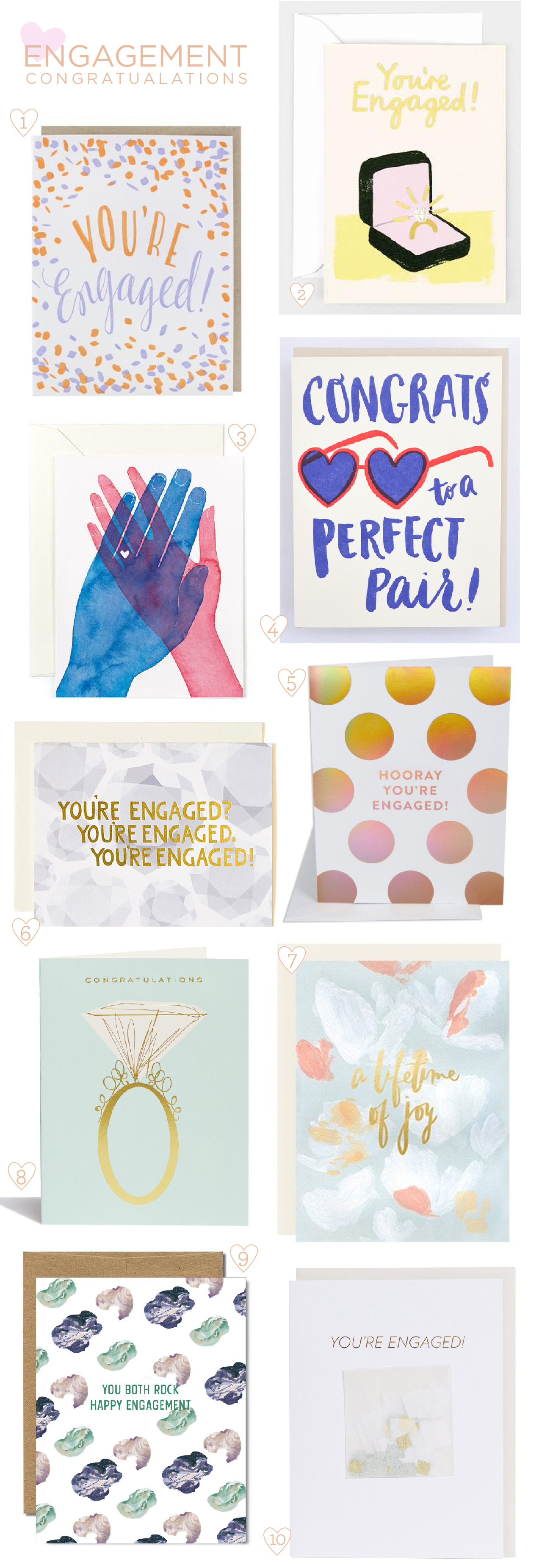
Engagement Congratulations Card Round Up

From top left:

1. Celebrate your bestie’s engagement with illustrated confetti and general exuberance with this design from Smudge Ink.

2. Spending two months salary on one item is no joke, so why not honor the generosity of that purchase with this bling-ed out foil stamped design from Wrap Magazine?

3. Love this sweet watercolor illustration from Golden Fox Goods. No sentiment needed.

4. Don’t forget to accessorize with a fun illustration and a punny messaging from Hello!Lucky.

5. I wouldn’t think twice about saying yes to gold hologram foil. From The Social Type (if you are in the Los Angeles area, be sure to check out their new brick and mortar location!).

6. One Canoe Two has got your reaction down pat. Plus diamonds.

7. This card from Our Heiday honors engagement with a soft abstract painterly design, a touch of gold foil, and a celebration of the impending marriage.

8. Let’s call a spade a spade: some occasions just require a giant sparkling ring (a classic from Snow & Graham).

9. This Ferme à Papier design is great for its gender neutral palate and casual sentiment. I also really like that it addresses both members of the couple – after all, they’re both getting married!

10. Finally, what better occasion for some IRL confetti? Those party experts at Knot & Bow have got you covered. Literally.

Next week: the Valentines extravaganza begins!

Autumn Floral Copper Foil Wedding Invitations

We are just in love with these autumn floral copper foil wedding invitations by Lauren of Charm & Fig, featuring luxurious blind impression letterpress printed floral details. Lauren drew her inspiration from the bride’s unabashed love of the color orange, incorporating metallic copper foil and rounding out the color palette with deep red, plum, and forest green. We’re absolutely loving the copper foil details on the RSVP envelope and that gorgeous floral envelope liner!

Autumn Copper Foil Wedding Invitations by Charm & Fig

From Lauren: This wedding suite made me want to pull out cozy wool blankets and the spiked-apple cider! Taylor unabashedly loves orange, which was a no-brainer for her fall wedding and a not-so-secret tribute to her beloved Texas Longhorns. We ran with the idea of using lots of metallic copper, fall florals, and romantic details for this black tie wedding.

Autumn Copper Foil Wedding Invitations by Charm & Fig

First impressions are important! The first thing guests would see when they opened the interior envelope was a floral envelope liner displaying sophisticated fall hues of orange, wine, plum, and forest green. True story: another client saw a sample of this envelope liner, grabbed it, and vowed to use the palette for her dining room renovation!

Autumn Copper Foil Wedding Invitations by Charm & Fig

On the invitation, we started with double-ply cotton paper and had it blind letterpress printed with a bundle of botanical florals. Debi Sementelli’s Bellucia calligraphy font was printed in copper foil over the blind image and brought just the right amount of elegance and femininity to the suite. A chocolate wax seal with a custom monogram was affixed to the top and added another layer texture to the main piece. For extra thickness, the invitation was backed with Stardream’s metallic copper paper.

Autumn Copper Foil Wedding Invitations by Charm & Fig

In order to create some balance within the suite, we opted for more simple reception and response cards, flat printed in chocolate on single-ply cotton paper to coordinate with the chocolate wax seal. The outer envelopes were addressed by Maureen Vickery of Pendance Studio. She sourced the perfect copper ink and calligraphy style to match our invitations. For the final packaging, we created a single copper bellyband with the same paper used on the back of the invitation.

Autumn Copper Foil Wedding Invitations by Charm & Fig

Autumn Copper Foil Wedding Invitations by Charm & Fig

The dinner plate menus were flat printed in chocolate brown with the same dogwood florals from the response envelopes, and served double duty as a place card with the name of each guest printed at the top.

Autumn Copper Foil Wedding Invitations by Charm & Fig

By far, the response envelope was our favorite piece. It was printed in copper foil with a detailed dogwood botanical illustration and the couple’s monogram. Although it was a little tricky to foil print over the crease of the envelope, our amazing printers pulled it off and it was totally worth it. It’s kind of a secret gift to yourself to have a pretty RSVP envelopes since you’ll get gorgeous mail for weeks as the RSVPs roll in.

Autumn Copper Foil Wedding Invitations by Charm & Fig

Thanks Lauren!

Design and Styling: Charm & Fig

Printer: Quality Printing Company

Envelope Calligraphy: Maureen Vickery of Pendance Studio

Charm & Fig is a member of the Designer Rolodex – check out more of their beautiful work right here or visit the real invi­ta­tions gallery for more wedding invitation ideas!

Photo Credits: Charm & Fig

Happy Weekend!

Happy Friday everyone! How was your first week of 2017? I spent most of the week cleaning out my office and trying to mentally prepare myself to dive into 2017. The last couple of years have felt VERY chaotic, both personally and professionally, so this year I’m trying to take a step back and focus on building a foundation that will help me grow and move forward in an intentional way. I know we all project a positive, happy, and successful vibe on blogs and social media, but behind the scenes life often feels like the exact opposite! So, last summer, I signed up for Shanna Skidmore’s Blueprint Model program to help me build that foundation. I’m only about two thirds of the way through the 12-week program, but it has been absolutely invaluable in helping me figure out the direction I want to take, both with my business and my life (more on that sometime soon!), and some of the key ingredients missing from my business model. Anyway, I’m looking forward to finishing the final third of the program while things are still fairly quiet in January, and if any of you are interested in doing something similar for your business, I’d definitely encourage you to sign up for the next 12 week round – registration opens today and runs through January 12! And you can even get $100 off your registration with code “THEYTOLDMETOO” at checkout. And if that wasn’t enough, Shanna is offering one-on-one sessions for the first 25 people that sign up. Go NOW! But in the meantime…

Little Arrow Shop / Don't Quit Your Daydream

Don’t Quit Your Daydream Unicorn pin by Little Arrow / Photo by @tokyokittengalaxy

…a few links for your weekend:

  • How stamps get designed. I think this is just the coolest thing ever.
  • Just totally obsessed with this vase – and this matching terrarium
  • The holidays may be over, but I totally want to try Ashley’s recipe for dairy-free Milk Punch (made with almond milk!)
  • Have any of you tried a facial cleansing oil? I tend to get really dry skin in the winter months, so I’m very curious!
  • Can I please get this sweater in my size?? (I’m totally getting one for Sophie – and it’s 40% off with code MUSTSHOP!)
  • The invisible workload. I found this article super interesting. I’m sure in some homes it’s the husband who does most of the invisible thinking work, not to mention households with couples of the same gender, but I’m guessing in most homes the invisible work generally falls to one person. In my home, my husband helps keep track of our grocery list, but I keep track of pretty much everything else. What do you think? Is it the same for you?

This week on Oh So Beautiful Paper:

That’s it for us this week! Have a fabulous weekend, and I’ll see you back here next week! xoxo

Elegant Blush and Gold Letterpress Wedding Invitations

I pretty much always fall in love with anything in the color pink. Pale blush pink, bright pink, magenta, neon… the list goes on and on. Lisa from Missive created these elegant blush and gold letterpress wedding invitations for a wedding in the mountains. I’m loving the combination of rustic and romantic, with hand drawn botanical details and vintage-inspired floral postage stamps. And those pale pink wedding details cards? So good!

Elegant Blush and Gold Letterpress Wedding Invitations by Missive

From Lisa: The inspiration for this suite came from both the event venue and the bride’s description of her vision for their perfect wedding day. The wedding venue was the Black Bear Inn, a rustic, elegant lodge in the heart of the Sierra (think towering sequoia trees and the scent of pine year round). The wedding was held outdoors in the venue’s garden, surrounded by the resplendent woodland foliage of the Stanislaus National Forest.

Elegant Blush and Gold Letterpress Wedding Invitations by Missive

An elegant blush and gold color palette with charcoal gray accents was a theme throughout the wedding and reception, from gold rimmed flutes, to sparkly pink sequin (yes, sequin!) table runners and blush pink floral arrangements in rustic wood boxes, which were handcrafted by the bride and groom.

Elegant Blush and Gold Letterpress Wedding Invitations by Missive

Since their wedding was all about their love of the outdoors, coupled with bride’s idea of a perfectly elegant wedding, I designed a nature-inspired invitation suite featuring hand drawn foliage surrounding a combination of modern, calligraphic scripts and typefaces with rustic charm. The invitation design was kept symmetrical and orderly while incorporating lots of flowing, hand drawn botanicals to frame the wording.

Elegant Blush and Gold Letterpress Wedding Invitations by Missive

Their entire wedding suite was letterpress printed on our vintage presses in blush and matte gold inks on soft white cotton and blush pink papers, with deep, tactile impressions. The couple’s wedding website had plenty of information for out of town guests, so we created a wedding details card printed in gold on blush pink stock for an accent of color.

Elegant Blush and Gold Letterpress Wedding Invitations by Missive

Reply card envelopes were the same blush pink color and featured their address surrounded by more hand drawn botanicals. The bride chose the gorgeous Botanical Art stamps for the postage, which I’ve personally been hoarding for future use!

Elegant Blush and Gold Letterpress Wedding Invitations by Missive

Thanks Lisa!

Design and Printing: Missive

Check out the Designer Rolodex for more tal­ented wed­ding invi­ta­tion design­ers and the real invi­ta­tions gallery for more wedding invitation ideas!

Photo Credits: Missive