Quick Pick: Off Switch

I’m all for pretty flourishes, illustrations, and design motifs, but sometimes all you really need is a meaningful message and simple black and white hand lettered text. Katie from Off Switch also has plenty of color in her collection, but I feel like her black and white greeting cards and art prints are where her work truly shines. Sweet messages of love and encouragement, cards offering a shoulder to lean on during tough times, and cards (and art prints!) celebrating the magic of optimism and empowerment – oh, and a few Valentine’s Day-appropriate cards, too. Here are a few of my faves:

Quick Pick: Off Switch Shop

More from Off Switch right here!

The World of Illustration: Jia Guo

Hello friends! I kicked off January with some big goals in mind, in true new year’s fashion. And then I promptly went searching for pretty illustrations related to stuff I’m saving for and making wishes on stars for — everything including a perfect knit winter sweater, a home of our own, and maybe even some travel thrown in to see friends in big cities. So it was rather kismet when I stumbled on the Instagram account of Sydney-based illustrator and artist Jia Guo. Her illustrations were just the inspiration I was looking for on these frosty January days. Jen

The World of Illustration: Jia Guo

Saturated colors and whimsical style makes this painterly illustration of sweaters one I’d love to frame and hang in my bedroom. (And I choose the blue-and-white fair isle style sweater for real life.)

The World of Illustration: Jia Guo

This illustration looks seemingly simple and effortless, which is when you know art really speaks to you. I love how the color palette is a happy mix of sunset shades.

The World of Illustration: Jia Guo

Anyone else dreaming of a lake home? The pickup truck is my favorite detail in this illustration by Jia.

The World of Illustration: Jia Guo

Jia includes many home illustrations in her portfolio, including this illustration of a farm on an autumn day. I’ve never been to Australia, but these colors do feel like New England fall to me.

The World of Illustration: Jia Guo

The World of Illustration: Jia Guo

I love this fashion illustration Jia created of women in the 1960s. That was a great decade in style! The jackets with big pockets. The simple flare. And she uses a similar color palette in the train illustration, above, which gives it that retro modern vibe.

The World of Illustration: Jia Guo

A work in progress by Jia Guo, who calls herself a crazy cat lady (some of my favorite people go by the same label).

The World of Illustration: Jia Guo

Jia’s recent illustration of the day included cats as a fun welcome to the new year. For a peek into more of her work, you can check out Jia Guo Illustration. Anything big on your wishlist for the new year? Let me know and I’ll be sure to scout out some illustrations to match up! See you soon, friends!

Images: Jia Guo Illustration

New York City Inspired Floral Watercolor Wedding Invitations

Is there anything more beautiful than New York City in the fall? Central Park practically explodes with gorgeous fall foliage, and all the brownstones decorate their stoops with pumpkins and colorful autumn blooms. Becca of Suite Paperie created these whimsical New York City inspired floral watercolor invitations for a bride and groom tying the knot in the city. The invitations feature a color palette of rich autumn hues like purple and deep green, along with an illustrated map of Manhattan and soft watercolor florals.

New York City Inspired Floral Watercolor Wedding Invitations by Suite Paperie

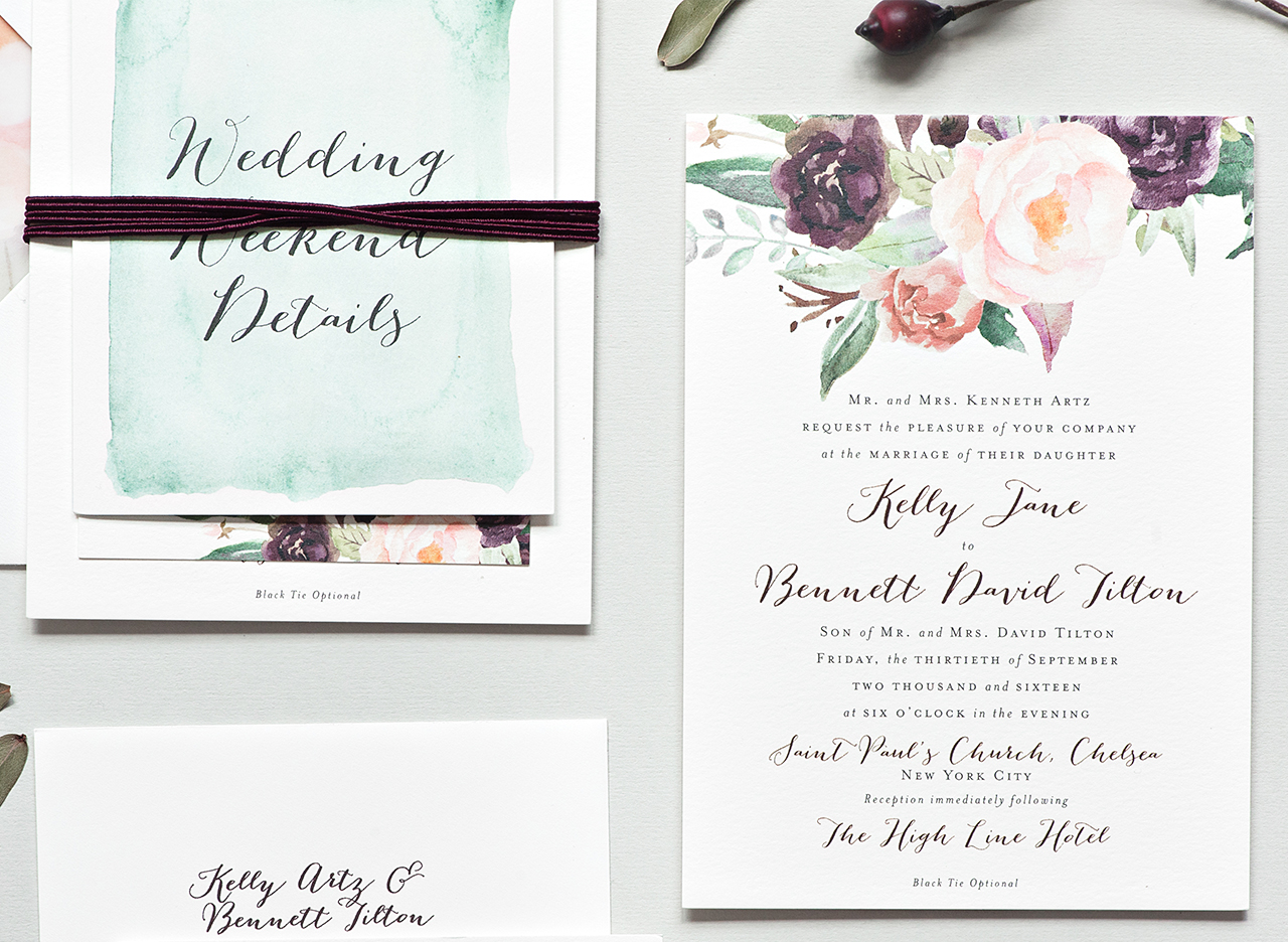
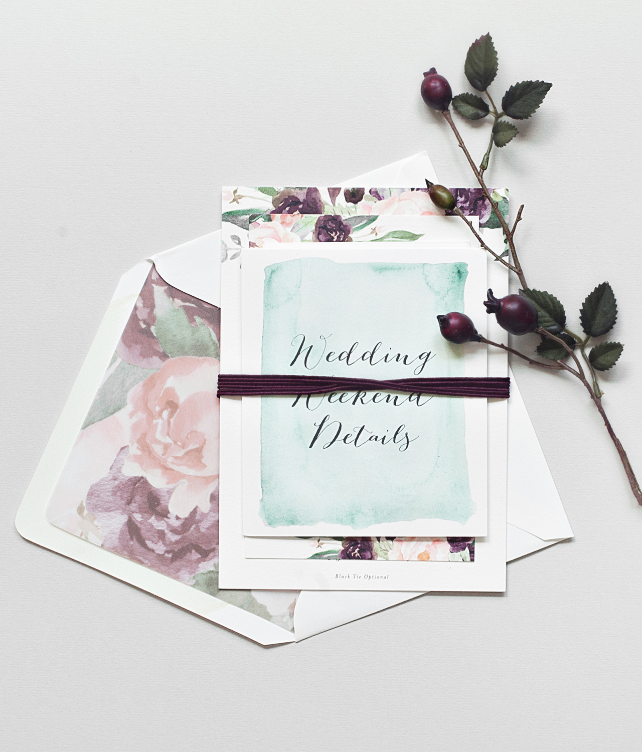
From Becca: Kelly and Bennett wanted to set the perfect early Autumn New York City tone for their mostly out of town guests, and we set out to do just that! Oversized fall blooms were watercolor painted in rich purples, dusty roses, blushes, and deep greens, and paired perfectly with their wine and gray whimsical script and serif lettering on the main piece of their invitation suite. Digitally printed on duplexed soft white cover stock, the invitation was both colorful and luxuriously thick.

New York City Inspired Floral Watercolor Wedding Invitations by Suite Paperie

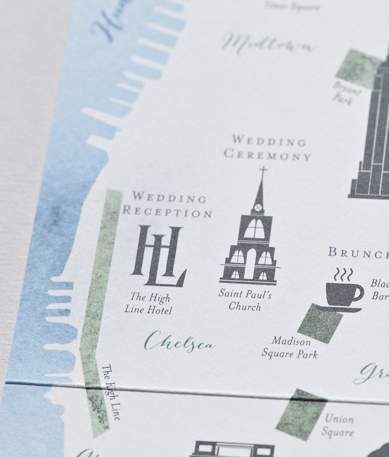
We created a custom map of Manhattan showcasing the neighborhoods and venues for the events throughout the wedding weekend. We also made sure to highlight important landmarks and neighborhoods that had special meaning to the couple, like their favorite place to sit and people watch, Washington Square Park, and where Bennett proposed to Kelly, Greenwich Village.

New York City Inspired Floral Watercolor Wedding Invitations by Suite Paperie

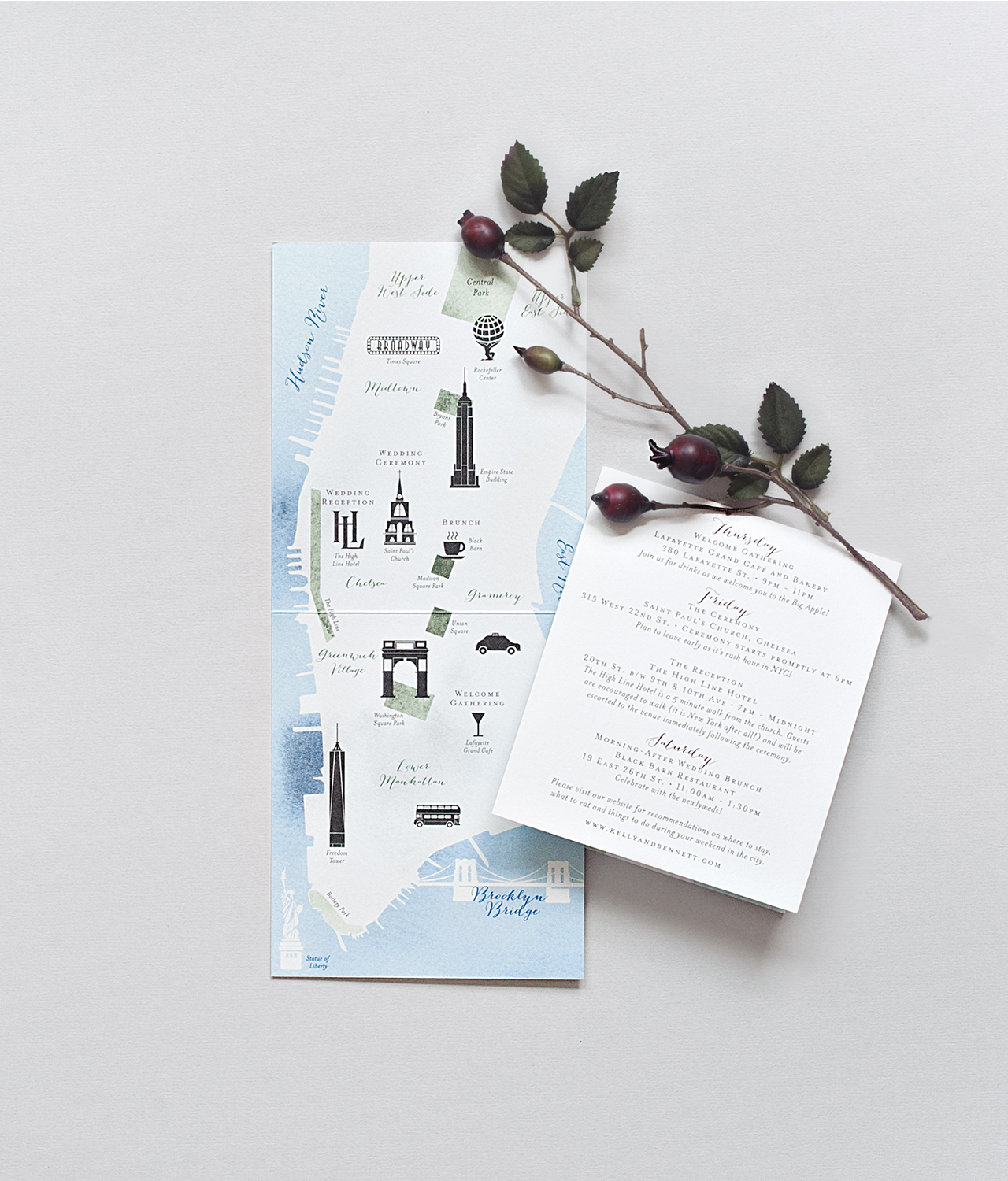
The back of the folded map listed a detailed schedule of the weekend, including welcome drinks and a post-wedding recovery brunch, a NYC must-have! The couple also wanted to include little fun facts and tips about New York City, like leaving plenty of time to get to their ceremony on a Friday afternoon, during rush hour, and encouraging guests to walk from the church to the reception at The High Line Hotel because, well, it’s New York City after all!

New York City Inspired Floral Watercolor Wedding Invitations by Suite Paperie

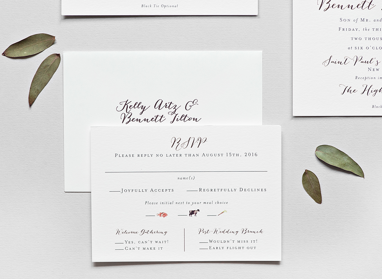
We carried the watercolor look onto the RSVP card and the front of the map insert. On the response card, we created mini watercolor animal silhouettes that served as meal option indicators. Additionally, on the front of the map insert, an oversized wash of minty green watercolor gives the suite a fresh, cheery punch.

New York City Inspired Floral Watercolor Wedding Invitations by Suite Paperie

My absolute favorite part of the suite is the envelope liner. We enlarged and layered the watercolor flowers to create a beautiful pattern and then digitally printed them on vellum for a subtle, but cohesive look to the suite. Finally, we wrapped the pieces in a berry colored double-thick cotton twine bringing out the rich colors in the suite.

New York City Inspired Floral Watercolor Wedding Invitations by Suite Paperie

Thanks Becca!

Design: Suite Paperie

Check out the Designer Rolodex for more tal­ented wed­ding invi­ta­tion design­ers and the real invi­ta­tions gallery for more wedding invitation ideas!

Photo Credits: Lindsay Nathanson

Seasonal Stationery: Valentine’s Day Cards

Love is in the air! At least, it is at all the shops in my neighborhood. Valentine’s Day greeting cards are always a stationers favorite (the seemingly endless puns!), so the bevy of designs can be overwhelming. For those in a committed relationship, the options are truly endless, but what about all the other people you want to express affection to? While many Valentines Day greeting cards focus on romantic love, there are plenty of people in our lives we love in other ways – your mom, your besties, your work wife. We know it can be easy to dismiss Valentine’s Day, but honestly, the whole world could really use more love these days. In this initial Valentine’s Day card round up, we’re focusing on more universal messaging without any romantic notions (but stay tuned for next weeks round up if you are looking for saucier options). Enjoy!

Seasonal Stationery: Valentine's Day CardsFrom top right:

1. A sweet floral wreath in a rustic watercolor style from Little Truths Studio.

2. Share Valentine’s Day greetings with red foil and soft pink paper from Rifle Paper Co.

3. Send a rainbow of affection with this Valentine’s Day card from One Canoe Two.

4. This double heart note from Meeschmosh conveys the perfect dose of platonic affection.

5. It wouldn’t be Valentine’s Day without at least one food-related pun. The berry nice design (see what we did there?) comes courtesy of Mr. Boddington’s Studio.

6. This doily inspired greeting card is available as an online design (as well as paper). Designed by Hannah Berman for Paperless Post.

7. Keep it short, sweet and to the point with this simple message and hand-lettered text from And Here We Are.

8. Loving this red and pink block print inspired design from the good folks at Kansas City-based Hammerpress.

9. This card definitely leans more to the romantic side, but still feels appropriate to send to your best friend The red, white and pink roses are so sweet! From Clap Clap Design.

10. This floral die cut comes courtesy of Amy Heitman.

11. Really enjoying the combination of brush lettering with a soft palate from Evermore Paper Co.

Next week: Romantic Valentine’s Day designs for your (romantic) love!

Refined Modern Neutral Letterpress Wedding Invitations

Aaaaaahhhh…. if invitations could be a soothing breath of fresh air, these refined modern neutral letterpress wedding invitations from Alana of Bourne Paper Co. would definitely be it. A clean, minimalist design with classic serif and sans-serif text, luxurious neutrals, and a delicate textured envelope liner? So good. And the silk thread wrap and white wax seal finish are simply sublime!

Refined Modern Neutral Letterpress Wedding Invitations by Bourne Paper Co.

From Alana: This invitation suite was designed to focus on modern typography and a warm, neutral color palette. We wanted the suite to have a very clean and crisp feel paired with unique textures that would stand out even when executed in whites and taupes.

Refined Modern Neutral Letterpress Wedding Invitations by Bourne Paper Co.

The first design decision made was to forego script fonts in favor of clean serif and sans-serif fonts. Italicized accents were added to the type to give the suite a more formal and elegant feel. We also created a modern monogram that was subtly featured throughout the invitation suite.

Refined Modern Neutral Letterpress Wedding Invitations by Bourne Paper Co.

The invitation suite was letterpress printed in a warm, metallic gold ink which reflected with the perfect, subtle shine when held at an angle. For paper, we used Somerset Velvet 300g card stock in Radiant White for a bright look and a soft cotton-like texture. The card stock also allowed us to apply stronger pressure during the printing process, which gave the letterpress text the crisp, clean feel we were going for and ensured the typography maintained its sharp edges and angles.

Refined Modern Neutral Letterpress Wedding Invitations by Bourne Paper Co.

To complete the suite, we finished the invitation with a silk thread wrap and white wax seal which used the couple’s monogram. We selected a warm taupe envelope for both the invitation and response card, something to add a hint of color without straying too far from the neutral theme. The taupe envelopes paired perfectly with the metallic gold ink, which was used to print the couple’s address and monogram onto the response envelope.

Refined Modern Neutral Letterpress Wedding Invitations by Bourne Paper Co.

We finished the invitation with an envelope liner featuring blind embossed cherry blossoms and other delicate florals. We loved the dramatic texture the liner provided and the bright white paper was the perfect compliment to the warm, taupe envelope – it also added just the right touch of florals to maintain the suite’s modern but elegant look.

Refined Modern Neutral Letterpress Wedding Invitations by Bourne Paper Co.

Thanks Alana!

Design: Bourne Paper Co.

Check out the Designer Rolodex for more tal­ented wed­ding invi­ta­tion design­ers and the real invi­ta­tions gallery for more wedding invitation ideas!

Photo Credits: Alana Cutler