Wood Veneer and Watercolor Floral Wedding Invitations

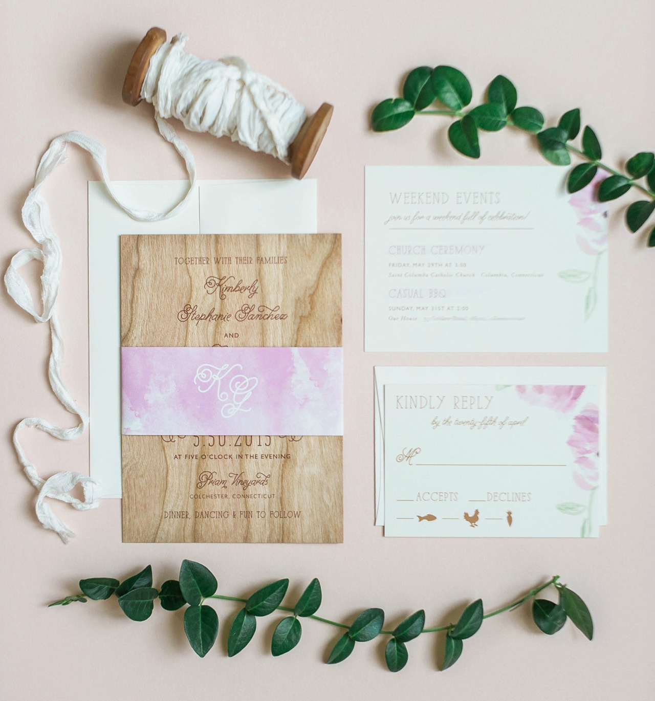
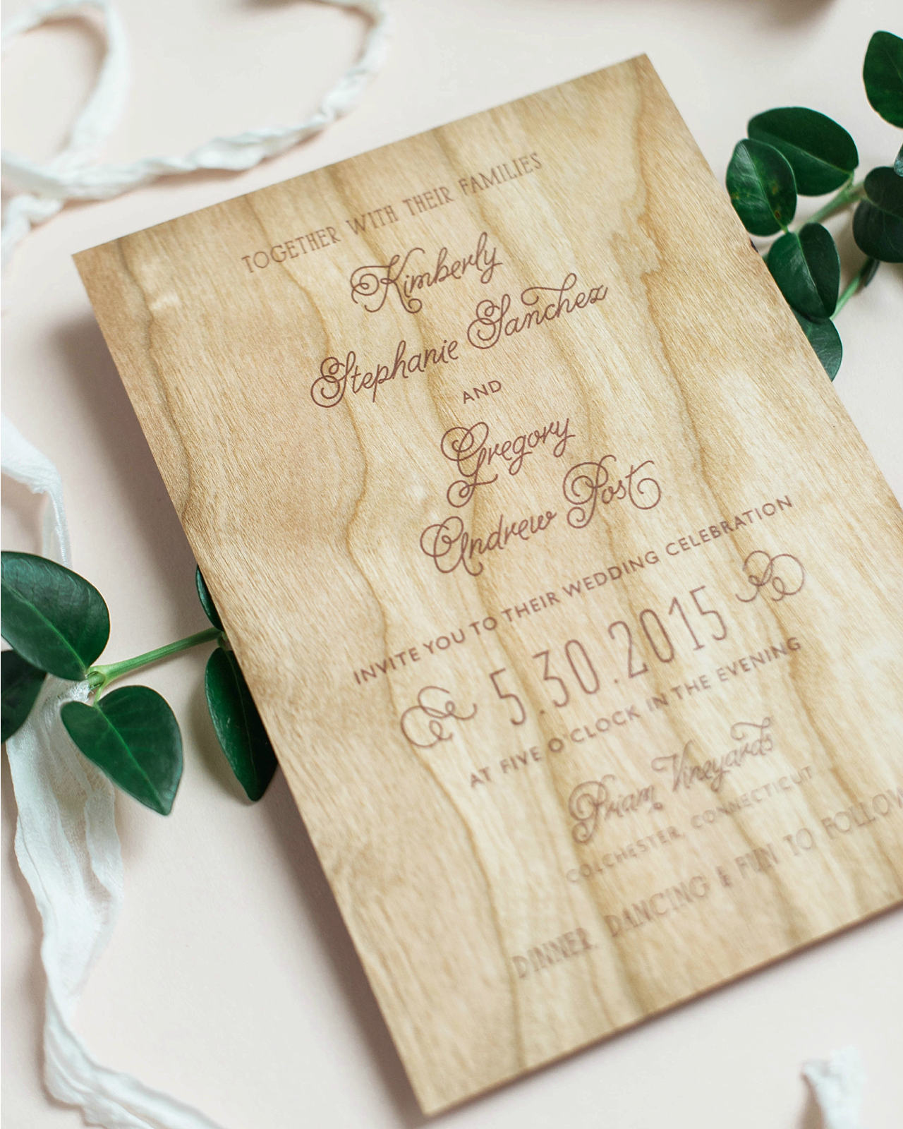
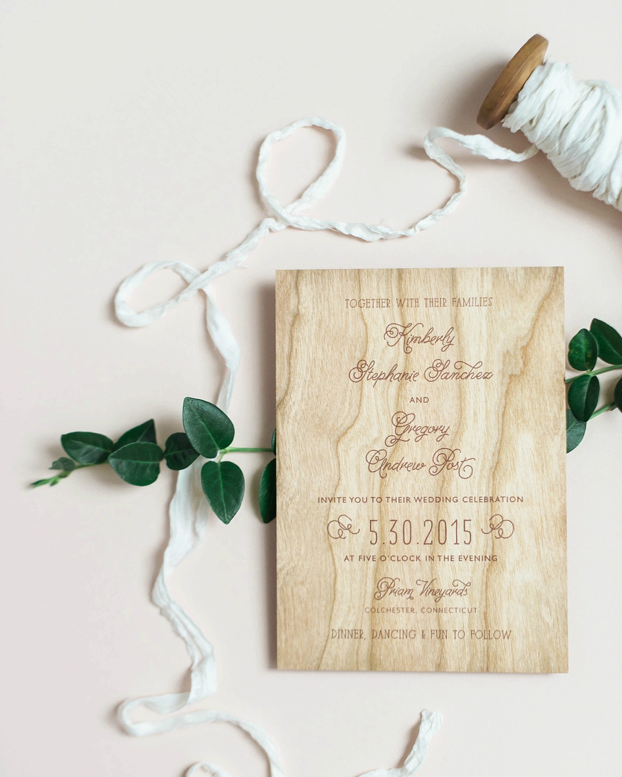
Wood veneer invitations are a fantastic choice for rustic weddings, but they can also be soft and bohemian when paired with soft watercolor floral elements! Sandy of Roseville Designs created these rustic-yet-bohemian wood veneer and watercolor floral wedding invitations, inspired by the eco-friendly Connecticut vineyard where the wedding took place. The clean and simple design allows the wood veneer to take central stage in such an elegant way!

Wood Veneer and Watercolor Floral Wedding Invitations by Roseville Designs

From Sandy: I am so excited to share Kim and Greg’s rustic and bohemian wood wedding invitation suite! They wanted their wedding invitations to reflect the rustic look of their Connecticut vineyard wedding, while still maintaining some soft floral elements. I immediately fell in love with their vision for the big day! Priam Vineyards, their wedding venue, is a sustainable and wind-powered winery, and they really wanted to honor its eco-friendly vibe. We loved the idea of printing the invitations on wood veneer sheets, which creates a unique and tactile experience for guests upon opening the envelope.

Wood Veneer and Watercolor Floral Wedding Invitations by Roseville Designs

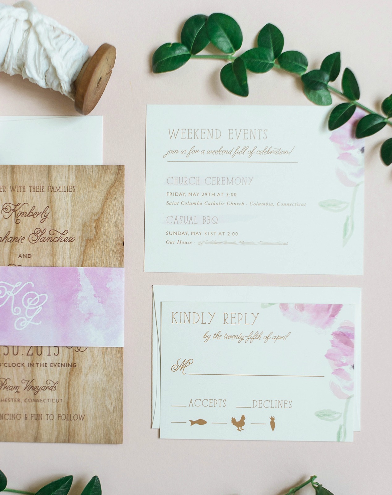
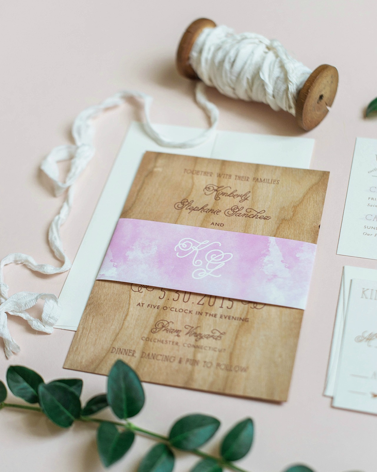
We kept the invitation card clean, simple, and type-driven so the texture of the actual wood card would be the main focus. To balance out the wood and incorporate that bohemian feel, I created purple watercolor flowers that we used on the RSVP card and info card, which included details about all the weekend festivities.

Wood Veneer and Watercolor Floral Wedding Invitations by Roseville Designs

I also used the purple watercolor brush strokes from the flowers to create a background on a paper belly band, which wrapped about the entire suite. The soft purple made a real statement on top of the wood veneer! The belly band featured a custom wedding monogram that we used throughout their wedding paper story, including their programs, favors, and menus.

Wood Veneer and Watercolor Floral Wedding Invitations by Roseville Designs

The rest of the invitation suite was digitally printed, with the insert cards on cream paper stock to complement the darker wood tones of the invitation card. Kim and Greg were a fantastic couple because they gave me such a clear sense of their vision, but trusted me to run with it and create something unique, approachable, and reflective of them as a couple.

Wood Veneer and Watercolor Floral Wedding Invitations by Roseville Designs

Thanks Sandy!

Design: Roseville Designs

Check out the Designer Rolodex for more tal­ented wed­ding invi­ta­tion design­ers and the real invi­ta­tions gallery for more wedding invitation ideas!

Photo Credits: Brooke Allison Photography

Romantic Shipwreck-Inspired Wedding Invitations

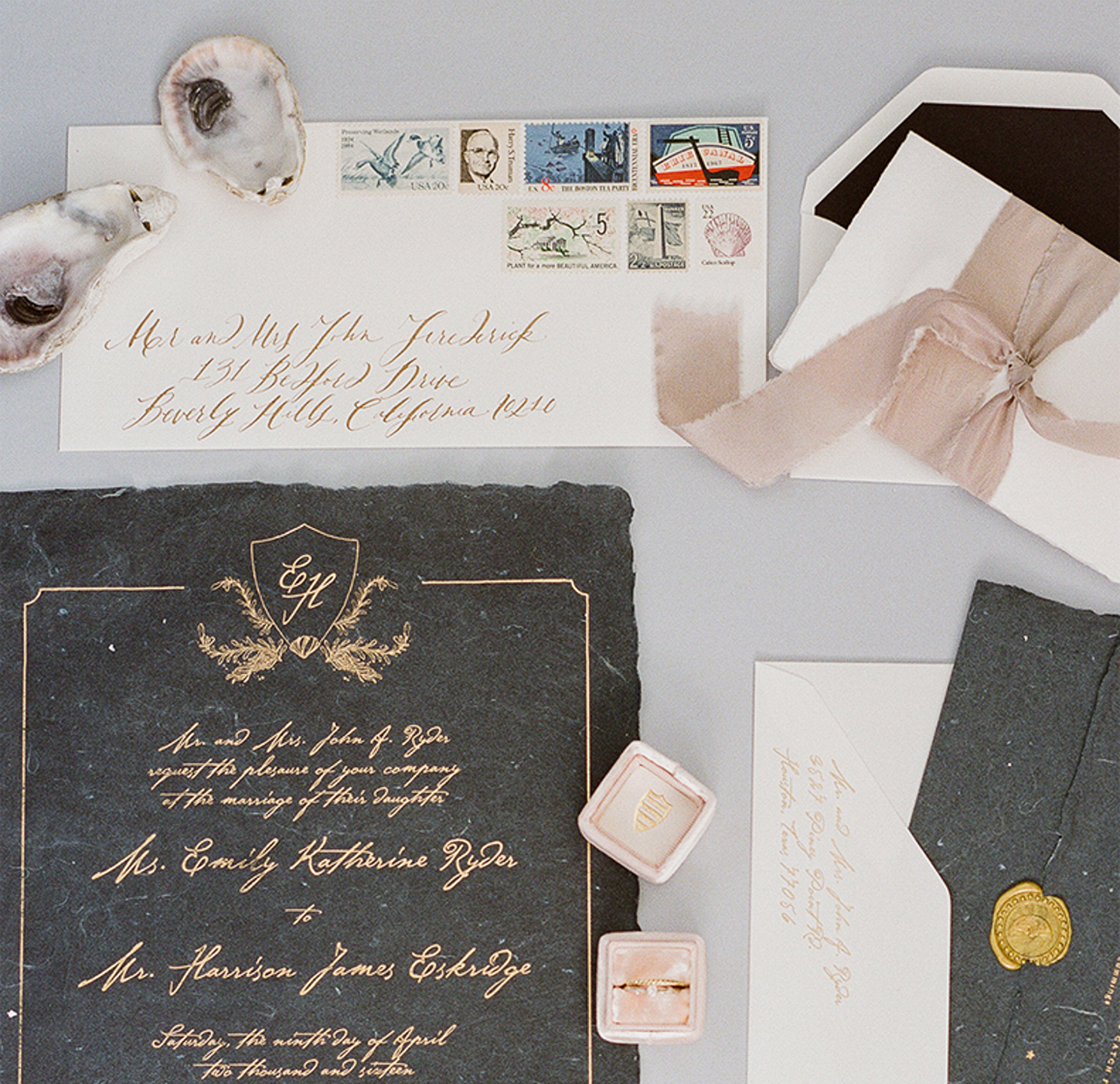
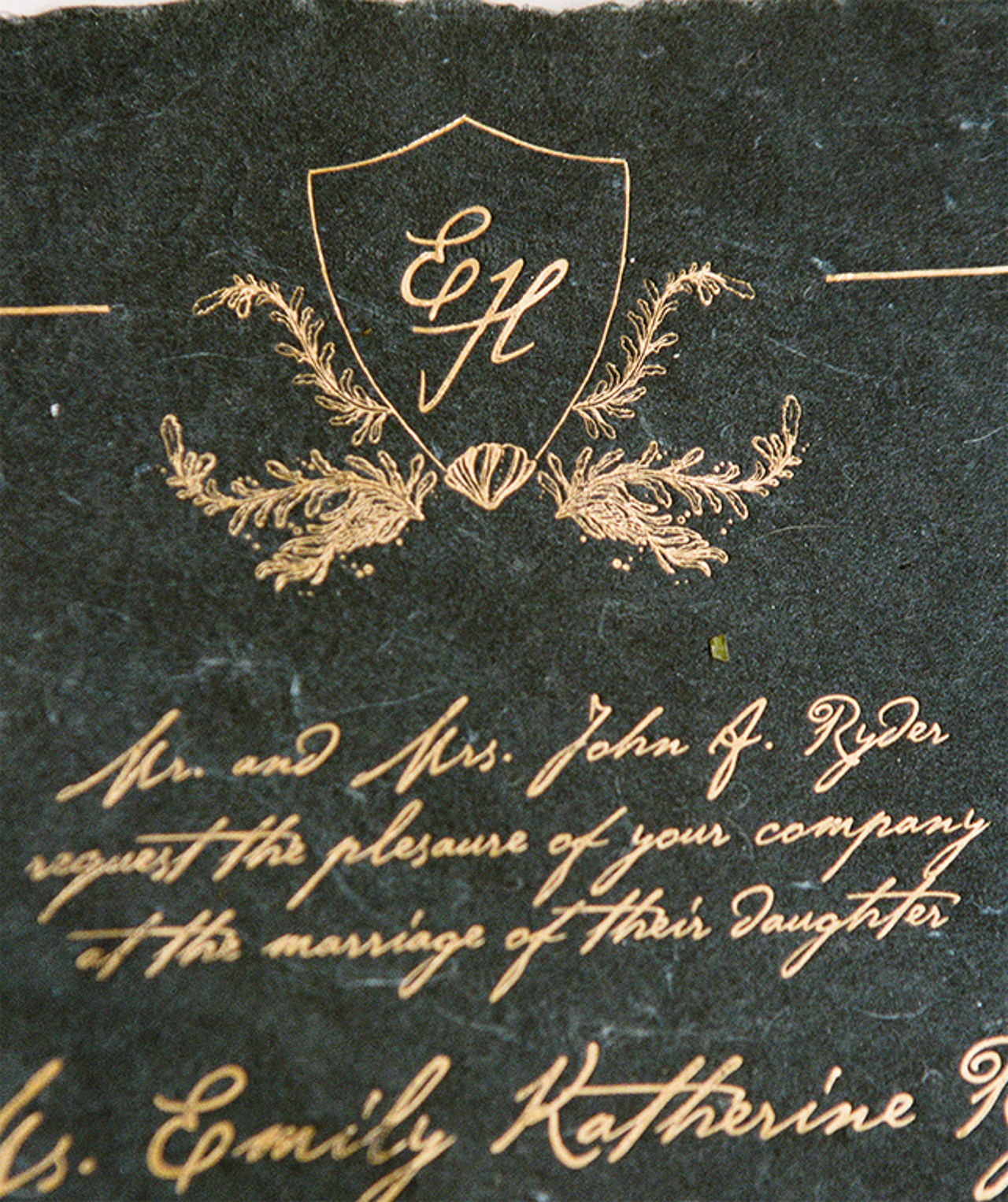
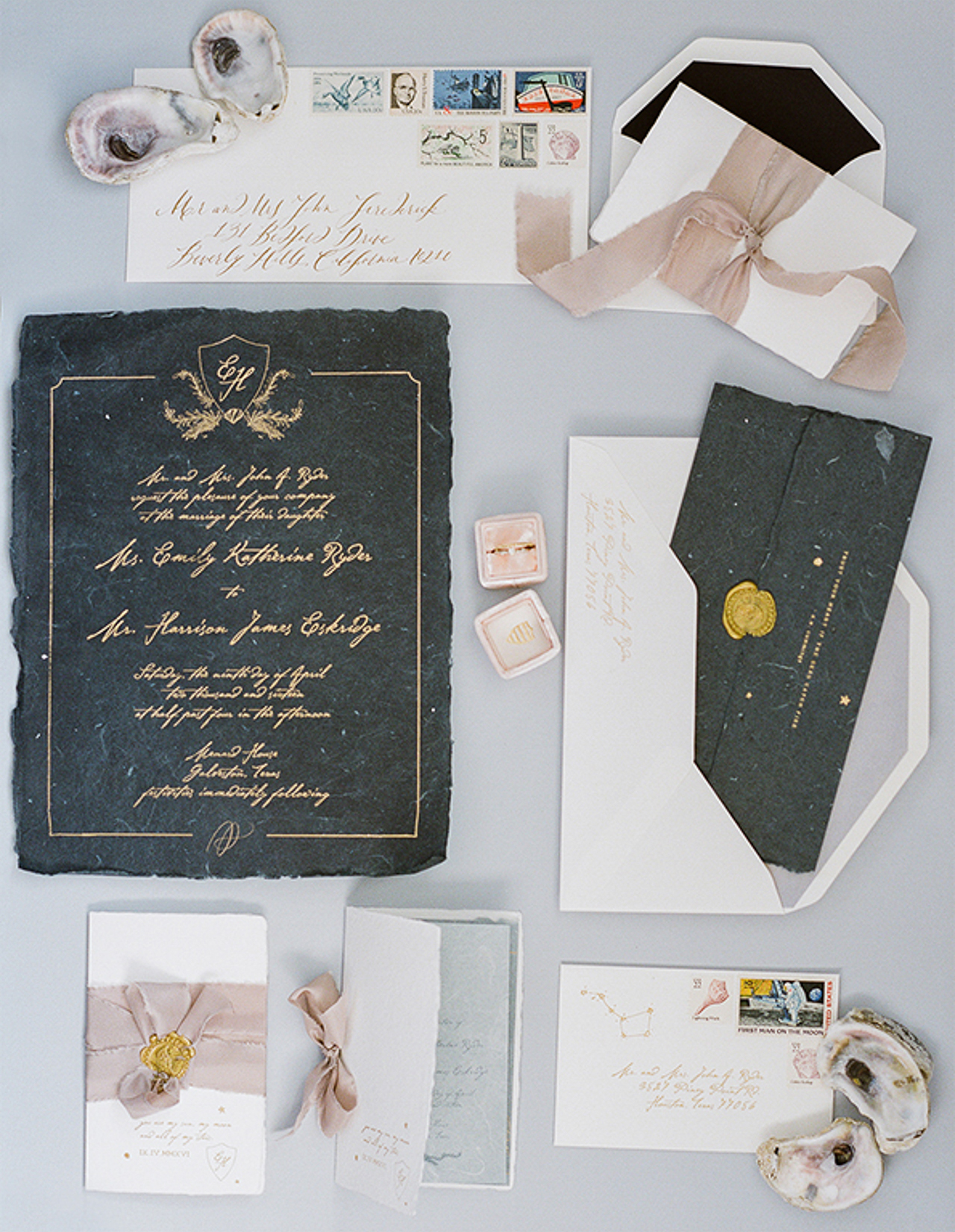
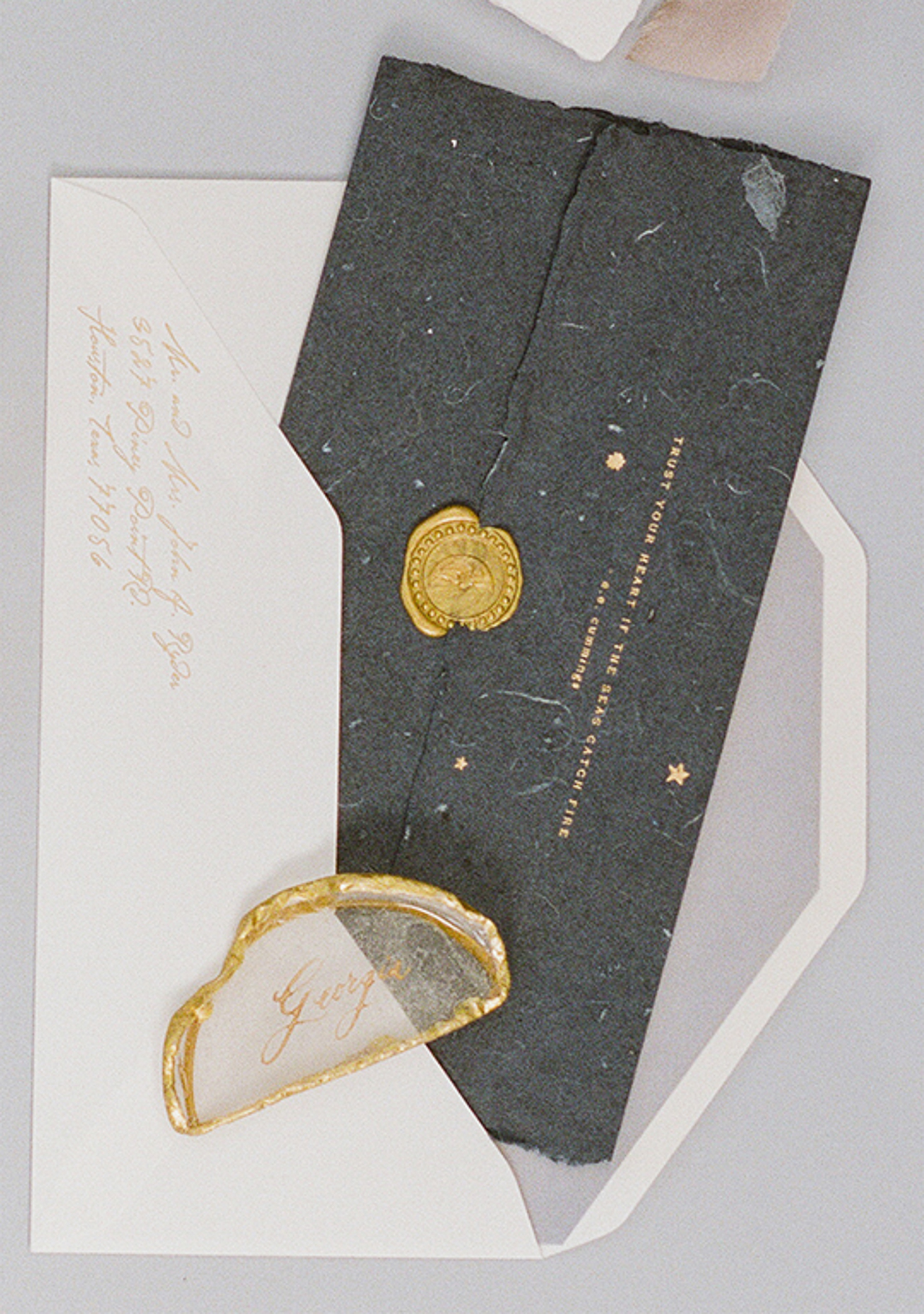
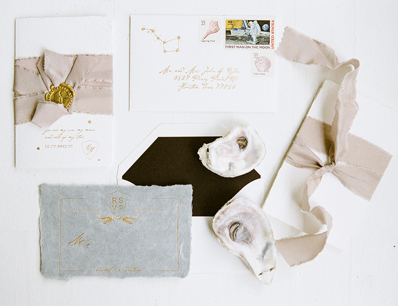
These romantic shipwreck-inspired wedding invitations bring to mind a transatlantic voyage to find true love! Lily, the creative force behind the newly rebranded Poste and Co., worked with Caroline Arendall of Belle of the Ball to design these soft and elegant invitations. The shipwreck theme is reinforced throughout the entire suite, from the raw edges of the handmade paper to the delicate wax seals to the beautifully frayed ribbon.

Romantic Shipwreck-Inspired Wedding Invitations by Poste Co.

From Lily: Shipwreck chic pretty much sums it up! When the wedding planner, Caroline Arendall of Belle of the Ball in Houston, Texas, came to me with the idea of a romantic shipwreck inspired invitation suite I was so excited! I had been dreaming about using Stephanie Hare‘s handmade indigo paper for months. This was the perfect project!

Romantic Shipwreck-Inspired Wedding Invitations by Poste Co.

Romantic Shipwreck-Inspired Wedding Invitations by Poste Co.

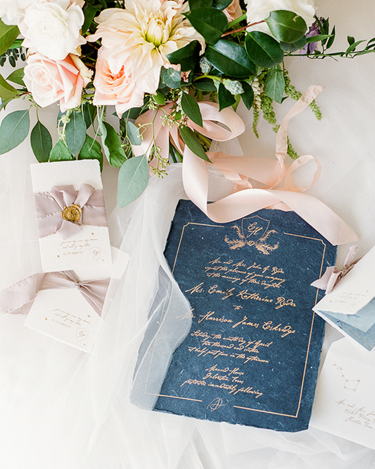
The sheets of paper are 8.5 x 11, so not your typical invitation size. The color is so rich and has a slight glittery sheen to it that made it absolutely perfect for this suite, I knew I had to find a way to make it work. The reply card and interior pages of the program were printed on a soft blue paper stock, also made by Stephanie. The contrast between the rich indigo of the invitation paper created a dramatic effect.

Romantic Shipwreck-Inspired Wedding Invitations by Poste Co.

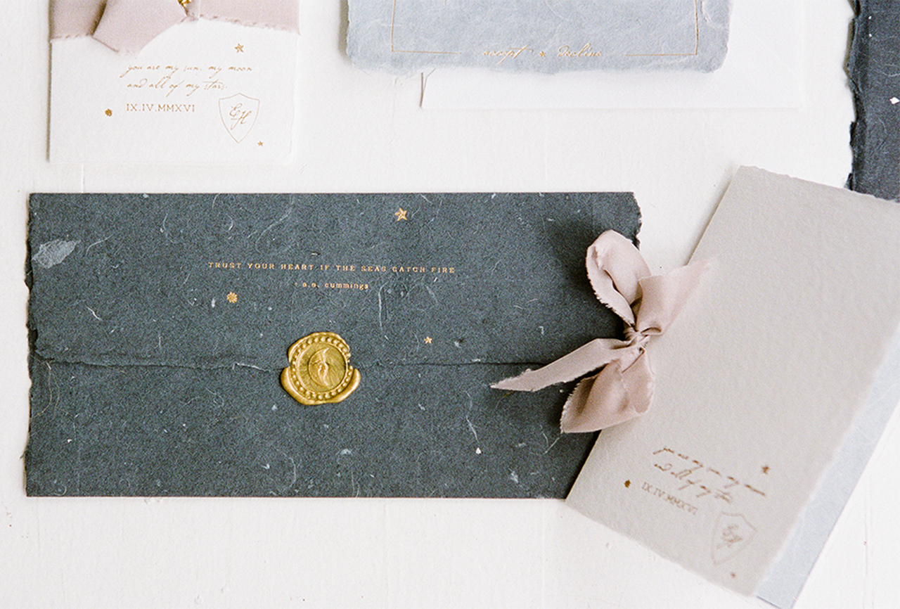
The invitation folded three times like a treasure map and was sealed with an antique wax seal I found in Italy that featured a crescent moon. The entire suite was printed in a matte gold foil. I used a romantic quote from E.E. Cummings on the reverse side of the invitation. When the invitation was folded and stamped with the wax, it slipped into the envelope and the quote was first thing guests saw when they opened the invitation suite.

Romantic Shipwreck-Inspired Wedding Invitations by Poste Co.

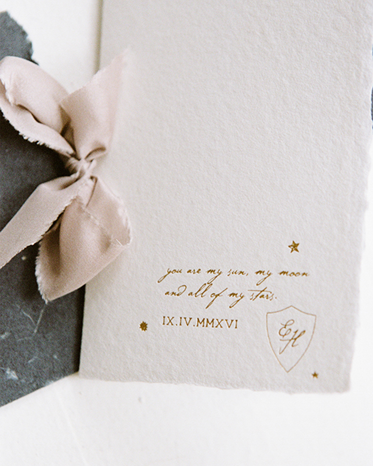
The program cover also featured another quote and the wedding date in roman numerals to tie in the old world theme. The constellations on the envelopes were hand illustrated along with the custom crest of sea kelp and a single shell. The hand frayed edge of the paper paired beautifully with Frou Frou Chic ribbon for the programs and the guest names were hand calligraphed by Signora e Mare on gilded sea glass to be used as place cards. This is truly a special suite and I am excited to share it with you!

Romantic Shipwreck-Inspired Wedding Invitations by Poste Co.

Romantic Shipwreck-Inspired Wedding Invitations by Poste Co.

Romantic Shipwreck-Inspired Wedding Invitations by Poste Co.

Thanks Lily!

Creative Direction & Design: Poste and Co.

Calligraphy: Signora e Mare

Paper: Share Studios

Ribbon: Frou Frou Chic

Printing: Littleford Letterpress

Poste and Co. is a member of the Designer Rolodex – you can check out more of Lily’s beautiful work right here or visit the real invi­ta­tions gallery for more wedding invitation ideas!

Photo Credits: Kelli Durham Photography

Behind the Stationery: Coral Pheasant

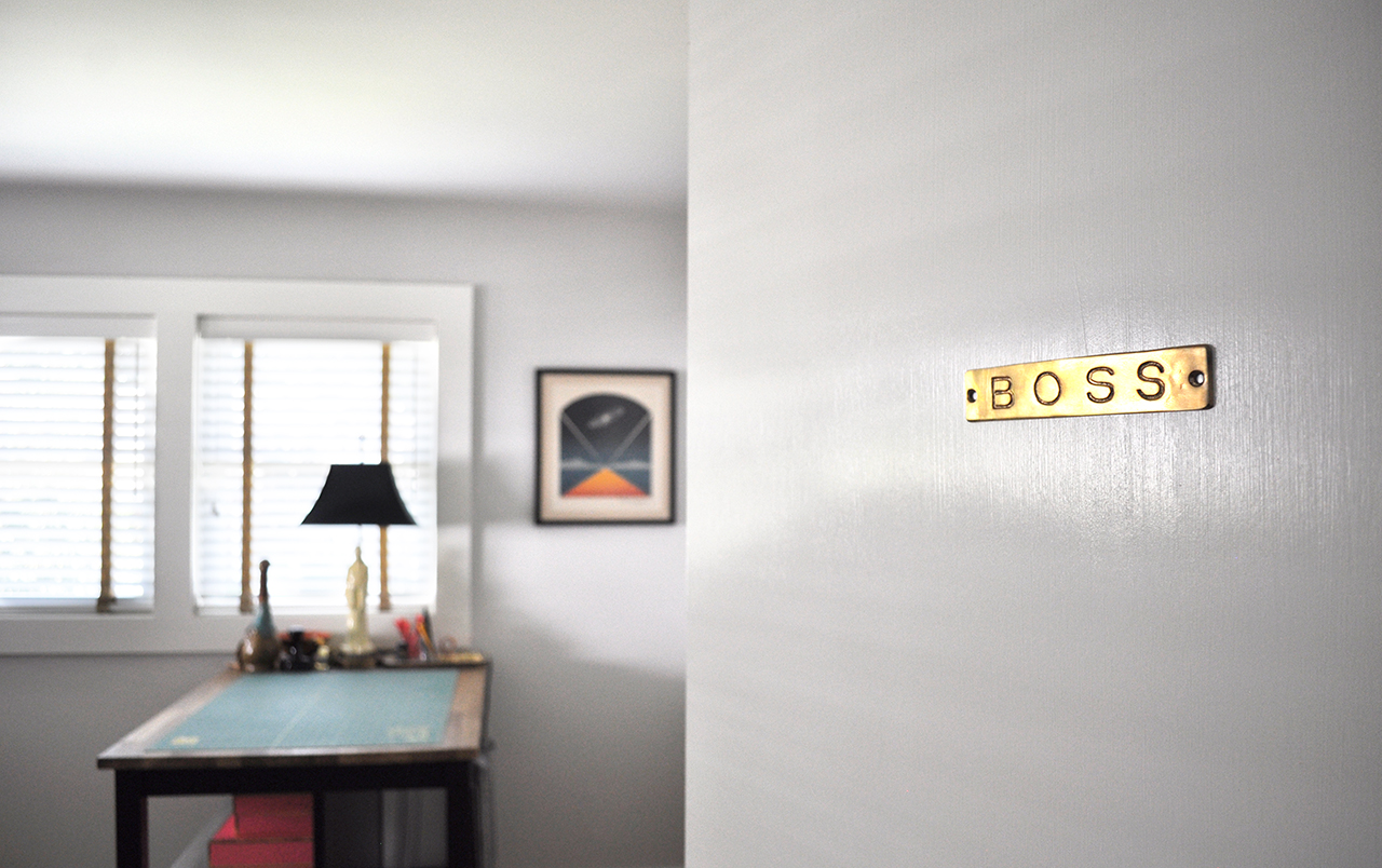
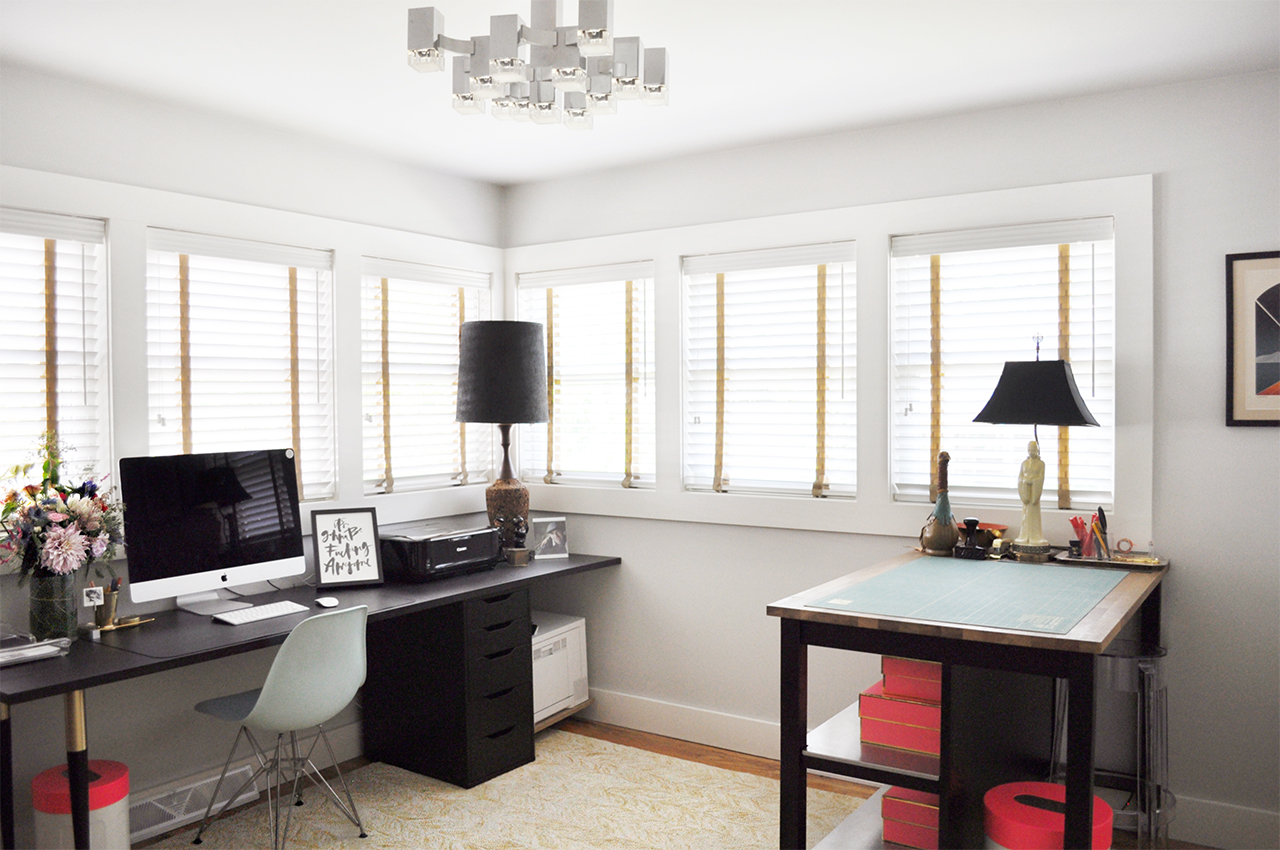
Hello! My name is Nichole and I am the Chief Dreamer and designer at Coral Pheasant on the Connecticut shoreline. I am delighted to be guest blogging on my favorite stationery spot on the web this week, and I’m excited to share some of my work and behind the scenes with you. I’m a paper nerd with a penchant for beautiful typography, gorgeous patterns and thick, luxurious stock. Custom invitations are my specialty. I adore clients who respect etiquette and tradition, appreciate the rules, and break them just a bit to create a hip, on-trend, thoughtful and highly personalized stationery suites.

Behind the Stationery: Coral Pheasant / Oh So Beautiful Paper

Art has been in my blood for as long as I can remember and my parents encouraged my pursuits wholeheartedly. One of my earliest memories of creating was building my dollhouse with my father. Everything on that miniature house was handcrafted from laying the chimney brick by little brick, to wallpapering the walls, to building the furniture. I delighted in working with my hands to make sure the tiniest of details was perfect. In college, I pursued my love of design by enrolling in a Fine Arts program and graduating with a Bachelor of Fine Arts degree.  It was during those four years that I became infatuated with typography and knew I had found my calling.

Behind the Stationery: Coral Pheasant / Oh So Beautiful Paper

The vendors that we hired for our wedding quickly became friends and I was invited to collaborate with them on editorial shoots. My involvement in these creative projects and their support was the kick in the pants I needed to formally develop my stationery business. For the next two years I worked both my corporate job and my own business. In 2012, I attended the Engage! Luxury Wedding Conference and had the great fortune of meeting Sarah Haywood, one of Britain’s top wedding planners. It was this serendipitous encounter that led to our collaboration on the redesign of her 240-page Wedding Bible and her Wedding Bible Planner. Meeting Sarah and landing the job gave me the confidence to dedicate myself full time to my business. Two weeks after returning home from the conference I resigned from my job and began the crazy, rewarding, challenging, wonderful journey of being an entrepreneur.

Behind the Stationery: Coral Pheasant / Oh So Beautiful Paper

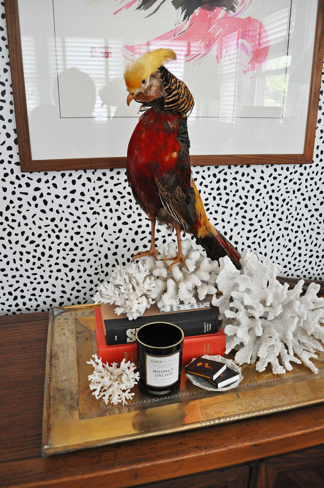
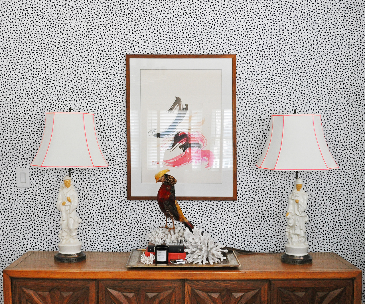
When thinking of a name for my business I was sitting on the couch in our apartment’s living room and looking around the space. Sitting on a credenza that was a vignette I had styled that was composed of a tall cylindrical vase filled with pheasant feathers and a piece of coral. (I’ve long had a thing for what I like to call “animal ephemera”). I put the two words together and really liked how they sounded. After doing a quick internet search I confirmed that the URL was available (not an easy feat to find one that’s not been taken!) and knew I had a winner. For a while there, I always associated the word coral with the petrified piece that was the original inspiration. It wasn’t until I stared at the clothes hanging in my closet that I realized I owned multiple coral-colored things and a light bulb went on. Of course coral was also a color! It’s funny how something can be so obvious and yet so elusive.

Behind the Stationery: Coral Pheasant / Oh So Beautiful Paper

My design process begins with learning as much as I can about the couple I’m working with. I want to know what they love to eat, how they spend their vacations, where they shop and what makes their house a home. Learning what they love in their day-to-day life – and what they don’t! – helps tremendously in understanding the vision for their wedding day.

Behind the Stationery: Coral Pheasant / Oh So Beautiful Paper

My design process is also heavily inspired by vintage finds and studying beautifully curated interiors. In my questionnaire I ask my clients what the most treasured piece of furniture or art is in their home. This speaks volumes to me! I love the history behind objects and the visual storytelling that develops as these treasured pieces find their way into homes. The layering of unexpected items, their textures and patinas and patterns. It parallels the design of my stationery. I always seek to have each item in a suite coordinate with the whole but never “match.”  I like to vary the sizes of the cards and the colors of the envelopes and I strive to create an element of discovery. This element might be a charming detail tucked into the envelope liner or the unexpected placement of the stamp on an RSVP envelope.

Behind the Stationery: Coral Pheasant / Oh So Beautiful Paper

Working for yourself certainly has its rewards and challenges. One of the rewards is realizing my world got so much bigger. When I was working for a company, that was my world. I went to work, did my job and came home. I loved the people I worked with and they were essentially my “network.” For the most part we were all similar in age, doing similar things. When I started working for myself, I crossed paths with so many new people, with a multitude of talents, from wildly diverse backgrounds. It was – and is – wonderful to connect with people who are different from me. Each person brings a new perspective and can challenge you to see things in a new light. On the flip side, being a company of one can be lonely. I loved the people I worked with at my past job. There was definitely a social aspect to work where we all had lunch together and it was easy to bounce ideas around. I also had others to hold me accountable for tasks and projects. When you work for yourself, you have to make a concerted effort to network and you’re the one steering the ship.

Behind the Stationery: Coral Pheasant / Oh So Beautiful Paper

I hope you enjoyed learning a little bit about this gal behind the paper!

Photo Credits: Coral Pheasant

Printable Vellum Favor Tags

This post is brought to you by CJ Affiliate’s VIP Content Service. Thank you My M&M’S for sponsoring this post! All content and opinions are my own. Thank you for supporting the sponsors that make Oh So Beautiful Paper possible!

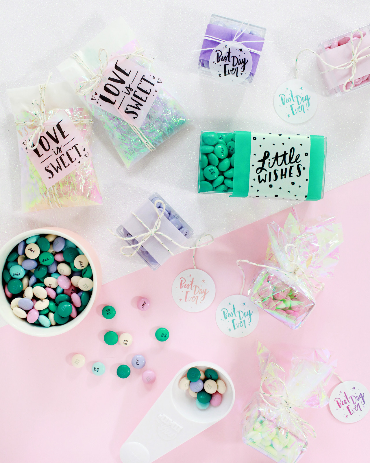
My girls have birthdays coming up in September, and I have party planning on the brain! And when it comes to party favors, I’m always in favor of something edible – ideally chocolate. So today I’m partnering with My M&M’S to create three DIY party favors with their adorable personalized M&M’s, complete with printable party favor tags from Courtney of Swiss Cottage Designs! For the packaging, I combined two of my favorite things â€“ anything iridescent and colorful vellum – to create three packaging options perfect for any occasion! So whether you’re planning a wedding or a bridal shower, baby shower or a birthday party, just pick your favorite printable tag and add some colorful M&M’s and you’ll be good to go! Oh, and keep reading below for a special discount from My M&M’S just for Oh So Beautiful Paper readers!
Printable Party Favor Tags with My M&Ms / Design by Swiss Cottage Designs / Oh So Beautiful Paper

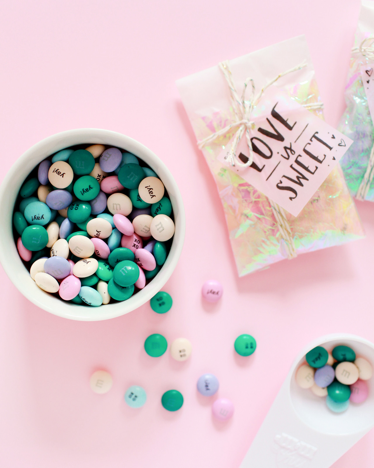
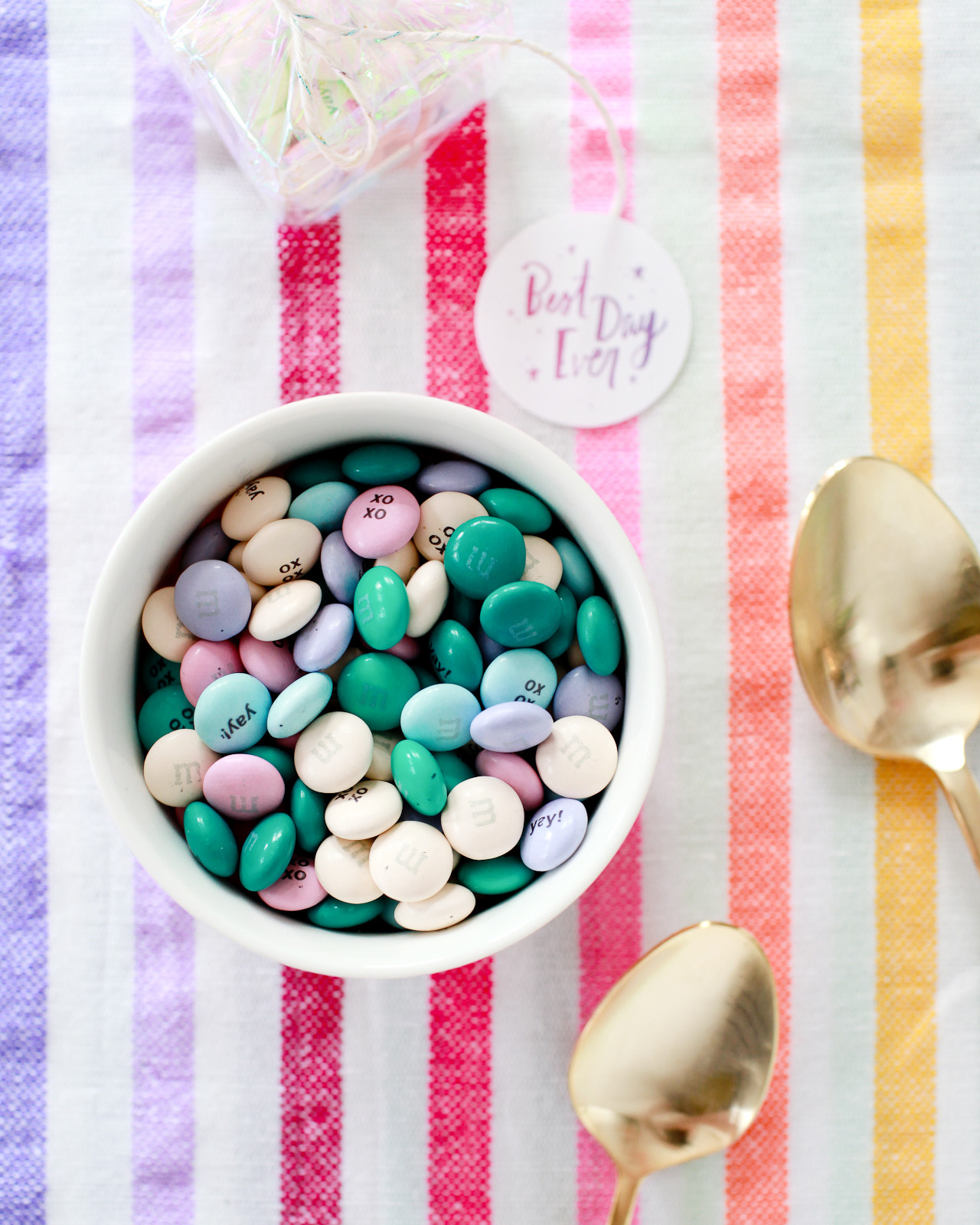
My M&M’S are the ideal personalized party favor. As a party guest, I always hope for something edible rather than a random personalized trinket, and who doesn’t like chocolate?? My M&M’S are completely customizable with photos or text, which means you can make them totally unique to your event. You don’t need graphic design skills to create the personalized M&M’s – just upload a photo or type in your selected text and My M&M’S will take care of the rest! I kept mine simple with short messages of “yay!” and “xoxo,” but I think it would be so sweet to include names for a wedding or bridal shower – or even a name and birthday for a kids birthday party!
Printable Party Favor Tags with My M&Ms / Design by Swiss Cottage Designs / Oh So Beautiful Paper

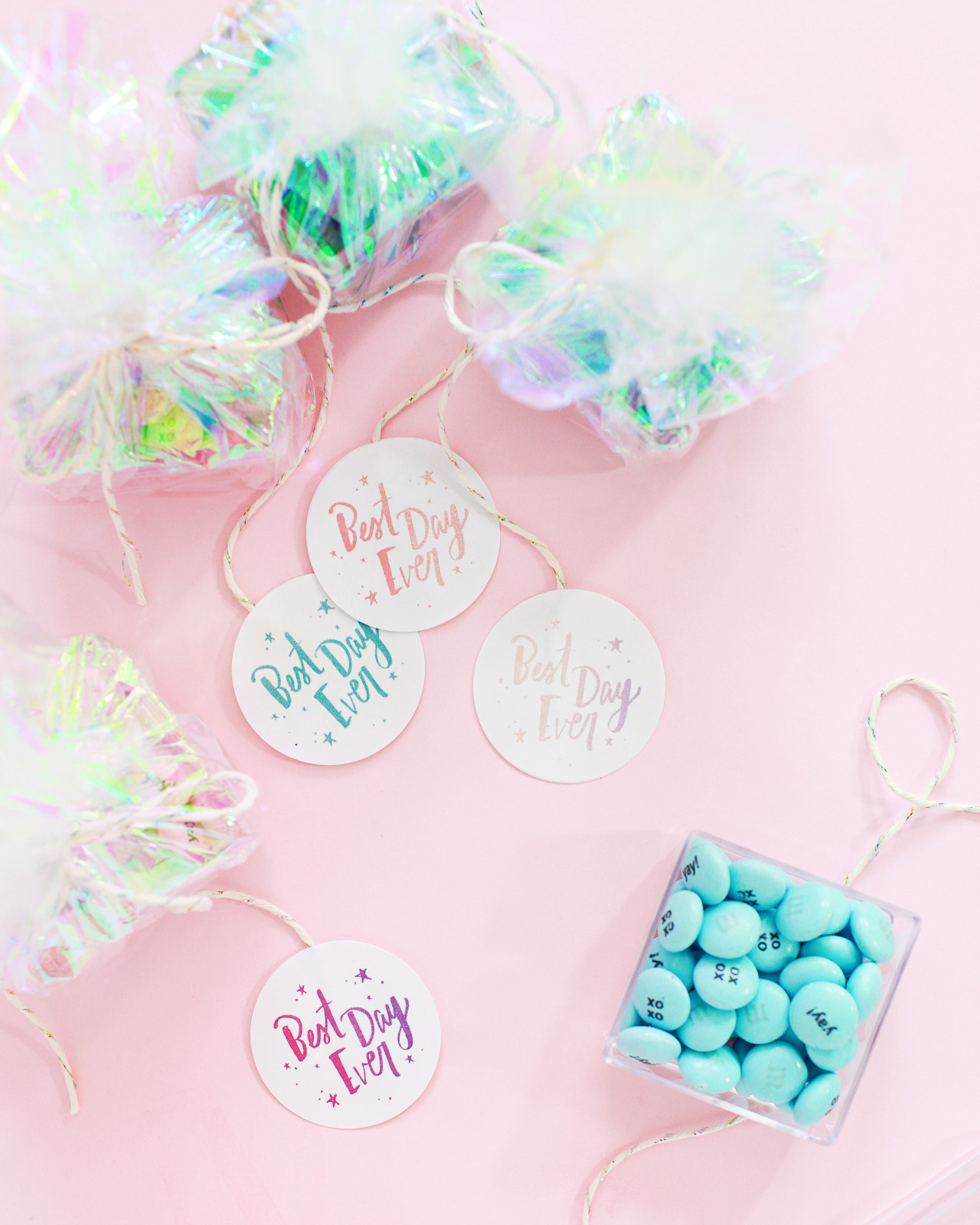
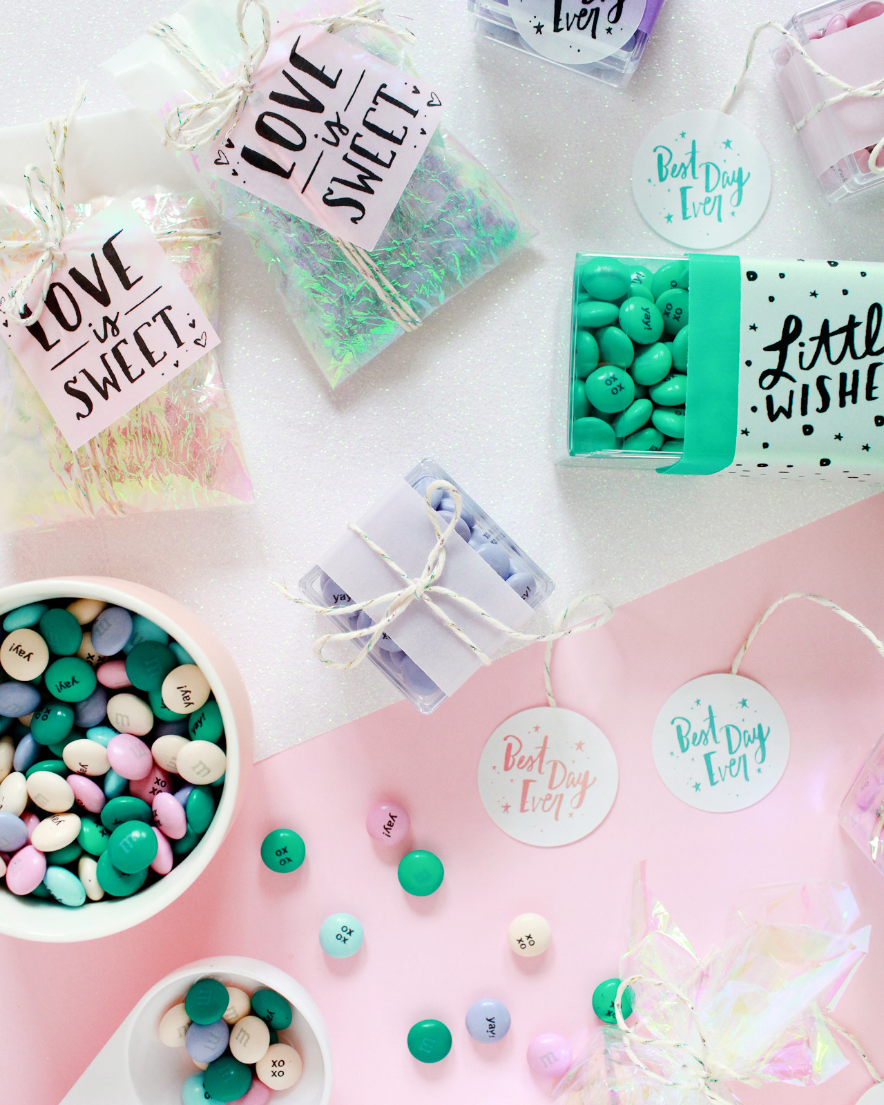
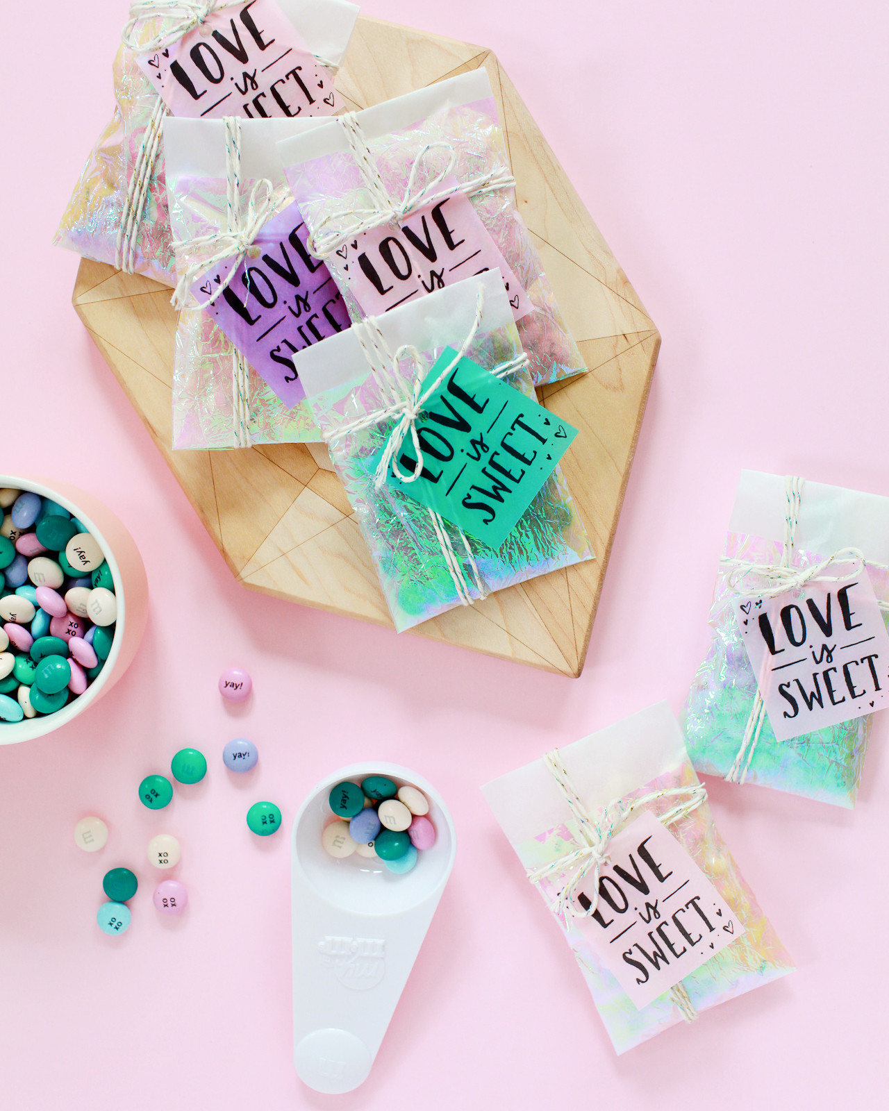
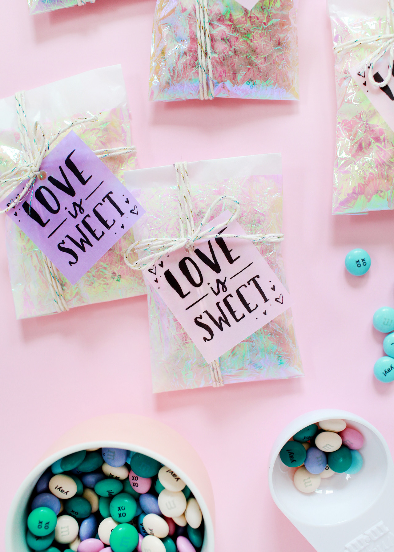
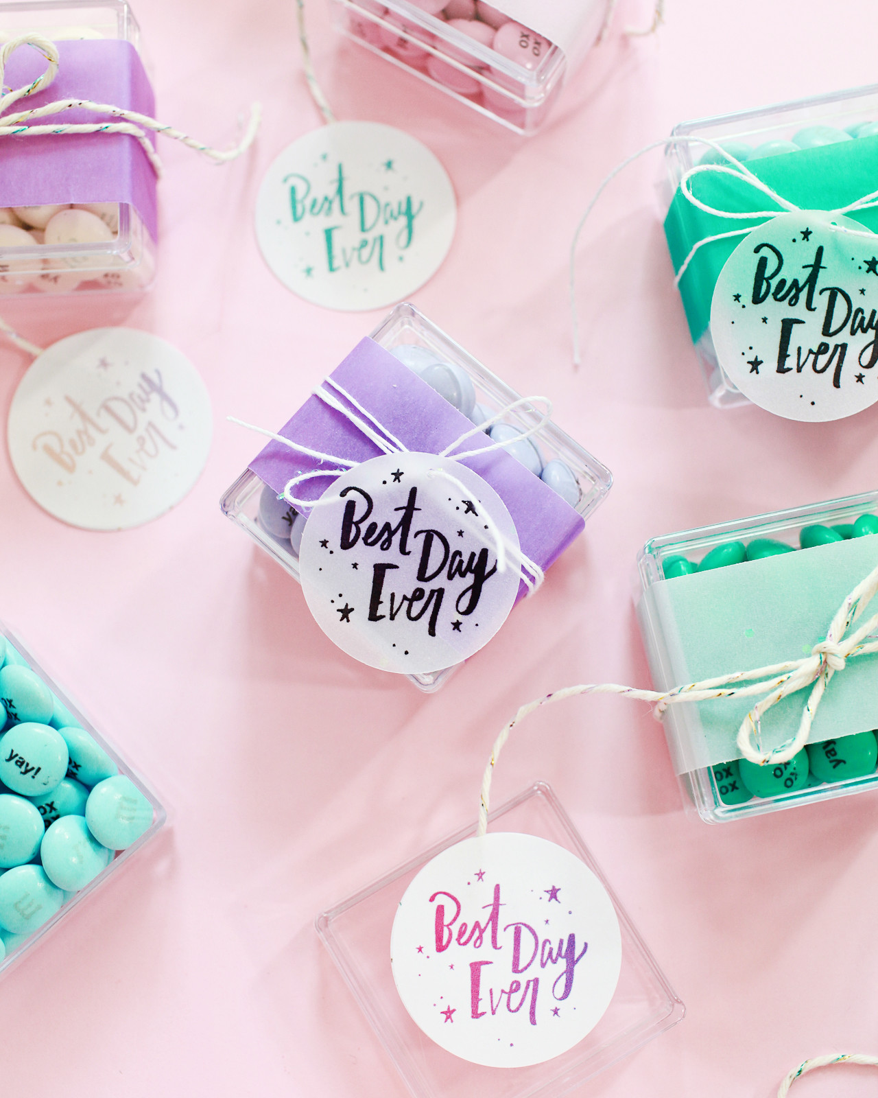
I used three different size party favors, each with different printable party favor tags: a long and skinny rectangular candy box, a square favor box, and glassine envelopes. Courtney and I kept the favor tag designs fairly simple with cute hand lettered messages and sweet little illustrations that could work for a variety of occasions. The favor boxes are both clear so you can see a little glimpse of the My M&M’S inside, while the color of the My M&M’S peeks through the glassine envelopes to give a hint of what’s inside. My M&M’S are the perfect solution for DIY party favors and candy buffets, especially since you can choose your own colors! I used a color palette of pastels – pink, lavender, cream, and light blue – with a bit of aqua and dark green. With 25 colors to mix and match, you can find the right color combination for any event!
Printable Party Favor Tags with My M&Ms / Design by Swiss Cottage Designs / Oh So Beautiful Paper

For the long rectangle favor boxes, I used strips of transparent vellum in our color palette of pink, purple, and aqua – they look so great against the My M&M’S! I also found positively DREAMY opalescent vellum and a white vellum with iridescent dots for just a little extra sparkle. I printed Courtney’s designs directly on the opalescent and iridescent vellum, cut the printed vellum into 2″ strips, and layered that over another 3″ strip of vellum in a complementary color.
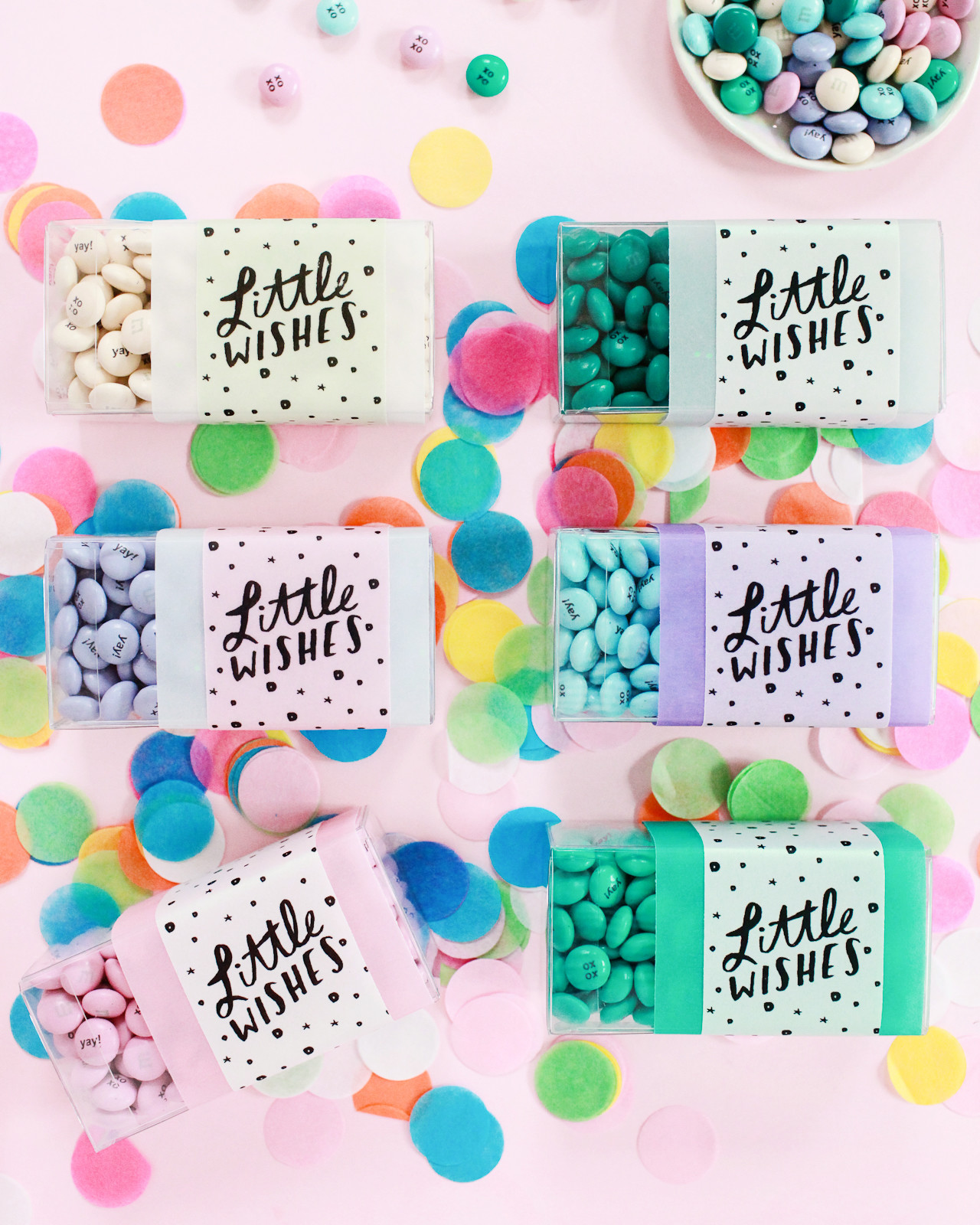
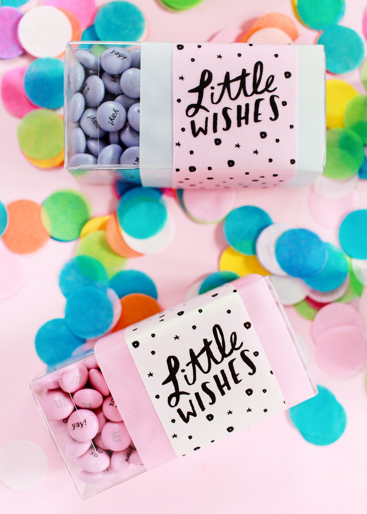
Printable Party Favor Tags with My M&Ms / Design by Swiss Cottage Designs / Oh So Beautiful Paper

Printable Party Favor Tags with My M&Ms / Design by Swiss Cottage Designs / Oh So Beautiful Paper

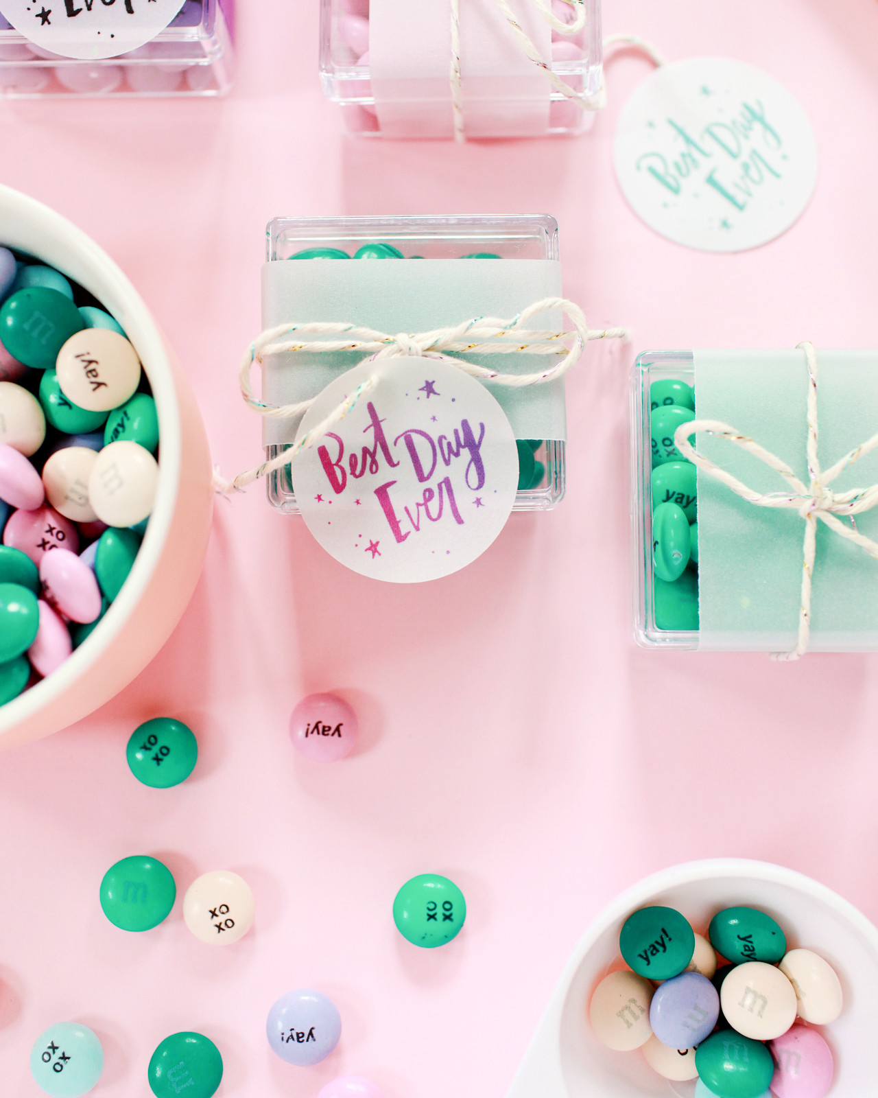
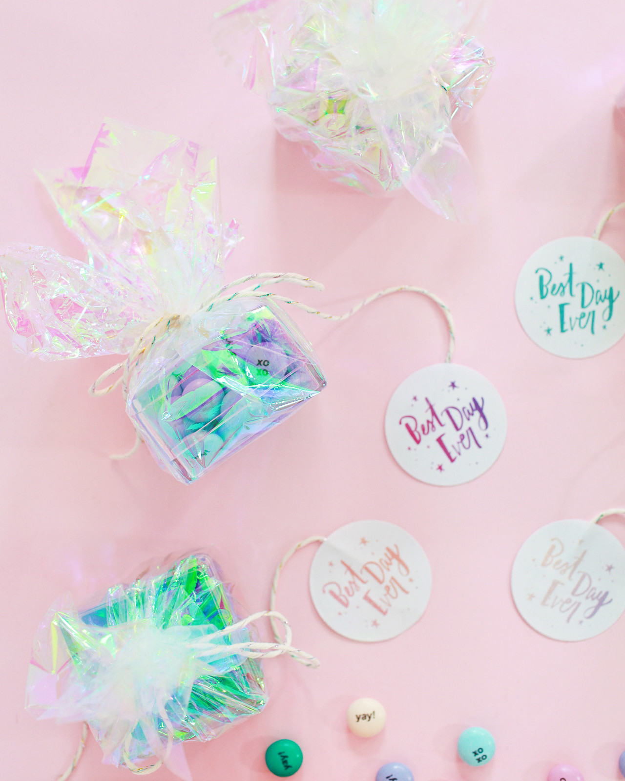
I paired the square favor boxes with circle favor tags. For some favor boxes, I wrapped the boxes in 1″ strips of colorful vellum and sparkly iridescent twine. For other favor boxes, I wrapped the entire box in squares of iridescent cellophane and tied it up with sparkly twine. To turn the circle tags into gift tags, just print onto vellum and punch them out using a 1.5″ circle punch, then punch a 1/8″ hole for the twine. Or print the circle tags onto these labels and stick two labels together to create a tag!
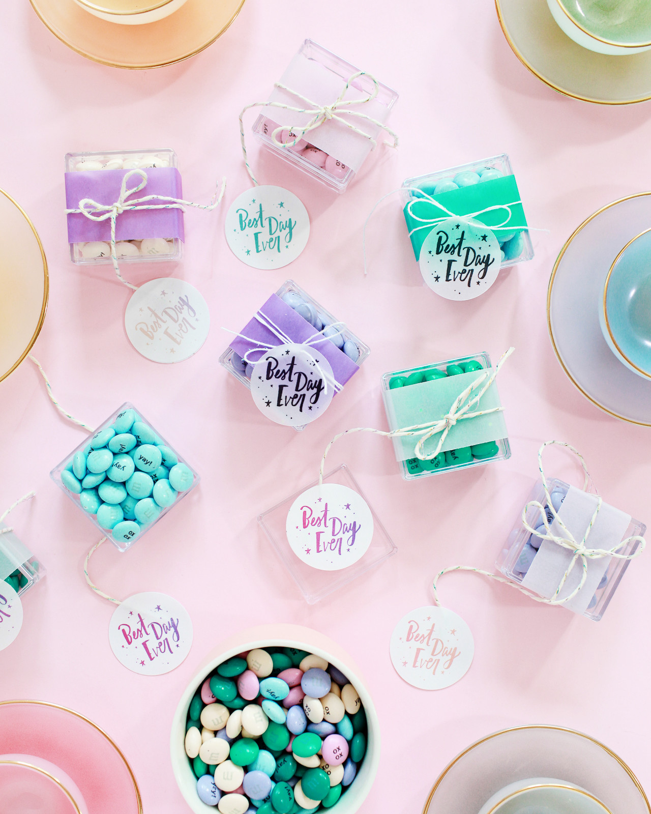
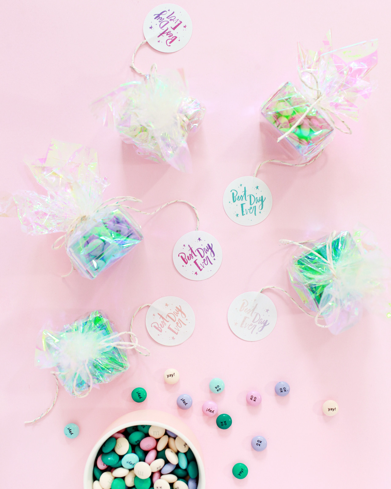
Printable Party Favor Tags with My M&Ms / Design by Swiss Cottage Designs / Oh So Beautiful Paper

Printable Party Favor Tags with My M&Ms / Design by Swiss Cottage Designs / Oh So Beautiful Paper

Printable Party Favor Tags with My M&Ms / Design by Swiss Cottage Designs / Oh So Beautiful Paper

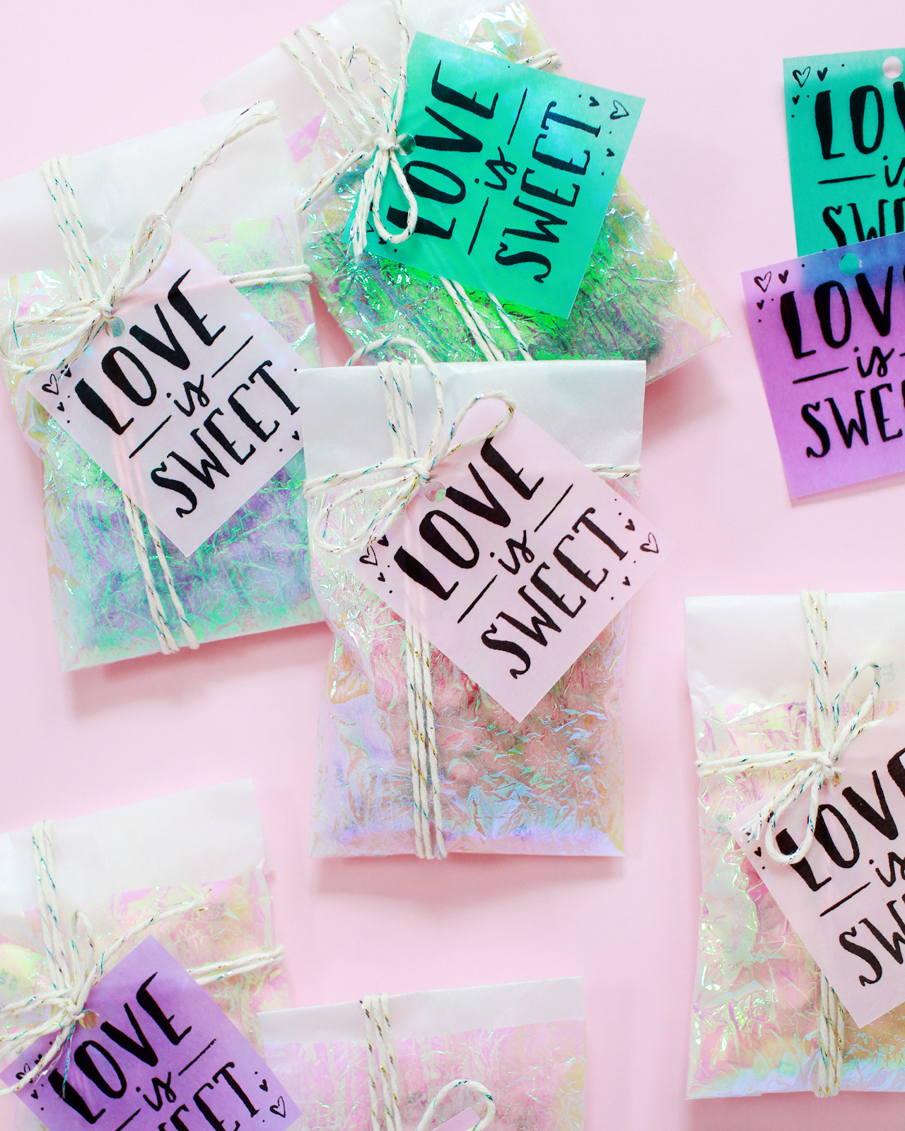
The glassine bags feature a layer of iridescent cellophane (DIY tutorial coming tomorrow!) with a colorful vellum tag and sparkly twine.
Printable Party Favor Tags with My M&Ms / Design by Swiss Cottage Designs / Oh So Beautiful Paper

Printable Party Favor Tags with My M&Ms / Design by Swiss Cottage Designs / Oh So Beautiful Paper

I printed mostly black and white versions of the printable party favor tags, but I included some color versions in case you want to print them onto labels or white printer paper. Use full sheet labels for Little Wishes and cut down to 2″ wide, use these square labels for the Love is Sweet tags, and use these circle labels for the Best Day Ever tags. They’re all formatted in the appropriate templates for each label and ready to print! The color versions also look AMAZING printed onto the opalescent and iridescent vellum, I’m just saying.
Printable Party Favor Tags with My M&Ms / Design by Swiss Cottage Designs / Oh So Beautiful Paper

Here’s everything that you’ll need to make your own!

My M&M’S in your chosen colors – and My M&M’S is graciously offering Oh So Beautiful Paper readers a 25% discount through September 1, 2016 with the code OHSO!

Clear Rectangular Candy Boxes

Square Acrylic Favor Boxes

Glassine Bags

Colorful Vellum (I used blush, pink, purple, and aqua)

Iridescent Vellum

Opalescent Vellum

Prism Twine

Paper Trimmer

1.5″ Circle Punch

2″ Square Punch

1/8″ Hole Punch

Printable Party Favor Tags with My M&Ms / Design by Swiss Cottage Designs / Oh So Beautiful Paper

The favor boxes would look so cute stacked in rows on a table, while the glassine envelopes could be placed in a cute basket or pinned on a board for guests to take! I’m just completely obsessed with the combination of iridescent and pastels. These glassine favor bags, printable party favor tags, and colorful M&M’s will definitely be making an appearance at my girls’ birthday party in just a few weeks!
Printable Party Favor Tags with My M&Ms / Design by Swiss Cottage Designs / Oh So Beautiful Paper

Printable Party Favor Tags with My M&Ms / Design by Swiss Cottage Designs / Oh So Beautiful Paper

Printable Party Favor Tags with My M&Ms / Design by Swiss Cottage Designs / Oh So Beautiful Paper

Printable Party Favor Tags with My M&Ms / Design by Swiss Cottage Designs / Oh So Beautiful Paper

Save 25% at My M&M’S through September 1, 2016 with the code OHSO!

Download all of the printable party favor tags below!

LITTLE WISHES: COLOR | BLACK + WHITE

BEST DAY EVER: COLOR | BLACK + WHITE

LOVE IS SWEET: COLOR | BLACK + WHITE

All printable artwork © 2016 Swiss Cottage Designs created exclusively for Oh So Beautiful Paper. All artwork is made available for personal use only and may not be altered, reproduced, or sold in any way. By downloading the patterns you agree to the terms of use.

Photos by Nole Garey for Oh So Beautiful Paper

This post is brought to you by CJ Affiliate’s VIP Content Service. Thank you My M&M’S for sponsoring this post. While this was a sponsored opportunity from My M&M’S, all content and opinions expressed here are my own. Thank you for supporting the sponsors that make Oh So Beautiful Paper possible!
Elegant Rustic Coral Wedding Invitations

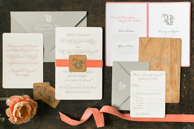
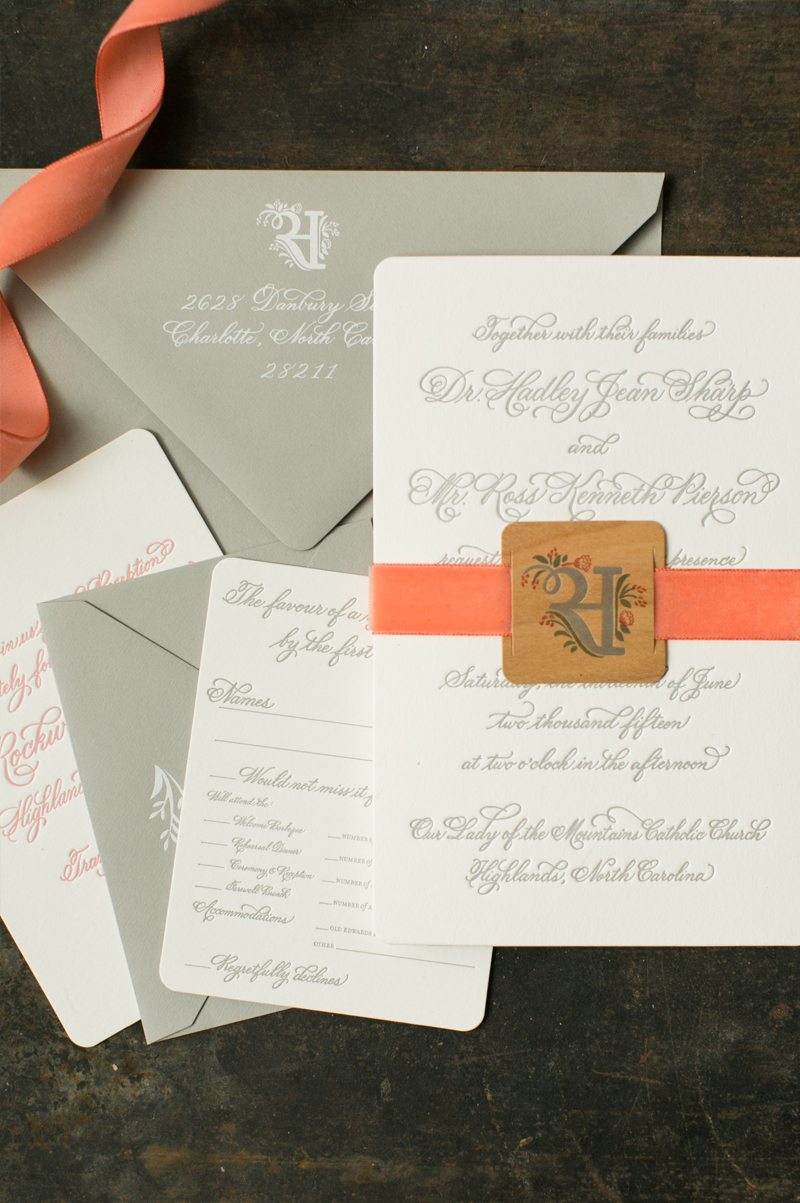
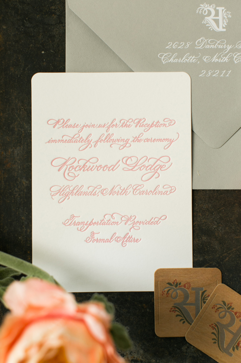
Beautiful modern calligraphy paired with a fantastic vintage coral velvet ribbon? Yes, please! These elegant rustic coral wedding invitations from Melissa of Atheneum Creative pair elegant letterpress printed calligraphy with a sophisticated gray, white, and coral color palette and rustic wood details throughout the invitation suite. Absolutely gorgeous!

Elegant Rustic Coral Wedding Invitations by Atheneum Creative / Oh So Beautiful Paper

From Melissa: Hadley and Ross planned a rustic wedding in the mountains, but wanted their wedding to be sophisticated and elegant at the same time. We started working on their wedding monogram and their wedding stationery with that concept in mind: rustic, modern, and softly elegant.

Elegant Rustic Coral Wedding Invitations by Atheneum Creative / Oh So Beautiful Paper

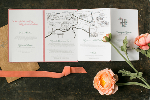
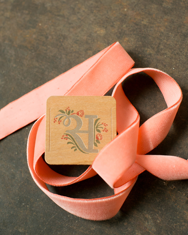
The wedding invitation was letterpress printed with gray calligraphy text on white paper, then bound with a vintage velvet coral ribbon and a custom wood tag featuring the wedding monogram. The coral ribbon is absolutely gorgeous when paired with the cherry wood tag! The wedding invitation suite also included an accordion-fold booklet with a wood front and back cover. The booklet listed all of the wedding events and contained a custom map. The wood booklet cover helped provide the rustic feel for the invitation suite. A letterpress printed reception card in coral calligraphy, a formal RSVP card in gray calligraphy, and gray envelopes completed the invitation suite.

Elegant Rustic Coral Wedding Invitations by Atheneum Creative / Oh So Beautiful Paper

Elegant Rustic Coral Wedding Invitations by Atheneum Creative / Oh So Beautiful Paper

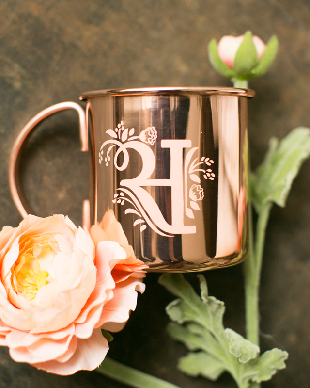
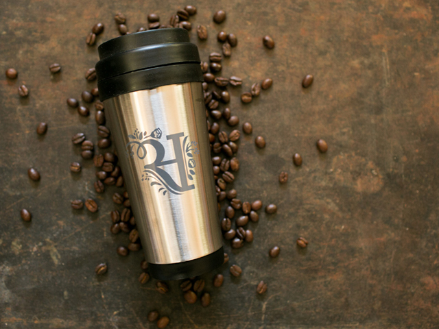
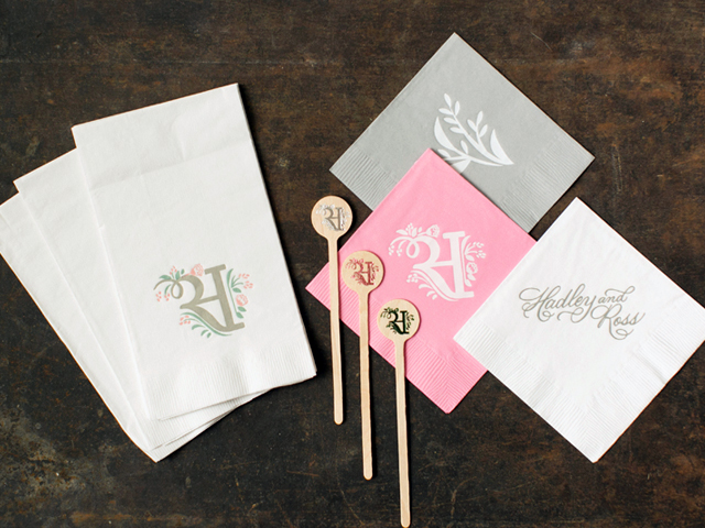
We also had lots of fun with their day-of wedding stationery. Napkins and stir sticks in matching colors, ceremony programs, and more! Our favorite detail of all has to be the custom copper cups that were sitting at everyone place setting. The copper just popped right off the table! We also made a custom coffee travel cup for guests to grab for brunch on the go the following morning.
Elegant Rustic Coral Wedding Invitations by Atheneum Creative / Oh So Beautiful Paper

Elegant Rustic Coral Wedding Invitations by Atheneum Creative / Oh So Beautiful Paper

Elegant Rustic Coral Wedding Invitations by Atheneum Creative / Oh So Beautiful Paper

Elegant Rustic Coral Wedding Invitations by Atheneum Creative / Oh So Beautiful Paper

Elegant Rustic Coral Wedding Invitations by Atheneum Creative / Oh So Beautiful Paper

Thanks Melissa!

Design: Atheneum Creative

Atheneum Creative is a member of the Designer Rolodex – you can see more of their beautiful work right here!
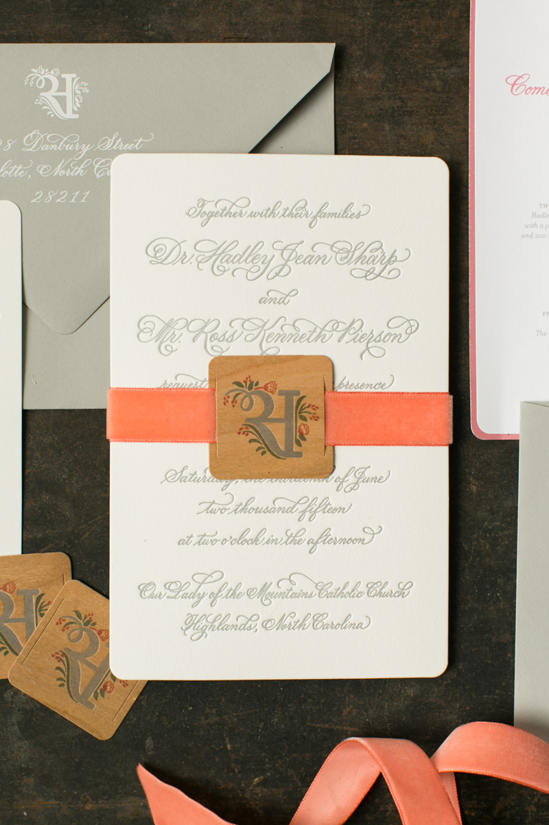
Photo Credits: Chelsea Davis Photography