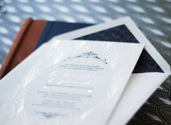
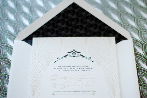
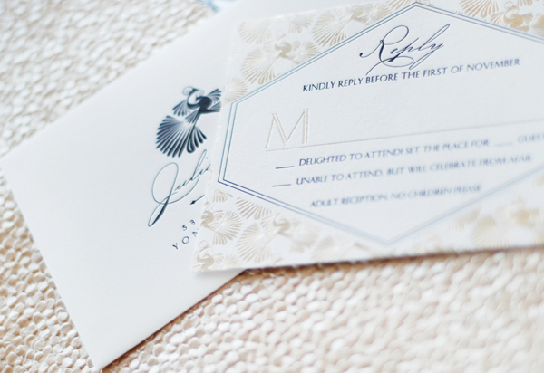
So we’re all pretty familiar with shiny gold foil by now, yes? But what about matte metallic foils – like the subtle champagne foil on these vintage-inspired wedding invitations from Nicole at Umama? Nicole worked with the talented team at Boxcar Press to print these invitations, pairing the subtle matte metallic foil with crisp black and white. Such a great combination!
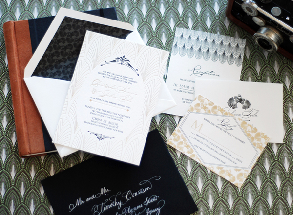
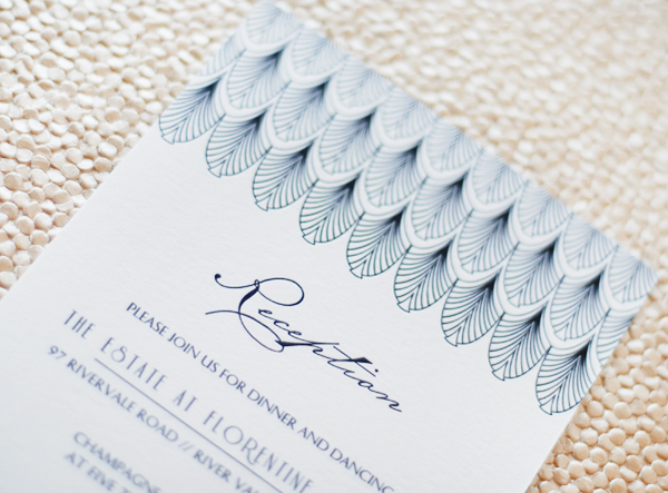
From Nicole: I wanted to create a pattern that would combine romance and elegance and could be used throughout the wedding invitation suite. I went with a classic deco scallop for the invitation and a set of nestled peacocks that repeated from the reply card to the envelope liner.
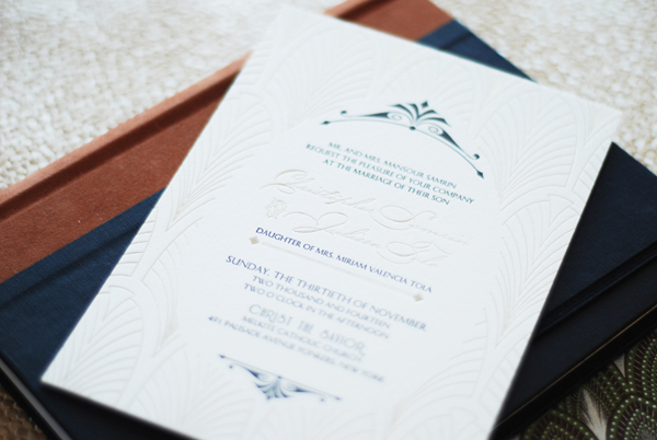
While reviewing swatches from Boxcar Press, we absolutely fell in love with the tawny foil. It was more subtle than the gold foil, and really lent itself to the softness that Julissa was looking for. It mimics the color of champagne, and brings to mind the decadence of the evening, and the cause for celebration.
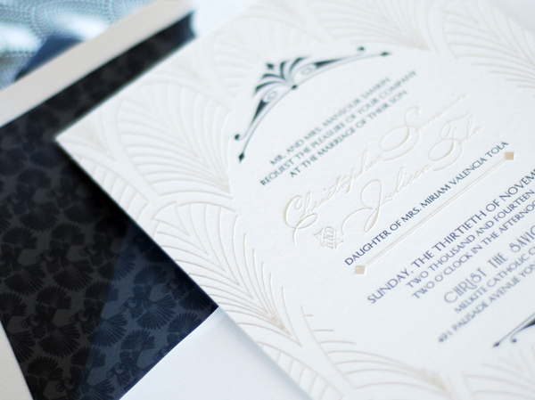
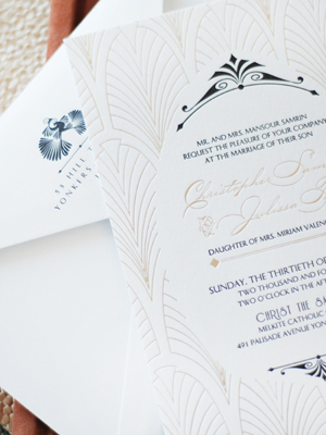
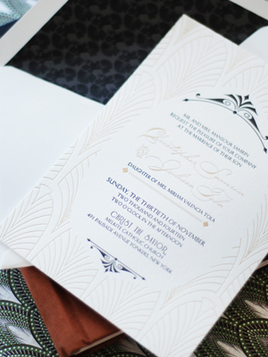
The invitation suite was printed on Crane Lettra 220 Pearl White paper with tawny foil and black letterpress. A coordinating liner was also custom designed and printed in two shades of black. Mary from Boxcar Press was the keen eye that helped to pull all the details together seamlessly from design to print. The end result was breathtaking!
Thanks Nicole!
Design:Â Umama
Letterpress and Foil Printing: Boxcar Press
Check out the Designer Rolodex for more talÂented wedÂding inviÂtaÂtion designÂers and the real inviÂtaÂtions gallery for more wedding invitation ideas!
Photo Credits:Â Umama
