It’s SNOWING here in DC, so I’m trying to distract myself from this situation with these whimsical poppy and eucalyptus watercolor wedding invitations from Kim of Bright Room Studio! We’ve had the pleasure of featuring many of Kim’s beautiful hand lettered and watercolor wedding invitations over the years, and I’m beyond thrilled that she recently released a new wedding invitation collection that makes it easier for brides and grooms to get Kim’s signature style without the pricetag and timeline of a custom invitation suite. Kim is here today to share one of her favorite designs from the new collection! We’re loving Kim’s cheerful script lettering paired with the gorgeous watercolor floral and eucalyptus elements!
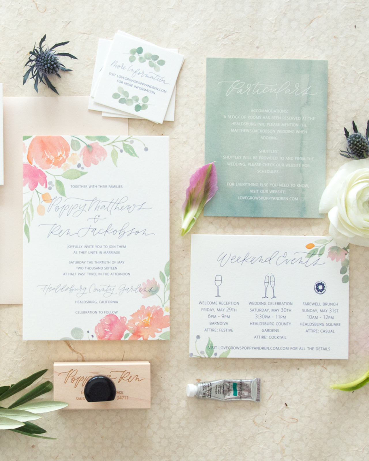
From Kim: I’m so excited to share one of my favorite suites from my new Bright Room Studio Wedding Collection! I call this suite the Poppy design. This design was actually the last one I created. The other suites in the collection are all pretty simple and very typography based and I felt like I needed a little more watercolor and a little more floral in my life, so I started painting!

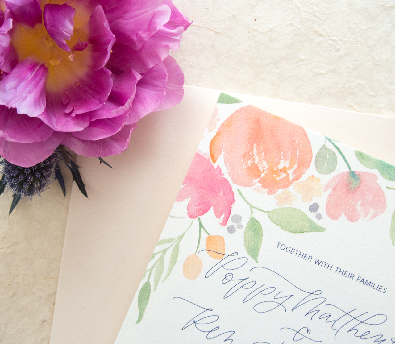
The florals are inspired by some of my favorite wedding bouquets, with big bold flowers, lots of texture and unusual elements like kumquats and berries. I love the cheery color palette because I think it works for any season; the greens and pinks are perfect for spring and summer, the orange tones lean a bit more toward fall and the touches of eucalyptus can even bring this suite into winter time.
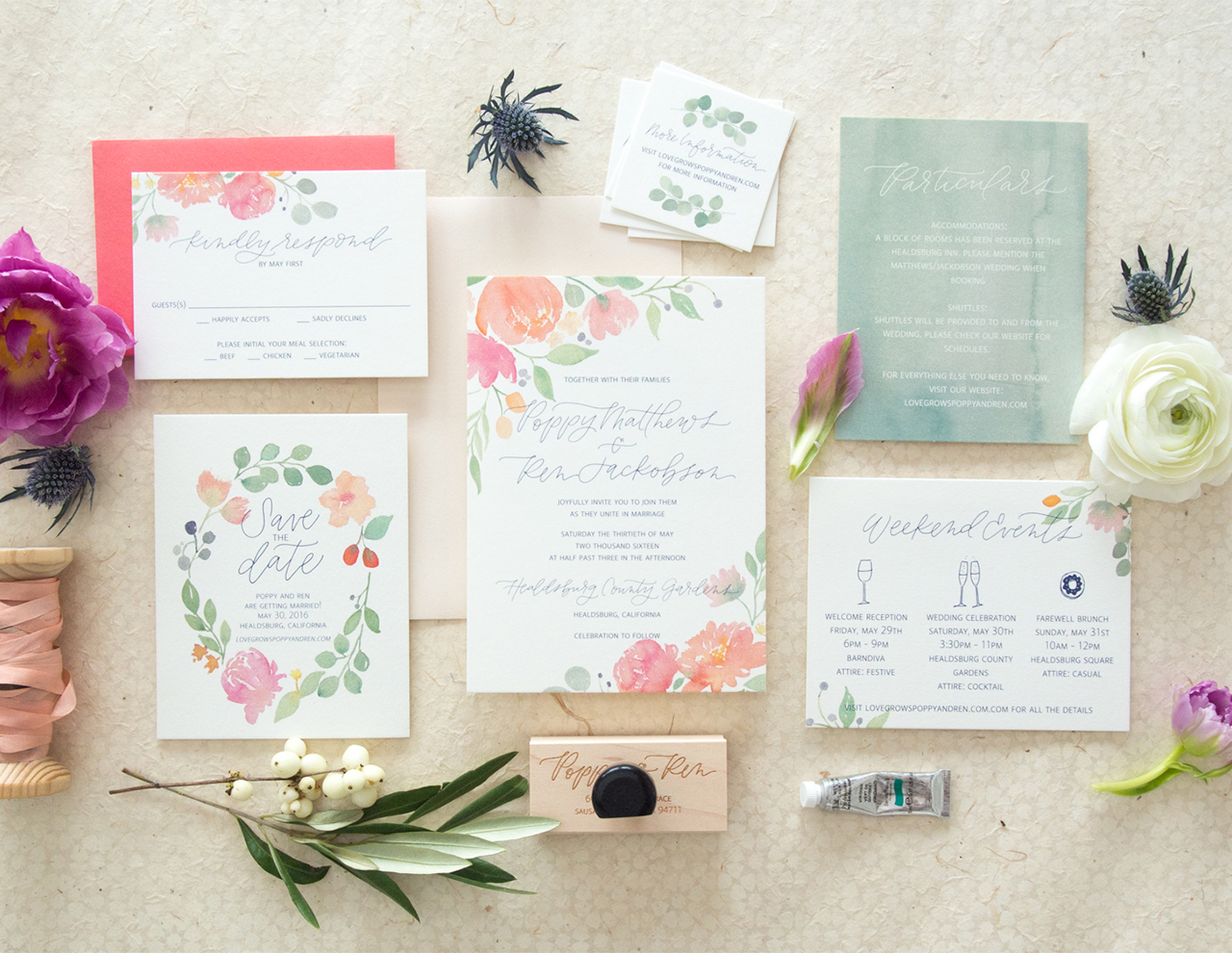
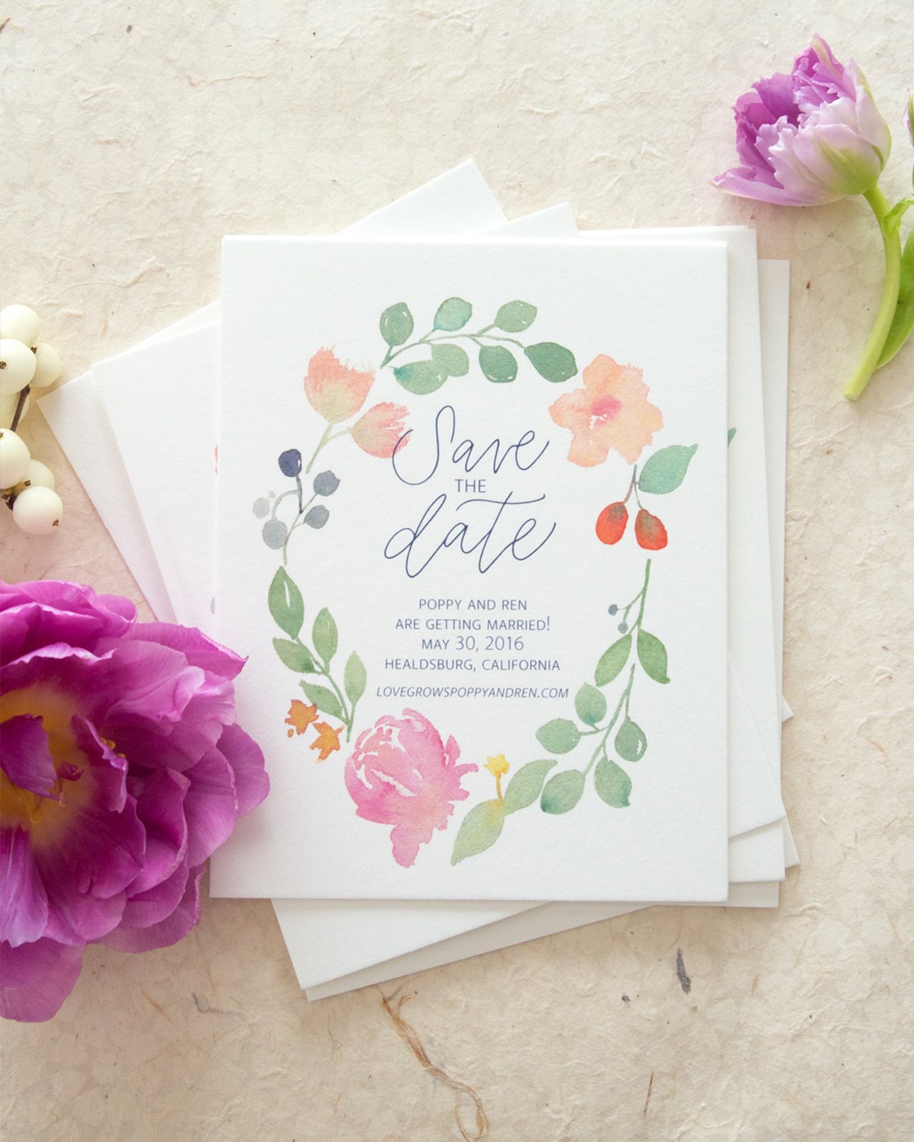
I used the florals throughout the suite, but I think my favorite spot is on the Save the Date. I love how the wreath compliments the rest of the suite without being too “matchy matchy.” I think this might be my favorite piece in the whole collection!
I love when invitation suites come together in a way that is coordinated and cohesive but not matching, so I gave the particulars card a watercolor wash background for a little pop and to ground the whole group. I also just kept a small eucalyptus leave on the mini details card to break up the florals a bit. Everything goes together but no two pieces are the same.
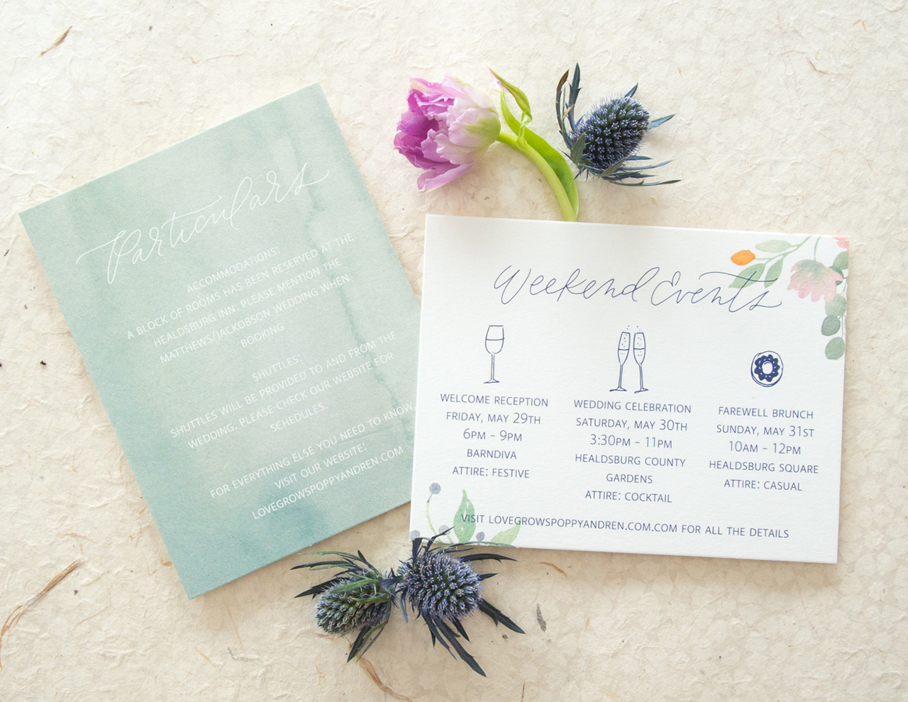
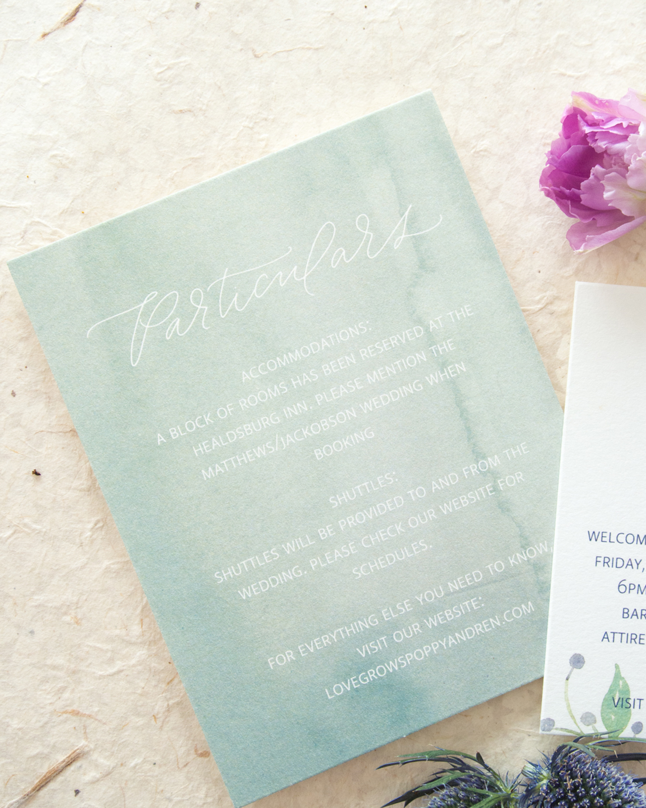

I also love how the watercolor prints look on the lovely textured cotton paper. It almost looks like it was painted directly onto the card instead of digitally printed. All that texture really brings the florals to life.
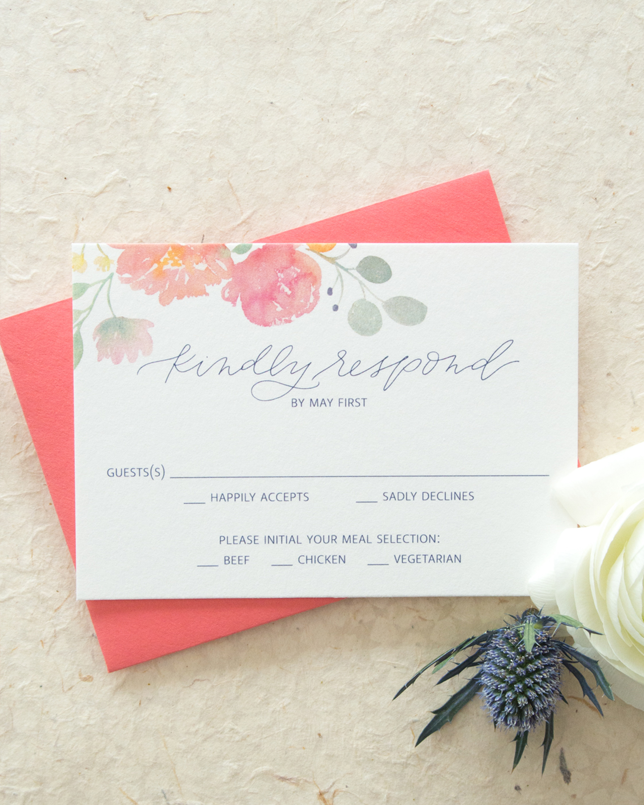
The entire suite can be customized too! For brides who love the florals, you can select your hand-lettered script style, font, color, envelope colors, and which pieces you need to bring together your perfect suite. Each suite has the option of an invitation, RSVP, particulars card, weekend events card, mini card (that can be used for a website, reception details or any other little bit of info), save the date and return address stamp. I simply love how versatile a pre-designed collection can be for brides!

Thanks Kim!
Design: Bright Room Studio
Printing: Mercurio Brothers Printing
Bright Room Studio is a member of the Designer Rolodex – you can see more of Kim’s beautiful work right here or visit the real inviÂtaÂtions gallery for more wedding invitation ideas!
Photo Credits:Kim Roth

I love all the designs here, it was really amazing.