Last week I mentioned my new partnership with eBay. They asked me to curate some shopping collections around my favorite topics. And I’ve been having so much fun pulling them together! My first two collections featured home bar essentials and a fun group of cocktail picks, stir sticks, and paper straws! I also thought it would be fun to share a few of my favorite paper styling props and some tips for awesome paper styling! I know through experience that even the prettiest wedding invitations and birth announcements can be really hard to photograph. But with the right technique and a few styling props, you can take your paper photography and styling to the next level!
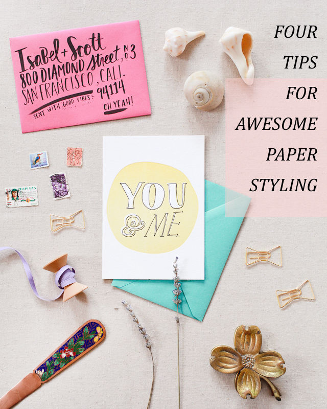
Start with the Right Conditions
A great photo starts with good lighting conditions and a few pieces of equipment. Always take photos using bright and even natural light, ideally on a table placed near or next to a large window. Buy the highest quality camera you can afford and invest in a great 35 mm or 50 mm lens. A few basic pieces of inexpensive equipment, like light diffusers, reflectors, and white foam core, can help you create a makeshift light box and avoid harsh shadows or bright spots.
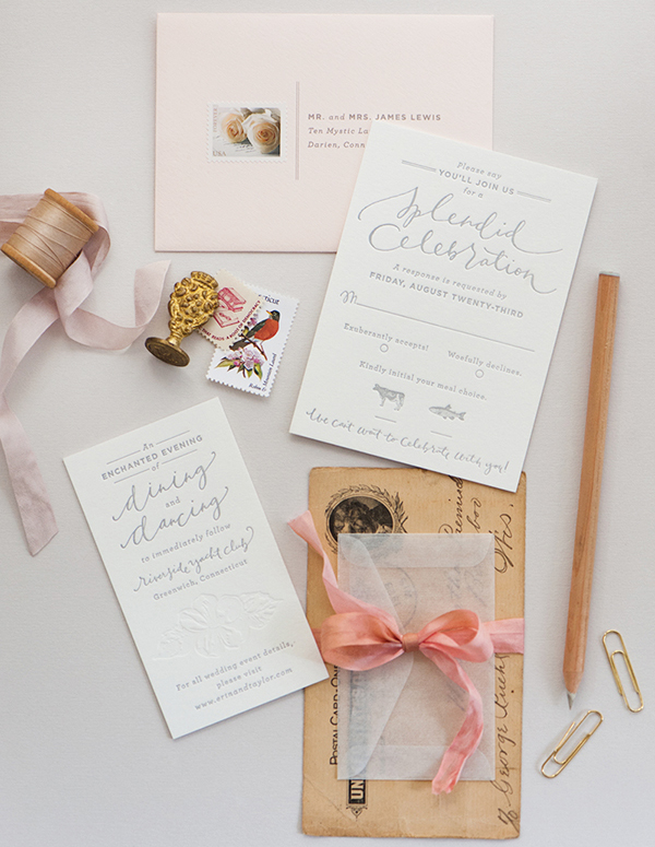
Photo Credit: Coral Pheasant
Choose Your Backdrop
I always recommend styling and photographing paper against a flat surface placed on the floor or a table near a window. White or colorful foam board makes a fantastic neutral backdrop. You can also choose a neutral linen or fabric in a complementary color to elevate your photographs. If you’ll be taking lots of photos, consider investing in a styling surface – Erickson Surfaces, Woodville, and One Stone West are all great places to start.
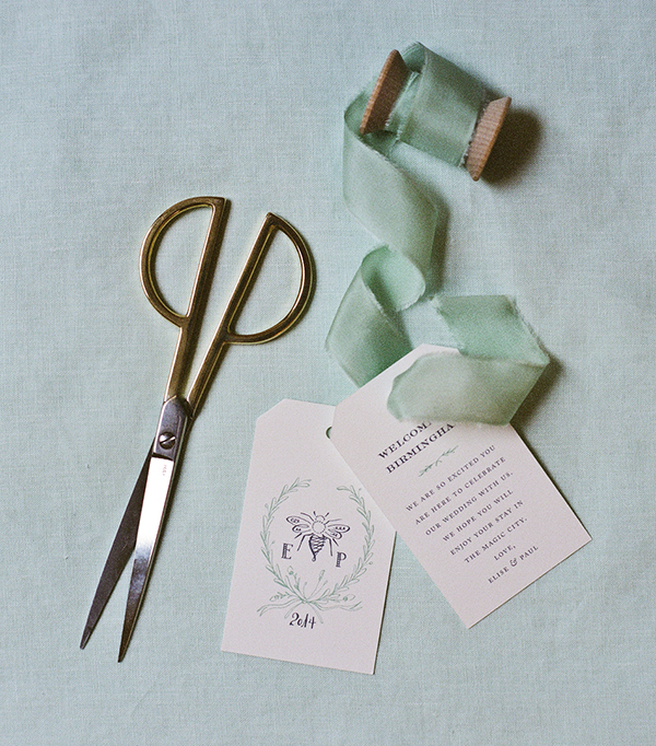
Photo Credit: Mandy Busby Creative / Design by Holly Hollon
Style it Up!
I always return to the same favorite props for my own styling needs. Choose items in a variety of shapes, sizes, and dimensions to direct the viewer’s eye and fill negative space. Vintage postage stamps, brass paperclips (especially in unique shapes!), twine, silk and cotton ribbon, washi tape, brass scissors or letter openers – anything with texture or that adds a vintage patina is perfect for adding character to photos! Natural elements like seashells and dried lavender also make fantastic styling props.
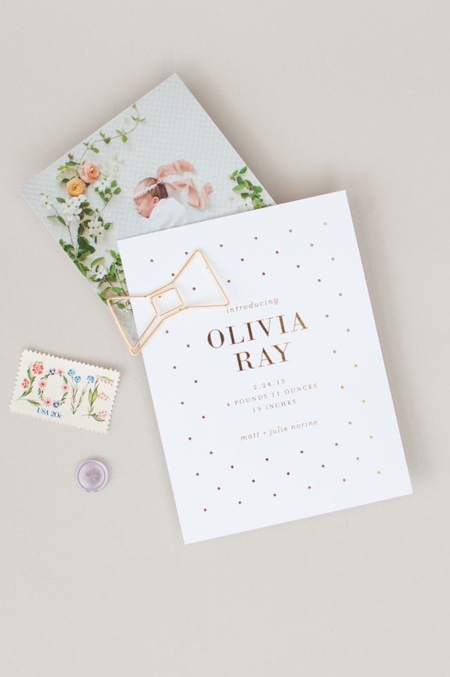
Photo Credit: Lauren Chism Fine Papers
Avoid a Grid
Paper styling and photography should be fun! Try to photograph everything straight on, with a few fun props scattered around to add visual interest. Have at least one thing (and maybe three) slightly off-kilter in each image. Square or rectangular paper pieces turned on a slight angle feel playful and whimsical. Have some elements touch or overlap in the photo to create depth and texture. Ribbon and washi tape can also run off the image to create movement and add visual interest.
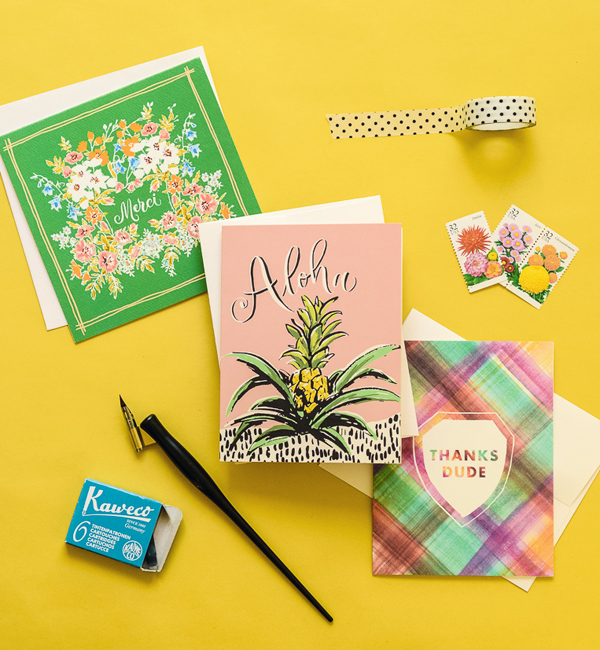
Photo Credit: Antiquaria Design Studio
Finally, don’t forget to take photos of the full paper suite, especially for wedding invitations and birth announcements, along with plenty of detail shots of individual pieces. And those detail shots are a great excuse to rotate and add in new props!
For any stationers out there, whether you have a wholesale stationery line or specialize in custom design, you’ve probably heard about the importance of styling a million times over. And to be honest, it’s a huge factor when I’m deciding which submissions to feature here on Oh So Beautiful Paper. Great styling can really help elevate a beautiful design and make it stand out from the crowd!
This post was created in partnership with eBay. All content and opinions are my own. Thank you for supporting the sponsors that make Oh So Beautiful Paper possible!

Great article about the paper styling! I know all too well the struggle with photographing paper goodies. It is one of my personal goals for the next couple of months…