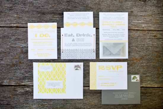
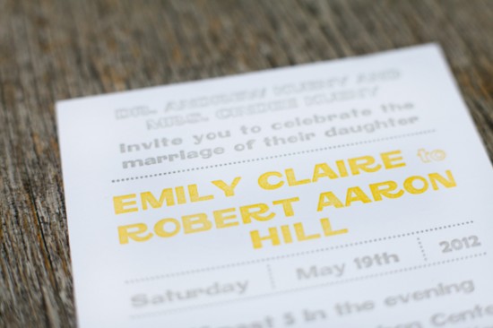
Emily and Robert wanted a playful and modern design for their wedding invitations; they worked with Emily and Dianna from Fourth Year Studio to create a typography-based design that was letterpress printed in a sunny yellow and gray color palette.  Just perfect for a laid back summer wedding in Texas!
From Emily and Dianna: Emily and Robert were married in Dallas, Texas.  We jumped at the chance to print in yellow and gray, one of our favorite color combos.  There was a ton of information to relay to their guests – and when there are multiple pieces to an invitation suite we try to come up with a way to make it to all fit together in a package that guests will enjoy opening.
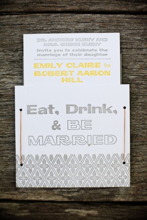
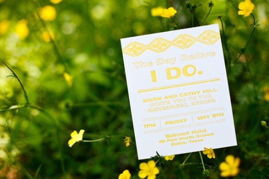
The invitation and rehearsal dinner card were letterpress printed on cotton stock and tucked into a pocket that held it all together. Â Each pocket was tied with wax thread, the same kind used for book binding.
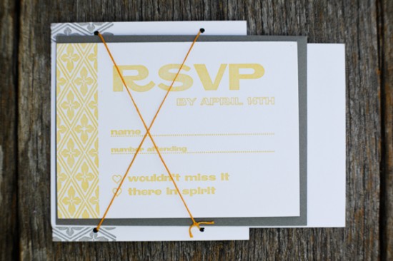
The RSVP card and envelope were tucked behind the crisscross of the thread.  The RSVP cards were printed front and back – one side for the wedding (yellow) and the other for the rehearsal dinner (gray).  The RSVP addresses were letterpress printed with white ink onto gray envelopes.
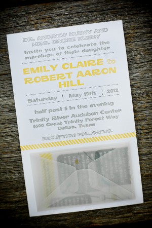
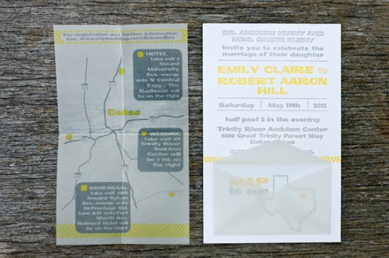
Our favorite part of the entire set is the map.  At the bottom of the invitation is a small vellum envelope.  Inside is a flat printed vellum map with directions to the wedding venue.  Removal of the map reveals a letterpress printed outline of Texas with corresponding text “map to our heart.”  The invitation suite was packaged with a matching envelope label with the repeating floral pattern that was derived from native Texas succulents and used graphically throughout the set.
Thanks Emily and Dianna!
Check out the Designer Rolodex for more talÂented wedÂding inviÂtaÂtion designÂers and the real inviÂtaÂtions gallery for more wedding invitation ideas!
Photo Credits:Â 5 Rings Photography

Yellow and gray, always a lovely combo. I love the font used on these.